2021年3月の初旬。フォントにまつわる一つの画像がTwitterで大きな反響を集めました。
「特にこだわりは無いけどフォントでギャグ漫画はメリハリが付けられるので編集さんに見せるために作った画像」という投稿文と共に投稿されたこの画像。実際のセリフと共に、使用シーンが分かりやすくまとめられています。
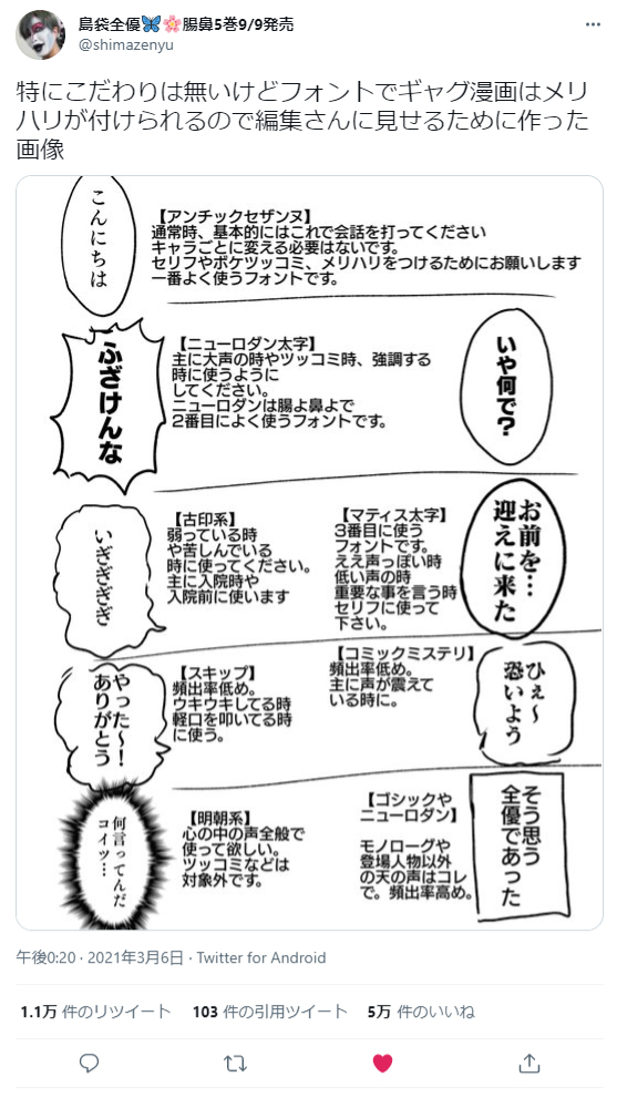
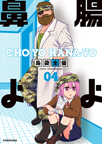
投稿したのは島袋全優さん。「潰瘍性大腸炎」という難病を抱えながらも、その闘病の様子をギャグエッセーという形でマンガアプリ「GANMA!」で連載されている漫画家さんです。
今回はバズった画像について触れつつ、漫画家という立場でのフォントへのこだわりや関わり方について、島袋先生に書面でのインタビューにお答えいただきました。
誰もいない教室の黒板に絵を描いていた小学生時代
――この度はインタビューにご回答くださりありがとうございます!元々島袋先生の漫画を拝見していたので、例のツイートにフォントワークスのフォントをご使用していただいているのを見てとても驚きました(笑)
さっそくですが、島袋先生のプロフィールを教えてください。
島袋先生:初めまして、島袋全優です。好きな部首は阝です。21歳の時に「蛙のおっさん」で月刊ライバルで連載デビューして、現在はギャグエッセイ「腸よ鼻よ」「脱・陰キャで事故プロデュース」を連載しています。
「潰瘍性大腸炎」と診断され、入退院と手術を繰り返しながら10年になりましたが、ここ2年間は初めて入院をせず無事にハッピーに過ごせています。
――漫画家を目指したきっかけは何だったのでしょうか?
島袋先生:幼稚園児くらいの頃からずっと絵を描いていました。漫画家という職業を知り(なりてえな……)って思ってからずっと漫画家なりたかったので、今なってます。なれて良かったです。
あと小学校6年生の時に、誰もいない教室の黒板にドラゴンを描いていたら担任の先生に見つかりまして。なんですけど、先生は感心しながら「島袋さんは絵が上手いなぁ」って言ってくれて。その時(私……漫画家になれるわ…… )って思い、余計に漫画家になる決意を固めました。
文字なんだけど声色が分かる
――冒頭でも少し触れましたが、島袋先生がツイートされた「フォントの使い分け」の画像が大きくバズりましたよね。こちらを投稿しようと思ったきっかけは何だったのでしょうか?
島袋先生:あの画像自体は【自分がギャグ漫画を描く時に、いつも気をつけているフォントの使い方】で、連載作品の担当さんに「こんな感じで使い分けてください」とお願いした時に送ったものなんです。漫画でのテンションや脳内再生される音声にイメージを付けるために、フォントを使い分けて勢いを出したかったので、担当さんにそれを説明して写植をして頂いていました。
ある時、私の漫画を読んだ友人に「全優の漫画って、フォントの使い方が良いよね。文字なんだけど声色が分かる」と言われたんですけど、その時、『あぁ自分の気をつけていた事がちゃんと読み手に伝わってて良かったな』と思い、何となくTwitterに投稿してみました。自分でもバズると思っていなかったので、驚いています。
需要ってどこにあるか分からないものですね。
――フォントワークスの投稿に限らず、フォントをテーマにしたツイートでここまでバズるのも珍しいと思います。このツイートでフォント業界に激震が走ったと思いますよ!(笑)
フォントを意識されはじめたきっかけって覚えていらっしゃいますか?
島袋先生:最初はずっとアナログの紙の原稿とかイラストとか描いていたので、フォントまで気が回っていなかったと思います。PCで趣味の絵を描き始めてセリフを打ち込み出してから、少し気にするようになってきて…1番意識するようになったのは、初連載の時に担当さんがセリフに付けてくれたフォントの種類を見てからです。
それをきっかけに、フォントでの勢いの付け方を自分なりに見つけていきました。
――例の画像でフォントワークスのフォントをたくさん紹介していただきましたが、弊社のフォントとの出会いは何でしたか?
島袋先生:6年前くらいにメディバンペイントでお仕事をさせて頂くようになってから、自分でフォントを使い分けるようになったのですが、メディバンにフォントワークスさんのフォントが沢山入っていて、色んなフォントに触れました。凄い楽しかったです。
その後にmojimoとかにもお世話になりました。
――mojimoもご使用いただいていたんですね!お使いになってみていかがでしたか?
島袋先生:入院中とかに、仕事や趣味で「mojimo-manga」の方を使わせて頂いてたんですが、使用しているメディバンペイントでもCLIP STUDIO PAINTでも問題なく使えました。フォントの種類も「manga」だけでも沢山あるので、セリフを打ち出す際に原稿を彩ってくれますね。通信制限とかあったのでオフラインでも好きなフォントが使えるのは心底助かりました。
全種使いきれないくらいあるので、漫画を制作する際にフォントで沢山感情を表現できてギャグ漫画描きの私としては楽しくて仕方ないです。

フォントを変えながらセリフに文字入れすると、落書きでもバシッと漫画になる
――次は島袋先生の漫画制作について深堀りさせていただければと思います!
ご自身で漫画の文字入れをする際にこだわっていることがあれば教えてください。
島袋先生:先程の質問でちょっと答えちゃったんですけど、やっぱりギャグ漫画なので勢いを大事にしています。あとは、一つの話で使うフォントは数を多くても3~4種類にする事ですかね。沢山フォント使いたいところですが、読む上で色々たくさんのフォントが出てくるの目が疲れちゃうので、主なセリフをアンチックセザンヌ、ツッコミをニューロダン、ボケをマティス……みたいな感じで使い分けて、目を疲れさせないようにしています。
――Twitterにあげるようなカジュアルな漫画にも、しっかりと文字入れする意味は何だと思われますか?
島袋先生:やっぱり読みやすさでしょうね。手書き文字が別にダメという訳では無いんですが、私自身そこまで綺麗な字でもないので、文字を打った方が読みやすく綺麗な画面になるかなと思っています。
あと、フォントを変えながらセリフに文字入れすると、落書きでもバシッと漫画になるんですよ。アレが気持ちいい。確かにフォント変えながら全コマに文字を打つのって結構労力なんですけど、初めて自分の描いた原稿の吹き出しにセリフが入った時の漫画!って感じ、けっこう感動したんですよね。
――そのように言っていただけてとても嬉しいです!漫画自体が「絵」なら、フォントを使ったセリフは「額縁」といいますか…二つが組み合わさることで、「作品」としてのクオリティが上がるように私は思います。
好きなフォントワークスのフォントとその理由を教えていただけますか?
島袋先生:
・ニューロダンの太文字:1番勢いがあって画面が締まるし脳内で再生しやすい!
・マティス太文字:ええ声っぽい!かっこいい!決め台詞に使いがち!
・スキップ:ルンルン気分を視認できる感じ目に優しくて好き
・レゲエ:激しいツッコミとかに使うと脳内再生しやすくて好き、関西弁とかに使うととてもマッチする
大体のフォントを「感覚」で選んで使用しているので、共感してもらえるか分かりません(笑)
――確かに「ええ声」っぽいです!(笑)スキップのルンルン感もよく分かります。
それでは次が最後の質問になります。
漫画家を目指している方へ、メッセージをお願いいたします!
島袋先生:漫画家を目指している方、ケ〇シロウ、フォントはいいぞ!
漫画で伝える術が、文字の形で色々広がる上に、絵がちょっと下手でも文字で読ませる技術があれば、漫画として立派に成り立つのです……フォントに本当に助けられてるんだ……ダジャレみたいになったけど、いやマジでフォントは良い。
あとSNSで漫画載せる時にも画面映えするのでオススメです。
――本日は本当に、いえ、フォントにありがとうございました!これからも島袋先生の漫画を拝見できるのを楽しみにしています!
島袋全優
病弱入院御家芸ギャグ漫画家。慢性持続型全大腸型潰瘍性大腸炎でした。23歳で大腸全摘、ストーマ5回目。オストメイト。手術10回目が無事成功。月刊少年ライバルで「蛙のおっさん」デビュー。GANMA!にて「腸よ鼻よ」連載中。
マンガアプリ「GANMA!」