As a pioneer of instant noodles, Marutai Co., Ltd. is a food manufacturer in Kyushu offering delicious, high-quality and attractive products.
Under the corporate philosophy of "contributing to the creation of a rich food culture through the development, production, and sale of instant noodles," we are offering attractive products using our traditional and original production system.
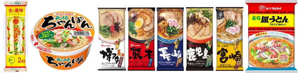
Marutai is known as stick ramen, and stick ramen is known as maltai. It boasts a great name recognition and recognition, and among its masterpieces, "Marutai ramen" has received great support from consumers all over the country.
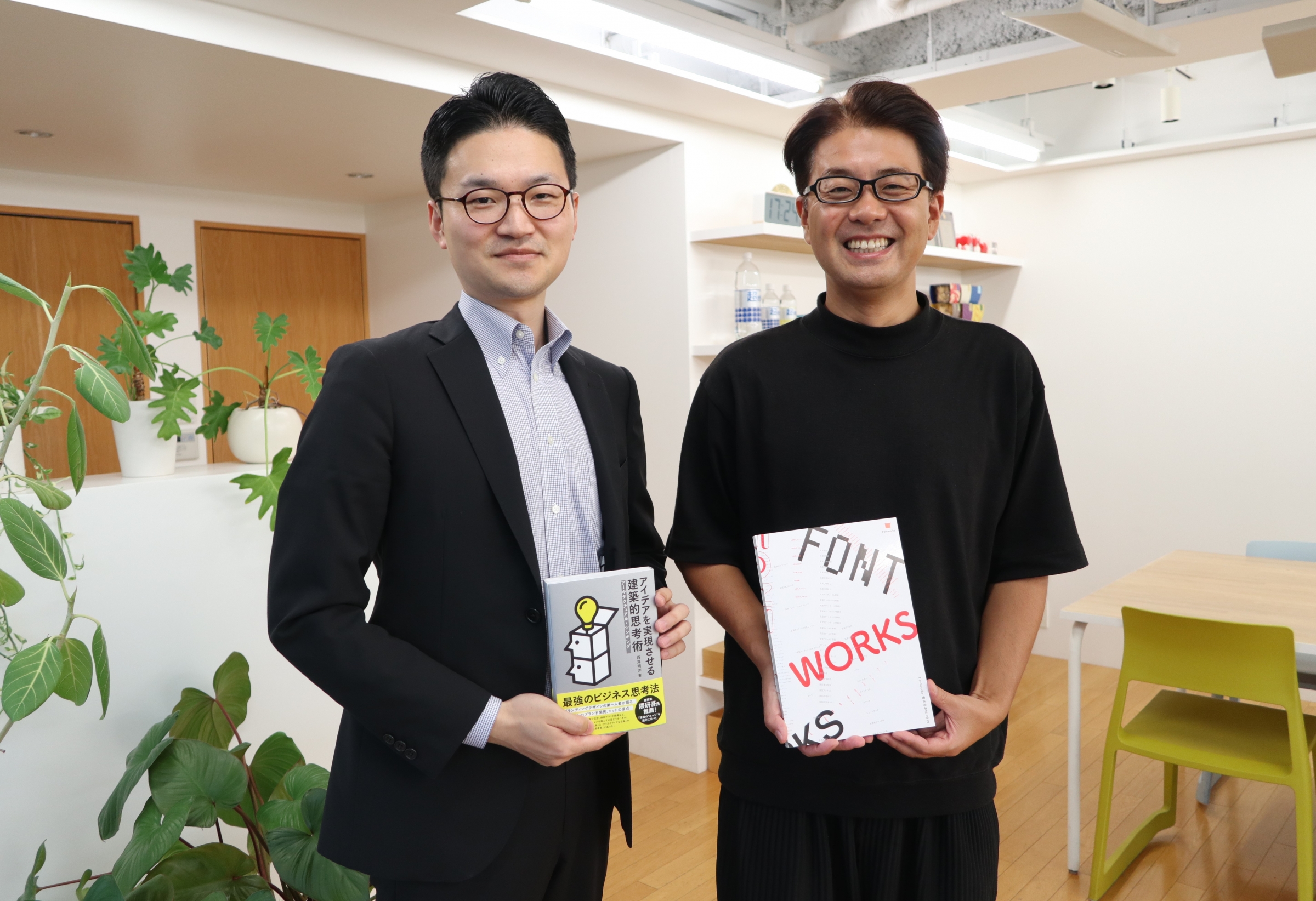
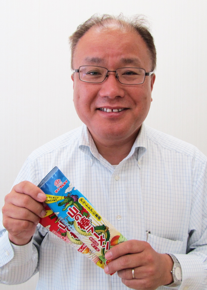
This time, the 23rd of Usage in the typeface "Introduction of the Yoshiharu Osaki design Kurokane a" Packaging we have on use in the entire surface of the production and of the "mountain of stick noodles", other Packaging Co., Ltd. for the design We interviewed Mr. Nakazono of the Marutai Marketing Department and Mr. Hirata and Mr. Murayama of the external designers who were in charge of the design.
Commitment to Marutai products
It goes without saying that we strictly adhere to the "provide safe and secure products" imposed on food manufacturers, and as a Kyushu company, we will continue to offer a variety of products that focus on Kyushu. I will.
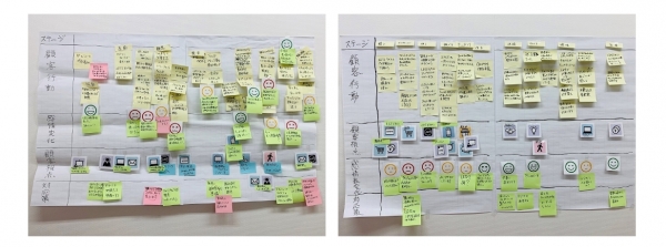
Each department is assigned its own role, such as procuring raw materials, selecting tastes, examining shapes, and selecting designs in line with product planning based on trends and market research. It takes at least half a year to one year to develop our new product, and we will repeat trial and error many times, especially when selecting the taste, and revise until we are satisfied.
We mainly sell new products in spring and autumn, so by setting up a schedule so that planned products can be properly released and announced, and by regularly holding meetings with sales personnel, We are making it possible to deliver the enjoyment of food to the dining table.
About the Packaging design of multi-product

In the product development flow, I'm deeply involved in product planning and design selection as a marketing department. After a long period of product development for "men," "soup," "kayaku," and "seasoning oil," product Packaging will begin. When the products are lined up at the store, the product Packaging that first touches the eyes of the consumer is not only conspicuous and has an impact at the store, but we also use products that match the image and concept of the product. I will.
The Packaging design will be brushed up through discussions based on what the designer will create by giving a concrete image from here and the ideas that we have received as suggestions.
In particular, our products, ramen and udon noodles, are cooked by the consumers themselves, so we are paying even more attention to the Packaging photos so that they can be used as a reference for cooking. In order to post pictures that look colorful and look delicious, our staff will be present at the time of shooting to instruct the photographer directly.
In addition, on the back side, there is an important information posting place where raw material notation etc. as specified by law are posted, so several persons in charge repeatedly make detailed checks to see if there are any typographical errors or violations of the regulations. I am. Regarding layout, we also try to use fonts and sizes that are easy to see and understand for everyone, while maintaining the originality while maintaining the legal regulations regarding food labeling.
Developed as a ramen suitable for outdoors

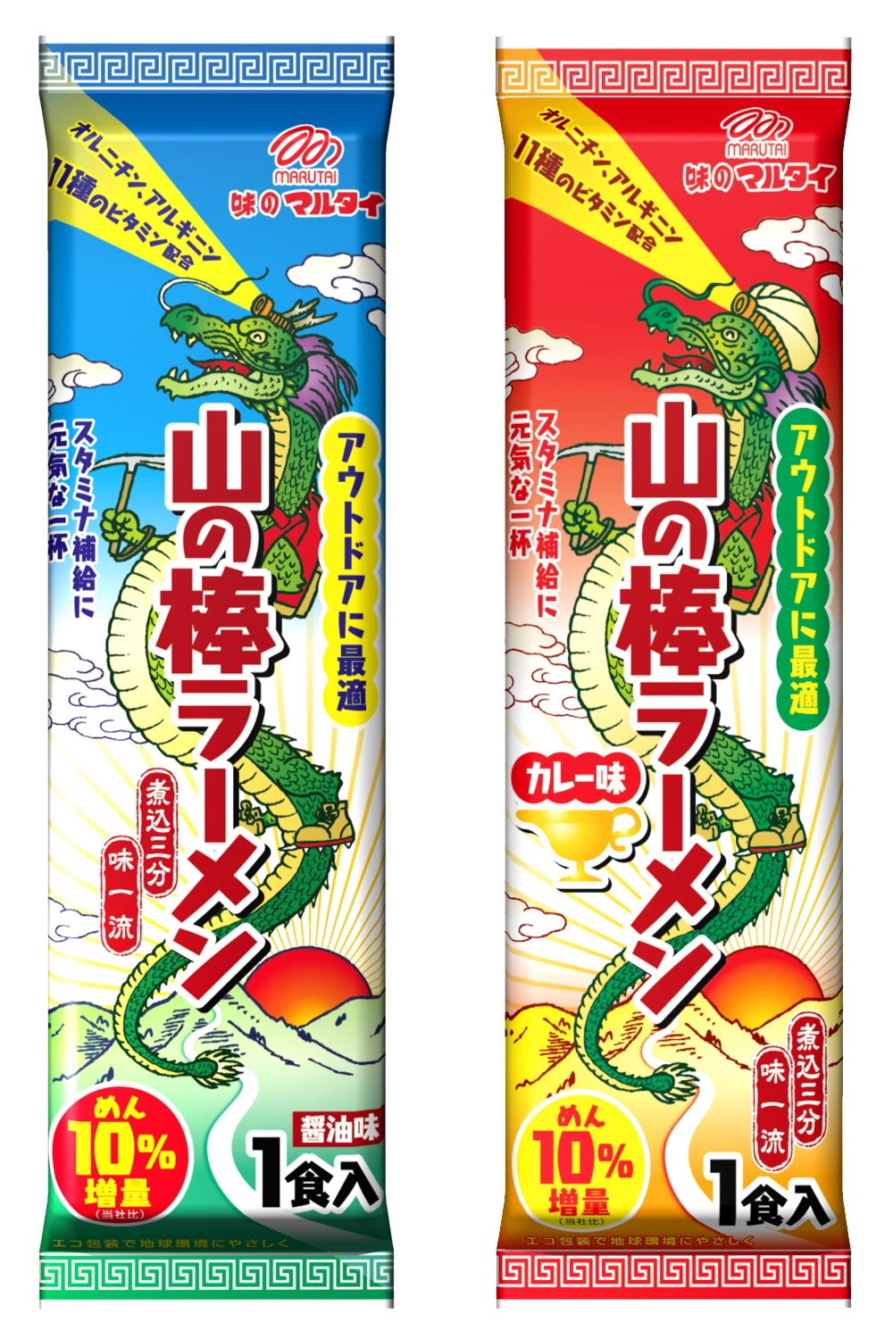
This "Yama no Bar Ramen" was developed as a product suitable for mountain climbing and outdoor activities. Originally, our long-selling product "Marutai Ramen" has often been featured in outdoor magazines, and it is said that it is convenient to carry because of its compact form. "Always bring" Marutai Ramen "to mountain climbing". We received a lot of voices like that, which was a direct impetus. If it! With the emphasis on stamina supply and physical strength Support rather than ordinary ramen, we have also started to develop products featuring eco-packaging.
Fresh and eye-catching Packaging
The Packaging features a dragon, which is the motif of "Multai Ramen," and has a more powerful and dynamic design. In addition, from the point of view of products suitable for mountain climbing, we were particular about details such as equipping a mountain climbing item such as a headlamp on the dragon, a backpack on the back, ice ax on the hands, mountaineering shoes on the feet. The design is finished.
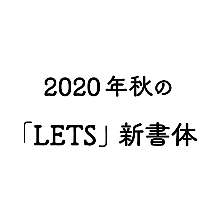
The typeface used for the Packaging of "Yama no Stick Ramen" has a clear assertion that is different from Gothic or Mincho typeface, yet it has a somewhat round and gentle image. The reason why it was adopted was that it was exactly applied to the brand image of our stick ramen and the image concept of the product that is eco-friendly eco packaging. We have never seen a Packaging using such a typeface among our products, so it will be fresh and eye-catching.Thanks to consumers who actually bought it or saw it in the store. Also, we are aware of our commitment and we have received praise. (Mr. Nakazono)
About the typeface "Kurokane" seen from the designer
The first time there was a request of design from Marutai customers, so was that "mountain climbing, etc., want to make a ramen suitable for outdoor", stick noodles are our evaluation already from consumer customers that it is ideal for outdoor of the Packaging form is to be used as it is, Packaging we have is from the proposed design.
Currently adopted Packaging separately from the, me for a cooking photo by using the thick of the horizontal line tomorrow morning Packaging there were also those proposed design, the "mountain of stick noodles" is, "mountain in the planning stages sometimes keywords such as Girl "was out, we went underway in continue to represent the image of" soft and cute but strong "direction" a strong likely man-ish "than the image with the climbing.
For this reason than to me for a cooking photo, extruding a design that was an illustration of the dragon is a motif on the front, we decided to appeal to the cuteness. And strength of the dragon has originally, was to express the cuteness with the illustration Packaging to the title, I wanted to use as much as possible innovative fonts in consideration of the concept of the product. Therefore, the "font Works's, which also has conjunction soon floating he is strong and also somehow cuteness Kurokane was".
And ultimately not only the title, "to almost the entire surface in such a sentence on the back surface of the cooking method described Kurokane with a" Packaging is finished in design. I think that it would be this kind of usage is rare, to I think also easy to use and also smoothly subsided also in the vertical writing in playing not while also comparatively visibility is horizontal writing because the typeface that is, cute feeling of "Seurat" and "Pop Happiness" in an atmosphere different from the typeface, such as, but it is nice new feel to.
So had decided image you want to express, significant changes in the production process was not nearly. In addition to the climbing only equipped with the dragon, Packaging and out the luster in the sun by using the aluminum area of the material, with or to represent the image of sunrise and sunset, in two different taste, ingenuity of design in a variety of places also received a high evaluation to Marutai customers of the client by the.
Both individuality and visibility are important
Like "Kurokane" used in the main this time, Advertisement and Packaging often bring unique typefaces to the title. Not only has the characteristics, but recently, visibility has also been required, so it is thick weight so that `` Pearl'' and `` Budo'' that are cute and do not assert too much can be used in the title. I would like to increase. Also, this is a request for weight development, but "Tsukushi Old Mincho" should have a thick weight! It is easier to use the ones that have been adjusted such as optical illusions, rather than making them thicker by themselves. (Hirata and Murayama)
< Editor's note >
The introduction of "Yama no Stick Ramen" was triggered by the fact that I was introduced in the TV outdoor feature. I saw "Kurokane" in front of Packaging, so I would like to introduce it, so I requested an interview. Not only from the designer side, but also from the manufacturer Marutai, I feel that I was able to tell more about the atmosphere of the typeface by receiving feedback on "Kurokane" I am. We will continue to make efforts to widely introduce "LETS" and its typefaces.
Company Info
| Company name | Marutai Co., Ltd. |
|---|---|
| location | 3-23-42 Shusenji Temple, Nishi-ku, Fukuoka City, Fukuoka Prefecture |
| TEL | 092-807-0711 |
| Fax | 092-807-0716 |
| URL | http://www.marutai.co.jp/ |
For enrollment in the "LETS" program or purchase of products, please Contact Us your retailer or place an order.