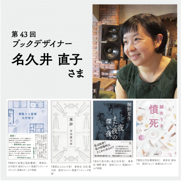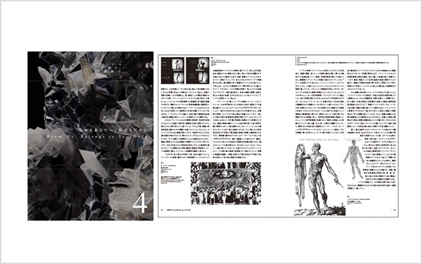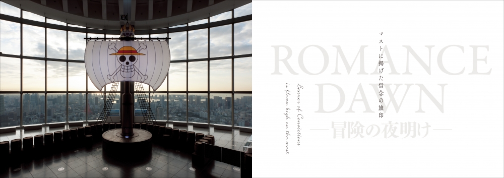
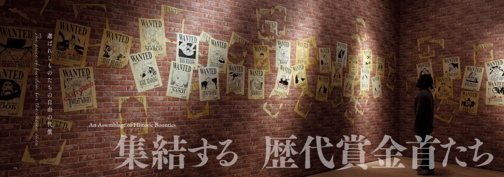
"ONE PIECE" official catalog "Memory" Middle surface typeface used Tsukushi A Midashi Mincho / Tsukushi A Old Mincho
Introduction of designer Shogo Shibata
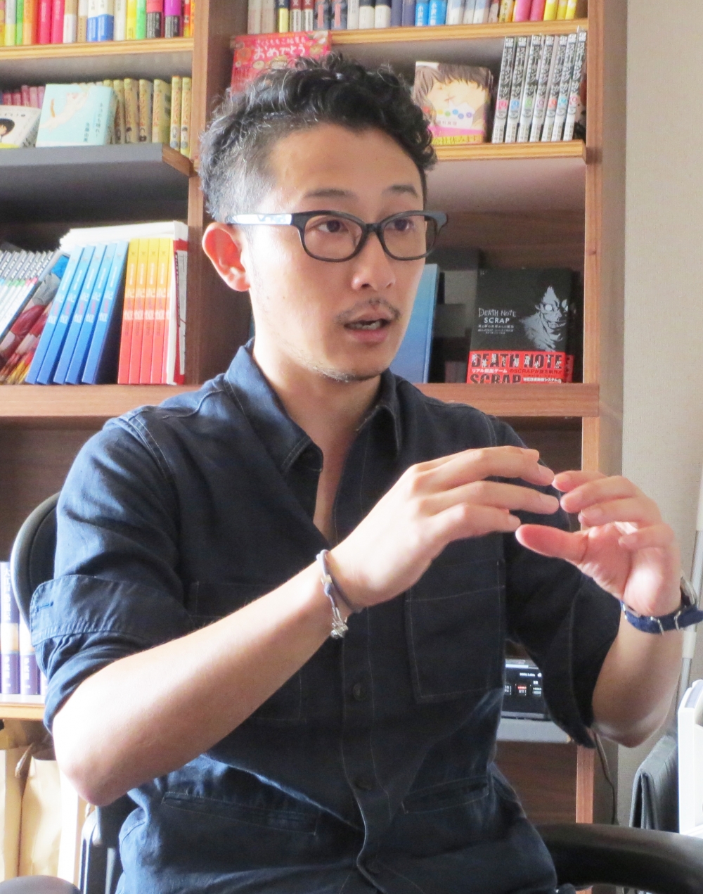
While working at a design office, was in charge of the Advertisement direction and design for Shueisha's "Men's Nonno" and "BAILA", as well as the editorial design for Shogakukan "Platinum Saray" and "Kakuru". After that, after working as a freelancer, he established Plastus Design Co., Ltd. Based on our experience in paper media, we are challenging various media beyond genres such as magazine appendixes and CD jacket Packaging designs.
This time, the official catalogs and pamphlets of the "ONE PIECE Exhibition", which attracted much attention, and the events held in Tokyo and Osaka were held. Real escape game "The escape from the world of death and sand" used in the new web-based system of "," and Momoko Sakura's original mook "Momoko Sakura Sakura debuts 30th anniversary of the editorial debut" with manga, essays, dialogues, etc. You introduced many examples using LETS fonts.
After becoming independent, use the Chikushi typeface naturally
I met Chikushi typeface when I was working as an editor for an information magazine at a design office before I became a freelance. Since the magazine targets economically rich people and high age groups, the publishers were requested to make it a high-quality magazine considering readability. I had the opportunity to ask the opinions of those who were active as font directors in the previous stage. Therefore, I was introduced to "Tsukushi A Midashi Mincho" and "Tsukushi Mincho".
Since the title logo is a magazine that uses a Handwriting typeface, I thought "moving design" would match beautifully, so I used "Tsukushi A Midashi Mincho" as the catch phrase that stands out on the cover. In addition, the Text is the same Tsukushi series also in the "Tsukushi Mincho has adopted a". In this Text it was necessary to set a large font size as a measure to improve readability, but increasing the font size does not change the image of the magazine, and it is possible to read while maintaining a high-class feel. I think it was easy and beautiful. I think that this is different from the design that seems to be pressed into a square, but it has a habit in a good sense, or that it is related to the element that feels the movement.
While using the Chikushi typeface in various places like this, when I thought "I want to assemble in Mincho typeface", I first thought about making it in "Tsukushi typeface". It was.
The Chikushi typeface is also used in the official catalogs and pamphlets of the “ONE PIECE” exhibition with a different concept.
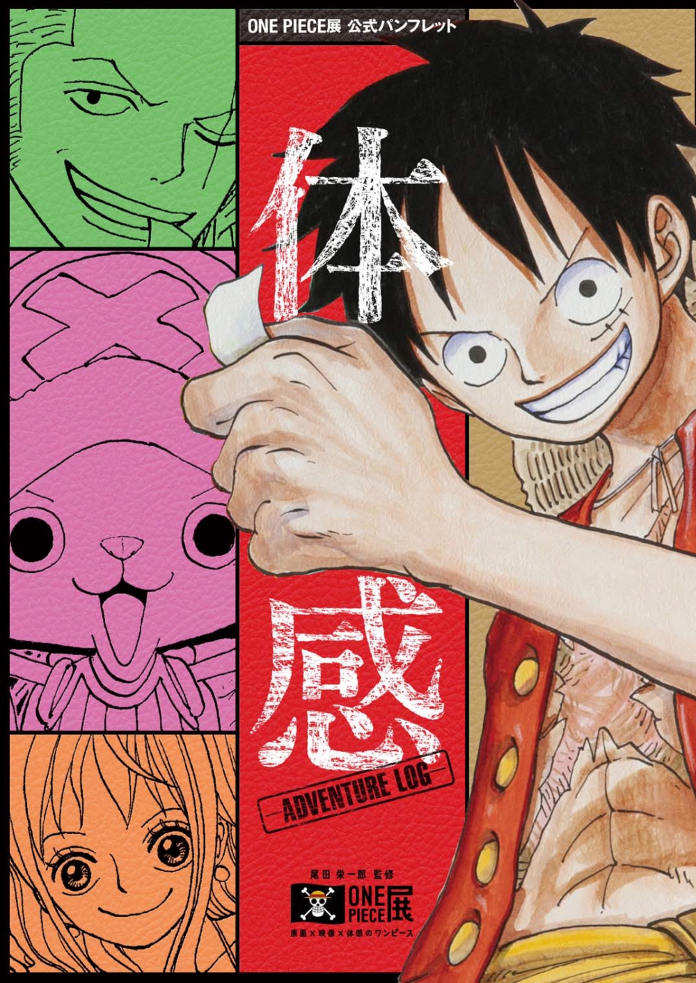
This is the official catalog "Memory" and the official pamphlet "Experience" of the "ONE PIECE Exhibition" held in Tokyo and Osaka. We produced according to each concept.
"Experience" is based on the idea of "I want children to be happy!" By the author, Eiichiro Oda, and the concept is "profitable". The bookbinding design keeps the price down and a lot of photographs and illustrations are used in the magazine. Did.
On the other hand, "Memory" is designed with the concept that it will be cherished as a collection book for a long time. I will.
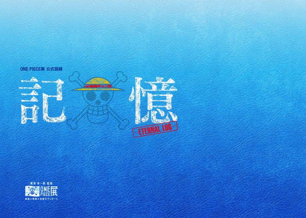
There is a manga part like "Experience", but it is full of photographs and illustrations such as life-sized "ONE PIECE" characters and carefully selected original drawings. Therefore, the font in the pictorial book uses "Chikushi typeface" that can incorporate the "unification" and "luxury" that are suitable for collection books. Relaxed with the element "Tsukushi typeface" is Heading and small Heading "part Tsukushi A Midashi Mincho not only", "also on the page of the English, which has posted a conversation Tsukushi A Old Mincho the" Text using the I am.

In addition, this "Tsukushi A Old Mincho" is easy to use due to the variety of weight variations. For example, if you are using "Tsukushi A Old Mincho M" for long Japanese text, change one alphanumeric character to "Tsukushi A Old Mincho R" with one thin weight. It is time to make adjustments so that they are even.
Depending on the arrangement and proportion of Japanese and European texts, most fonts make alphanumeric characters look a little thick.
Therefore, we make adjustments, but there may be a sense of distance between the design side and the reader side who receives it. If it's too stiff, it feels a little overkill, so I'll try to design it while studying why it feels like that and how comfortable it is to create an atmosphere. I think it has become a "one book with a sense of unity".
"Congratulations to Momoko Sakura, Editor-in-Chief" using many fonts
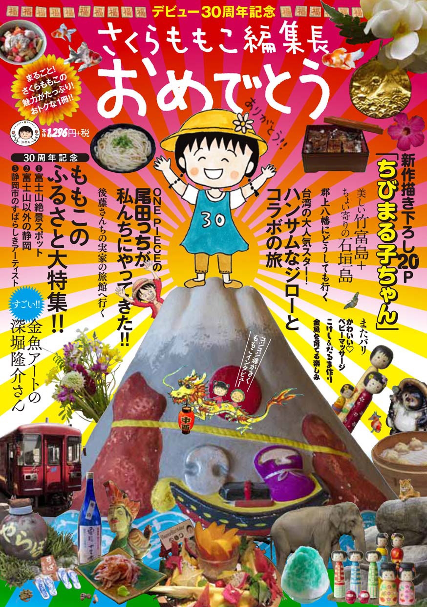
Momoko Sakura's original mook uses many typefaces, as you can see on the cover. Each story has a different appearance and font, so I think that each design is a book that gives you a feel for each image.
I don't remember how many typefaces I actually used, but I even told the printing company who submitted the paper, "Please think that you will use all LETS OpenType fonts!".
It was the first time for me to use so many fonts in one book that was not a Fonts. However, we received a request from Sakura Productions, our client, that many of the project contents should be clearly separated as much as possible to show the characteristics of each project, and the layout of the entire layout with manuscripts. Since I was thinking about it, I decided to devise a method that uses a lot of typefaces like this, in terms of features or a way of showing each project's personality.
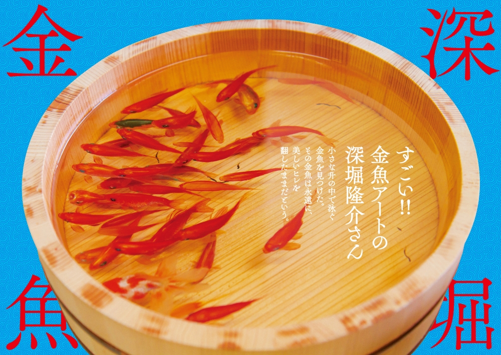
Since the layout adjustment was started based on the content of the manuscript, I was able to propose a font according to the content when I submitted the rough. Among the fonts selected, the one most enjoyed by the receiving side of the reader was the "Tsukushi C Old Mincho".
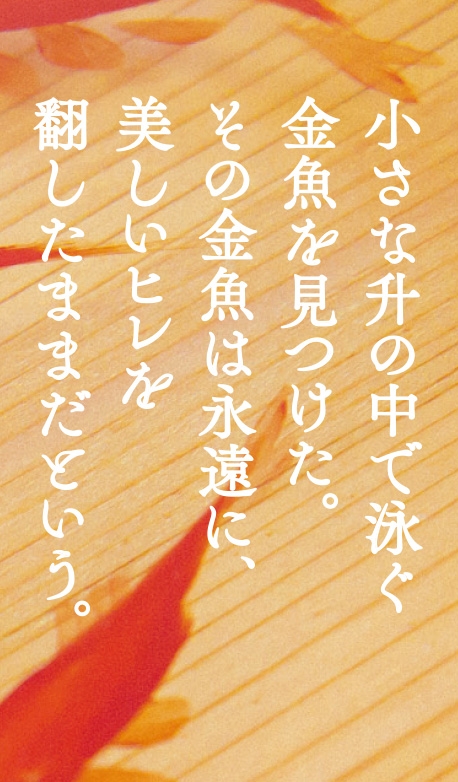
I submitted this rough, thinking that this typeface should be like a goldfish, but I was a little worried. Because it was just released, I wasn't used to it myself, and I felt that it was a bit of a dance typeface for use in the Text. However, when the editorial staff and clients raised the rough, I got an interesting reaction, "Why is this character moving so much?" I don't get much reaction or impression from the editors regarding the design of the fonts used, which is why I can use this typeface! I got the response.
When placing white letters on the photo with the same weight as this time, it was hard to see the harai part and there was a high risk of blurring, so it was a bit of a painful measure, but adjustment to thicken the weight a little I did Although it will be uniformly thick, I was able to express the "moved" feeling I submitted at the rough stage as it was, so I was pleased with "It's interesting!" This typeface used for the Text while it feels strange to me is also interesting to those who are looking at the magazine, and it is an interesting typeface, so it is an opportunity to learn again the feelings of the production side and the receiving side. It was
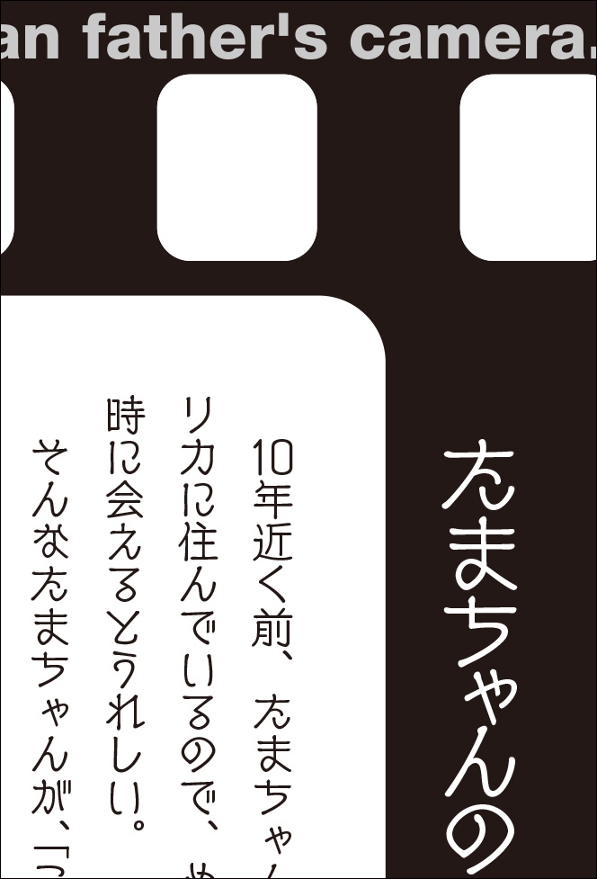
Another essay is "Tama's father's camera." Since the content is clear, I want to make it a strike image! I want you to convey the image to the readers from your eyes! I immediately thought of this "New CinemaB".
This typeface is called "air vented" and has a design unique to movie subtitles. To make it easier to convey its characteristics, I think that by setting the series in the Text larger than in other pages, I was able to create a retro atmosphere like the camera introduced in this chapter.
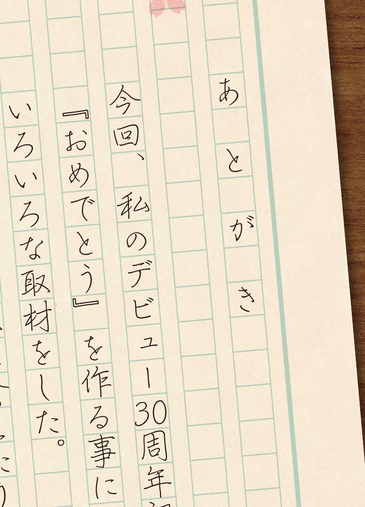
In addition, I thought about shooting and using a raw manuscript handwritten by Sakura in the “afterword” part, but it was not the one I got for shooting, so the font “Smooth” written with a pen Kafu Penji”, I decided to put the font on the paper like composition paper and create a handwriting feeling.
Choosing a typeface is essential for creating such an atmosphere. I think that feelings can be more communicated to the other person by making it a handwritten magazine.
Mr. Sakura, who said "I couldn't write more than I thought," wasn't even a design, but I thought that I could do Support using the font design as much as possible. Of course, I think that the style and image of each writer will be involved in the selection of the typeface, so I think that it was a completed book because I was able to interact closely with each other while meeting.
"DEATH NOTE x SCRAP Escape from the world of death and sand" creates a scary feeling
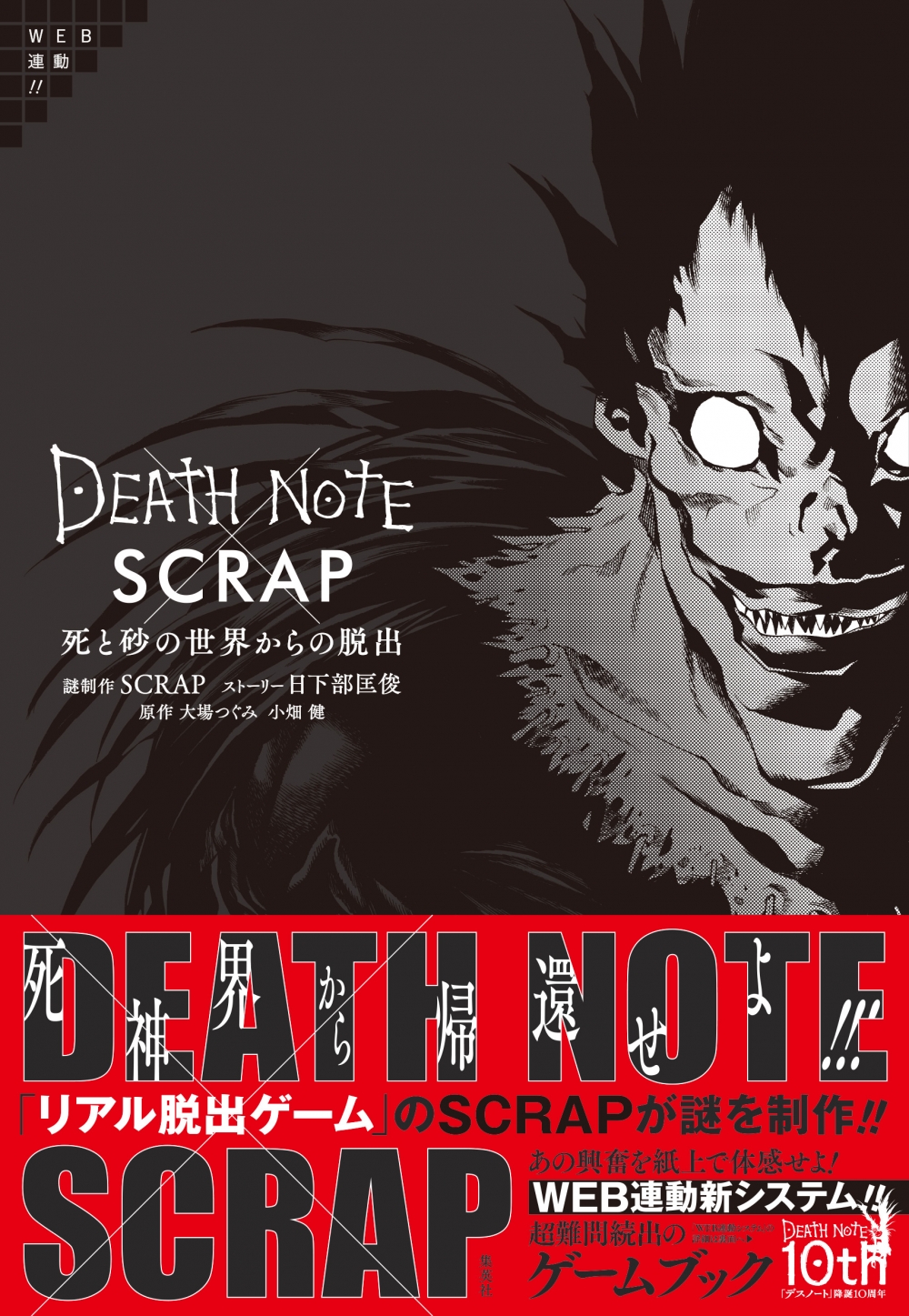
"Tsukushi A Old Mincho" in the cover title "Escape from the world of death and sand", "Comic Mystery" in the conversation part of the god of death appearing in "DEATH NOTE" in the Text, and in the question question part I used "Manyo Koushi Large".
In “Comic Mystery” the character-by-character design is either intonation or swaying, so I felt anxiety and a dreadful atmosphere. It was perfect.
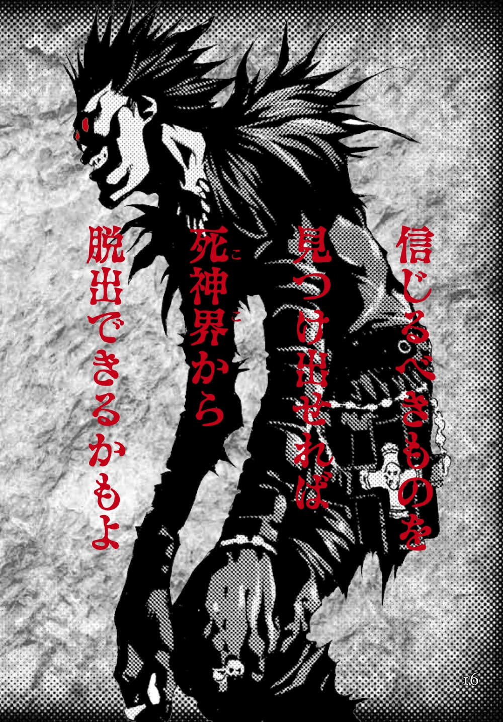
The information that comes in through your eyes is impressive. As I noticed later, the same font was also used in weekly magazine manga in a similar situation. Since this font has a strong design, it may be easier for both the production side and the receiving side to have the same impression.
I want to be a person who can make suggestions from here
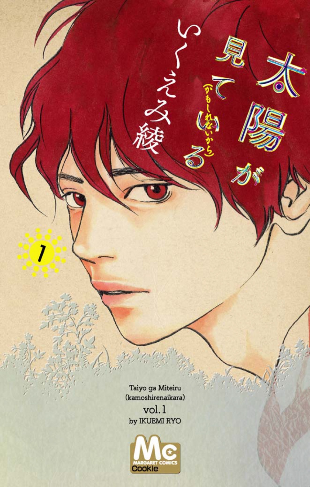
I think that information is not something that you can understand by simply following the text, but that there is something that comes from the character design. Otherwise, I don't think there will be any typefaces with such various designs in history.
I think that for some reason, I researched it and came up with a design tailored to TPO, and as the number of opportunities to use the Internet has increased, new fonts and typesetting will come out to match it. I think. Then, I think that the younger generation of users who are accustomed to displaying texts on the Internet are also sharpened their eyes and it is a sensation, but with such adjectives "Isn't this beautiful?" I think the design will be expressed more often.
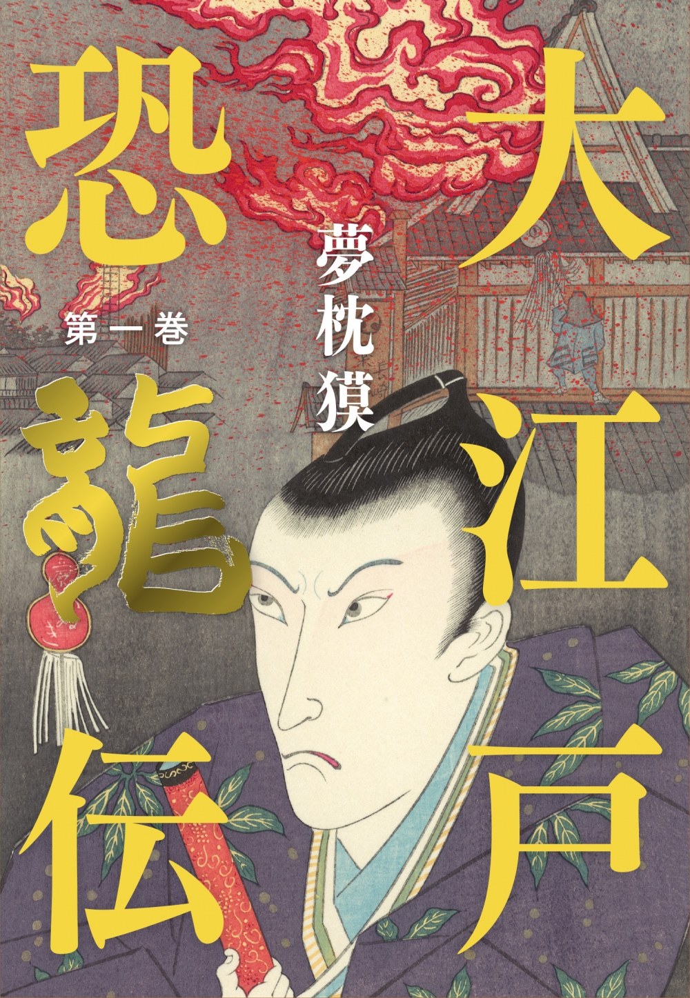
When that happens, the way the design will be will add a positive effect to the original product, and I think that it will be the target of things that I want to keep as my hobby or possess it more than ever. For example, I want to read the book of my favorite author in hardcover. I don't think it would be interesting if similar designs were lined up there. It is better that there are various ways to see it depending on the work. That said, I feel that if I change too much, or if I do too much, it will be different.
When that happens, I think it's important to match your personality and sex appeal to the world of each work, and to incorporate the design that you are doing on purpose. I think that there are various ways of expression, so I would like to become a person who can say that it is better to do this from here as to how to use fonts in a little way.
For that reason, please continue to release the Chikushi series. "LETS", which can use many typefaces, allows all users to use the latest fonts at the same time, so I feel that the medium and timing to use are important. Even in such a situation, I would like to aim for a design that gives the viewer the impression that the viewer has a different taste.
< Editor's note >
When I interviewed, I was able to see more than one Tsukushi typeface used in the newly installed book. From the typeface development side, I would like to convey what impressions and feelings can be left to the recipient side through the information at the time of release and the example publication.
Company Info
| Company name | Plastus Design Co., Ltd. Mr. Shogo Shibata |
|---|---|
| location | 2-14 Kanda Jimbocho, Chiyoda-ku, Tokyo Asahi Jimbocho Plaza 1203 |
| TEL | 03-6268-9980 |
For enrollment in the "LETS" program or purchase of products, please Contact Us your retailer or place an order.
