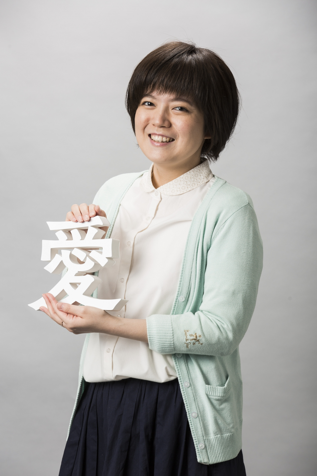
Fontworks Type Designers / Akiko Ochi
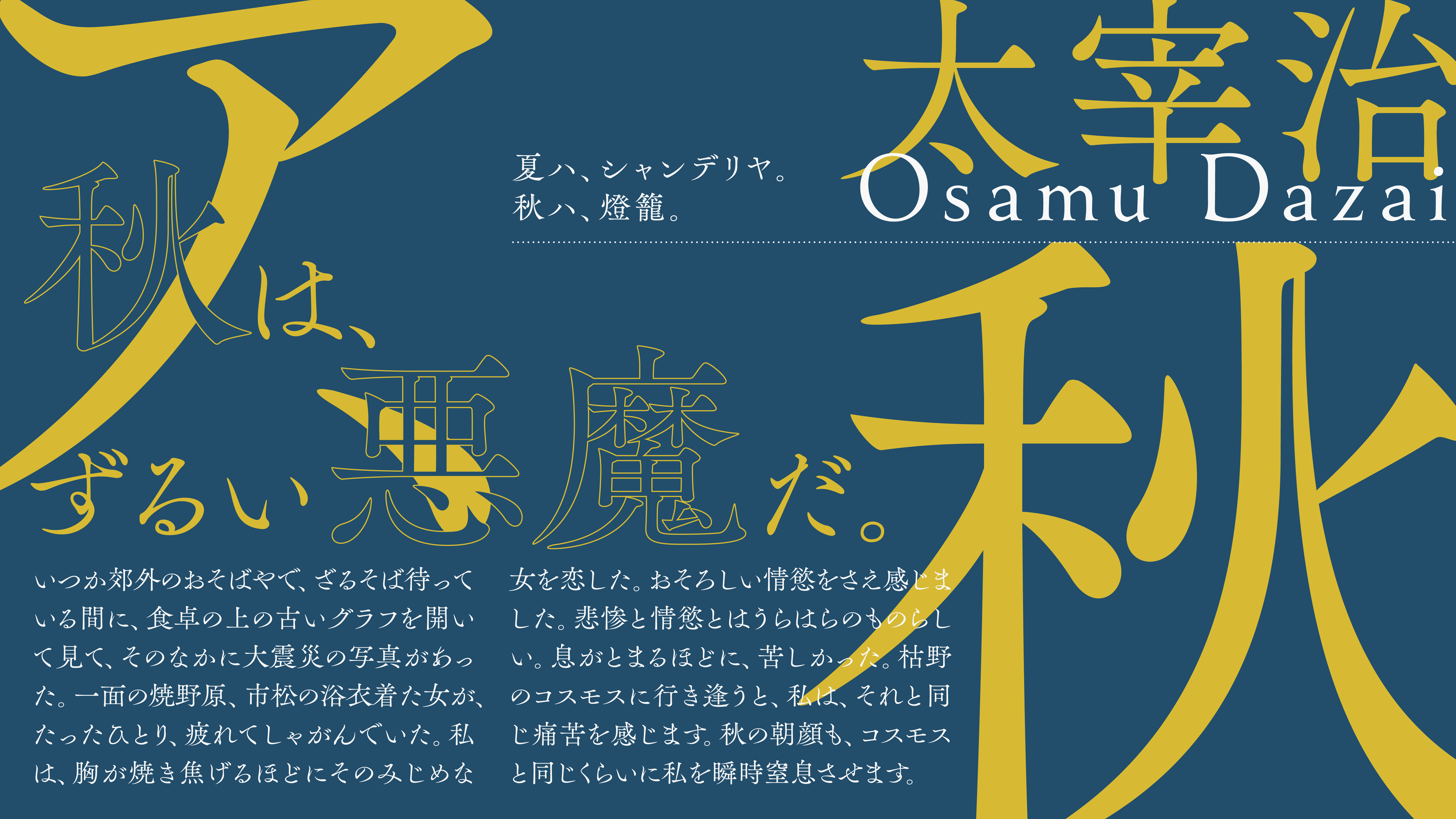
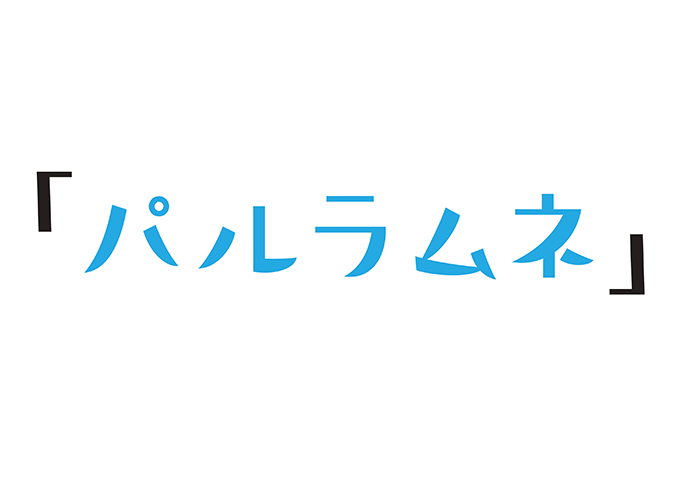
In April 2017, Fontworks released a new typeface, "PalRamune." The typeface was designed by Akiko Ochi of the Typeface Design Group. Six years after joining the company, Ochi designed "PalRamune," a catchy typeface with a modern, relaxed flavor. The process of joining Fontworks was very unique. We spoke to her about her journey from her student days to Fontworks, and the features of the new typeface.
What I did to become a Type Designers
When I was studying design at Nihon University College of Art, I thought, "I wonder if I will be a graphic designer." However, as I proceeded with many school challenges, I began to think, "Is this road okay, is it right for me?"
The only thing I was confident about was the typography class. When I thought that I wanted to do a job that specializes in letters, I found the internship at the right time when I found out about the existence of a job called "Type Designers." The first thing I thought about was that I was a craftsman, and I was really cool! I also want to do such a job. But I have no idea how to become a Type Designers. So anyway, I was acting steadily from the way I came up with the idea that "you can hit and break."
We asked the typemakers we met during the internship about the “typeface design work,” and asked other typemakers about their job hunting situations. In the meantime, I was able to connect to various edges, and I reached the point where we were interviewed by Fujita, and it was decided that I would join Fontworks. Actually, the test is quite unique in the interview? There was something like this, but I will keep it secret for those who are aiming to be a Type Designers from now on.
Training period that touched on the essence of typeface
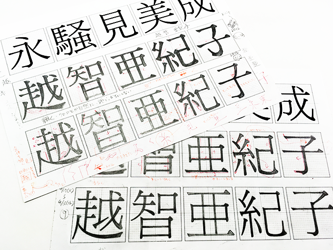
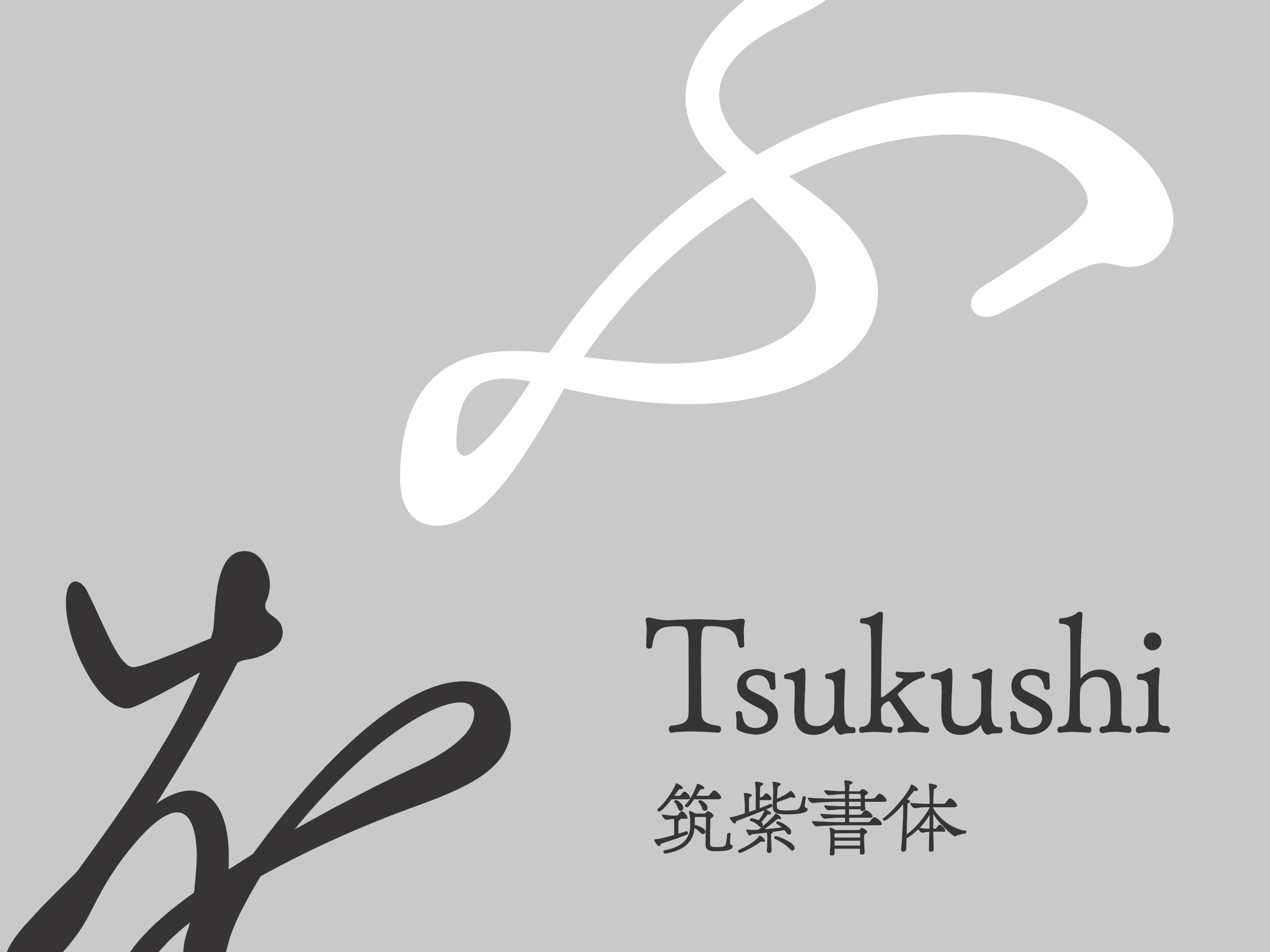
The first thing I came into contact with after joining the company was TsukuMin. Using TsukuMin L and TsukuGo D as models, I lettered my name, "Ochi Akiko," within a square grid. By the way, the model here was not the actual character "Ochi Akiko," but the five characters that have basic elements: "Ei," "Sou," "Mi," "Bi," and "Nari."
I think that while looking at these five characters, I was able to thoroughly break them down into the elements necessary for my name, and as I moved my head and hands, spreading the elements out, bouncing them, and bringing them closer together, I was able to experience the elements of the Tsukushi font. Even though I said I wanted to be Type Designers, I wasn't particularly interested in letters when I was a student, and it was just a profession I pursued because I admired it. That's why I learned more after joining the company, and I think that this period in particular was a valuable opportunity to come into contact with the essence of "typefaces" themselves.
In the meantime, I gradually became involved in the creation of fonts such as KafuTechno, Skip-E, and Universal Design fonts. However, I started with simple things like symbols and circled numbers. Since I was sitting next to Fujita, I was always watching what he was doing, sometimes bombarding him with questions, and I was engrossed in learning about the work of font design.
The Birth of "PalRamune"
At the time, the typeface design group had a set schedule for the year, starting in April and running through January of the following year to come up with design proposals for new typefaces to be released the following year. "PalRamune" began with a comment made by Fujita when he looked at the prototype design for a typeface called "Carl," which had been created the year he joined the company. "I like that feeling. But try making a more modern typeface."
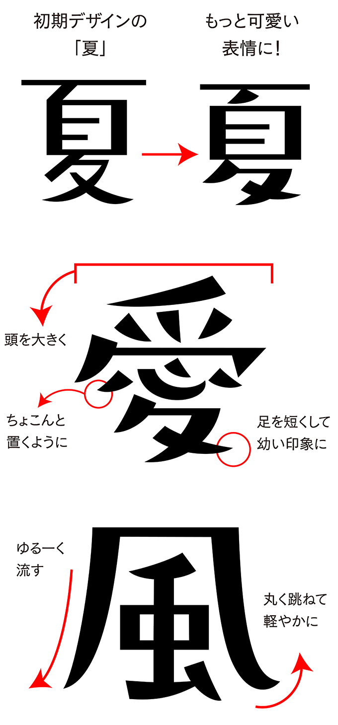
So I looked at the fancy typefaces of various manufacturers to see what typefaces were trendy, and I realized that at first glance, the structure looks uneven and unmotivated, but it's cute - that's what's popular now. Looking back at "Curl," I saw that it was a lively design. This would be popular in its own way, but it's not "modern," so I decided on a "relaxed, laid-back, cute" style! That's how the concept was decided.
While I was making the prototype, Fujita was staring at me from behind. I was worried, wondering if this font was okay, and he said, "I see, it's a modern character, so maybe we should make it quickly." I was so worried until he commented that I even remember that the prototype was the "ha" character. It was the most highly evaluated design in the research we did both inside and outside the company after that, so we started designing for the official release.
A refined, relaxed font = "PalRamune"!?
The defining feature of "PalRamune" is that the center of gravity is lowered. I aimed for a relaxed style, but making the head too big would have been problematic if it looked cocky. Also, the strokes of the kana characters can change the direction of the relaxed style significantly depending on how you stroke them, so I struggled to find the size and balance of the strokes that suit "PalRamune". Fujita said, "If the whole thing isn't finished with elegance, the typeface will look 1.5 to 2nd class."
Actually, when people used to say to me, "You're a disciple of Fujita, aren't you?" I used to think, "No, no, that's not true," (laughs), but while I was making "PalRamune," my thoughts changed and I started to think that it's not so different. I always have the Tsukushi typeface, which is highly regarded for its quality, in my mind, and I feel that Fujita has had a big influence on my approach to typeface creation.
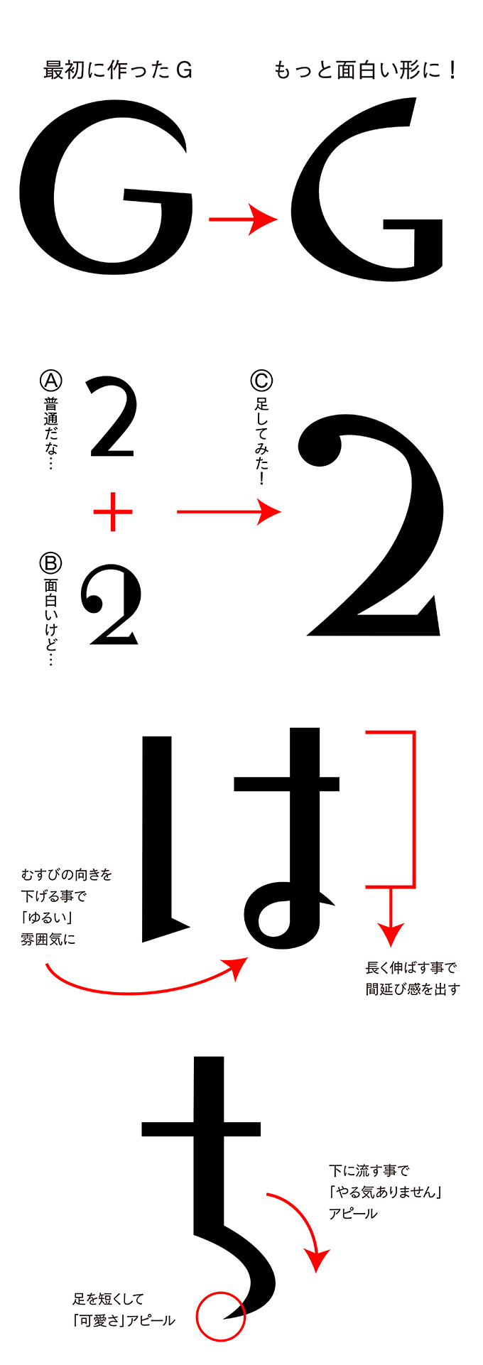
I was able to make the hiragana, katakana, and kanji parts in a certain degree of continuity, but when I started making the numbers, alphabets, and symbols, some time had passed, so it took me a while to regain the image of "PalRamune" that I had originally had in mind. "PalRamune" is also characterized by its small character face, but I made the symbols a little larger. At such times, Fujita always gave me appropriate hints. If you focus too much on one character, you will forget the essence of the typeface. But that is something you should never forget when creating Character Sets. I think that was the moment I realized that I should always be aware of this.
And because the alphabet has rules for ascenders, descenders, x-heights, etc., it was difficult to create a design that resembled "PalRamune" within those rules. On the other hand, we had a lot of fun playing around with the symbol part to match the Japanese text, so we hope you'll pay attention to that as well.
In fact, the thing that put me under more pressure than the production itself was the name of the typeface. During the development stage, I called it "Lollipop," but it was too cute for the atmosphere of the typeface, so it didn't really fit. So I tried to call it "Ramune," but Fujita told me, "Just as the typeface name "Chikushin" is Shigenobu Fujita's brand, I want you to think of a brand name for the typeface that Ochi creates."... I was in total panic (laughs). I got my friends involved and spent the night thinking about what would be a good word to start all the typefaces I would create from now on, and we decided on "Pal," which means "comrade/friend" in English.
Joy and future as a Type Designers
Fontworks creates a variety of typefaces, so even when I first joined the company, I was already involved in the creation of many typefaces. Of course, when a typeface was completed, I felt a sense of fulfillment and accomplishment, but I had not yet experienced the joy of seeing a typeface I had designed go out into the world.
But now that "PalRamune" has been completed and released, I feel something more. It's like I want to say to everyone out there, "Thank you for your support." It's only in the last year or two that I've felt the joy of being Type Designers, that I truly enjoy my work. After all, up until that point I'd been desperately trying to hang on to it.
Now I'm thinking about what to make next. A font that has never been made before at Fontworks, and that customers need. I would like to research it and create a font that is "PAL brand", that is, a font that is like me.
"PalRamune" is a catchy font, so I think it can be used in various places such as comic titles and product Packaging. More than anything, I'm grateful that people are using it. I'm saving up for "PalRamune", so I'd like to go around to various bookstores and shops every day and buy products that use PalRamune!