<< Monthly MdN October 2017 issue linked project >>
This is the answer to the font quiz (“question”) published in the monthly MdN October 2017 issue.
In addition, we have also prepared a reading material for you to acquire the topic of "absolute font feeling".
Please enjoy.
< table of contents >
1.MdN October issue answer
2. Get a sense of absolute font
▼ 1st: Study-Let's learn about Mincho body
▼ 2nd: Practice-Let's actually compare typefaces
▼ 3rd: Development-Challenge the quiz
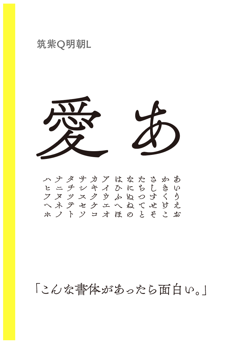
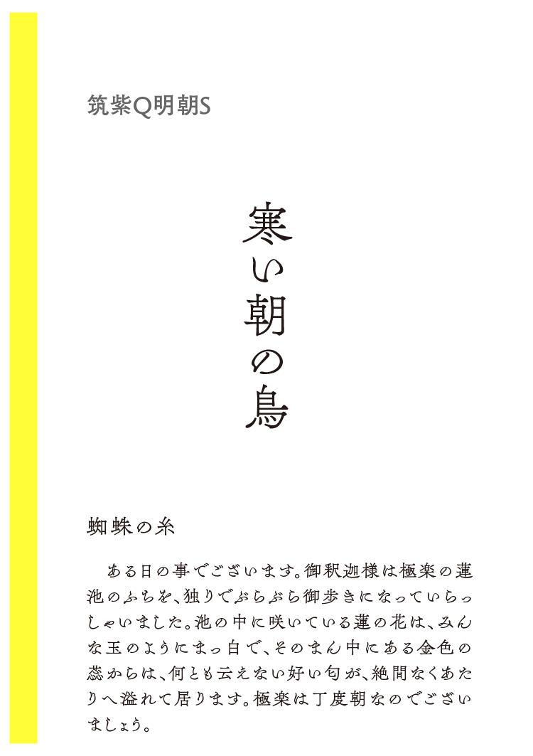
Introducing "Chikushi Q Mincho" released on 3.8 / 22
"Monthly MdN" September 6th, 2017 Sold by Fontworks Advertisement Answer
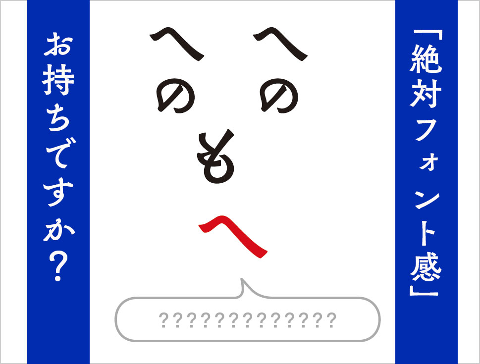
First of all, I will deliver from the answer of the Advertisement "problem edition" of the monthly MdN October 2017 issue.
If you haven't read MdN, please try the problem section before you view this answer section!
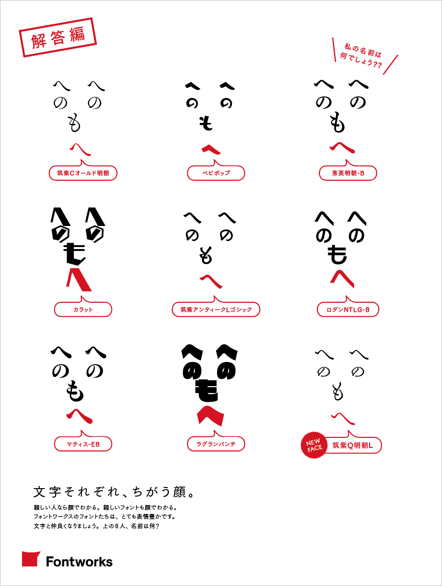
How many correct answers did you have among the 9 questions?
At the end of the next chapter, we will prepare another issue as "Development", so please try it!
Next, as a study version, < Mincho type > We will introduce the characteristics and how to distinguish.
Please improve your "absolute font feeling" skills! !
Let's acquire the absolute font feeling Part 1: Study-Let's learn about "Minchotai"
1. What is Mincho-tai?
It was established as a typeface for printing in woodblock printing and printing, and was introduced to Japanese in the early Meiji era. Mincho is an orthodox typeface that is the most frequently used typeface.
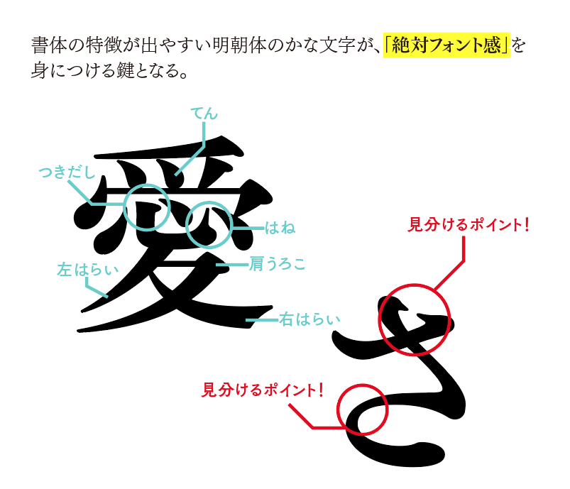
As for the glyphs, the vertical and horizontal strokes are vertical and parallel respectively, the vertical strokes are thick, the horizontal strokes are thin, and the components such as "ten", "harai", and "scale" are as if they were written with a brush. A typeface with a distinctive intonation.
When distinguishing Mincho characters, "kana" is more characteristic than kanji, and it is easier to identify.
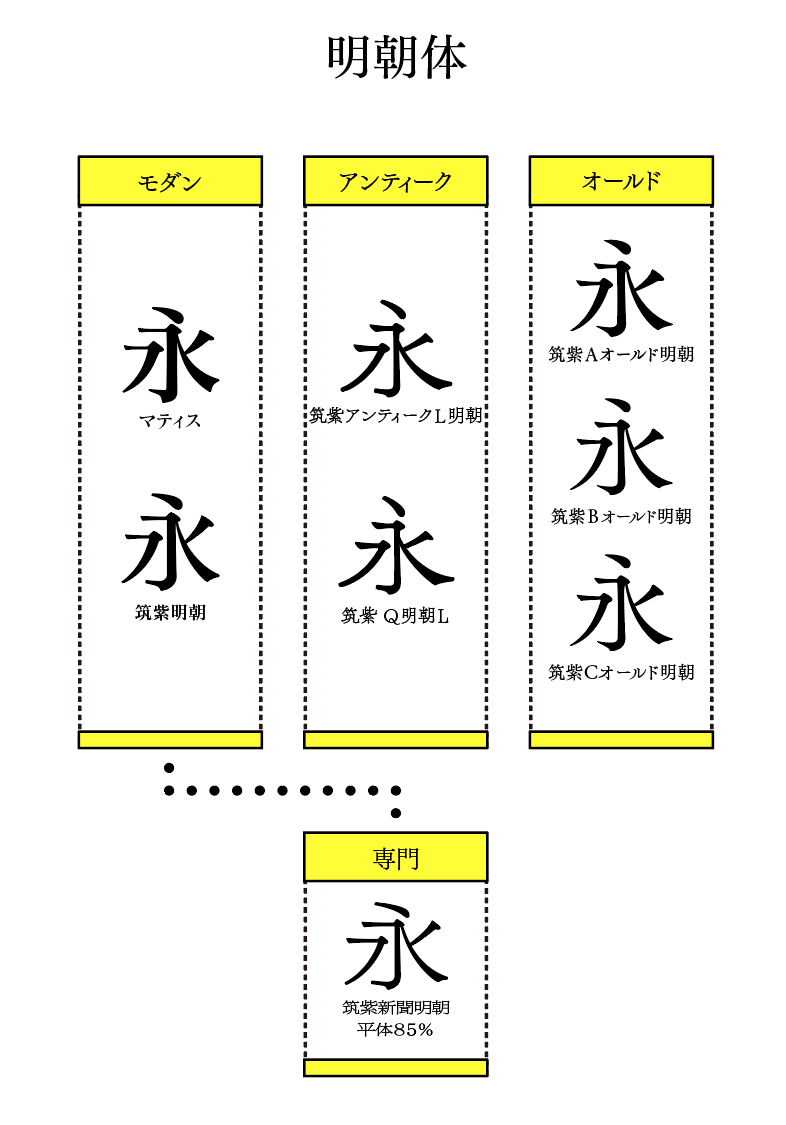
2. Fontworks Mincho type (part)
▲A partial list of Fontworks' Mincho fonts.
Fontworks' Mincho fonts are roughly divided into <Modern> <Antique> <Old> and <Specialty>, and are classified as shown in the figure below.
Fontworks' Mincho fonts, especially those in the Tsukushi typeface series, are made to retain the flavor of metal type and are designed to make use of the unique shapes of the characters.
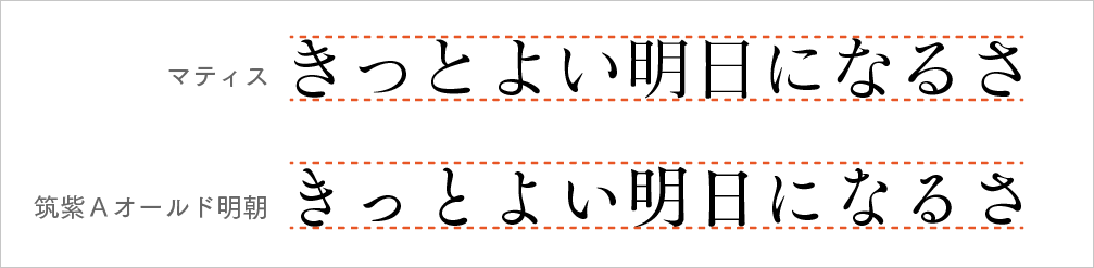
As you can see from the image above, there are typefaces like Matisse where the kanji and kana are lined up in a straight line, while the Mincho typeface in the Tsukushi typeface series has a different balance between the kanji and kana, making it easy to read and suitable for long texts.
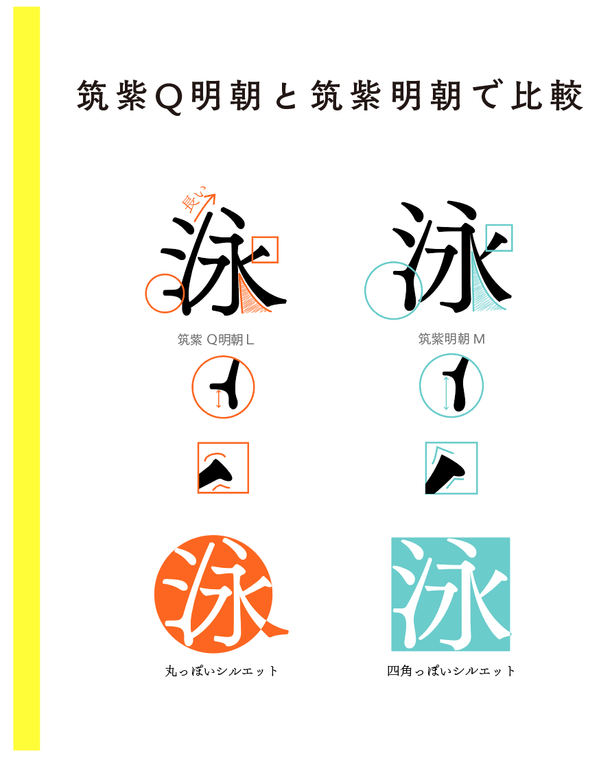
絶対フォント感を身につけましょう 第2弾:実践編〜実際に文字を比べてみよう
From here, I will introduce some of the points that will be the point when distinguishing typefaces as a practical part!
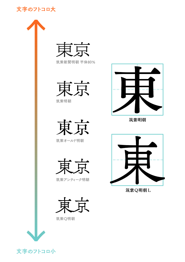
1. "Futokoro"
First, the futokoro.
Fukuroro is the space inside the letters. Most of the Mincho typefaces in the Chikushi typeface series are designed to have a tighter squeeze, but the Chikushi Q Mincho type has a tighter squeeze.
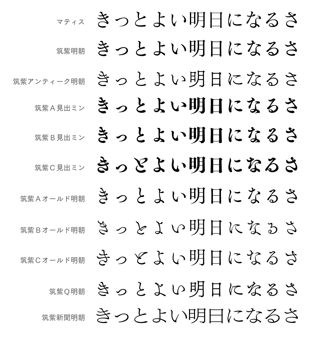
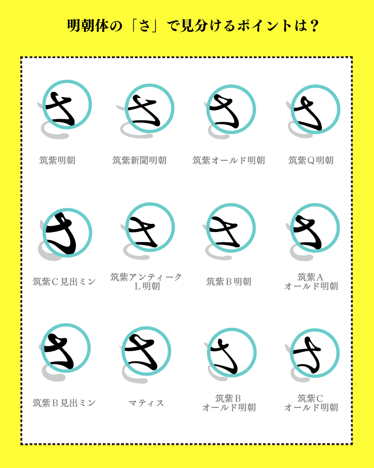
2. "Hiragana"
"Kana" is the most important point when distinguishing typefaces (especially Mincho typeface).
The usage rate of "Kana" exceeds 70% in Japanese sentences. Also, especially in the Mincho style, it is easier to distinguish “kana” because there are few differences in kanji.
Characters that tend to have characteristics include "sa", "su", "na", "ka", etc. If you find these characters and look closely at the characteristics, it is easy to identify the typeface.
"Sa", which is the character that makes the above difference easily.
For example, line up this “sa” and pay attention to the circled part.
Even with the same letter "Sa", each character is different depending on the typeface, such as warped or rounded, connected or curled forward.
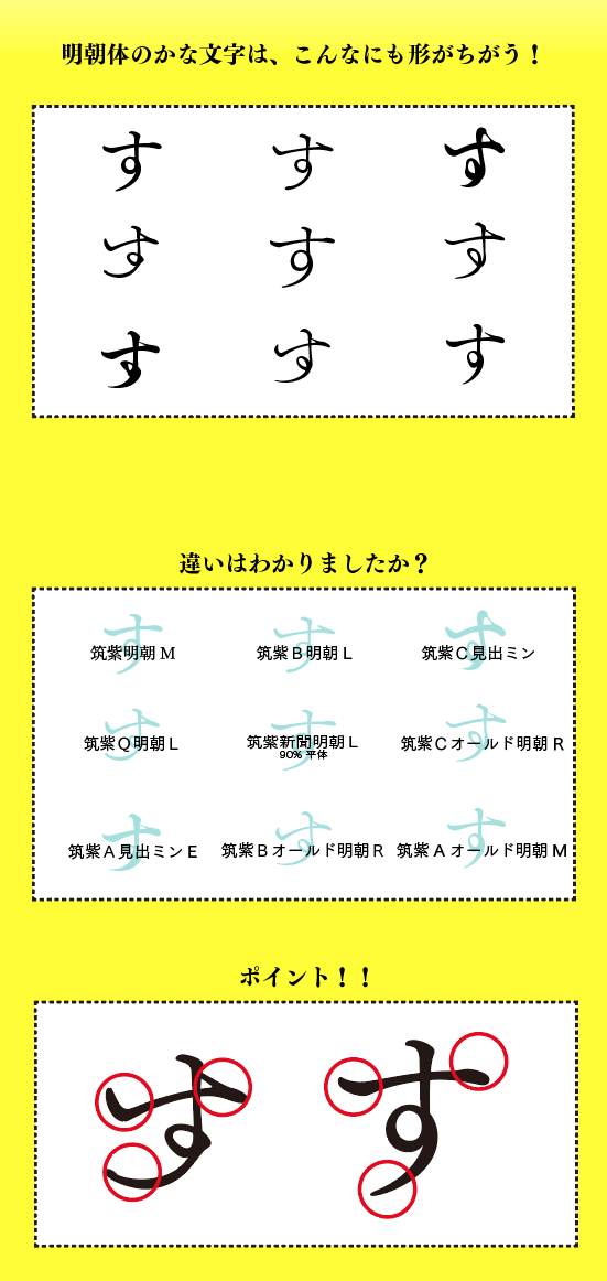
Please also compare the "su" below.
3. Combination of kanji and kana
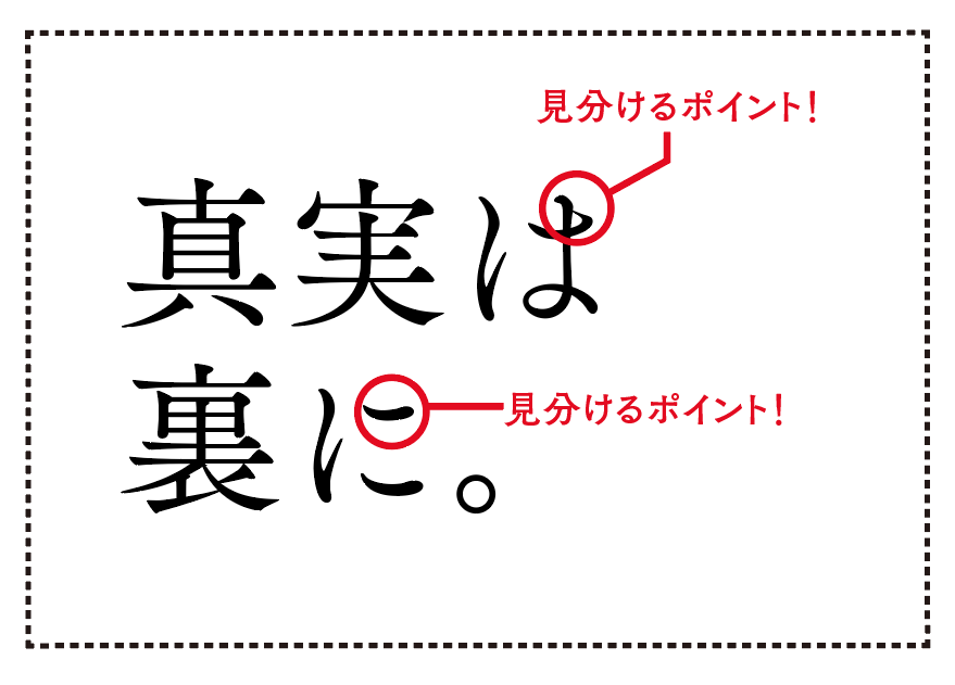
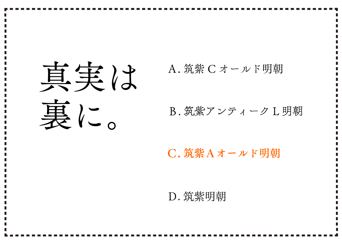
"Are the truth behind" in the upper left of the image is with which of A to D?
The point is the width of the kanji and the carrying of the kana!
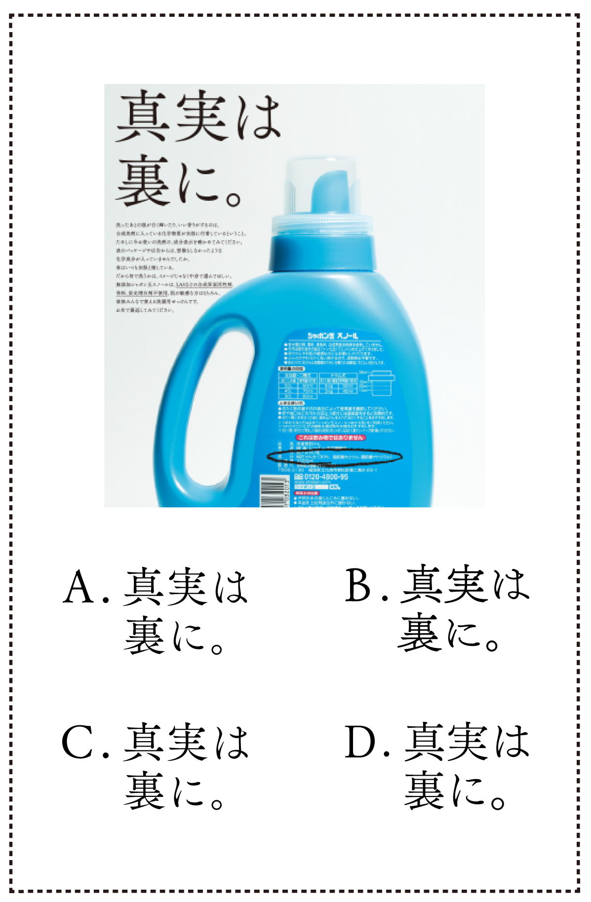
Now, here's a more difficult question...
What are the names of the fonts A through D above?
(Hint: Choose one from the options below.)
TsukuMin / TsukuAOldMin / TsukuCOldMin / TsukuAntiqueLMin
Let's acquire the absolute font feeling Part 3: Development-Challenge the quiz
For those who are not satisfied, we have prepared more problems!
Please take on the challenge!
Extra Edition: "This is Mincho !?" Introducing a new typeface
Some of the Fonts and assembled samples of "Chikushi Q Mincho" that were just released on August 22 are posted.
Fonts page, you can also try out with your favorite text!
On the Fontworks site, Font column page Has been introduced and introduces the features of various fonts.
Please take a look!