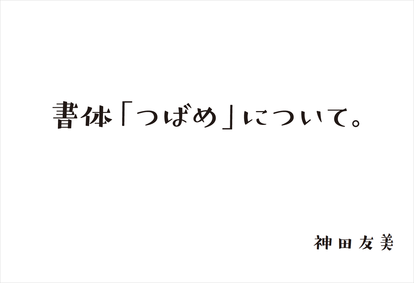
書体名の「つばめ」は、息子が鳥好きなこと、そして「つばめ」という言葉の響きが昭和レトロな懐かしい感じがすること。
ひょんとしたハライやクチバシのような三角のウロコが「つばめ」っぽいこと。
だから、「つばめ」に決めました。
「つばめ」に想いをのせて。この書体がたくさんの方に使っていただけますように。
神田友美
「つばめ」は2016年5月に提供が開始された書体です。
フォントワークスフォントの月間ダウンロードランキングで、常に上位をキープしている「つばめ」は、提供開始から1年が経過し、テレビや書籍、ポスターなど、その特徴あるかわいらしいデザインを見かけることが増えてきました。
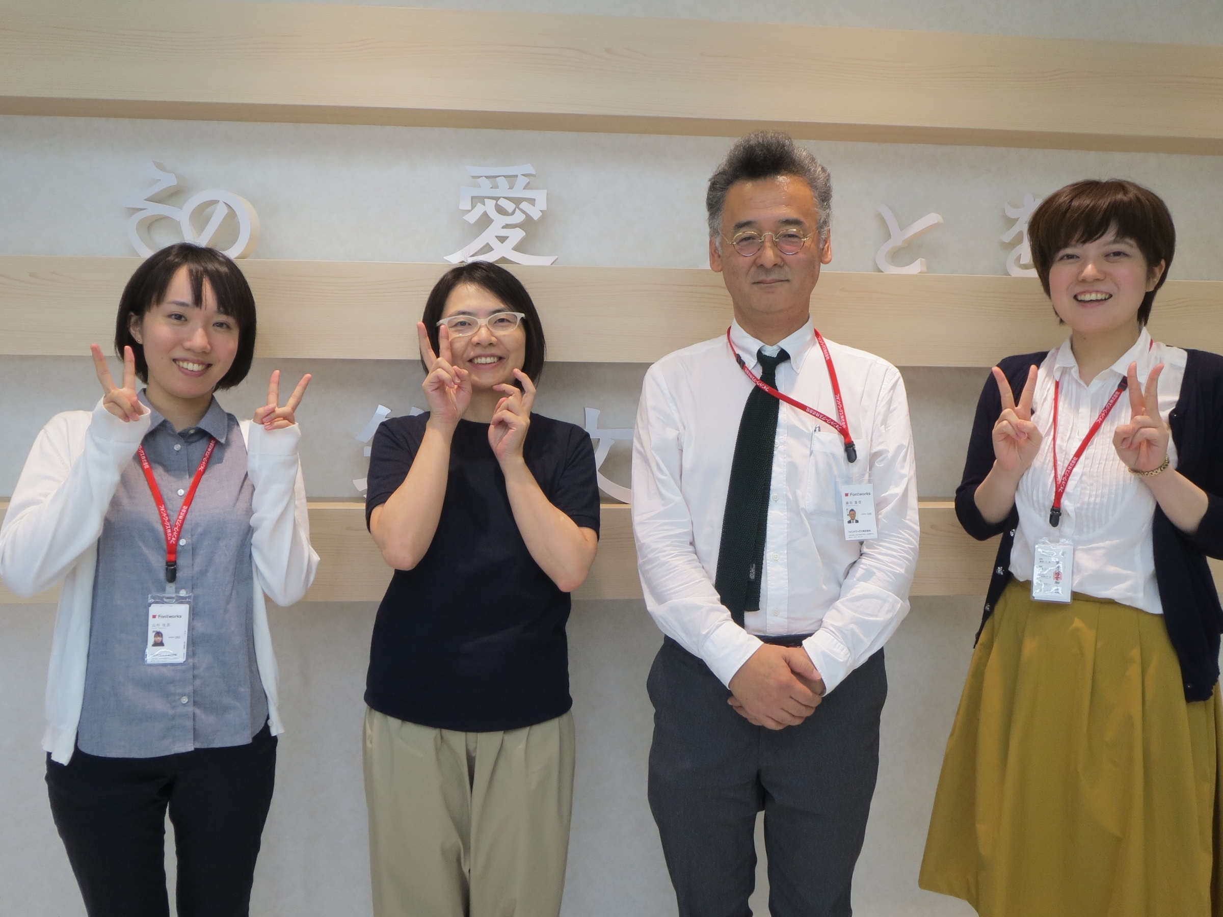
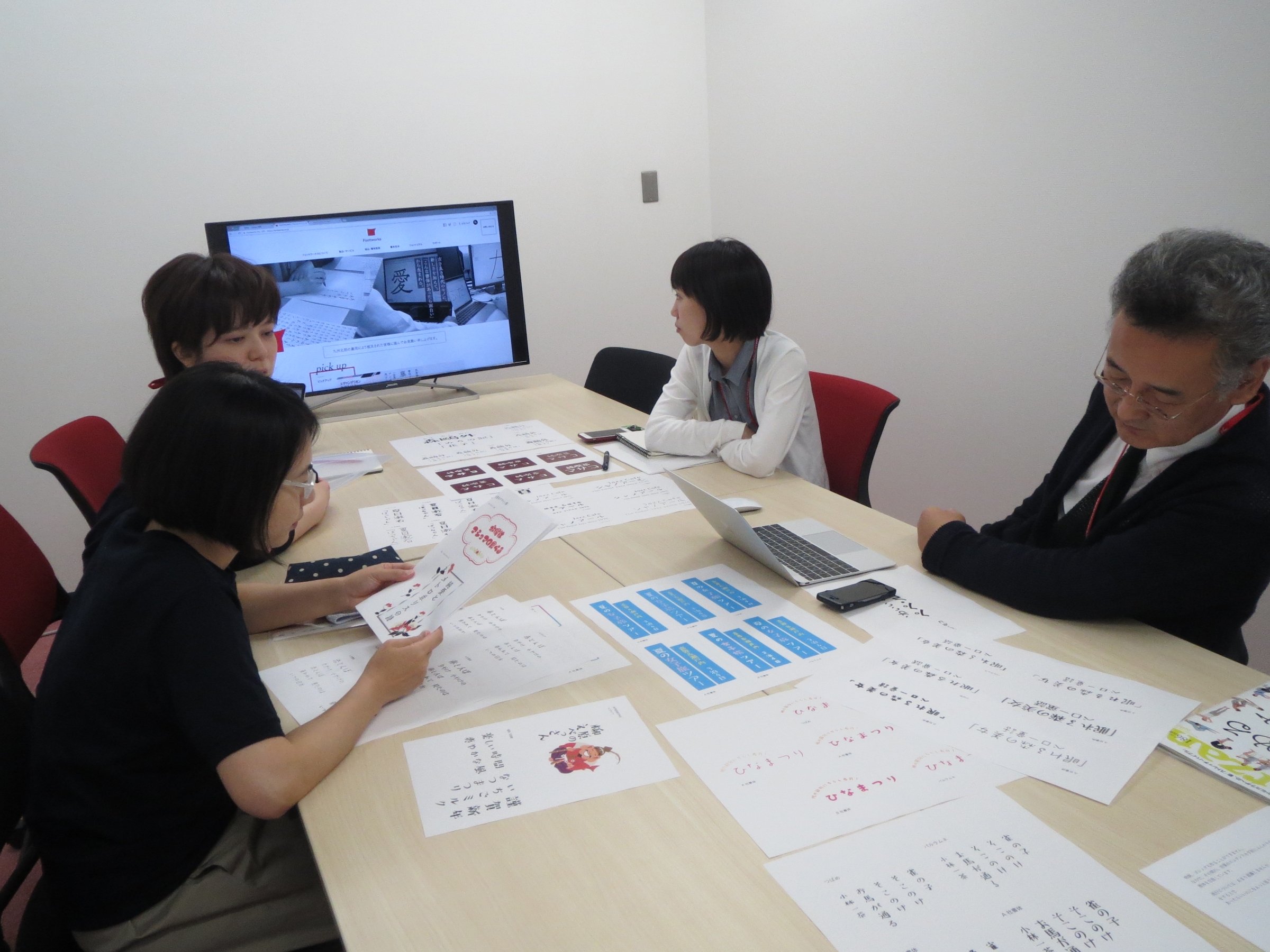
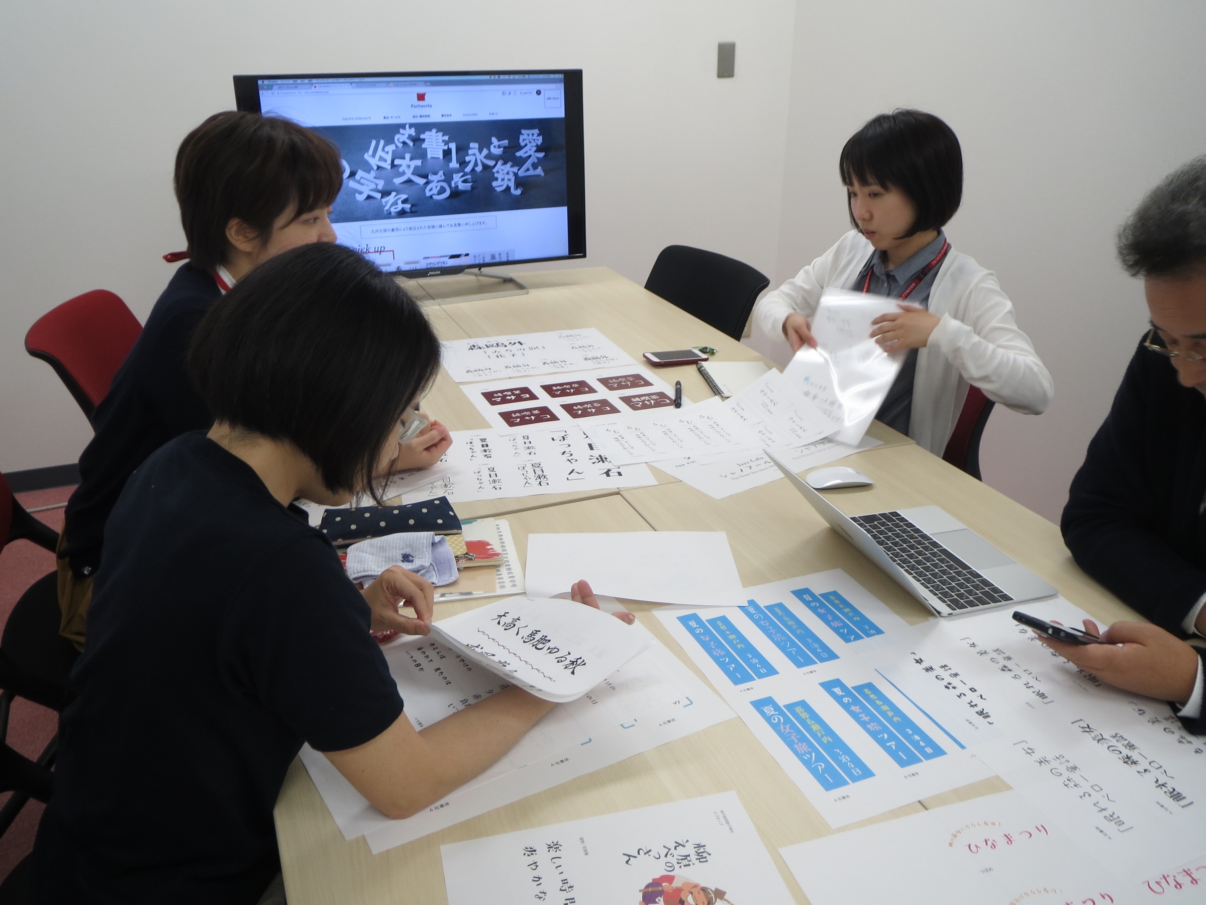
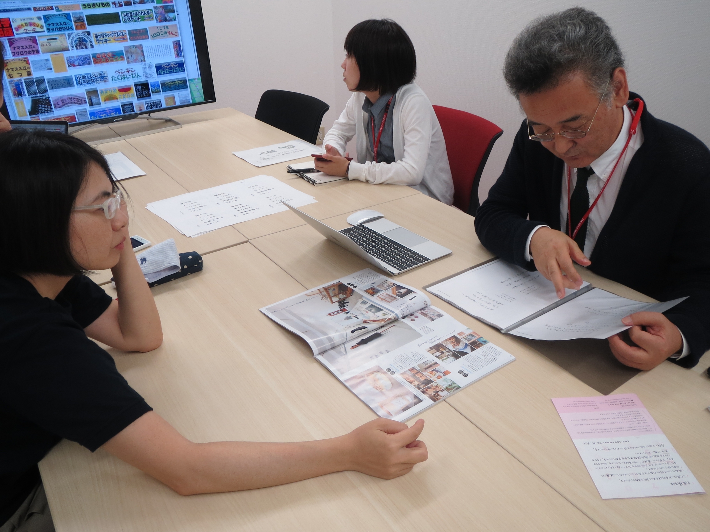
今回は、「つばめ」の書体デザイナー 神田友美氏(以下、神田)をお招きし、フォントワークスの書体デザイナー藤田重信(以下、藤田)・越智亜紀子(以下、越智)・山村佳苗(以下、山村)との対談形式で、「つばめ」制作の書体誕生にまつわるエピソード話を中心に、世の中の書体の流行の話や同じカテゴリとして存在する各デザイン系書体の話など書体デザイナー同士の対談だからこそ実現した内容でお届けします。
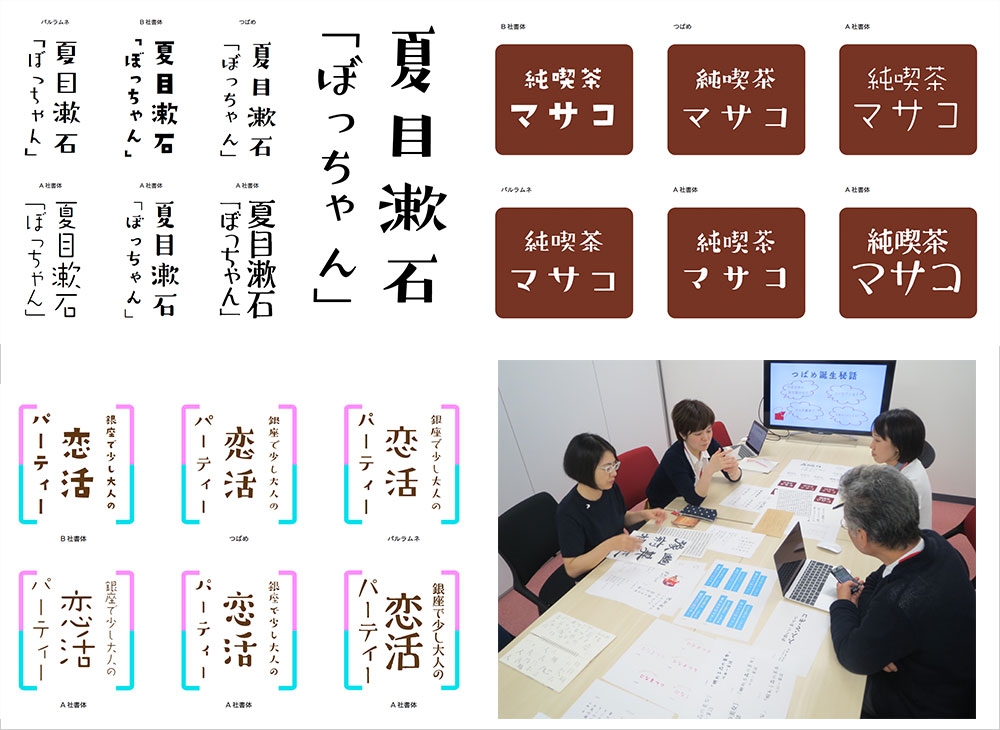
インタビュー時の様子
「あさがを」という書体が「すごく綺麗」で感銘を受けて
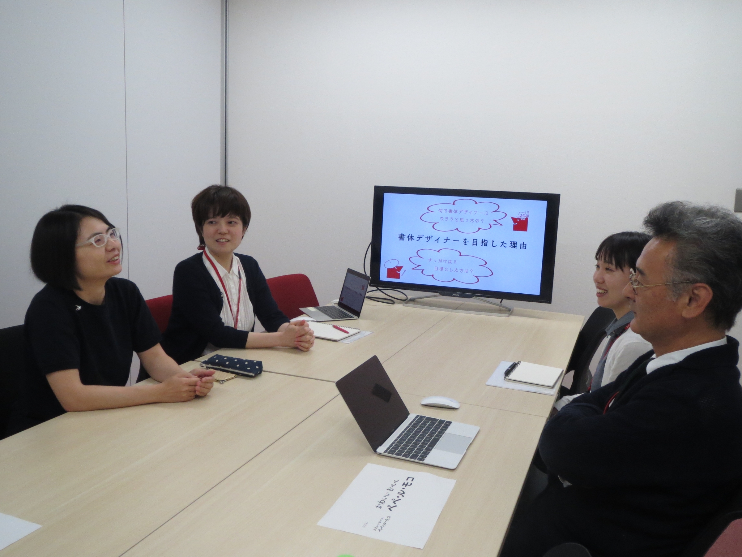
——まずは、神田さんの「書体デザイナーを目指した理由」についてお話いただけますか?
神田 私は短大の服飾科を卒業し、就職したものの、すぐに阪神大震災にあって何もかもがなくなるという経験をしたんです。
そこで人生がガラッと変わったんですね。「本当にやりたい仕事に就こう!」と。
そんな折、たまたま、モリサワ賞国際タイプフェイスコンテスト金賞作品である佐藤豊さんの「あさがを」を見て、「すごく綺麗だ」と感銘を受けて。明朝体・ゴシック体以外の書体で、「こんなに綺麗な書体があるんだ」と感動したんです。
それで、「この仕事に就きたい」って(笑)!
とはいえ、すぐにフォントメーカーに就職できるはずもなく、まずはグラフィックデザイナーを志し、デザインの会社に何とか入れて。
それから、「タイポグラフィ年鑑」に作品を出すようになって、2000年に、初めて作ったロゴタイプが日本タイポグラフィー協会の年鑑に入選したこともあり、タイポグラフィ協会に入会することができました。ちょうどその時、味岡伸太郎さんから「「FONT1000」を立ち上げるのでフォントを作ってみないか。」と声をかけていただき、文字作りを始めました。
フリーの書体デザイナーに立ちはだかる壁「正方形に入りません!」
——初めて書体制作をされたのは?
神田 仕事でグラフィックデザインを行っていて、作ったロゴタイプをフォント化したら面白いのではないかなと。ロゴは正方形に入れなくていいんですけど、書体は正方形に入れないといけないんですよね。「愛」とか「永」とかは入るけど、「驚」とか画数の多い文字になると、正方形に入らなくて(笑)。
味岡さんに、「正方形に入りません!」って電話して。「一番画数の多い大きい字を基準にして、あとは全体的に小さくしたらどうにか入るんじゃない?」って言われて。
藤田 フォントメーカーだと書体を作るときに、最初に最も画数の多い字と画数の少ない字を9字の書体見本に入れて、画数の多い字面に対してどう表示するかなどのアウトラインを決めるって知ってるんだけどね。
神田 今でも、画数が多い字の字面は大きくなります(笑)。
でも、それを、自分のオリジナリティとして存在させればいいかなと思うようになりました。今更、正方形の中に押し込めようという感覚にもならなくて、それもデザインとしてやっていこうかなと。
金農の書に影響をうけて
——「つばめ」作成で影響を受けているものはありますか?
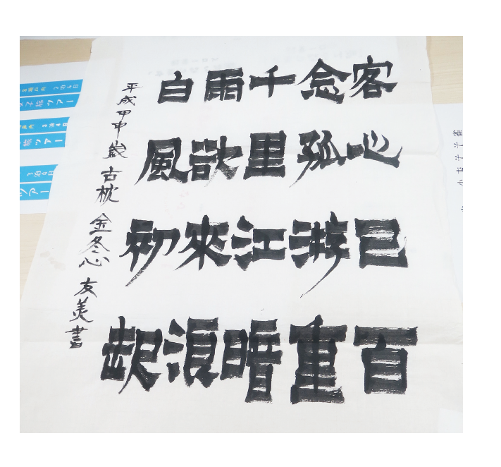
4歳の頃から書道を習いはじめ、大人になり、グラフィックデザイナーとして働き始めた頃に、金農(金冬心)の書に一目惚れしました。
刷毛で書いたような太い横線と、それをざっくり斬るような左斜め続け下に伸びる縦線が魅力的で、半年ほど臨書した記憶があります。
影響力が強すぎるのか、「つばめ」も全体的に左に流れています。
つばめ作成の経緯~デザインコンセプトなど、「つばめ」作成当初から完成まで
——「つばめ」は、神田さんが作成されたロゴタイプを元にされたんですよね?
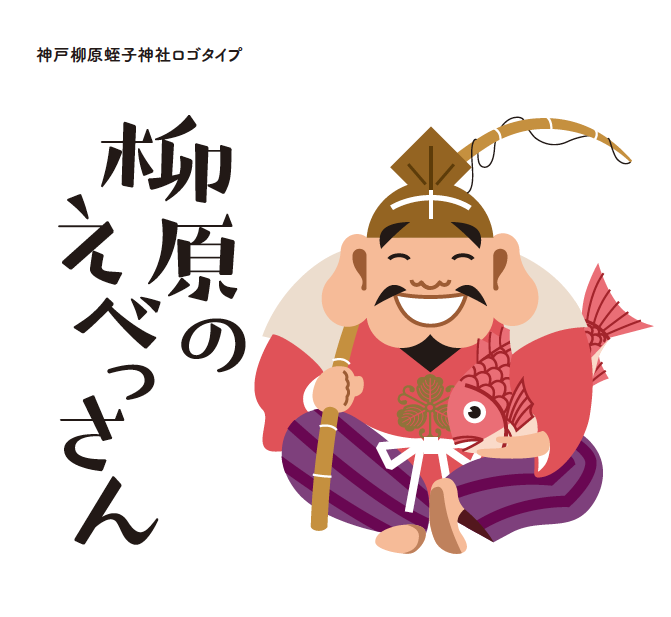
神田 そうですね。私がデザインした、神戸の柳原蛭子神社のロゴタイプを元にしています。
もともと、「昭和レトロ風な雰囲気の文字を作りたい」という思いがずっとあったので、このロゴタイプを書体化したらどうかなって。
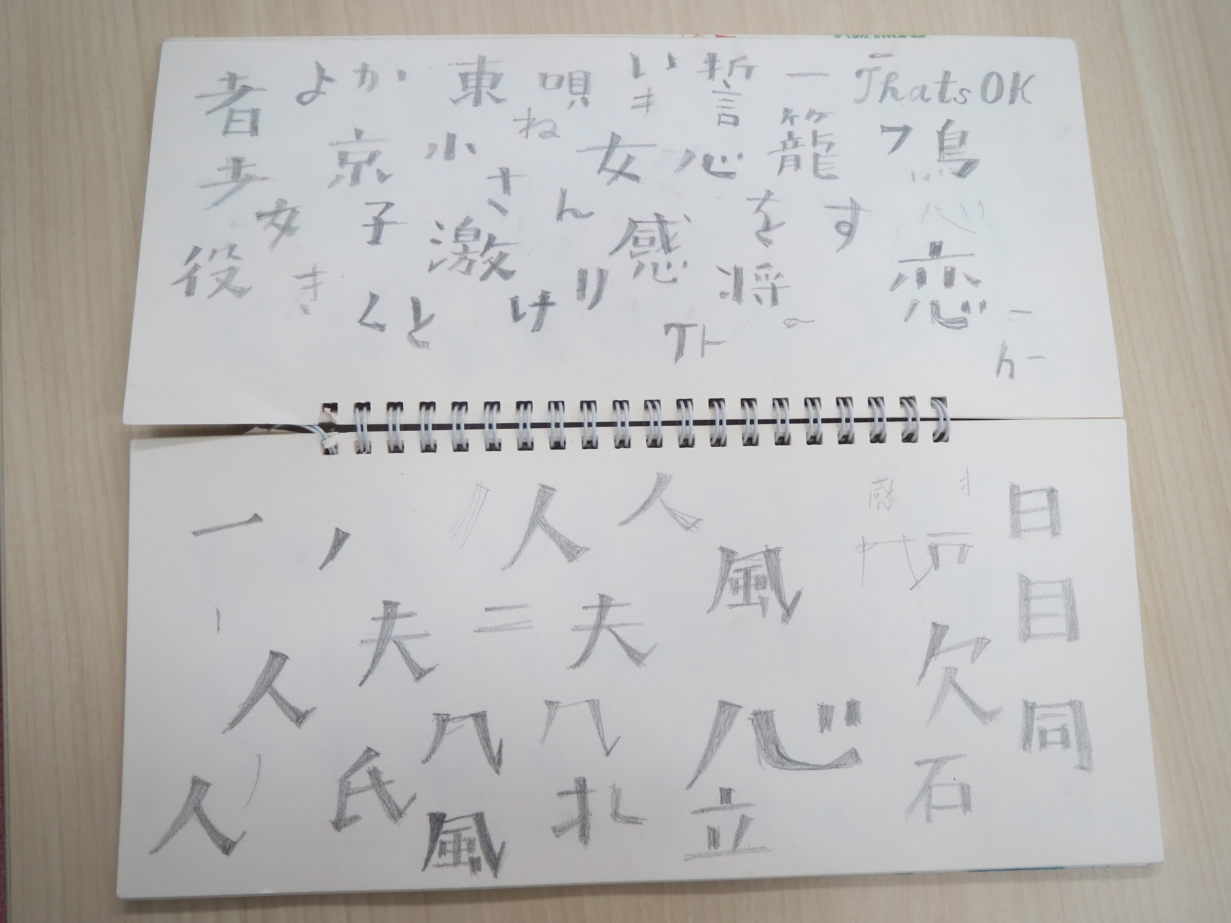
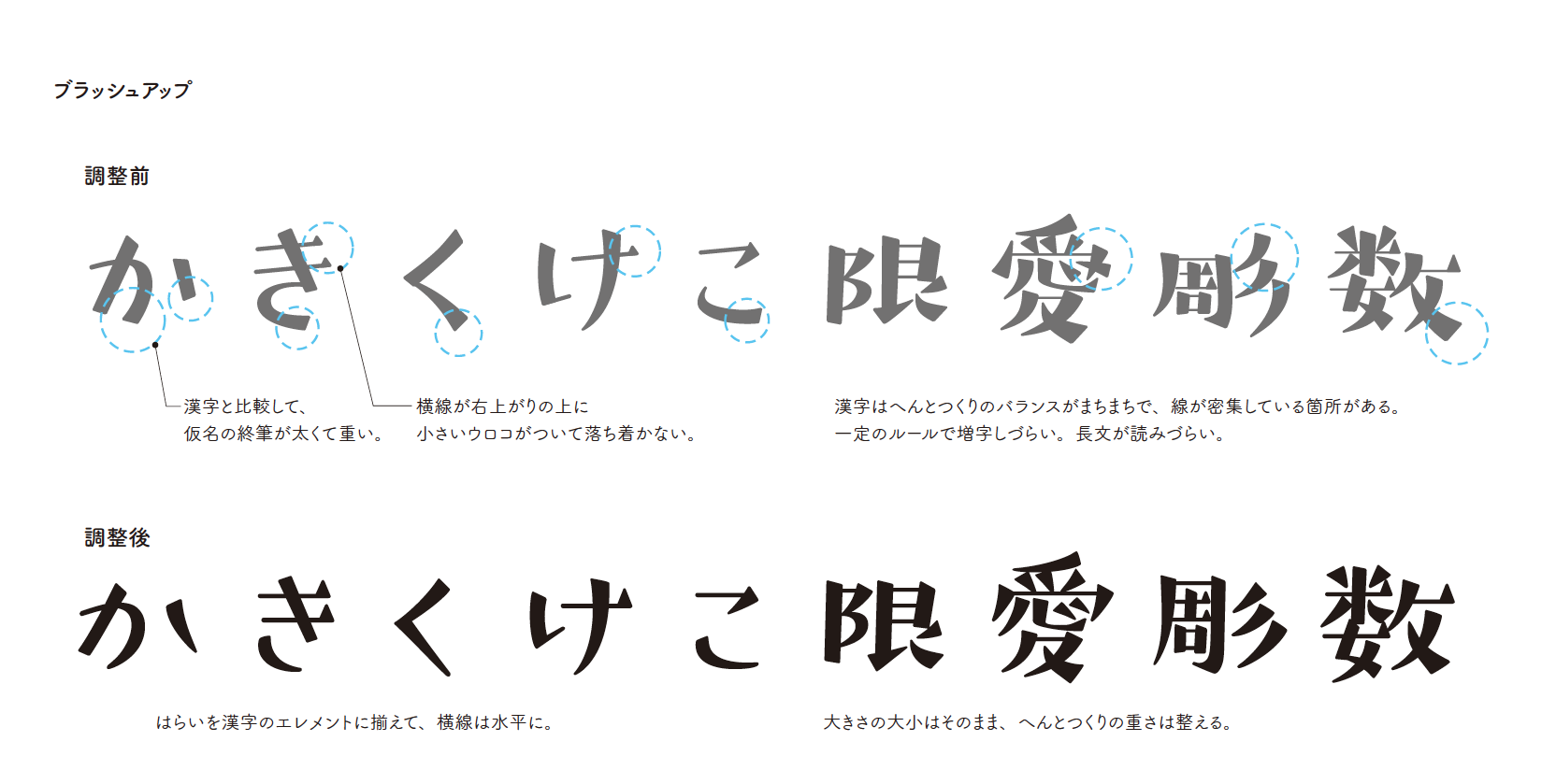
初期のほうのデザインは、横線が細くて、カタカナも適当な感じがあって、エレメントの種類も複雑で、統一感がなかったのですが、2013年に和文と欧文という大阪の勉強会で鳥海修さんや成澤正信さんから書体制作を学ぶ機会を得ることができ、見ていただいたのです。
ロゴタイプから書体化するときのルールを指導してもらって、ブラッシュアップできました。
本当、ハライとか、気分で作っていたのを全部ルール化して。その辺を整えて、フォントワークスに提案したのが「つばめ」です。
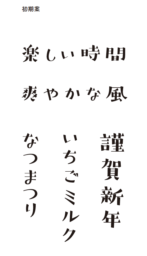
デザインの元になったロゴタイプと初期案
初めてのAdobe-Japan1-3全文字制作とブラッシュアップ
書体採用が決定したのが2014年のことでした。指定された文字セット(AJ1-3)に必要な字種の一覧を見た時は気が遠くなりました。「毎日休まず10文字作っても約2年半かかる!」と。
制作を開始した当時は、会社勤めをしていたので、日中は作業ができず、夜な夜なコツコツつくる日々が1年半続き、2016年リリースの半年前に仕事を辞めて、ラストスパートをかけたんです。
怒涛のチェックバック
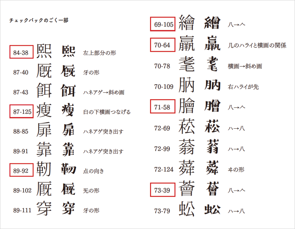
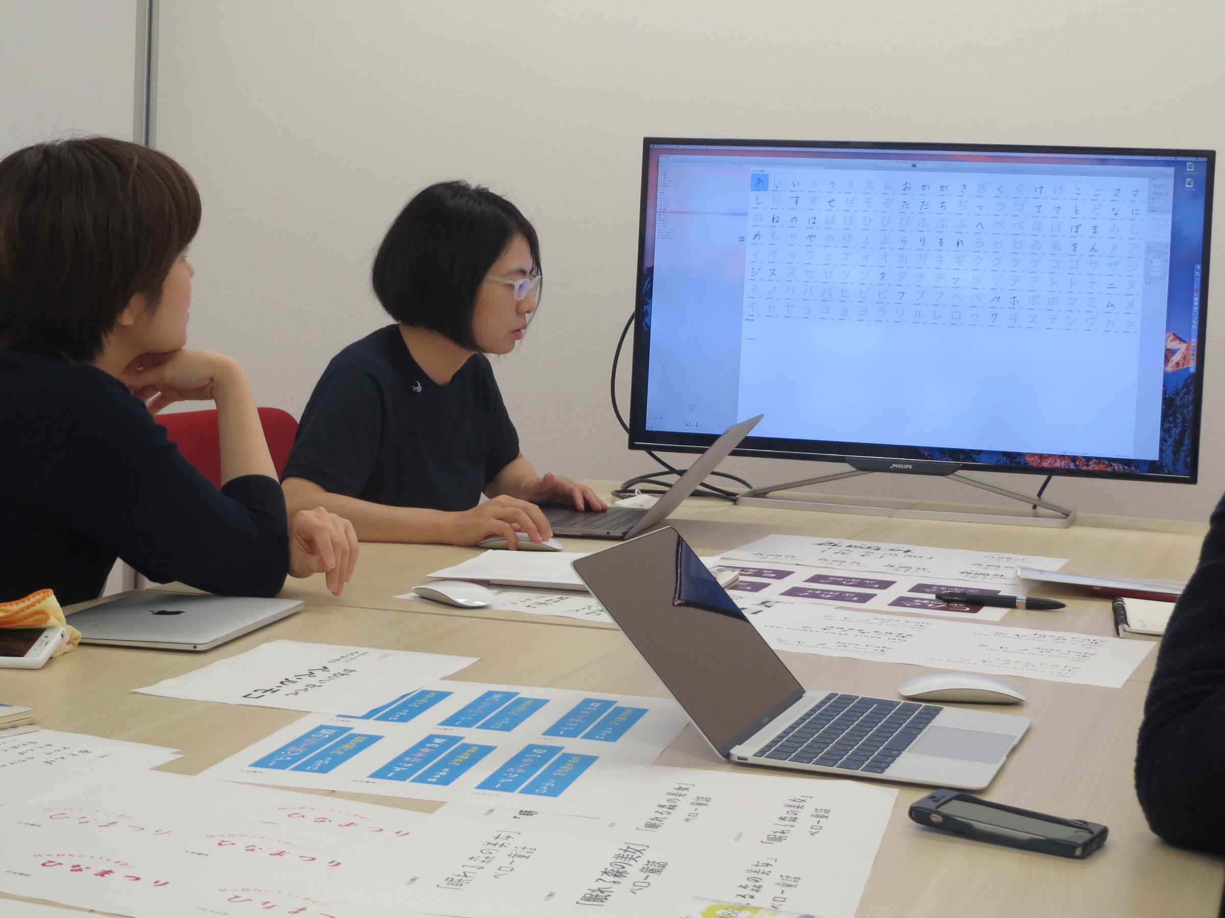
2016年春にリリースすることが決定し、2015年末からフォントワークスの技術部による字体・デザインチェックが開始されました。
そして、怒涛のチェックバック&修正がリリースのぎりぎりまで続きました。
完成版
「つばめ」字面の特徴や骨格・エレメント
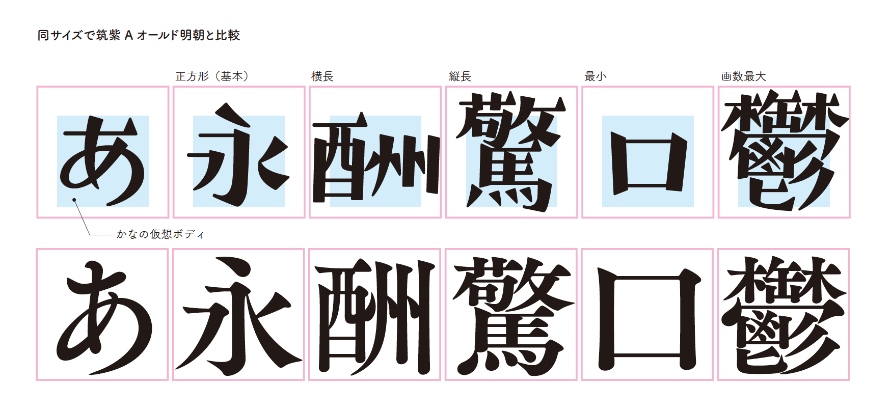
線幅調整を施して正方形の字面にきちんと納めることに慣れていないので、楷書のように、かなの仮想ボディを小さく設定し、画数の多い漢字は大きく、画数の小さい文字は小さく、でこぼこ自由に作りました。
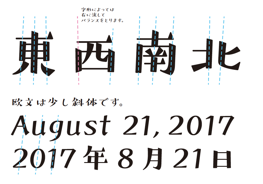
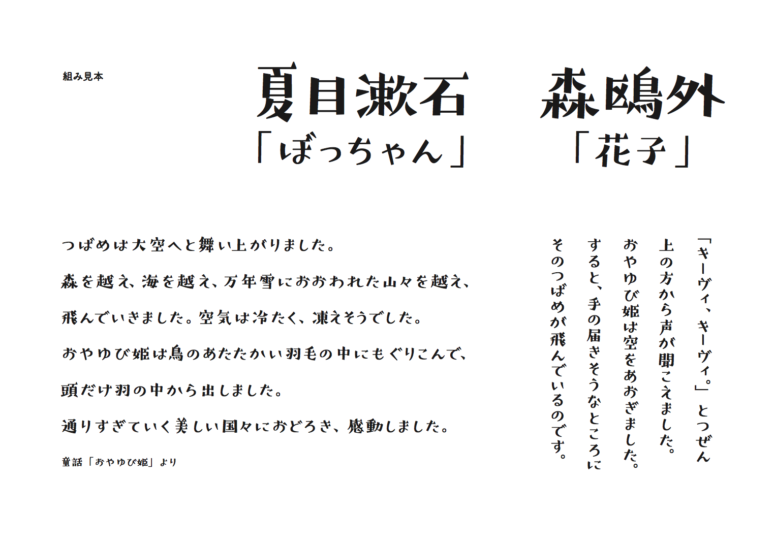
エレメントはコンセプトの<昭和レトロな文字>には細い横線とぽってり大きな三角のうろこだ!と即決。 初期案は横線がかなり細かったので、小さいサイズで使われることを想定し、やや太らせてウロコを大きくしました。
「つばめ」を初めて見た瞬間
リリースして初めて使用されているのを見つけたのが、テレビの朝の情報番組でした。
息子が「作った文字がでてるでー!」と報告してくれて、テレビ画面の写真をとり、一緒に喜びました。
次第に、ポスター、テレビ、書籍や漫画でも見かけるようになり、素敵なレイアウトの中に「つばめ」がいると、たくさんあるフォントの中から選んでいただけたのだと嬉しい気持ちでいっぱいになります。
女性をターゲットにしたもので使用されていることが多い気がして、本人としては意外な気もするし、でも自分が女性なので、そういうものなのかなとも感じたりしますが、いろいろな場面に使っていただきたいです!
これからも「つばめ」の飛ぶ先を見守っていきます!
他のデザイン系書体と比べてみました
神田 友美氏 プロフィール
書体デザイナー・グラフィックデザイナー
1974年神戸生まれ。グラフィックデザインに従事する傍ら書体デザイナーを志す。2000年よりFONT1000参加、「TA-椿」「TA-桜」リリース。モリサワタイプデザインコンペティション2014、「ハーモニー」佳作入選。2016年フォントワークスより、「つばめ」リリース。NPO法人日本タイポグラフィー協会会員。2009年より奈良芸術短期大学デザイン科非常勤講師、2017年より京都造形芸術大学芸術学部キャラクターデザイン学科非常勤講師。
「つばめ」は、日本タイポグラフィ年鑑2017に入選。