フォントワークスは、第一弾の「ユニバーサルデザイン(UD)フォントの評価に関する研究」に引き続き、第二弾の研究として、九州大学と「デバイス表示の特性に基づいたUDフォントのデザイン性に関する研究」を共同研究として実施。共同研究内で、IoTにおけるウェアラブルなどの極小画面デバイスに最適なフォントの実験を、九州大学芸術工学研究院のコンテンツ・クリエーティブデザイン部門およびデザイン人間科学部門との共同研究の一環として実施しました。
IoTデバイスにおける、読みやすく美しいフォントとは?
総務省によると、IoTデバイスの急速な普及に伴い、世界のIoTデバイス数の推移は、2015年時点での、およそ200億個から、2020年時点では403億個に増加されると発表しています。中でも、コネクテッドカーの普及によりIoT化の進展が見込まれる「自動車・輸送機器」、デジタルヘルスケアの市場が拡大している「医療」、スマート工場やスマートシティが拡大する「産業用途(工場、インフラ、物流)」などの高成長が予測されています。また、急速な普及の要因として上がっている、IoTデバイスの小型化や省電力化などにおいては、今後も技術の発展に伴い、ますます小型化することが予想されます。
そのIoTデバイスにおいて、読みやすく美しいフォントの開発は重要な課題です。特に、デジタルヘルスケア分野においては、スマートウォッチなどのウェアラブルにおいても、限られたスペースでの文字表現で読みやすく美しさも保った最適なフォントについて多くのお問い合わせをいただいております。これらの課題を解決したフォントとして、九州大学との共同研究における実験にて誕生したフォントが「Type-D UD角ゴ_スモール-M」です。
実験について
実験概要
| 研究員 | コンテンツクリエーティブデザイン部門 伊原 久裕 教授 藤 紀里子 助教 楊 寧 学術研究員 デザイン人間科学部門 須長 正治 准教授 |
|---|---|
| 研究名 | デバイス表示の特性に基づいたUDフォントのデザイン性に関する研究 |
| 研究概要 | フォントの主観評価実験およびフォント形態属性の計測を行い、得られたデータの解析・比較を行うことで、心理的側面と物理的側面の両面から総合的な分析を行うこと |
| 実験の流れ | 今回の実験では、3回の予備実験にて、本実験の実験用フォントを選出。 起点となるフォントの選出方法については、フォントワークスが以前九州大学と行った共同研究「UDフォントの評価に関する研究」の結果を踏まえ、すでに可読性の高さが実証されている、フォントワークスのユニバーサルデザイン(UD)フォントの角ゴシック体にし、中でも、より字面の大きいラージタイプを選択。UD角ゴ_ラージを起点フォントとして選出。また、他社製UDフォントも比較対象として選択。 |
今回の実験で比較対象としたフォントワークスフォント
- UD角ゴ_ラージ-R
- UD角ゴ_スモール-RM
UD角ゴ_スモール-RとUD角ゴ_スモール-Mの中間の太さのフォント
- 筑紫ゴシック-D
- ニューセザンヌ-M
- 筑紫A丸ゴシック-MD
筑紫A丸ゴシック-Mと筑紫A丸ゴシック-Dの中間の太さ
- UD丸ゴ_スモール-MD
UD丸ゴ_スモール-MとUD丸ゴ_スモール-Dの中間の太さ
- UD角ゴ_SS-RM
UD角ゴ_スモール-RMを94‒96%縮小したフォント
- UD角ゴ_スモール-M
※ 下線のフォントは今回の実験を行うにあたり、予備実験時の結果を踏まえ既存のフォントを改良。
予備実験
予備実験については、前回の九州大学とのUDフォントにおける研究で可読性に優れていると結果が出た「UD角ゴ_ラージ」を起点に、本実験のフォントの選定を行うために実施。以下のフォントの組み合わせで3つの予備実験を行いました。
実験環境
| 実験装置 | コンピュータ制御のiPad mini 4 |
|---|---|
| 観察距離 | 30cm(目と平行) |
| 観察条件 | 暗室 |
| 背景色および文字色 | 黒(<0.35cd/m²)/ 白(<185cd/m²) |
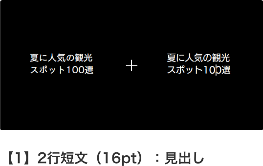
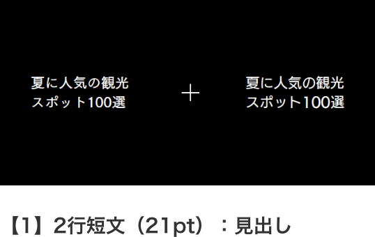
| 見出し | 文字種混合の2行の短文、プログラム上の設定上は16ptのサイズ |
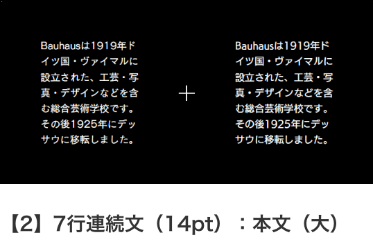
| 本文(大) | 文字種混合の7行の連続文、プログラム上の設定上は14ptのサイズ |
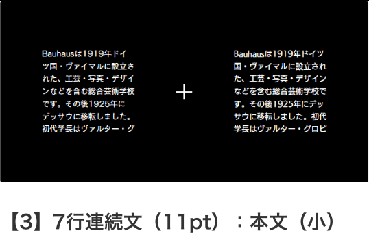
| 本文(小) | 文字種混合の7行の連続文、プログラム上の設定上は11ptのサイズ |
実験方法
| 提示方法 | 一対の文字列提示 |
|---|---|
| 評価方法 | 一対比較法(二つのサンプルを比較し勝敗を決定) |
| 被験者の課題 | 提示された文字列対に対して、どちらが「読みやすいか」を回答 |
【1】フォントワークス社製UDフォント+ 他社UDフォント(可読性実験の成績の良いフォント)
- 1UD角ゴ_ラージ-R
- 2他社UDフォントA(可読性1位)
- 3他社UDフォントB(可読性2位)
- 4他社UDフォントE(可読性1位)
極小画面に、よりたくさんの文字を表示できるよう、コンデンス(長体)書体を含め、再度実験。
【2】フォントワークス社製UDフォント+ 他社UDフォント(可読性実験の成績の良いフォント) + コンデンスフォント(フォントワークス社と他社)
- 1UD角ゴ_ラージ-R
- 2他社UDフォントA(可読性1位)
- 3他社UDフォントB(可読性2位)
- 4UD角ゴ_コンデンス80-R/ 他社UDフォントAコンデンス90
コンデンス(長体)書体は良い結果が出なかったため、候補から除外。また、被験者が、可読性を評価する際に、字面の大きさや濃度(黒み)などの、形態属性から影響を受けることがわかっており、より小さな字面の方が、濃度(黒み)が増し評価が高くなるのではないかと推測し、当初は、字面の大きなラージタイプでの実験だったが「UD角ゴ_スモール」や「筑紫ゴシック」などの字面の小さなフォントを追加して再度実験。
【3】フォントワークス社製UDフォント + フォントワークス社製他フォント(丸ゴシック体も含めて)
- 1UD角ゴ_ラージ-R
- 2UD角ゴ_スモール-RM ※1
- 3筑紫ゴシック-D
- 4ニューセザンヌ-M
- 5筑紫A丸ゴシック-MD ※2
- 6UD丸ゴ_スモール-MD ※3
※1 UD角ゴ_スモール-RとUD角ゴ_スモール-Mの中間の太さのフォント
※2 筑紫A丸ゴシック-Mと筑紫A丸ゴシック-Dの中間の太さのフォント
※3 UD角ゴ_スモール-MとUD角ゴ_スモール-Dの中間の太さのフォント
※ 画像は実際の実験で使用されたものではなく、イメージです。
実験画面
実験結果
3回の予備実験の結果、極小画面デバイスへの文字表示の条件に対して、被験者は、字面の大きさや濃度(黒み)など、いくつかの形態属性(備考 ※2)から評価を行う傾向が見られました。よって起点となる「UD角ゴ_ラージ」よりも字面が小さく、濃度(黒み)が強い「UD角ゴ_スモール」を投入。 被験者のインタビューでは、コンデンスフォントに対して、長体率90%のフォントが長体率80%のフォントより読みやすいと評価されています。また、丸ゴシック体については、文字の表示サイズが小さいので、角ゴシック体と明確に区別することはできないとのことでした。以上の結果を踏まえ、実験フォントを角ゴシック体に限定して、フォントワークス社製UDフォントと他社UDフォントから、実験フォントを選定しました。
本実験1-A 可読性実験[概要]
実験内容と評価方法について
実験内容
各設定ごとに、被験者は2つの書体のサンプルを比較し「読みやすい」かを判断します。サンプルを総当たりさせて、書体の各設定における相対的な評価を実施。また同時に、被験者を20名ずつ2グループに分けることで背景色による影響についての実験を行いました。具体的には、片方のグループには黒背景から白背景の順番にサンプルを提示して、もう片方のグループには白背景から黒背景の順番にサンプルを提示しました。
実験環境
| 実験装置 | コンピュータ制御のiPad mini 4 |
|---|---|
| 観察距離 | 30cm(目と平行) |
| 観察条件 | 暗室 |
| 被験者 | 若干名(40名) |
| 背景色および文字色 | 黒(<0.35cd/m²)/ 白(<185cd/m²) |
| 見出し | 文字種混合の2行の短文、プログラム上の設定上は21ptのサイズ |
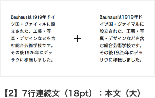
| 本文(大) | 文字種混合の7行の連続文、プログラム上の設定上は18ptのサイズ |
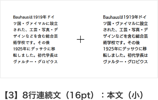
| 本文(小) | 文字種混合の8行の連続文、プログラム上の設定上は16ptのサイズ |
実験方法
| 提示方法 | 一対の文字列提示 |
|---|---|
| 評価方法 | 一対比較法(二つのサンプルを比較し勝敗を決定) |
| 被験者の課題 | 提示された文字列対に対して、どちらが「読みやすいか」を回答 |
実験フォント(7書体)
- 筑紫ゴシック-D
- UD角ゴ_スモール-RM
- UD角ゴ_SS-RM
- 他社UDフォントA
- 他社UDフォントB
- 他社UDフォントC
- 他社フォントD
実験画面
本実験1-A 可読性実験[結果]
【1】2行短文:見出し
黒背景
| 順位 | フォント |
|---|---|
| 1 | 他社UDフォントA |
| 2 | 他社UDフォントC |
| 3 | UD角ゴ_スモール-RM |
| 4 | 他社UDフォントB |
| 5 | UD角ゴ_SS-RM |
| 6 | 他社フォントD |
| 7 | 筑紫ゴシック-D |
白背景
| 順位 | フォント |
|---|---|
| 1 | 他社UDフォントA |
| 2 | 他社UDフォントC |
| 3 | 筑紫ゴシック-D |
| 4 | UD角ゴ_スモール-RM |
| 5 | UD角ゴ_SS-RM |
| 6 | 他社フォントD |
| 7 | 他社UDフォントB |
【2】7行連続文:本文(大)
黒背景
| 順位 | フォント |
|---|---|
| 1 | 他社UDフォントA |
| 2 | UD角ゴ_SS-RM |
| 3 | 他社UDフォントC |
| 4 | UD角ゴ_スモール-RM |
| 5 | 他社フォントD |
| 6 | 他社UDフォントB |
| 7 | 筑紫ゴシック-D |
白背景
| 順位 | フォント |
|---|---|
| 1 | 他社UDフォントA |
| 2 | 他社UDフォントC |
| 3 | UD角ゴ_スモール-RM |
| 4 | UD角ゴ_SS-RM |
| 5 | 他社UDフォントB |
| 6 | 他社フォントD |
| 7 | 筑紫ゴシック-D |
【3】8行連続文:本文(小)
黒背景
| 順位 | フォント |
|---|---|
| 1 | 他社UDフォントA |
| 2 | 他社UDフォントC |
| 3 | UD角ゴ_スモール-RM |
| 4 | 他社UDフォントB |
| 5 | UD角ゴ_SS-RM |
| 6 | 他社フォントD |
| 7 | 筑紫ゴシック-D |
白背景
| 順位 | フォント |
|---|---|
| 1 | 他社UDフォントA |
| 2 | 他社UDフォントC |
| 3 | UD角ゴ_スモール-RM |
| 4 | 他社UDフォントB |
| 5 | UD角ゴ_SS-RM |
| 6 | 他社フォントD |
| 7 | 筑紫ゴシック-D |
※ 背景色について:黒背景と白背景の提示する順番において、有意な相関性が認められた。ただし、黒背景と白背景の背景色の違いにおいては、有意な相関性が認められなかった。
※ 書体の有意差:1位の書体との間の有意差の有無により、書体を2つのグループ(グレーの背景は有意差があるグループ)に分けたものが上記の表。書体の先頭に付いている数字が順位を表す。
フォント毎の勝率を計算し、これを基に有意差検定(※)を行いました。下表に結果を示します。
1位と有意差のなかった当社フォント
| 見出し/黒背景 | UD角ゴ_スモール-RM |
|---|---|
| 見出し/白背景 | 筑紫ゴシック-D、UD角ゴ_スモール-RM |
| 本文(大)/黒背景 | 筑紫ゴシック-D、UD角ゴ_スモール-RM、UD角ゴ_SS-RM |
| 本文(大)/白背景 | UD角ゴ_スモール-RM、UD角ゴ_SS-RM |
| 本文(小)/黒背景 | UD角ゴ_スモール-RM、UD角ゴ_SS-RM |
| 本文(小)/黒背景 | UD角ゴ_スモール-RM、UD角ゴ_SS-RM |
※ 平均値を基に、統計ソフトRを用いて、ホルム(Holm)法の調整済みp値(adjusted p-value)によるウィルコクソンの 順位和検定(Wilcoxon rank sum test)および多重比較を行った。
実験結果
UD角ゴ_スモール-RMは全ての場合において、1位と有意差が無いことが判明しました。しかし研究では、フォント形態属性の計測から得られたデータの解析・比較を行った結果から、字面面積(備考 ※2)と濃度(黒み)が実験結果に影響を与えることが判明。このことから、極小画面デバイスにさらに最適なフォントがあるのではないかという推測を行い、新たな実験を行うこととしました。 加えて、上位のフォントなどと比べて、欧文の文字幅が詰まっている印象があったため、欧文の文字幅を変更する調整を実施。
本実験1-B 判別性実験
実験内容と評価方法について
実験内容
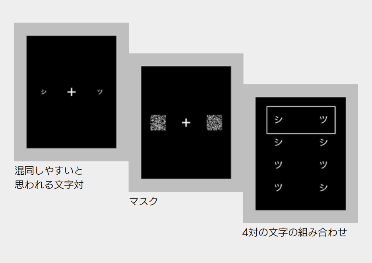
各設定ごとに、被験者は類似した文字対が提示されます。その後に4つの文字対が表示されるので、その中から最初に提示された文字対を選択します。これにより書体の各設定における評価を実施。また同時に、被験者を20名ずつ2グループに分けることで背景色による影響についての実験を行います。
実験環境
| 実験装置 | コンピュータ制御のiPad mini 4 |
|---|---|
| 観察距離 | 30cm(目と平行) |
| 観察条件 | 暗室 |
| 被験者 | 若干名(40名) |
| 背景色および文字色 | 黒(<0.35cd/m²)/ 白(<185cd/m²) |
実験方法
| 提示方法 | 最初に、混同しやすいと思われる1対の文字が固視点に左右に提示される(提示時間::16.7msec 〜 2.13sec)。次に、マスクがかけられ(提示時間:200msec)。最後に4対の文字の選択肢が提示される。 |
|---|---|
| 評価方法 | 四者選択法 |
| 被験者の課題 | 類似した文字対が様々な提示時間で提示される。その4対の文字の組み合わせから同じ文字の対を強制選択する。 |
文字対
カタカナ、ひらがな、英数字の3文字種に合計20対を用意。
| カタカナ | ス-ヌ、チ-テ、ソ-ン、マ-ア、 コ-ユ、シ-ツ、ワ-ウ |
|---|---|
| ひらがな | う-ら、れ-わ、さ-き、ぼ-ほ、 め-ぬ、ぽ-ほ |
| 英数字 | 3-8、1-(l小文字L)、6-8、 g-q、5-S、O-Q、c-o |
実験フォント(6書体)
- 筑紫ゴシック-D
- 他社UDフォントB
- UD角ゴ_スモール-RM
- 他社UDフォントC
- 他社UDフォントA
- 他社フォントD
実験画面
実験結果
実験で使用したフォントに関して、問題となるような判別性の悪さを確認することはできませんでした。
本実験2 可読性実験[概要]
本実験1より、「UD角ゴ_スモール-RM」が良い結果を得られたものの、被験者が[可読性]を評価する際に字面が小さく、黒みが強い方を選択される傾向にあることから、黒みの強さ=ウエイトを太くした、「UD角ゴ_スモール-M」だと、さらに「読みやすさが向上する」のではないかと推測しました。また、本実験1などで上位となったフォントと比較した際に、UD角ゴ_スモールは、英数字の文字幅が詰まっている印象があったため、英数字の文字幅を拡張する調整を実施。そのフォントを、「UD角ゴ_スモール-M改」として、本実験2の実験フォントに加え実験を行いました。
実験内容と評価方法について
実験内容
各設定ごとに、被験者は2つの書体のサンプルを比較し「読みやすい」かを判断します。サンプルを総当たりさせて、書体の各設定における相対的な評価を実施。また同時に、被験者を20名ずつ2グループに分けることで背景色による影響についての実験を行いました。具体的には、片方のグループには黒背景から白背景の順番にサンプルを提示して、もう片方のグループには白背景から黒背景の順番にサンプルを提示しました。
実験環境
| 実験装置 | コンピュータ制御のiPad mini 4 |
|---|---|
| 観察距離 | 30cm(目と平行) |
| 観察条件 | 暗室 |
| 被験者 | 若干名(40名) |
| 背景色および文字色 | 黒(<0.35cd/m²)/ 白(<185cd/m²) |
| 見出し | 文字種混合の2行の短文、プログラム上の設定上は21ptのサイズ |
| 本文(大) | 文字種混合の7行の連続文、プログラム上の設定上は18ptのサイズ |
| 本文(小) | 文字種混合の8行の連続文、プログラム上の設定上は16ptのサイズ |
実験方法
| 提示方法 | 一対の文字列提示 |
|---|---|
| 評価方法 | 一対比較法(二つのサンプルを比較し勝敗を決定) |
| 被験者の課題 | 提示された文字列対に対して、どちらが「読みやすいか」を回答 |
実験フォント(7書体)
- 筑紫ゴシック-D
- UD角ゴ_スモール-RM改
UD角ゴ_スモール-RとUD角ゴ_スモール-Mの中間の太さのフォント
欧文の文字幅を調整
- UD角ゴ_スモール-M改
欧文の文字幅を調整したUD角ゴ_スモール-M
- UD角ゴ_ミディアム-M改
UD角ゴ_スモール-MとUD角ゴ_ラージ-Mの間の字面面積を持ったフォント
欧文の文字幅を調整
- 他社UDフォントⒶ
- 他社UDフォントⒷ
- 他社UDフォントⒸ
- 他社フォントⒹ
※ 下線のフォントは今回の実験を行うにあたり、予備実験時の結果を踏まえ既存のフォントを改良。
実験画面


本実験2 可読性実験[結果]
【1】2行短文:見出し
黒背景
| 順位 | フォント |
|---|---|
| 1 | UD角ゴ_ミディアム-M改 |
| 2 | 他社UDフォントA |
| 3 | UD角ゴ_スモール-RM改 |
| 4 | UD角ゴ_スモール-M改 |
| 5 | 他社UDフォントC |
| 6 | 他社UDフォントB |
| 7 | 筑紫ゴシック-D |
白背景
| 順位 | フォント |
|---|---|
| 1 | UD角ゴ_ミディアム-M改 |
| 2 | UD角ゴ_スモール-M改 |
| 3 | 他社UDフォントA |
| 4 | 他社UDフォントC |
| 5 | UD角ゴ_スモール-RM改 |
| 6 | 筑紫ゴシック-D |
| 7 | 他社UDフォントB |
【2】7行連続文:本文(大)
黒背景
| 順位 | フォント |
|---|---|
| 1 | UD角ゴ_スモール-M改 |
| 2 | UD角ゴ_ミディアム-M改 |
| 3 | UD角ゴ_スモール-RM改 |
| 4 | 他社UDフォントC |
| 5 | 他社UDフォントB |
| 6 | 他社UDフォントA |
| 7 | 筑紫ゴシック-D |
白背景
| 順位 | フォント |
|---|---|
| 1 | UD角ゴ_スモール-M改 |
| 2 | UD角ゴ_ミディアム-M改 |
| 3 | 他社UDフォントA |
| 4 | 他社UDフォントC |
| 5 | UD角ゴ_スモール-RM改 |
| 6 | 筑紫ゴシック-D |
| 7 | 他社UDフォントB |
【3】8行連続文:本文(小)
黒背景
| 順位 | フォント |
|---|---|
| 1 | UD角ゴ_スモール-M改 |
| 2 | UD角ゴ_ミディアム-M改 |
| 3 | 他社UDフォントC |
| 4 | 他社UDフォントA |
| 5 | 他社UDフォントB |
| 6 | UD角ゴ_スモール-RM改 |
| 7 | 筑紫ゴシック-D |
白背景
| 順位 | フォント |
|---|---|
| 1 | UD角ゴ_スモール-M改 |
| 2 | UD角ゴ_ミディアム-M改 |
| 3 | 他社UDフォントC |
| 4 | 他社UDフォントA |
| 5 | UD角ゴ_スモール-RM改 |
| 6 | 他社UDフォントB |
| 7 | 筑紫ゴシック-D |
※ 背景色について:黒背景と白背景の提示する順番における結果の違いはないと結論づけた。ただし、黒背景と白背景を別の結果として扱うことにした。
※ 書体の有意差::1位の書体との間の有意差の有無により、書体を2つのグループに分けたものが上記の表。書体の先頭に付いている数字が順位を表す。
フォント毎の勝率を計算し、これを基に有意差検定を行いました。下表に結果を示します。
1位と有意差のなかった当社フォント
| 見出し/黒背景 | UD角ゴ_ミディアム-M改(1位)、残り全フォント |
|---|---|
| 見出し/白背景 | UD角ゴ_ミディアム-M改(1位)、UD角ゴ_スモール-M改(2位) |
| 本文(大)/黒背景 | UD角ゴ_スモール-M改(1位)、残り全フォント |
| 本文(大)/白背景 | UD角ゴ_スモール-M改(1位)、残り全フォント |
| 本文(小)/黒背景 | UD角ゴ_スモール-M改(1位)、筑紫ゴシック-D以外 |
| 本文(小)/白背景 | UD角ゴ_スモール-M改(1位)、筑紫ゴシック-D以外 |
実験結果
UD角ゴ_スモール-M改、UD角ゴ_ミディアム-M改は全ての場合において、1位と有意差が無いことが実証されました。しかしながら、ほぼ1位を独占しているUD角ゴ_スモール-M改が、より可読性の高いフォントといえます。
備考
※2 実験結果と形態属性の解析・比較
【1】形態属性の計測
研究では、フォント毎に形態属性を計測。例として、以下の二つをあげます。

濃度(黒み)
文字の黒い部分の面積。例えば、マイナス記号(-)は長方形なので、高さ×幅で計算されます。
研究では、かな、漢字、英数字の平均値を使用します。

字面面積
文字の最小外接矩形の面積。
研究では、かな、漢字、英数字の平均値を使用します。
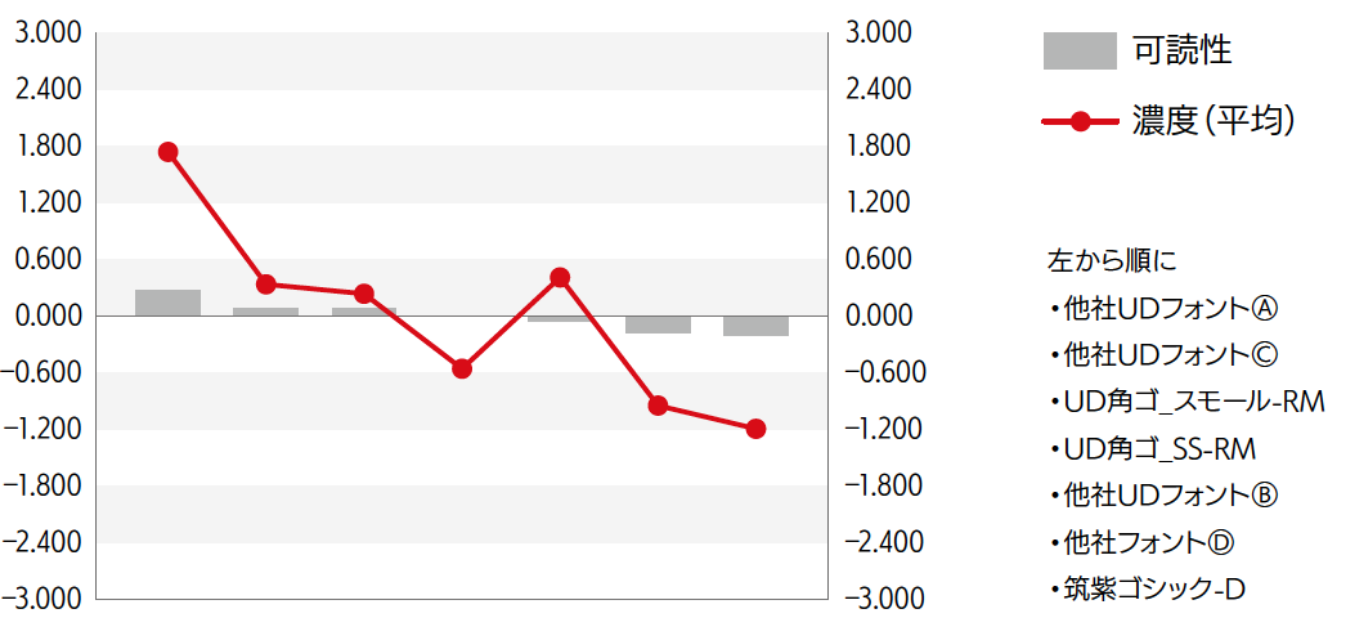
【2】実験結果との比較
実験で得られた順位と形態属性の値を照らし合わせ、互いが同じように並ぶ時に、形態属性が実験結果に影響を与えている可能性があると考えます。下図は本文(大)白背景の相関図。可読性の高い順に左からフォントを並べ、その濃度を折れ線グラフで示しています。折れ線グラフは右肩下がりの傾向を示しているため、濃度が高いフォントの方が、可読性が高くなるのではないかという推測を行います。