Study on text information presentation method under AR environment
Fontworks collaborates with Hirose / Tanigawa / Narumi Laboratory, Graduate School of Information Engineering, University of Tokyo, to effectively present textual information in AR environment (Augmented Reality (AR) environment) and various methods. In order to verify the font characteristics that are considered appropriate in the information presentation situation, we conducted "Research on character information presentation method under AR environment".
The purpose of this research is to consider what kind of font is appropriate when presenting character information in an Augmented Reality (AR) environment. Recently, the AR environment has become diversified, and the usage environment and compatible terminals are wide ranging from those using smartphones and tablet terminals to those using personal wearable terminals and in-vehicle head-up displays. Therefore, in order to select an appropriate font in the AR environment, it is first necessary to clarify the purpose and situation in which character information is presented.
As the first study of this time, regarding information presentation expected in AR environment, by presenting information presentation in AR environment by investigating how character information cognitive load changes when various elements of characters are changed. We will clarify the favorable conditions for.
About research
| research content | Study on text information presentation method under AR environment |
|---|---|
| research summary | We verify the method of effectively presenting character information in AR environment and the font characteristics considered appropriate in various information presentation situations. In the AR environment, font characteristics considered to be appropriate for information presentation in AR, considering factors such as information presentation purpose, presentation method (space fixed or user following), user state (moving or stationary), etc. And research on a method of effectively presenting character information in an AR environment. |
| researcher | Hirose / Tanigawa / Narumi Laboratory, Graduate School of Information Engineering, The University of Tokyo Fontworks |
| Research period | October 2017-March 2020 (ongoing) |
| Experiment environment | HoloLens |
| subject | 15-20 men and women in their 20s and 30s |
About research outline
The outline of the research is as follows.
1. Classification of textual information cognitive load
The character information cognitive load is the load that occurs when a person recognizes character information, and the following can be considered.
- Readability ... Ability to recognize words when understanding text content
- Legibility: Ease of recognition as characters
The textual information cognitive load is thought to affect the following:
- Speed of reading sentences
- Understanding of text content
- Memory retention
- Speed of finding character information
The following factors can be considered as factors that affect the cognitive load of text information.
- Font type
- Font weight
- Font Size
- Font color
- Layout of text information
- background
- Character information movement
- Display media
- User behavior
- Surrounding environment
2. Classification of types in information presentation in AR environment
Element 1: [Classification by purpose of presenting information]
As for the purpose of presenting textual information, there are two types: "things whose purpose is to draw attention to textual information rather than content = discovery type" and "things whose purpose is to have the content understood = understanding type". I have categorized.
"Discovery" is information presentation whose main purpose is to draw attention to the information being presented, and examples include user interfaces such as menus and notifications, Advertisement, signs, and alerts. ..
“Understanding” is information presentation whose main purpose is to have the contents of the information scrutinized. Examples include online articles, manuals, and the Text emails.
Element 2: [Classification by information presentation method]
In the AR space, the position of text information can be moved freely. It is classified into "things that are fixed and presented in a space linked to places and things = space fixation" and "things that follow the user and are always presented in the user's field of view = user follow-up".
"Fixed space" is a case where information is fixed at a specific place and is suitable for information related to objects and places. Examples include product information annotations, route navigation, and tourist information display.
On the other hand, there are cases where information is presented that follows the movement of the user and is suitable for presenting a user interface or the like.
I will. For example, menu screens and notifications.
Element 3: [Classification by information presentation status]
By using wearable AR devices such as HoloLens, it is possible to live while always seeing the information presented in the AR environment. We classify when the user is stationary and when the user is walking depending on whether the background for presenting information changes significantly.
"When the user is stationary" means that the user stays in a specific position and only moves to look around. That is, for example, when the background of the presented text information does not change significantly, for example, when you sit down and read an e-mail or an online article.
When a user moves, the user moves around, such as walking or riding on mobility. In other words, in the situation where the background of the presented text information changes greatly, for example, checking emails that arrive while walking or presenting them on the in-vehicle head-up display can be mentioned.
Supplement: Billboard format
Another element is the classification by the character display method. Regarding the display method of characters, only the characters are displayed (Plain), a monochrome rectangle called billboard is drawn on the background of the characters (Billboard), and a blurred edge is displayed around the characters (Anti- interference) and a method of displaying a shadow behind the character (Shadow). Of these, the billboard method hides the real background by drawing the billboard, so if a large amount of textual information is presented, or if information needs to be presented in association with an object in the real world, Not suitable. Also, when using a billboard, it is thought that it will be a situation similar to presenting the letters written on ordinary paper,
In this guideline, we consider the case where the billboard is not used in AR, and consider the plain character display method.
Summary of experimental results
The relationship between the character information presentation status and advantageous font characteristics when the user is stationary is summarized. In the following, according to (1) to (4) in the table, we will introduce what kind of font is appropriate for the situation of each character information presentation.
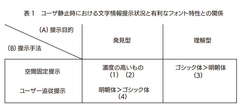
(1) The higher the concentration, the more advantageous it is for the discovery-type information presentation
For the purpose of investigating fonts that are advantageous for presenting discovery-type information in the AR space, 16 types of fonts were evaluated by paired comparison, and an experiment was conducted to check the visibility (Details of the experiment: Experiment details Additional experiment See). As a result of this experiment, a strong correlation was found between the density and the score of visibility, and it became clear that the higher the density of the font, the more prominent it was in the AR environment. Among the fonts used in the experiment, Universal Design Maru Gothic type had the highest score, and Chikushi Q Mincho type had the lowest score.
From this result, it is considered that in the character presentation by the space fixed type AR, the font with higher density is more advantageous for the discovery type information presentation.
(2) Sans serifs are more advantageous than serifs for discovering information (on paper)
Silver et al. Are investigating the influence of font, character Weight, and character size on readability of warning texts on product labels (reference [2]). According to this study, the Helvetica font is easier to read than the Times font.
From this research, it is considered that the sans serif body is more advantageous than the serif body for the discovery-type information presentation on paper. It is considered that this characteristic does not make a big difference in the discovery-type information presentation that is fixed in the space, compared with the case where it is on paper. Therefore, it is considered that the sans-serif type is more advantageous for the discovery-type information presentation than the serif type even in the character presentation by the space-fixed AR.
(3) Gothic type is better than Mincho type for understanding information presentation (paper / display)
Kiyohara et al. Investigated the effect of fonts and display media on comprehension of text content (reference [3]). This study shows that the Gothic type gives better results than the Mincho type when it comes to the task of questioning the comprehension of text content.
From this result, it is considered that the Gothic type is more advantageous than the Mincho type on the surface of the paper and on the display for understanding-type information presentation. It is considered that this characteristic does not make much difference in the case of understanding type information presentation that is fixed in space, compared with the case of paper. Therefore, even in character presentation by space-fixed AR, the Gothic font is considered to be more advantageous for understanding-type information presentation than the Mincho font.
(4) Mincho type is more advantageous than Gothic type for presenting discovery-type information when the user follows
In the user-following character information presentation in the AR space, in order to find a font that is advantageous for the discovery-type information presentation, let the user search for a specific character in a random character string while the character string is being tracked by the user. We conducted an experiment that imposes a visual search task to be answered (for details of the experiment, refer to Detailed Experiment Experiment 2). As a result of this experiment, it became clear that Mincho typeface is more advantageous in search time and correct answer rate than Gothic typeface.
From these results, it is considered that Mincho typeface is more advantageous for discovery type information presentation than Gothic typeface in the character presentation by user-following AR.
Experiment details
In this study, we assume [information presentation purpose-discovery type] and [information presentation situation-when the user is stationary], and [information presentation method-empty].
Experimented with a combination of [fixed between users / follow-up].
| Experiment 1 | Experiment on distance and character information cognitive load in fixed space presentation (discovery type / when user is stationary) |
|---|---|
| Experiment 2 | Experiment on distance and cognitive load of text information in user follow-up presentation (discovery type / when user is stationary) |
| Additional experiment | Experiments on fonts that are useful for discoverable information presentation |
[Experiment 1] Experiment on distance and character information cognitive load in fixed space presentation (discovery type / when user is stationary)
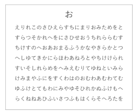
As an index to measure the cognitive load of text information, we designed a visual search task in which participants were asked to search for specific characters in a random string of characters and answer the number of characters. We measured the time it took to complete the task and the points lost, and also measured subjective evaluation of the readability of the characters in a questionnaire.
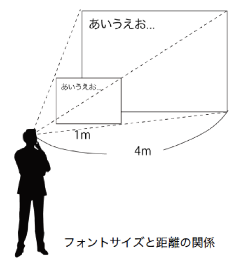
Two conditions were prepared for the distance to the string of characters: a short distance of 1m and a long distance of 4m. In the former condition, the character size was 30pt, and in the latter, it was 120pt. This made the apparent size of the characters the same, so we thought that we could eliminate the effect of character size on task performance. Two types of fonts, Universal Design Kaku Gothic Small and UDMin which are representative Japanese fonts, were used for the presented string of characters.
A total of four conditions (two distance conditions x two font conditions) were presented to each subject twice, and the time it took to complete the task and the rate of correct answers were measured.


Experiment outline
| Experimental device | HoloLens |
|---|---|
| subject | 8 people (7 men / 1 woman) |
| Distance to target and Font Size | Long-distance condition 4m: 120pt Short-distance condition 1m: 30pt |
| Font used | Gothic (UDKakugo_Small) Ming typeface (UDMin) |
| conditions | 10 questions per condition Each subject has 4 conditions (distance 2 conditions and font 2 conditions) x 2 tasks Subject sits in a chair and is stationary (when the user is stationary) String is fixed in space |
Experimental result
Regarding the response time, 20 questions were averaged for each condition and used as the representative value of the subjects. A two-factor analysis of variance showed a significant tendency for font conditions. About the goal, 20 questions were summed up for each condition and used as the representative value of the subjects. Two-way analysis of variance showed a significant difference for font conditions and a significant trend for distance conditions.
Consideration
The higher the distinctiveness of the characters, the shorter the response time because the random character string can be searched quickly. In addition, it is considered that the number of points overlooked will be reduced and the number of points will be reduced.
From the experimental results, it is considered that both the answer time and the goal are more discriminative in the Mincho type than in the Gothic type. From this result, it can be said that the characters of Mincho type are easier to distinguish from the Gothic type when presenting information fixed in space.
[Experiment 2] Experiment on distance and text information cognitive load in user following presentation (discovery type / when user is stationary)
As an index to measure the character information cognitive load, we designed a visual search task that searches for a specific character in a random character string and returns the number of characters. We measured the answer time of the task and the score, and measured the subjective evaluation of the legibility of the letters in the questionnaire.
Experiment outline
| Experimental device | HoloLens |
|---|---|
| subject | 8 people (3 men / 5 women) |
| Distance to target and Font Size | Long-distance condition 4m: 200pt Short-distance condition 1m: 50pt |
| Font used | Gothic (UDKakugo_Small) Ming typeface (UDMin) |
| conditions | 10 questions per condition Each subject has 4 conditions (distance 2 conditions and font 2 conditions) x 2 tasks Subject sits in a chair and is stationary (when the user is stationary) String is fixed in space The string follows the movement of the subject's head |
Experimental result
Regarding the response time, 20 questions were averaged for each condition and used as the representative value of the subjects. A two-factor analysis of variance showed a significant tendency for font conditions.
For each goal, 20 questions were summed up for each goal and used as the representative value of the subjects. A two-factor analysis of variance revealed a significant difference in font and distance conditions.
Consideration
From the experimental results, it is considered that both the answer time and the goal are more distinctive in the Mincho type than in the Gothic type. In addition, from the result of the goal loss, it is considered that the discrimination is higher when the letters are arranged at a short distance than the long distance. From these, it can be said that the Mincho typeface is easier to distinguish from the Gothic typeface even when presenting information that follows the user.
However, in this experiment, due to the nature of searching for specific characters from multiple lines of random character strings, there were many subjects who scanned from left to right one line at a time as when reading a sentence. Therefore, it is possible that the situation was not always the same as the discovery-type information presentation.
[Additional experiments] Experiments on fonts that are advantageous for presenting discovery-type information
In the AR space, we investigated fonts that are advantageous for discovery-type information presentation. The discovery type is mainly for getting attention to the information being presented, and corresponds to UIs and signs such as notifications.

Experiment outline
| Experimental device | HoloLens |
|---|---|
| subject | 15 people (11 men / 4 women) |
| Font Size | 40pt |
| Experimental conditions | Subjectively select a font that you feel is conspicuous 1 trial 153 comparisons 3 trials per person Subject sitting in a chair and still Against a white wall |
| Font used | Universal Design Square Gothic Large L / M Universal Design Marugo Large L / DB TsukuGo L/D NewCezanne M Skip L/D UDMin L/DB TsukuOldMin R/D Mode Mincho L/D Tsukushi Q Mincho L Humming L/D |
Experimental result
The selection rate of each font was calculated by the Thurston pairwise comparison method, and the inverse function of the standard normal distribution was calculated. Flat for each font
The average value is used as the scale value. Universal Design Maru Gothic was the highest, and Chikushi Q Mincho was the lowest.
Consideration
There was a strong correlation between the density and the score of the visibility, and the higher the density, the more prominent the font was. this is
The results are consistent with the fact that the human eye is more sensitive to brightness and that the higher the density, the higher the brightness, and that the "white area area has become the criterion" in the free description section.
From the results of this experiment, it is considered that high density, that is, a bold font is advantageous for the discovery-type information presentation in the AR space.
You Discoverable information is primarily notifications and signs, which we suggest using a bold font to draw the user's attention.
It will be.
Reference: Related research on textual information cognitive load
(1) Research on the visibility of product labels
Regarding the warning text on product labels, we are investigating the effects of font, character Weight, and character size on readability. According to this study, people of Helvetica font is easier to read than the Times font, character Weight is thick it is, the character size has been with the easy-to-read larger.
(2) Research on text presentation method using AR HMD
When presenting a sentence in an AR environment, the effect that the presentation position of the sentence and the presentation method have on the reading action is that presenting the sentence at the bottom of the screen improves the understanding of the sentence content, both at rest and while walking. We know that cognitive load is reduced. It has also been found that RSVP, which presents sentences by word when stationary, is suitable for presenting sentences by sentence when walking.
(3) A study on the effect of font and size on the reading speed
It has been found that when a character is read on a display, how the character size and font affect the reading speed is that the larger the character size, the faster the reading speed. Also, Georgia fonts tend to read faster than Helvetica fonts.
(4) A study on the influence of the font and the media that displays the text on the content understanding
As for the influence of fonts and display media on the understanding of the content of sentences, Mincho and Gothic fonts are taken as Japanese fonts, and printed materials and displays are taken as display media.
It is shown that the printed matter is better than the display, and the Gothic style is better than the Mincho style in the task of asking the degree of comprehension of the text content.
(5) Study on character presentation method using AR HMD
As an effect of the background, character color, and character Styles on readability in an AR environment, it has been found that drawing a single-colored rectangle called a billboard on the background of characters improves readability.
(6) Research on Anti-Interface font
An outline font called an Anti-Interface font has been used to check the readability in an environment with a transparent background. The color of the outline is chosen to give the maximum contrast with the color of the text. This font has been found to be more readable than regular fonts.
References
[1] Michele Fiorentino, Saverio Debernardis, Antonio E Uva, and Giuseppe Monno. Augmented reality text style readability with see-through head-mounted displays in industrial context, Presence: Teleoperators and Virtual Environments, Vol. 22, No. 2, pp. 171-190, 2013
[2] N Clayton Silver and Curt C Braun. Perceived readability of warning labels with varied font sizes and styles. Safety Science, Vol. 16, No. 5-6, pp. 615-625, 1993
[3] Kazuaki Kiyohara, Minoru Nakayama, Hiroshige Kimura, Hideo Shimizu, Yasutaka Shimizu (2003) Effects of Display Media and Display Format on Sentence Understanding, Japanese Journal of Educational Technology, 27 (2), 117-12