In February 2015, Fontworks released the "Fontworks Universal Design font" series as universal design (Universal Design) fonts. It is a typeface designed with the aim of making the letters easier to read, easier to see, and easier to convey, with "Yommoji, Mirmoji, Itaermoji" as the "Moji Concept". In order to show the objective evaluation of these typefaces as evidence (foundation), Fontworks conducted a comparative experiment in a joint research "Research on Universal Design font evaluation" with Kyushu University. In this article, we will report the test contents and evaluation results of [Readability], [Visibility], and [Discrimination] for Fontworks Universal Design fonts.
What is a universal design font?
Universal Design font is a typeface that has excellent readability, visibility, and distinctiveness, and is designed to be easy to read and read by anyone regardless of age or gender. It is released by each manufacturer. Normally, the typeface (design) of the typeface is produced on the condition that many people "can recognize the character correctly", and most typefaces of most manufacturers including our company have various designs depending on the condition. It has been created with special features. In other words, it can be said that general typefaces sold in the market also have some elements of Universal Design.
Therefore, Fontworks created the following concept when developing its own brand Universal Design font. First of all, Fontworks Universal Design font has "higher readability", "visibility", and "discrimination", and a typeface with specially enhanced characteristics. Defined as being. Therefore, among the fonts used by the user, those fonts that are frequently used by the user, especially those that are considered to have the property of Universal Design, can be We chose from each of them, and designed it so as to specially enhance the properties of Universal Design without impairing the original aesthetic appeal of the typeface.
Square Gothic type (UD Kakugo_Large) and Maru Gothic type (UD Marugo_Large) are for Heading, Mincho type (UD Mincho) is the Universal Design font for Text, and each usage is clarified. .
* FW-Universal Design Gothic = UD Kakugo_Large, FW-Universal Design Maru Gothic = UD Marugo_Large Maru Go_Large, FW-UD Mincho = UD Mincho.
About the experiment
- Fontworks Universal Design fonts were compared and compared with general fonts and Universal Design fonts of our own and other manufacturers, and an objective evaluation was made on the Universal Design characteristics [readability] [visibility] [discriminability]. The purpose was to seek.
- The comparative experiment was conducted as a part of joint research with the following faculty members of the Content Creative Design Department and the Design Human Science Department of Kyushu University Faculty of Design.
Content Creative Design Department | Professor Masaru Sato, Hisayasu Ihara Professor, Kiriko Toh Assistant Professor Design Human Science Department |Shoji Sunaga Associate Professor - In this experiment, instead of requesting an absolute evaluation for one typeface, we performed an evaluation by comparing multiple types of typefaces sold on the market in terms of the respective characteristics of Universal Design. . We have adopted a method of scoring all target typefaces and finally calculating the rating for Fontworks Universal Design fonts.
About experiment contents and evaluation method
- 97 young / elderly / design-related work experience subjects
- In the experiment, the square Gothic type and the round Gothic type are Heading, and the Mincho type is an experiment that requires evaluation in the Text.
- Ten fonts including square Gothic, Maru Gothic, and Mincho, including Universal Design fonts that are generally available, are categorized into two types, one for Heading for Text, and displayed in any combination for scoring. The standard value for the result is calculated, and the font itself and comprehensive evaluation are performed.
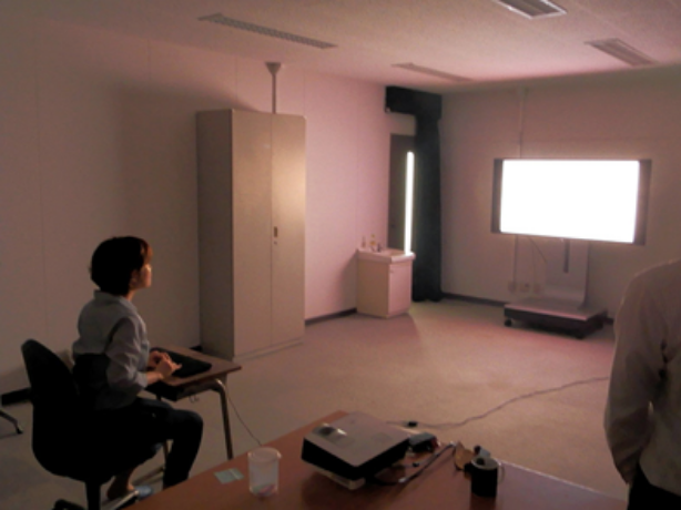
Experiment environment
Universal Design The following is the information on the experimental device / subject / fonts used in the font comparison experiment.
A. Experimental equipment
| Display device | 4K display ▼ 24 type: Dell: 23.8 inch UP2414Q (4 times the full HD, 4K (horizontal 3,840 × vertical 2,160 pixels) liquid crystal panel with a resolution of about 8.29 million pixels and Premier Color technology, equipped with high-definition and high-quality with a maximum display color of 1,074 million colors. Image quality. 12-bit internal processing, color gamut is Adobe RGB 99%, sRGB 100%, and displays Video in rich colors) ▼ 65 type: Sony: 65 inch KD-65X9200A (4 times the full HD, 4K (horizontal 3,840 × vertical 2,160 pixels) liquid crystal panel with a resolution of about 8.29 million pixels and super resolution high image quality circuit newly developed by Sony. High-quality image. The color gamut is based on the wide color gamut technology of Triluminous (R) display and complies with Adobe RGB and sRGB to display Video in rich colors. |
|---|---|
| Observation distance | 60cm or 5m |
| Observation condition | Darkroom |
| Font Size | 18pt to 120pt |
| Character type | Kanji, kana, alphanumeric |
B. Subject
| Young people | 30 people 14 males and 16 females (average age 21.9 ± 1.62) |
|---|---|
| Senior citizens | 36 people 20 males and 16 females (average age 67.9 years ± 3.18 years) |
| Experience in design related work | 31 people 14 males and 17 females (Average age: 43.2 years ± 12.04 years) |
C. Font used for the experiment
| Gothic | FW-Universal Design Gothic (Fontworks Universal Design Gothic) Company A-Universal Design Gothic / B-Universal Design Gothic / C-Universal Design Gothic / D-Universal Design Gothic / E-Universal Design Gothic / E-Gothic / F-Universal Design Gothic / F-Gothic / K-Gothic |
|---|---|
| Round gothic | FW-Universal Design Maru Gothic (Fontworks Universal Design Maru Gothic) Company A-Universal Design Maru Gothic / Company B-Universal Design Maru Gothic / C Company-Universal Design Maru Gothic / D Company-Universal Design Maru Gothic / E Company-Universal Design Maru Gothic / E Company-Maru Gothic / F Company-Universal Design Maru Gothic / G Company -Round Gothic / Company H-Round Gothic |
| Mincho type | FW-UD Mincho (Fontworks UD Mincho) Company A-UD Mincho /Company A-Mincho/Company B-UD Mincho /Company C-UD Mincho /Company D-UD Mincho /Company E-Mincho/F Company -UD Mincho /Company I-Mincho/K Company-Mincho |
D. Experimental method
| readability | Paired comparison method (choose whichever is better) |
|---|---|
| Visibility | Scoring method (scoring the visibility from 0 to 4) |
| Distinctiveness | Four-way forced selection (forcibly select only one of the four that you think is correct) |

Experiment 1: Readability
| Measuring method | Pairwise comparison method |
|---|---|
| Subject task | Select one of the two upper and lower strings that is “easy to read” |
| Display content | Kaku Gothic ... A character string of mixed character types as "Heading" (1 line) Maru Gothic: Character string with mixed character types as Heading (1 line) Mincho ………… One paragraph character string as "Text" (3 lines) |
Evaluation aggregation method
The win rate is calculated for each comparison opponent from the number of selections made by the paired comparison method, the Z value is calculated based on that, and the average value is set as the psychological scale value of the "readability" of the font. This assumes that the winning rate follows a standard normal distribution. Based on the psychological scale value, the evaluation was performed in five grades so that all the evaluation targets also had a distribution close to the standard normal distribution. (Unit: typeface)
result
| 5-step evaluation | Angular gothic | Round gothic | Mincho type |
|---|---|---|---|
| Very good: 5 points | 0 | 1 | 4 |
| Good: 4 points | Four FW-Universal Design Gothic included |
3 FW-Universal Design Round Gothic included |
2 FW including Mincho |
| Normal: 3 points | 5 | 3 | 0 |
| Not very good: 2 points | 0 | 2 | 2 |
| Bad: 1 point | 1 | 1 | 2 |
Overall readability assessment
Round gothic
The results were sparsely distributed, probably because the designs of each company had strong originality or because they were used less frequently than the other two.
Angular gothic
There were no outstandingly readable fonts, and most of the fonts tested were evaluated as typefaces with a certain level of readability.
Mincho type
Because the typeface is used frequently and is often used for both Heading and Text, the evaluation was clearly divided. Fontworks Universal Design fonts were rated as “4 points (good)” for the square Gothic type, the round Gothic type, and the Mincho type, and were highly readable.
Experiment 2: Visibility
| Measuring method | Scoring method (Score evaluation from 0 to 4 points) |
|---|---|
| Subject task | Display 1 character in different size and grade in 5 levels |
| Scoring criteria | Easy to read: 4 points Readable: 3 points Hard to read, but readable: 2 points Very difficult to read: 1 point Unreadable at all: 0 points |
| Display content | Kaku Gothic ... One character on the 65-inch display Maru Gothic ... 1 character on the 65-inch display Mincho ………… One character on the 24-inch display |
Evaluation aggregation method
The Font Size that is graded as "hard to read but readable" is the "minimum visible character size" and the Font Size is calculated. Normalized fonts that are considered to be commonly used as "1".
Font set to standard value "1"
- Company K-Square Gothic
- Company G-Round Gothic
- Company I-Mincho
result
| 5-step evaluation | Chinese characters | Kana | Alphanumeric |
|---|---|---|---|
| FW-Universal Design Gothic | 1.00 | 0.95 | 0.86 |
| FW-Universal Design Maru Gothic | 0.99 | 1.02 | 0.67 |
| FW-UD Mincho | 0.95 | 0.96 | 0.80 |
FW-Universal Design font in visibility
The numerical value of the evaluation result, for example, a value of 0.95 means that the same visibility can be obtained even when displayed at 9.5 points, which is 0.95 times as large as the standard font displayed at a size of 10 points. Fontworks Universal Design fonts are square Gothic fonts, round Gothic fonts, and Mincho fonts, which are rated at or below the standard, and are highly visible.
Experiment 3: Discrimination
| Measuring method | Four-way compulsory selection |
|---|---|
| Subject task | First, show a pair of two characters, and then from the four similar candidates that are displayed, select the same pair of characters as the one displayed earlier. |
| Display content | Kaku Gothic… − Maru Gothic ...- Mincho ………… 24-inch display |
Evaluation aggregation method
The presentation time that gives a "correct answer rate of 62.5%" is calculated as the "discriminable time" of the correct shape of the character. Normalized the commonly used font as "1".
Font set to standard value "1"
- Company I-Mincho
result
| 5-step evaluation | Chinese characters | Kana | Alphanumeric |
|---|---|---|---|
| FW-UD Mincho | 0.90 | 0.90 | 0.82 |
FW-Universal Design font in visibility
Discrimination is performed only in Mincho type. In order to prevent misreading, the intelligibility of the correct glyph is evaluated. As a typeface for long sentences, all kanji, hiragana, and alphanumeric characters were rated as 1 or less, which was evaluated as highly discriminating.
FW-Universal Design font general comparison test
In joint research with Kyushu University, Universal Design is conducting research on font evaluation. Among them, the characteristics of Universal Design font compared with our Universal Design font this time and Universal Design font (including some common fonts) released from various manufacturers. The degree of excellence in [readability], [visibility], and [discrimination] defined as was evaluated and evaluated.
As a result, "Fontworks Universal Design font" was able to obtain results that exceeded the values set as standards for the square Gothic type, the round Gothic type, and the Mincho type. Among the fonts used in this experiment, it is only Fontworks that all the fonts released by one manufacturer exceed the standard value. From this, it can be said that "Fontworks Universal Design font" is excellent in [readability], [visibility], and [discrimination], and it is concluded that "Fonts Universal Design font" can be used with peace of mind. It was
"Fontworks Universal Design font" is a square Gothic type "UD Kakugo_Large" and a round Gothic type "UD Marugo_Large" released in January 2015 for Heading, Mincho The body "UD Mincho" clearly proposes the intended use such as for Text. In January 2016, by releasing "UD Kakugo_Small" and "UD Marugo_Small", which are designed to improve readability in long sentences of square Gothic and round Gothic, Universal Design fonts have been released. Expand the range of applications.