"UD Kakugo_Large" is one of the fontworks universal design typefaces released in 2015.
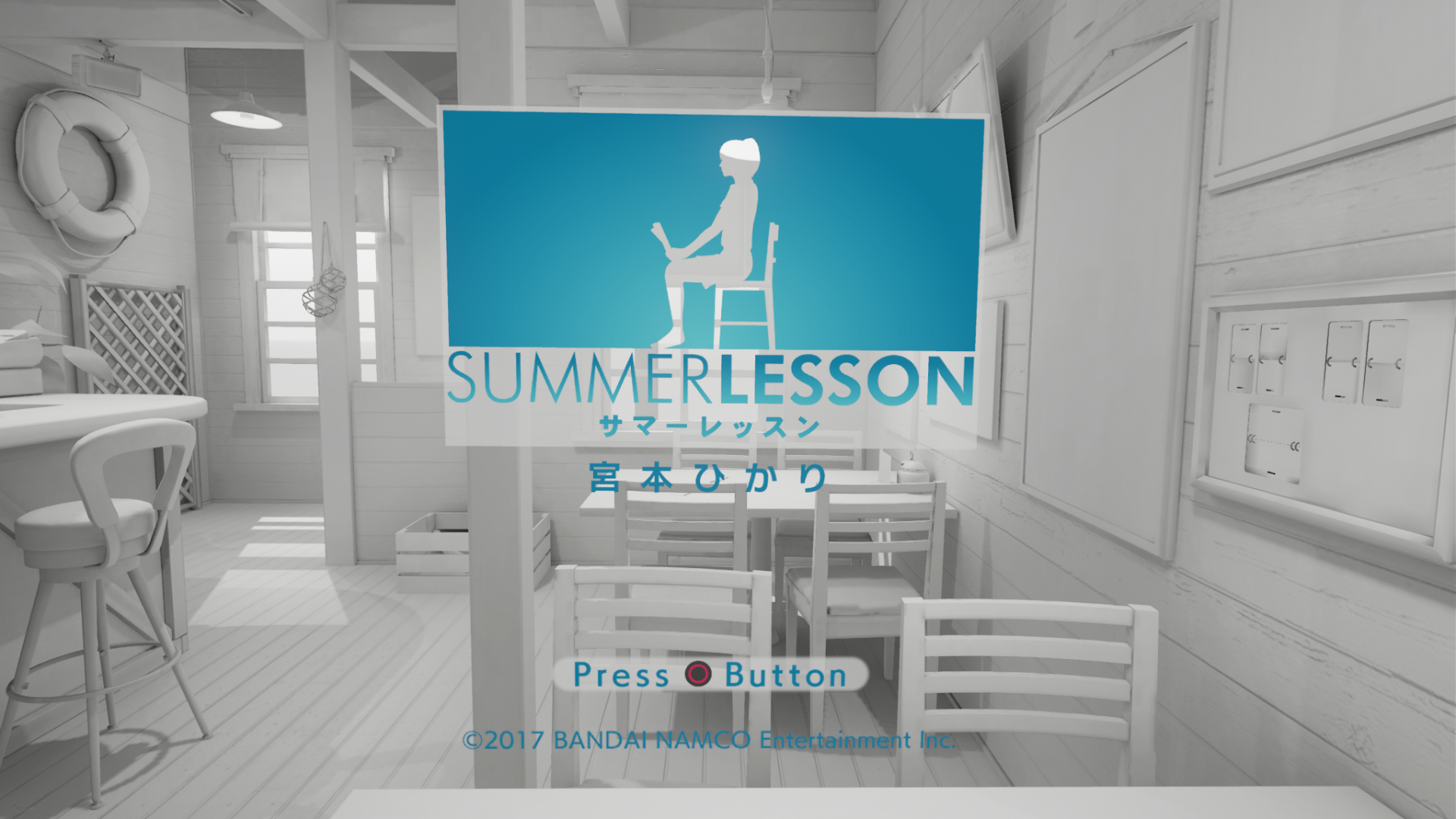
Because of the high visibility and functionality that "UD Kakugo_Large" is proud of, it was adopted as the main font in the PlayStation VR (PS VR) software "Summer Lesson" released in 2016.
This time, I would like to introduce the circumstances in which "UD Kakugo_Large", which cleared the problem of character expression in VR space, was adopted for PS VR software "Summer lesson".
Cooperation © BANDAI NAMCO Entertainment Inc.
Challenges in expression in VR space
What is "summer lesson"?
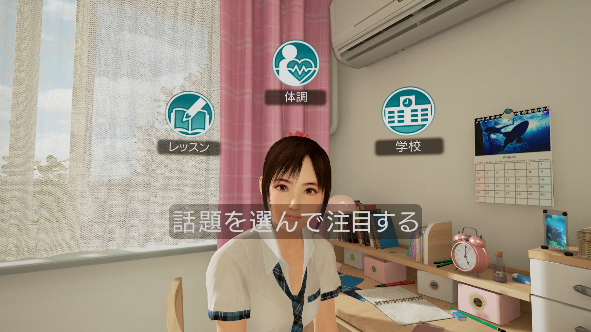
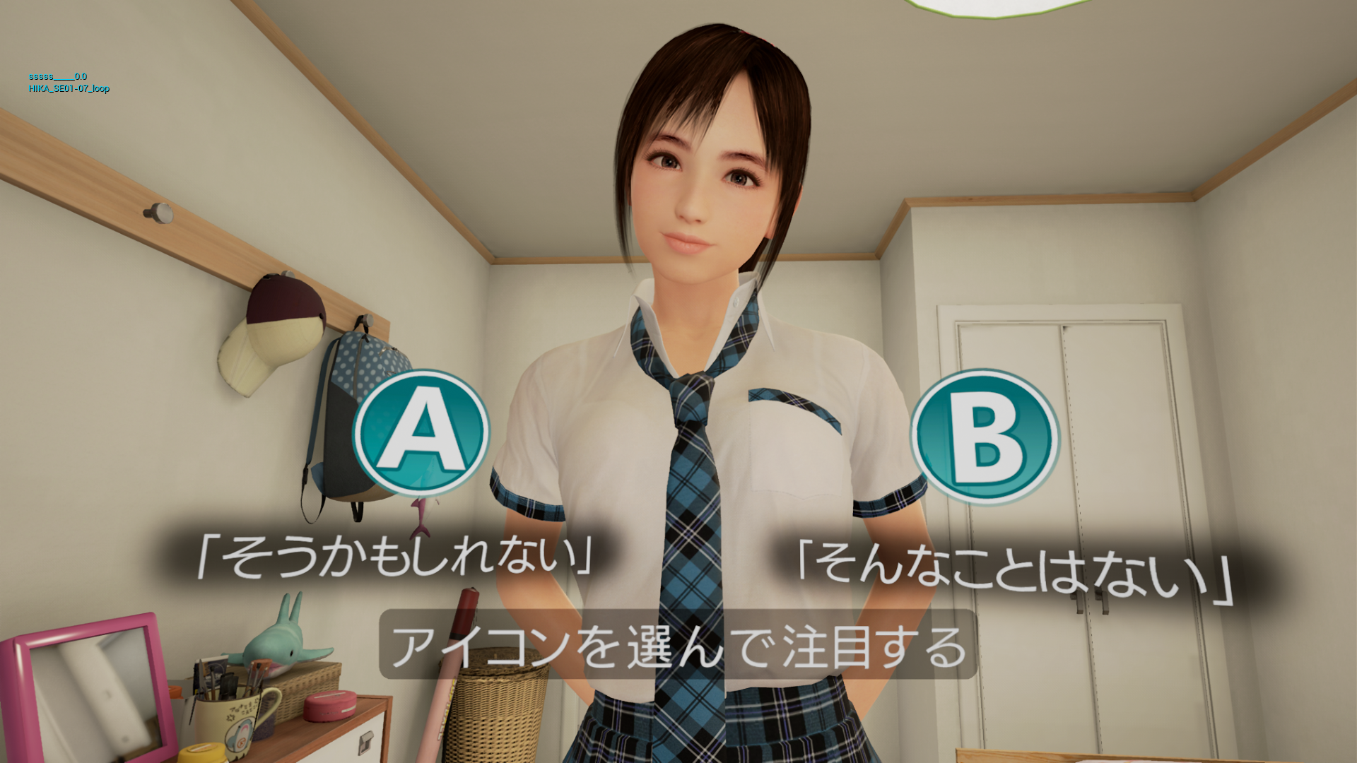
BANDAI NAMCO Entertainment's "Summer Lesson" product is a new genre work called "VR Character Experience" that allows you to communicate with the characters of girls in the game.
The player wears a head-mounted display, PS VR, and operates by looking, nodding, and shaking his/her head.
Unlike conventional games, in VR space all 360 degrees is the player screen, so the character representation in VR space is ``If you try to display characters by the existing method, the visibility of the characters on the VR screen as a whole drops. There was a big obstacle. Also, due to the nature of the game of communicating with characters, it is important to select a font because the UI should emphasize the player's immersive feeling in the game.
In order to solve such problems, in addition to high readability and high design, "UD Kakugo_Large" has been adopted to realize an interface that is easy for users to use.
Existing character representation in 2D screen
Since the size of the display varies depending on the player's environment, the screen resolution is an index that determines the character size. Along with the development of technology, the numerical value of the resolution has increased and it has become possible to express higher quality and higher definition Video.
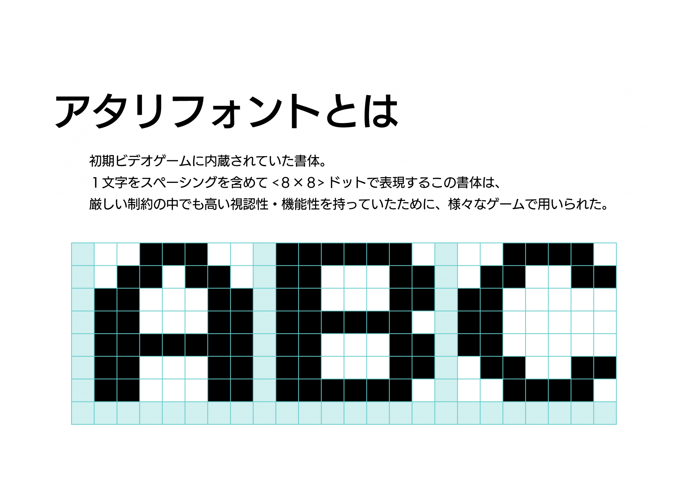
The resolution of the arcade game "Gee Bee", which was first developed by Namco, the predecessor of Bandai Namco in 1979, has a resolution of 224 x 272 dots, compared to 3840 x 2160 dots, which has become popular in recent years.
At the time of game development, the Atari font, which was developed by Atari, Inc. of the United States and which expresses one character in 8 x 8 dots including spacing, was used as a reference. This is because the visibility and functionality were excellent even under severe restrictions.
As the digital production environment has improved with the development of technology and the range of expression has expanded dramatically, PS2 (released in 2000) with a screen resolution of 640 × 480 dots makes it possible to use commercially available DTP fonts even in games. It was. Therefore, in the expression on the screen, the idea of "displaying characters with ◯ pt" has finally become possible.
Reasons for difficulty in expressing characters in VR space
In the development of "Summer Lessons", trial and error of interface expressions and character expressions were repeated.
The conversation in the game is basically by voice, but it was necessary to select the option written in letters in the VR space or read the sentence in the story.
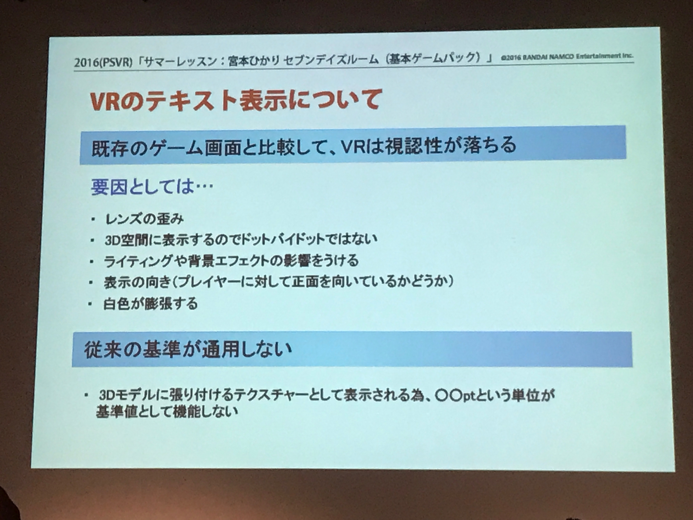
There were difficulties in character representation due to the characteristics of the head mounted display (HMD) and the characteristics of VR space, but the biggest problem was that the "standards for existing character representation" did not work. Regarding the text display of VR, the visibility will be lower than that of the existing game screen. There were various factors, and it was necessary to solve the problem.
"Game Shop and Characters Namco Bandai Studio x Monotype (held October 21, 2016)" Material
Compared to the existing game screen, VR has less visibility of characters
"Lens distortion"
HMD (Head Mounted Display) causes distortion and bleeding in the characters due to the structural reason of looking through the lens.
"It is not dot-by-dot because it is displayed in 3D space."
In the case of HMD (head mounted display), different images are displayed on the right and left eyes, and the human brain recognizes them as one image. Therefore, 1 dot of the Video does not correspond to 1 dot of the monitor, and the visibility is lower than the original character data.
"Affected by lighting and background effects"
For example, in the same way that objects look different in a real room and a dark room in the real world, the appearance of the surrounding environment also affects the appearance of the characters in 3D space.
"Direction of display"
Obviously, if you put the letters out of the player's view, they won't be noticed or read. It is possible that there is an object that you want to show in <the direction you are facing at that moment> because all 360 degrees is the screen.
Imagine that the player is facing backwards, and you can see that the text in front of the player is unreadable.
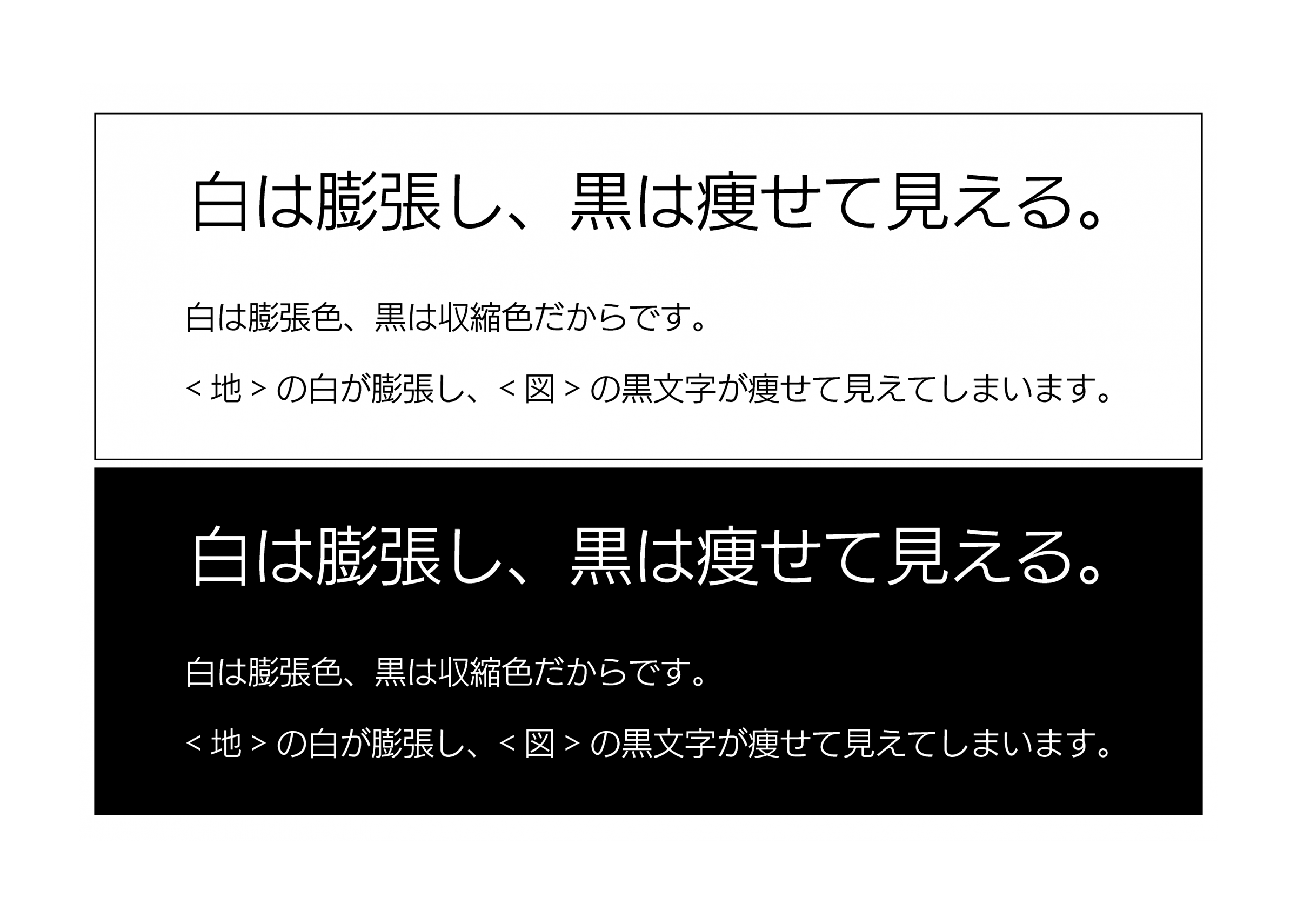
"White expands"
If you place black text on a white background, the white text will expand and the black text will appear thinner than it actually is.
Conventional standards don't work
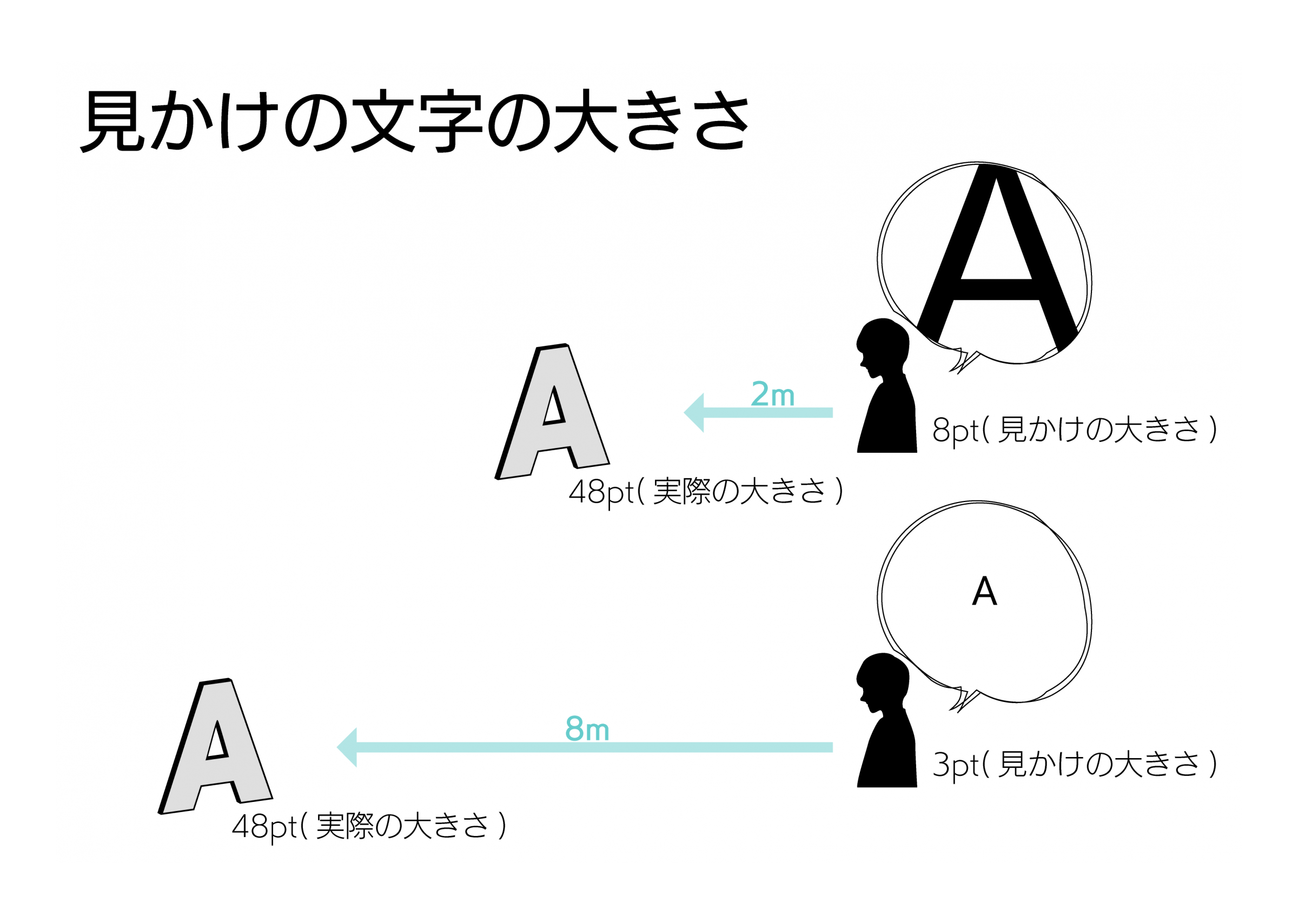
There is a problem that "it is displayed as a texture that is pasted on a 3D model, so the unit pt does not function as a reference value." Since the characters in the VR game are displayed as a texture attached to a plate polygon, they appear small when placed far from the player, and appear large when placed near the player.
The <apparent text size> is closely related to the <reading distance> and the <text size on the object>.
A method of character placement in a VR space where you can experience a deep Video that can be viewed 360 degrees, instead of thinking with a pt number like on a 2D screen, "arranging with a size of △ cm at a distance of ○ cm from the player" It seems reasonable to change to.
To improve visibility
Two approaches
There are two ways to solve the problem that the visibility of characters is low due to the "difficulty of character expression in VR space" mentioned above.
One is to solve the "cause of poor visibility". This is doing everything possible. For example, with respect to the problem of “color swelling”, by displaying white characters against a black shadow, the possibility of <characters becoming thin> is minimized. At the same time, with this method, the <effect of lighting and background effects> is minimized.
The other is to simply use a "typeface with higher visibility and functionality".
Choose "typeface with higher visibility and functionality"
We interviewed Mr. Tamaki, the producer director of “Summer Lessons”, and Mr. Shimosako, who is in charge of UI design, about the selection of typefaces.
Mr. Tamaki
"The expression of characters in the VR space is a completely different field than before, and the challenge was how to express the interface and how to express the characters. By visiting Fontworks' universal design font and adopting it, we were able to create an interface that is readable in VR and easy for customers to use.”
Mr. Shigesako
“I actually tried various fonts in the environment where it was hard to see the letters VR and what kind of font would be suitable. Among them, Fontworks' universal design font was We decided to adopt it because we judged it to be readable and superior in terms of design compared to other fonts.”
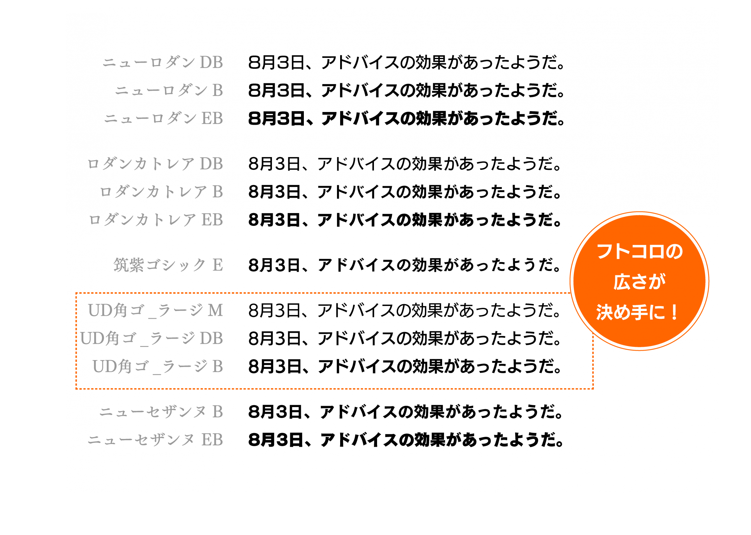
When selecting the typeface, it seems that they actually decided to compare multiple typefaces on VR. For example, in the corner Gothic, font Works typeface 12 typeface (New Rodin-DB / B / EB, cattleya Rodin-DB / B / EB, Tsukushi Gothic-E, UD Kakugo_Large-M / DB / B, New Cezanne- We compared DB/B) with Universal Design fonts of other manufacturers and 8 other non-Universal Design fonts for a total of 20 fonts.
Since it was discovered that the player was looking at the characters from an angle that was not intended by the production side in the VR space, it is said that "typefaces with good visibility from any angle" became the most important.
The traffic sign on the road made me decide that I needed this "typeface with high visibility from any direction". Road signs have a visibility that can be immediately seen and understood even in <environment with complicated weather and background> <recognition conditions with various distances and angles>. It seems that he thought that this point was common with the condition of character recognition in VR space.
Fontworks' Universal Design font's "easy-to-see" feature that makes it easy to recognize dakuten/semi-dakuten and has a wide space. This was the decisive factor, and it was introduced as the main typeface in "Summer Lessons". Initially, I planned to use Universal Design Kaku Go-Large _DB mainly to use thick fonts according to Western VR guidelines, but the alphabet-based guidelines are not suitable for Japanese notation, especially There was a problem that characters with a large number of strokes, such as kanji, were destroyed.
Therefore, we adopted UD Kakugo_Large-M as the main typeface and UD Kakugo_Large-DB/B as the typeface such as Heading.
In fact, UD Kakugo_Large is not the only typeface used for "Summer Lessons"!
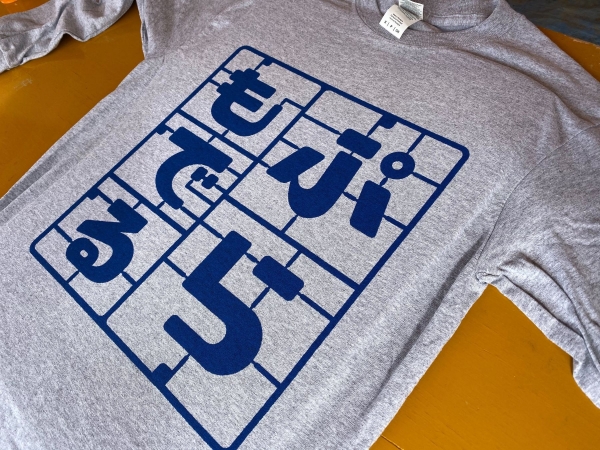
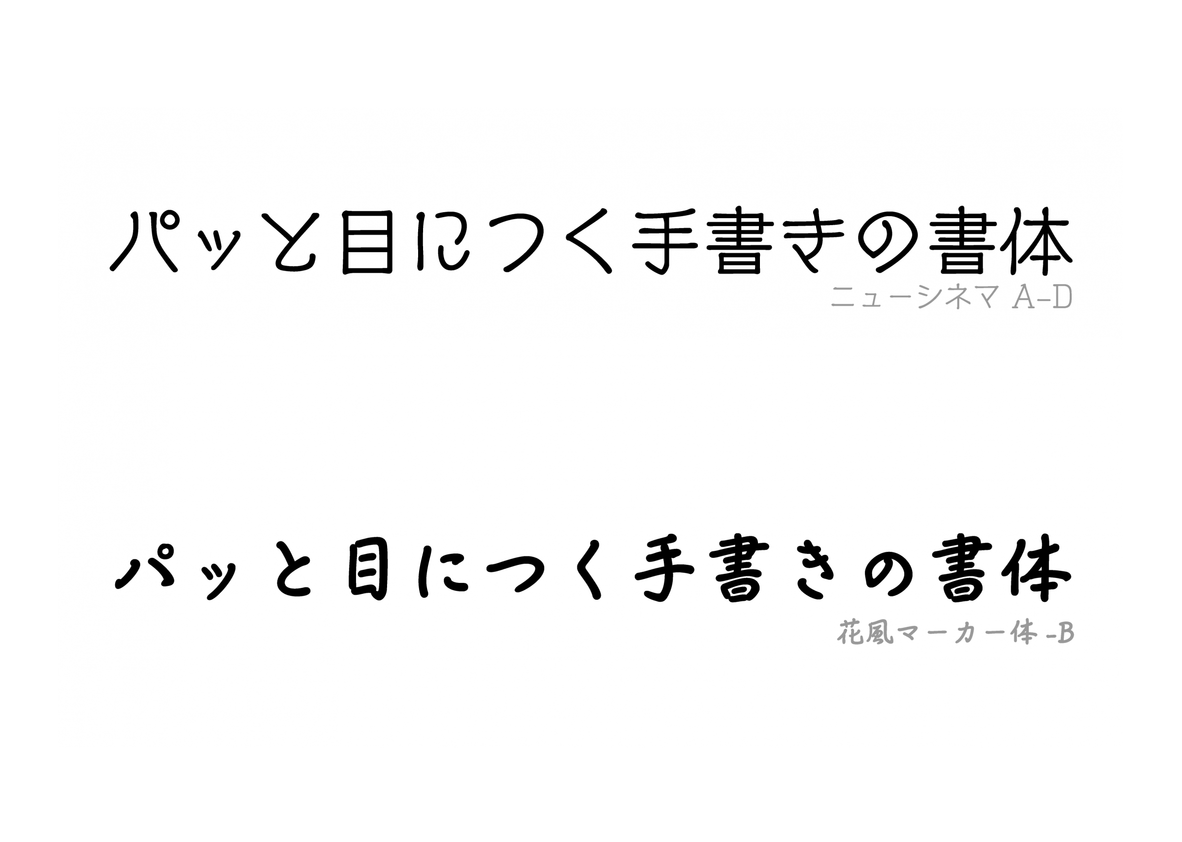
Kafu Marker
Kafu Marker It is, on the game has been used to <handwritten character>.
Handwriting style typeface is a lot there, but other handwriting fonts that match the view of the world is relatively things of fine print many, it says that there has been a problem that <would cut>. Under such circumstances, to some extent Weight easier to read there is, was adopted as a typeface to meet the world of the game is Kafu Marker is.
In addition, although was dismissed on the grounds that do not fit in the view of the world, "it can be even to read without having to display only a short time," as the New Cinema typeface typeface of high visibility handwriting is it more necessary, and "Summer lessons" production person in charge was told.
"L, R, instead of the weight M, D, B, U ... such as, is more happy if there is a handwriting font, such as changes in habit. Or, in the handwriting style Universal Design Toka typeface."
If the original, character a character that hero of the girl wrote, the hero of the mother wrote, I user wanted to distinguish the typefaces in each of the image such as a character written, less the type of font that can be used as a reality, Kafu Marker seems to have become to be used in unified.
In this way, the fontworks Universal Design typeface, UD Kakugo_Large, which has been evaluated as "easy to see" and "easy to read", is actually the high visibility with Kyushu University. Proven in joint research.
Of font Works Universal Design typeface is "safe to use Universal Design font"
Comparative experiment by joint research with Kyushu University
Fontworks Universal Design font Is Characters that are “easier to read, easier to see, and easier to convey” It is produced for the purpose of being. Universal Design font (universal design font) is a typeface created based on the concept of universal design, which has been drawing attention in recent years, and other companies in the same industry are also working on Universal Design fonts.
However, the definition of "how to design a Universal Design font" remains unclear in the industry.
Therefore, Fontworks conducted a joint experiment with Kyushu University for the first comparative experiment targeting a wide range of subjects. As a result, it was concluded that it is a "Universal Design font that can be used with peace of mind" that is objectively based on [readability], [visibility], and [discrimination].
▶ ︎ Report of experimental results Here
What is "UD Kakugo_Large"?
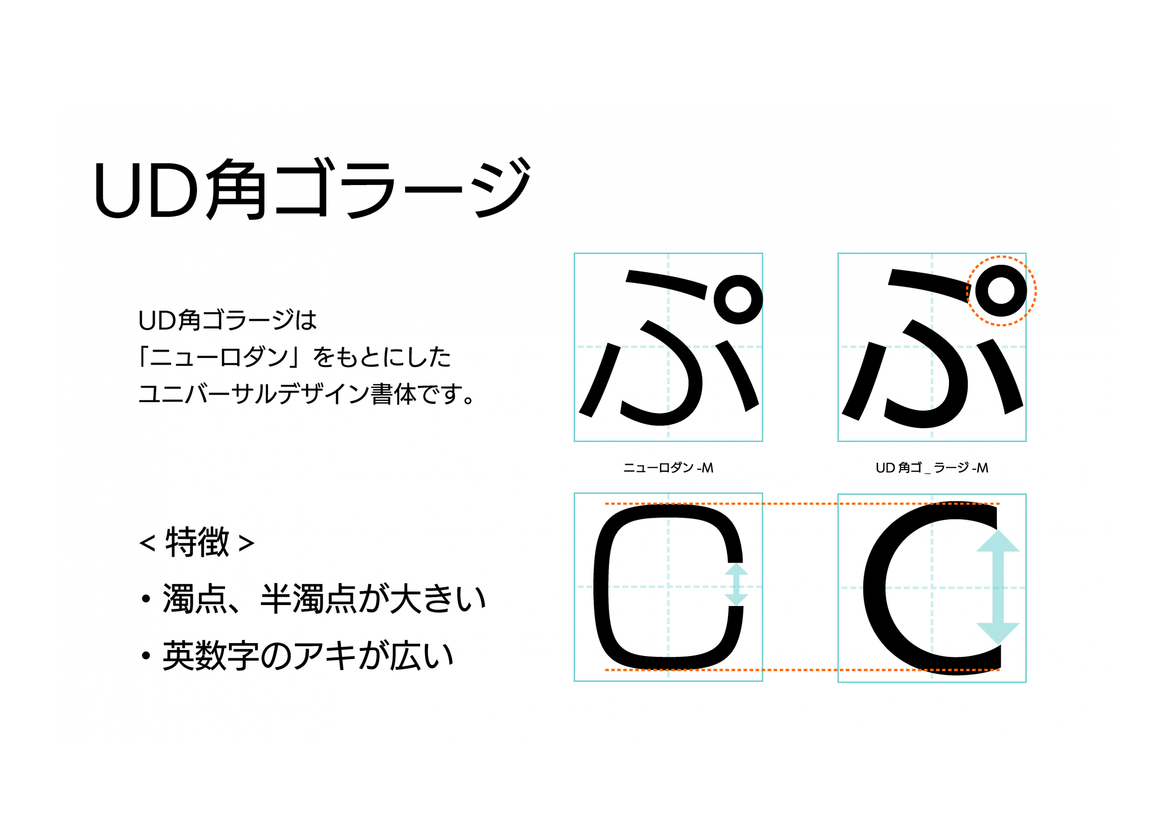
UD Kakugo_Large, one of Fontworks Universal Design fonts, is a square Gothic typeface with a large face. New Rodin The design is based on ", and it is the Universal Design font that is most suitable for < Heading >.
By changing the design to increase the alphanumeric space and adjusting the dakuten semi-dakuten to be larger, the visibility/discrimination is improved.
UD Kakugo_Large has a larger character surface compared to a typical typeface, but the design of Kanji and Kana, which are the characteristics of modern Gothic, is almost the same.
Fontworks Universal Design fonts can be used with the annual flat-rate service "LETS".
For more information, Here Please refer to the.