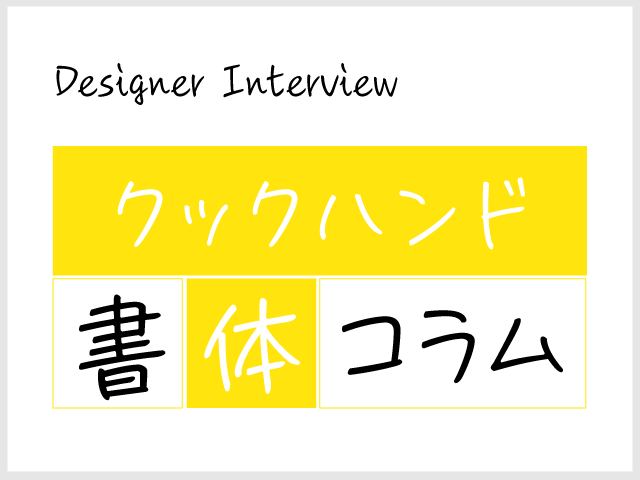
BOOKUOKAが開催する「書店員ナイトin福岡拡大版「書体(=フォント)に恋して」」(11/3開催)で、エッセイ『文字の食卓』(本の雑誌社)が話題となった正木香子さまとフォントワークスの書体デザイナー藤田重信とのトークセッションの内容をコラムにいたしました。
筑紫書体をベースに、書体にまつわる素敵なお話をしていただいています。ぜひ、ご覧ください。

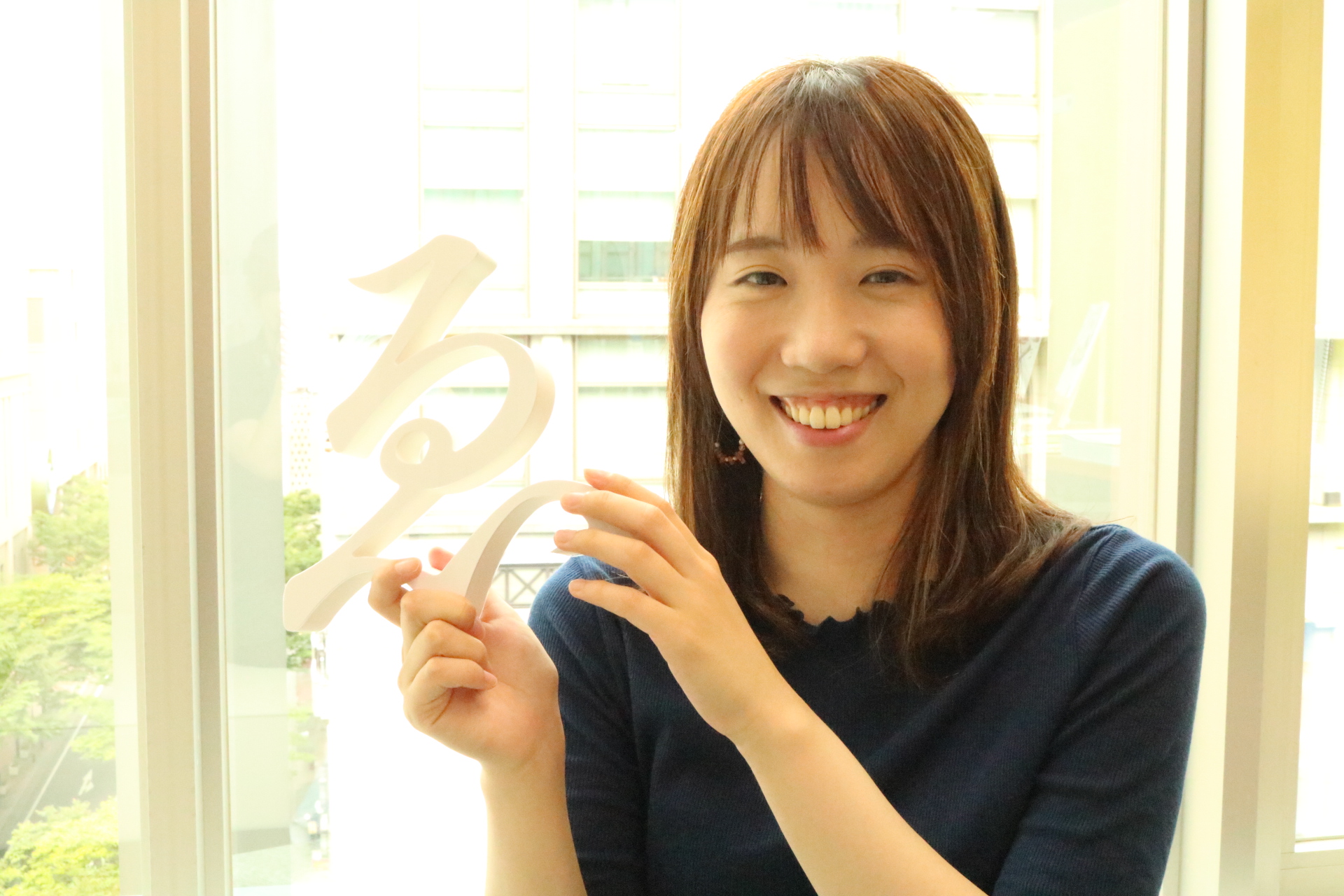
正木 香子氏
文筆家、「文字の食卓」主宰、レタリング技能検定中央試験委員。幼いころから活字や写植の書体に魅せられ、〈滋味豊かな書体〉をテーマに各紙誌エッセイを発表している。著書に『文字の食卓』(本の雑誌社)、『本を読む人のための書体入門』(星海社新書)、『文字と楽園 精興社書体であじわう現代文学』(本の雑誌社) など。福岡県出身。
藤田 重信
福岡 筑紫野の出身。筑陽学園デザイン科を卒業し、株式会社写研に入社。二十数年間朝から晩まで文字デザインを行う。1998年、フォントワークスに移籍し、筑紫書体を次々と開発し続ける。<明朝体の歴史>を変えることが野望の60歳。
正木
最近、漢字研究で有名な笹原宏之先生に教わったんですが、すごくわかりやすいと思ったので紹介します。
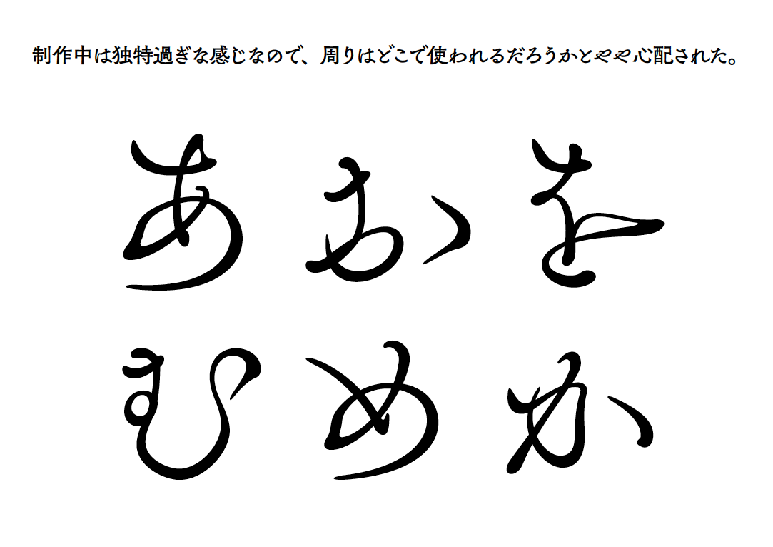
今、この会場にいるみなさんに「鳥」という漢字を書いてくださいと言ったら、きっと全員書くことができると思います。
ね、頭の中に思い浮かべてみてください。
でも、みんなの頭の中で浮かんでいるそれは、<書体>ではなく<字体>なんですね。
私はそのお話を聞いて、文字のイメージに<差が生まれる>部分、たとえば「鮮やかな色の羽だな」とか、「首がちょっと長いな」「くちばしが綺麗だな」とか、そういうふうに感じさせてくれるものが<書体>だなと思ったんですが、この考え方で言うと、こちらにいらっしゃる藤田さんは、ものすごーく変わった「鳥」を作るデザイナーなんです(笑)
今日は、私が選ばせていただいた、いくつかの本の装丁を見ながら、藤田さんが作られた書体のお話を伺っていきます。
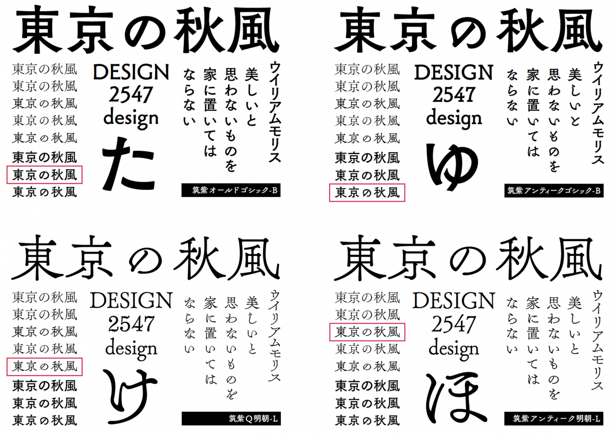
みなさんが筑紫書体を見分けられるようになって、筑紫書体は、どんな鳥だろう? というイメージが、湧くようになるといいなあ、と思っています。
筑紫書体、事例をまじえて
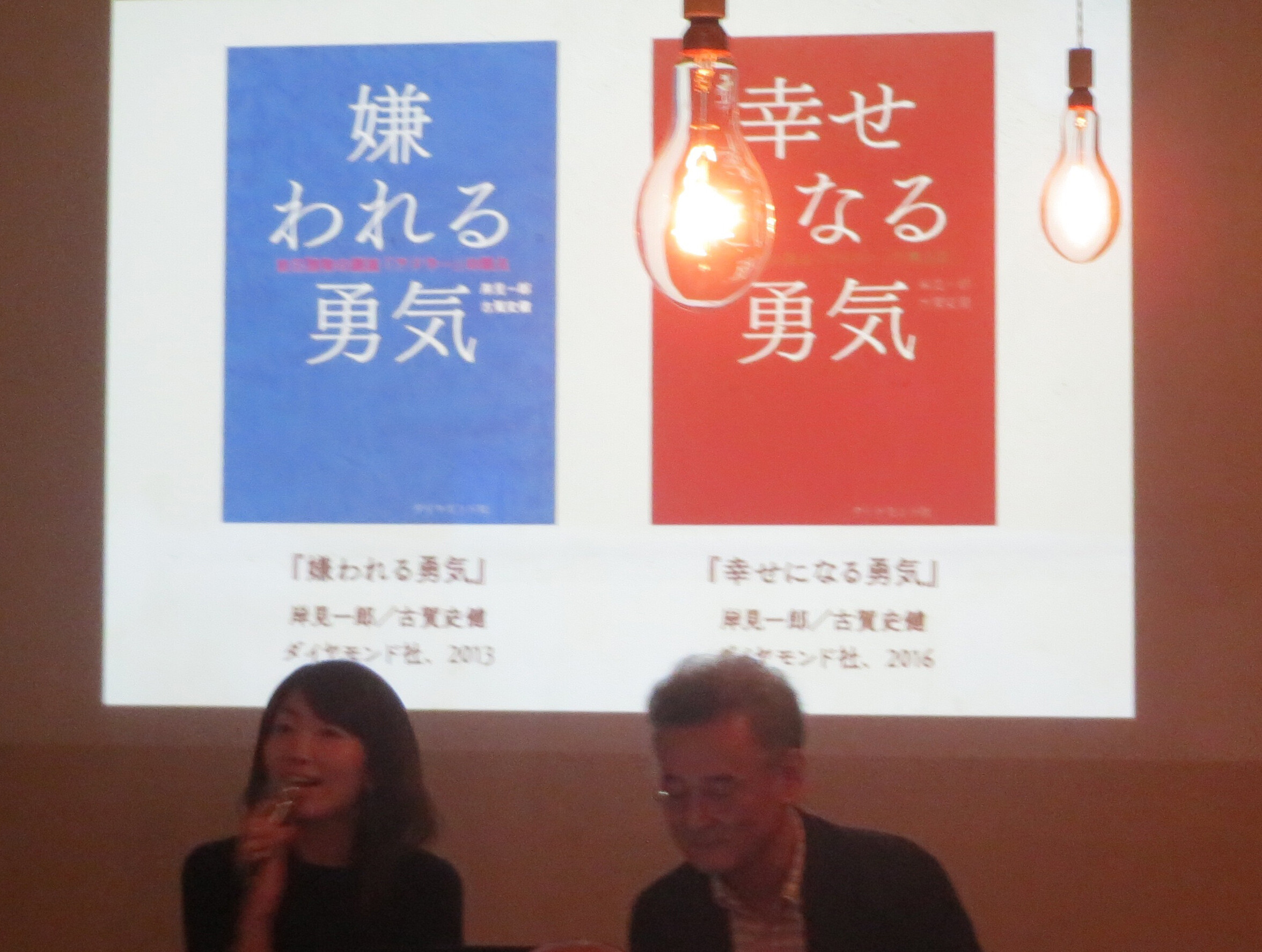
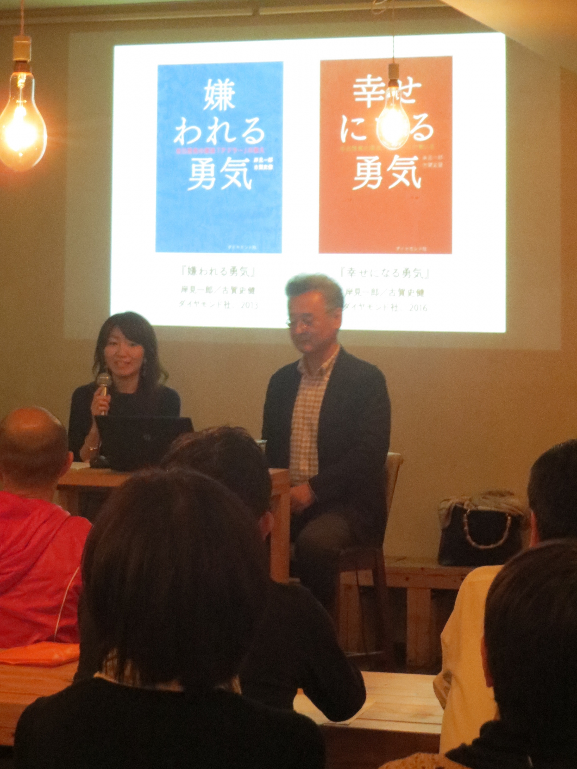
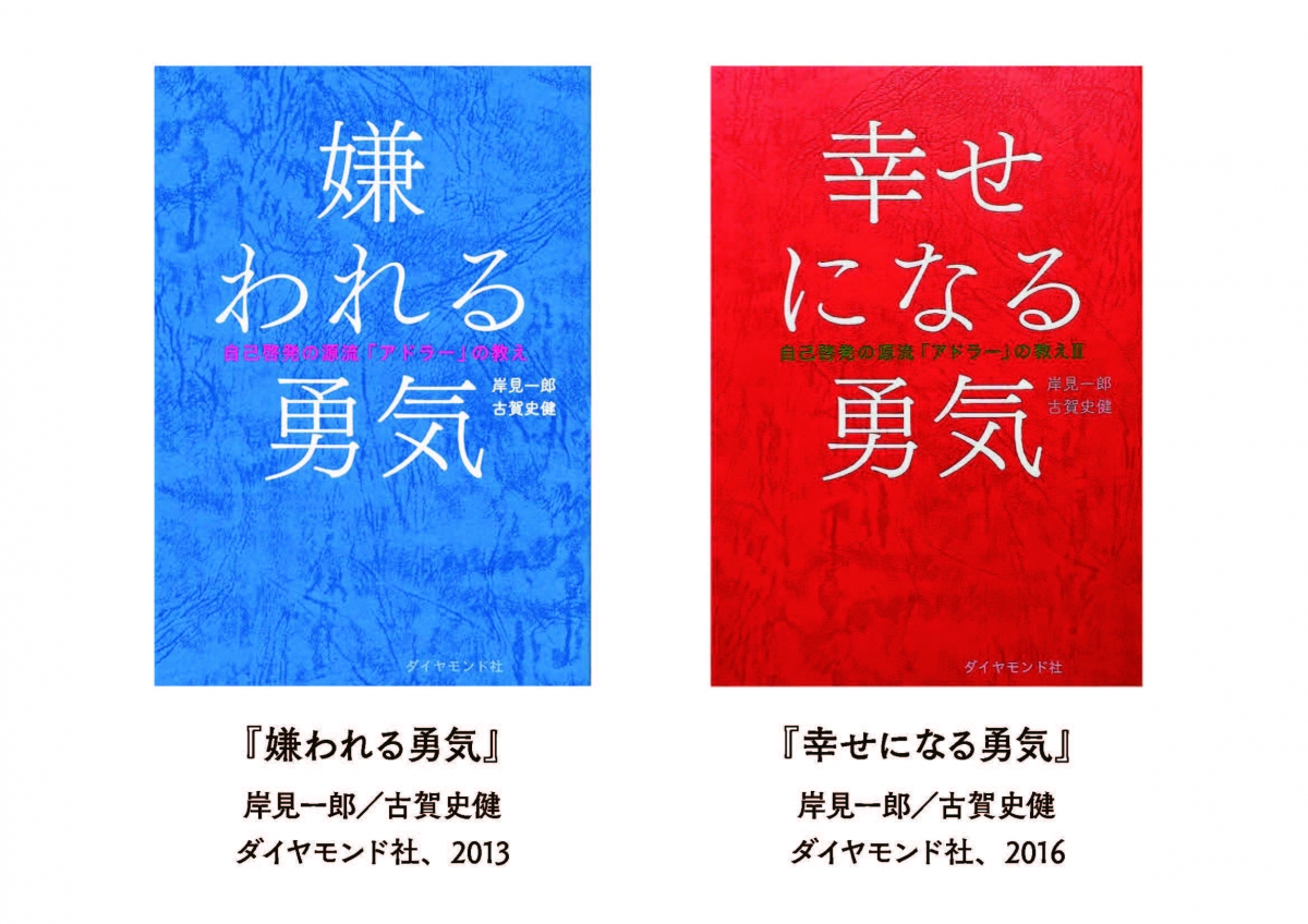
『ナラタージュ』『嫌われる勇気』『幸せになる勇気』と筑紫明朝

藤田
僕は1998年にフォントワークスに来て、とにかく明朝体が作りたかったんです。
ルーティン作業の合間にコツコツと5年程度かけて制作し、2004年にリリースした書体が、「筑紫明朝」です。
正木
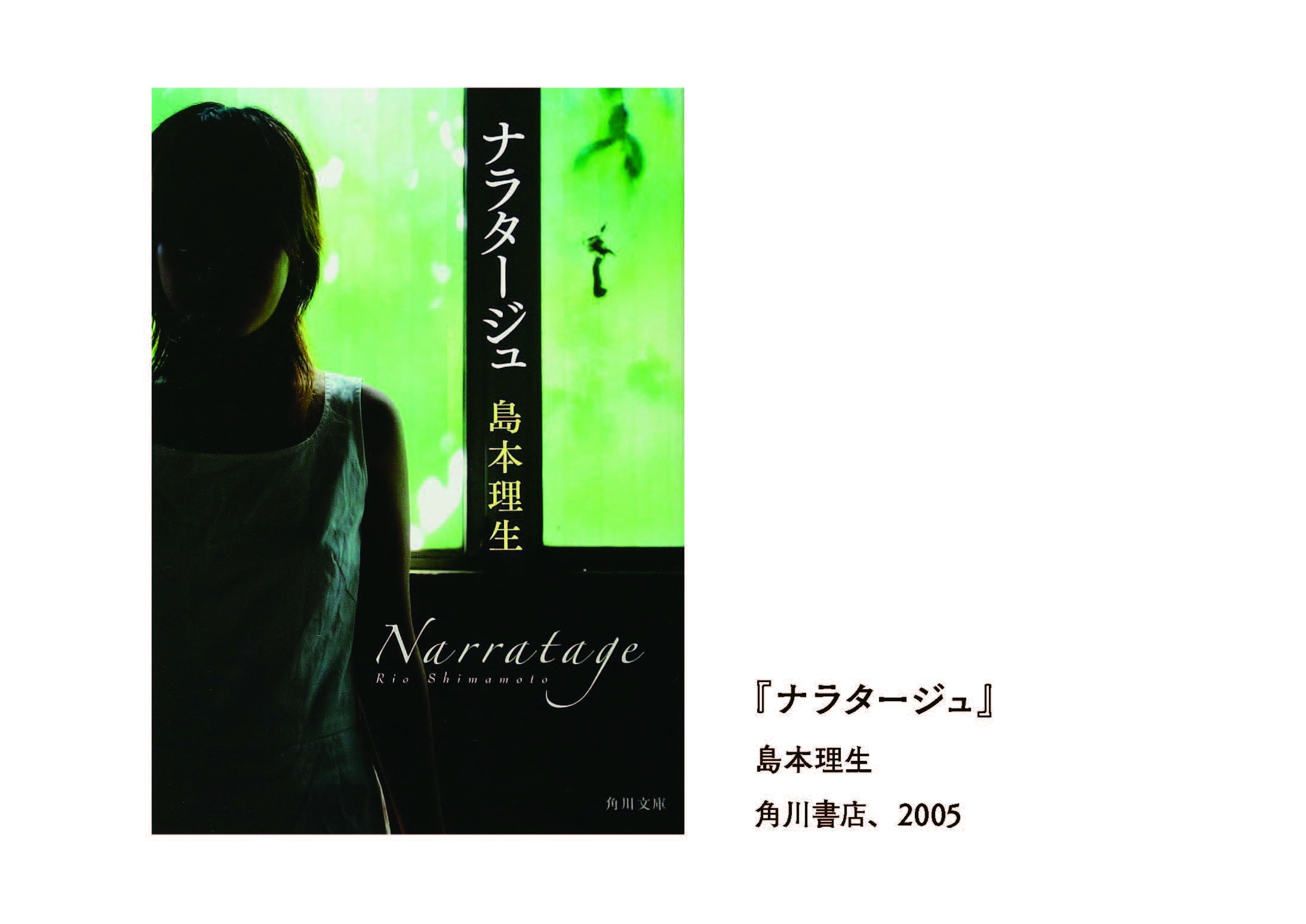
筑紫明朝を最初に「面白い書体だな」と思ったのは2005年出版の『ナラタージュ』でした。
キュッと上がっている「ジ」が印象的ですよね。もし別の書体を使っていたら、もっと平凡な装丁になっていたと思います。
2013年に『嫌われる勇気』が、そして昨年2016年に続編の『幸せになる勇気』が出版されて、それもすごく注目されましたよね。

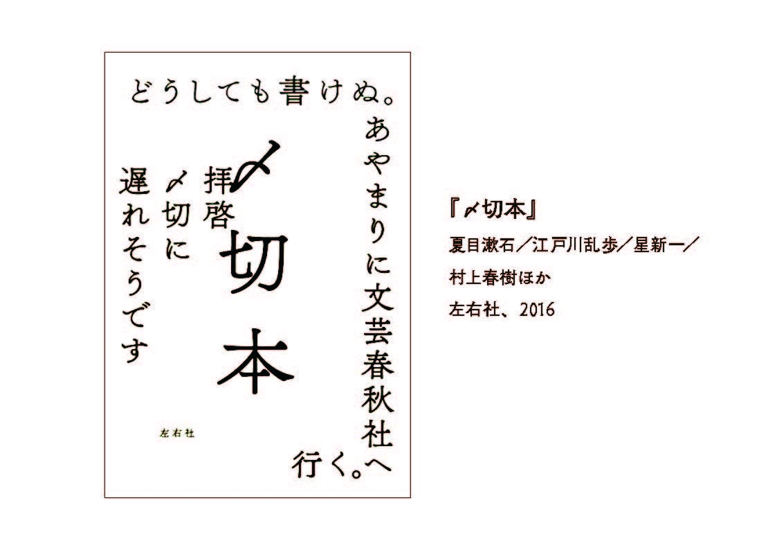
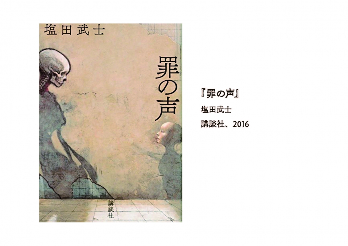
『〆切本』『琥珀の夢』『罪の声』と「筑紫アンティーク明朝」
正木
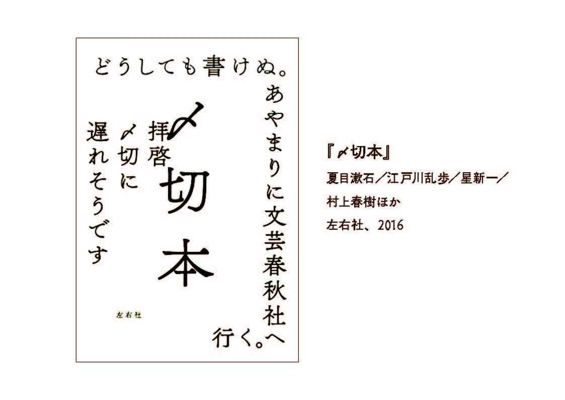
文字だけの装丁というのはいわば<書体ありき>だと思うのですが、2016年に出版された『〆切本』の装丁デザインも、書体なくしては成立しなかっただろうな、と思います。
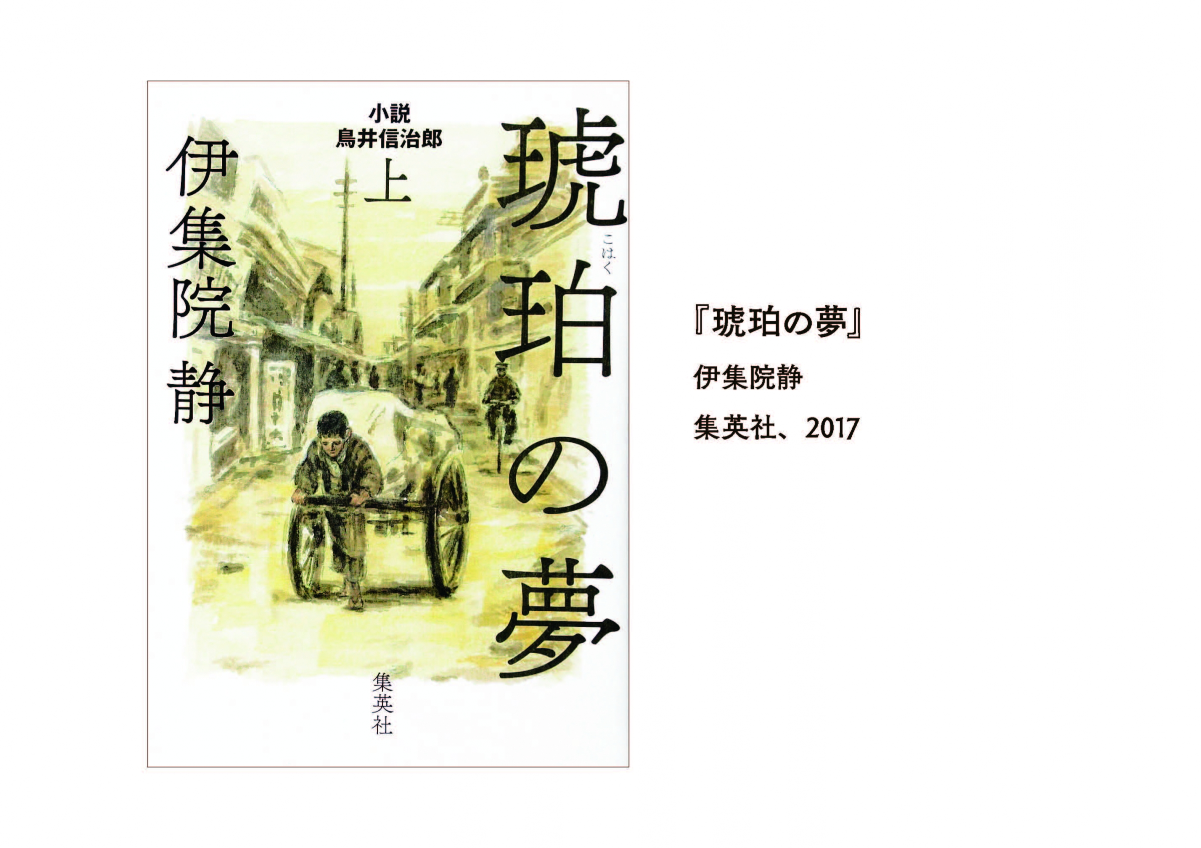
この本に使われている「筑紫アンティーク明朝」は最近すごく流行っていますね。同年刊行の『罪の声』や、今年出版された『琥珀の夢』でも使われています。

正木
この5年をふりかえってもそうですし、もっというと、この1年をみてもフォントワークスの書体がどんどんどんどん増えてますよね。
私が2013年に出版した『文字の食卓』で取り上げている写植書体は、普及するのに10年くらいかかったと言われています。一つの書体が伝播して、読者が見慣れるまでに10年かかる、と。
それがDTPの時代になって、1年も経たずに生活の中に馴染んでしまうような書体が次々に生まれてくるようになりましたね。
『六月の夜と昼のあわいに』『たとえる技術』『往復書簡 初恋と不倫』と「筑紫Aオールド明朝」
正木
「なんで筑紫書体がこんなにたくさん使われるんだろう」という疑問に対して、私なりに理由を考えてみたんですが、藤田さんの作られる漢字って、<ひらがな的>な抑揚をもっていますよね。
ひらがなにも抑揚があるんですが、漢字のデザインにも抑揚があることで、独特の雰囲気や一体感が醸し出されている、と感じます。
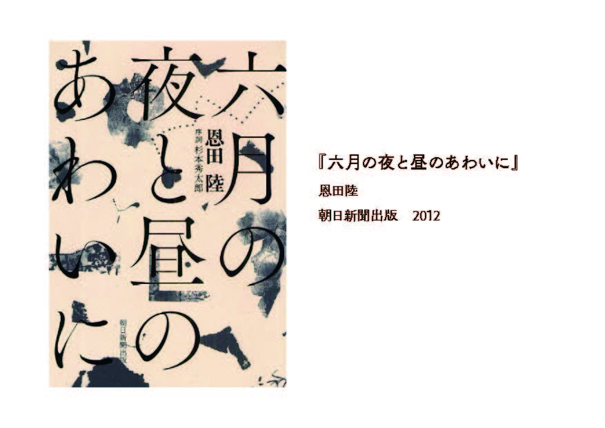
『六月の夜と昼のあわいに』も、そういった文字の特徴を生かしたデザインになっていると思います。
藤田
きっかけは「石井明朝」ですね。
若い頃は「本蘭明朝」とか、もっと<カシッ>としたような、現代的な明朝が綺麗だなと思っていました。
例えていうなら、東京のドライ感。アパート暮らしの隣の人と挨拶だけで済むみたいな(笑)そんな「本蘭明朝」が素敵だったんです。
「石井明朝」には情感が見えて、風習とか因習とかが多い「田舎」みたいで、あまり好きじゃなかった。
でも、30になると、変わるんです。そういった<情の深い>ものに引き込まれるわけですよ。
<奥行き>のある「石井明朝」にどんどんのめり込んで、「<情感>を表現できる明朝体を作りたい」と思うようになりました。
新人の頃は、写研で朝から晩までスタッフのひとりとして、先輩たちが考えた明朝体を手分けして作りました。
年数が経つにつれて、「僕だったらもっとこうしたい」という気持ちが生まれて、自分の理想像を形にしたら、「筑紫オールド明朝」という形になったんです。
最初からコンセプトのストックというものはないけれど、自分がシビれた「石井明朝」や、その大元になった「築地5号明朝」というものが、僕の根っこにあるんですよ。
だから僕は、「築地5号明朝」と「石井明朝」をよく見て、自分流に<なぞって>、「筑紫オールド明朝」にしました。でも同じじゃない。ちょっと別物になるんです。
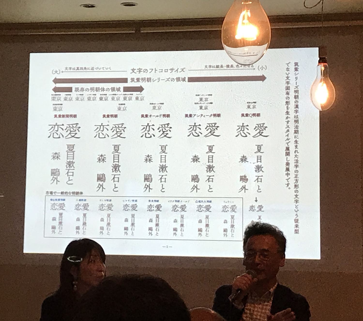
たとえば10人の方に文字を書かせるとみんながバラバラな文字を書くように、明朝体も10人が作れば10人バラバラになるし、10社が作れば10個の明朝体ができる。
単純にいうと「築地5号明朝」は<明治大正の美人の顔つき>で、石井明朝は<昭和美人の顔つき>。
そして、僕が作ると、<平成の、現代のお化粧をした女性の顔つきをしたかな>になるんです。
正木
「文字は時代を表すものだ」ってよく言われますよね。
本でも広告でもそうですけど、あるひとつの書体を「面白い」と感じる作り手がいて、世の中に広がっていくということは、それがどこかで<時代を表している>からだと思います。
時代の空気感というか、ニーズというか。そういうものをとらえる力が、書体デザイナーという仕事には必要なんですね。
藤田
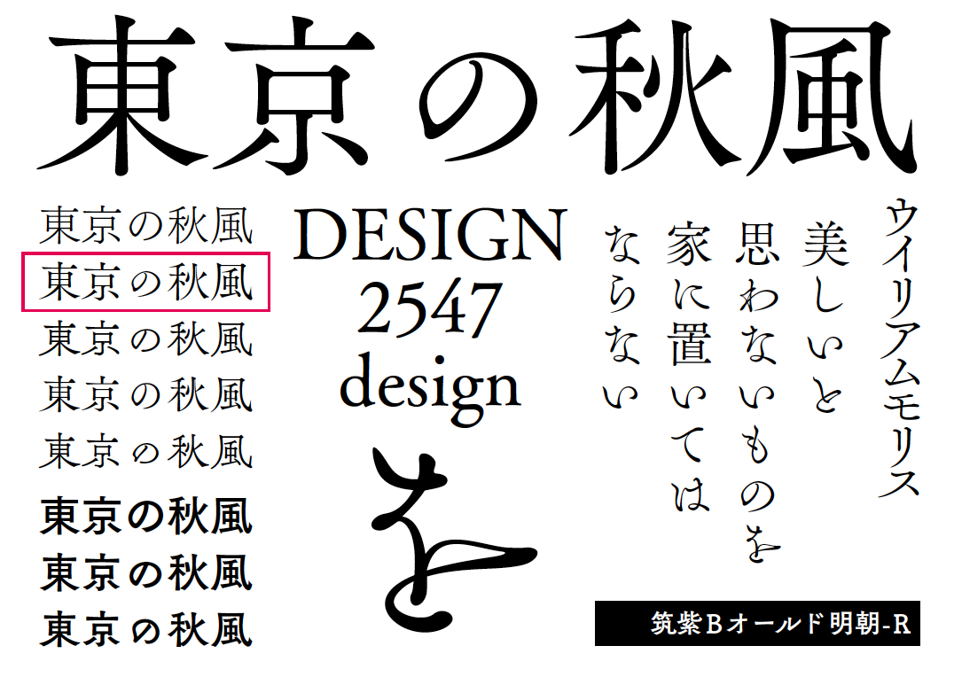
『六月の夜と昼のあわいに』をみていただくと、「月」の部分に<ハネ>の部分があるでしょ?
「筑紫書体」はみんな、二画目の<ハネ>の直前に、丸ゴシックのように1回カーブが入ってから跳ねさせています。だから柔らかい。
明朝体って、三角形の<ウロコ>とかいっぱいあるけど、とにかく「きっちり」していますよね。
いかに柔らかいところを多く作るか。それだけで、「筑紫」っていうのは今までの明朝体とは全然違うんです。
違うっていうところで、<異端>というハンコを押されているんですね。(笑)
正木
ちょっと面白い装丁を持って来ました。
『たとえる技術』っていう本なんですけど。『たとえる技術』の半分、「る技術」が鏡になっている文字です。
ついさっき見ていただいた『六月の夜と昼のあわいに』と同じ「筑紫オールド明朝」が使われているのですが、これもすごく柔らかいデザインになってます。
私、筑紫書体の中で一番好きな書体が「筑紫オールド明朝」かもしれません。この書体を読んでいると「高級なホテル」みたいなイメージが浮かぶんです。
高級なホテル、とくに、歴史があるクラシックなホテルに行くと、ふかふかした絨毯みたいな廊下があったりするじゃないですか。
そういう、「足元がふかふかしているところを歩いているような気持ち」で読む感じ。
ただ古いだけじゃない、古い洋館をリノベーションしたような、女子も好きな感じというか。
正木
『往復書簡 初恋と不倫』は、漢字がゴシック体で、明朝体と組み合わせているんですが、『初恋と不倫』の「と」の部分だけが「筑紫オールド明朝」で組まれているんですよね。
このふかふかした「と」が中にフワッと入ることによって、印象はこんなにも変わるものだなあ、と。
『スクラップ・アンド・ビルド』と「筑紫Bオールド明朝」

藤田
これは、筑紫オールド明朝の、かながBタイプなので、「筑紫Bオールド明朝」です。
正木
芥川賞を取ったこともあって、すごく有名になった装丁ですよね。
こうして題字として見ると「この書体しか考えられない!」という感じで、すごく作品にハマっているんですが、五十音字で並んでいるとかなり個性的。初めて書体見本を見た時は、やっぱりちょっと「えええっっ」て思いましたよね(笑)。
ものすごい迫力で。でもそう思ったのは私だけではなくて、これを作った時には結構みんなにびっくりされたんですよね?
藤田
はい。幸運なことに「筑紫明朝」を最初に出す時も、戸田ツトムさんという著名なグラフィックデザイナーさんに見ていただいて。
僕は、こういう装幀家さんにお会いして、いろんな意見を伺ったり、サンプルを持っていってお見せしたりすることが多いです。
「え、何これ!いつ出るの?」と、そう言わせたい。「次、どういうのを持っていけば相手に驚いてもらえるか」。「自分は、こういうのがあると絶対面白い」と。
それが両立すれば、「これはきっと商品化できる」と確信を持つ。
ここ10年くらい、その繰り返しから、どんどんどんどん「筑紫書体」というのが拡張されていった感じですね。

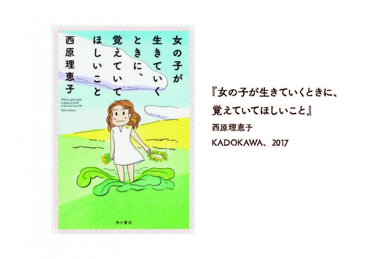
『女の子が生きていくときに、覚えていてほしいこと』と「筑紫A丸ゴシック」

藤田
雑誌『ku:nel』を作っている有山達也さんに「オールド明朝」のサンプルを見せにいったときの話ですが。
サンプルを見てもくれずに、資料をポンと横に置かれる、悔しいですよこれ。
そして一言。「丸ゴシックが欲しいんです」と。「今は石井丸ゴシックを使っているけれど、DTPのフォントには丸ゴシックがなくて困ってるんです」と。
「書体ってどのくらいでできるんですか?」
「最短で1年です」
「じゃあ来年の今日、お待ちしています」と、有山さんがハッキリ言うんですよ。
そこで金属活字の時代まで丸ゴシックをさかのぼってみたら、字面の大きさが石井丸ゴシックと同じだったんです。
ということは石井丸ゴシックも、金属活字から<なぞった>んだな、と。それなら僕はもっと<筑紫流>にして、この雰囲気で現代版を作ろうと思いました。
とりあえず2、3ヶ月後に、有山さんのところにサンプルを持って行ったら、今度は真剣に見てくださって、
「あとはゆっくりじっくり、いいものに仕上げてください」と。
その帰りに、祖父江さんとかいろんな有名な方にサンプルを見せると、「みんな待ってますよ、これ!」と絶賛してくださる。それで出したのが「筑紫A丸ゴシック」と「筑紫B丸ゴシック」。
これが自分でびっくりするくらい、世の中に一番ウケたんですよ。
だから自分で考え出したというよりは、お客さんの要望に応えて作った書体なんです。
藤田
このポソポソポソっとした感じ。これが必要だったんですよ。
昭和の中期くらいまではこれが標準だったんですよ。
ところが、昭和の後期からは「ナール(注 写研が1973年に発売した丸ゴシック体)」という、いわゆる正方形の中にパッツパツに入っている、そういうのが2000年過ぎまで主流になった。
デザイナーの中では「昔使っていた丸ゴシック、こっちのがどうしてないんですか?」っていう声がそろそろ出てきていた頃です。
正木
有山さんがおっしゃっていたという「石井丸ゴシック」は写植の書体なんですが、私も大好きで、『文字の食卓』の中では<こんぺいとうの文字>というタイトルで、登場しているんですね。
私もデザイナーさんとお話するとき、「写植書体では何が好きでした?」と聞いてみることが多いんですけど、
「石井丸ゴシックが好き」って言う方が結構多くて。そんな時に「筑紫丸ゴシック」が出たので、「ああ、出た!」と。
『ハリネズミの願い』と「筑紫オールドゴシック」

藤田
このゴシック体は、「筑紫オールドゴシック」。
自分が30の時に願った<夢>は、「筑紫オールド明朝」を作り上げたときに完成して、東京TDC賞もいただいて。
夢も叶って、「これからどうしよう」って思っていた矢先に、祖父江さんにちょっと顔を出す機会があって。
ちょうどこの頃、頭の中に何か<触れる>ものがあって。ある本を見て「金属活字かなあ、いいよねこれ」「そうだ、こういう感じで作ってみよう」と。
サンプルを作って祖父江さんのところに持っていって、「こういうのを考えたんですよ」。
すると祖父江さんが困ったように言うんです。「いや、いいのか悪いのか分からない」と。
祖父江さんに「3ヶ月後にもう一回見せてくれ」って言われて。3ヶ月後に見せたら、絶賛したんですよ。「いや、絶対いいよ、これは」。「これ、いつ出るの?いい!」と。
ここからですね、「筑紫アンティーク」とか「筑紫ヴィンテージ」とか、その後の書体の発展の起点となった、自分にとって記念すべき書体なんです。
これがなかったら、その後の筑紫がどうなったか分からない。ここから、<フトコロ>をクッと絞って、<ハライ>をスッと伸ばすというこの方向で、
「もっと明朝・ゴシックが面白くなるんじゃないか」って思えた、最初の書体なんです。
正木
そうだったんですね。確かに、<筑紫らしさ>がすごく集約されている気がします。
藤田
「これからの筑紫はこれで運命が決まる」くらいの思いがあったけど、でもこれは冒険でもあったんですよね。
四角の中にパッツパッツなゴシック体でタイトルがデザインされた装丁が多い時代に、「こんなに小さくでしか出ないのかよ」ってなる可能性がある。自分のゴシックは、ゴシックを明朝的に書いちゃう、作っちゃうんですよ。それが、使う人にとっては「ウッ」って(笑)「明朝みたいなことをしてる」って。
あえてそういうものを使おうとするときはいいんだけど、普通のゴシックみたいにポンと<パンチ>を効かせたい時には、ちょっと優しさが強い。「男性が欲しいところに女性を入れられる」みたいなね、そういうところがあるんですよ。筑紫ゴシックにはね。
正木
「漢字をひらがな的に作る」し、「ゴシックを明朝的に作る」。なんで藤田さんが<異端の人>と言われるのか。ただ変わった文字を作る人ではなくて、今までにない方法論で作っていらっしゃるというのが理由なんだと。
藤田さんが作ったから、やっと伝えられるようになった感覚、フォントがなければ伝えられないものがあって。それを感じとることができたら、本屋さんに行くのがもっと面白いし、本を読むのもすっごく楽しくなりますよね。
書体の名前を覚える必要はなくて、「あ、これ、この間見かけた<鳥>と違う<鳥>だ」って気づくことが大切なのかなと思います。
BOOKUOKAが開催する「書店員ナイトin福岡拡大版「書体(=フォント)に恋して」」(11/3開催)で、エッセイ『文字の食卓』(本の雑誌社)が話題となった正木香子さまとフォントワークスの書体デザイナー藤田重信とのトークセッションの内容をコラムにいたしました。
筑紫書体をベースに、書体にまつわる素敵なお話をしていただいています。ぜひ、ご覧ください。
 正木香子 氏
正木 香子氏
文筆家、「文字の食卓」主宰、レタリング技能検定中央試験委員。幼いころから活字や写植の書体に魅せられ、〈滋味豊かな書体〉をテーマに各紙誌エッセイを発表している。著書に『文字の食卓』(本の雑誌社)、『本を読む人のための書体入門』(星海社新書)、『文字と楽園 精興社書体であじわう現代文学』(本の雑誌社) など。福岡県出身。
藤田 重信
福岡 筑紫野の出身。筑陽学園デザイン科を卒業し、株式会社写研に入社。二十数年間朝から晩まで文字デザインを行う。1998年、フォントワークスに移籍し、筑紫書体を次々と開発し続ける。<明朝体の歴史>を変えることが野望の60歳。
 フォントワークス 書体デザイナー 藤田重信

正木
最近、漢字研究で有名な笹原宏之先生に教わったんですが、すごくわかりやすいと思ったので紹介します。
今、この会場にいるみなさんに「鳥」という漢字を書いてくださいと言ったら、きっと全員書くことができると思います。
ね、頭の中に思い浮かべてみてください。
でも、みんなの頭の中で浮かんでいるそれは、<書体>ではなく<字体>なんですね。
私はそのお話を聞いて、文字のイメージに<差が生まれる>部分、たとえば「鮮やかな色の羽だな」とか、「首がちょっと長いな」「くちばしが綺麗だな」とか、そういうふうに感じさせてくれるものが<書体>だなと思ったんですが、この考え方で言うと、こちらにいらっしゃる藤田さんは、ものすごーく変わった「鳥」を作るデザイナーなんです(笑)
今日は、私が選ばせていただいた、いくつかの本の装丁を見ながら、藤田さんが作られた書体のお話を伺っていきます。
みなさんが筑紫書体を見分けられるようになって、筑紫書体は、どんな鳥だろう? というイメージが、湧くようになるといいなあ、と思っています。
筑紫書体、事例をまじえて 『ナラタージュ』『嫌われる勇気』『幸せになる勇気』と筑紫明朝

藤田
僕は1998年にフォントワークスに来て、とにかく明朝体が作りたかったんです。
ルーティン作業の合間にコツコツと5年程度かけて制作し、2004年にリリースした書体が、「筑紫明朝」です。
正木
筑紫明朝を最初に「面白い書体だな」と思ったのは2005年出版の『ナラタージュ』でした。
キュッと上がっている「ジ」が印象的ですよね。もし別の書体を使っていたら、もっと平凡な装丁になっていたと思います。
2013年に『嫌われる勇気』が、そして昨年2016年に続編の『幸せになる勇気』が出版されて、それもすごく注目されましたよね。

 『〆切本』『琥珀の夢』『罪の声』と「筑紫アンティーク明朝」
正木
文字だけの装丁というのはいわば<書体ありき>だと思うのですが、2016年に出版された『〆切本』の装丁デザインも、書体なくしては成立しなかっただろうな、と思います。
この本に使われている「筑紫アンティーク明朝」は最近すごく流行っていますね。同年刊行の『罪の声』や、今年出版された『琥珀の夢』でも使われています。

正木
この5年をふりかえってもそうですし、もっというと、この1年をみてもフォントワークスの書体がどんどんどんどん増えてますよね。
私が2013年に出版した『文字の食卓』で取り上げている写植書体は、普及するのに10年くらいかかったと言われています。一つの書体が伝播して、読者が見慣れるまでに10年かかる、と。
それがDTPの時代になって、1年も経たずに生活の中に馴染んでしまうような書体が次々に生まれてくるようになりましたね。
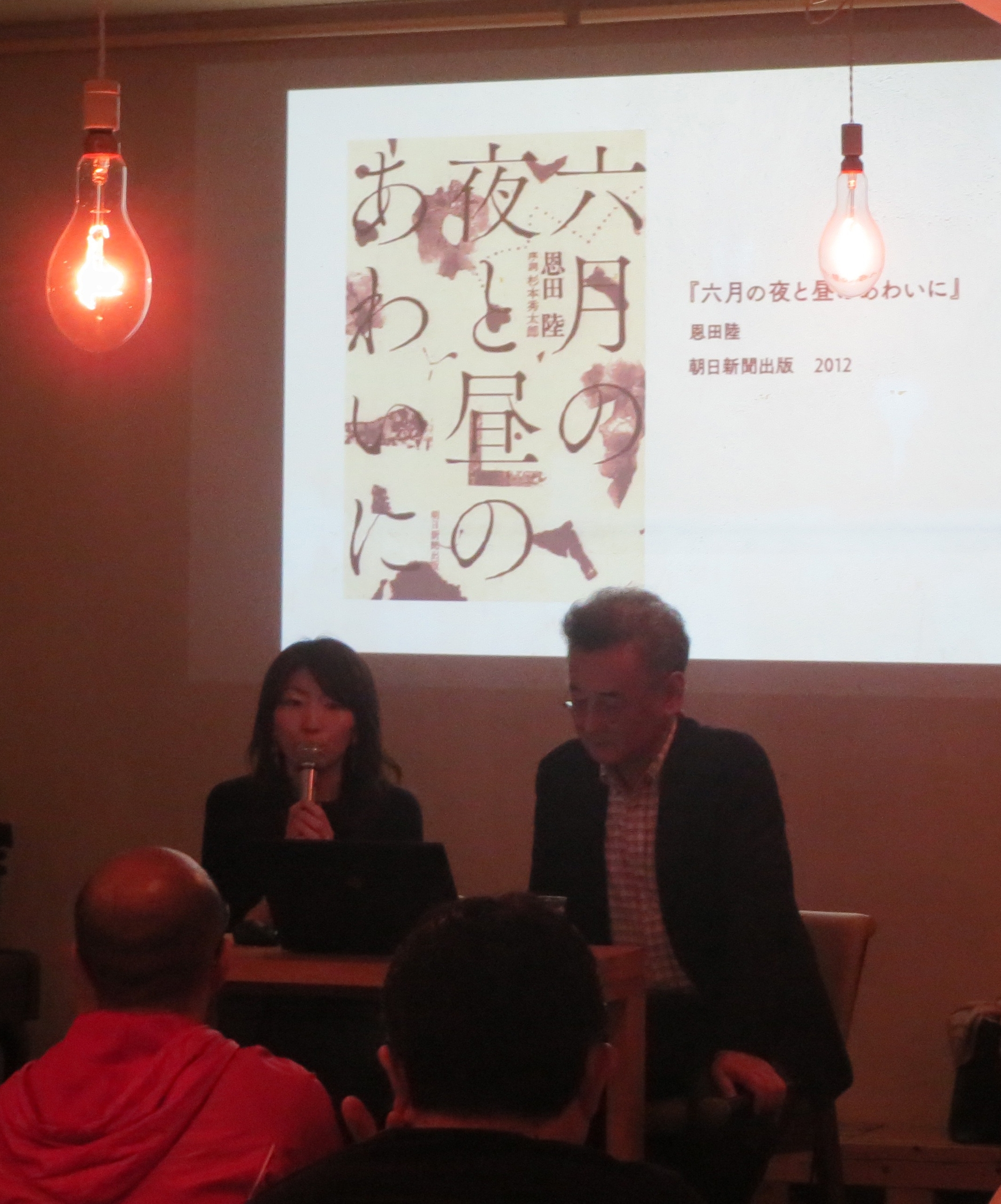
『六月の夜と昼のあわいに』『たとえる技術』『往復書簡 初恋と不倫』と「筑紫Aオールド明朝」
正木
「なんで筑紫書体がこんなにたくさん使われるんだろう」という疑問に対して、私なりに理由を考えてみたんですが、藤田さんの作られる漢字って、<ひらがな的>な抑揚をもっていますよね。
ひらがなにも抑揚があるんですが、漢字のデザインにも抑揚があることで、独特の雰囲気や一体感が醸し出されている、と感じます。
『六月の夜と昼のあわいに』も、そういった文字の特徴を生かしたデザインになっていると思います。
藤田
きっかけは「石井明朝」ですね。
若い頃は「本蘭明朝」とか、もっと<カシッ>としたような、現代的な明朝が綺麗だなと思っていました。
例えていうなら、東京のドライ感。アパート暮らしの隣の人と挨拶だけで済むみたいな(笑)そんな「本蘭明朝」が素敵だったんです。
「石井明朝」には情感が見えて、風習とか因習とかが多い「田舎」みたいで、あまり好きじゃなかった。
でも、30になると、変わるんです。そういった<情の深い>ものに引き込まれるわけですよ。
<奥行き>のある「石井明朝」にどんどんのめり込んで、「<情感>を表現できる明朝体を作りたい」と思うようになりました。

新人の頃は、写研で朝から晩までスタッフのひとりとして、先輩たちが考えた明朝体を手分けして作りました。
年数が経つにつれて、「僕だったらもっとこうしたい」という気持ちが生まれて、自分の理想像を形にしたら、「筑紫オールド明朝」という形になったんです。
最初からコンセプトのストックというものはないけれど、自分がシビれた「石井明朝」や、その大元になった「築地5号明朝」というものが、僕の根っこにあるんですよ。
だから僕は、「築地5号明朝」と「石井明朝」をよく見て、自分流に<なぞって>、「筑紫オールド明朝」にしました。でも同じじゃない。ちょっと別物になるんです。
たとえば10人の方に文字を書かせるとみんながバラバラな文字を書くように、明朝体も10人が作れば10人バラバラになるし、10社が作れば10個の明朝体ができる。
単純にいうと「築地5号明朝」は<明治大正の美人の顔つき>で、石井明朝は<昭和美人の顔つき>。
そして、僕が作ると、<平成の、現代のお化粧をした女性の顔つきをしたかな>になるんです。
正木
「文字は時代を表すものだ」ってよく言われますよね。
本でも広告でもそうですけど、あるひとつの書体を「面白い」と感じる作り手がいて、世の中に広がっていくということは、それがどこかで<時代を表している>からだと思います。
時代の空気感というか、ニーズというか。そういうものをとらえる力が、書体デザイナーという仕事には必要なんですね。
藤田
『六月の夜と昼のあわいに』をみていただくと、「月」の部分に<ハネ>の部分があるでしょ?
「筑紫書体」はみんな、二画目の<ハネ>の直前に、丸ゴシックのように1回カーブが入ってから跳ねさせています。だから柔らかい。
明朝体って、三角形の<ウロコ>とかいっぱいあるけど、とにかく「きっちり」していますよね。
いかに柔らかいところを多く作るか。それだけで、「筑紫」っていうのは今までの明朝体とは全然違うんです。
違うっていうところで、<異端>というハンコを押されているんですね。(笑)

正木
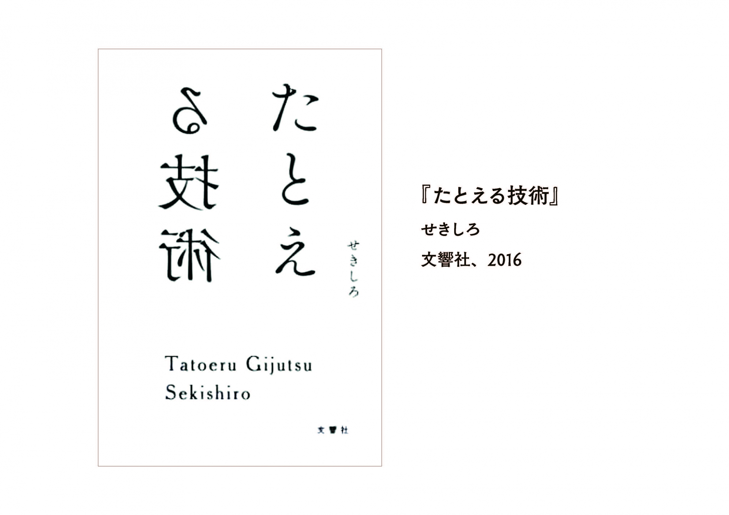
ちょっと面白い装丁を持って来ました。
『たとえる技術』っていう本なんですけど。『たとえる技術』の半分、「る技術」が鏡になっている文字です。
ついさっき見ていただいた『六月の夜と昼のあわいに』と同じ「筑紫オールド明朝」が使われているのですが、これもすごく柔らかいデザインになってます。
私、筑紫書体の中で一番好きな書体が「筑紫オールド明朝」かもしれません。この書体を読んでいると「高級なホテル」みたいなイメージが浮かぶんです。
高級なホテル、とくに、歴史があるクラシックなホテルに行くと、ふかふかした絨毯みたいな廊下があったりするじゃないですか。
そういう、「足元がふかふかしているところを歩いているような気持ち」で読む感じ。
ただ古いだけじゃない、古い洋館をリノベーションしたような、女子も好きな感じというか。

正木
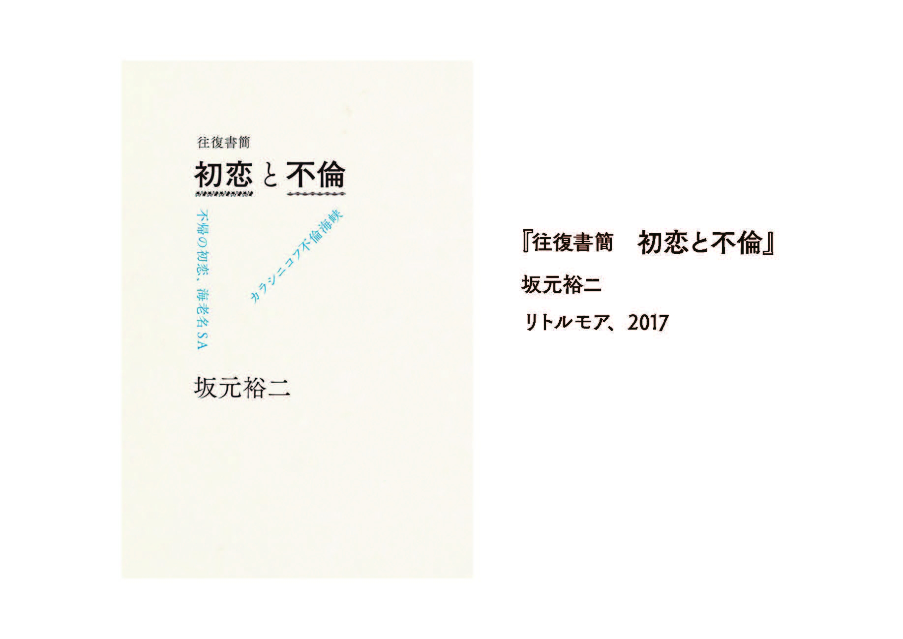
『往復書簡 初恋と不倫』は、漢字がゴシック体で、明朝体と組み合わせているんですが、『初恋と不倫』の「と」の部分だけが「筑紫オールド明朝」で組まれているんですよね。
このふかふかした「と」が中にフワッと入ることによって、印象はこんなにも変わるものだなあ、と。
『スクラップ・アンド・ビルド』と「筑紫Bオールド明朝」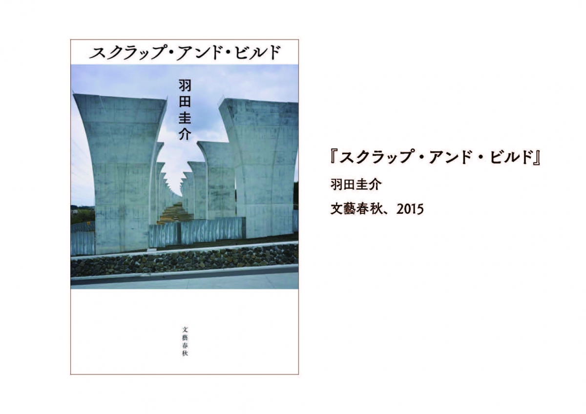
藤田
これは、筑紫オールド明朝の、かながBタイプなので、「筑紫Bオールド明朝」です。
正木
芥川賞を取ったこともあって、すごく有名になった装丁ですよね。
こうして題字として見ると「この書体しか考えられない!」という感じで、すごく作品にハマっているんですが、五十音字で並んでいるとかなり個性的。初めて書体見本を見た時は、やっぱりちょっと「えええっっ」て思いましたよね(笑)。
ものすごい迫力で。でもそう思ったのは私だけではなくて、これを作った時には結構みんなにびっくりされたんですよね?
藤田
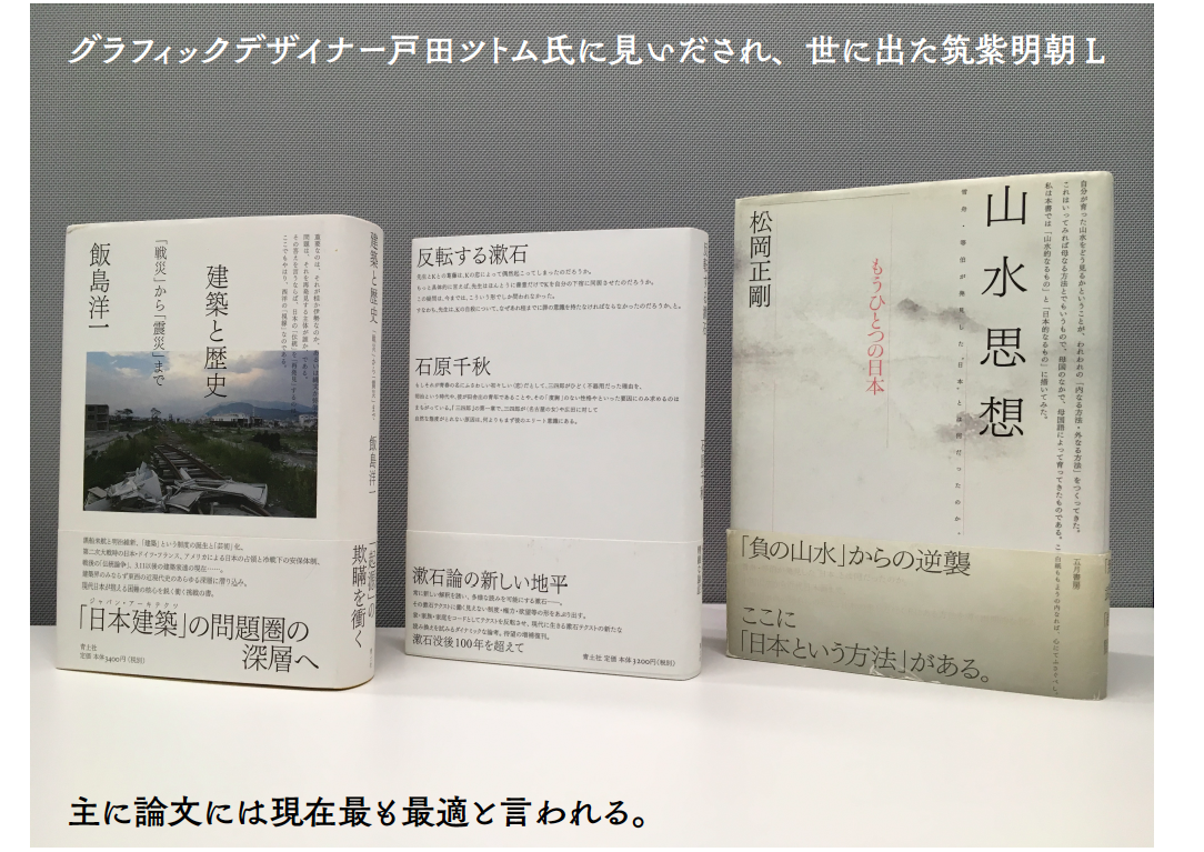
はい。幸運なことに「筑紫明朝」を最初に出す時も、戸田ツトムさんという著名なグラフィックデザイナーさんに見ていただいて。
僕は、こういう装幀家さんにお会いして、いろんな意見を伺ったり、サンプルを持っていってお見せしたりすることが多いです。
「え、何これ!いつ出るの?」と、そう言わせたい。「次、どういうのを持っていけば相手に驚いてもらえるか」。「自分は、こういうのがあると絶対面白い」と。
それが両立すれば、「これはきっと商品化できる」と確信を持つ。
ここ10年くらい、その繰り返しから、どんどんどんどん「筑紫書体」というのが拡張されていった感じですね。
 『女の子が生きていくときに、覚えていてほしいこと』と「筑紫A丸ゴシック」
藤田
雑誌『ku:nel』を作っている有山達也さんに「オールド明朝」のサンプルを見せにいったときの話ですが。
サンプルを見てもくれずに、資料をポンと横に置かれる、悔しいですよこれ。
そして一言。「丸ゴシックが欲しいんです」と。「今は石井丸ゴシックを使っているけれど、DTPのフォントには丸ゴシックがなくて困ってるんです」と。
「書体ってどのくらいでできるんですか?」
「最短で1年です」
「じゃあ来年の今日、お待ちしています」と、有山さんがハッキリ言うんですよ。
そこで金属活字の時代まで丸ゴシックをさかのぼってみたら、字面の大きさが石井丸ゴシックと同じだったんです。
ということは石井丸ゴシックも、金属活字から<なぞった>んだな、と。それなら僕はもっと<筑紫流>にして、この雰囲気で現代版を作ろうと思いました。
とりあえず2、3ヶ月後に、有山さんのところにサンプルを持って行ったら、今度は真剣に見てくださって、
「あとはゆっくりじっくり、いいものに仕上げてください」と。
その帰りに、祖父江さんとかいろんな有名な方にサンプルを見せると、「みんな待ってますよ、これ!」と絶賛してくださる。それで出したのが「筑紫A丸ゴシック」と「筑紫B丸ゴシック」。
これが自分でびっくりするくらい、世の中に一番ウケたんですよ。
だから自分で考え出したというよりは、お客さんの要望に応えて作った書体なんです。

藤田
このポソポソポソっとした感じ。これが必要だったんですよ。
昭和の中期くらいまではこれが標準だったんですよ。
ところが、昭和の後期からは「ナール(注 写研が1973年に発売した丸ゴシック体)」という、いわゆる正方形の中にパッツパツに入っている、そういうのが2000年過ぎまで主流になった。
デザイナーの中では「昔使っていた丸ゴシック、こっちのがどうしてないんですか?」っていう声がそろそろ出てきていた頃です。
正木
有山さんがおっしゃっていたという「石井丸ゴシック」は写植の書体なんですが、私も大好きで、『文字の食卓』の中では<こんぺいとうの文字>というタイトルで、登場しているんですね。
私もデザイナーさんとお話するとき、「写植書体では何が好きでした?」と聞いてみることが多いんですけど、
「石井丸ゴシックが好き」って言う方が結構多くて。そんな時に「筑紫丸ゴシック」が出たので、「ああ、出た!」と。
『ハリネズミの願い』と「筑紫オールドゴシック」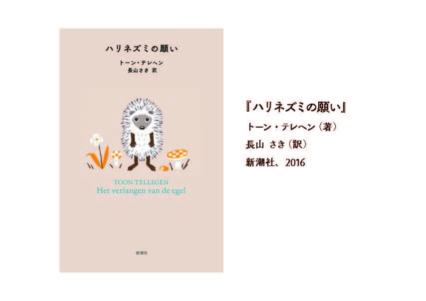
藤田
このゴシック体は、「筑紫オールドゴシック」。
自分が30の時に願った<夢>は、「筑紫オールド明朝」を作り上げたときに完成して、東京TDC賞もいただいて。
夢も叶って、「これからどうしよう」って思っていた矢先に、祖父江さんにちょっと顔を出す機会があって。
ちょうどこの頃、頭の中に何か<触れる>ものがあって。ある本を見て「金属活字かなあ、いいよねこれ」「そうだ、こういう感じで作ってみよう」と。
サンプルを作って祖父江さんのところに持っていって、「こういうのを考えたんですよ」。
すると祖父江さんが困ったように言うんです。「いや、いいのか悪いのか分からない」と。
祖父江さんに「3ヶ月後にもう一回見せてくれ」って言われて。3ヶ月後に見せたら、絶賛したんですよ。「いや、絶対いいよ、これは」。「これ、いつ出るの?いい!」と。
ここからですね、「筑紫アンティーク」とか「筑紫ヴィンテージ」とか、その後の書体の発展の起点となった、自分にとって記念すべき書体なんです。
これがなかったら、その後の筑紫がどうなったか分からない。ここから、<フトコロ>をクッと絞って、<ハライ>をスッと伸ばすというこの方向で、
「もっと明朝・ゴシックが面白くなるんじゃないか」って思えた、最初の書体なんです。
正木
そうだったんですね。確かに、<筑紫らしさ>がすごく集約されている気がします。
藤田
「これからの筑紫はこれで運命が決まる」くらいの思いがあったけど、でもこれは冒険でもあったんですよね。
四角の中にパッツパッツなゴシック体でタイトルがデザインされた装丁が多い時代に、「こんなに小さくでしか出ないのかよ」ってなる可能性がある。自分のゴシックは、ゴシックを明朝的に書いちゃう、作っちゃうんですよ。それが、使う人にとっては「ウッ」って(笑)「明朝みたいなことをしてる」って。
あえてそういうものを使おうとするときはいいんだけど、普通のゴシックみたいにポンと<パンチ>を効かせたい時には、ちょっと優しさが強い。「男性が欲しいところに女性を入れられる」みたいなね、そういうところがあるんですよ。筑紫ゴシックにはね。
正木
「漢字をひらがな的に作る」し、「ゴシックを明朝的に作る」。なんで藤田さんが<異端の人>と言われるのか。ただ変わった文字を作る人ではなくて、今までにない方法論で作っていらっしゃるというのが理由なんだと。
藤田さんが作ったから、やっと伝えられるようになった感覚、フォントがなければ伝えられないものがあって。それを感じとることができたら、本屋さんに行くのがもっと面白いし、本を読むのもすっごく楽しくなりますよね。
書体の名前を覚える必要はなくて、「あ、これ、この間見かけた<鳥>と違う<鳥>だ」って気づくことが大切なのかなと思います。
一覧へ戻る