<<月刊MdN 2017年10月号連動企画>>
月刊MdN 2017年10月号に掲載した、フォントあてクイズ(「問題編」)の解答編です。
また、今話題の「絶対フォント感」を身につけていただくための読み物もご用意しました。
ぜひお楽しみください。
<目次>
1.MdN10月号 問題編の解答
2.絶対フォント感を身につけましょう
▼第1弾:勉強編〜明朝体について学ぼう
▼第2弾:実践編〜実際に書体を比べてみよう
▼第3弾:発展編〜クイズにチャレンジ
3.8/22リリースの「筑紫Q明朝」をご紹介
「月刊MdN」2017年9月6日売号 フォントワークス広告 解答編
まずは、月刊MdN 2017年10月号の広告「問題編」の解答からお届けします。
MdNをご覧になられていない方は、この解答編をご覧になる前に、問題編をお試しくださいね!
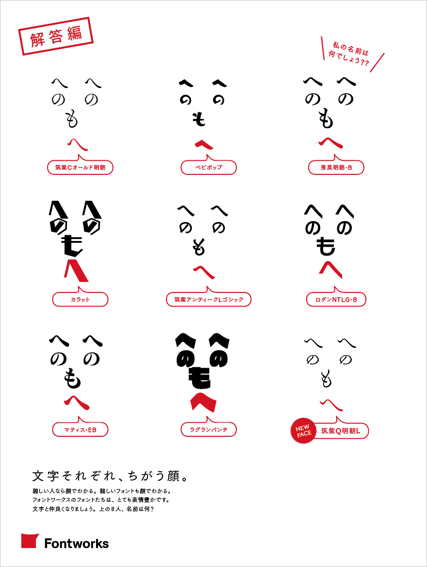
皆様は、9問中、いくつ正解できましたか?
次章の最後には「発展編」として別の問題も用意していますので、そちらにもチャレンジしてみてください!
続いては、勉強編として、<明朝体>の特性や見分け方などをご紹介します。
皆様の「絶対フォント感」をスキルアップさせてくださいね!!
絶対フォント感を身につけましょう 第1弾:勉強編〜「明朝体」について学ぼう
1.明朝体とは?
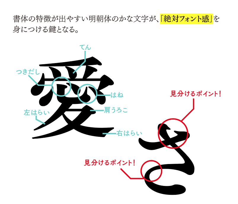
木版印刷や活字における印刷用書体として成立したもので、日本語には明治時代の初期頃にもたらされた。明朝体は、書体のなかでもオーソドックスで、一番使用頻度が高い書体。
字形は、縦画と横画はそれぞれ垂直・平行で、縦画が太く、横画が細く、「てん」や「はらい」、「ウロコ」などの構成要素には、筆で書いた時のような抑揚が特徴的な書体。
明朝体を見分ける場合は、漢字よりも、「かな」の方が特徴的な部分が多く、見分けやすい。
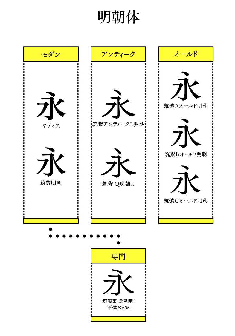
2.フォントワークスの明朝体(一部)
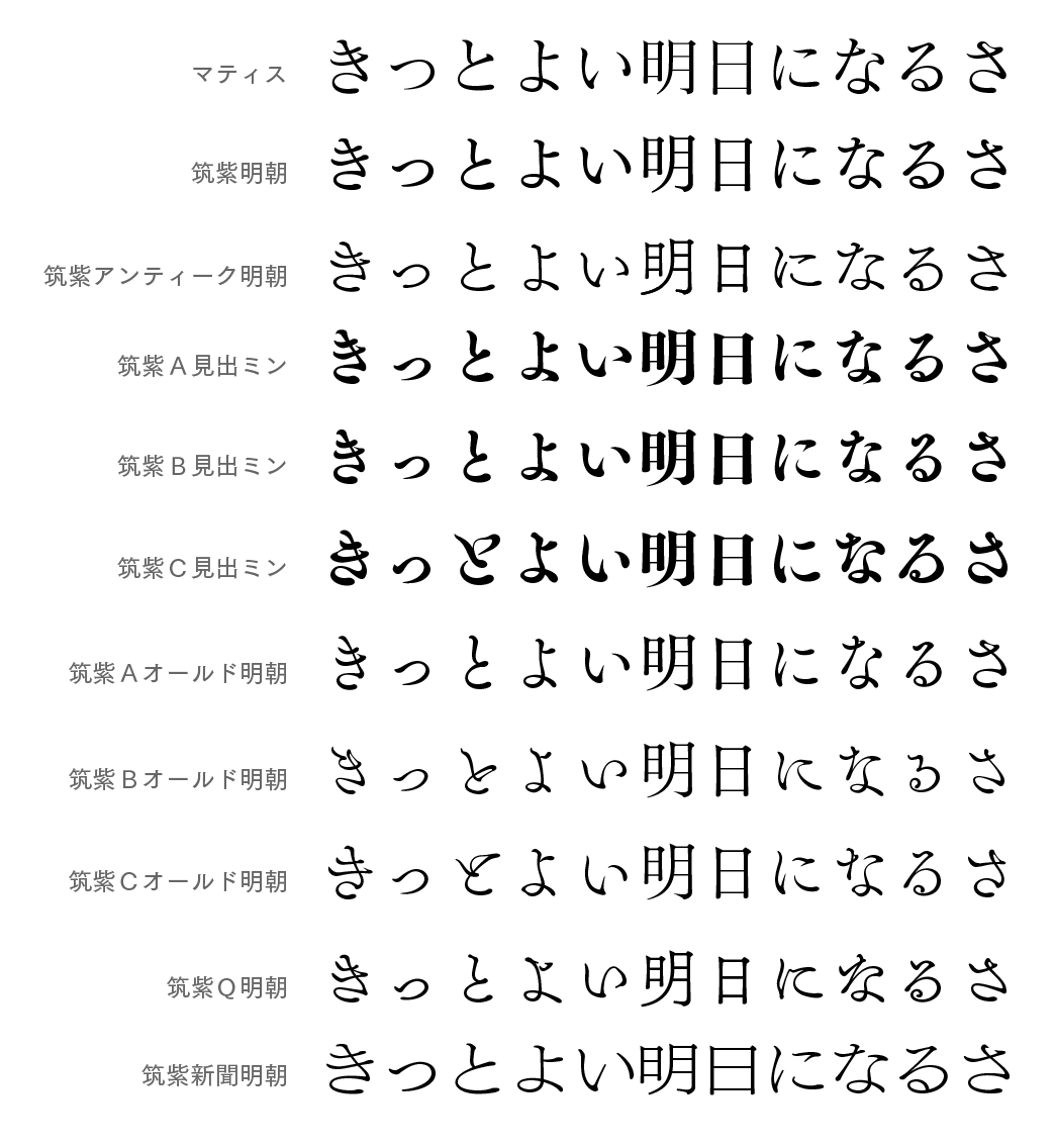
▲フォントワークスの明朝体の一覧(一部)です。
フォントワークスの明朝体は、大きく<モダン><アンティーク><オールド><専門>に分かれており、分類すると下図のように分類されます。
フォントワークスの、特に筑紫書体シリーズの明朝体は、金属活字の味わいを残した作りにしており、文字固有の形をいかしたデザインにしています。
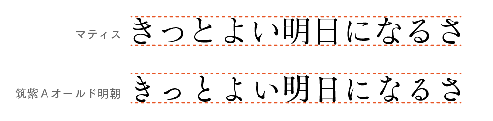
上図を見ていただくと、マティスのように、漢字と「かな」が一直線に並んでいる書体もあれば、筑紫書体シリーズの明朝体は、漢字と「かな」のバランスに違いをもたせ、長文などに適した読みやすいデザインにしています。
絶対フォント感を身につけましょう 第2弾:実践編〜実際に文字を比べてみよう
ここからは、実践編として、書体を見分けるときのポイントとなる部分をいくつかご紹介します!
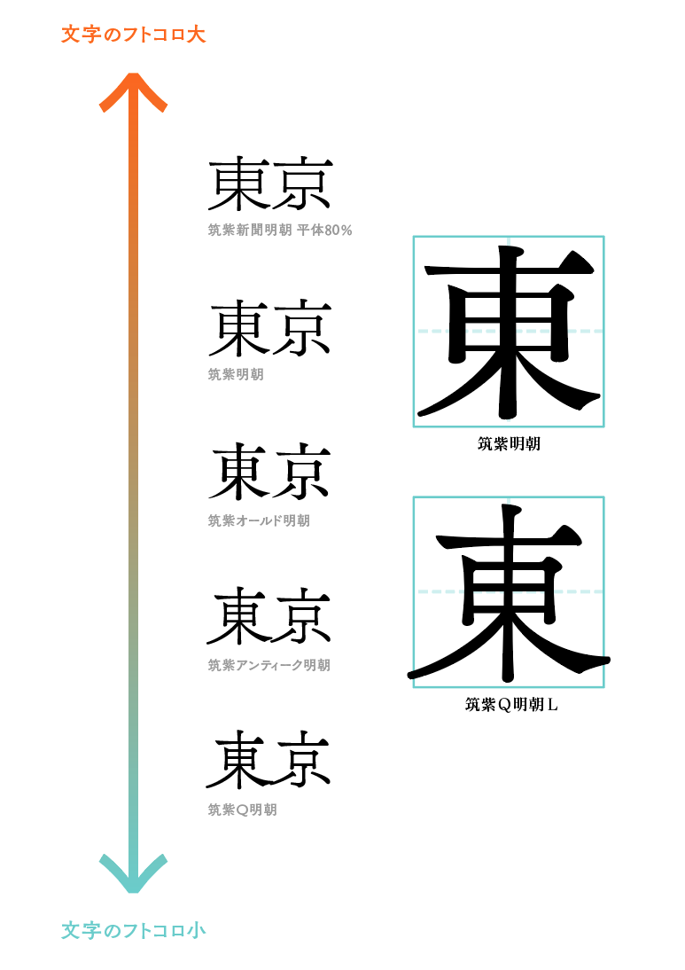
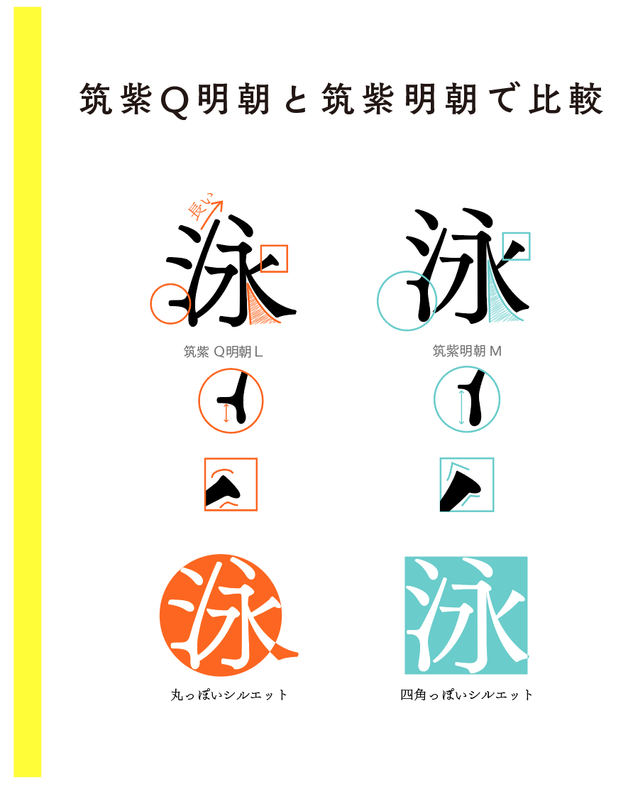
1.「フトコロ」
まずは、フトコロです。
フトコロとは、文字の内側にできている空間のことです。筑紫書体シリーズの明朝体は、フトコロをぐっと絞ったデザインになっている書体が多いですが、中でも筑紫Q明朝は、さらにタイトにフトコロをしぼった作りになっています。
2.「ひらがな」
書体(特に明朝体)を見分ける時に一番ポイントとなるのが、「かな」です。
日本語の文章は、「かな」の使用率が70パーセントを超えます。また、特に明朝体では、漢字にあまり違いが出づらいことから、「かな」のほうが見分けやすいといえます。
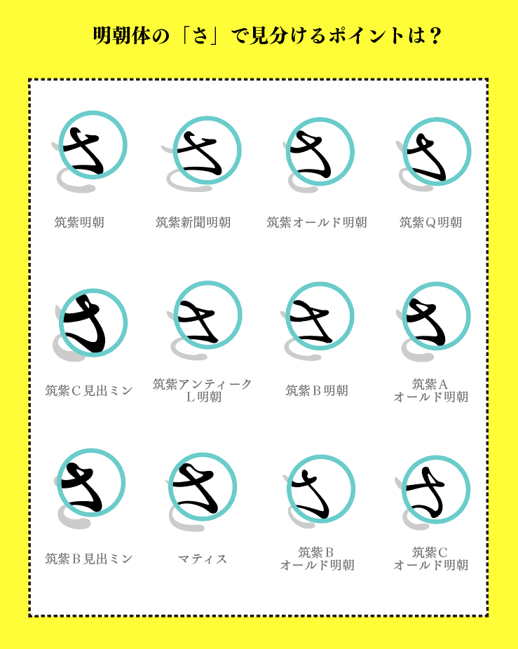
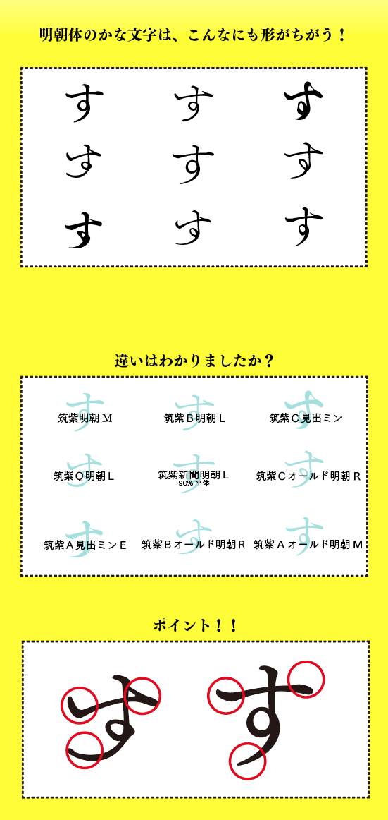
特徴が出やすい文字として、「さ」「す」「な」「か」などがあり、この文字を見つけて特徴をよく見ると、書体を見分けやすいのです。
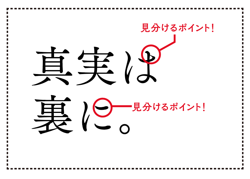
上記にあげた違いの出やすい文字である、「さ」。
例えばこの「さ」を並べ、丸で囲まれた部分に着目してください。
同じ「さ」という文字でも、反っていたりまるくなっていたり、繋がっていたり前のめりだったり、と書体によってそれぞれの個性が出ています。
下の「す」も比べてみてください。
3.漢字とかなの組み
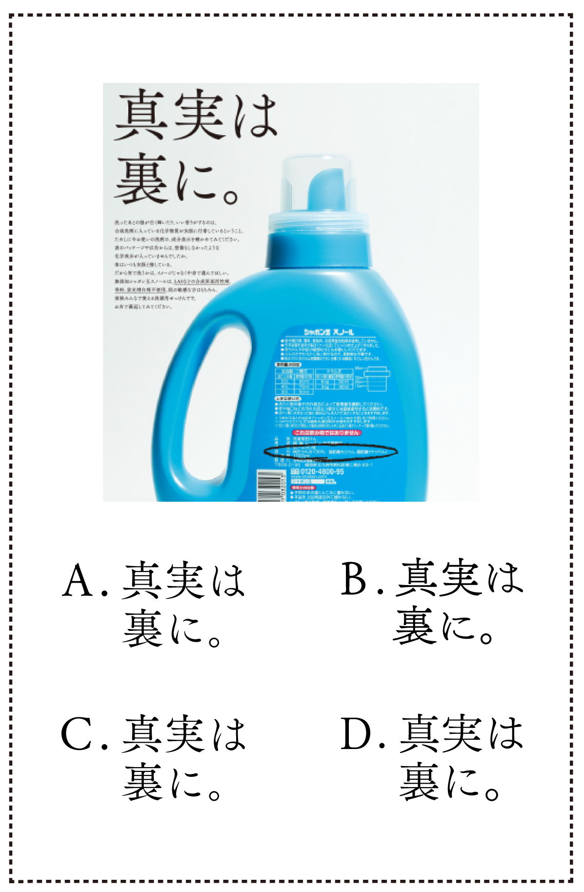
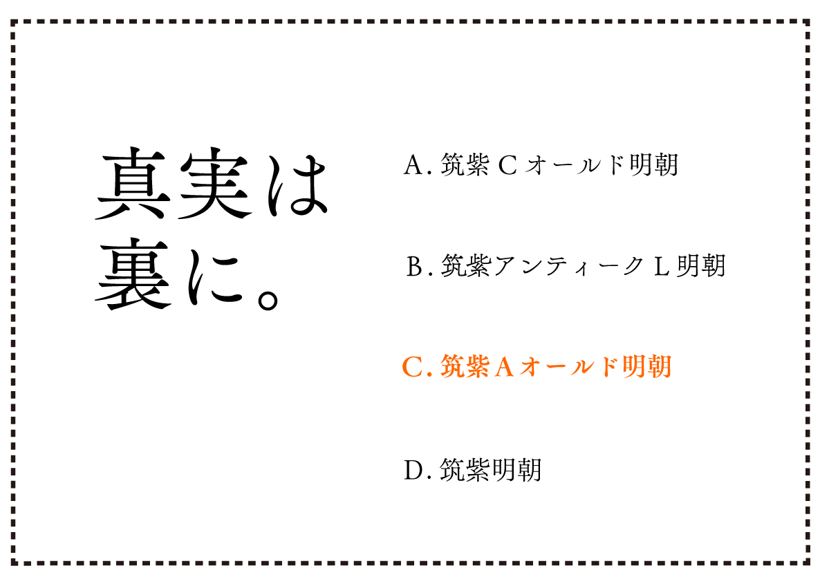
画像左上にある「真実は裏に。」は、A〜Dの中のどれと一緒でしょう?
ポイントは、漢字のフトコロの広さと、「かな」の筆運びですね!
では、さらに難しい問題ですが。。。
上のA〜Dの書体名は何でしょうか?
(ヒント:下の中からそれぞれ選択してください。)
筑紫明朝/筑紫Aオールド明朝/筑紫Cオールド明朝/筑紫アンティークL明朝
絶対フォント感を身につけましょう 第3弾:発展編〜クイズにチャレンジ
物足りない方へ、さらに問題をご用意しました!
ぜひ、チャレンジしてくださいね!
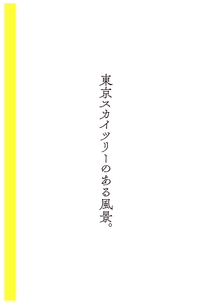
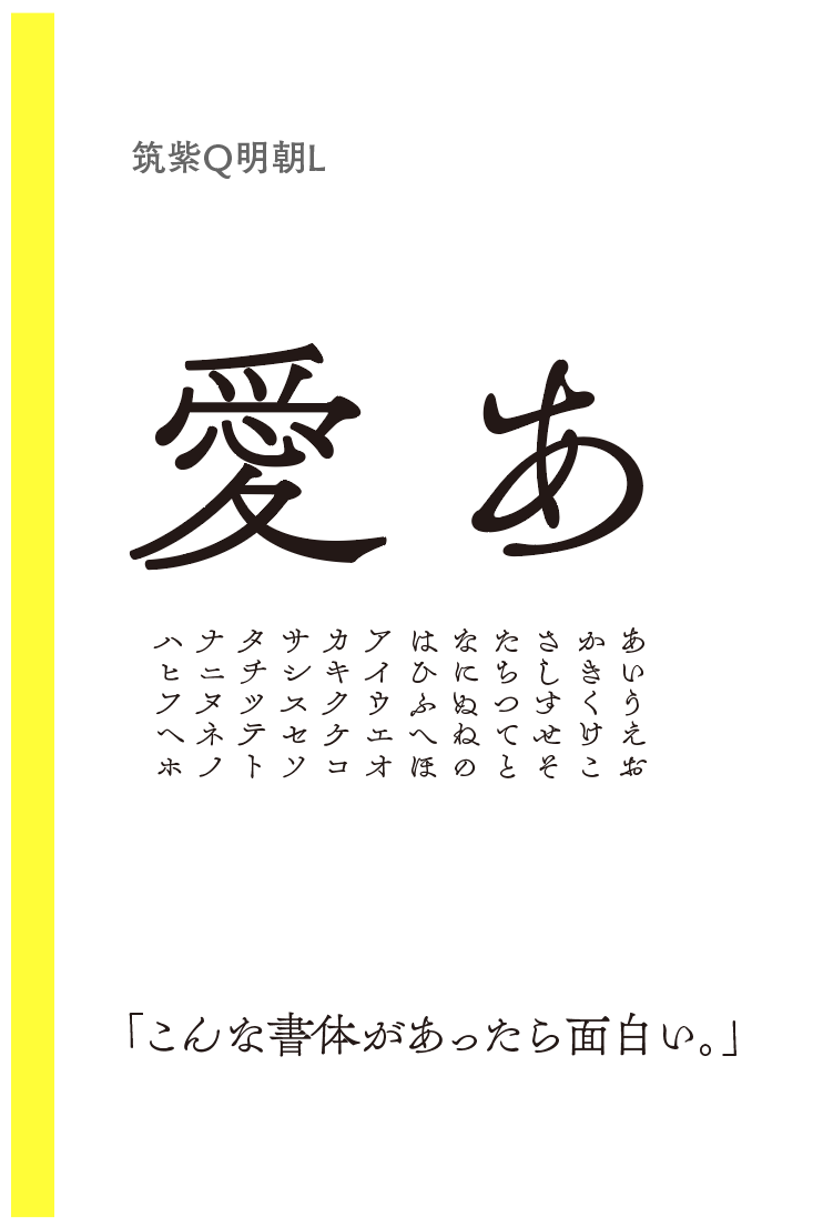
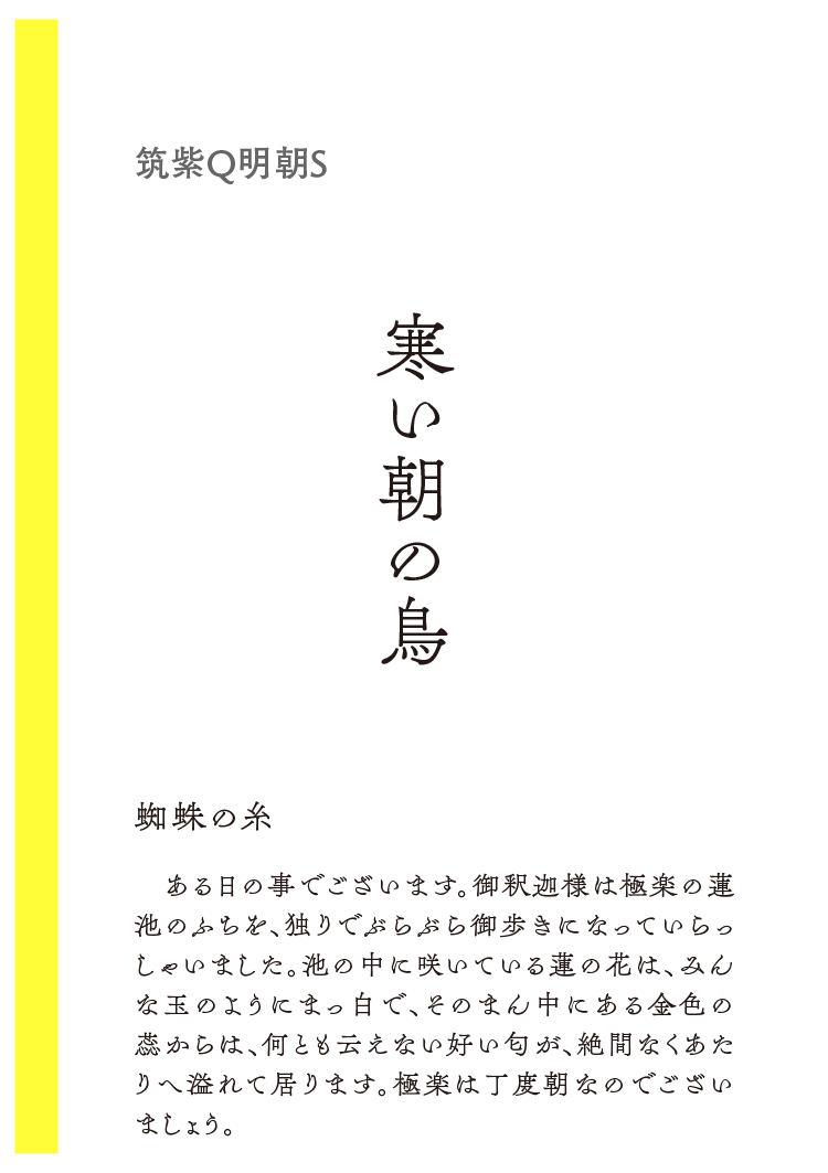
番外編:「これが明朝体!?」新書体のご紹介
8/22にリリースされたばかりの「筑紫Q明朝」の書体見本や組み見本を一部掲載しています。
書体見本ページでは、お好きなテキストで試し打ちもできます!
フォントワークスのサイトでは、フォントのコラムページをもうけており、様々なフォントの特徴などをご紹介しています。
そちらも、ぜひ、ご覧ください!