フォントワークスでは、130年の歴史を誇る世界的な欧文フォントメーカー「Monotype」社の9,000書体超の欧文/多言語フォントを、年間契約で利用できる年間定額制フォントサービス「Monotype LETS」として提供しています。
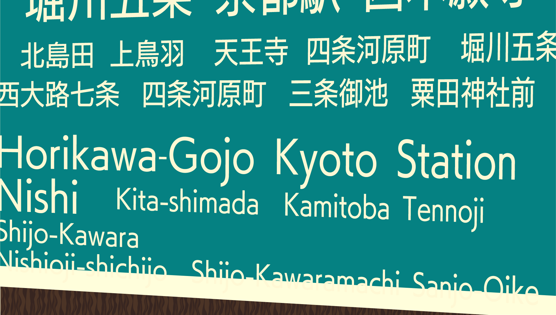
欧文書体の豊富さはさることながら、標準的なラテン言語の他、キリル、ギリシャ等を含む89言語以上に対応の拡張欧文フォント、ヘブライ、ディーヴァナーガリー、アラビア、タイなど、幅広く多種多様な多言語対応フォントに対応していることから、最近では、多言語展開が必須のゲーム業界でのご利用が増えています。
中国の国家標準規格に準拠したフォントを収録している点も安心してご利用いただけるポイントなのです!
今回は、Monotype社の中でも特に有名どころの書体を一部ご紹介しますねー!
フォントの定番「Neue Helvetica®」
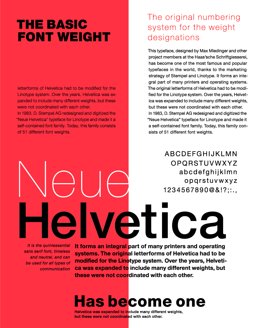
スイスのマックス・ミーディンガーとハース活字鋳造所のプロジェクトチームの手によって誕生したHelveticaは、ステンペル社とライノタイプ社のマーケティング戦略のおかげで、世界で最も有名で人気のある書体のひとつとなりました。今やHelveticaは多くのデジタルプリンタやオペレーティングシステムにとって、なくてはならない存在です。
Helveticaのもともとの字形はライノタイプ自動鋳造植字機向けに調整がされていました。Helveticaは長い年月の間に拡張され、ウェイトのバリエーションも増えましたが、互いの調和は取れていませんでした。1983年、ステンペル社はライノタイプ社向けにHelveticaをデジタル改刻したNeue Helveticaを制作し、ファミリーに拡張しました。現在は51種類のウェイトで構成されています。Helvetica Roman 55を基準に、数字の10の位は線の太さを表し(25 Ultra Lightや95 Extra Black)、1の位は字幅とスタイルを表しています(Helvetica 53 ExtendedやHelvetica 57 Condensed)。
現在、Neue Helveticaはその字形やバリエーションにおいて、新たなスタンダードとなっています。時代を感じさせず、ニュートラルであらゆるコミュニケーションの場面に使えるNeue Helveticaは、まさにサンセリフ体の代表格と言えます。
機能性と明確さに優れた「Neue Frutiger®」
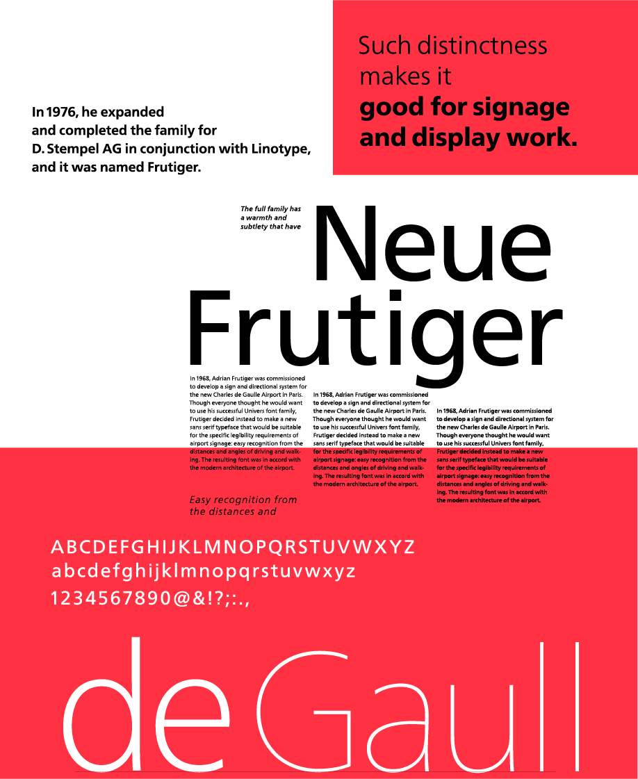
オリジナルのFrutiger書体は、1970年代はじめにAdrian Frutiger率いるチームがパリのシャルルドゴール空港のサインシステムのためにデザインしたものです。同空港がオープンしてすぐ、他のサイン・システムや出版物にこの書体を使いたいと申し出る企業が続出し、1977年、Frutiger書体はLinotypeライブラリに登場しました。
サイン用途にも、印刷物においての重要な書体としても、機能性と明確さに優れた典型的な書体として、Frutigerは現代の最高傑作のひとつとなりました。
Neue Frutiger®はFrutiger書体ファミリーの2009年版です。Adrian Frutigerの密接な協力を得て、小林章氏がデザインを再検討し、改良を加えました。
モダンな英国のクラシックフォント「Gill Sans®」
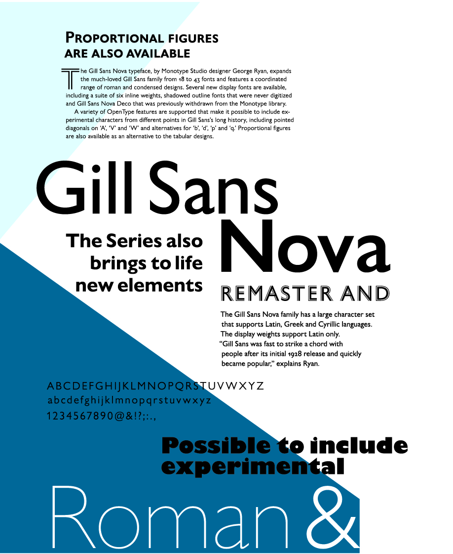
Gill Sansはヒューマニストスタイルのサンセリフファミリーで、トーンもコンセプトもとりわけイギリスらしいとよく見なされていますが、世界的に様々な場面で使われています。
並外れた特徴的なデザインという理由で、Gill Sansは偏在的なフォントの座を獲得しました。
このファミリーには、幅広い種類のスタイルがあります。Lightはオープンでエレガントなスタンダードなスタイル。Regularは下がフラットなd、上がフラットなpとq、上が尖っているtなどがあり、コンパクトで力強い見た目が特徴です。Boldはオープンでソフトな雰囲気がある一方、Extra BoldとUltra Boldはそれぞれ個性がはっきりしていますが、どれも目に留まる見出しを作成できます。
ウェイトの種類が豊富な上にコンデンスドとエクストラコンデンスドのデザインもあり、さらには言語の拡張サポートもあるので、多方面で使うことができます。
色褪せない普遍性を持つ書体「DIN Next®」
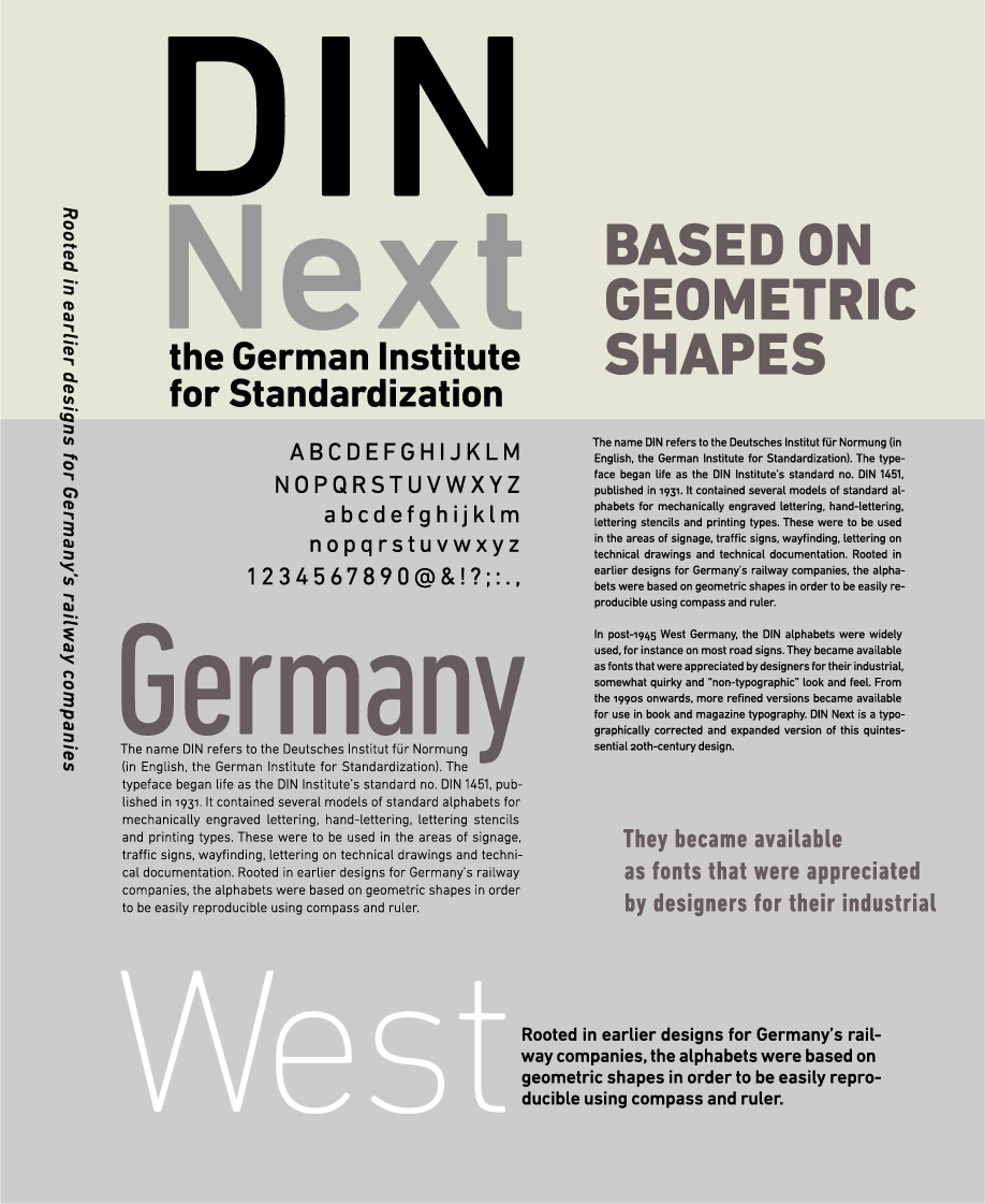
DIN Nextは20世紀を代表するDIN書体に現代的なデザイン処理を施し、ファミリー展開したものです。
DINとはドイツ規格協会(Deutsches Institut für Normung)の略称で、DIN書体は1931年にこの協会の工業規格書体DIN 1451として誕生しました。DIN 1451には機械彫刻文字、レタリング文字、ステンシル文字、活字向けの標準的なアルファベットが収録され、公共サイン、交通標識、案内・誘導サイン、製図や技術文書用の書体として使われていました。鉄道車両の識別用文字から始まったDINは、コンパスと定規で再現しやすいよう、幾何学的なデザインとなっていました。
モダンな書体となったこのクラシックデザインには、LightからBlackまで7ウェイトがあり、イタリックやコンデンスドのバージョンがあります。このファミリーにはDIN Next Roundeもあり、DIN Nextをよりソフトな表情にし親しみやすさを加えた書体です。
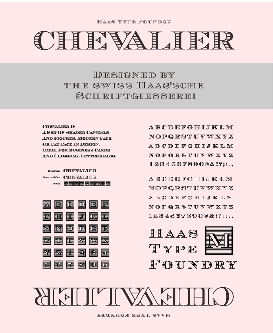
洗練された雰囲気「Sackers Gothic™」
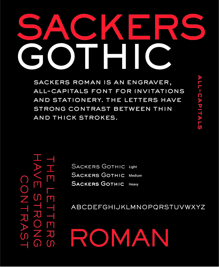
Sackers Gothicは、大規模なSackersシリーズの一部です。
Sackerシリーズは、米国ノースカロライナ州シャーロットの凹版印刷会社を営んでいたGary Sackersによる、文字の刻まれた文房具や名刺を作るためのテンプレートをもとにした書体のコレクションです。
Sackers Gothicは、それ以来、本のカバーやポスター、そしてもちろん文具において、誠実で率直な言葉を伝えるのに人気のある選択肢となりました。性質が異なった見出し用書体と相性が良く、洗練された雰囲気が必要な時に適しています。
そのほかのキャッチな書体たち
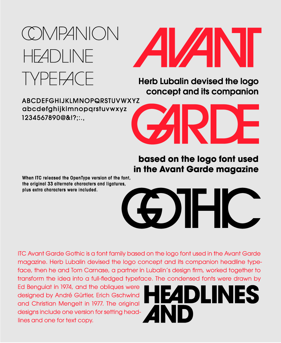
Avant Garde Gothicは、アメリカのグラフィックデザイナーHerb Lubalinが、雑誌「Avant Garde」のロゴのためにデザインしたオリジナルの書体。
どことなくレトロな風貌を感じさせる幾何学的サンセリフ体で、人気が高い。Avant Garde Gothicの特徴の一つに、リガチャ(合字)と呼ばれる文字が重なり合ったデザインがあります。
ワインラベルや高級チョコレートのパッケージなどによく使用される、銅版彫刻の雰囲気を残した大文字だけの書体です。
トーンに抑えることができ、繊細な感じが伝わります。
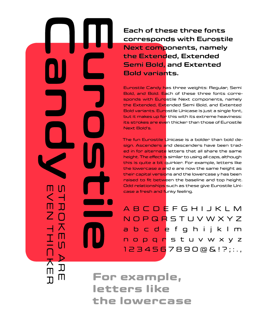
丸ゴシック体で、「candy」という名の通り可愛らしさに溢れる書体です。