フォントワークスのLETSフォントには、「ソリューションフォント」として提供しているフォントがあります。 「ソリューションフォント」とは、フォントワークスの既存フォントを<使用方法や媒体に特化してリデザインまたはチューンナップしたフォント>です。現在では、印刷用/コミック用/放送用と3種類のソリューションフォントがあります。ソリューションフォントについて、詳しくはこちら
今回は、放送用のソリューションフォント「テロップ明朝-D/B/E/H」について、誕生の経緯や書体の特長をご紹介します。
「テロップ明朝」は、2008年に放送業界専用書体(※)として誕生した、横太明朝体です。
本文用書体として読みやすさに定評のある「筑紫明朝」をベースに、横画の太さや曲線の濃度調整を施すことで、画面表示に最適な書体へとチューンナップしてリリースされました。
ウエイトも、画面表示に特化した書体であることから、あらかじめ放送業界で使用しやすい、太いウエイト<D/B/E/H>で展開しています。
※現在は、LETSの通常のプログラムでご使用いただけます。
テレビのテロップなどで明朝体を使用する際、横線がちらつく問題を解決した「テロップ明朝」
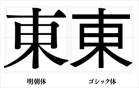
明朝体は、縦線に比べると横線を細くデザインされるのが特長です。使用箇所も、小説などの長文の本文で、可読性を重視される読み物への使用が一般的でした。
フォントメーカーからリリースされている明朝体の多くは、横線が縦線より細くデザインされており、テレビのテロップなどで画面に表示させると、ちらつきが起きてしまうという問題があるため、 放送業界では、テロップなどには、縦線と横線が均一の太さに設計されたゴシック体などがよく使用される傾向にありました。
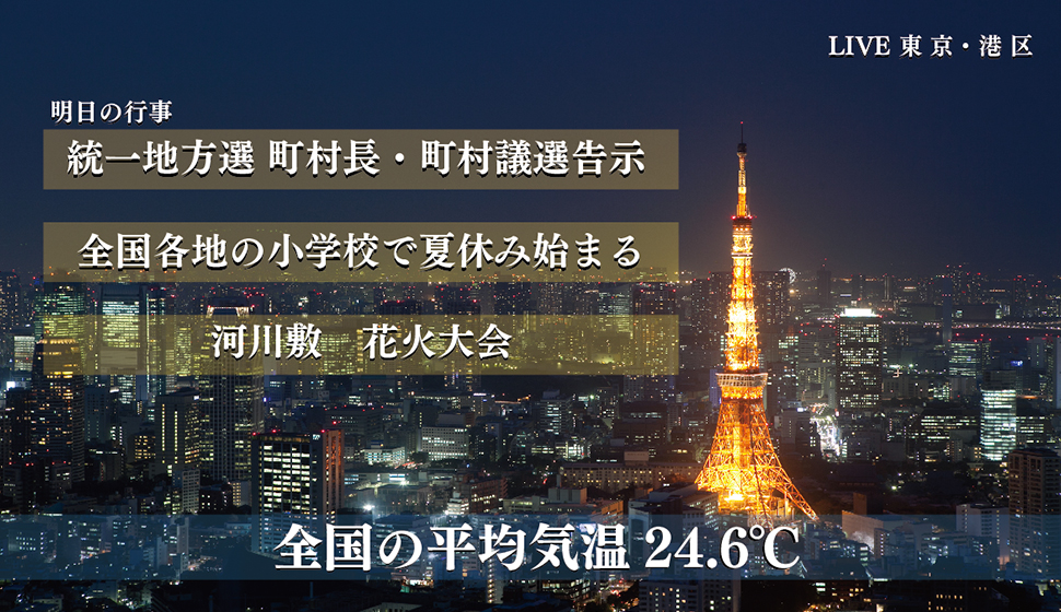
ですが、PCやテレビモニタの解像度の向上、また、テレビなどのデジタルコンテンツの急速な発展で、それまでは文字情報を正確に伝えるためだけのものだったテロップの役割が、 心情や臨場感、空気感やタレントのキャラクター性などを演出する一つの重要な要素になっていったことから、様々なデザインの書体が使用されるようになりました。
そこで、放送業界からは、<ちらつかない明朝体を開発してほしい>という要望もいただくことになったのです。
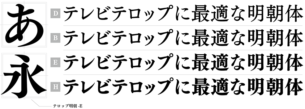
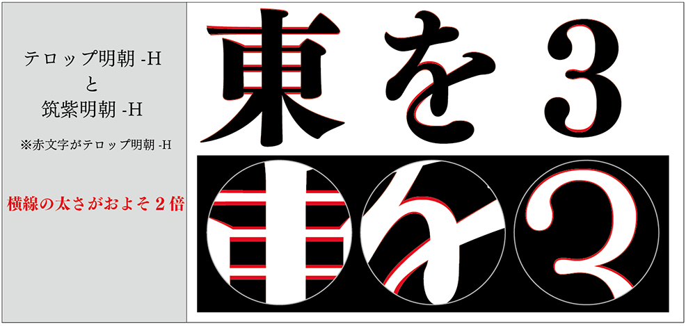
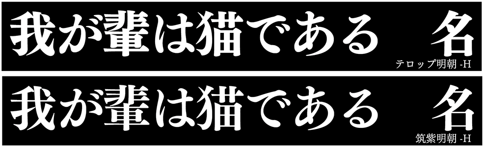
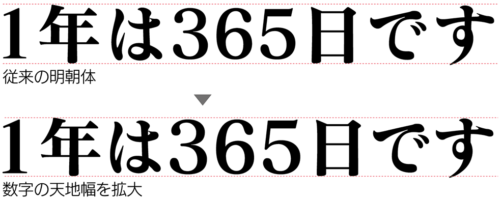
「テロップ明朝」の書体の特長は、横線と曲線が通常の明朝体に比べて格段に太いこと、そして、数字の天地幅を拡大していることです。
ベースとなった「筑紫明朝」の横線のおよそ2倍の太さで設計しているため、横線と縦線の太さの比率が近づき、視認性が向上しています。
また、数字の天地幅を拡大することで、視認性を高めています。
また、フォントワークスのLETSフォントでは、「テロップ明朝」以外にも、天地幅の拡大処理などを施した専用フォントをご用意しています。
本文用書体である「筑紫明朝」を土台にした理由
「筑紫明朝」は、そもそもはデジタルコンテンツ向けの書体ではなく、紙媒体、主には小説などの長文の本文用で使用していただくことを目的として制作した書体です。
長文の本文で使用する場合、一般的には<L/R>といった細いウエイトが使用されるケースが多いため、リリース当初は太いウエイトの展開をしていませんでした。 しかし、デジタルコンテンツなどの急速な発展に伴い、書体の使用方法も多用化したことや、1つのコンテンツに付随する媒体は、同じ書体を使用して展開する流れが主流となってきたことから、 本文用の書体として開発した「筑紫明朝」をデジタルコンテンツでも展開したいなどのご要望を会員様にいただき、2007年に「筑紫明朝」の太いウエイト<B/E/H>をリリースしました。
この「筑紫明朝-B/E/H」は、リリース当初から、デジタルコンテンツなどに多くご使用いただきました。
本文用で開発した明朝体をデジタルコンテンツで使用していただけたことは、フォントワークスとしてもまた新たな発見となりました。
そして、こういった流れを汲んで、デジタルコンテンツでも多く使用いただいている「筑紫明朝-B/E/H」をベースとし、さらに横線や曲線を太くしたテロップに特化した 「テロップ明朝」が制作されたのです。
「テロップ明朝」は、テレビ画面やモニタ上で明朝体を表示させる際に、横線や曲線が見えにくいといった視認性の問題に対してのソリューションとして、ご使用いただけます。
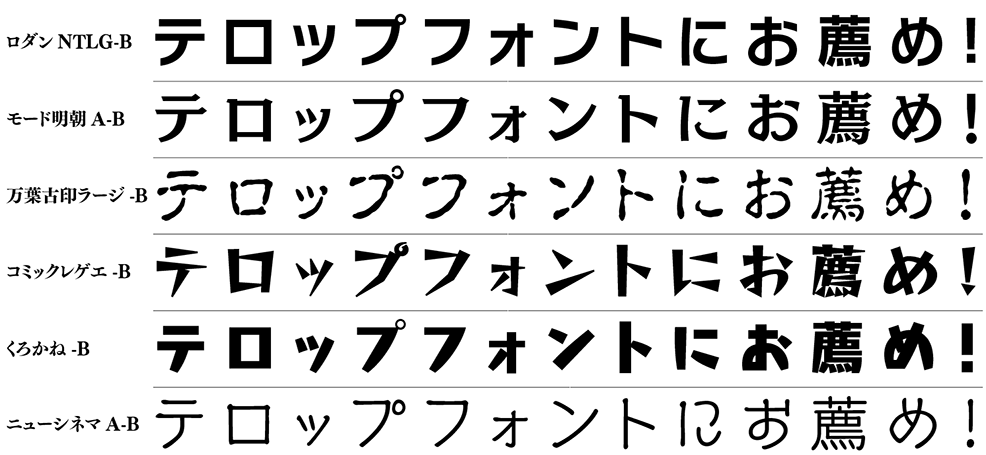
Topic!! その他、テロップでよく使用されているフォント
テレビ番組のテロップでは、心情や臨場感などを表現するため、様々なデザインフォントが演出要素として使用されています。
テレビ番組のテロップも、近年では、ただ文字情報を伝えるためのものから、臨場感や空気感、心情などをより分かり易く伝える手段としてその使用方法も多様化されました。
テロップで使用される書体も、バラエティ豊かなデザイン書体はもちろん、明朝体・ゴシック体でもメーカーやスタイル、ウエイトから厳密に選定し、よりその場面にあう書体を使用されることが多くなりました。
以下に、テレビテロップでもよくご使用いただいている書体を掲載します。