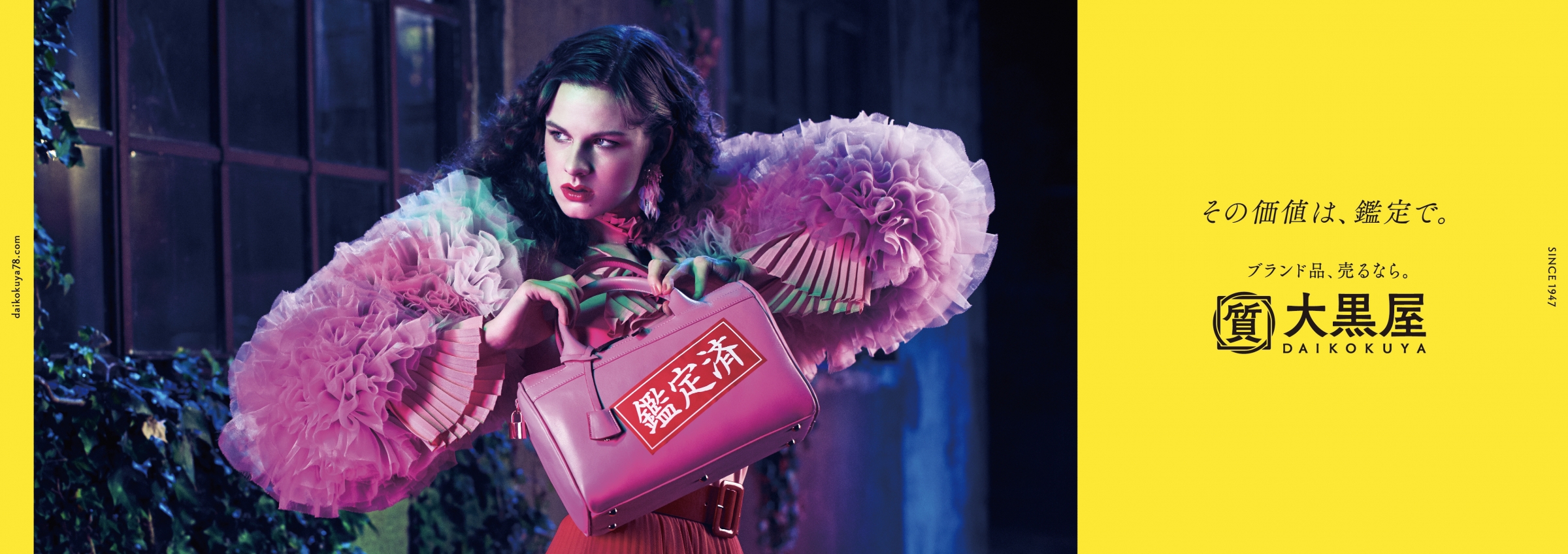
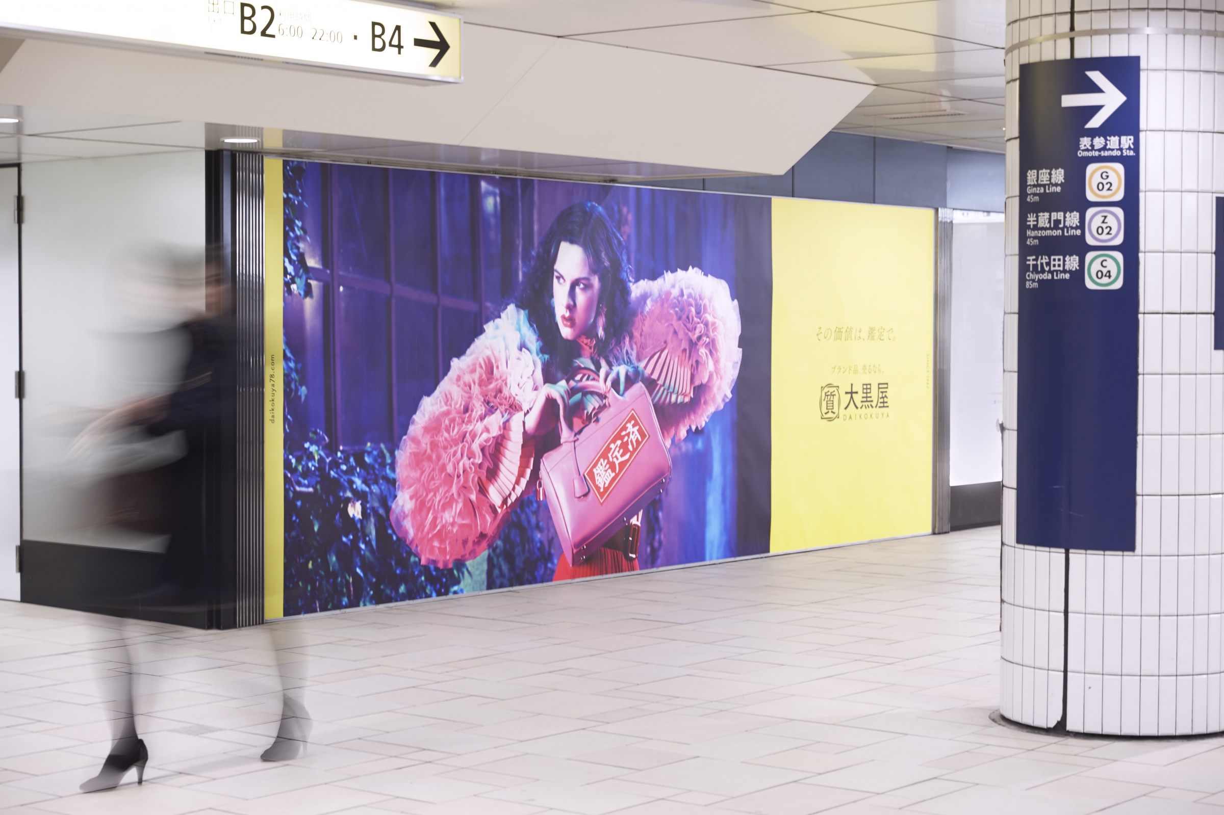
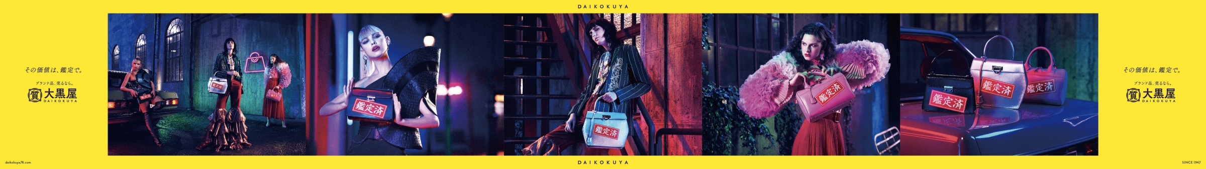
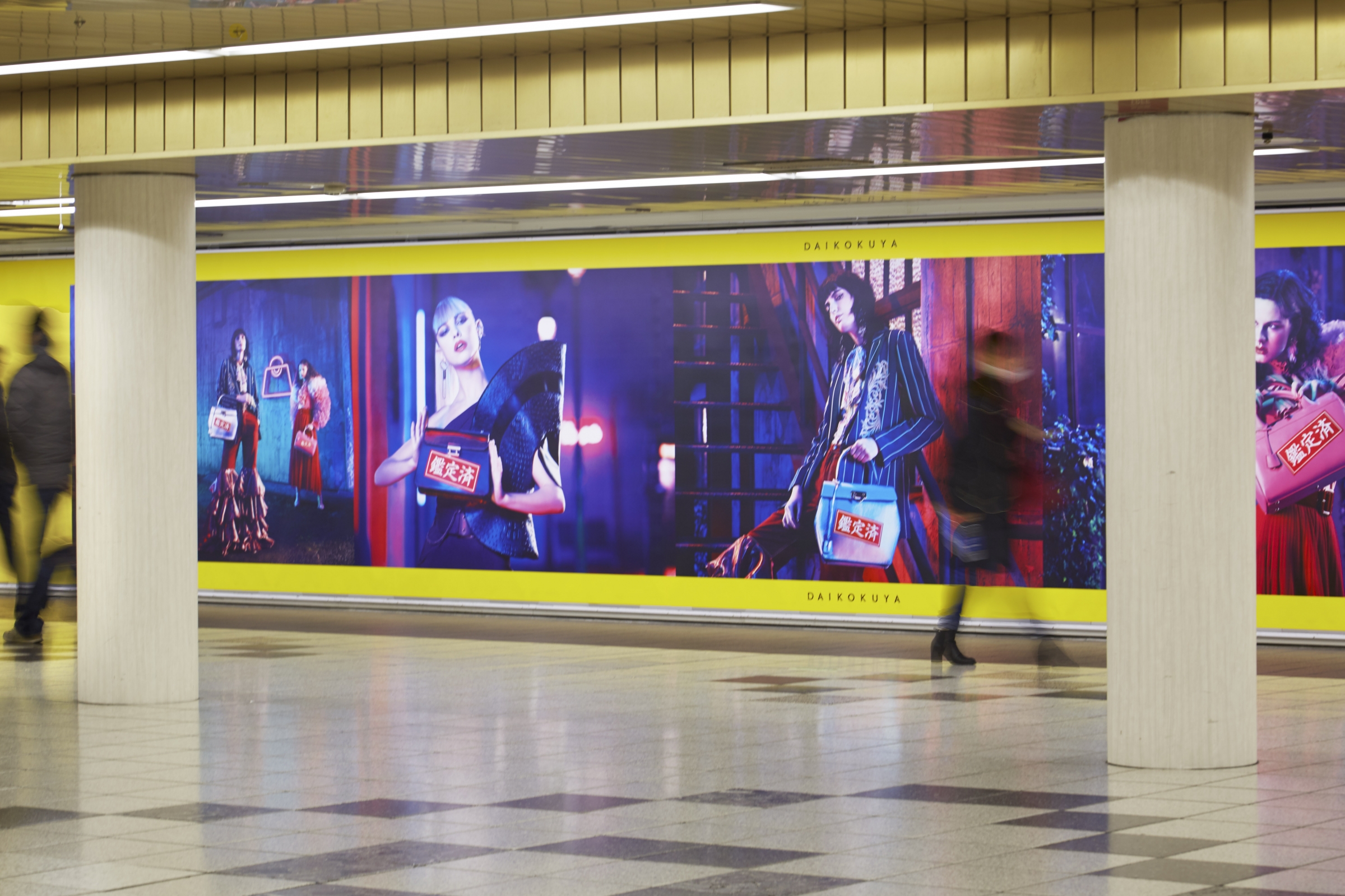
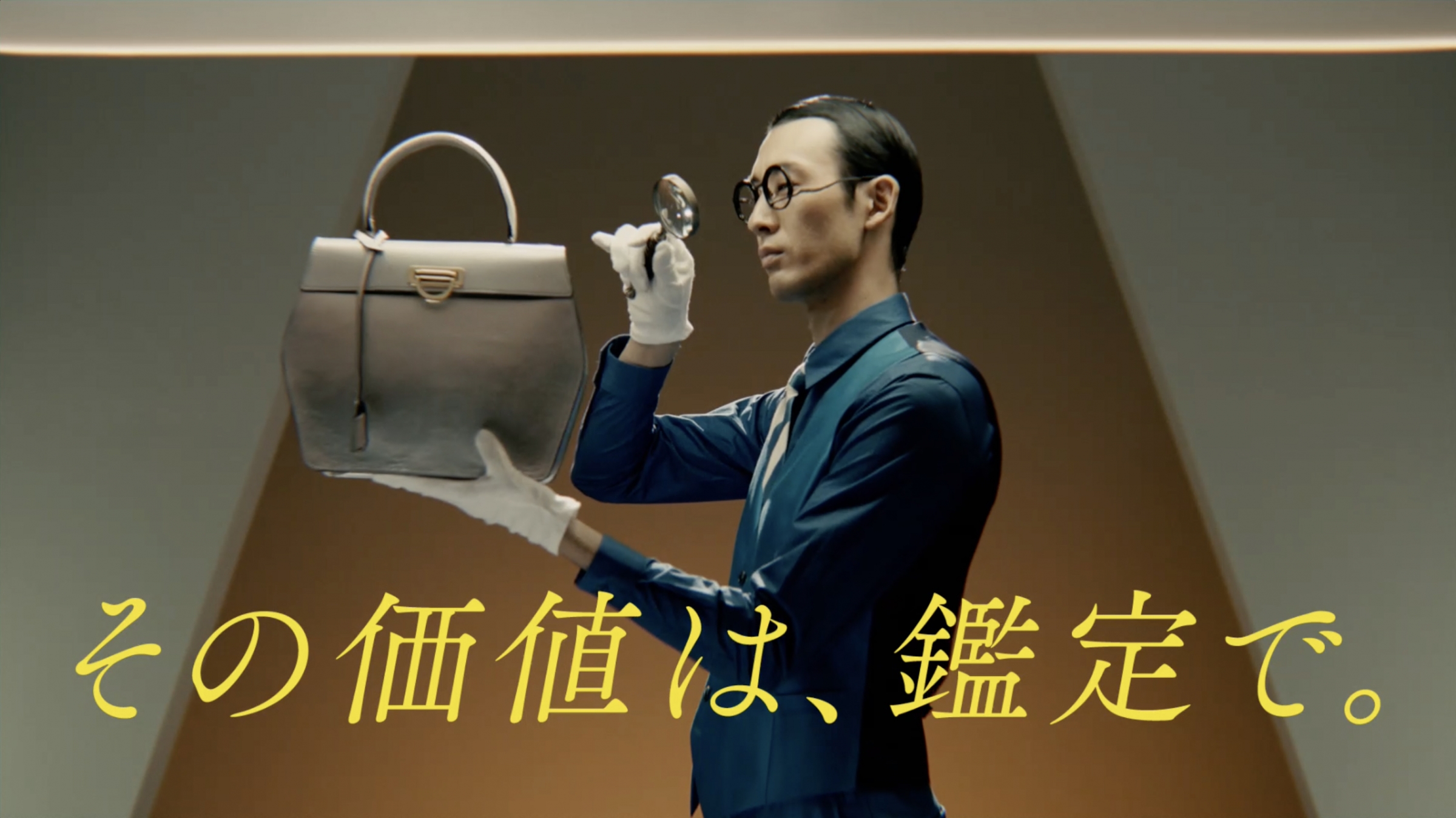
▲ CM "Appraisal" version broadcast in the Kanto area
In commercials, appealing the company's appraisal technology to determine the market value of branded products with a high-brand style production.
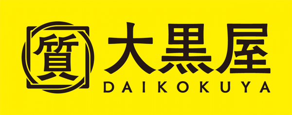
Purchase and sell branded products "Daikokuya" However, in the Kanto area, we rebranded for the first 72 years, including the first commercial broadcast, graphic production, and the company logo renewal.
This time, I was involved in creative works such as logo production, CM, graphics, web campaign logo, and Mr. Nakagawa, creative director of Dentsu Inc. who was in charge of this project, and art of Dentsu Inc. Mr. Nagai and Mr. Wakabayashi of Sherpa Co., Ltd.
We talked about the font you selected this time as part of the rebranding efforts of a long-established company.
Because it is a company that "handles high brands," it should have a good and dignified logo.
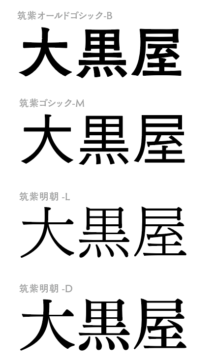
-- Both the logo and the commercial graphics use Tsukushi font. Could you tell us about the original request from Daikokuya?
-Mr. Nakagawa
With flea market apps now at their peak, Daikokuya approached us about rebranding for the next generation, and we decided to renew our logo at the same time as producing commercials and graphics.
-Mr. Nagai
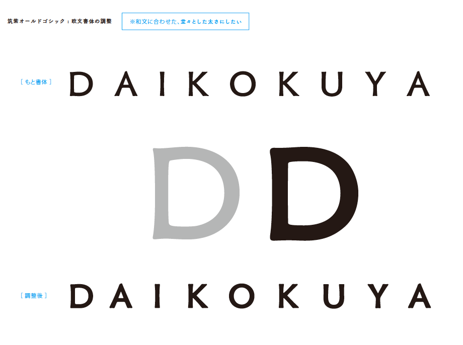
We tested various fonts, but in the end, we decided that because we are a company that "deals with high-end brands," the logo should be elegant and dignified. On top of that, we wanted to emphasize the sense of long history and elegance, so we started with Mincho font, but then we came across a typeface that really made an impression on us. It's Gothic, but it looks like it was written with a brush, and although it's not Mincho, it has both strength and elegance. That's" TsukuOldGothic."
As we were creating the logo together with Wakabayashi, we came to the conclusion that the font's bold strokes would go well with the auspicious letters of Daikokuya.

Designed like a family crest to express "history" and "trust"
-- Were there any other typefaces that were considered as candidates?
-Mr. Nagai
We tried making other thinner typefaces, but decided on TsukuOldGothic as this one looks more dignified and better.
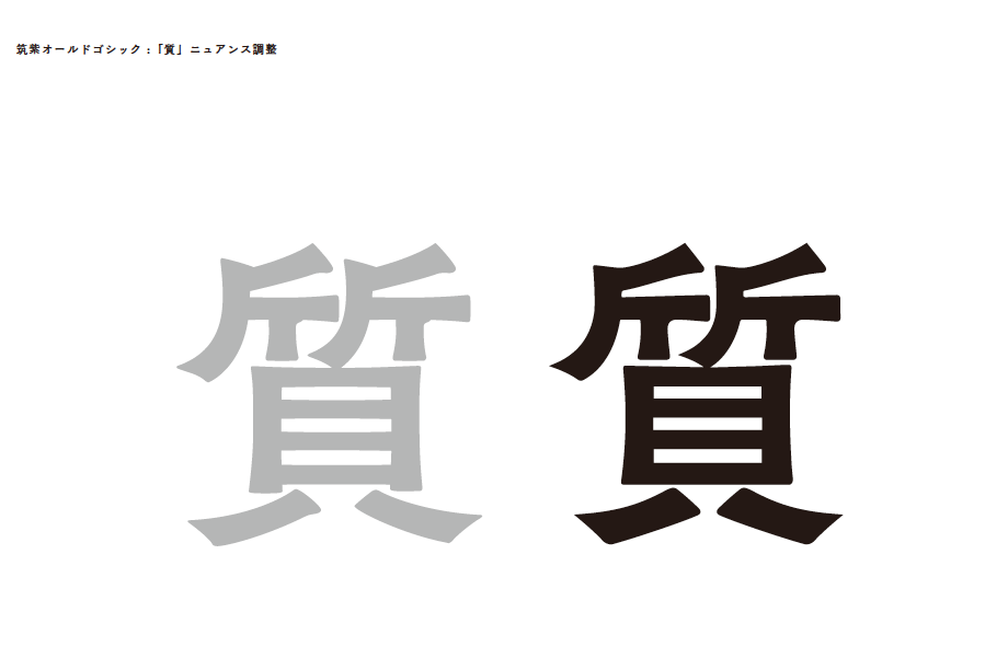
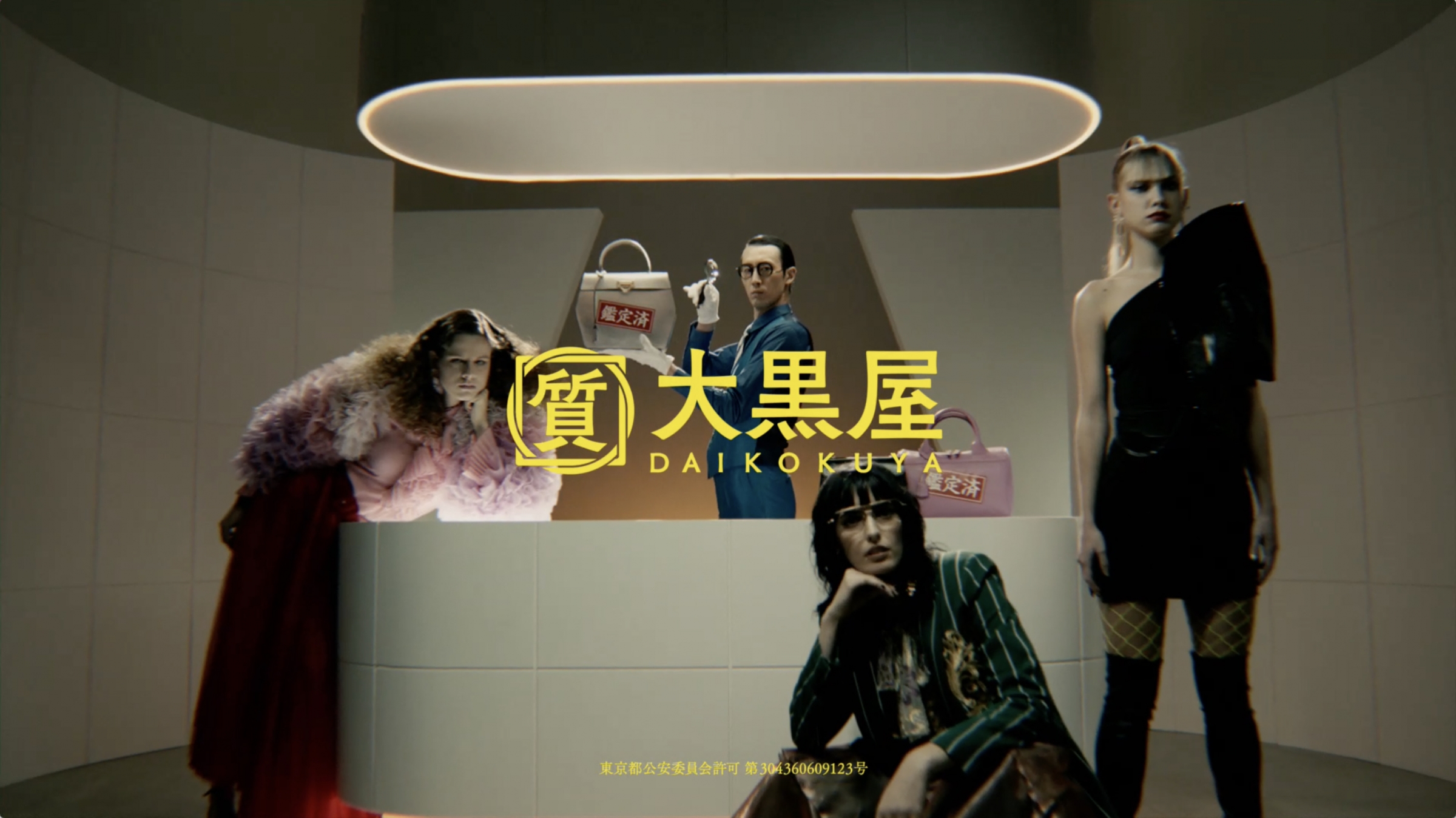
Speaking of the design of "Quality" in front of Daikokuya, in Japan we have something called a family crest. I think a family crest is a symbol that represents a long family history or a sense of trust, so I thought I would express the trust that Daikokuya has by designing the character for quality like a family crest and making it into a logo.
The previous logo also had a square and a circle surrounding the character "quality," so we kept this and made use of it to recreate the connection with customers and the relationship with things.
-Mr. Nakagawa
Daikokuya's key color is yellow, but the original logo had a yellow background with many colors, such as blue, red, and black, so we unified it with black to give it a classy look.
What is expressed is "widening at the end". The "elegance" felt in TsukuOldGothic
--Could you tell us about the changes you made to the text?
-Mr. Nagai
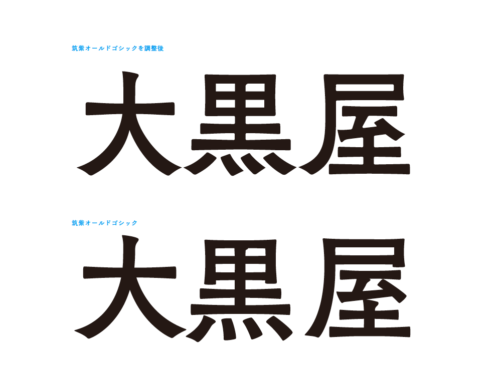
The "harai" part of the character "Daikokuya" has been slightly modified to emphasize the fan-shaped shape.
Even though this font is Gothic, it feels like a Ming style font. I think that's what really gives it that "elegance."
-Mr. Wakabayashi
The hiragana parts of "Daikokuya" are all made using the same elements so that the three letters appear as one.
-Mr. Nagai
TsukuOldGothic is an exquisite design, old-Styles yet modern at the same time.
-Mr. Nakagawa
As a way to differentiate ourselves from our competitors, the thicker one was after all, when it came to promoting trust and appraisal power. At first glance, "I like this".
On top of that, it would be difficult for the customers to understand if it was changed too much, so I decided to make good use of Daikokuya. As a further adjustment, since there are many inbound people recently, I have entered English letters. As we deal with official and high-brand products, we want to bring out that kind of luxury.
The appearance of "appraisal"
-Mr. Nakagawa
The flea market app, which is in full swing, is a place where others decide value, Suitable for selling the branded goods that you cherished In some cases, it may be questionable.
Also, when compared to pawnshop competitors "It's better to be fashionable if you go anyway" .
In order to clarify the difference with the flea market app and other companies, "Appraisal" I wanted to express the appearance by putting emphasis on the.
It matched this font.
--Honestly, pawn shops are a bit difficult to enter. It would be nice if this logo would be wiped out.
-Mr. Nakagawa
I think that there are many people who feel the height of the sill, or something like darkness. Actually, I was worried about whether to take the word “quality”. But when selling appraisals, it's better to have quality as a backbone.
In addition, regarding communication, I made good commercials and graphics that were really cool, so I think it was good that there was an impact when I entered "quality" there.
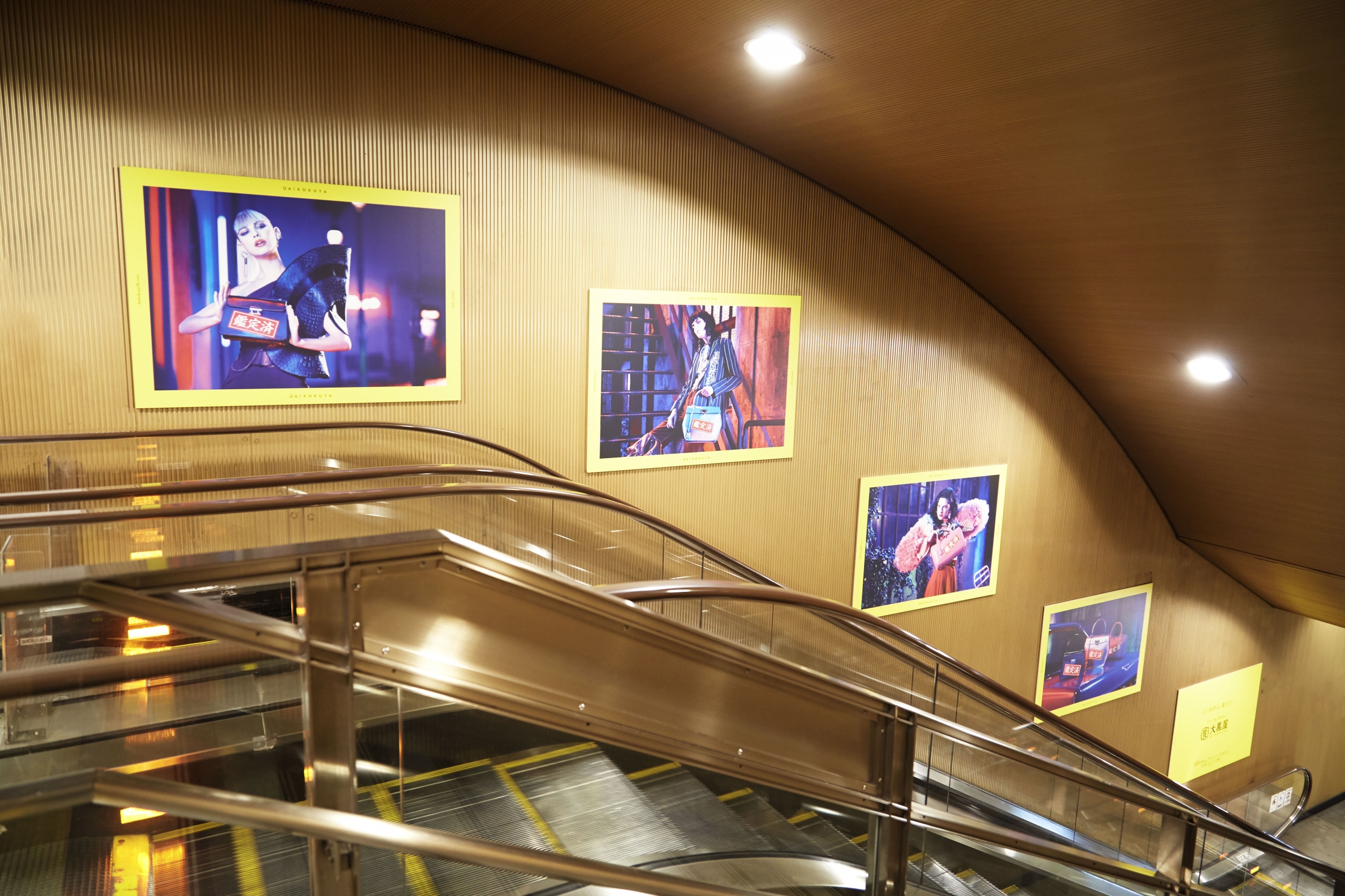
Jack Roppongi, Omotesando, Shinjuku and Shibuya!
--Please tell us why you used TsukuOldMin for the graphics and commercial copy.
-Mr. Nagai
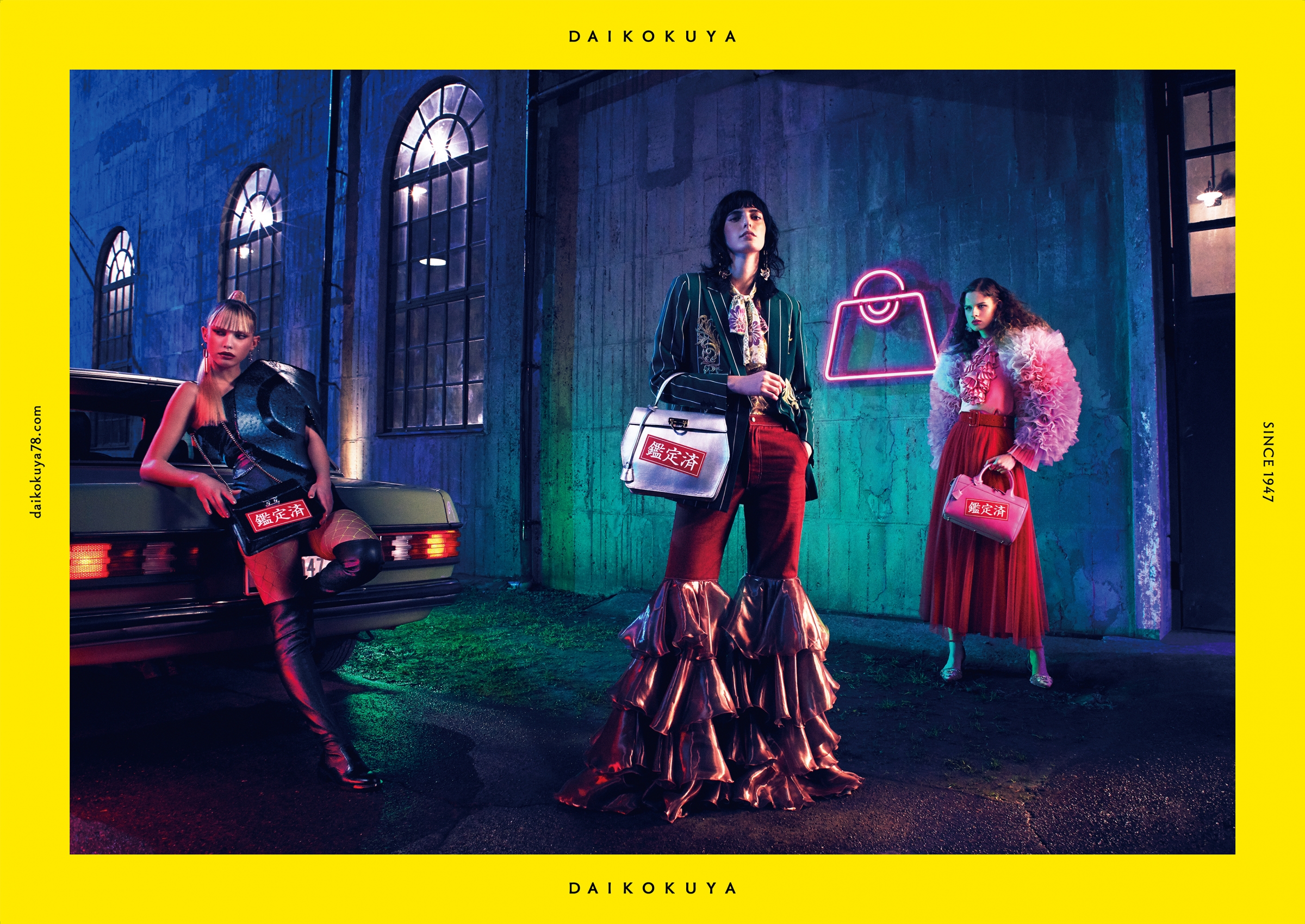
For the copy, "Its value is determined by appraisal," we thought that a slightly sheer Mincho font would be best to match the image of the graphic, and we tested several fonts. Among them, "TsukuOldMin" was the most elegant and suited the image of this time.
-Mr. Wakabayashi
The graphic shows the tagline "If you're selling branded goods" above the Daikokuya logo. This also uses "TsukuOldMin", which is an easy-to-read font that doesn't interfere with the logo.
--How was the reaction?
-Mr. Nakagawa
You were murmured quite a bit on SNS.
I don't think there was a competitor trying to get this position.
Other pawn shops are still cluttered, and with the flea market app, the image is "easy, easy, and cheap."
This time it was great to find a gap there.
For the issue of how to differentiate from other companies, The key is "goods", "formality", "appraisal power".
That is "The appearance of handling high brands" Was to express.
Introduction of Dentsu Nakagawa, Nagai and Sherpa Wakabayashi