国内累計ダウンロード数が1700万(2019年6月末時点)を突破し、2018年上半期には世界セールスの第1位に輝き、さらに「日本ゲーム大賞 2018」の「年間作品部門 優秀賞」を受賞した、スマートフォン向けRPG「Fate/Grand Order」(iOS / Android。以下、FGO)。リリースから継続した人気を誇り、ファンを魅了し続ける同作の開発は、FGO PROJECT(TYPE-MOON、アニプレックス、ディライトワークスの製作委員会)。
今回は、開発を担当しているディライトワークスで現在グラフィックディレクターを務める辻畑氏に、「FGO」でのフォントの選定から採用、UIにおけるフォントの役割などのお話をお伺いしました。
人気タイトル「FGO」のUIを支えるフォント
フォント決定の流れ
フォントを決めるのは様々な要素の流れに影響を受けます。画面のイメージが固まってきた段階で「あ、このフォントを使おう」というイメージが出てきます。そこから全体のイメージに寄り添うものを選択しています。
「FGO」の開発当時、最初にシステムフォントを決めるため、いくつかのゲーム画面の素案とともに、弊社からTYPE-MOON様へスキップをご提案しました。 その後、TYPE-MOON様のご協力の元、全体のUIを設計していき、マティス、筑紫明朝、ニューロダンといったフォントも採用していきました。
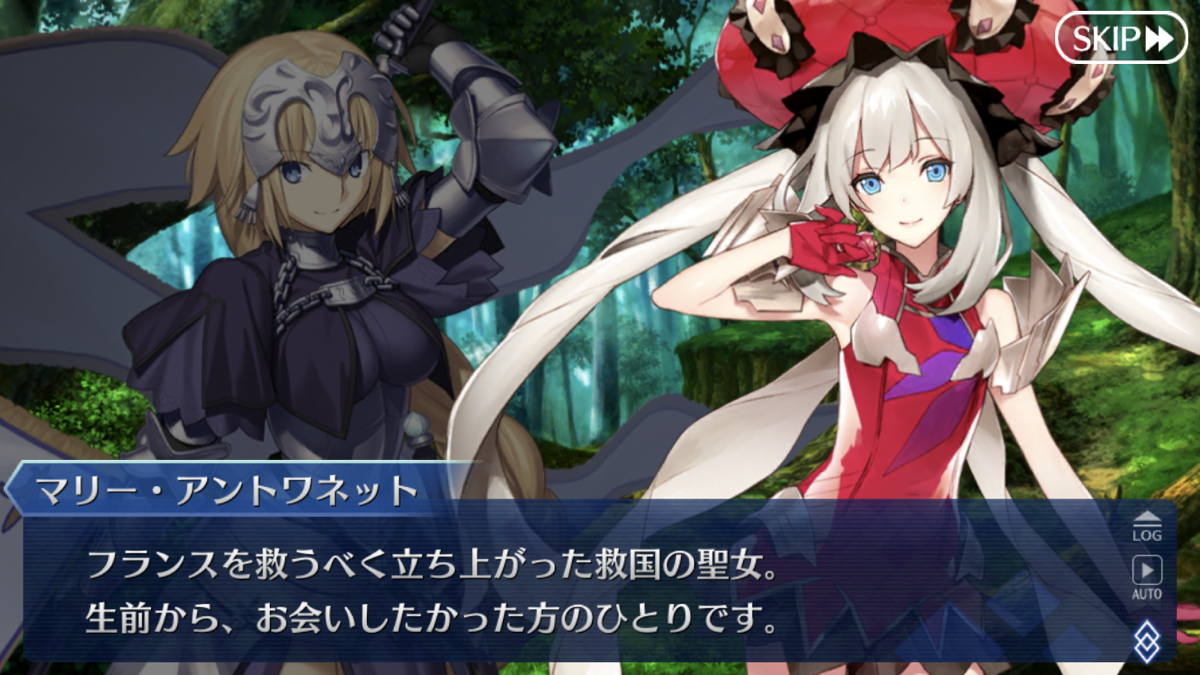
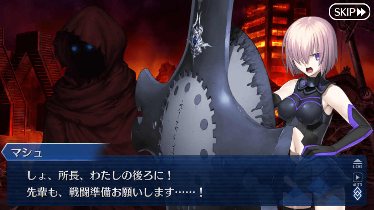
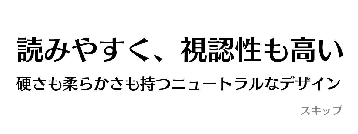
壮大なシナリオを気持ちよく読ませるためのフォント「スキップ」
スキップを選定した理由は、3つあります。
1つ目は、「読みやすさ」です。
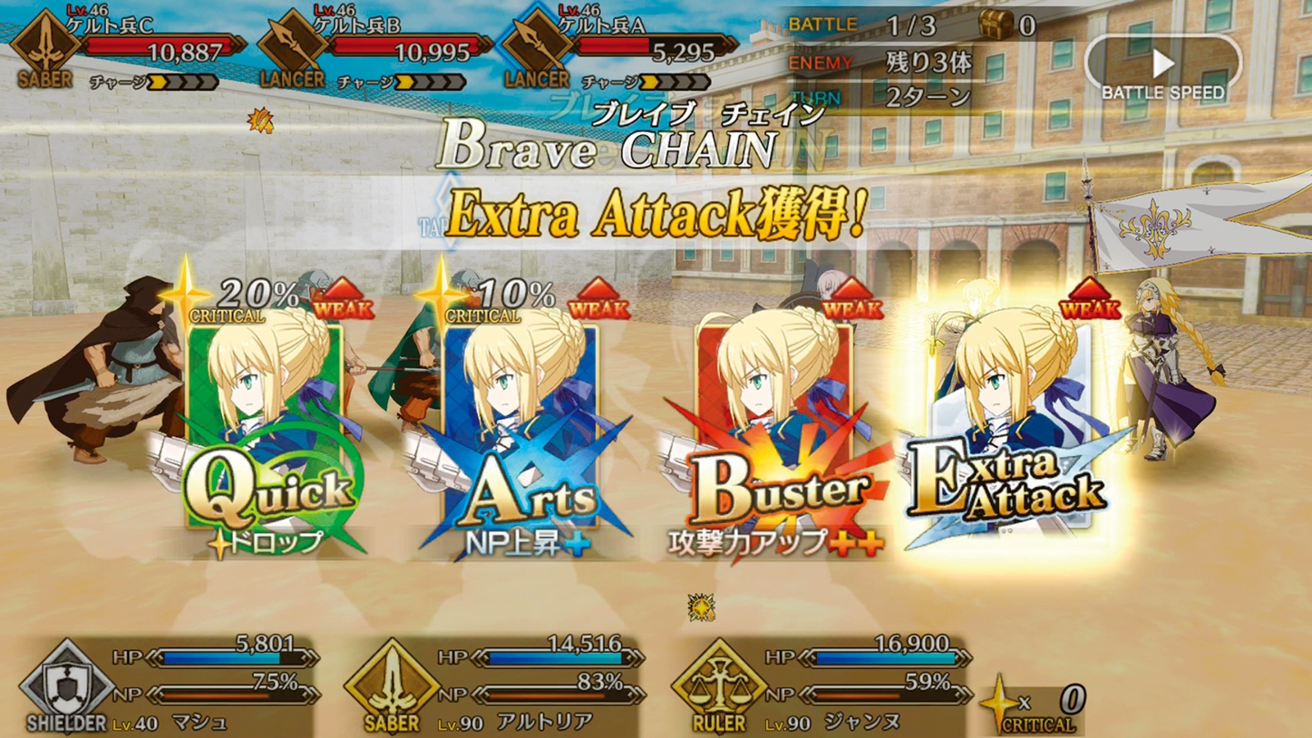
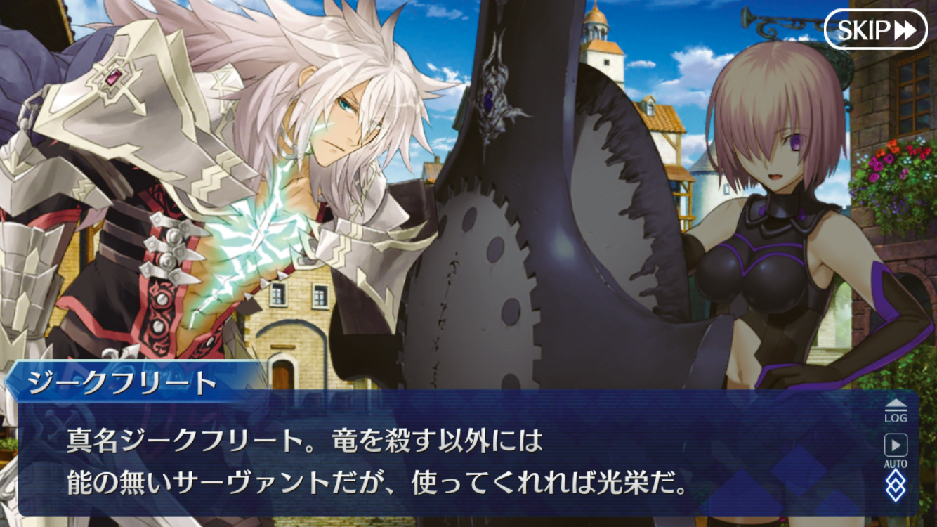
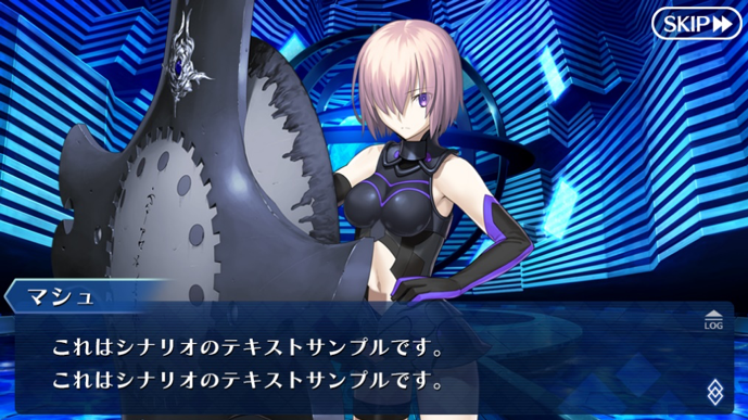
壮大なシナリオ(ストーリー)が特徴の「FGO」では、テキストを気持ちよく読ませるということが、UI設計においてとても重要なことになります。UI画面でセリフが出る場面のUIを作っていた時に、読みやすく、さらにゲームの世界観ともしっくりきたものとして、「スキップ」をシステムフォントに選定しました。
2つ目は、「硬さも柔らかさも持つニュートラルなデザイン性」です。
もともとのFateシリーズのノベルゲームは、明朝体を使うことが多かったのですが、明朝体の印象だと世界観としてシリアス寄りの雰囲気が強く出すぎるなと感じていました。
今作「FGO」は、シリアスなだけでなくコミカルなシーンもあるため、印象を固定してしまうのはよくないと考え、UIを設計するにあたって、フォントについては、「スキップ」を選択したのです。初期には、「キアロ」も検討したのですが、「キアロ」は少し癖があるため、「スキップ」のほうがサラリと読み進められると感じました。
「気持ちよく読み進める」ということが重要な要素でしたので、それらにマッチしたのが「スキップ」でした。ウエイトは「B」を使用しています。
3つ目は、「視認性の高さ」です。
FGOの開発をはじめた当初の基準端末は「iPhone5」でした。その画面サイズは1024x576と、現在のスマートフォンと比べるとかなり小さかったため、その小さなサイズでも、読みやすいという「視認性の高さ」も決め手の一つとなりました。
「スキップ」は、大きくしても小さくても、形がキレイだったのです。ウエイトの「B」を選択した理由は、全ウエイトをスマホ端末で試した上で、一番読みやすかったからです。
開発初期のフォント選定のタイミングで候補に上がった書体。


UIのこだわり、そこで使用するフォント
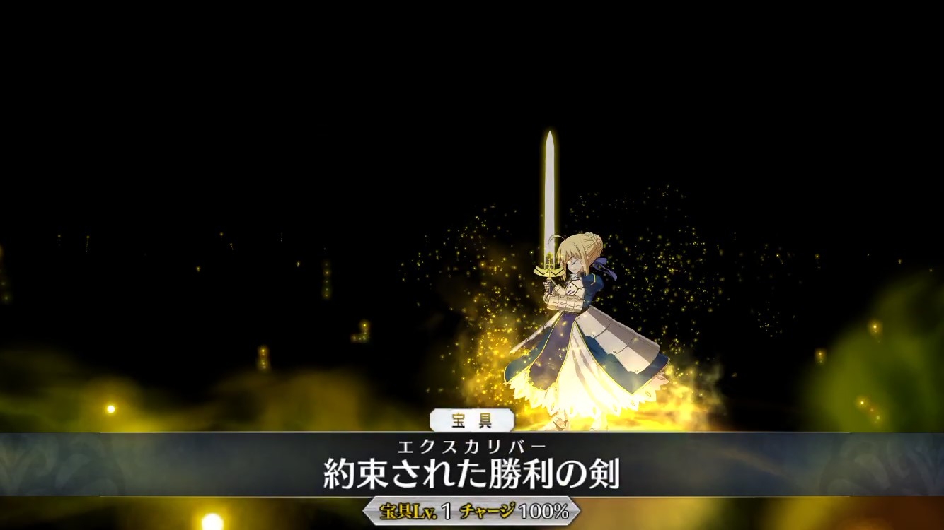
「スキップ」「マティス」のメイン書体以外では、例えばゲーム画面の章の名前などには、「筑紫明朝」も使っていたりします。宝具などにも「筑紫明朝」ですね。「筑紫明朝」を少しアレンジしています。
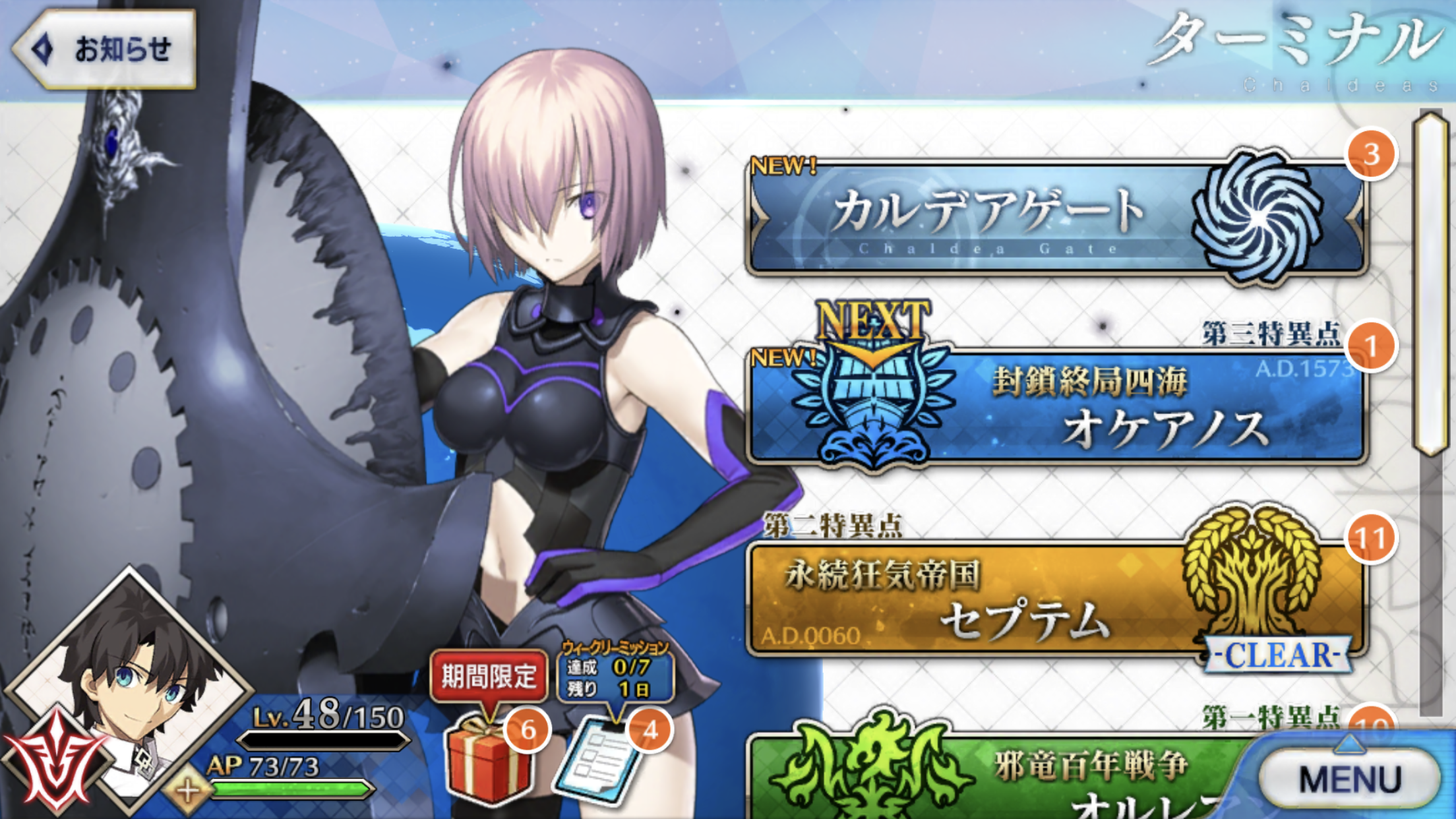
ボタンの中のUIには、「ニューロダン」を使っています。
「ニューロダン」には90%長体をかけています。ベタで打つことはあまりないくらい手を加えてはいますね。範囲に対する文字数などで微調整を加えるなど、文字ごとにカスタマイズを加えています。
また、イベントではそのイベントの雰囲気に合うようなフォントを使い分けています。
「FGO」では、サーヴァントがメインですので、サーヴァント(キャラクター)を引き立たせるために、主張しすぎず、目立ちすぎないユーザーインターフェースを心がけています。
あとUIで気をつけていることは、「透明感」ですね。「透明感」を重視し、画面に圧迫感が出ないように気を配っています。
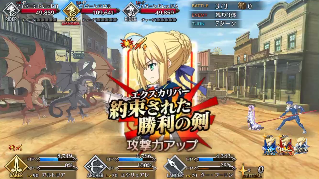
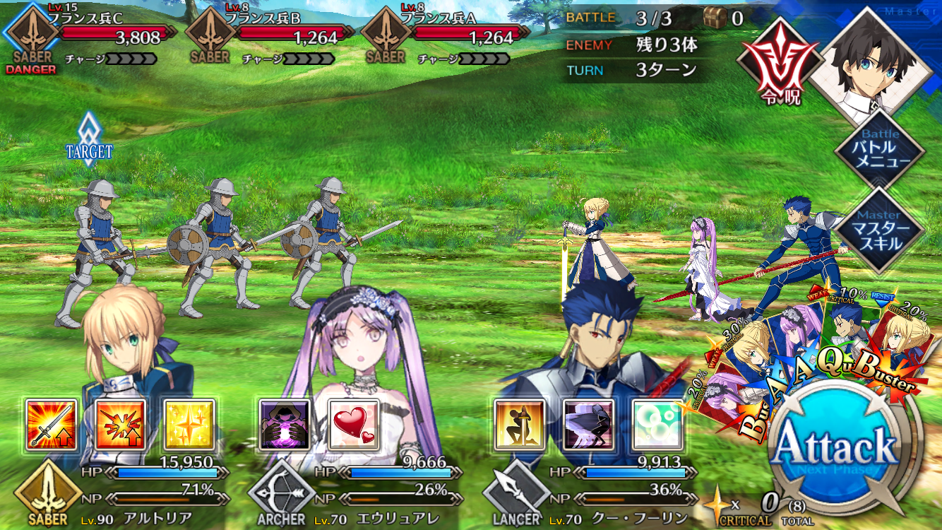
そして、特にバトル画面では、「わかりやすさ」にこだわっています。
「Attack」というボタンを押せばいいという設計にしており、直感的にバトルを楽しめるようにしています。
魔じん(神の下に人)・沖田総司のような実際には存在しない文字をフォント化
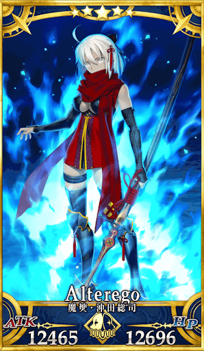
「FGO」では、「魔じん(神の下に人)・沖田総司」のように実際には存在しない文字があって、作字と思われる方もいるかもしれませんが、これらは、別途、フォントワークスさんにフォントとして作っていただき使用しています。
こういったところも作品の魅力の一つかなと思っているので、探して見つけていただけると嬉しいですね。
今回、お話くださった方
辻畑 孝信 氏
2017年 ディライトワークス株式会社入社
「FGO」のグラフィックスディレクター
最高にエキサイティングなグラフィックを目指すべく、“ディライトアートワークス”“ディライトグラフィックワークス”の立ち上げに関わる。
「TYPE-MOONさんがどんなものを作りたいのか、望んでいるかという視点から、デザインや先々のイメージボードを取りまとめ、実際に担当チームのリーダーへイメージを共有し、作り込んでもらっています。その取りまとめを行うため、全体を俯瞰で見つつ、チームのマネージメントを行っています。」
フォントワークスの書体は、年間定額制サービス「LETS」でご使用いただけます。