Hello, this is Fukushima spokesman.
On June 3 (Monday), Type Designers Fujita (@ Tsukushi55) Is giving a lecture about fonts to students of the Faculty of Arts and Sciences, Onomichi City University in Hiroshima Prefecture.
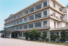
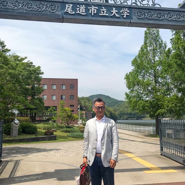
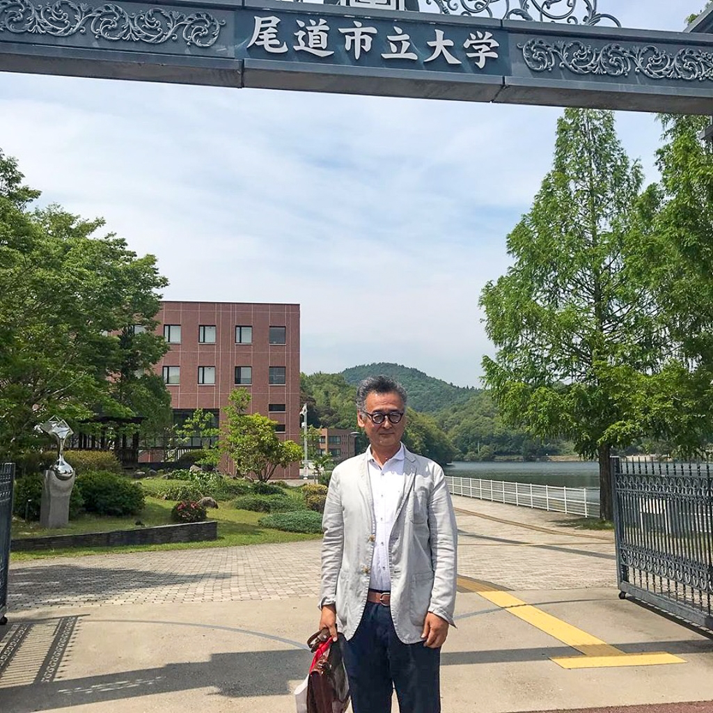
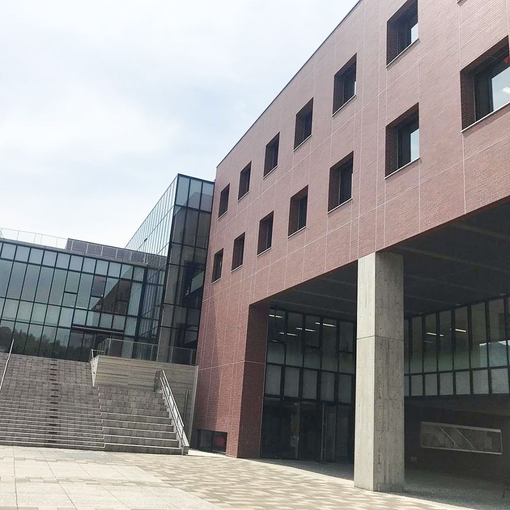
Onomichi City University Is a public university with a campus in Onomichi City, Hiroshima Prefecture.
The Faculty of Art, Fine Arts Department and day learn the Japanese painting, oil painting Text learn day in order to aim and scholar-writer of science Text are derived from the two courses of the Department, this time, students of the both I participated in the class.
Depart from Hakata Station by bullet train. Open the PC on the way and prepare for the final step.
Noticed on the Shinkansen train.
— Shigenobu Fujita (@ Tsukushi55) June 3, 2019
The brightness inside the car changes inside and outside the tunnel, and the MacBook seems to try to optimize the brightness automatically according to it. pic.twitter.com/IeOgI7q8xe
In the meantime, I arrived at Shin-Onomichi station. It took about 2.5 hours from Hakata Station.
I went to school by car, but I was a little frightened as to where I would be taken at first because I crossed the mountain on the way, but I arrived at Onomichi City University safely!
The campus is very beautiful and the atmosphere is very peaceful! It's quiet and calm so you can concentrate on your studies! !
Work and lectures that touch the Chikushi typeface
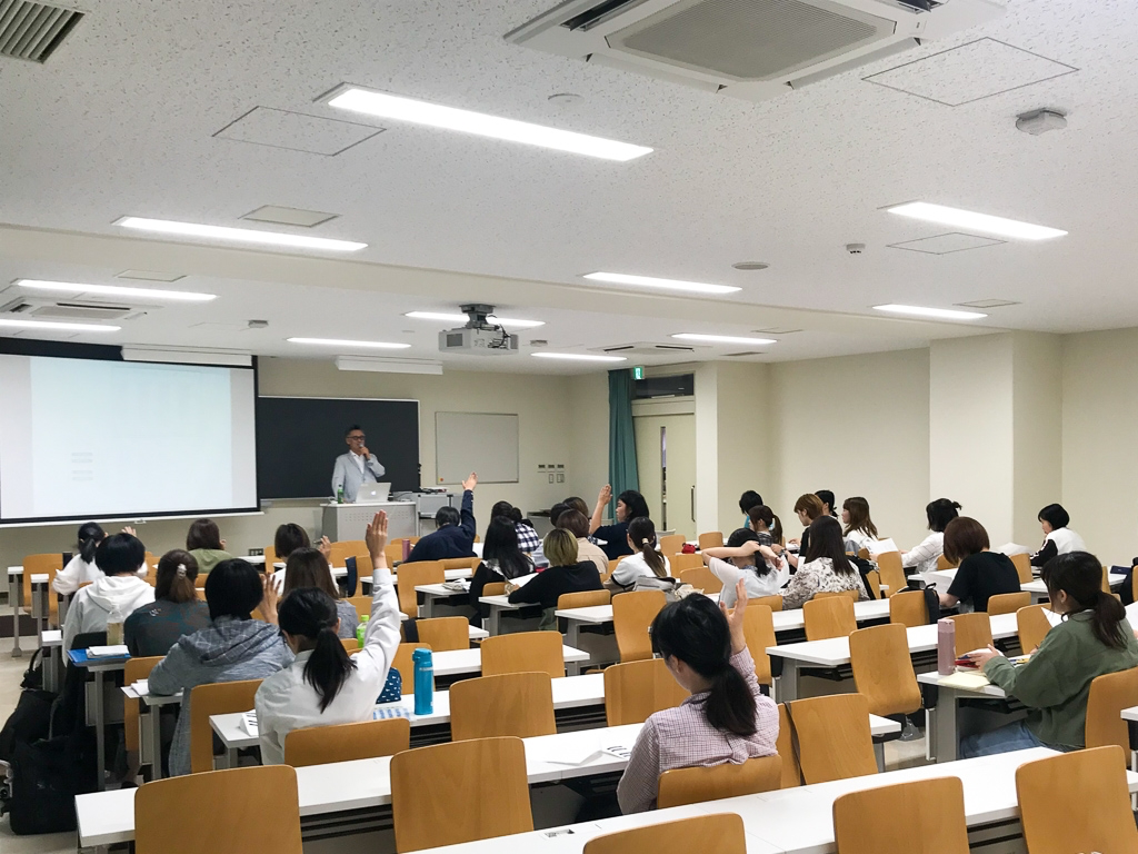
Well, the class starts at 14:50. It is a 90-minute lecture because it is a university.
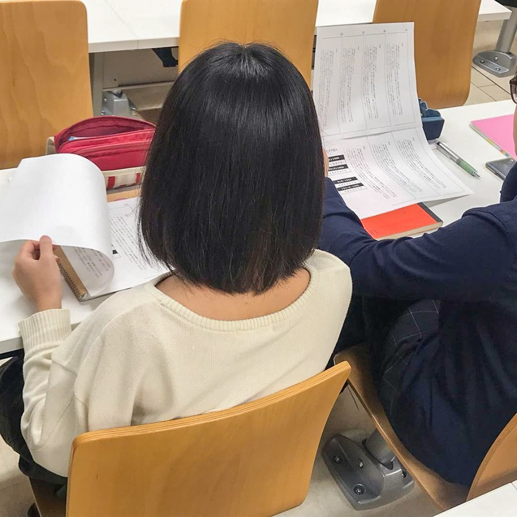
First, in the first 10 minutes, we had you work on a simple work. Fujita has prepared a paper material prepared with various fonts of each company, and we have prepared a novel Text composition. First of all, please compare it thoroughly for 5 minutes. The question asks which one of the AG types you like or not.
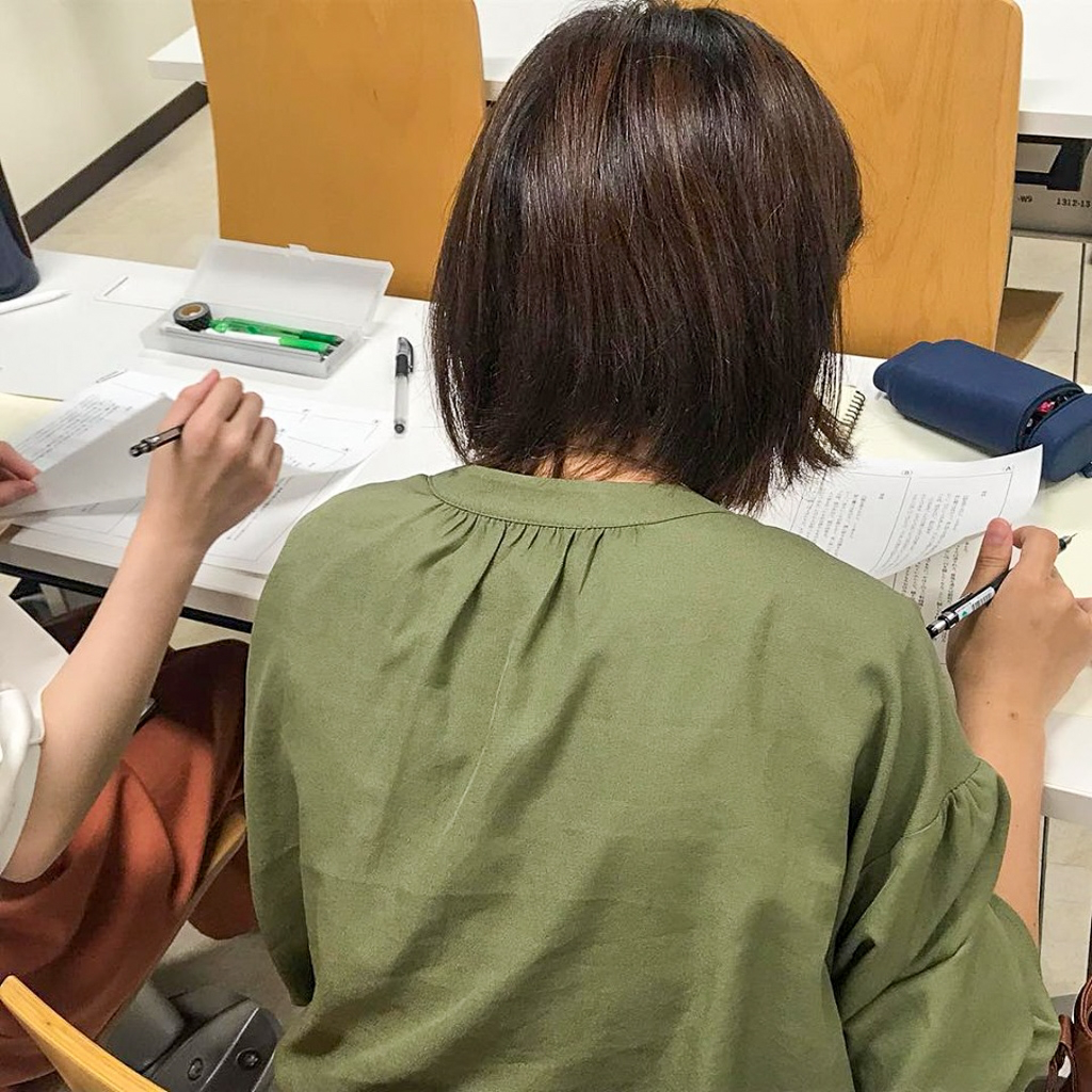
A student who really appreciates the materials.
Some students were choosing while talking to the person next to them, asking "What do you like? What do you like about it?", but the result was that the majority of students said they liked TsukuMin!
And there was not a single person who didn't like Chikushi very much!! Fujita also had a very happy look on his face as the opening stage began.
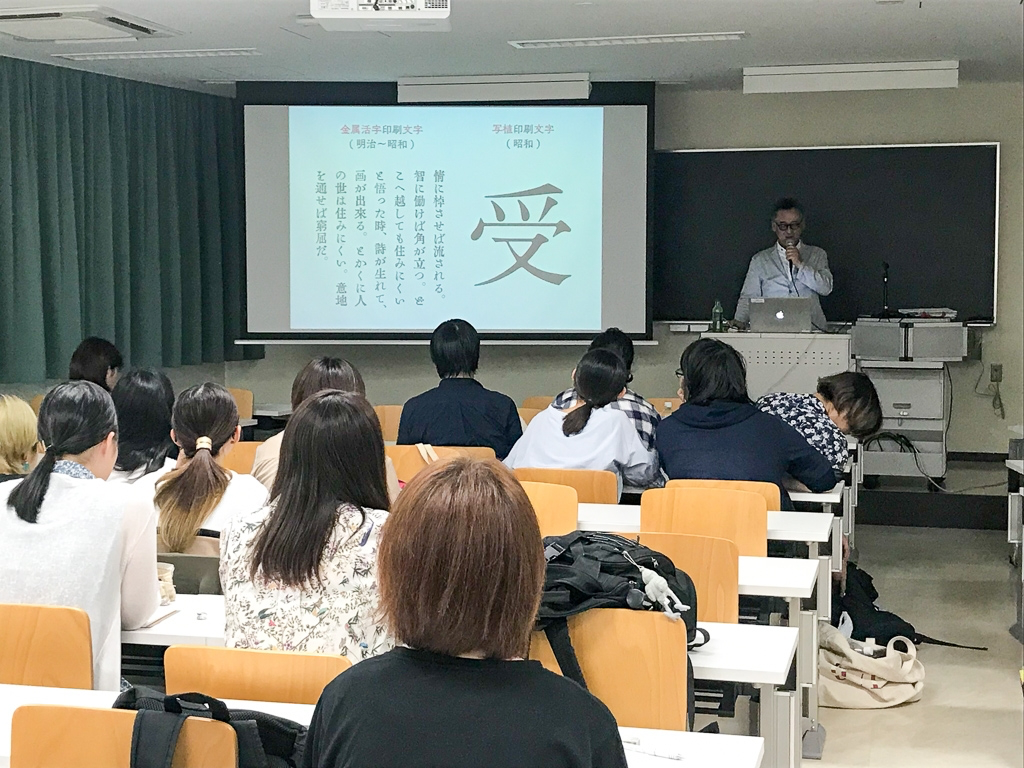
After that, we talked about the Tsukushi typeface, which everyone said they liked.
He explained how Tsukushi typefaces have incorporated new elements while reproducing the blurring of metal type, from metal type to phototypesetting and digital fonts. Students from the art department in particular are very familiar with fonts, and listened to the lecture attentively.
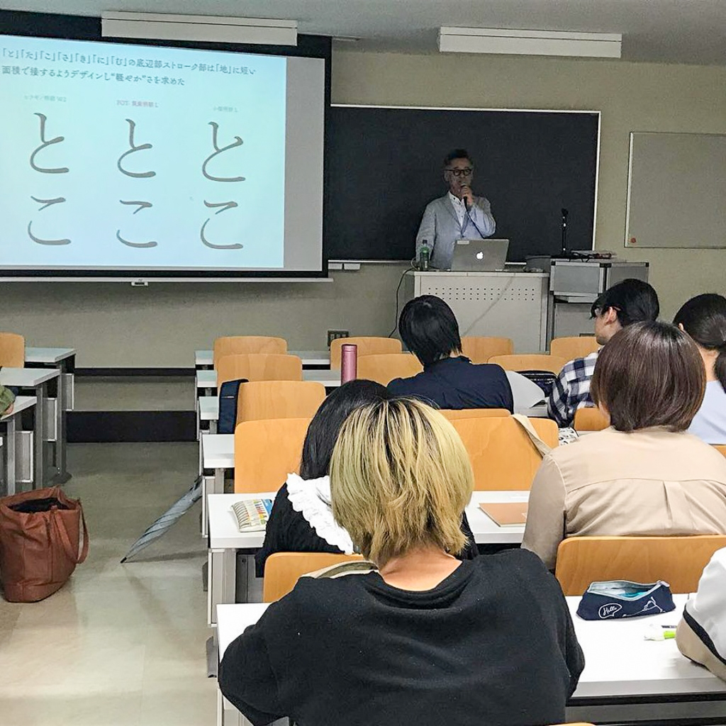
We will explain the attention to detail in the design of the hiragana and katakana characters in the Tsukushi font.
Hmm... the strokes of TsukuMin touch the "ground" with a short area...
Also, the kana are designed to slope upwards by 1-2 degrees to the right.
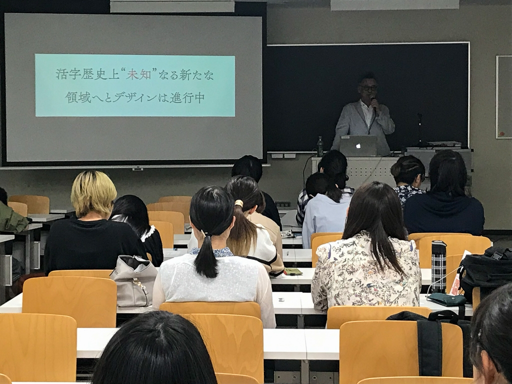
The design of the Chikushi typeface is underway into a new area that is unknown, in the history of printing.
It is very difficult to invent new things in Mincho style. Fujita is trying to pull it off!
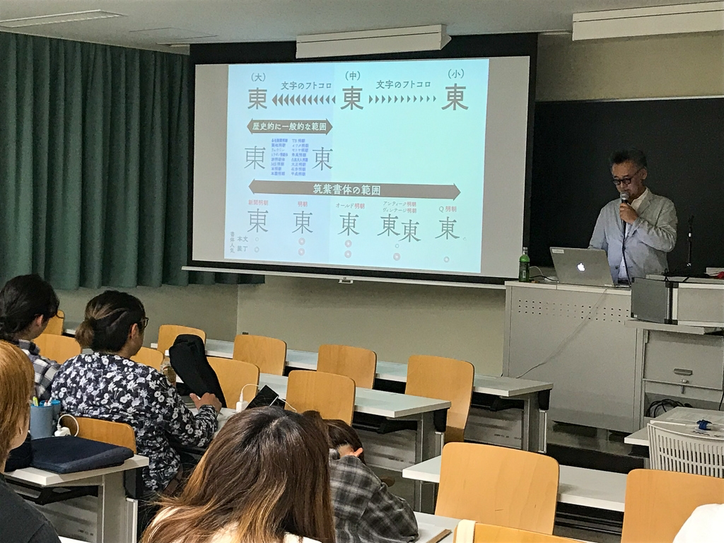
And the story of Futokoro, which is indispensable when talking about the Tsukushi typeface.
It retains the beauty of the kanji itself and retains the beauty of the form, such as when you encounter a page in which the ink of the metal printing era was rich and scented. It features a narrow futokoro that is tightly squeezed in kanji and the elasticity of the left and right halves, and makes use of the shape and skeleton unique to the character.
That's why the typeface is so relaxed that you can read while breathing by writing in letters.
The lecture progressed in that way, and 90 minutes passed in no time, and it was time.
Art and daily Text to students who have learned the science, that of the typeface of transition and Tsukushi typeface, became a precious time that can tell you and so on.
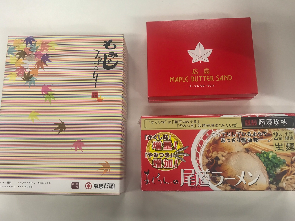
With a sense of fulfillment, I bought souvenir maple buns and Onomichi ramen on my way home.
was delicious!