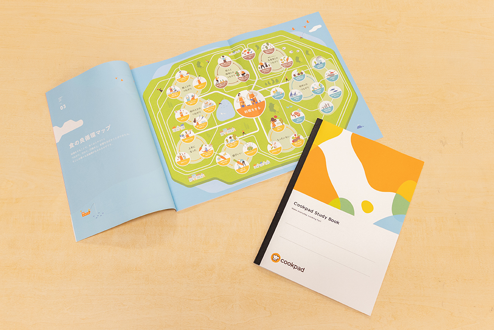
With the mission of "enjoying everyday cooking," Cookpad Inc. has businesses such as "Cookpad," a cooking recipe posting and search service, "Cookpad Mart," a fresh food EC, and "Komerco," a cooking Marche app. Is operated.
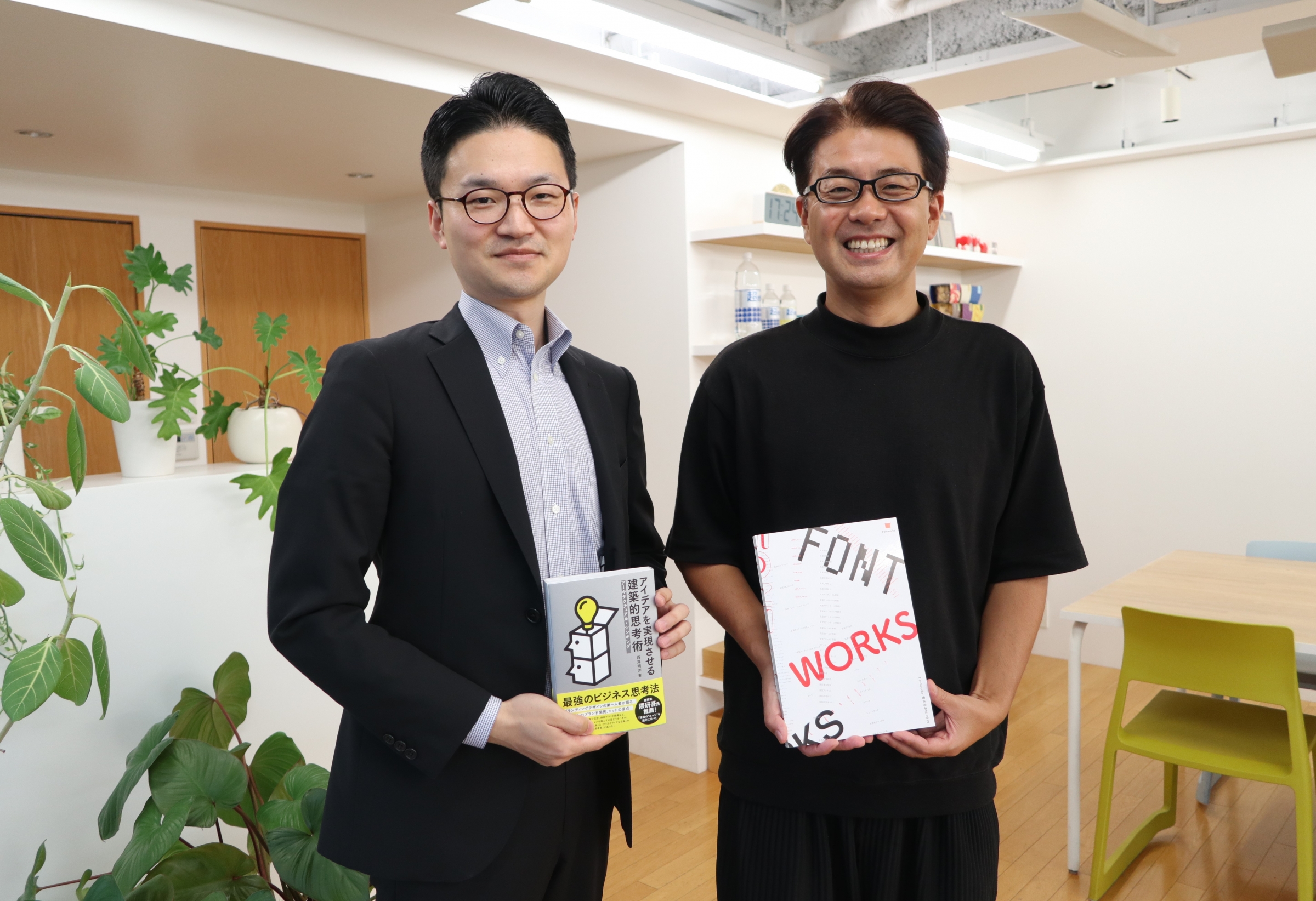
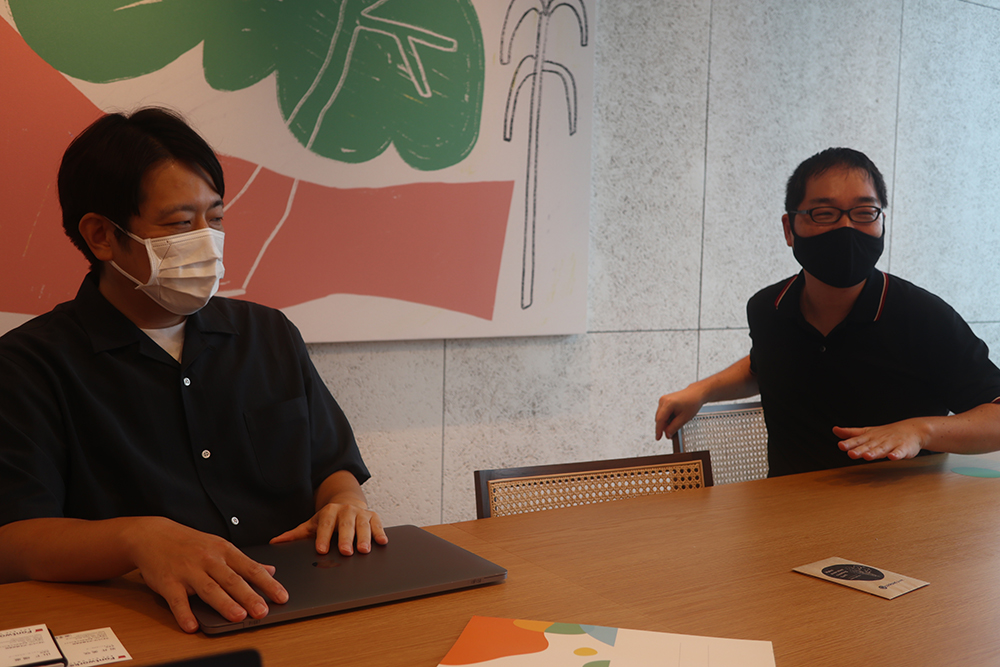
This time, we talked about the background of the introduction of the font and future prospects while approaching the personality of Mr. Sugita, Corporate Branding Department, COOKPAD Inc., who was involved in the introduction of the original font "Cookpad Sans".
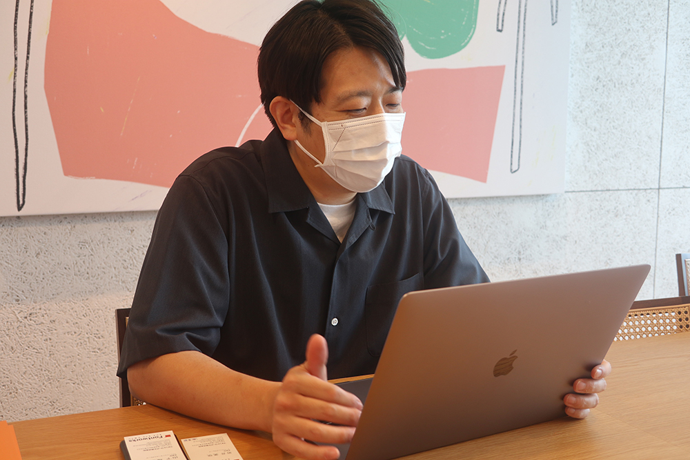
* The mask is removed only when shooting
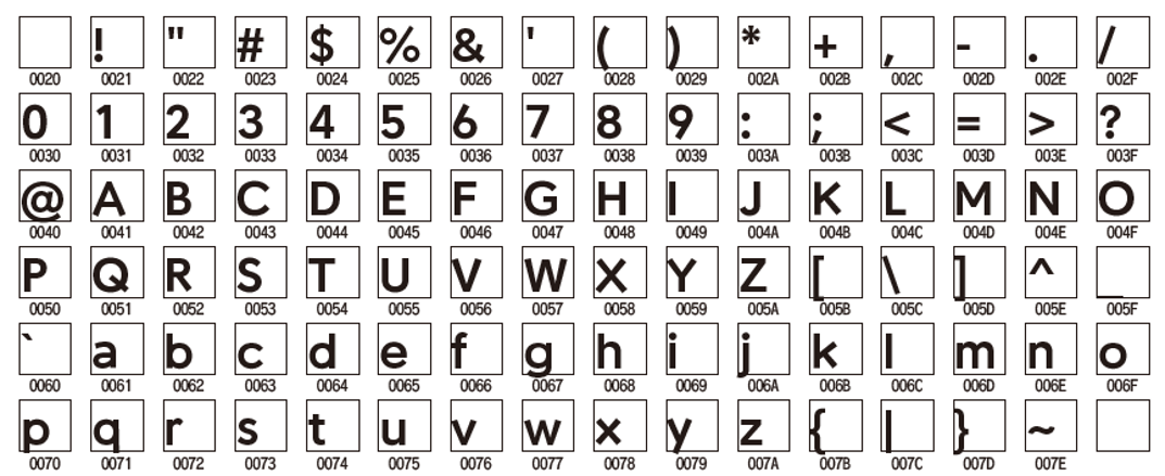
"Fonts" that are important for recognizing corporate brands
--First of all, thank you for introducing the original font.
I would like to know how you introduced "Cookpad Sans".
Mr. Sugita: This "Cookpad Sans" started as part of the "corporate brand design formulation" that I am in charge of. In this project, we are creating the brand concept and personality of the corporate brand, and the design concept for output.
"Font" is as important as "logo" in order to recognize the brand, but if the font is Cookpad original in various scenes, it will be more effective to spread the corporate brand to the world. I started to consider whether it could be done.
――In what kind of scene do you actually use the original font?
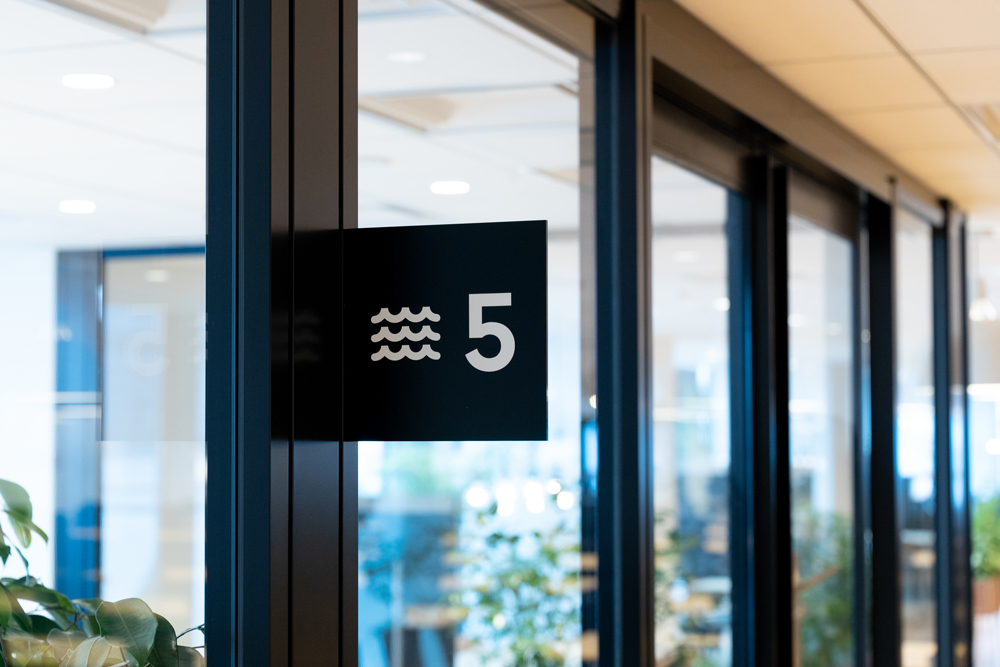
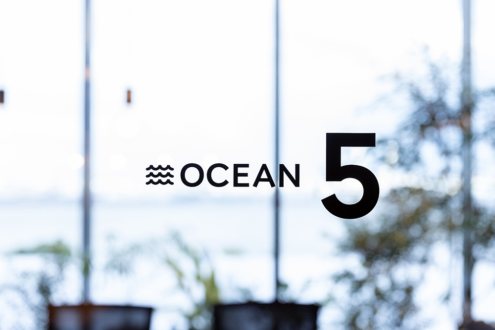
Mr. Sugita: I moved my office from Ebisu to Minato Mirai, Yokohama in May, and I immediately used "Cookpad Sans" to sign the conference room.
――Very fashionable and wonderful!
Mr. Sugita: I think there are many companies that have names in the conference rooms (while looking at the pictures of the actual conference rooms). In the office before the move, Cookpad had the name of vegetables in the conference room, but it did not penetrate. Of course, it is the most "functional" to express only with numbers, but that is not tasteful, so I thought of a name that could penetrate.
The new office in Minato Mirai, Yokohama is proud of the view because the sea is in front of you. At the same time, the Landmark Tower and commercial facilities are right next to it. Since we moved to a new location, we took advantage of the environment and named the conference room with a view of the sea "Ocean" and the conference room in the direction of commercial facilities with "City". rice field. So far, everyone has called me, so I think it's starting to penetrate.
We also use "Cookpad Sans" in novelty (vegetable seed) Packaging
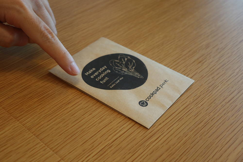
――It's wonderful! Why did you choose "seed" for novelty?
Mr. Sugita: There are several reasons why I chose "seed" for novelty ... I would like to talk about the relationship with the "maker", which is one of the reasons for moving the office.
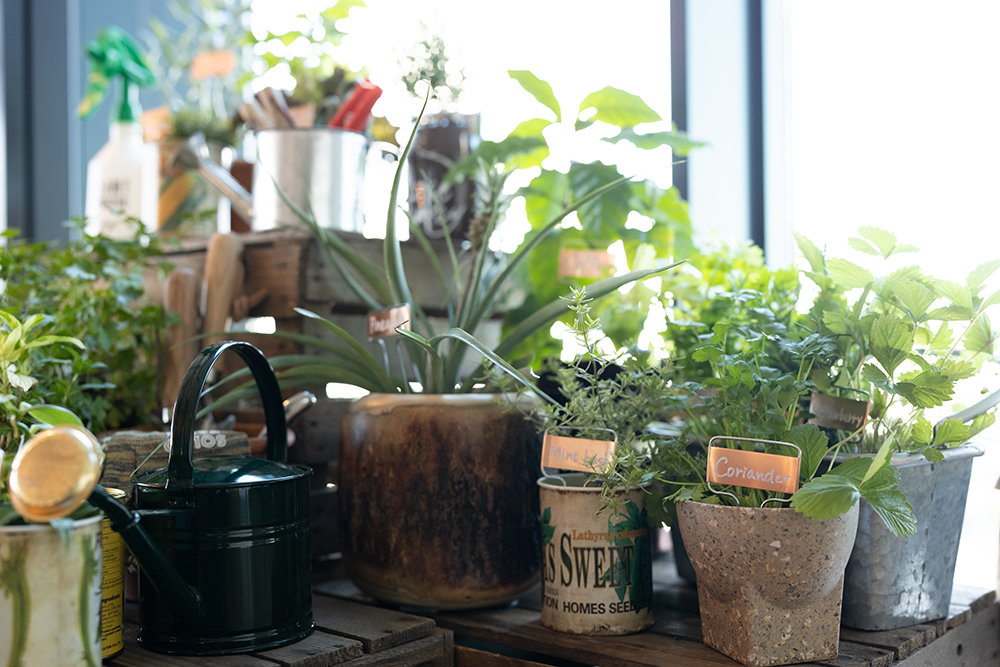
We call everyone who expands the enjoyment of food, including those who cook food, as well as producers of vegetables and writers who make tableware, as "makers".
While facing various issues in order to "enjoy everyday cooking" in daily work, I came up with the idea that it is necessary to shorten the distance with the "creators" and solve the issues together. I did. Yokohama is a place where people gather, but there are also markets and large shopping streets, so it's easy to live in, and it's also close to places where there are many producers and writers, such as Kamakura, which is a little further out. .. In such a place, I moved my office to Yokohama, thinking that I could develop products at a close distance to the "makers".
Therefore, in order for the employees working in the new office to feel closer to the "maker", there are many food-related plants and many plants that can actually be eaten in the office.
Mr. Sugita: We started presenting vegetable seeds with the hope that those who came to the office would feel the joy of cooking and the joy of growing them, and that they would become "creators."
Aiming for a globally unified corporate brand design.
――You have already used "Cookpad Sans" in various scenes. Please tell us about your future development image.
Mr. Sugita: I would like to use it in various products and media to spread it, but I hope that it can be applied globally in the future. I belonged to the branding team of a company that is expanding globally in my previous job, but even if the design reflects the culture and trends of each country, by consistently using the original font, as a global brand I was able to realize that I could secure the values and image of.
Cookpad Inc. has a global head office in the United Kingdom and has expanded its services to many countries, but has not yet established a corporate brand like Japan. It's not in that phase yet, but it would be great if Japanese corporate brands and "Cookpad Sans" could be applied globally.
Using original fonts is also a big challenge for us. There are already Weight letters)", so I would appreciate your continued cooperation.
--of course! Let's walk together! !!
--Then finally. What does "corporate branding design" mean to Mr. Sugita?
Mr. Sugita: It's difficult to say in a nutshell, but I think it's about getting people to know and understand the power of design in order to increase the number of people who sympathize with the company's mission and vision.
――In building a “brand image” for users, the power of design = an effective means of visually communicating!
Thank you for telling us a valuable story today!
At COOKPAD Inc., under the mission of "enjoying everyday cooking," we are facing various "creator" issues and taking on challenges to solve them. Mr. Sugita also had a feeling of respect for people related to food, and I felt enthusiasm for solving problems during the interview.
Thank you very much for choosing Fontworks for the production of the original font "Cookpad Sans" as an element of the wonderful Cookpad branding.
In response to Cookpad's thoughts, the author would like to enjoy cooking and eating every day even more.
Date of coverage: July 5, 2021
![]()
Cookpad Inc.
With the mission of "enjoying everyday cooking," we operate businesses such as the cooking recipe posting and search service "Cookpad," the fresh food EC "Cookpad Mart," and the cooking Marche app "Komerco."
https://info.cookpad.com/
The person who wrote this article