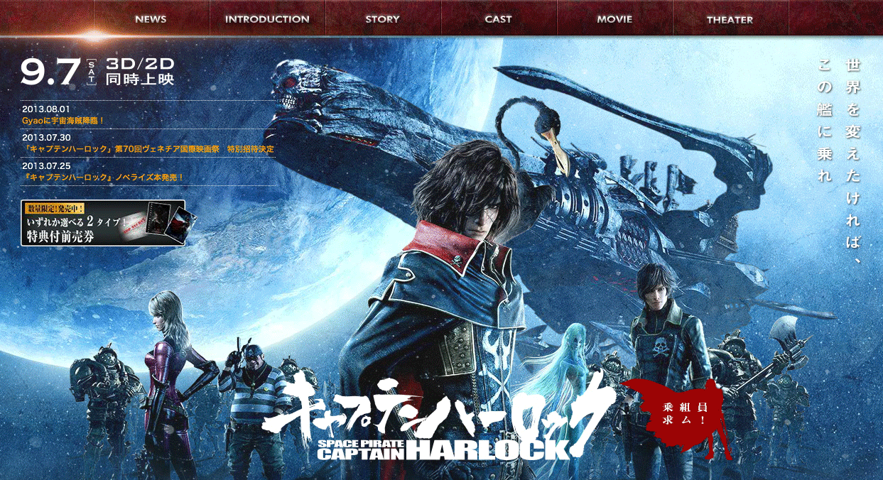
松本零士氏が生み出した伝説のキャラクター「宇宙海賊キャプテンハーロック」。かつて少年の心を虜にし、男たちの魂を焦がした反逆のヒーローが、壮大なスケール、圧倒的な映画インパクトと共にスクリーンに蘇る。 単なるリメイクではなく、松本世界の魂を大切に保ちながら、より壮大に、より斬新にリブート(再誕)させた作品。2013年9月7日(土)より全国公開。
マーザ・アニメーションプラネット様のご紹介
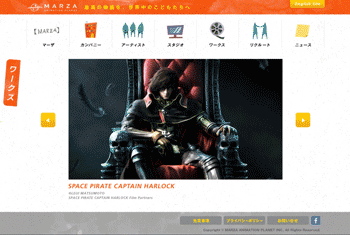
マーザ・アニメーションプラネットは、株式会社セガの3DCGアニメーション開発部門を原点に、 セガサミーグループの3DCGアニメーションスタジオとして2009年6月に設立されました。
長年培われてきた制作管理システムや、R&D環境などの3DCG映像制作技術に加え、 オリジナルストーリー開発環境を保有するなど、国内最高峰の3DCGアニメーション制作基盤を構築されています。 その技術や環境を活用し、日本文化とグローバルストーリーテリングを掛け合わせた独自の世界観を持つストーリー開発を行なうことで、高品質なオリジナル3DCGアニメーション映画を製作・提供し続けるアニメーションスタジオを目指されています。
今回は、同社が創り出す新しい夢と冒険の世界を、3DCGアニメ映画『キャプテンハーロック』の制作を含めてお話しいただきました。
マーザ・アニメーションプラネットでの制作経緯
『キャプテンハーロック』の制作に携わった経緯としては、東映アニメーションの取締役から荒牧監督へお話しをいただいたときに、監督自ら弊社にも声をかけてくださったことがきっかけになりました。
監督とは以前からいくつかのプロジェクトをご一緒していましたし、世界と互角にわたり合えるクオリティの高いフルCGアニメーション作品を作りたいということで、一度組んだことのある信頼できるスタッフやスタジオで一緒に仕事をしたいとお誘いいただきました。制作当時は弊社の実績としてリアル系のCG作品が多くはなかったのですが、長編作品を作ってみたかったことから依頼をお受けしました。
そこでまず、約3分のパイロット版「RITA」を作成することになりました。「RITA」は、本編の制作を開始する以前の2009年に作成したのですが、このときはまだ本編用のシナリオ制作が並行して進められているころでした。
原作の魅力を崩さずに、かつ現代社会が持つテーマを反映させたリブート作品となるので、「RITA」では自分たちが目指す映像表現をスタッフ間で共有することでスタッフ間のクオリティに差ができないようにし、またその制作に求められる技術やコストの把握ができることを徹底しました。
パイロット版「RITA」の字幕にはニューシネマを採用
「RITA」の制作時に「ニューシネマ」を使ったのが、本編でもフォントワークスフォントを検討、使用するきっかけでしたね。正直なところ、「フォントって何を持ってきてもわからない、字幕は字幕だろう」って少し軽く考えていたところがありました。
ところが、いくつか候補に挙げた書体をあててみてもどうもしっくりこなかったので、社内にあった書体の見本帳を開いて皆で選ぶことにしました。そこで偶然、字幕書体「ニューシネマ」が目についたんです。「映画でよく見る字幕の書体はこれか!」って。目的に応じた書体選びって大切なんだと痛感しました。
この「RITA」の制作意図としては、本作の礎になるであろうものを固めておくことで、今後の本編制作に向けてもブレることなく進行することだったので、字もアタリとしてでなく、できるだけ字幕書体を使って本編に近い雰囲気を出したかったんです。 結果、目指すところが決まっていたことで、映像そのもののクオリティの向上にも繋がったと思いますし、良いものを作っていきたいという気持ちの面でも奮起させるものが「RITA」にはあったと考えています。
本編では、声優さんがいらっしゃることから字幕の表記はありませんが、冒頭部分にあるテキストには視認性の高い書体「ロダン」を選んで使っています。
媒体が変わったときでも安心できる使用許諾が極め手
映画になる作品に携わることは、その作品が後にDVD化することも考えて、できるだけ後で権利関係で問題が起きないように普段から気をつけるんですよ。それに今回は、原作があまりにも有名で、世界中にも多くのファンがいる作品であることから、必然と使用許諾には敏感になりました。そのため、使用個所が決まる前から許諾が明確なフォントだけを集め、その限られたデザインの中から選定して使っていくという進め方でした。
その中でも【LETS】は、全てのフォントが同じ許諾内容で使えるため、安心して沢山のデザインから選ぶことができました。ただ、本当に権利関係が複雑な世界なので、そのつどフォントワークスさんに問い合わせながら進めていったことを覚えています。
最近ではベネチア国際映画祭で特別招待作品に選ばれたり、世界各国の配給会社から沢山のオファーがある注目度の高い映画ですから、何度もやり取りをして進めていって良かったと思っています。カタログなどにも許諾の明確な記載はありますが、もしものことがあると大変ですからね。
ご協力いただいた旨を、フォントワークスさんの紹介も兼ねてエンドロールで記載させてもらってますよ。
テクスチュアなどの細かい表記にも使用
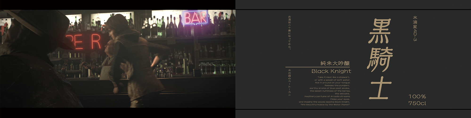
冒頭にでてくる酒場のシーンがありますよね。青年ヤマがアルカディア号に乗船する前のシーンなのですが、実はここでも小さな瓶ひとつひとつのテクスチュアにフォントワークスのフォントを使っています。とっても小さくて劇場でご覧いただいてもすぐにはご確認いただくのも難しいくらいなのですが、フルCGでの作成のため細かい箇所でも徹底的に作り込んでいます。
ただ、映画内で登場する全ての文字に、デジタルフォントを使用したというわけではなく、アルカディア号船内ではイメージにちょうどいいステンシル系のフォントを、自分たちで作成するなど、こだわりをもって対応したところもあります。
そういったデザイン面でのこだわりを大幅にカバーしてくれたのが、【LETS】の持つ書体のバリエーションだったと思います。細かい箇所も丁寧に作り込むことで、よりリアリティあるものに仕上がったと思います。
非常に頼もしいスタッフのような存在です
和文、欧文の統一されたデザインが、オーソドックスな書体からアーティスティックなフォントまで、 豊富な種類を揃えてあるので、今回の『キャプテンハーロック』では、エンドロールから、劇中のポスター、宣伝用の看板までいろいろ使わせてもらっています。
また、映像作品での権利処理のシンプルさでいつも大変助かっています。
非常に頼もしいスタッフのような存在です。
今後ともよろしくお願いします!
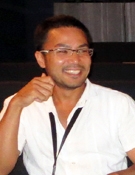
荒牧伸志
1960年生まれ、福岡県出身。メカニカルデザイナー・映画監督。
主な監督作品に『キャプテンハーロック』『APPLESEED』『エクスマキナ』など。 フルCGアニメ業界をリードし続ける日本を代表するデザイナー・演出家。 アニメのデザイナーとしても、『機甲創世記モスピーダ』『メガゾーン23』『機動戦士ガンダム MSIGLOO』『鋼の錬金術師』などを手がける。
<編集後記>
世界中のファンが見るこの映画に、弊社のフォントがたくさん使用されていること、またその映像の美しさに感動しました。微力ながら、弊社でもお役に立つことができ光栄です。
エンドロールには、荒牧監督のお気に入りのフォント「セザンヌ」を指定したと伺いました。冒頭部分のテキストに使用されている「ロダン」と併せて、劇場で映像の美しさを体感しながら、ぜひフォントを探してみていただきたいと思います。
企業情報
| 社名 | マーザ・アニメーションプラネット株式会社 |
|---|---|
| 所在地 | 東京都品川区東品川2-2-20 天王洲郵船ビル 18階 |
| TEL | 03-6381-0562 |
| FAX | 03-5461-3061 |
| URL | http://www.marza.com/ |
「LETS」プログラムへのご入会や製品のご購入については、お取引のある販売店様へお問い合わせ・ご注文くださいますようお願いいたします。