This time, we asked Fujitsu Design, who developed this "Always Assist Fukumaro", to create the fonts used in the "Always Assist Fukumaro" installed in the Fujitsu PC FMV.
FUJITSU DESIGN SOLUTION, which is the character of AI that is at the forefront of technology and what kind of design was required for "Fukumaro" which also has the concept that "PC becomes a family" and the charm of the finished font We interviewed Mr. Takahiro Ibi and Mr. Tomoyo Ueda, Platform & Design Group.
We also asked Morita, the Type Designers of the Fukuma font, about how he solidified the design proposal when he designed the typeface, and what he had to say.
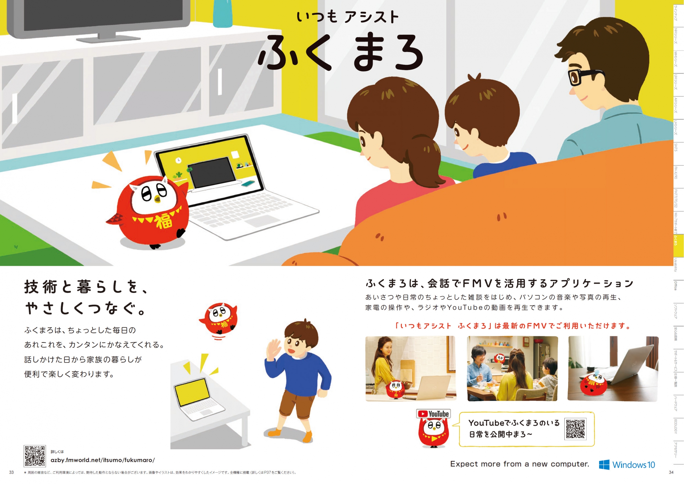
"Always assist fukumaro" product concept
-Tell us about "Always assist Fukumaru".
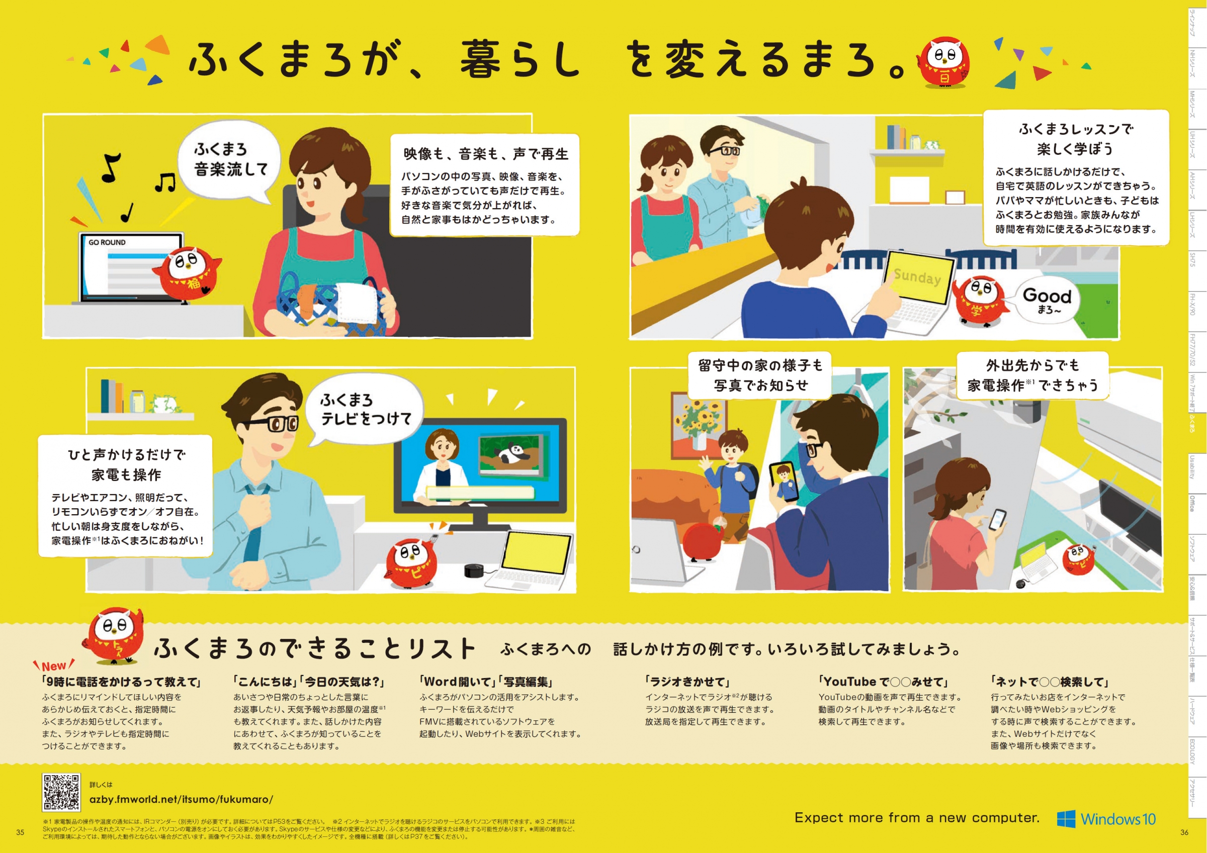
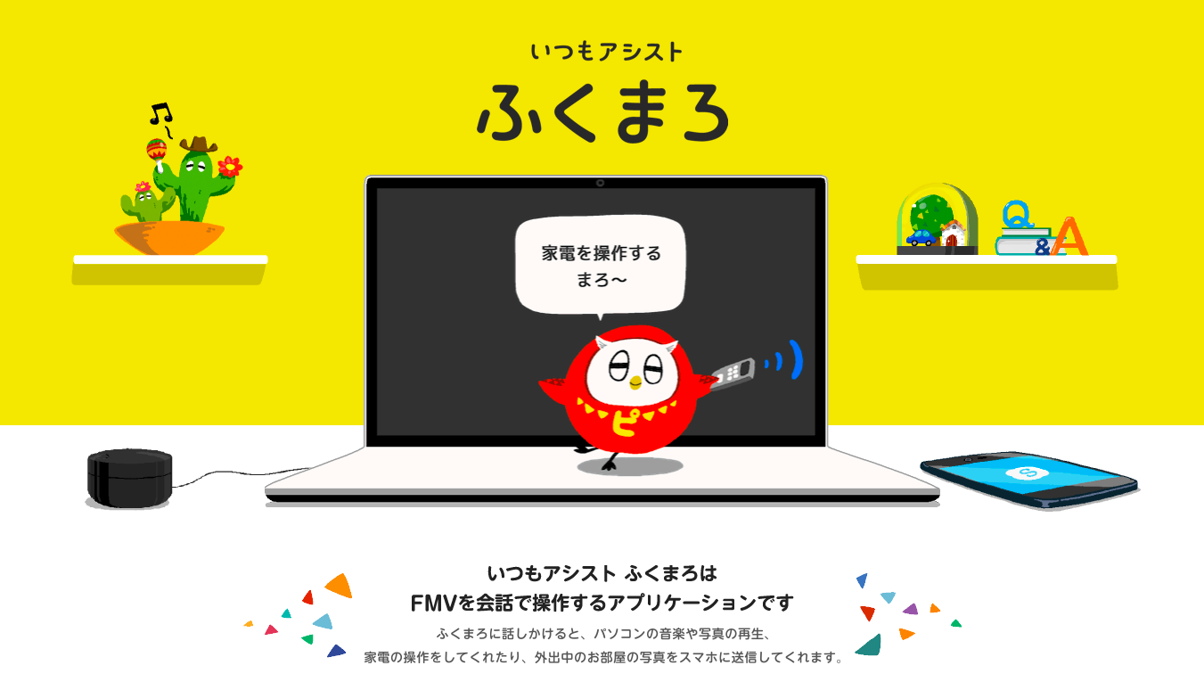
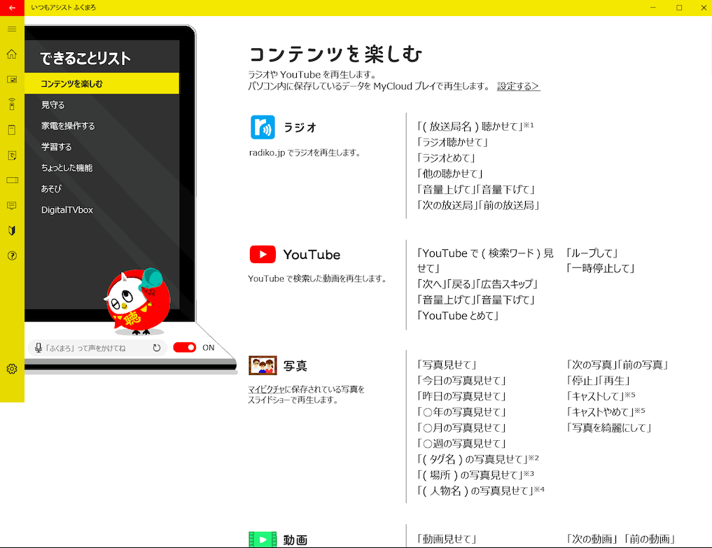
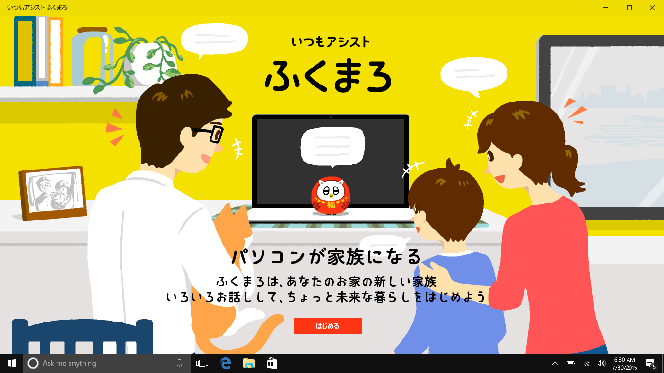
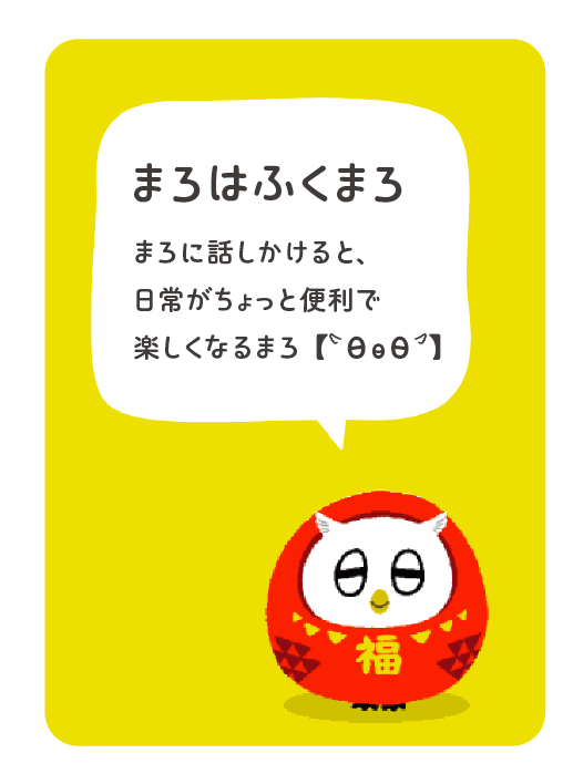
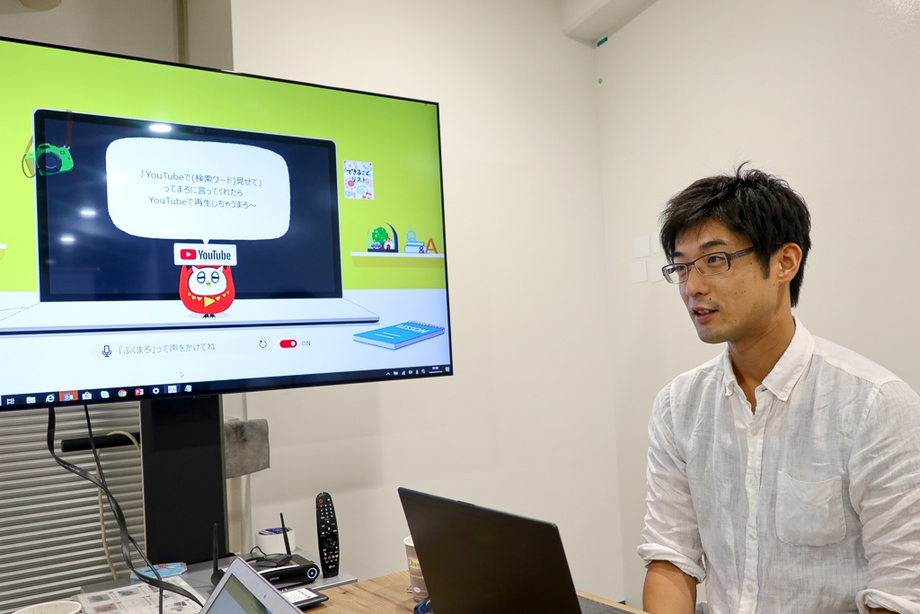
"Always assist Fukumaru" is a voice assistant App that Support life in a fun way. Just by talking to the character "Fukumaru" who lives in the FMV, you can search the weather and the Web, play contents, and operate home appliances. If you use a smartphone, you can check the state of your house and operate your home appliances from around the world.
The reason why the character "Fukumaro" was incorporated into the application that operates a PC with voice is that when the new technology of voice operation became popular, it became possible for the PC to talk with a personality rather than as a tool. There was a theme that if we could enter the family as a member, the usage and value of personal computers would change significantly.
Although it was a slightly strange theme, we deeply considered what kind of character the PC should be in order to be accepted as a member of the family, and finally the character "Fukumaro" was completed.
The owl, which is a motif of the bear, expresses the intelligence of the personal computer, the daruma that is auspicious at home.
From the process of deciding the character to the detail of the character, the designer played a central role in the production, involving the project members. Based on more than 50 character proposals, we have repeatedly evaluated it through in-house workshops, web surveys, and interviews, and have repeatedly brushed up.
From the cute appearance, the completed Fukumaru is a good opportunity for users who are not interested in new technology to use the voice assistant.
Create a font that expresses the character "Fukumaru" that can be forgiven even if it fails
Some of the proposals had a little more AI-like intelligence, but there was a theme of "computers become a family," so instead of being a character like a butler, it's more like a pet that is a member of the family. It was decided to be the character's bear.
The technology of operating machines with voice is spreading mainly in smart speakers, but it is still developing and it does not understand and respond 100% to what humans have said.
That's why by controlling the character to have a loose appearance, we control the gap between user expectations and reality.
-Why did you want to create a font for "Fukumaru"?
Originally, I was using existing fonts, but I was not satisfied, and I thought that there should be more fonts that fit better. As a result of examining various fonts, it was talked about trying to make a special font for Fukumaru.
I also expected that if there were font files that could be incorporated into the application, they could be used widely within the application, and the quality and efficiency of the design could be improved. I also thought that it could be widely applied to Video, catalogs, and character goods used in promotions.
-Why did you request Fontworks?
I've heard that your company makes fonts with a strong sense of the world used in games. Therefore, I was hoping that I might have some knowledge about the production of fonts for characters, and that I could enjoy working on it.
Also, I was addicted to the game "Splatoon," and I really liked the view of the world, and I felt that there would be no doubt that it was a company that made the fonts used there.
Until the completion of "Fumaro Font"
Based on TsukuARdGothic-E
First, we started by selecting the base typeface. After much deliberation by the typeface design team, we selected three fonts that had a cute, round image based on the impression we got from "Fukumaro."
From Fujitsu Design:
・It doesn't have to be too strict (it's like lounging around at home) / It gives a sense of security (silly, relaxed)
・It would be better if it wasn't rounder than it is now / ・I want to prioritize impression over visibility
We received such requests, and initially we were thinking of emphasizing the cuteness of Fukumaro's appearance, but we reconsidered and thought that a slightly different design might be better, and proposed the following eight fonts again. Based on the feedback from Fujitsu Design, we decided on the direction of "a version of TsukuARdGothic-E with the kana changed." At this time, we were also given the concepts of "flat brush feel = Fukumaro feel," "a slightly relaxed atmosphere," "handwritten feel," and "simple feel."
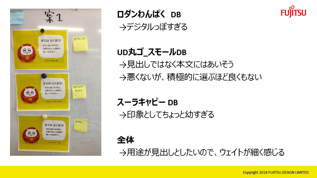
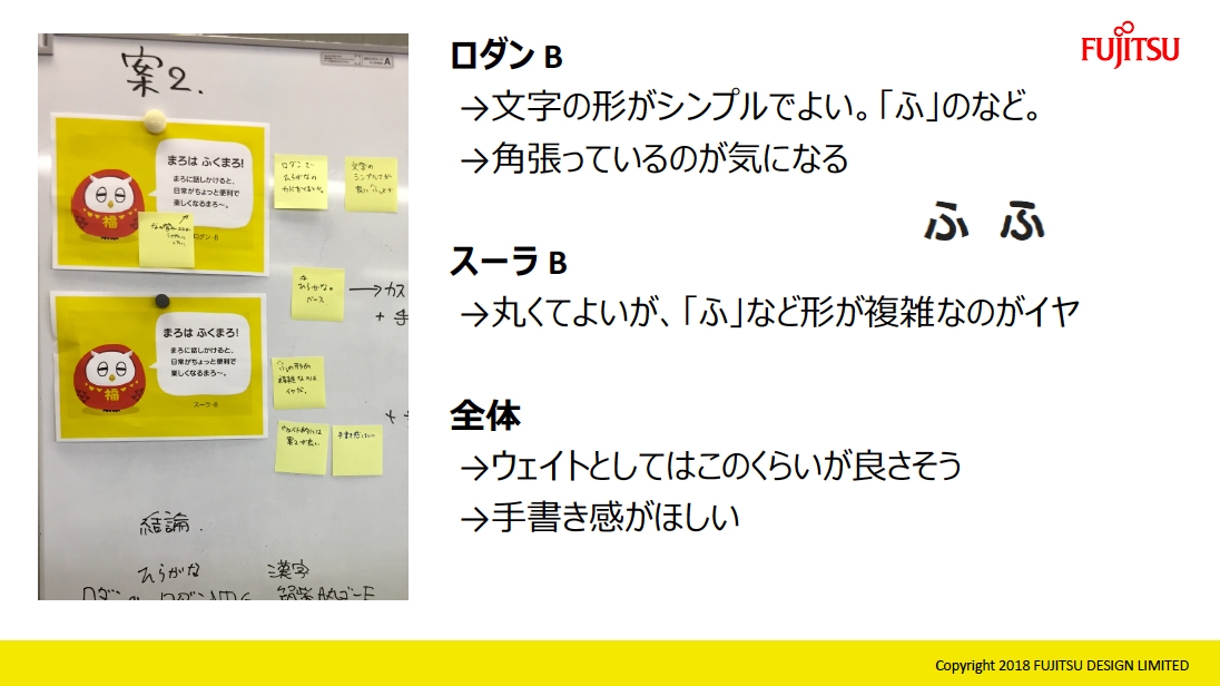
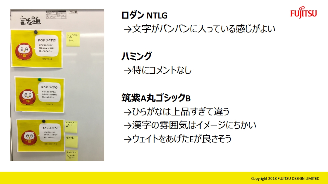
▲ Fordback from Fujitsu Design for the 8 typefaces we proposed for the second time
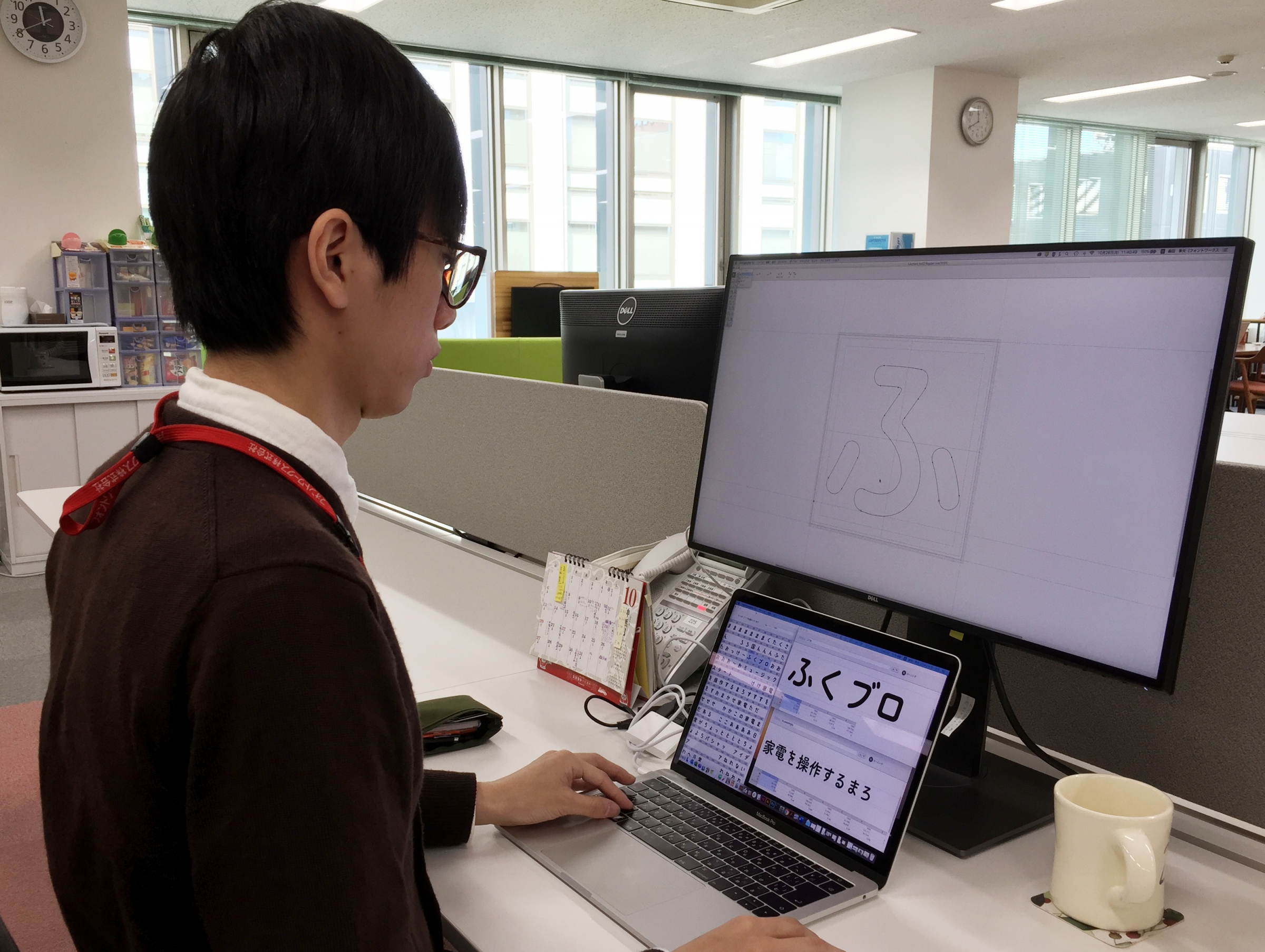
Book production
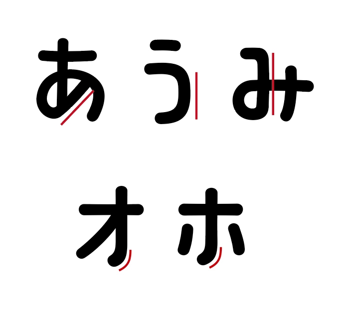
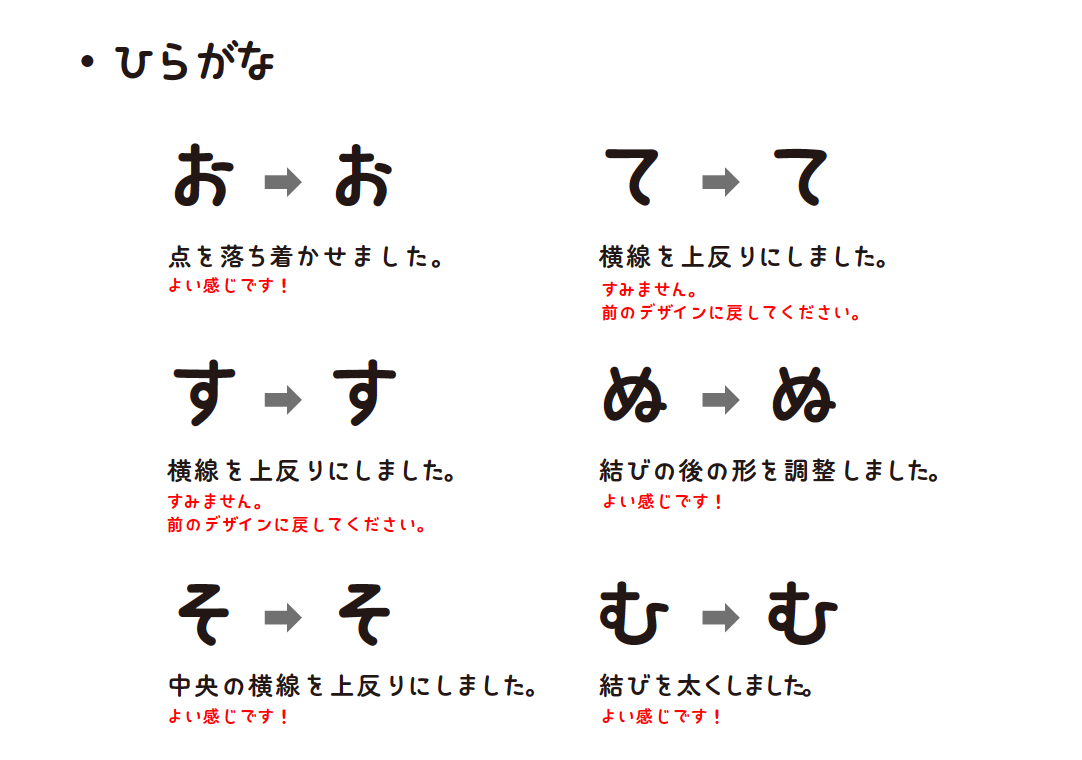
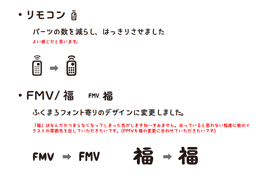
We received feedback on the preceding 50 characters and started to produce all characters. So far, I used to design with a rough handwriting feel, but I got the opinion that the tone is good, such as "I tried to write it like a digital, but I got an analog feeling because it was bad shit" The design incorporates a geometrical (but distorted) shape.
As a whole, I cherish the "loose lines" and express that they are not too straight and not too beautifully curved, and I also remember that I was very distressed how to put a characteristic "habit." If you play too much, you may feel brutal rather than "missing," so that balance is important. Since there are few straight lines in hiragana, I aimed for a feeling of being squiggly by putting a straight line in a place like "Should this be a straight line?" Since katakana originally has a simple shape, we intentionally made a part that bends strangely and designed it to eliminate the "tightness".
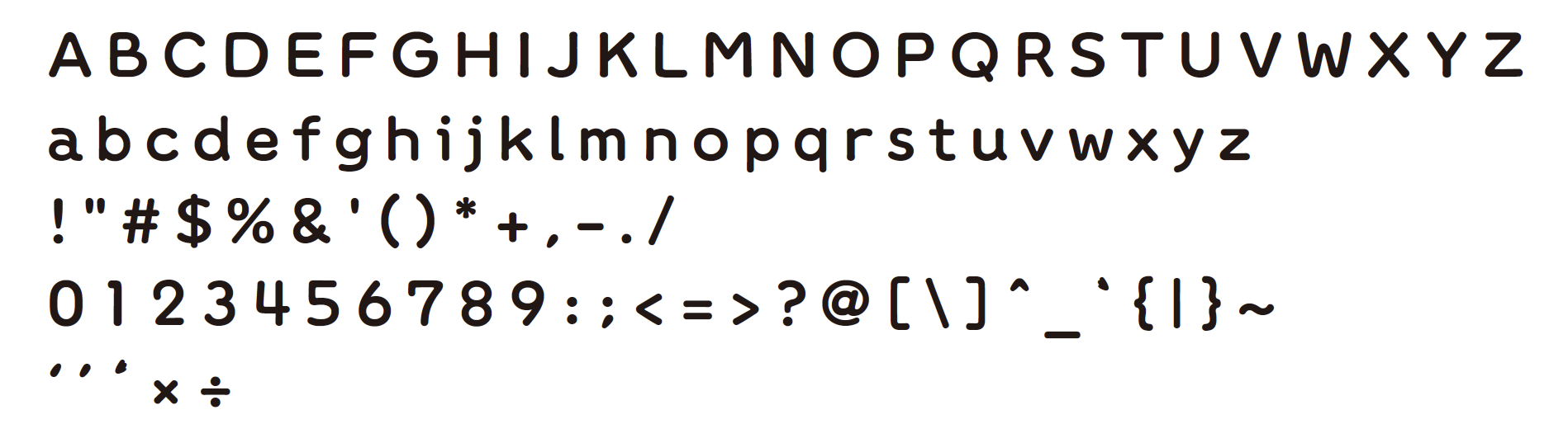
Regarding alphanumeric characters, I made it so that I could feel a digital feeling somewhere, while being aware of the feeling of "Korokoro".
Interaction in production
We proceeded with the process of creating a design in the form of a document, adding correction instructions and impressions to it, and further improving the correction.
The importance of fonts in branding
It's cute, but it's not too round, and I like the balance of distortedness. I think it's a missing font.
I felt that it was a font that successfully embodied the charm of Fukumaro.
Normally, in UI design that I do, it is important to organize things, but if you do it with the design of "Font for Fumuro", the looseness and missing feeling that are the charm of the character will disappear. It was difficult to lose. I think Morita-san worked hard to create the right balance that fits well with the body.
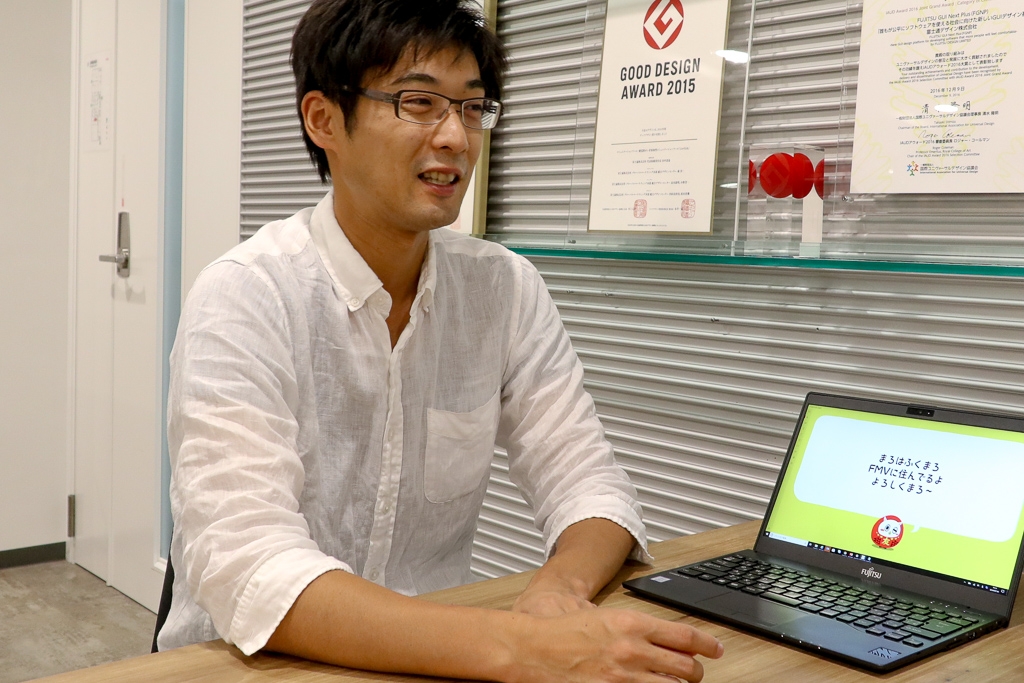
The completed fonts were incorporated into the app and updated to use the lines spoken by Fukumaro.
The words that the user spoke to the bear are displayed in the existing font that the Windows OS has, but the serif of the bear is displaying "font for the bear". By changing the words of the bear to the font for bear, I think that the words of the bear are easy to understand and the impression is stronger. I thought that the power of the font was amazing once again when I thought that people using this application would be able to understand it when they looked at "Fukumaro Font" elsewhere.
Normally, when designing a UI, I can't choose the font freely, so I once again felt the versatility and effects of the font.
This time, we have signed a contract to use fonts on a project-by-project basis and are using it widely among the people involved. For example, we are making PowerPoint documents related to the project in "Fumaro font". The looseness of the frame is also felt from the font, so even a serious conference material will naturally have a subtle impression. In addition to being used internally as well as by affiliated companies, I feel that the world view of the world is naturally expanding.
I don't think there are so many characters that have their own fonts, so I think it's a very luxurious experience. Also, I strongly feel the power and effect of the font, which has strengthened the world view of Fukumaru.