Introduction of Onomichi City University
Onomichi City University Department of Fine Arts is a department that provides education for the purpose of producing human resources who are engaged in creative activities such as painters and designers. As one of the towns of art and culture where Onomichi City aims to live and live, it aims to foster specialists and contribute to local culture.
I think that the activity as an artist requires a willingness to express and a certain modeling ability to support it, and in the first year, practical training that emphasizes basic practical skills without being obsessed with specialized fields and develops basic modeling ability Has been incorporated.
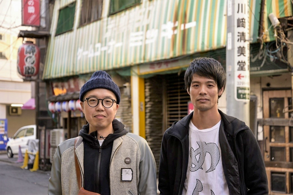
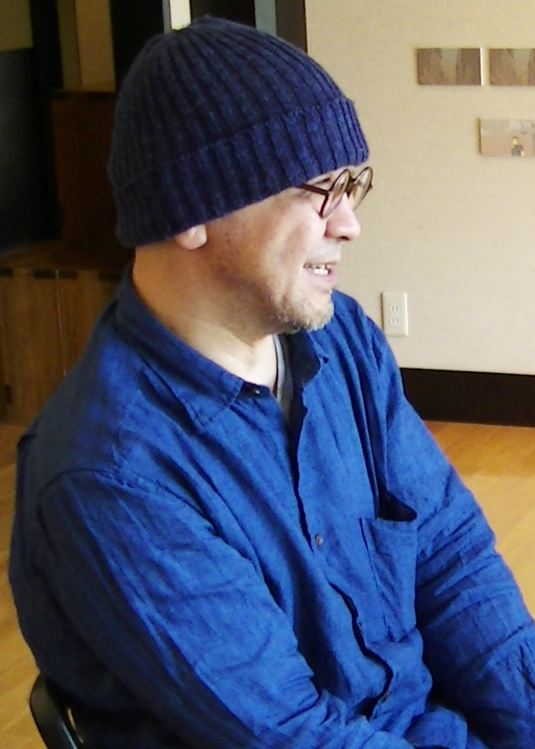
This time, we asked Associate Professor Takaoka of the design course and students Hirai and Kimura about the importance of fonts in design.
I want you to know the importance of letters in design properly
One of the major characteristics of Onomichi City University is that you can study the basics of Japanese painting, oil painting, and design in the first year, and then choose the course you want to study in earnest.
I teach in typography and editorial in a design course. With the idea that we want you to know the importance of characters properly and to learn the knowledge of fonts properly, we try to put emphasis on fonts, such as giving a lecture from a font maker who is an expert.
It's a psychology, but I think it's necessary to have something like guts to handle letters. There are times when students try to improve the accuracy of the whole production, and they often leave the letters behind, and there is also a dilemma due to the relationship with other graphic elements. It's important to have a consciousness that I like letters and are making them, and I think it's a task that I am particular about.
For that reason, I would like you to understand and understand the basics from now on. Characters that are indispensable as an element of design. I would like to introduce how students at Onomichi City University perceive it through the students, rather than from my explanation.
Hirai-kun is a graphic artist, and Kirai-san is an editorial artist.
Why it became that design is important
I was originally interested in design, so I majored in design from high school. In high school classes, I had the opportunity to come in contact with letters such as the lettering test throughout the three years, but at that time I didn't feel like I was interested.
Of course, I learned knowledge about the mechanism of letters here, but the opportunities to make logos at the university increased, I began to think that it was interesting as I investigated how to express letters, and I will focus on the letters part in graphic design as well. It has become.
As an extension of that, I am creating European fonts and studying the design of Japanese. Actually, I often write my own characters, and I don't have much opportunity to use existing fonts, but I sometimes incorporate those that I think are easy to use and I like the design. Mainly because I'm doing graphic design, I think that in a good sense, a “flat” design that is “characteristic-free” is easy to use. Of course, I don't think this font design is common to all media, but I think that it can be accepted by men and women of all ages when viewed as part of the design. Regarding this point, even when I created the Western font myself, I often struggled with what I should consider in order to make the characters readable.
With the newly created Japanese design, what I paid attention to was the letters written by children.
In order to reproduce the unique shape, rhythm, and fun that children write, I decided to sample it from elementary school students who have just begun to learn writing. I thought, "I can read it properly even if a part of the letters are cut off," or "Why is this happening?"
Although it is a character made from immature hands and inexperience, it is not a'designer 'who designs typefaces so that the desire to imitate the shape of a small child can be properly transmitted to people. I felt it.
Thinking about why the design was made, what kind of things are required, and by grasping the characteristics and rules, we will consider how to incorporate design elements and design in the future. I would like to feed them.
I want to use paper and fonts carefully
I often use Fontworks fonts for my editorial design. I became interested in letters because of the lesson of setting up a fictitious company and creating a brand for that company, called the "CI plan."
Since I used to like books for a long time, I decided to create a series of things such as corporate logos and publications that are products, setting the theme as something that a publisher and a bookstore merged. I think that the first time I was in the process of making letters, I was excited about what kind of fonts to make, and that was the first time.
In particular, since the editorial design uses a highly readable Mincho typeface for the Text, I have been particular about using the Mincho typeface. Nowadays, I can tell the Mincho body naturally when I use it often, and when I look at the poster attached to the station, I feel like "Ah! This font is...". It's thanks to Tsukushi A Old Mincho that I became interested in fonts like this.
Text I use in a well-vertical story for, but while there is a line is thin and delicate image, there are a luxurious atmosphere because there are scales I think really it's beautiful. I loved it when I had only "R" weight, and I was looking forward to becoming a family. Originally, it was used frequently, but it has become even more accelerated, such as for assisting Professor Takaoka's lectures and creating school brochures. Also, fonts with different characteristics of Kana design (Tsukushi B Old Mincho / Tsukushi C Old Mincho) have been released, and I am looking forward to what kind of scene they will be used in.
In the work I made this time, I wanted to unify the whole with a gorgeous and gorgeous image that women would like to pick up if possible, so I used Tsukushi A Old Mincho as the font. The font is originally glossy in hiragana and katakana, but this time it was finished with a slight modification to give it a retro feel. In this way, I would like to devise my own ideas for what I like and what I think is wonderful and then express them in design. For that expression, we are particular about the fact that fonts occupy the majority.
Actually, my mother asked me to make a small leaflet, so I often use the Chikushi typeface in addition to school production. Since I've made it several times, I sometimes ask it how it feels, but it seems that the fonts have a good reputation. After using Tsukushi A MaruGothic, I received requests for fonts because it was easy to read and familiar.
As a tool that can express your free thinking
<Mr. Takaoka> Despite the same grouping of design, the two think about fonts, like Hirai-kun, "think graphics mainly, harmonize fonts and character sets, and leave no smell." It seems that the root of the concept is different from the idea of “using the image generated from the font itself and arranging the font suitable for the purpose and leaving the odor” like Mr. Kirai.
I think that each of them will have issues in design preferences and production media, but unlike my younger days, I often feel that the perspective in design is also fresh, so please tell me what you learned in the future. I'm excited to use it. In that sense, a system that can use various fonts is useful as a tool that allows you to express your own ideas.
In fact, there are increasing requests from students to increase the number of environments in which they can use the Chikushi typeface. Thank you for giving me the opportunity to ask you about the production process of "Tsukushi Mincho" and your thoughts on new fonts.
I think you could once again realize that the appearance of the font differs depending on its design. I think this lecture was a good stimulus for students. I really enjoy the future of students flapping from here!
< Editor's note >
We have seen students' works at museums and solo exhibitions run by Onomichi City University. It was a high sense that I feel that the basic knowledge that I learned may be utilized not only in the works I posted, but also in the works of the students who could not be introduced. To create a better environment, LETS for students I would like to consider a service that will contribute to educational support such as.
Company Info
| school name | Onomichi City University |
|---|---|
| location | 1600 2 Hisayama-cho, Onomichi City, Hiroshima Prefecture |
| URL | http://www.onomichi-u.ac.jp/ |
For enrollment in the "LETS" program or purchase of products, please Contact Us your retailer or place an order.