大崎 善治さんは書籍・雑誌などのデザインをはじめ、オリジナルの「タロットデッキ」の制作など幅広く活躍されています。日本タイポグラフィ協会発行「日本タイポグラフィ年鑑」の入選実績も多く、また多摩美術大学非常勤講師もされています。
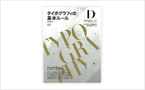
著書「タイポグラフィの基本ルール」では、第一線で活躍するプロのグラフィックデザイナーの立場から、あらゆる場面で愛用している文字を美しく見せるためのテクニックを詳解されています。さらに書体デザイナーとしても活躍され、『フォントワークスLETS』のデザインクラブで提供している「くろかね」も手掛けられています。
今回は、グラフィックデザイナーの立場から書体選定のポイント、書体デザイナーの立場から「筑紫書体」の捉え方、さらに大崎さんデザインの「くろかね」についてもお話しを伺いました。
まとわせたい言葉や文章の持っている雰囲気に似合うか
グラフィックデザインでの書体の選定基準として、“まとわせたい言葉や文章の持っている雰囲気に似合うか”ということをいつも考えています。書籍の本文用などになると、一度気に入った書体はわりと何度も選んで使うことが多いですね。
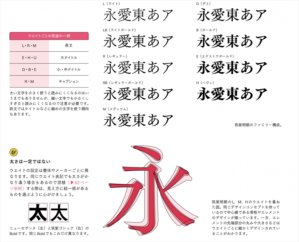
最近では、漢字とかなのバランスが良く読みやすい「筑紫明朝」を様々な書籍の本文として使用しています。エレメントの先端やうろこなどにまるみを帯びたところがあるので、その処理方法から柔らかい印象を受けますね。
また、骨格の取り方などが少し活字のような感じがしますが、やりすぎという訳ではなく温故知新な書体となっていて、その現代的な様子がしなやかな感じを表現させたりもしてくれます。
そのため、文字そのものの表情と文字組みをしたときそれぞれで「柔らかさ」や「しなやかさ」が感じられるのでとても気に入っています。欧文についても、雰囲気の近い別の欧文書体と混植などをせずにそのまま使えるというのも素敵です。
文字を組む際に心がけていること
使用する場所にもよりますが、基本的には書体の持っている情報をそのまま使うようにしています。文字間に関しては、見出しや数行のリードのような場合には、調整して使ったりしますが、長体や平体は文字のカタチを崩してしまうような感じがするので極力使わないようにしています。
そういった処理をしないと入らないものは、事前に行うレイアウトの設計が破綻しているということですから、書体そのもののサイズを見直す作業を行いますね。
あとは、カギカッコなどの記号類だけウエイトを落として使ったり、別の書体を持ってきたりすることもあります。
書体をデザインの一部としてクライアントに提案
クライアントからの使用書体は基本的におまかせしていただいていますが、中には担当者さんご自身で指定をしてくる方もいらっしゃいますね。そういうときにはそのリクエストを尊重しつつも、他にも似合う書体を提案することもあります。
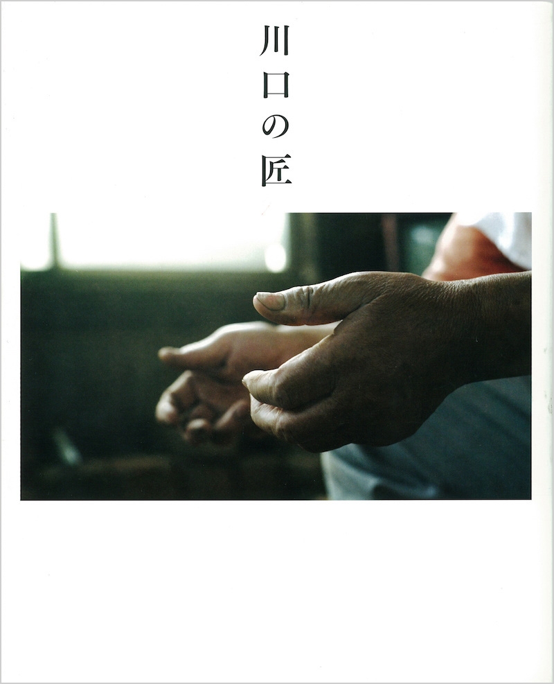
2011年秋にデザインを担当した『川口の匠』という、埼玉県川口市を支え続けている「職人」さんを紹介した本があります。都心に近く便利なベッドタウンとして見られがちな川口市ですが、歴史をたどれば「ものづくりの街」として発展してきた歴史があるんです。その中でも12人の職人さんたちにスポットをあて、これまでの生き方や仕事への姿勢などを地元のギャラリーの方々とともに同行取材して仕立てました。
長い道のりを歩んできたからこそ発せられる職人さんの今の眼差しや姿勢、言葉を体感してきましたので、レイアウトをする上でも、それらのことを文字の表情から表わしてくれるのは、凛とした佇まいの「筑紫明朝」がいいだろうと考え、1冊まるごと「筑紫明朝」で統一しました。クライアントである川口市の方にも雰囲気があっていると好評いただき、その方からの別の依頼のときにも「今回も明朝体はこれがいい」と「筑紫明朝」の指定をいただくくらいです。
今後使ってみたい書体は?
やはり「筑紫丸ゴシック」ファミリーは今後使ってみたいですね。2008年のリリースでしたでしょうか?「筑紫丸ゴシック」にA、BそれぞれBウエイトのみが先行して出ていますが、その段階で “これは早くファミリー展開して欲しい!” と思っていました。スーラのように字面が大きい丸ゴシックはこれまでありましたけど、金属活字を思わせるような、そんな表情の書体はあまりなかったですからね。
柔らかいんだけどあまり弾けすぎていないっていうのが「筑紫丸ゴシック」の持つ雰囲気だと思います。「筑紫明朝」のときの例にも近いんですけど、「こう、真面目なんだけど、頑固じゃなくて柔軟さも持っている」みたいなものや、それを表現する文章に使ってみたいですね。
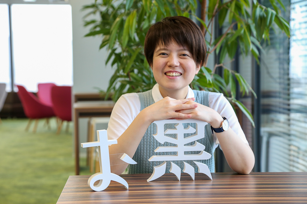
大崎さんデザインの「くろかね」について
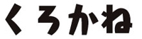
「くろかね」はその名のとおり「黒々さ」っていうのを意識した書体です。名前の由来は金属の「鉄」。金属のもつ鋭角な雰囲気を、エレメントの端などを“スパっ”と落とすことで表現しています。ちょっと遊んだ感じのディスプレイ書体ですが、エレメント処理などは過度に読みにくくならないようにしたつもりです。使用していただくところとしては「かな」はちょっととぼけた表情がありますので、短いタイトルなどがやはり「くろかね」の居場所かなと思いますね。
「くろかね」制作は描いては戻りの繰り返しでした
最初にデザインをお見せしたのが確か2003年くらいだったと思います。そのとき所属していたデザイン団体に書体をつくっていらっしゃる方がたくさんいて、「いいなあ、そんな仕事がしてみたいなぁ」とやや軽い感じで提案したのがはじまりでした(笑)。そのときのサンプルはたしか60文字もなかったような感じだったんですが、ありがたいことに採用いただき、長い制作がスタート。
それまで書体を作った経験がほとんどなかったので、まずは一般的な手順に則って制作・拡張をしていったんですけど、日常のグラフィックデザインの合間に進めていたりするもので、まったく書体制作にかかれないときも出てくるんですよね。
それで、いざ再開!となって始めると、感覚を忘れてしまったり、文字の重心などが微妙に変わってしまったりすることもありました。また、エレメントのデザインそのものまでも途中で変えたくなったりして、描いては戻り、描いては戻りっていうのをかなり長い時間やっていました(笑)。今も新しいものを制作中ですが、同じようなことがおきないよう、日をあまりあけず数文字ずつだけでも進めるようにしています。
書体デザイナーから見た「筑紫書体」は?
筑紫はとても素敵な書体たちです。「明朝」「ゴシック」「丸ゴシック」という表情の違いはあれど、ひとつの統一感がありますし、なんといっても美しいです。
今、自分でも明朝体を制作しようという思いがあり、ある方のもとで勉強中なのですが、使う場合とは違って、作る側としての「見る」をはじめると、いろんな要素の積み重ねでこの表情がうまれているというのがよりわかってくるような気がしています。やはり、次代のスタンダードともいえるような「筑紫書体」はしっかりと体で覚えておきたいと思いますね。
<編集後記>
今回はこれまでとは違い、“フォントを使用する側” と “フォントを制作する側” の2つの視点から見ることができるデザイナー大崎さんにお話を伺いました。グラフィックデザイナーとしての角度から、デザインに対するこだわりを非常に分かりやすく説明していただき、私も勉強になる部分が多くありました。その中でも、書体選定時に使われた「まとわせたい」という表現は、グラフィックデザイナーさんならではの言い回しだと感じました。
また、少しではありますが「くろかね」の制作についてもお話しをいただきましたので、別の機会にTVや広告の見出し、コミックのタイトルなどで多様されている「くろかね」の使用事例を皆様にご紹介できたらと思います。
企業情報
| 氏名 | 大崎 善治 Yoshiharu Osaki |
|---|---|
| 業務 | グラフィックデザイナー・書体デザイナー |
| リリース書体 |  |
| その他 | プロフィール |
「LETS」プログラムへのご入会や製品のご購入については、お取引のある販売店様へお問い合わせ・ご注文くださいますようお願いいたします。