Seiko Time Creation Co., Ltd. has a clock business that consistently develops, manufactures, sells, and after-sales services for wall clocks, table clocks, and alarm clocks, as well as equipment clocks, sports timekeeping equipment, digital signage, large display boards, and baseball fields. It is a watch maker that develops, manufactures, sells, and after-sales services for scoreboards and automation equipment, and also develops timekeeping support activities for various sports competitions.
On April 1, 2021, Seiko Clock Co., Ltd. and Seiko Time System Co., Ltd. merged and integrated their businesses, and began to take a new step as "Seiko Time Creation Co., Ltd."
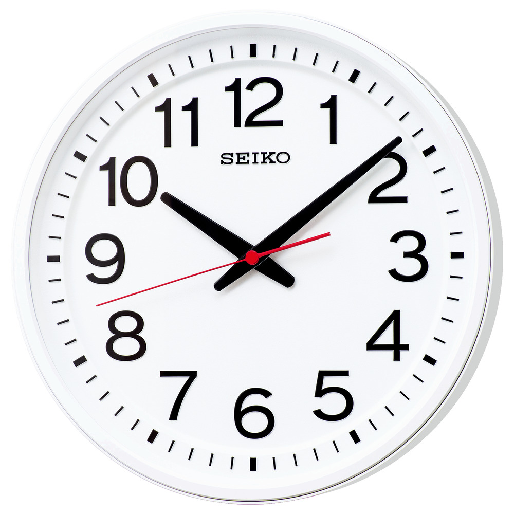
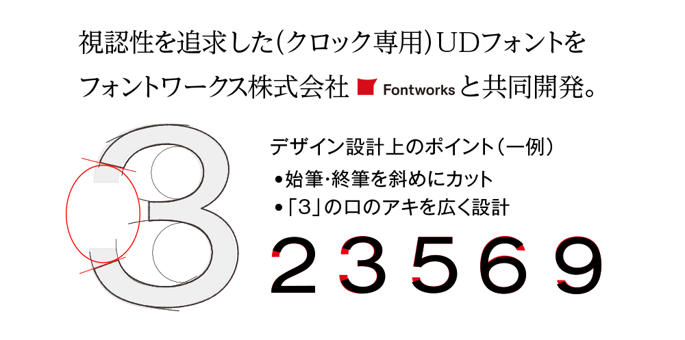
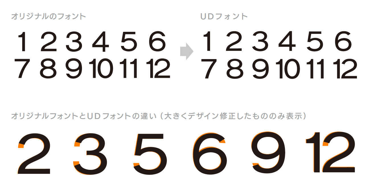
The Universal Design font (universal design font) exclusively for clocks, which was jointly developed with Fontworks, is used for the "classroom clock," which can be said to be a representative product of Seiko Time Creation Co., Ltd. You are using it.
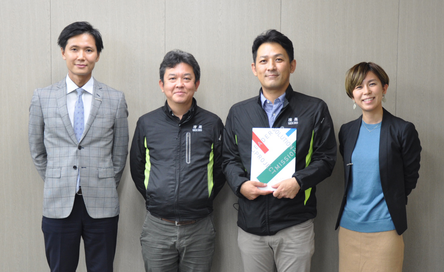
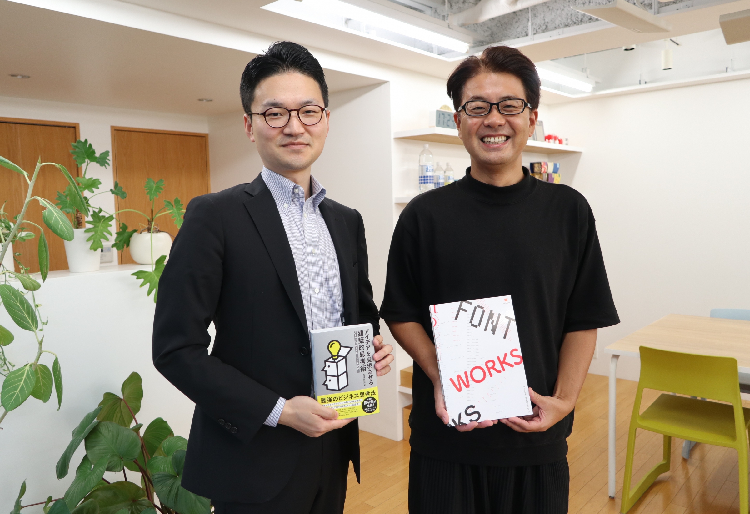
This time "classroom of the watch was Tazusawara in the production of", Seiko time Creation Co., Ltd. clock Division in charge has been Kamiya like the planning, design the charge has been Yoshida like, Product Planning Department, of Nam Il-like, and of public relations Mr. Saito visited our Aoyama Headquarters Universal Design fonts in "classroom clocks" and the "relationship between clocks and fonts".

"Classroom clock" with attention to detail that makes everyone look equal
――First of all, I would like to ask you about the “classroom clock”.
I think that your clock has been used in various places since ancient times, mainly in public places such as schools and government offices. How did Universal Design font" and "classroom clock"? Please tell us the background of whether "" was born.
Kamiya: The "classroom clock" project started from an idea about a year before its release (laughs). I have daughters of elementary school and junior high school students, and I often go to school (visiting classes), but I've seen various things such as the old-fashioned office clock on some classrooms and the other clocks on. It was. Seeing that, we are in an environment where we can educate children, so it would be nice if there was something that everyone could see more equally.

Kamiya: Looking back at our catalog, there was a part that was ambiguous in terms of design because it was not a product that was intended only to be placed at school. Therefore, this time, we will focus on "clocks for classrooms", "what is important for children", "appearance", "likeness", "functions", and "safety (made of acrylic so that they will not be injured even if dropped). ”, Etc.,“ How to make a good watch for students ”was discussed and produced by the design team including Yoshida.
Also, as a background on the elementary school side, the number of schools where chimes sound is decreasing recently. One of the reasons is that he wants his children to look at the time and act independently. Instead of listening to the chime and being told to do it, the children themselves look at the clock to check the time and voluntarily think about what they should do at least a few minutes ago.
Due to such school circumstances, it seems that the position to put the clock on is also changing. I think it was next to the blackboard in our time, but now the mainstream seems to be installed on the corridor side. As with the chime story I talked about earlier, when a child sees a clock in front of him, he constantly looks at the clock, saying, "I wonder if the class will end soon."
Therefore, on the premise that this "classroom clock" will be hung on the corridor side, we valued such viewpoints as "whether it is difficult to see when it is angled" or "it looks the same from anywhere". When I was having such a discussion, Type Designers Shigenobu Fujita appeared, and I was surprised to hear "Oh, that's right" (laughs).
――Thank you for watching!
How long did it take from the time this idea came to your mind until it was actually released as a product?
Kamiya: It's been about a year. It takes a little longer than other projects because there is a place where we dig a little deeper into what the current situation of the school is at the initial stage and because we are working with your company from the beginning.
"What you see from a distance" is the keyword
――From a designer's point of view, please tell us if you enjoyed this area during development.
Mr. Yoshida: I really enjoyed the process of listening to the big concept and solving problems one by one. At the time of development, my child was also an elementary school student, so I thought I should go to the survey because it was a great opportunity to open the school. Then the clock was really on the corridor side!
Since I see the rearmost child and the frontmost child, I thought again that the scale must be visible even when the clock is centered and viewed from 45 degrees.
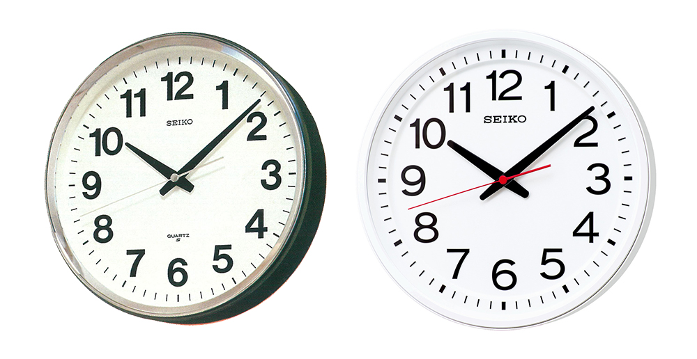
Mr. Yoshida: As you can see by looking at the old clock, the dial is a little deeper when viewed from the side, so the scale is hidden. Then the time cannot be read. This "classroom clock" has also been devised around that area, with a scale placed at the same height as the hands, and a two-step staircase. By doing so, the scale can be seen properly even when viewed from the side, and even when viewed at an angle, the pointing position cannot be seen.
――There are a lot of commitments for children! How about fonts?
Mr. Yoshida: Regarding fonts, I thought that "what you see from a distance" is the keyword, so I was particular about the size.
It's a little off topic, but when I was in elementary school, I saw a traffic light on the road. I think it was time to replace it.
If you look at the light bulb inside the traffic light by your side, it's very big. I still remember the idea that something that looks just right is so big. Since then, I have become very particular about the relationship between "distance" and "visible size."

Mr. Yoshida: I was also asked, "Why is this watch so clunky and you can put in big numbers?", But when you look at it from a distance in the classroom, it's just right ... Freehand without seeing the real thing. I wanted to make it look like the iconic "THE watch" I wrote in.

Yoshida: And this number part. It is called a hot stamp, and a black sheet is crimped with heat. The things we usually use have a lot of light reflection, but the reflection of light means that it is hard to see. To suppress it, I used a custom-made item with a matte finish. Therefore, the highlight is not included in black from any angle.
Also, since the life of a watch is "hands, scales, and numbers," I tried to keep my eyes on the case as much as possible. And only the second hand that everyone cares about stands out. I also kept in mind the harmony between Weight your font and the scale. It was very difficult because it was simple. I left the parts that I really needed and stripped off the rest, so in that sense, I think that it is very synchronized with the distinctiveness and visibility of your font.
--I am glad to hear that!
By the way, I have a question for Mr. Yoshida. What did you think when you heard the concept of fusing Universal Design fonts with your company's traditional number design?
Mr. Yoshida: (To Mr. Kamiya) You said a word, "It's good."
Kamiya: Our numbers were designed by our predecessors nearly half a century ago through trial and error, so while paying homage to them, we have further evolved by fusing Universal Design I wanted to.
There was no particular problem in this area, and it went smoothly.
The word "gentle" from the principal
――How is your reputation from outside the company?
Kamiya: When I borrowed the old clock (which I brought with me this time) from the elementary school, I left the "classroom clock" instead. Then the principal was really complimenting me! You actually touched it and said that it was very easy to see. As expected, I didn't say "I'll introduce all the classrooms right away!" (Laughs).
But it was really popular and said, "It's a gentle watch." The old type clocks that used to be in the classroom were not made exclusively for schools, so there was a dignified personality that seems to be in banks, government offices, post offices, etc., but those designed by Yoshida I think it means that is very kind and friendly to children.

A watch with "reliability" that is not strange
――While it was developed with attention to detail for children, I am very happy to hear the feedback from the principal who knows the site well that it is "gentle"! Now let me dig a little deeper into your company. What do you think is the strength of Seiko watches?
Mr. Yoshida: As you can see in the results of the questionnaire, is it "reliability"? After all, I think that is deep-rooted.
That's why I feel that I shouldn't betray it, and my motto is "don't be crazy" and "don't make a fool of yourself."
However, if it's too natural, it will be "boring", so it's a little horizontal ... It's like "I'm not too addicted to the phrase, a little too much" like the lyrics of Keisuke Kuwata and Mr. Children (laughs). The salt plum is difficult to reach again.

――Where do you set the goal of making watches for Mr. Yoshida?
Mr. Yoshida: It may be that we have to think about how to end instead of setting goals. There is no end to design and architecture. If you want to do it, you can do it all the time, like Sagrada Familia (laughs). But one day I'll die, so I've thought about deciding how to end it.
――The world of manufacturing is deep! What are your thoughts on "Seiko-ness"?
Mr. Yoshida: I have some personal feelings, but there is no such thing as the "Seiko-ness 5 Articles" shared by all employees. I don't have one, but I think it's basically "simple".
This is my personal opinion, but it is an image that is very simple and the strength of the core overflows from things. The rest is clean and clear. I think that Seiko's uniqueness is condensed in our "Series C3" watch.
Kamiya: The word "moving the times and the heart" in our tagline is also condensed.
A pinch is a chance. Watches that support telework
――Schools, hospitals, airports, etc ... There is a recognition that it will be placed in public facilities and infrastructure facilities with a large number of people, but it is in the current Corona era that a large number of people gather in such places I think it's getting a little harder. Under such circumstances, please tell us about the future outlook for your watch business.
Kamiya: A pinch isn't an opportunity, but we're starting to work on a new product that can manage time so that Support
――Is the interior clock a benchmark for the future?
Kamiya: It's very popular these days, isn't it? Very fashionable watches are coming out at home improvement stores, but basically our watches are simple, beautiful, and reliable.
While keeping that functional, I would like to take on the challenge of being a product that incorporates a little more interior-likeness.

During the interview, I asked Mr. Yoshida about the role and importance of fonts in watch design, which he felt while working as a designer for many years.
Mr. Yoshida: In watches, "hands, numbers, and scales" are the basis of everything. I think fonts are very important. I think it is an "important factor" that determines the appearance of the watch.
As with the shape of the typeface, Weight, delicate or bold, and the feeling of air are very important.
Also, when talking about "Seiko-ness," Mr. Yoshida said that it was "basically simple." It seems that the directionality of his design is also "simple is best". An example is the story of Jasper Morrison, a London product designer.
Mr. Yoshida: Looking back, I think I like simple things.
I like Jasper Morrison's "Glow Ball". It's a really simple round lamp, but it's crushed a little vertically. I wonder if the feeling that it's simple but a little broken is touching my chord.
There is a sense of security, but I am attracted to a unique place.
Universal Design fonts is their high readability, visibility, and discriminability, which are indicators of readability and readability. And I think that it has the beauty of font design, [sensitivity]. We hope that many people will come into contact with this font, which was created based on the idea of "a font that is easy for everyone to read."
We hope that you will find it useful as a font maker in your future activities.
Date of coverage: April 22, 2021

Seiko Time Creation Co., Ltd.
Clock business that consistently develops, manufactures, sells, and after-sales services for wall clocks, table clocks, and alarm clocks, and develops equipment clocks, sports time measuring equipment, digital signage, large display boards, baseball field scoreboards, and automation equipment. Develops time system / FA business that manufactures, sells, and provides after-sales service. In addition, we also carry out timekeeping support activities for various sports competitions.
https://www.seiko-stc.co.jp/
The person who wrote this article