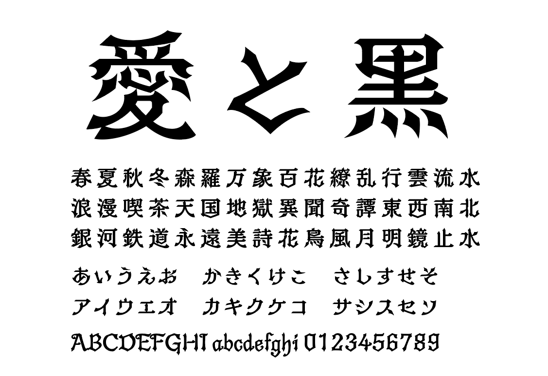
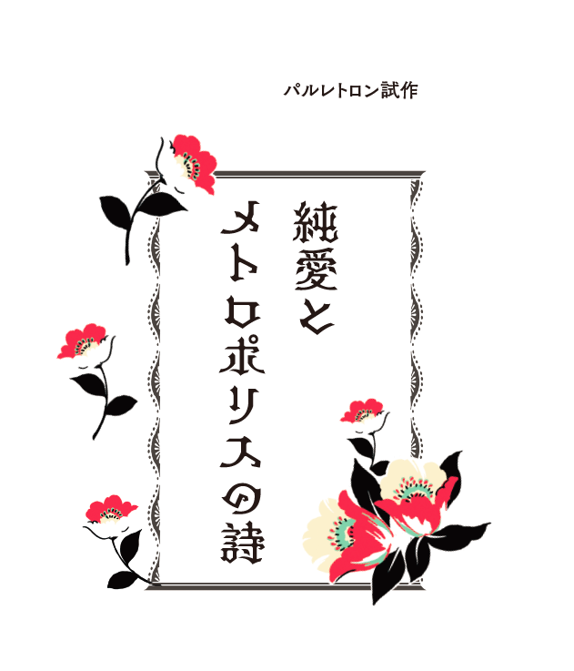
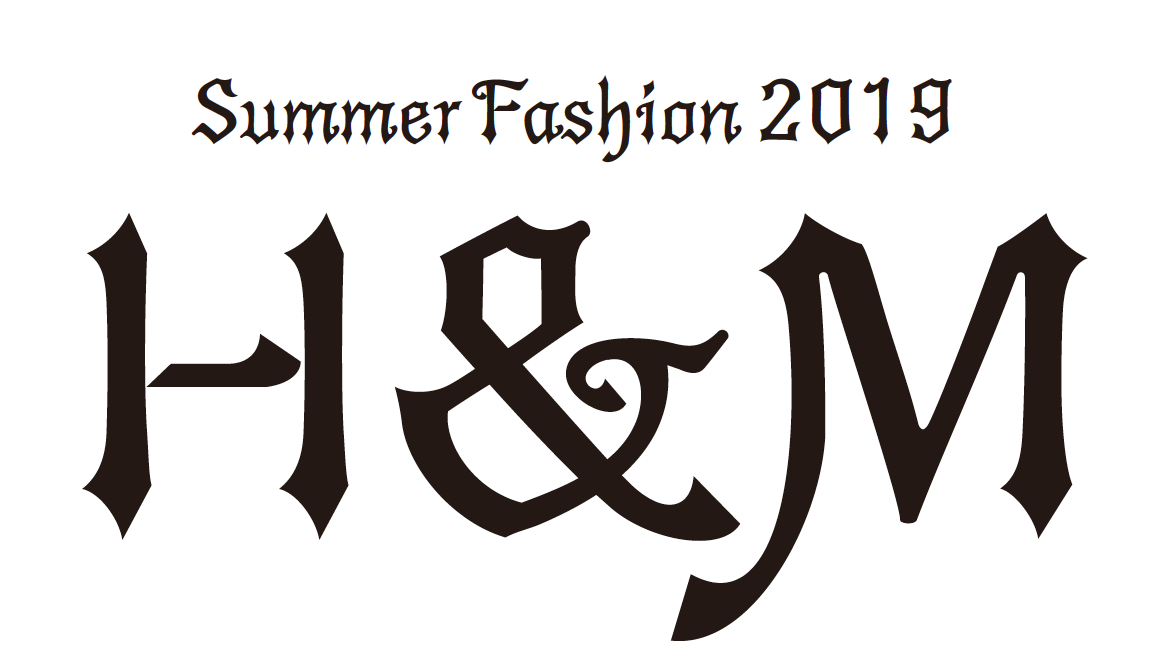
"PalRetron", the second in the "Pal" series, is a typeface created with a Western retro and gothic lolita theme. The unique vertical and horizontal strokes give a romantic impression, and while it is decorative and gorgeous, its design with shadows makes it a typeface that stands out when used for light novel titles, catchphrases, etc.
We interviewed Ochi, who designed the typeface, about the secret story behind the typeface, including the concept and characteristics of the typeface.
The trigger was "I want to create a powerful typeface that is the opposite of looseness."
As the production of my first work, "PalRamune," a typeface with a loose and cute design, reached its climax, I felt a creative desire to "create a powerful typeface that is the complete opposite of looseness."
However, it was too vague, I was worried about what kind of design to make, and I was making trials. At that time, I had the opportunity to talk to the customer, and I asked for a "Taisho Roman" or retro style typeface. "
Powerful typeface, Taisho roman ... Although there was a part to get lost in the direction of the second bullet, I think that there is no retro type catch typeface in Fontworks, so I thought "Let's make it!" It was
What is "Taisho Romance"?
First of all, in order to organize "Taisho Romance" in my own, I collected materials such as movie posters from one side.
What I imagine in "Taisho Romance" is the handwritten characters, the strength of the habit, and the unique atmosphere. How to design such an image as a font to be used in the new era has become an extremely high barrier. I couldn't capture the direction of the design. However, even if you are worried as it is, time will pass, so if it is, you should think about shifting the axis in a direction that you can easily grasp.
When I sort out "Taisho romance", I felt like I was caught in the word "Taisho" and couldn't move forward.
Then, when I thought about "retro," which was another keyword, the meaning of "roman = western" is also included, so I think that "western retro" should be attached by connecting western and retro. ..
I've always liked "gothic lolita" clothes, so let's try "western retro" and "gothic lolita"
I've always liked "gothic lolita" clothes. So I decided to add the essence of "gothic lolita" to the "Western retro". Because I thought that Gothic Lolita would be a typeface that would be easy to accept and use even for people who love anime and games.
I felt that adding a gothic lolita element to the typeface design would make it a "slightly scary but cute" design typeface.
Furthermore, this time I wanted to create a flashy typeface, so I added the gothic lolita's flashiness to the "Western retro" concept.
However, I was worried whether the "Western Retro" typeface would actually be popular, and although I had a good idea, the skeleton of the essential character was in a state where nothing came to my mind.
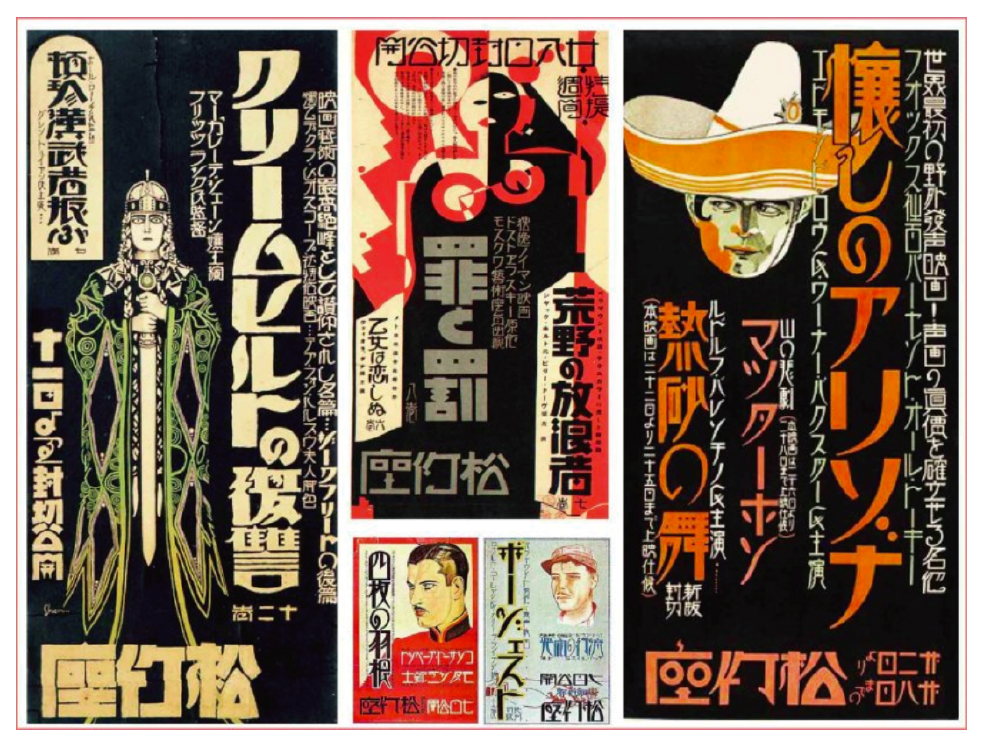
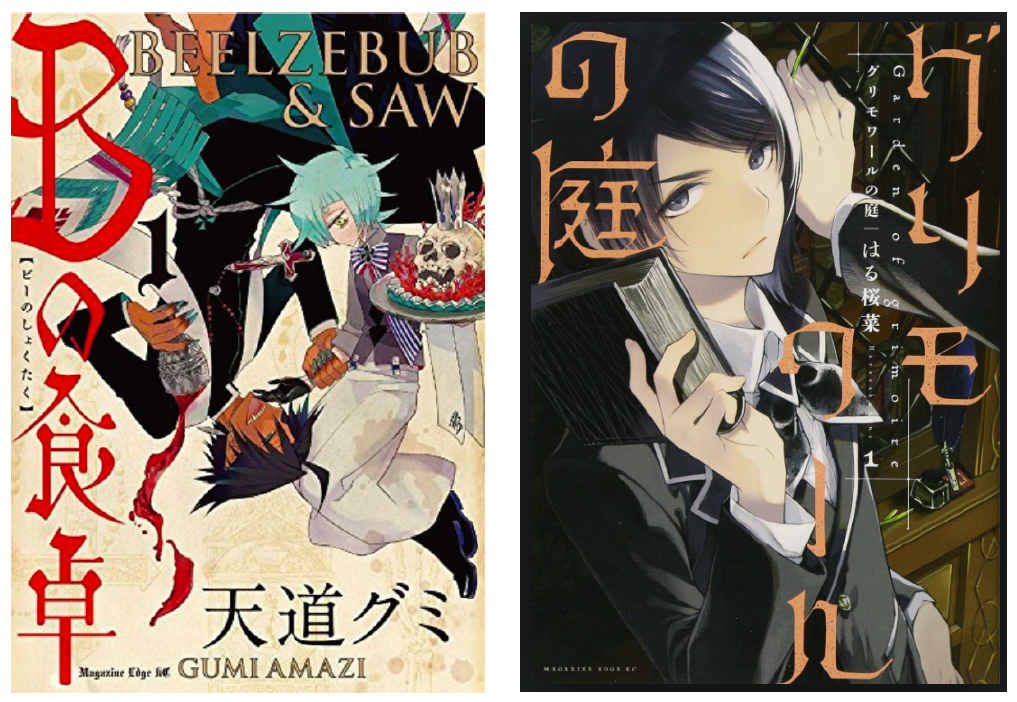
Refer to the manga title logo.
Are Western Retro and Gothic Loli really required by customers? I was worried about whether or not the world wanted it, so I decided to go to the bookstore and feel what is popular in the production scene right now, and what kind of fashion is in the world.
In particular, in the case of logos such as comics, which are not typefaces, the logos that are created by the designer are often very helpful because they are designed by the designer. I wondered what kind of logos were popular, and I went around various corners. Then, I was surprised to find that there are many Western-style logos. Everyone loves Western food. So I was convinced that the font of this concept was acceptable.
For other books that I thought would be helpful, I wrote down the titles and looked up later, and first I made materials for the production. The concept has been decided, and the skeleton of the typeface has come into view.
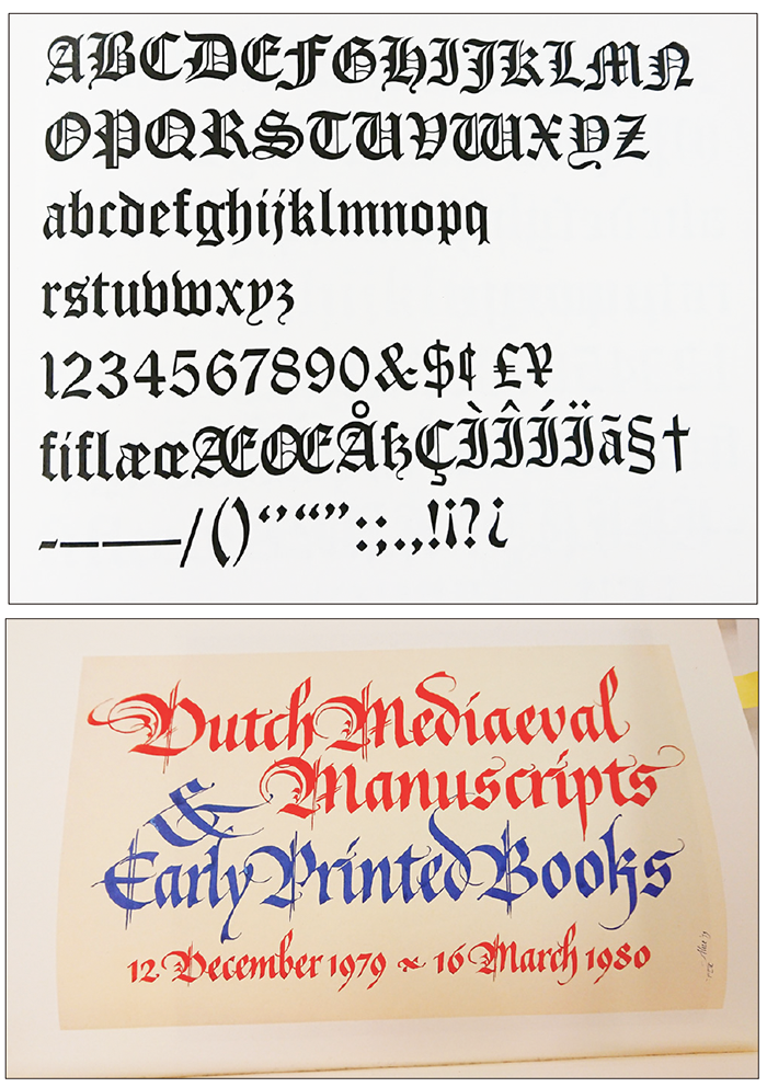
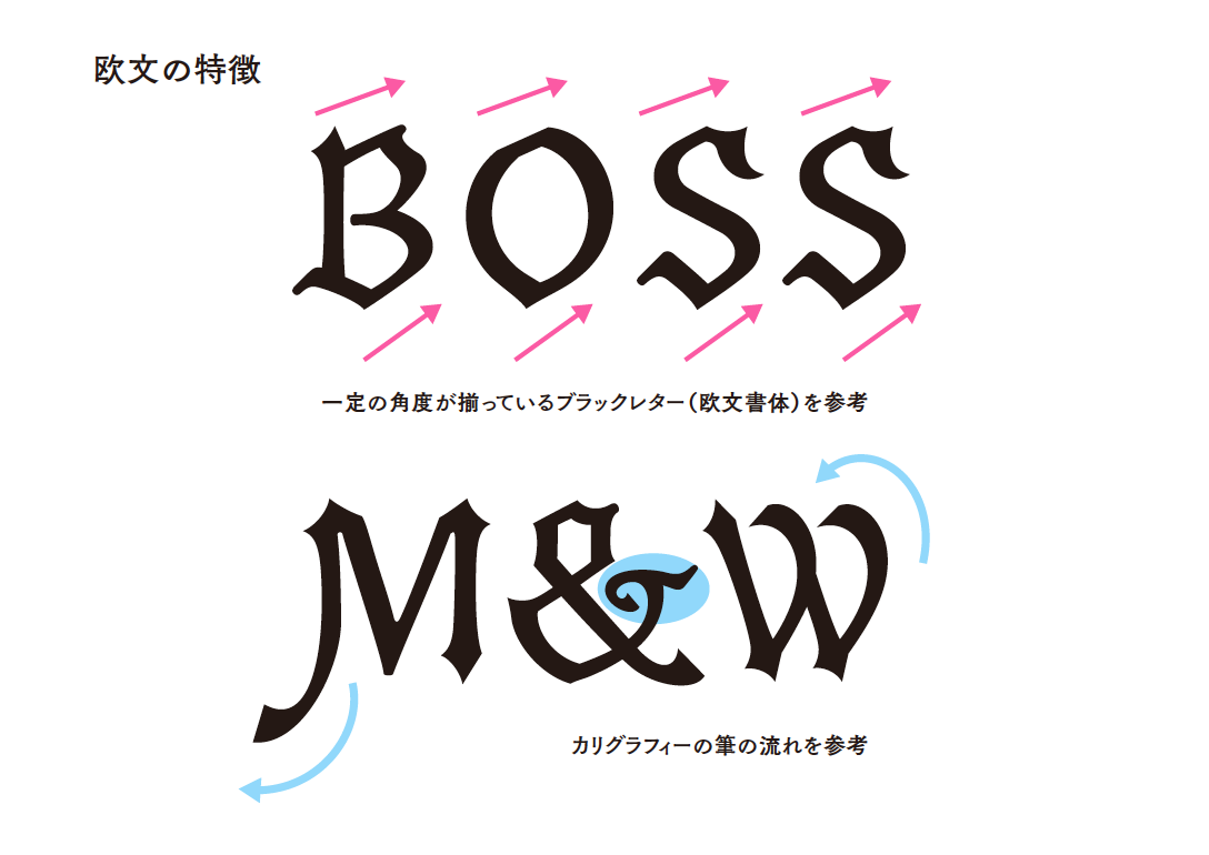
My image of the Western logo is the feel of a brush that the lines become thinner and thicker and flow smoothly. But, it's not like a calligraphy or writing brush, not a pen, not a Mincho. It looks like calligraphy but not calligraphy, and this "B" has a nice Western feel and is very cool. By adding decorations, hiragana can also be made western. I felt that this writing style was not helpful.
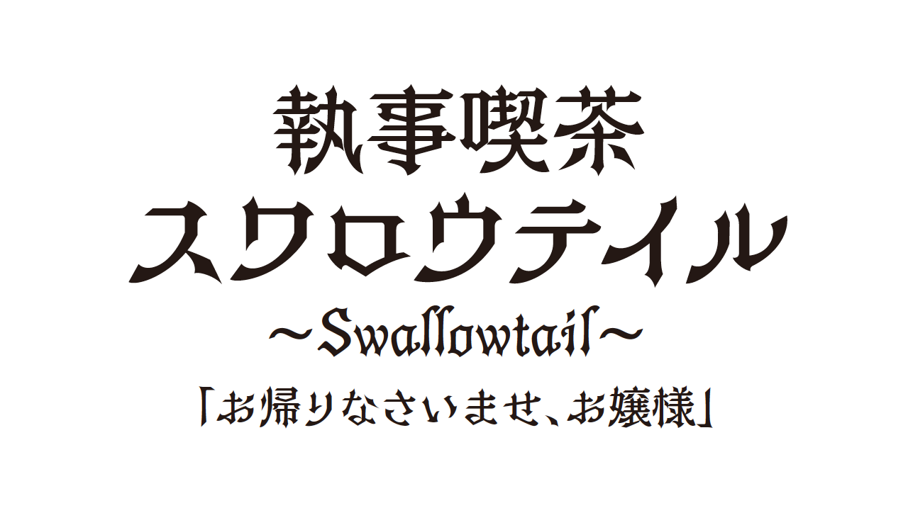
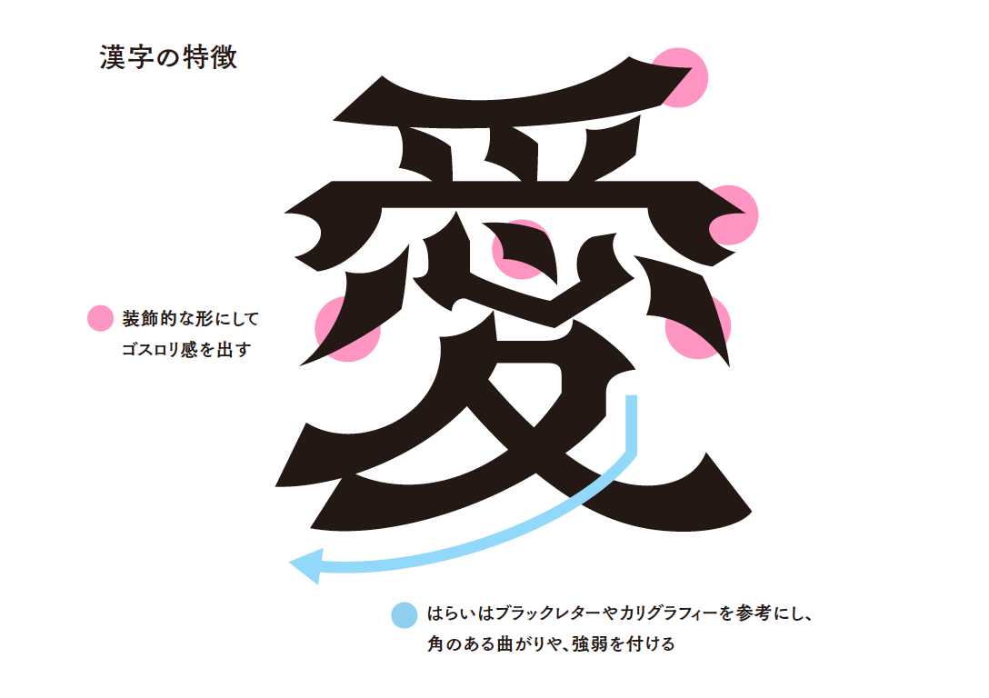
Prototype-The design motifs are "calligraphy", "black letter", and "gothic lolita (decoration)."
The "Western Retro" design was created by mixing the elements of "Calligraphy", "Blackletter" and "Gothloli (decoration)".
Where the rhombus is attached, at the beginning of the brush, the part where the hail (like a ribbon) is decorated = gothic lolita, the Western letters incorporate the elements of the black letter. The coolness, tightness, and design alignment of the black letter. That was helpful. Besides, there is also a factor to make it a typeface.
Calligraphy is a handwritten character, so the same character is not exactly the same. If you set the calligraphic element to 100%, the softness and tenderness will be lost and the "intensity" will be lost, so I designed it by complementing that part with a black letter.
When the prototype was completed and it was decided to show it to Fujita, the Chikushi Type Designers, we were creating the exact opposite of Fujita's idea that "let's show the characters with a skeleton", so the typeface with decorations this time is an evil way. I was surprised to see that it seems to be.
However, I still remember that I was able to go smoothly with the OK.
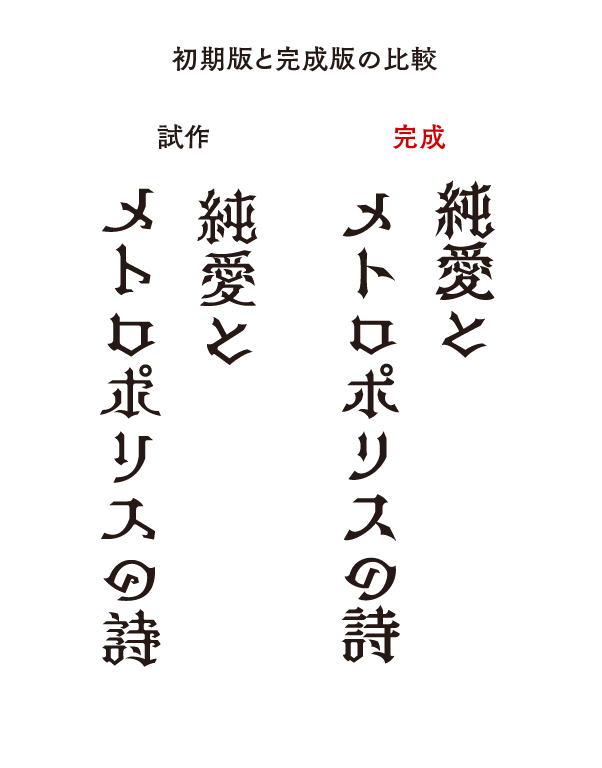
After that, I had the opportunity to show the prototype typeface to the binding designer who will be the actual user. When I showed it, I immediately liked it and liked it. Within a year from the prototype, we decided on the next release typeface.
However, I was very impatient because I did not consider the detailed design of the skeleton because it was a prototype typeface with image priority.
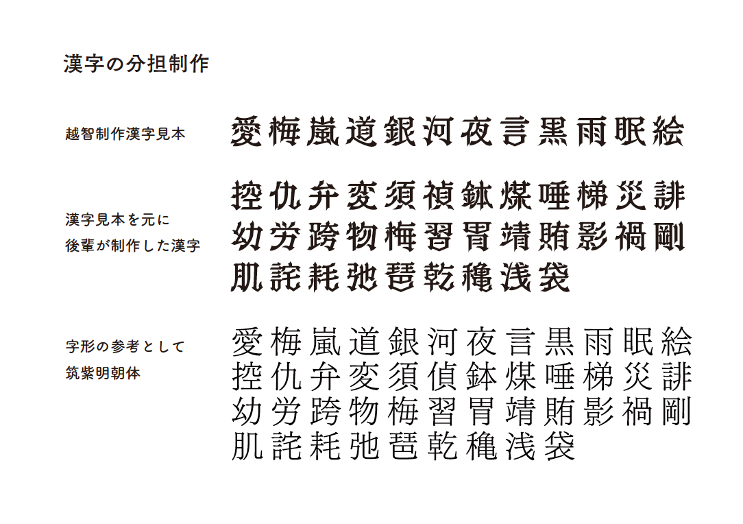
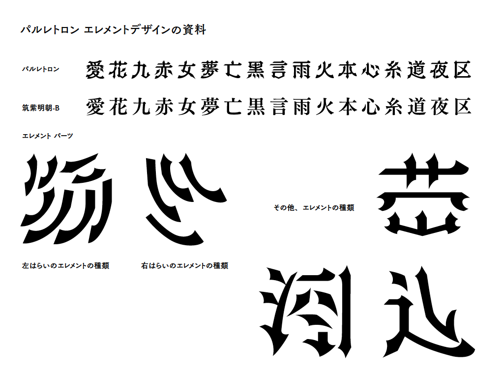
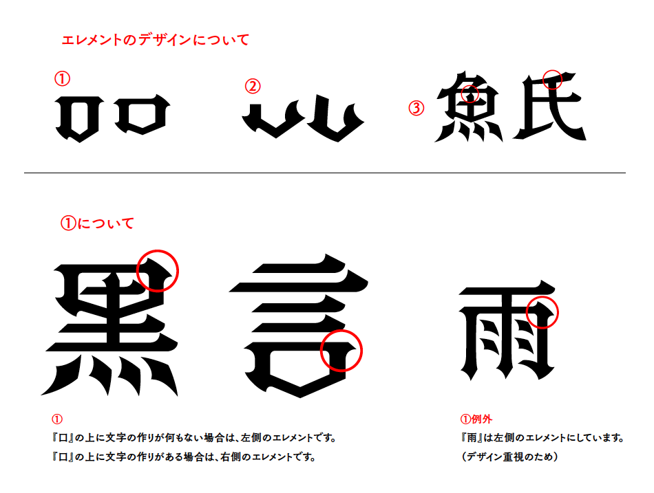
"PalRetron" production begins ~ First, create kanji characters
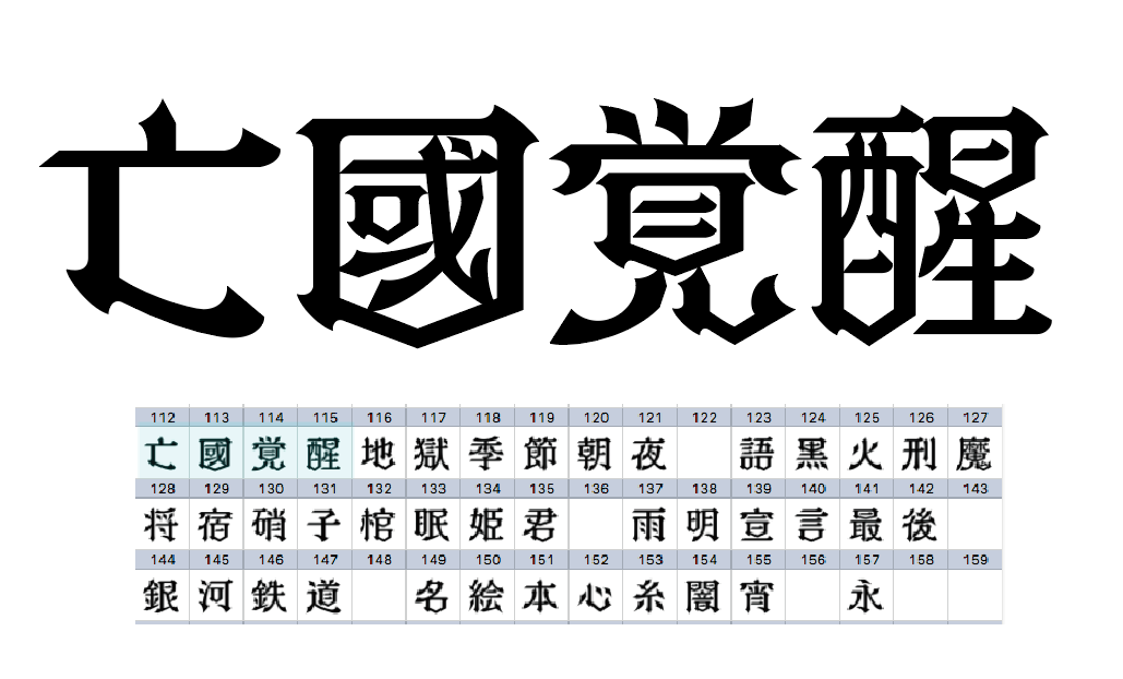
When creating the PalRetron, we started with the basic kanji characters.
PalRamune was created character by character according to the text of the folk tale. However, PalRetron is not a typeface that allows you to read long sentences, so we collected song titles that fit the image of the typeface and created the kanji for those titles character by character.
I designed the skeleton by trial and error, but because the typeface design is the complete opposite of PalRamune, it was hard to get the hang of it at first, and I had a hard time creating it.
We increased efficiency by having two junior Type Designers split the work between creating the kanji characters, while I focused on supervising and revising them.
Next, to produce hiragana and katakana
Next, we started working on the hiragana and katakana characters.
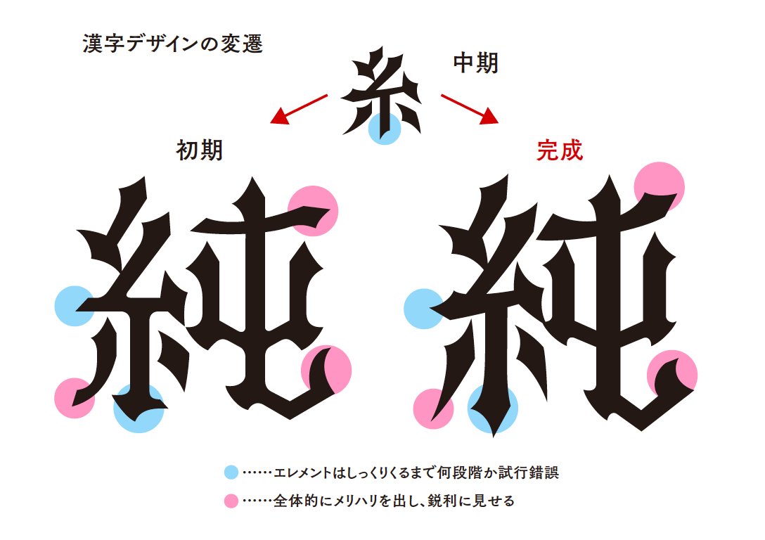
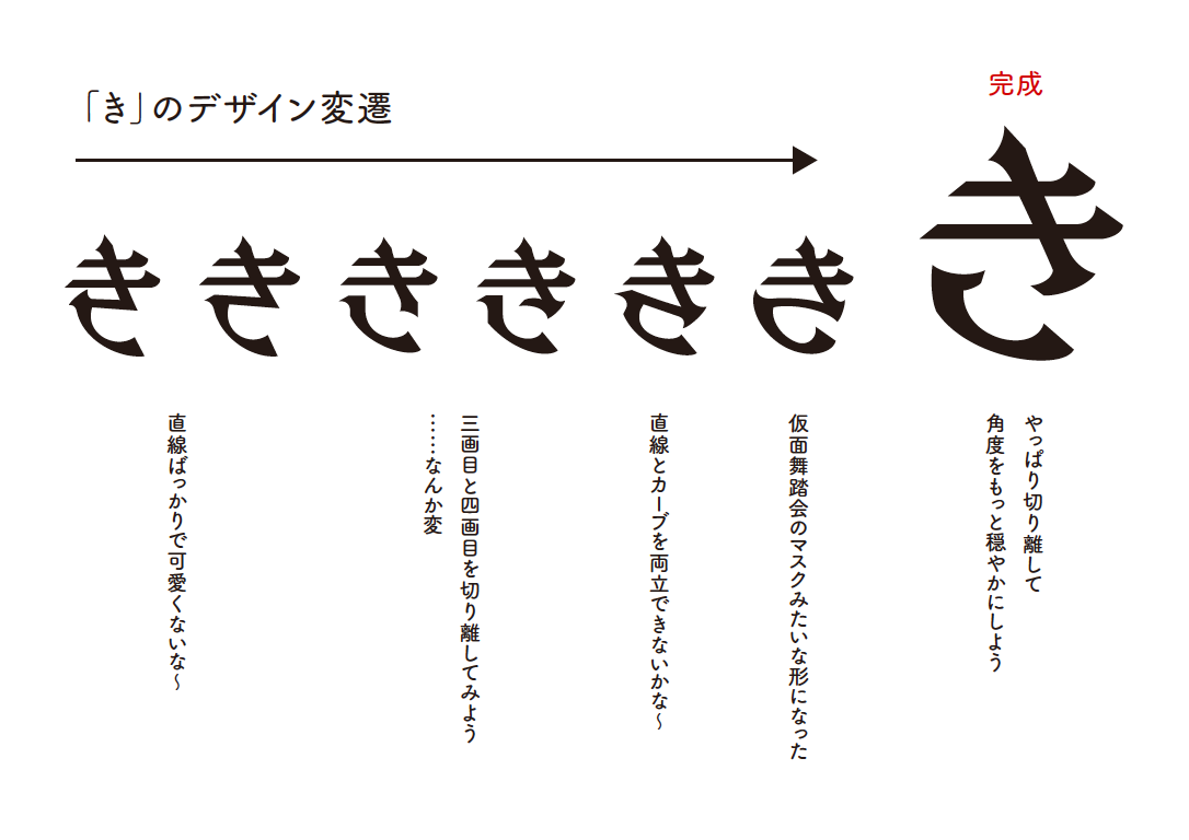
The most difficult part of creating PalRetron was the hiragana. Even if I wanted to use manga titles, logos, posters, etc. as reference, there were many kanji logos, but the hiragana characters were only "to" and "no", so there was no reference material.
Hiragana, unlike kanji and katakana, is characterized by its rounded shapes, so it was very difficult to know how to design it with the sharp PalRetron. If the design was left with rounded edges, it would look unfashionable, and if it was only straight lines, it would look a bit harsh.
I used the designs of TsukuAntique Gothic and calligraphy books as references, and made adjustments to express a sense of tension while still retaining the roundness.
As a result, I spent about five months creating hiragana. Honestly, I couldn't quite proceed as I expected with regard to the production of this Hiragana, and I could not see the future.
Western numeral production
The Language matches the concept of "Western Retro", so I enjoyed the production as if I were a fish with water.
I wanted to make a design that incorporates a lot of black letter elements for European languages, but it is difficult to recognize which letters are in the black letter, so adjust to make it legible by adding a lot of calligraphic elements. Did.
Release announcement After being posted on the Fontworks site, I also showed it on my Twitter.
I was glad to hear the amazing response, and I thought again to do my best at the final work of the release!
Fontworks will release "PalRetron" in July.
— Akiko Ochi (@ shirogoma1213) April 3, 2019
The design is inspired by Western retro and Gothic Lolita.
Please look forward to it. pic.twitter.com/PoYS2THgPY
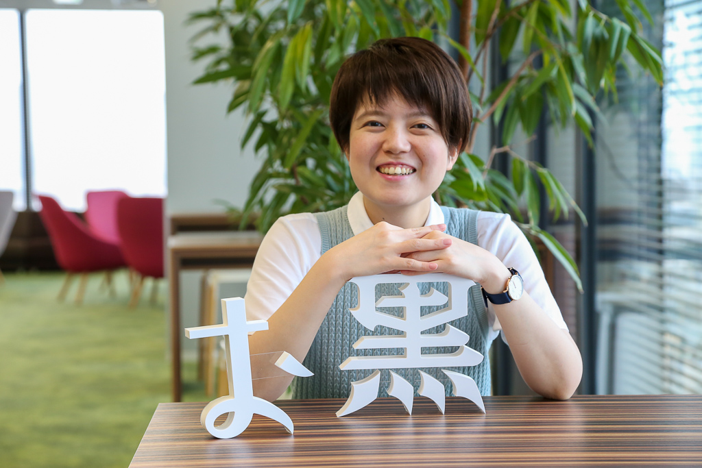
Introducing Akiko Ochi, a Type Designers
Type Designers Ochi Click here for an introduction.