2019年4月以降リリースの「LETS」新書体をご紹介します。
2019年4月から2019年12月までに、「LETS」は全部で46書体の新書体をリリースします。
リリース以降、安定した人気を誇る「スキップ」「ハミング」のPro/ProN化や、筑紫新聞明朝や筑紫B明朝のウエイト拡張によるファミリー化をはじめ、新規デザインの書体として、「奈」「パルレトロン」「ニューグレコ」「筑紫アンティークA/B/C丸ゴシック」「清御隷書体」をリリースいたします。
2019年の新書体も、どうぞお楽しみに!
※書体は全て開発中のため、提供時期や書体名など変更になる可能性があります。
2019年4月 「LETS」新書体
■提供書体:6書体
<筑紫書体シリーズ>
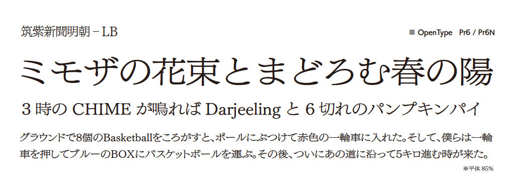
・筑紫新聞明朝-LB [Pr6/Pr6N] ウエイト拡張
<ベイシックシリーズ>
・スキップ-L/M/D/B/E [Pro/ProN] フォーマット拡張

2019年6月 「LETS」新書体
■提供書体:1書体
<デザインクラブシリーズ>
・奈-L [Std]
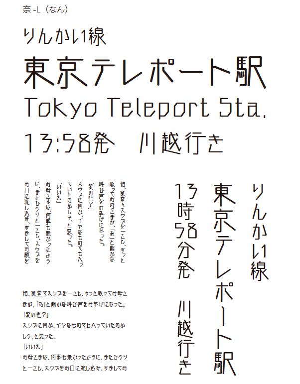
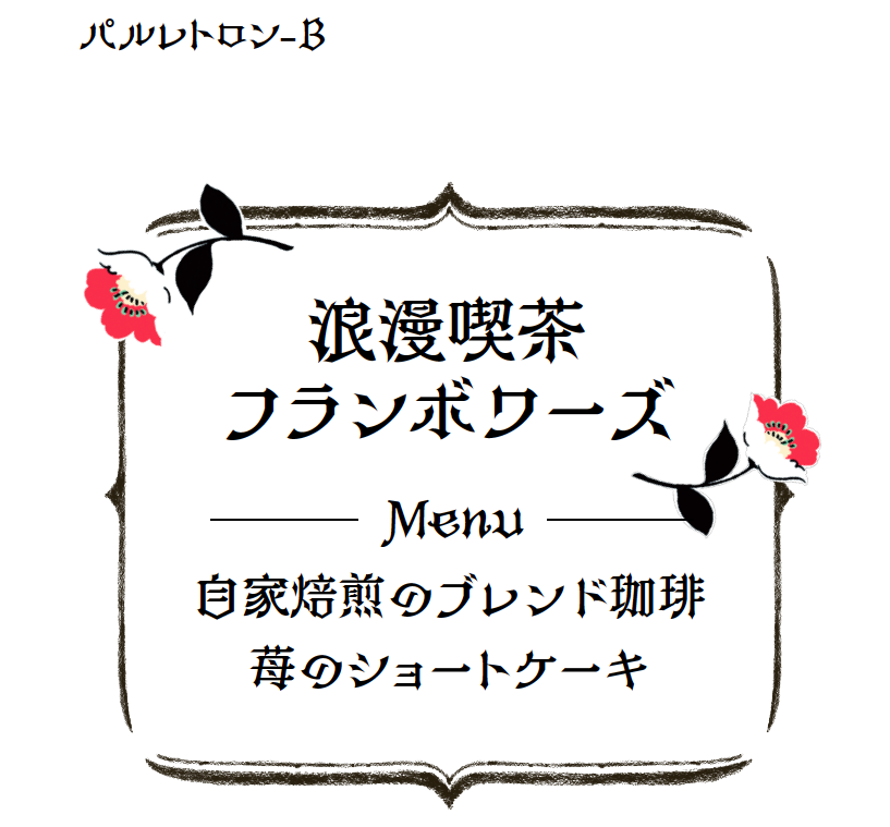
2019年7月 「LETS」新書体
■提供書体:1書体
<キャッチシリーズ>
・パルレトロン-B [Std]

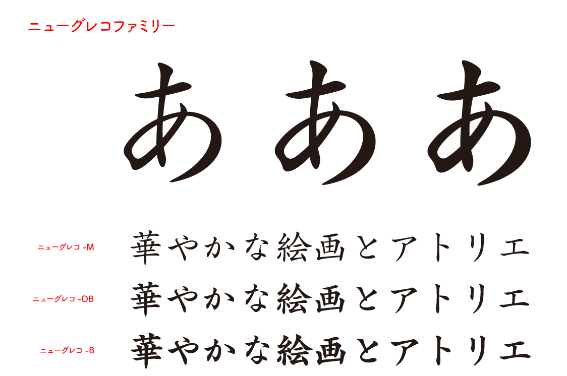
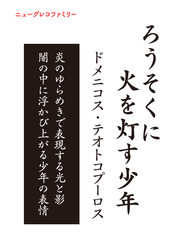
2019年8月 「LETS」新書体
■提供書体:6書体
<クラシックシリーズ>
・ニューグレコ-M/DB/B [Std/StdN]
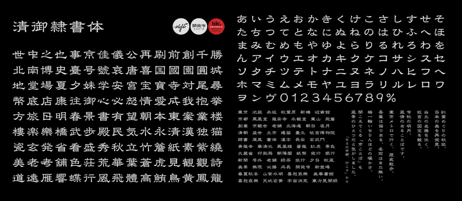
2020年1月 「LETS」新書体
■提供書体:1書体
<デザインクラブシリーズ>
・清御隷書体-R [Std]

2020年未定 「LETS」新書体
■提供書体:14書体
<筑紫書体シリーズ>
・筑紫B明朝-R/M/D/B/E/H[Pr6/Pr6N] ウエイト拡張
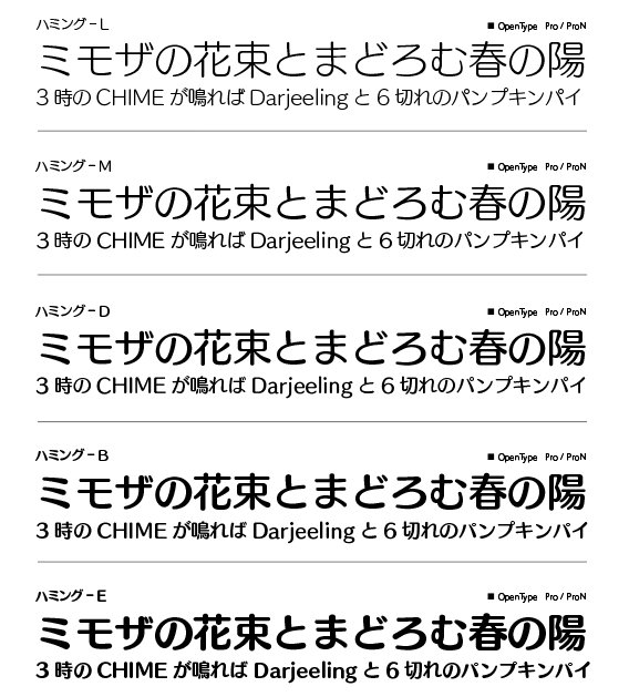
・ハミング-L/M/D/B/E[Pro/ProN] フォーマット拡張
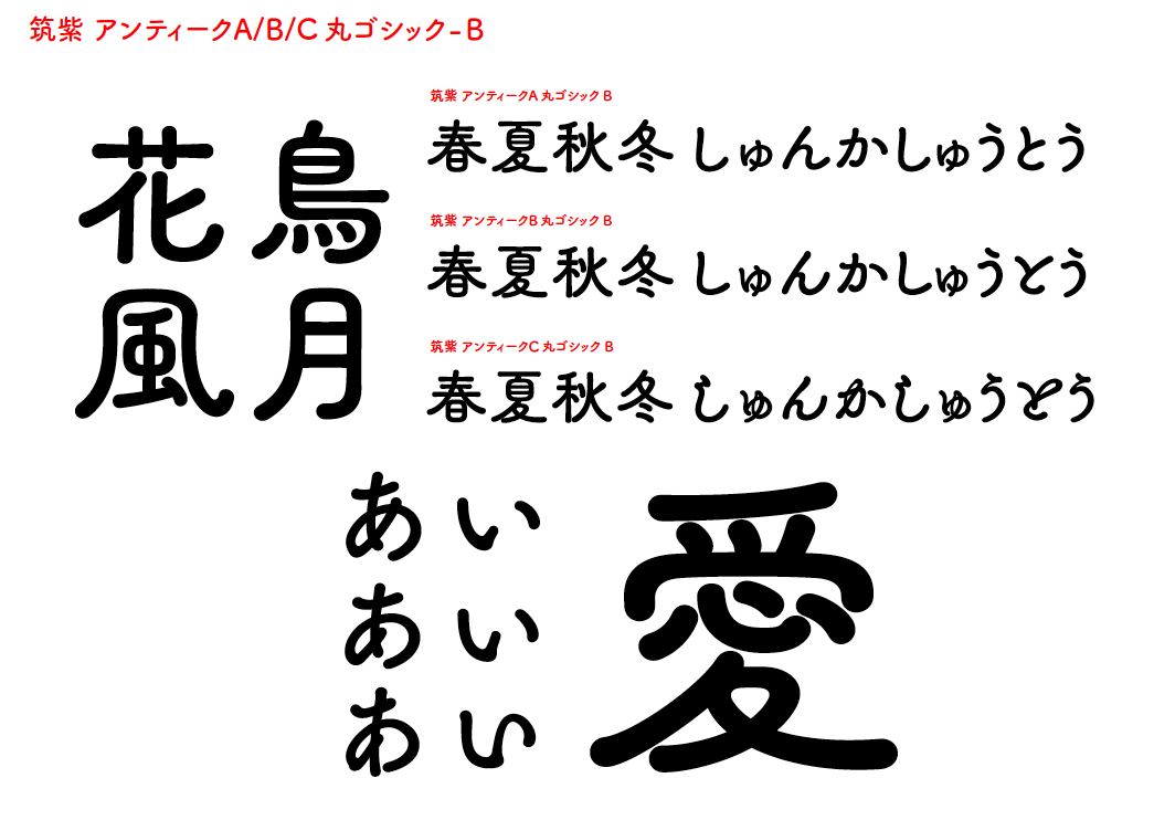
・筑紫アンティークA丸ゴシック-B [Std]
・筑紫アンティークB丸ゴシック-B [Std]
・筑紫アンティークC丸ゴシック-B [Std]