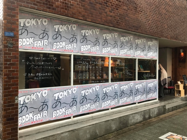
"Raglan Punch" is a fontworks CATCH typeface. It is a typeface that has unique and unique strength, and it is used in numerous media such as books, animations, and TV subtitles.
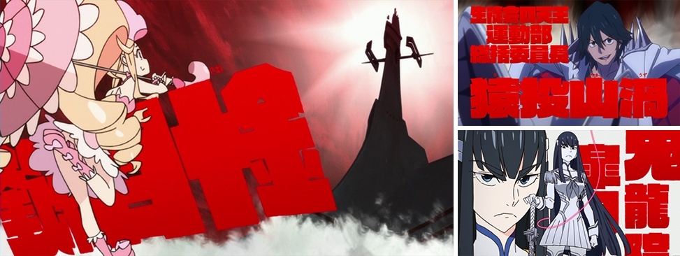
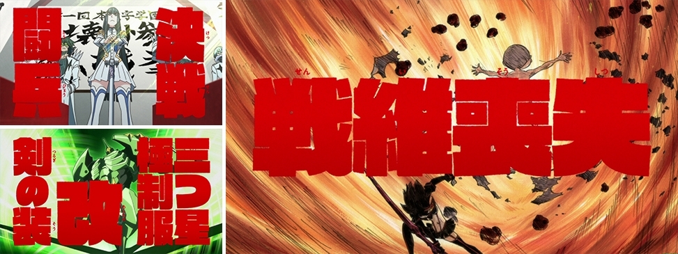
Especially in the work "Kill la Kill" (broadcast from October 2013 to March 2014) that effectively used this typeface, the impact on the character expression was enormous.
This time, we will Raglan Punch and introduce its development and the characteristics of this typeface, using examples such as how to use it in the animation "Kill la Kill".
In addition, Mr. Imaishi, the director of this work, commented on "Thinking about the role of the typeface in anime works" and cooperated in creating this article.
Production cooperation: © TRIGGER/Kazuki Nakajima/Kill la Kill Production Committee
Background of Raglan Punch Development-" Raglan" was born by refinement according to the times
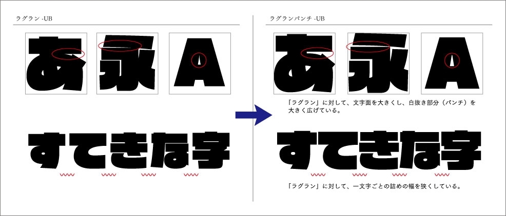
"Raglan Punch UB" is a refined typeface of "Raglan UB".
" Raglan UB" was born in 1995.
At that time, the types of so-called display design typefaces released by font makers were not as widespread as they are now.
At that time, it was released as a Heavy display typeface that no other company has, and it has a high impact design, and it is often used in leaflets and catalogs.
The main purpose of fonts at that time was to use them on paper media (printing), but there is a growing need for digital media such as monitors and displays due to the appearance of digital signage and the terrestrial digitalization of TV. It was. In particular, TV telops have come to be used in a form that expresses "scenes" and "emotions" from those that simply convey information in subtitles, and also in animations and games. However, many unique fonts have come to be used.
Of course, the usage of "Raglan UB" has expanded according to its needs. However, problems have come up as the applications have expanded. The problem was that "Raglan is easy to collapse" below a certain Font Size. As a font maker, we hope that by solving this problem, we will make it possible to use unique Heavy fonts more comfortably. As a result, we made improvements and created “Raglan Punch UB” in 2011.
" Raglan Punch UB" is a typeface refined according to the times.
The "Raglan Punch UB" has a larger character surface than the "Raglan UB", and the hole (punch) in the white part is expanded to make the contact area where lines intersect and the gap between parallel lines. By widening it, it has become an easy-to-use typeface with little crushing of characters even at Heading size, while maintaining a Heavy impact.
The impact created by adding "Raglan Punch" to the picture
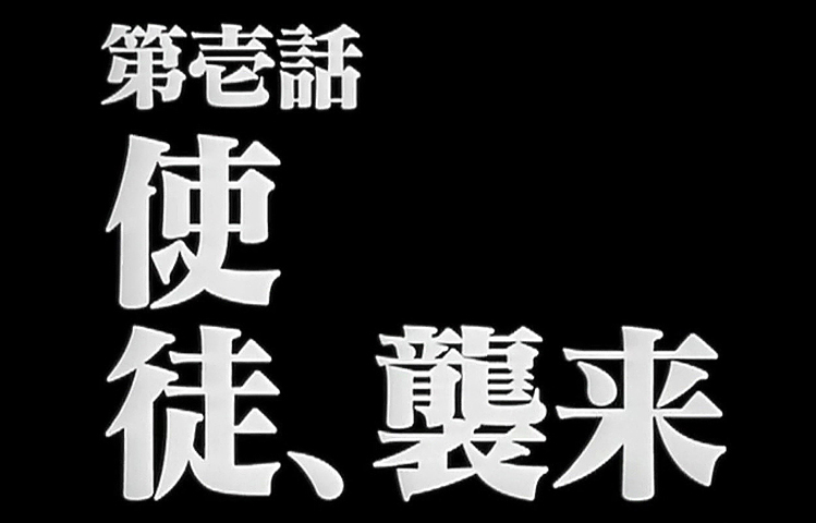
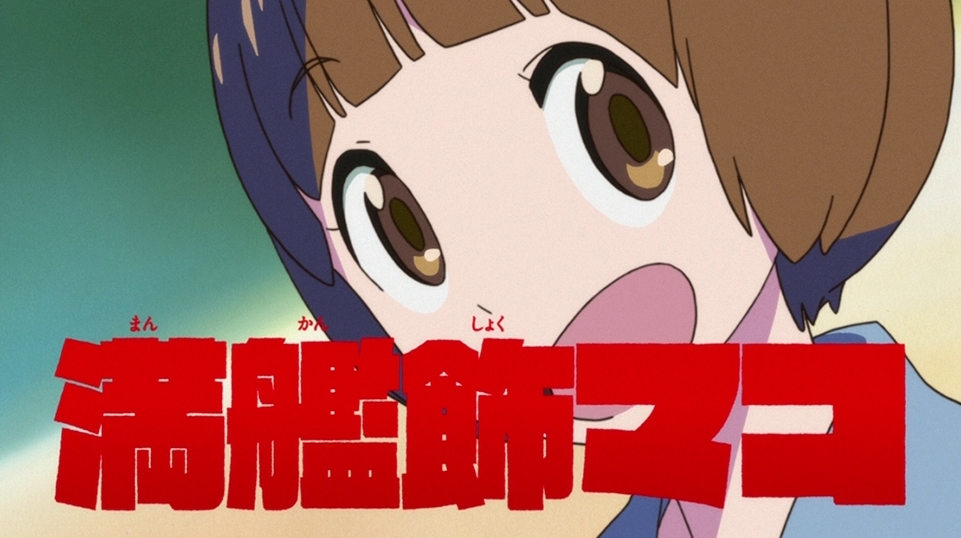
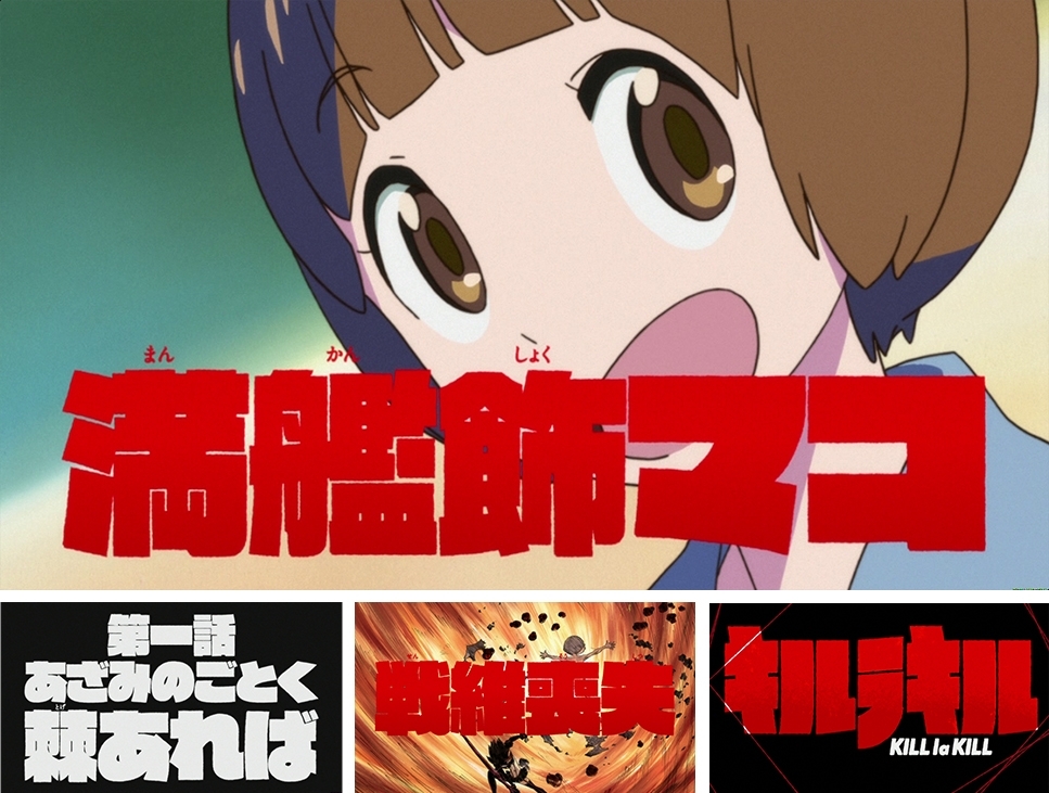
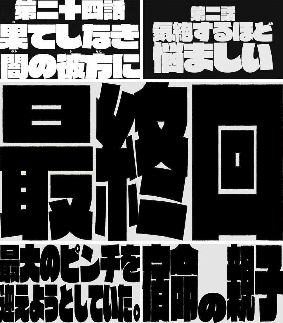
In the anime "Kill la Kill", we have been using the "Raglan Punch", which has a strong impact, as a more distinctive feature.
監督 今石 洋之氏のアニメ作品における書体の役割について思うこと
I think that the role of the typeface in animation is not only to simply supplement the information with characters (meaning, reading, etc.), but also to establish it as a picture and contribute to the production of the screen and atmosphere.
This time, in "Kill la Kill", it was known from the stage of the scenario that the element of character play was strong, so it was necessary to read important serifs with telop, and throughout the whole work except for drawing I felt that I wanted an expression that would become an icon. Therefore, we assumed that the characters would be extruded so strongly that they would fill the screen and the picture below could not be seen, so we chose the typeface "Raglan Punch" as the one that most closely matches that intention.
This is the method we adopted this time, but the characters are not visible over the characters and the ruby on the kanji is minimized. This is Styles, which says, "You don't have to read it, and the impact is more important than reading".
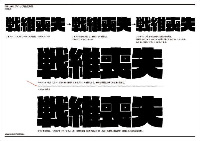
Also, this time, instead of using "Raglan Punch" as it is, we have added the processing to roughen the edge so that you can get the analog feeling of "Kill la kill".
By combining the typeface and the animation well, we were able to produce newness and novelty.