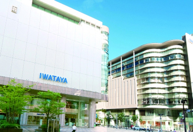
株式会社岩田屋三越は、福岡を代表する人気の百貨店です。
ファッションからフーズまでの多彩な商品が、年齢性別を問わず幅広い客層に支持されています。「常に上質で新しいライフスタイルを創造し、お客様の生活の中の様々なシーンでお役に立つこと」「お客様一人ひとりにとっての生涯にわたるマイデパートメントストアになること」を企業理念とし、日々、お客様一人ひとりのご要望とご期待に感動レベルでのおもてなしでお応えすることを追求されています。
今回は、2つの屋号を持つ株式会社岩田屋三越の広告やカタログの制作に長く携わっておられる販売促進担当の吉田 浩乃さんから、「岩田屋ブランド」に弊社のフォントがどのような役割を担っているのかを伺いました。
ブランドイメージにも書体が重要
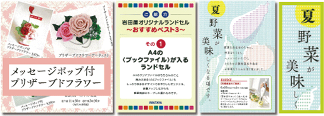
私たち販売促進担当は、お客様にお送りするダイレクトメールや商品カタログ、店内用のポスターや看板など、幅広い制作物を手掛けています。岩田屋では、多くのお客様に楽しんでいただけるよう、およそ一週間単位で様々なイベントを行っています。そのひとつのイベントに対しても、たくさんの付随した制作物が必要になるため、スピーディに対応できるよう社内で作成しているんです。それらの制作物は、フォントワークス書体を使ってデザインをしています。
私たちは、“岩田屋からお客様にお送りするモノにはイメージにバラつきがないようにしたい”というコンセプトのもと、できるだけ統一した雰囲気を出すように心がけています。 そこで重要だったのは、フォント選びでした。 お客様の層が幅広いため読みやすさはもちろんのこと、上品で落ち着きがあり受け入れられやすいこと、個性が強く自己主張しすぎないことをベースにブランドイメージの統一を図りたいと思っていました。さらに、岩田屋の社風や、お客様のスタイルに合っている書体は何かと考えると、 [明朝体]が最適だと思いました。その中でも日本語ひとつひとつが美しく見え、品質良く魅せることができる[筑紫明朝]を私たちのメイン書体として選定しました。
[筑紫明朝]は、他の[明朝体]とは違って文字組みをしたときに一文字一文字がはっきりと分かるようにデザインされていると思います。字のフトコロが大きい[明朝体]だと一般的には少しやぼったく見え、おしゃれに見えなくなるのですが、[筑紫明朝]はフトコロにしっかりと強弱がついていて、品がありますよね。読みやすいので年齢を問わずに使えますし、私もこのデザインが大好きです。
筑紫明朝の魅力
[筑紫明朝]にはたくさんのウエイトが揃っていて使いやすいところも気に入っています。本文にはもちろんですが、太いウエイトまで揃っているので、タイトル部分やもっと大きな媒体の看板などにも同じテイストで使えることは嬉しいですね。
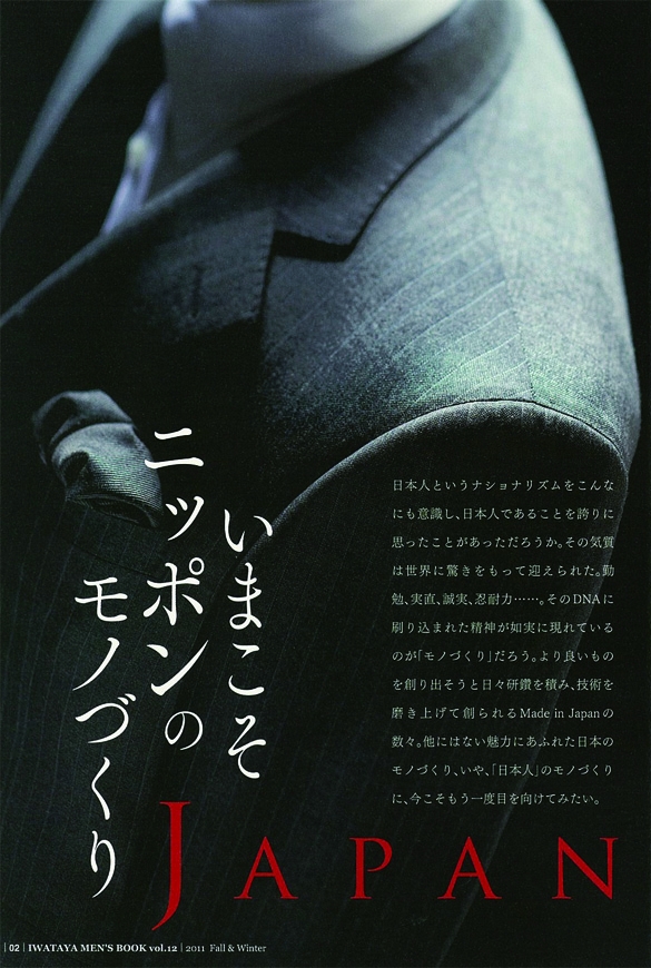
岩田屋の季刊誌である「MEN'S BOOK」の最新号「Vol.12」では、「ジャパンクリエイション」という企画で、日本人が作った高品質な衣類品のご案内をしています。品が良く、和風なものにも合い、さらに古さを感じさせないところが今回の企画と[筑紫明朝]のイメージにピッタリだと思います。この季刊誌は基本横組みなのですが、タイトルなどでたまに縦組みで使っても座りがいいんですよ。
また、女性向けのブライダル冊子で、ふんわりとした印象を与えるレイアウトでは、意図的に見出しなどの文字サイズの大きな場所に、細いウエイトの[筑紫明朝-L]や[筑紫明朝-R]を使用することにより、かわいらしいイメージを演出できます。同じ[筑紫明朝]なのに使い方によって様々な表情を見せられるところは、多くの制作物を作る私たち販売促進担当にとって特に魅力的だと感じている部分です。
私たちが心がけている書体の使い方
1つ目は、どの制作物にも共通することなのですが、商品とのバランスや見やすさを考えてフォントを選ぶことです。 現在、ランドセルを広告する店頭のポップに[丸ゴシック体]の[スーラ]を使用しています。そのポップでは、かわいらしいく元気なイメージを表現できていると思います。 今、フォントワークスカタログを見てふと思ったのですが、[筑紫丸ゴシック]では[スーラ]と違って、落ち着いた雰囲気を演出できそうですね。
2つ目に、1つの制作物にたくさんの種類のフォントを使わないことです。主役は写真に掲載している商品なので、商品以外のものが目立ちすぎたり、媒体に違和感を持たれたりすることがないように気を付けています。その点では、さすがに筑紫書体はシリーズだけあって、複数ある[明朝体]や[ゴシック体]を混ぜて使用しても統一感がありますね。いつもはあまり作らないのですが、気づいたら複数のフォントで完成していた制作物もあります。
「LETS」導入で変わったこと
これまでは、スタッフが増えたりマシンの入れ替えやメンテナンスをするたびに、OSやアプリケーションのインストール、特にフォントのインストールが大変でした。 書体のライセンス方式「LETS」が始まったことで、少なくとも書体のインストールの煩わしさからは解放されて、デザインワークに専念できる時間が増えました。画期的なこの方式がスタンダードになったのは大変良いことだと思っています。これからももっと、私たちデザインをする側のデザインにかける時間が長く取れるようになればいいと思います。
一番初めにこのライセンス方式を始めたフォントワークスは九州の会社ですよね?同じ九州の会社として[九州のいいものをすごく大切にしたい!一緒にがんばっていきたい!]との思いが「LETS」を長年使っている理由のひとつでもあります。
今後「LETS」に望むこと
筑紫書体などを見ているとひとつの書体のウエイトや文字セットが毎年増えているので、本当にその書体を大切にしているんだなというのが伝わってきます。新しい書体がたくさんリリースされるのもいいんですが、既存のものが使いやすくなるっていうのもいいですね。 今後の書体の希望としては、次の世代の人にも“やっぱりこれがいい!”と思われるロングセラーになるような書体を開発してほしいです。私の好きな[筑紫明朝]にも、欧文書体でいう[Helvetica]のような、永く愛される書体に是非なってほしいです。
<編集後記>
取材にご協力いただいた吉田さんは、社内制作物のディレクションも担当され、商品をさらに魅力的にアピールするためフォントの選定、および文字サイズ、字間、行間などにも大変気を配られています。フォントにも造詣が深く、お客様に伝わりやすい統一感のあるレイアウトを作り出す吉田さんは、「岩田屋ブランド」にとって大切な方だと感じています。 吉田さんをはじめとして、幅広い種類の制作物に関わられているデザインワークにより多くの時間を必要とされる方のために、弊社ではフォント管理ツールのバージョンアップなど、会員様の更なる制作環境の向上にお役に立てるよう取り組んで参りたいと思います。
企業情報
| 社名 | 株式会社岩田屋三越 |
|---|---|
| 所在地 | 福岡市中央区天神2-5-35 |
| TEL | 092-721-1111 |
| URL | http://www.i.iwataya-mitsukoshi.co.jp/ |