Ansible Title, Inc. is a post production company that creates titles for many movies and trailers.
Mr. Tsuda, the representative, has been active in the movie industry for about 30 years since the film era before becoming digital, shooting animations using cameras, shooting special composition materials, and creating titles. Founded in 2006, Ansible Title is a specialized company that specializes in titles such as subtitles and end rolls from among the many jobs involved in the movie.
This time, Mr. Tsuda, who makes the movie more attractive and effective with "character production" by subtitles, asked about how to use fonts during subtitle production.
How to make subtitle telop
Speaking of movie subtitles, you can imagine a foreign movie with a Japanese translation, but it doesn't show the Japanese translation of the dialogue as it is. Of course, at first, it is a direct translation, but the dialogue will be adjusted according to the scene of the movie and the display time. In other words, it's a special translation for subtitles. Since the number of characters that can be displayed on the screen at a time is fixed, the parts that can be seen by looking at the Video and the parts that can be omitted are adjusted to make it easier to understand.
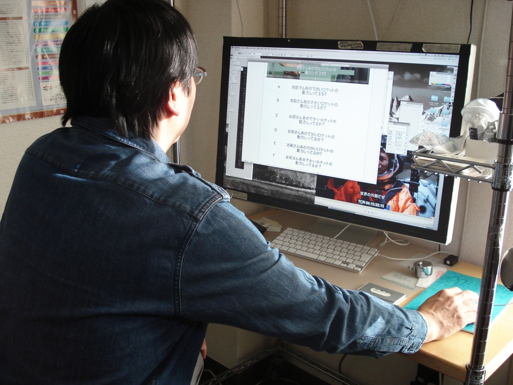
Based on the material that shows the display time, the translation for the subtitles made in that way will be adjusted to the screen. For the ansible title, use Adobe Illustrator to complete the character display and layout, and use the image editing software to create a movie title. The reason why I use Adobe Illustrator is that the typeface is the easiest to handle and it is easy to wake up on the screen.
Select a subtitle typeface with "Director's thoughts" and "Movie content"
When choosing a subtitle or end-roll typeface, meet and talk directly with the producer or director. I would like to make a proposal for the typeface after grasping what kind of thoughts I have about letters. If you are a particular director, you may be asked to specify a “pretty typeface” or “precious typeface” or a specific typeface name.
Also, there are directors who are said to have no idea about the typeface, so at that time, bring out all kinds of documents such as clippings of magazines, posters of the past, etc. In some cases, you may want to suggest something that matches your image. It depends on the director.
Consider the design of each typeface for the production of letters
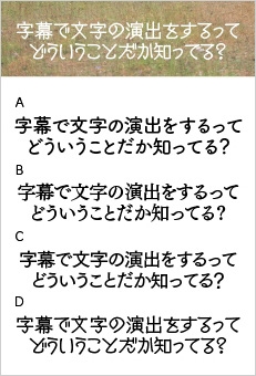
I'm currently working on a Japanese film, and there is a scene where the main character interacts with a foreigner, and I need to add subtitles to that scene. For this film, I'm using my recent favorite font, TsukuARdGothic. I'm using TsukuARdGothic with tracking set to "minus 50". This is because if the characters are set in solid text, the spacing between them becomes too wide, making it difficult to see them on the screen as a single word or sentence. I would really like to narrow it down a bit, but I don't think that would bring out the design of the characters. I want to make sure that the font looks beautiful while considering the characteristics of each font.
People unconsciously read the gaps between letters when there is a gap between them. If meaningless spaces between letters are distracting during the short screen time, it's difficult to concentrate on the content of the movie. Conversely, in some scenes, half-width or full-width spaces are left to intentionally make the viewer read the gaps. In other words, in that sense, the work of creating subtitles can be said to be using text that is more effective for each movie. We also arrange the characters in a rhythmic way in the end credits to keep the viewer from getting bored.
I want to use new fonts quickly
I'm really looking forward to seeing new fonts every year in Fontworks LETS. Not only I, but also those who have many choices when deciding the typeface with the movie director will be pleased. When a new typeface comes out, I think it's used relatively quickly. I want to use fonts that people haven't used yet. So, of course, not only "Fontworks LETS" but also "LETS" such as "Iwata LETS" were released and started early.
As expected, the New Cinema font is easy to use!
Recently, some manufacturers have created subtitle typefaces. Still, I think Hideo Sato's [New Cinema] is the most supported. Before this [New Cinema] entered "LETS," I used to use handwritten subtitled fonts, including Mr. Sato, in Japanese films and commercials, so when I joined "Fontworks LETS" To be honest, I was surprised and thought that I could finally use it for the movie. Originally, movie subtitles are filled with characters and displayed, and it takes time to fill them, but [New Cinema] created for movie subtitles is truly made by big veterans. As expected it is real! Just put in the serif without doing anything and it will look solid and well-packed. It's very easy to use, unlike other subtitle typefaces, and it saves a lot of work time. Besides, it's hard for people who watch movies to read sentences for two hours. In that respect, I think it is designed so that the reader is not stressed.
You can use your favorite typeface with confidence
Before I started using "LETS," I was honestly worried about licensing the typeface. Even though I properly purchased and used the Packaging, there were many things I couldn't understand how far it was licensed ... Even if I read the notes, the license agreement was only vaguely written, so I had to make inquiries one by one. At the time, I paid royalties for each production, even if it was used only for movie trailers.
It's very helpful because you can use your favorite design from among the abundant typefaces of "LETS", and the license is clear. Many of the finished works will be exposed to more people on other media such as DVDs, and will leave my hand to manage the rights. Therefore, I can't bother with the finished work, so I can't work without a typeface with a high degree of freedom even if I make a DVD or use Video content for secondary use. I sometimes talk to the production staff, "Is it okay to use this typeface?", But I decided not to use a slightly confusing typeface. Because I'm not very familiar with rights, "LETS" is what makes me feel safe if I use this. It's not an advertisement, but everywhere I go, I'm saying it's safe because the license has been cleared. Because of that, I often see it on TV these days.
It would be helpful if there were more TelopMin.
Fontworks LETS includes a font called TelopMin that has been specially processed for the broadcasting industry. If there is a request to use Mincho font for movie subtitles or end credits, the first thing I would suggest is TelopMin. TelopMin was designed based on TsukuMin to make horizontal lines and curves stand out clearly on the screen, and is a very elegant typeface that is perfect for movies. Since a font with an even Weight is generally good for subtitles, it would be helpful if there were more Mincho fonts with thicker horizontal lines. I would be happy if Matisse also had a font with such processing, such as making horizontal lines thicker.
Furthermore, using only [TelopMin] fonts would be too serious, so we would also like to have a cute font with strong horizontal lines for children and young women.
<Editor's Note>
We learned about the production process of subtitles and credits, including how to select fonts and how to shorten the characters by capturing the characteristics of the font. We were reminded that in an industry where complex rights relationships remain even after production is complete, it is important to have clear usage permissions as well as high quality fonts, so that we can carry out "text production" with peace of mind. We will continue to strive to provide a better font environment for electronic media, including movies and TV, which has seen an increase in demand in recent years.
Company Info
| Company name | Ansible Co., Ltd. |
|---|---|
| location | 2-3-10 Higashigotanda, Shinagawa-ku, Tokyo |
| TEL | 03-5789-6938 |
| Fax | 03-5789-6939 |
For enrollment in the "LETS" program or purchase of products, please Contact Us your retailer or place an order.