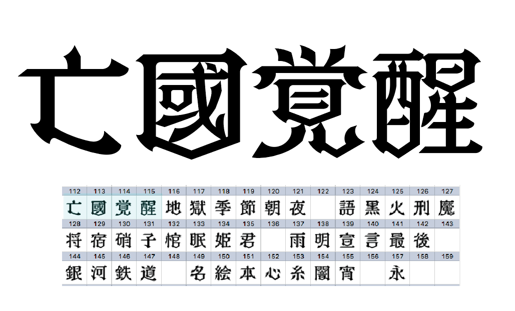
The Charm of TsukuMin
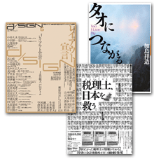
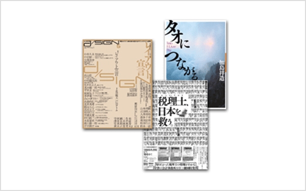
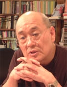
Suzuki Hitoshi is a book designer who not only designs the cover but also the entire book, including Text. He is actively using "TsukuMin" and "Tsukushi Head Min" in many magazines and books, including "Quarterly d/SIGN," which he co-edits with Toda Tsutomu. He keenly reads the characteristics of typefaces in book design and develops skillful typesetting layouts... We asked Suzuki to delve deeper into the appeal of TsukuMin.
Third generation of digital fonts Mincho ...... soft to the eyes.
We can say that we are now in the third generation of digital fonts. The first generation was Ryumin, the second was Hiragino, and the third generation was TsukuMin. The reason why it is called the third generation is that it is soft to the eye. Where does the softness come from? This is a guess from the user's perspective, but in phototypesetting, there was "smearing" and "blurring" in the process of printing the letter plate with light and developing it, but with digital fonts, this is disappearing. In the first generation, I think that output on photographic paper was still overwhelmingly more common, but that also decreased over time, and then film output, and now it is CTP output. Data reproducibility has become one-to-one. Along the way, there are no uncertainties such as "smearing", "blurring", or "fading".
Significance of the demand for the third generation Mincho
The resolution on the output side is increasing, just as the resolution of digital cameras is increasing. In the old days, the output of photographic paper was 1200dpi (although the world of computer typesetting is still 1200dpi), but when it reached 2400 and reached 3600, there was no intervening process and the resolution increased As it is, it is becoming visible to readers.
I think it can be said that it is represented by the Heisei-Mincho, etc., but the first-generation anchor point-saving fonts are becoming extremely tight. To be honest, the second generation Ming Dynasty is getting a little tighter. So I think the third generation of Mincho is now being requested. There is a sign that the "blurring" or "blurring" that was originally printed in the typesetting characters and prints was incorporated into the typeface design. Even from the viewer's side, at least this is true.
A letter is not a real thing, but exists as a form that resonates with the letter in the person's mind when seen. I think the third generation is where digital fonts are approaching human psychology. At the same time, I think I can say the same thing, but when I look at a book recently made by computer typesetting by Shaken, it looks dull. I feel that the "blurring" of the technology base of phototypesetting is being exposed to the contrary due to the fact that the resolution of the world has risen and has become stable. In that sense, it is a tough time. The resolution will not rise forever, and I think it will stabilize at around 2400. I suppose it is in the direction of producing output with a very high cost performance even with the 2400. For example, it is not a regular grit-shaped halftone dot based on FM screening called Fairdot plate making, but it is equivalent to 600 lines when converted to digital sand, the number of lines so far, but it seems to be stable at 2400 dpi Right. Until now, textbooks have said that it would normally be possible to use 175 lines or 3600 lines, but now it is the time when 600 lines worth of 2400 can be completely secured. Although there is no resolution war forever, when the CTP with stable cost performance at a certain resolution comes to life, the digital font design itself will become severe.
Usage of TsukuMin
Easy to read -- Horizontal typesetting -- The appeal of "blurring" -- Proportional typesetting
So, when I tried using TsukuMin it felt very soft and easy to read. I also think it would be good for horizontal typesetting. The reason is that when various people thought of typefaces specifically for horizontal typesetting, they probably tried based on the common sense that newspaper typefaces are vertical and flat, so for horizontal typesetting they should be vertically long, but when you look at why TsukuMin is easy to use for horizontal typesetting, it seems like it was born out of a reverse idea, that a flatter feel would make horizontal typesetting look prettier, and that it would have stronger horizontal continuity.
I think it is also related to the charm of "Nijimi", but the reason why "Nijimi" is attractive is because there is a kind of aura or spirit of words around each character. In other words, if you squeeze the Chinese numeral "ichi" beyond a certain limit, it becomes a figure. However, it is difficult to tell how far the Gothic Chinese numeral "ichi" is from a character to a figure. If you place the Gothic Chinese numeral "ichi" in a title with a dot, it will not look like a character. To make it recognized as a character, it is necessary to raise it a little and leave a small gap above it, rather than placing it in full-width, which will look silly. A character is a character along with the gaps around it. The charm of the "Nijimi" of TsukuMin matches well with the aura around the character, and what happened is probably because the proportional layout of Text is beautiful. When the line length is not that long and there is a mixture of Japanese and English characters, or when there are a lot of brackets and the text structure is very deep, brackets of various types are used over and over. In that case, it is no longer possible to control a line with full-width characters. Although there is certainly an aesthetic of full TsukuMin is extremely easy to read. There is an atmosphere of softness connecting with each other to form a line.
TsukuMin and Tsukushi Mide Min are the best combination
TsukuMin alone was a bit of a one-lunged flight, but I think that adding Tsukushi Mide Min makes it a pretty powerful combination. In terms of Sha-Ken, it's a balance similar to MM-OKL and SHM, in other words, you can do everything with just two. What it means when you say that TsukuMin and Tsukushi Mide Min are the strongest combination is that the idea of a family where you increase the weight one by one is out of the question. In a sense, it's like saying that the idea of making a family by engraving W1, W2, W3 with software like Icarus is no good. Even though Tsukushi Mide Min has A and B, it's a single typeface, so I feel like the era of single typefaces has come. I think it was a big deal that it wasn't a family. In terms of the way of thinking.
Tsukushi has a large character surface, and I feel like it fills the body. If you combine Tsukushi Midemin and TsukuMin at the same point, Midemin will look small. Because it is thick, the skeleton line of the character will go inside. An announcement may be necessary. If you want to make it look the same size, you need to make Midemin a little larger, otherwise it will not look the same size. Also, when using Tsukushi Midemin, I feel that it needs some adjustment to the closeness and pull. If you are using it for a book title, the designer should be able to manage each character to that extent, so it's fine. It is absolutely necessary to make it look like it is moving up or moving to the left, because it creates an optical illusion when the characters are close together or combined above and below. It can't be helped when there is such a big difference between the thin and thick parts.
TsukuMin is the Mincho style of the CTP era.
I think TsukuMin can be said to be the Mincho of the CTP era. The horizontal strokes are relatively solid and soft to the eye. As a user, I would like to see the appearance and Weight of the characters vary greatly depending on the type of CTP. It is completely unknown how Weight of the characters will be secured by combining various types such as CTP with resin plates and CTP burned from negatives. They are distributed nationwide in a scattered state. I used weight M with Mincho before, but it only looks like L. If it's so thin, I should have increased the weight by one... But it's too late now. I think it would be good if the manufacturer could give us some information about that. What to do about compatibility with CTP. Unlike before, CTP does not have a printing plate, so you can't adjust the printing, so the only thing you can do is adjust the amount of ink. It's also in the catalog. TsukuMin-LB may be good when the printing plate has a tendency to become thinner. I think it would be good to advertise it more.
Fontworks is a manufacturer like a manufacturer
Please stay violent at Fontworks. It feels like we haven't decided on a majority decision. I feel that the designer is relying on his own sensitivity. It is a typeface by a single person. Others often make fonts at meetings. When it comes to making fonts, it's much more crappy, rampage-like, and Kyushu-like compared to Kojiyou Kobo. I'm a fan of Nintendo movies, so even if I say "Yakuza" or "Kyushu", it's a functional aesthetic. I think they are aiming for the same place, but the finish is completely different. There is a place where the character Yubo workshop is well organized, and Fontworks seems to be popping up. But I wonder if that's going well, Mind Chikushi. I think it's hard to do that much. Now, the flow is a reprint of metal type. In the case of Fontworks, it's obviously a new work. And the old taste is revived modernly. If you follow the shadows of the old days, there is a yield and there is only 7 or 8 so it can be said that if Fontworks is popped up, it will hit the things that the times demanded quite a bit. I think Fontworks is a manufacturer. I don't think it's in good shape.
< Editor's note >
Mr. Suzuki's office is a silver dome-shaped building that creates a unique atmosphere in a quiet residential area. Not to mention the appearance, I was overwhelmed by the large number of books lined up on the bookshelf on the inner wall. From the perspective of a book designer, I received a lot of attention from various aspects such as typeface design, what fonts should be, how information should be provided, and I felt that I should develop together with customers as a font maker. We will continue to develop and disseminate LETS and new typefaces in addition to the "Chikushi series", while referring to the opinions of designers.
< profile >
Born in Tokyo in 1950. Book designer.
While studying at Tokyo Zokei University, studied under Kohei Sugiura. Independence in 1985. From the book design to the center of my work, I reach the present.
He put forward a "Chiezo" trial as a part of widely disseminating the importance of layout and format while focusing on the Text design along with the dressing.
December 1996 "Pagination Manual" was announced.
Authors include "The Birth of the Screen" (Misuzu Shobo) and "Page and Power" (Seidosha). Major design tasks include "all records of Showa 20,000 days" (Kodansha), "Japan An Illustrated Encyclopedia English Japanese Dictionary", "Memory of the series 20th century" (Mainichi Shimbun), "Japan Almanac" (Asahi Shimbun) Company) "Daijisen" (Shogakukan) and others.
Company Info
| Company name | Suzuki Kazu magazine design |
|---|---|
| Head office location | 6-9 Chikudohachimancho, Shinjuku-ku, Tokyo |
| TEL | 03-3235-4785 |
| Establishment | 1986 |
| Other | Works |
For enrollment in the "LETS" program or purchase of products, please Contact Us your retailer or place an order.
