美術出版サービスセンター さまのご紹介
美術出版サービスセンターさまは、学校の図工や美術の授業で使われる教材や画材をはじめ、美術書籍や備品など幅広い分野の商品企画・提供を手がける学校美術教材の専門商社です。
図工や美術の教科は、発想力、創造力、表現力など、子どもの感性を育み、確かな学力や豊かな人間性の確立に重要なものです。しかし、近年の教育課程では授業時間が年々減少している現実があります。そのため、美術出版サービスセンターさまでは、より充実した授業が普及するよう、図工・美術の先生方向けのワークショップに協賛されるなど、図工・美術授業の振興に力を入れられています。
今回は、取り扱いをされている商品が記載された「美術出版BSSカタログ」や、販促用資料に使われているフォントワークスフォントの使用感について、総合企画課の阿部さまに伺いました。
社内での制作物は、沢山のフォントが使える『LETS』を活用しています

弊社が『LETS』を使い始めたのは、2008年に制作環境をMac OS Xに移行したときでした。マシンやソフトなどの一式をまとめて販売会社さんにお願いしたので、その際にお薦めいただいた通りに『LETS』を導入したのですが、元々フォントワークスのパッケージ製品で 「ロダン」や「マティス」を使用していたので、馴染みのあるフォントをそのまま使い続けられています。
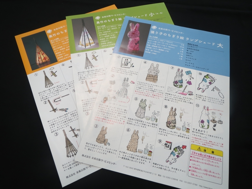
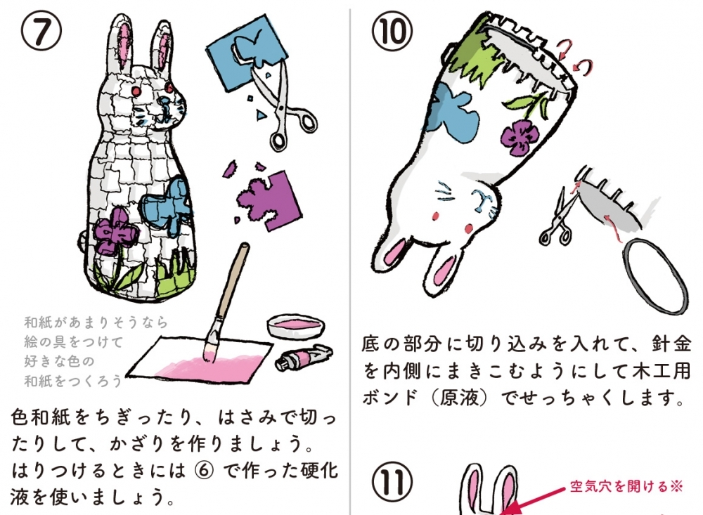
『LETS』を導入してからは、使用できるフォントの幅も広がりました。 弊社の制作物の大半は外注しているのですが、これからお話しする「美術出版BSSカタログ」は、約21,000点の商品を掲載していることもあり、スペック変更や商品説明の改善など、事細かな編集に即応できるよう、社内で制作をしています。
商品の説明をより詳しく掲載できるように、誌面に工夫をしています
実は、このカタログで取り扱っている“教材”の流通経路は少し特殊で、一般のお店に並んでいることはほとんどありません。そのため、ご購入前にお客さまの目で直接ご確認いただくことが難しいのですが、図工・美術教材は材質や風合いを重要視されるお客さまも多くいらっしゃいます。
そういったニーズのため、購入前にできるだけ詳しいスペックを知っておきたいという方が多いのですが、お問い合わせをいただくことを別にすると、基本的にはこのカタログに掲載されている内容だけでご判断をいただいています。
取り扱い商品自体は、弊社でも他社さまでも競合しているものが多いのですが、他社との差別化を図り、弊社の製品をよりアピールするためにも、できるだけ詳しい商品特徴や関連情報などを記載して、実物が想像しやすくなるように心がけています。
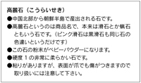
そうすると自然とテキスト量が増えてくるため、ページ割りや商品画像の配置を考慮することで情報の見せ方を工夫するのですが、“スッキリと読めるようなフォントを使う”という点にもこだわりを持っています。
そうすると自然とテキスト量が増えてくるため、ページ割りや商品画像の配置を考慮することで情報の見せ方を工夫するのですが、“スッキリと読めるようなフォントを使う”という点にもこだわりを持っています。
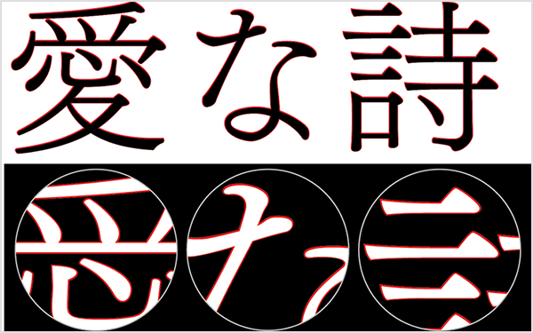
ロダン(カタログ使用書体)
弊社の場合は、見栄えする「見せるフォント」よりも、可読性に重きをおいた「読ませるフォント」を使いたいと考え、見出しにも本文にも角ゴシック体の「ロダン」を使用しています。「ロダン」は、漢字と仮名の見え方に風通しがよい印象があるデザインなので、長文だけでなく、テキスト量の少ないところにもウエイト違いで使用しています。
例えば、とてもベーシックな使い方ですが、見出し部分には「ロダン-DB」を、本文には、「ロダン-M」を採用して、統一感を出すとともに、表示サイズを調整してバランスを取る、といった具合に使っています。スペースの関係で長体をかけて使用するときも、ロダンらしいすっきりとした印象は変わらないのが気に入っています。
今の「ロダン」を使った体裁になるまでに、明朝体から角ゴシック体、また別の角ゴシック体といった具合で、何度も本文書体を変更してきた経緯があるのですが、ここ10年以上「ロダン」を採用し続けているのは、やはり読みやすいことの一番の裏付けなのでしょうね。ですが欲を言うと、狭いスペースを有効に使用できる“長体をかけることを前提にした”ロダンのバリエーションやフォントがあればもっと嬉しいです!
現場の声を聞いて制作した販促物は、人気の教材になっています
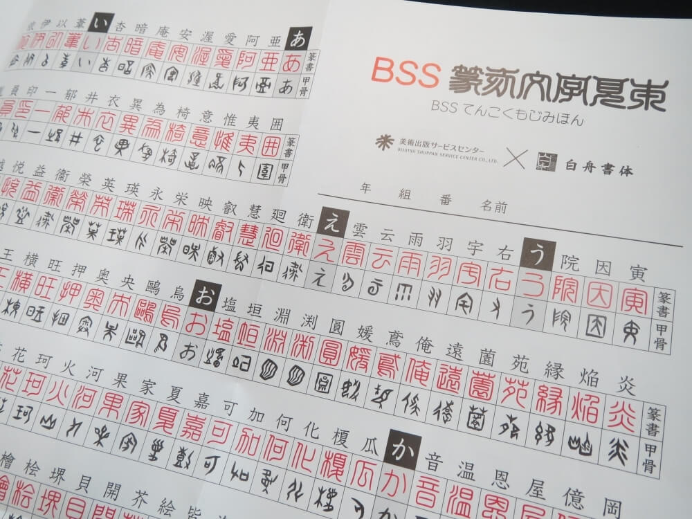
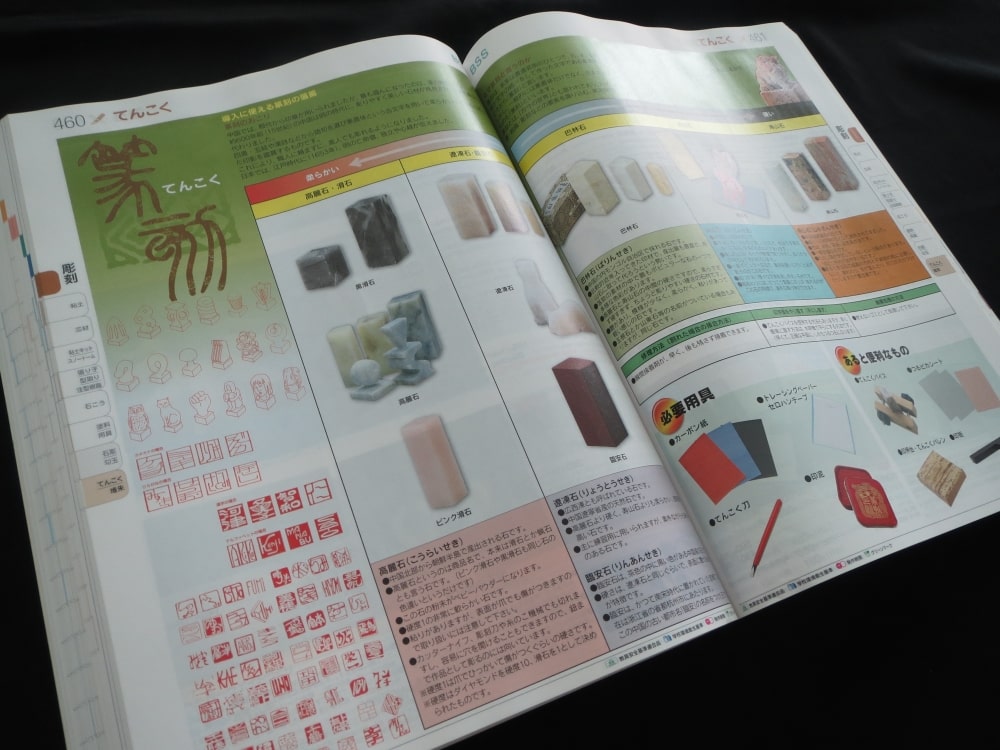
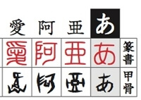
これは石を彫ってハンコを作る『てん刻』という技法の授業向けに、デザインの見本として提供している資料です。弊社では主に、小・中学校の生徒さんに商品をお使いいただくということから、授業内容に沿った資料や、「このような見本があればいいな」という要望から制作する販促物が多くあります。
この資料を制作した私も、中学生時代にてん刻の授業を受けた経験があり、当時“せっかく彫るのであれば、よく見かける書体よりもハンコらしい書体をお手本にしたいな”と感じたことが、『白舟LETS※』の書体を採用するきっかけになりました。
この見本には書体そのものをコンテンツにしている側面があり、許諾面に不安を感じたため、フォントワークスさんにご相談してみたんです。すると、デジタルフォントとして使えるかたちでの配布ではなく、印刷物としての提供であることや、学校教材として主に使われることから、使用にはまったく問題ないとお墨付きをいただき、諸々のご協力もしていただけました。
フォントメーカーさんの後ろ盾があるからにはこだわったものに仕上げよう!ということになり、てん刻の授業では名前を彫ることが多いことから、単純に漢字を文字コード順で並べるのではなく、人名によく使われる文字を厳選して掲載することにしました。
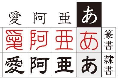
初版を作成したときは、「白舟篆書」と「白舟隷書」を使用しましたが、その翌年には増刷するほど好評だったため、第二版では新たに「LETS」に加わった、よりてん刻にふさわしい「白舟甲骨」を「白舟隷書」と入れ替えて採用しました。これは漢字の成り立ちが分かるような書体や、伝統が感じられるような書体を知ってもらい、『そこからなにかを学び取ってもらえるとうれしいな』という制作側からのメッセージもひそかに込められています(笑)
近年、図工や美術に割り当てられる授業時間が少なくなってきていることから、販促物や資料を制作する際は、先生方に向けては授業の質を少しでも上げるお手伝いができるもの、これらを使われる児童・生徒さんたちには、楽しみながら学んでもらえるものに仕上げることを念頭に置いて制作しています。
この資料の制作後にてん刻教材の売れ行きもぐっと伸びたことから、販促効果は大きかったと思っています。沢山のフォントをラインナップされているフォントワークスさんにご協力いただき、非常に質の高い販促物に仕上げられたのも成功の一因だと思っています。
※オプションにてご契約をいただいていました「白舟LETS」は、2014年1月より『LETS』の基本セットでご使用いただけるようになっています。
実は「ないと仕事にならない」くらい重宝しています
『LETS』で提供されているフォントの他にも、Adobe Illustrator用のプラグインは本当によく使っています。
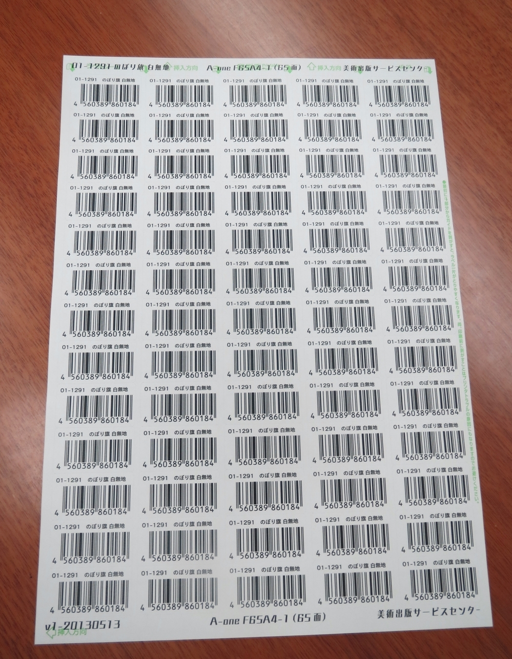
カタログに掲載している商品の中には、もともとJANコードが付いていないものも多いんです。 JANコードは、商品を管理する際に必要となるのですが、このコードを取得していないメーカーの商品などは、弊社のコードを割り当てて管理することがあります。そんなときに、Adobe IllustratorプラグインのJANコード作成ツール「LETS JANCode※」を使って、JANバーコードのラベルを作っています。
これはちょうど弊社でJANコード管理を始めようとしたときに、訪問ユーザーサポートで使い方をお伺いしたという経緯があるんですよ。 今では、もう手放せないくらいに使い込んでいます。より扱いやすいように、使っているペンタブレットのファンクションボタンに入力用マクロを記録しています!
※LETSでは、多種多様なコンテンツをデザインサポートツール「LETS Power Up Tool Kit」として、LETS会員さまへ無償で提供しています。
紙でもWebでも、見え方にこだわっていきたい
お話してきた販促物やカタログは、すべて紙媒体ですが、最近では紙よりも電子端末を使って調べものをすることが増えてきました。それでも、紙はそう簡単になくならない媒体だと考えています。使用する人がすぐに手に取って見れたり、追加の情報をメモのように書き込んだりと、とくにカタログのような媒体では、まだしばらく残り続けるのではないでしょうか。
ですが、今後はひとつの媒体だけに頼ることなく、時代に沿った柔軟な対応がどんな業界でも必要になってくると思います。そう考えると、こちらからアピールする媒体だけでなく、探しにきてもらうのに適した、Webなどの媒体にも力を入れる必要が出てきます。まだまだこちらの体制づくりに時間がかかるとは思いますが、ただ単に読めればよい、見れればよいというところで満足してはいけないと思っています。
そのため、見え方に気を遣っていきたいと考えたときに、紙でもWebでも同じフォントが使えるっていうのは、『LETS』ユーザーである強みだと思っています。まずは、イベント企画のページなど、独立したものからの採用になるとは思いますが、Webフォントを使うことで、今まで以上に美術出版サービスセンターらしい、と感じてもらえるような情報発信にトライしていきたいと思っています。
<編集後記>
小中学生の教育課程から図工・美術に触れ合う時間が減ってきていると伺いました。『LETS』を通して学びの一助となるように、 新しいフォントはもちろん、プラグインや写真素材についても益々便利な環境が整えられるように努めて参ります。
企業情報

| 社名 | 株式会社 美術出版サービスセンター 様 |
|---|---|
| 所在地 | 東京都新宿区市谷本村町2−19 |
| TEL | 03-3235-5137 |
| URL | http://www.bijutsu.biz/ |
「LETS」プログラムへのご入会や製品のご購入については、お取引のある販売店様へお問い合わせ・ご注文くださいますようお願いいたします。