Some fontworks LETS fonts are provided as "solution fonts".
"Solution font" is an existing font from Fontworks. < Fonts that have been redesigned or tuned up specifically for the usage and medium > is. Currently, there are three types of solution fonts: print/comic/broadcast.
In 1990, Fontworks first released fonts as a third party. At that time, the fonts were designed and released mainly for use in paper media such as printing.
However, the printing mechanism and the resolution of the output device have improved dramatically, and moreover, the needs for digital fonts are not limited to paper media. As a font maker while diversifying to display etc. < Designed for usage and medium > The fonts are now available.
This is called "Solution Font", and from Fontworks < Fonts that suggest how to use the developer's perspective and media > Is offered as.
This time, we would like to introduce the background of the birth of "Tsukushi Mincho LB/RB" and the features of the provided fonts as the first version of this "solution font."
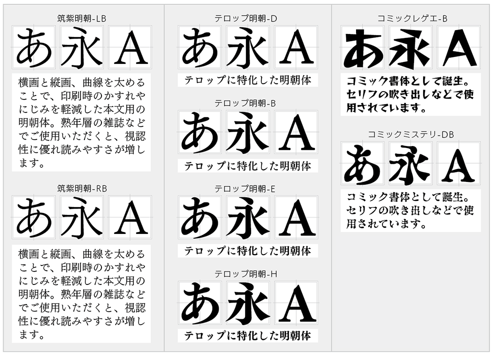
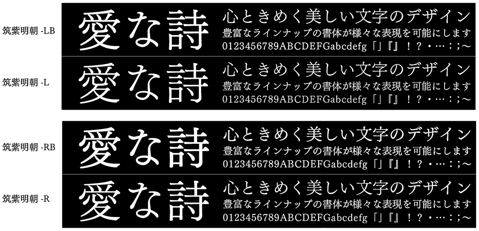
"Tsukushi Mincho LB/RB" that reduces "blurring" and "bleeding" during printing
"Tsukushi Mincho LB/RB" is a printing solution font provided by LETS as the Chikushi typeface series of the Fontworks collection.
" Tsukushi Mincho LB" was born in 2003 together with "Tsukushi Mincho L". "Tsukushi Mincho RB" was born in 2004 together with "Tsukushi Mincho R".
" Tsukushi Mincho design concept of" is, "full-fledged lengthy Text for the Ming, print, followed the essence of typesetting era, can be considered to maximize what should be the Mincho" and , "There is some nostalgia that you can see print-like ink pools even in offset printing."
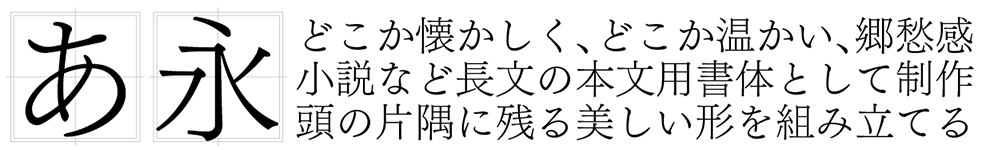
" Tsukushi Mincho L", which was first produced, has a different paper color in paper media such as books. < White > It is intended to be used for long Text such as novels and literary history based on.
On the other hand, we created and released "Tsukushi Mincho LB" in the same year, which is supposed to be used for pictures such as magazines and tint blocks that are not "white background", and also to display them overlaid on the color.
The background of the production came from the voice of some designers, "I want you to develop a Mincho typeface that can be beautifully read with thin weights when laying color on the background or overlaying letters on photos etc." ..
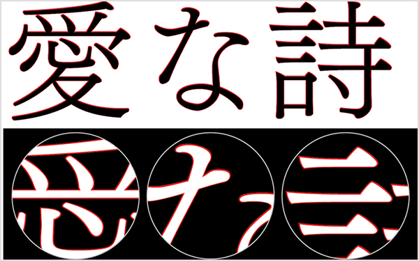
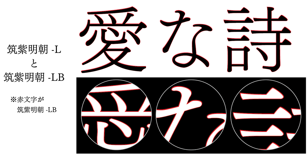
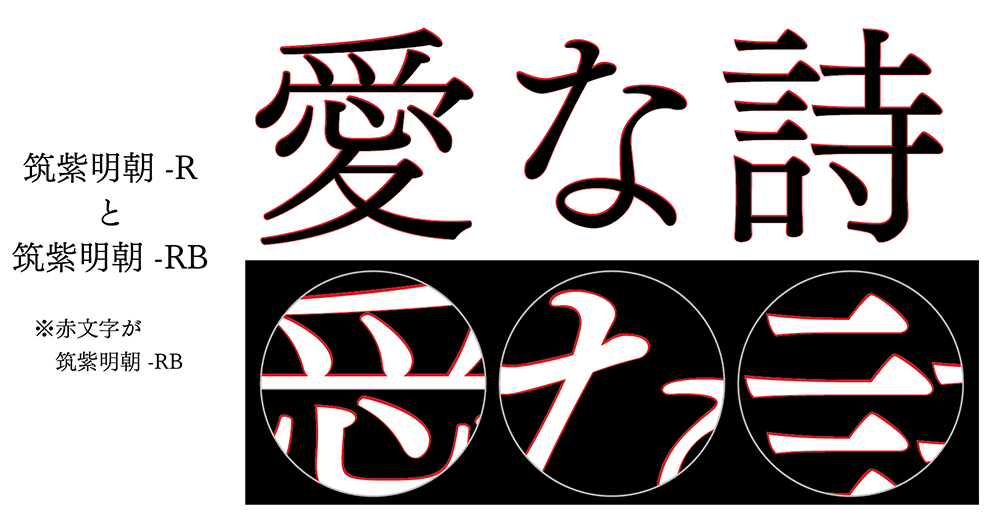
The "Tsukushi Mincho LB/RB" is a typeface in which each of the "Tsukushi Mincho L/R" is thickened by increasing the horizontal and horizontal strokes. It represents a "black type" that looks the same as the equivalent weight when printed in white Mincho on a black background (background pattern), and if you use "Tsukushi Mincho LB" on a black background, Weight will appear as a white background. You can make it look as Weight when "Tsukushi Mincho L" is overlaid.
If you compare the above images, you can see that not only the horizontal lines but also the vertical lines and curves are thicker in each part. By doing this, the density of the paper surface becomes darker and it becomes easier to read, even if you do not use a thick weight Mincho body.
In addition, even if a thin Mincho typeface is used over a photo or black background, it will be used in various media as a typeface that can reduce "blurring" and "blurring".
Not only is it used as a white Mincho typeface, but it is also established as a typeface for Text that can fully demonstrate its beauty.
Comments on "Tsukushi Mincho LB/RB" and Usage-Designer: Kazuho Suzuki "Typeface that can express strength"
Mr. Suzuki, a book designer who designs the entire book including Text including dressing, was previously on the LETS site. Member interview corner Then, I talked about "Tsukushi Mincho-LB/RB" as follows.
Tsukushi Mincho can be said to be the tomorrow morning of the CTP (abbreviation of computer to plate, which refers to the method of printing and developing images directly on the printing plate based on DTP data). The horizontal drawing is relatively solid and soft to the eyes.
What I would like to hope for as a user is that Weight looks different depending on the type of CTP. It is totally unknown how the character Weight is secured by combining various types of CTP of resin version and CTP baked from negative. It is being deployed nationwide in a scattered state.
Even though I used the weight M in the Mincho style before, it looks like only L. It would have been nice to raise the weight by one if it was so thin...it's a festival after that, no matter what. .. What do you do with compatibility with CTP? Unlike in the past, CTP does not have a printing plate, so it is not possible to adjust the printing, so at the very least there is only a way to hit the ink level.
Tsukushi Mincho-LB may be good when the printing plate tends to get thinner.
Next time, we will introduce the solution font for comics, Manyo Kouji Large/ Comic Mystery / Comic Reggae. to be continued