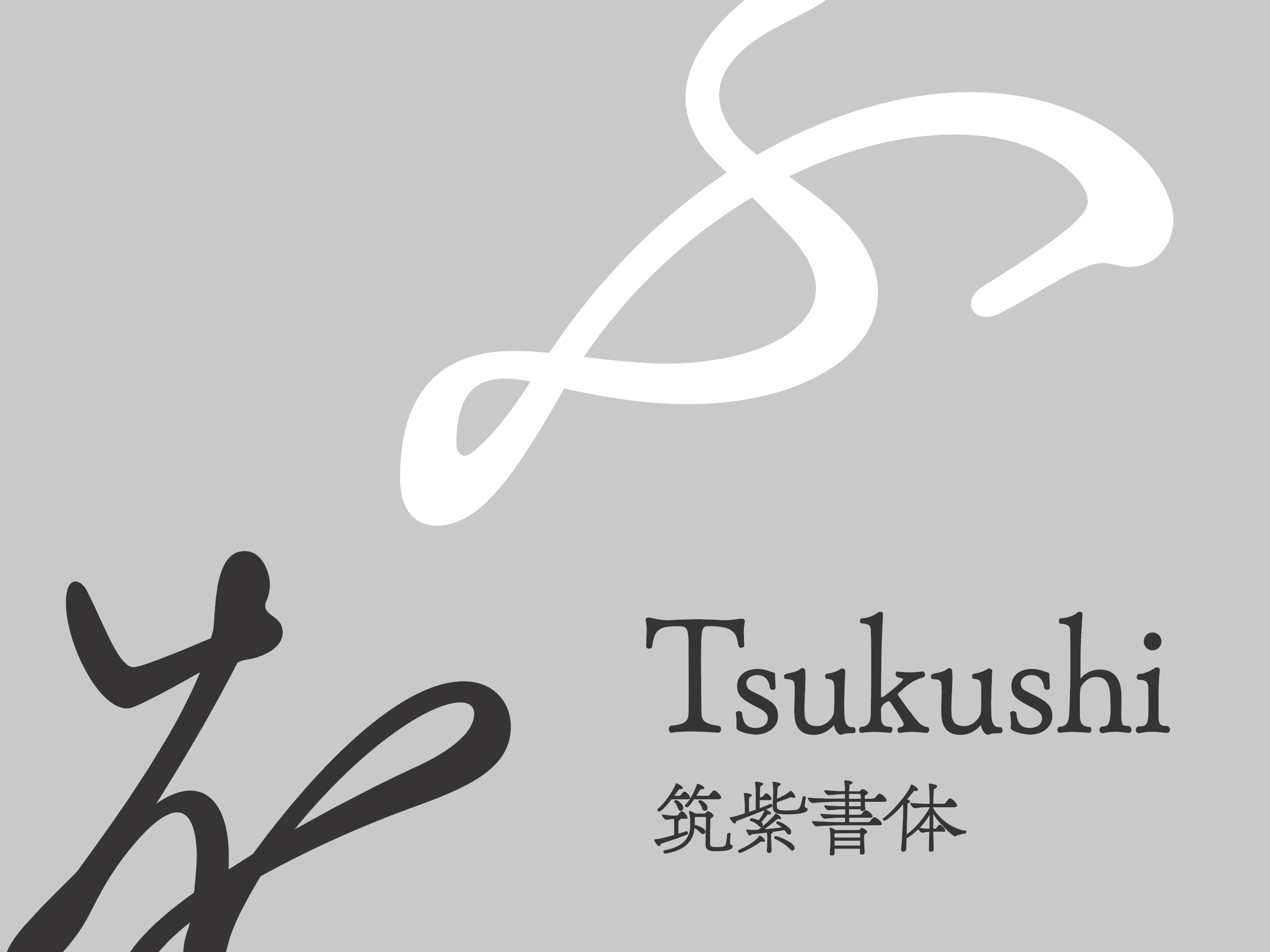
Font used Text: TsukuGo
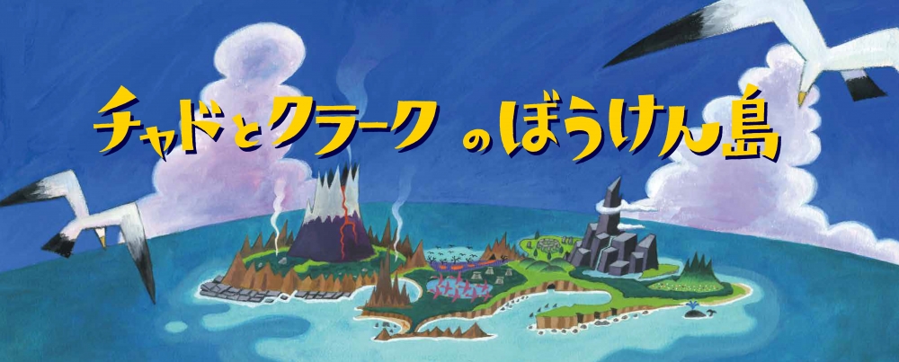
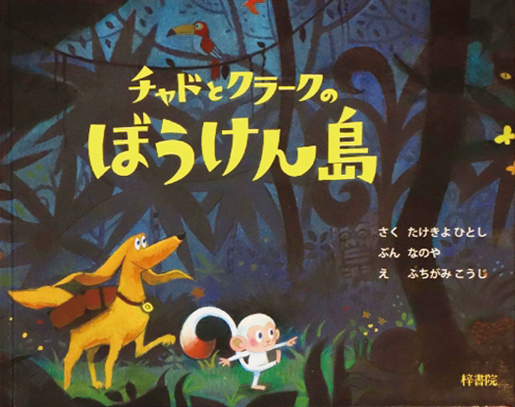
Picture book "Chad and Clark's Bowken Island" Picture book by animation film director Hitoshi Takeki. The animation picture director's "moving picture books like animation" has passed the time to read the picture books, but children's literature with only letters is still early, and it is popular as a perfect picture book for children at such times. I am.
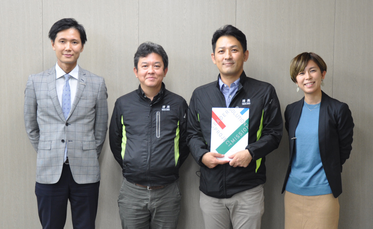
Introduction of Montblanc Pictures Co., Ltd.
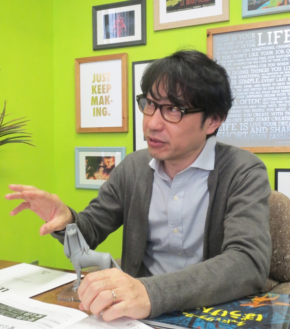
Montblanc Pictures Co., Ltd. is a company that plans and produces a variety of Video-related content, including feature films, character designs, TV commercials, and games, with a focus on 3DCG animation and motion graphics.
Fontworks fonts are also used in the movie After School Midnighters and on Hawks Vision at the Yahoo! Auctions Dome.
This time, we focus on the picture book "Chad and Clark's Adventure Island," which uses TsukuGo in Text, and ask about their thoughts on font selection.
Reasons for choosing "TsukuGo" as the font for Text text
This is closely related to the story of this picture book.
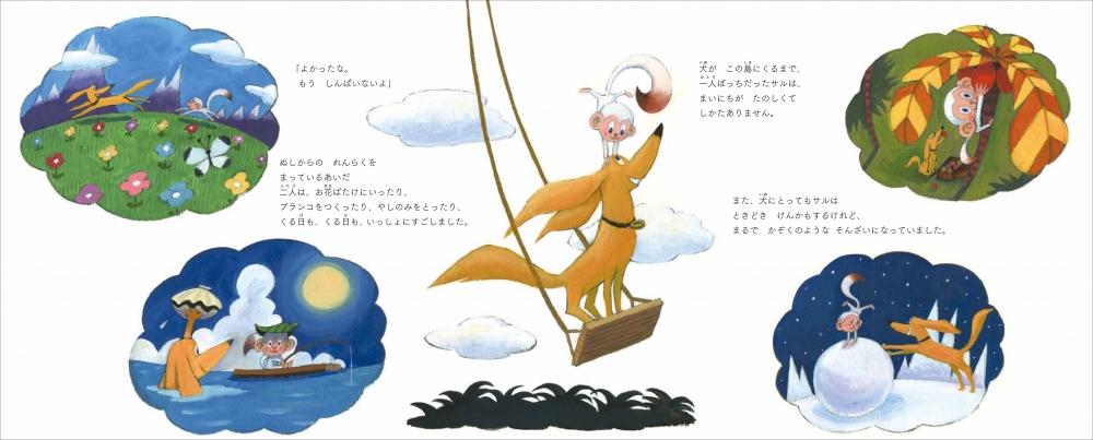
"Chad and Clark's Adventure Island" was created to be enjoyed by everyone, from young children who need to have someone read to them, to early elementary school children who can read it on their own, and even adults. It depicts the friendship that is born from the encounter and adventure of the main characters, who have different personalities and upbringings, and is "a story that will make even adults cry when they read it."
So even though it's a picture book, there are some parts that feel unexpectedly harsh. Like you're being confronted with reality. For that reason, a cute font like round gothic might be used in general, but I thought that it wouldn't suit this book, so I chose "TsukuGo", which has a universal and easy-to-read feel, but also has a bit of a unique feel.
The specific selection process leading to the decision to use "TsukuGo"
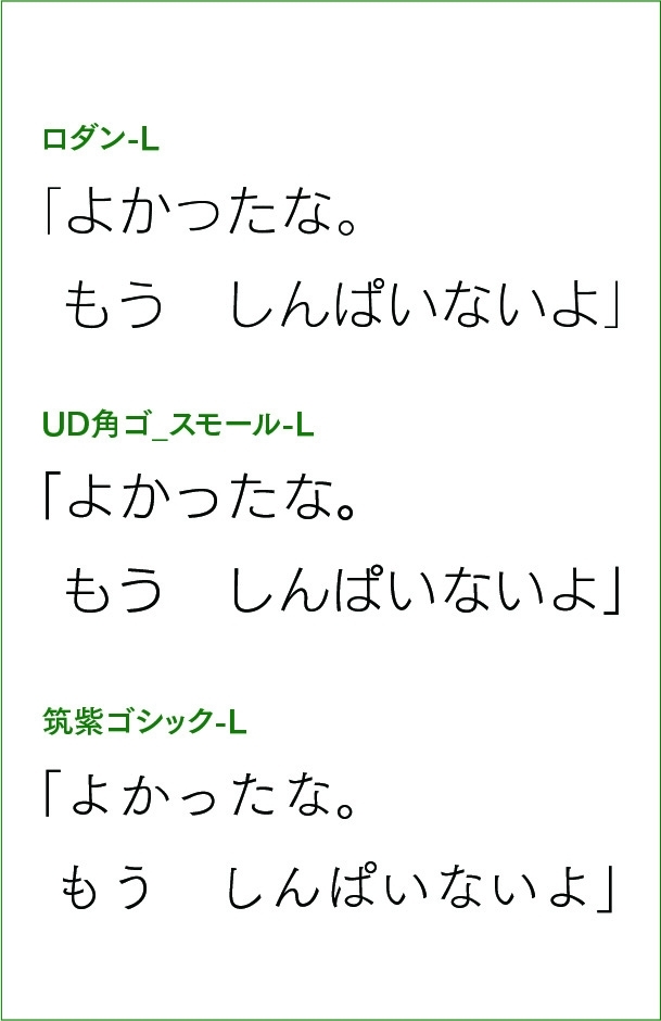
I replaced one sentence of the actual text with the font of the selection target and compared it side by side.
At the first stage, considering that it will be used for the Text, it seems that the pop style, the typeface with a strong design, and the Mincho type have a slightly different atmosphere, so from the round Gothic type and the Gothic type the basic I think I chose about 20 typefaces.
After that, for the reason I talked about earlier, the Maru Gothic font was no longer an option, and the Gothic font was selected.
Some basic Gothic typefaces for Text use have a “clicky” look that does not add extra images, or a soft impression with some organic nuances.
I think that the two are the typefaces that are suitable for transmitting the minimum amount of information and the typefaces that are familiar and easy to inspire, but the latter is definitely better for picture books. Finally, I laid out the whole page, including the fonts, and confirmed the readability and atmosphere. Now that I'm looking at it again, I think it's really in good shape.
現場の声を聞いて制作した販促物は、人気の教材になっています
This time I made a picture book for the first time, and I felt that the role of fonts in a picture book is extremely important.
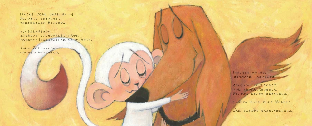
Almost half of this picture book is written. The important point is that the characters are arranged in the same amount as the picture, rather than the novel with only the characters. It is necessary to consider the compatibility of the fonts used for picture books with pictures, and I think that small children should be considered as figures before they are recognized as letters. With that in mind, I once again felt that the atmosphere created by the shape of the letters was an important element for communicating the content.
Direct the reaction at the story-telling Event of picture books
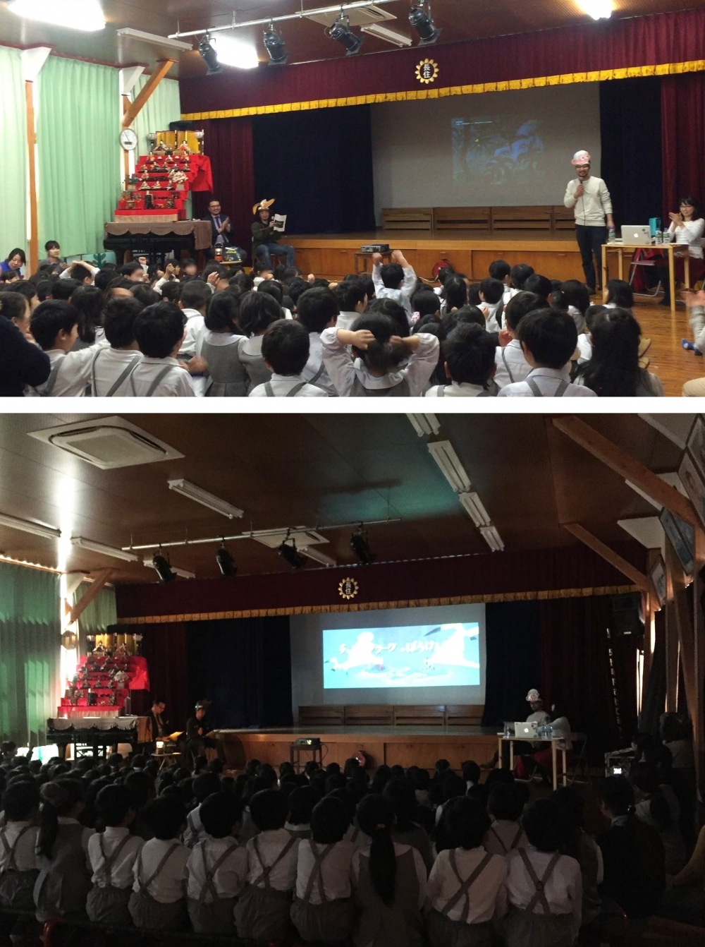
In addition to the work done by the client, I started the original entertainment project and wanted to make more people enjoy it, but it is not a complete picture book production, you can enjoy just the picture I wanted to do something like that.
By adding a little animation to the still picture of a picture book, we create a "moving picture book" and incorporate a mechanism to expand the imagination. We broadcast it as a TV series, and we also hold story-telling Event at elementary schools, kindergartens, and bookstores.
The imagination of children is amazing. It seems that you can freely combine pictures and stories and have fun. This has become popular, and we have been getting a lot of voices lately. The staff of our company is also enjoying it because you can directly feel the reaction of the picture book that you created.
The appeal of Fontworks fonts and expectations for the future
Fontworks fonts are, of course, not only the font design, but the fact that the license agreement is clear is very attractive. Different licenses for different font makers and fonts are a very delicate issue in this multi-media industry. Actually, I used this license a bit wrong before, so I am using it with confidence that it is Fontworks font.
The fonts that you really want to add to such Fontworks fonts ...
Nowadays, I'm wondering if the monitor resolution is too good and the fonts are too accurate and sharp. The edge seems to come out properly.
I want a font that looks fuzzy like printed matter when displayed on a monitor. It is an image of connecting adjacent weights by morphing and creating a weight between them, but the blurring and fluctuations when trying to add nuance are craftsmanship. I think that the font has the soul in the details, so I look forward to it!
Company Info
| Company name | Montblanc Pictures Co., Ltd. |
|---|---|
| location | 1-9-3 Takasago, Chuo-ku, Fukuoka City 3F, Juneta Building |
| URL | http://mtblanc.jp/ |
For enrollment in the "LETS" program or purchase of products, please Contact Us your retailer or place an order.