長い冬の時代とトンネルは終わり、パブリッシング時代の本当の春が到来!
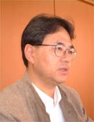
株式会社エイアールは、書籍、雑誌、Webデザインなど幅広く手がけているデザイン会社です。中でも雑誌と書籍、いわゆるエディトリアルデザインが中心で、一般的な書籍や雑誌、カタログやパンフレットなどの商業出版以外のものなど幅広く手がけていて、特に子供向けの書籍とムックは大きな割合を占めています。 デザイン活動だけにとどまらず、デザイン関連の教育やコンサルティング、執筆活動も行っている代表取締役兼アートディレクターの菊池氏にデザイン業界から見たLETSについてお話しを伺いました。
LETSは出版界にとって非常に有意義な存在
このところ出版不況などと言われてきて、今までの10年は旧来型の出版のあり方とこれからの出版のあり方でいろいろと模索していた時代だと思うのですが、出版界におけるDTPやワークフローも含めた出版のあり方みたいなものがようやくひとつ底を打って転機を迎えたかなという風に感じています。紙の媒体であることに変わりはないのですが、例えば文字の組み方やデザイン、出版のあり方、出版形態、流通ルート、どういったメディアと連動していくか、ようやくここにきてそれらを現実的にどのようにビジネスとして進化させていったらいいのかというフェーズに入っている気がします。それは大手、中小、専門など分野にかかわらずそういう動きがあって、そこでやはりコアになるのはデジタルではないかなと思います。目的ではなく手段としてのデジタルですね。
出版物を日本語で表現するためのフォントのあり方として、過去これまで培ってきたDTPのビットマップフォント、PostScript、OCF、CIDという流れがあって、これからはOpenTypeとPDF/X-1aで電子入稿というワークフローがごくごく普通の環境になってくると思います。そのときに最も重要になってくるのはフォントの使い勝手ですね。LETSの契約ライセンスを結んでいるユーザー同士であれば、フォントの有無を意識せずにLETSで提供されるフォントはどれでも使えます。また、Mac OS X、Mac OS 9、WindowsなどプラットフォームやOS環境に違いがあってもデザインレベルでの互換は取れます。LETSはフォントの流通形態だけでなく、出版におけるフォントのユーザービリティと言ったらいいんでしょうか。そのモデルケースを作って、それが今カタチになっていると思います。制限なく使えてストレスを感じさせないLETS。これは出版界にとって非常に有意義な存在ですね。
これからのライセンスのあり方
導入の決め手の1つとして、フロッピーディスクでなくCD-ROMで供給されることが挙げられます。FDは媒体として過去のもので、例えて言うなら最新のポルシェに8トラックのカセットデッキを積むようなもので、あまりにも異形ですよね。
通常インストールは1書体ごとなので本当に面倒ですが、LETSならキー1つで全書体インストールできてしまいます。これからはパッケージでいくつも購入する時代ではなくて、使っているコンピュータやユーザーに対してどれだけの使用権を与えて、それがどれくらいの年間の予算取りができるかがコーポレートに対するライセンスのあり方だと思います。ユーザーとしては新しいマシンやOSにスムーズに移行できて、今までのように支障なく使えることが一番大切です。契約台数の範囲で正しく管理運用すれば、いつでもすぐに簡単に入れ替えが行えるLETSには大変助かっています。
書体はどんどん増えていくのに、支払いは毎年決まった金額だけ!
私達デザイナーのスタンスから考えると、筑紫シリーズがリリースされたように、新しい書体やファミリーが年額のライセンス料を更新するだけで、既存の書体と同じように使用権利が継続できるというシステムは素晴らしいと思います。自動的に新しいデータCD-ROMが送られてきてインストールすればいいだけなのでとっても楽ですし、追加料金が要らないのは大変ありがたいですね。書体はどんどん増えていくのに、新たな予算が発生せずに毎年決まった金額だけでいい。ブロードバンドの定額制と同じようなものなのでユーザーとしては非常に気が楽です。きっと、みなさんも同じように思うのではないでしょうか。
エディトリアルデザインの基本って明朝とゴシックなんです。セリフのあるゴシックと本文で使える明朝、これは要するにエディトリアルデザインのご飯とみそ汁なんですよね。基本であるご飯とみそ汁がおいしいものでないと、その食卓って今ひとつ満足度が高くならない。だからご飯とみそ汁である本文書体とか本文中の見出しに組める明朝とゴシックが筑紫シリーズのように揃っていくのはとてもいいことですよね。
直にクライアントにイメージを伝えることができる
当社は主に雑誌・書籍のエディトリアルデザインを行っているのですが、デザインや文字の指定などは我々が全面的に決定するわけではなくて、あくまでもお客様であるクライアントの出版社や編集者の方とご相談しながら決めていくことがほとんどです。もちろん、こちらからご提案をすることもあります。提案する場合は書体見本だけではイメージが伝わりにくいため、実際に文字組みしたものをお見せしています。特に絵本や幼児教育関係のものが多いので、仮名の字形にはこだわっています。最終的には具体的に文字を比較して、大量にフォントをシミュレーションすることが必要になります。そんなとき、LETSは多種多様の書体があって、直にクライアントさんにイメージを伝えることができるので非常に喜ばれますし、それが我々にとってのデザインの提案でもあります。2書体で成立するエディトリアルデザインの分野もあれば、絵本や幼児教育など非常にたくさんのディスプレイ書体を必要とする分野も存在します。幼児教育関係の仕事は細かい要求もあり、私達にとってはLETSがないと仕事にならないと言っても過言ではありません。
導入して変わったことといえば、たくさんの書体を比較することで書体に対するフォントデザイナーの方の考え方が、すごくよくわかるようになりました。それがひいてはデザイナーの勉強になります。これは膨大なシュミレーションを繰り返すことで、興味と意識を持って見ることができる人間であれば、知らないうちにいい書体とは何か、また各々の書籍・雑誌にとって適切な書体とは何かを見る目が必ず養われてくると思います。
過去の資産がスムーズに再利用できるLETS
絵本の制作に長く携わっていると必ずあることですが、過去に制作した本の再販のため、例えば昔のスーラPlus(OCFフォント)で組んだデータがほしいという依頼があります。わずかな改訂なら在版データを再利用すれば簡単に済むことかもしれませんが、制作時のOS、アプリケーションやフォントのバージョンなど、環境が異なる場合は互換が取れないことも多く、正確に再現できません。デジタルデータはデータ的には劣化しませんが、バージョン的に陳腐化してしまうんですね。現在ほとんどのフォントベンダーではOCFフォントの販売を終了し、サポートも打ち切られている状況にありますが、フォントワークスは LETSでOCFフォントも提供・サポートしているため、過去の資産・在版データが再利用できて大変助かっています。Mac OS Xの場合でもClassic環境で使用できますしね。
導入して変わったことといえば、たくさんの書体を比較することで書体に対するフォントデザイナーの方の考え方が、すごくよくわかるようになりました。それがひいてはデザイナーの勉強になります。これは膨大なシュミレーションを繰り返すことで、興味と意識を持って見ることができる人間であれば、知らないうちにいい書体とは何か、また各々の書籍・雑誌にとって適切な書体とは何かを見る目が必ず養われてくると思います。
教科書体、楷書体の仮名のデザインの向上
書体デザインについて要望を挙げるとしたら、教科書体や楷書体の仮名のデザインの向上です。これはデザインの善し悪しという意味ではないのですが、グレコ、ユトリロ、クレーの仮名のデザインが少し暴れているような気がします。教科書体は、組んだときに水が流れるような感じや優しい感じがあったほうがいいですね。特に教科書で使用するときは「はね」などの細かい部分が重要になってきます。ですからもう少しブラッシュアップすれば教科書の分野にもっと参入できるのではないかと思います。それから、ユトリロとクレーに関しては現在ウエイトがMとDBしかないので、もう1つ細いLを追加して3ウエイトはほしいですね。
LETSの海外への展開を希望
LETSに対する要望として、海外のユーザーも入会できるといいですね。知人にLETSのことを教えたらとても興味を持っていました。法的な問題や違法コピーの問題があると思いますがそれがクリアになれば、認証、セキュアな環境を整備してオンラインダウンロードという形が理想的ではないかと思います。日本だけでなく海外で日本語の出版物を出しているところも多数あるはずですし、広告やエディトリアル、日本人向けのパンフレットも当然あります。パッケージ販売だけでなくLETSが海外に展開されることですごく助かる人達がいるんじゃないかなと思います。例えばデザインの勉強のために海外に留学した場合など、 LETSが使えるといいですよね。他のフォントベンダーがやってないことなので、たとえ制限付きであっても可能性としてアプローチする人達が増えてくるのではないでしょうか。
このビジネスモデルをどんどん発展させていただいて、フォントワークスさんが成長することはフォント業界全体が元気になることだと思いますのでがんばってください。
<編集後記>
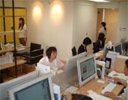
ちょうど取材前日にリニューアルされたばかりの事務所にお伺いしました。ほぼ全てのスタッフがPower Mac G5 + Cinema Displayという、なんともうらやましい環境の中でデザイン業務に打ち込まれていました。きっとこのシンプルでモダンな空間から無数のアイデアやデザインが生まれ、世に送り出されていくんだろうなぁ...と感じずにはいられませんでした。 弊社はLETSをどんどん発展・成長させてゆき、各業界がうまく連携・協力することで、フォント業界はもちろんのことデザイン、DTP、出版、印刷など、フォントにかかわるあらゆる業界市場の活性化につながればと考えています。
企業情報
| 社名 | 株式会社エイアール |
|---|---|
| 本社所在地 | 東京都港区赤坂9-6-28 アルベルゴ乃木坂 |
| TEL | 03-6804-5470(代表) |
| 設立 | 1985年7月 |
| 従業員数 | 7名(2010年11月現在) |
| 事業内容 | グラフィックデザイン全般・各種媒体・製品の企画立案 |
「LETS」プログラムへのご入会や製品のご購入については、お取引のある販売店様へお問い合わせ・ご注文くださいますようお願いいたします。