Keiji Terai is a freelance designer who is widely used in art direction such as music, art, fashion and book binding. At the Tokyo Wonder Site, which we often see, we deal with logos, exhibition leaflets, catalog designs, and even supervision of our website.
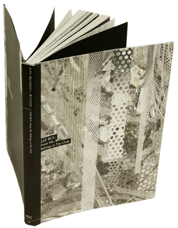
This time, a large-scale solo exhibition “Lee Bull: From me to you, I,” was held at the Roppongi Mori Art Museum in Tokyo from February to May 2012. I heard mainly about the story when you directed the official catalog of the exhibition and the graphic of the exhibition.
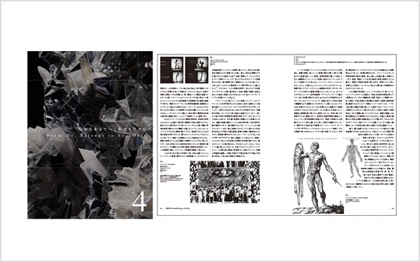
Especially in catalogs, we often use a number of different typefaces and weights to complete a design, and we use only one weight to create a design that exceeds 200 pages.
Representing Lee Bull as a solo exhibition
Originally, I had a friendship with Lee Bull, so I was entrusted with the catalog design of the solo exhibition. At an individual artist's exhibition (one-man show), the artist's own personal experience, imagination, and various emotions can often be seen, but this one-man show especially reflects the emotions behind her. It seems that it will be a solo exhibition that emphasizes a very personal aspect, such as the expressed performance, a new work based on a dog that has been deceased for a long time and died, a reproduction of a studio where various ideas were born. thought.
Rather than expressing emotions in conversation and words, she is an artist who is very good at expressing everything in the shape and expression of sculptures, and has many works that make her feel organic. That's why I wanted to express her passion and personal aspects as they were.
When I do my job, I feel like I'm a professional, but instead of using the numerically beautiful letters that I gained through experience, I take in my own mood, which is influenced by various things from time to time. I think it is okay. In this catalog, I had a strong desire to direct the organic parts of the works of my friend Lee Bull and the words that came out as words in order to be fascinated by my novels and literature. ..
I wanted to use TsukuOldMin which has a private feel.
Since it was an exhibition catalog, there were several text pages, including not only photographs of the works, but also essays, interviews, biographies, etc. One way to present or create a catalog like this is to use a lot of Gothic and Mincho fonts to divide the pages, and I actually do that sometimes.
However, when it came to Lee Bul, I wanted to use a font that would express her emotions and personal side, and that would express her more than just the words she spoke. I wanted to use an organic typeface with a sense of unevenness and rhythm in the size of the kana and kanji, like the old Ming typeface, and I wanted to create the work using only that typeface, so I deliberately avoided using multiple fonts such as Gothic and Ming typefaces together.
While examining some of the old Mincho fonts, we felt that TsukuOldMin, with its flowing accents on each kana and the atmosphere of the characters themselves that exudes a sense of sexiness as a Japanese font, was perfect for creating a more private atmosphere, and we decided to create this catalogue entirely using this typeface.
It was a challenge how much I could do with this typeface alone
Her sculptures are extremely intricately decorative, so I tried to make the catalogue look as simple as possible by keeping the layout flat and allowing the text to be clearly seen.
As for the font, I used only TsukuOldMin for the reasons mentioned earlier to create the table of contents and the entire body of Text. Of course, I've been using this typeface for some time now, so I knew that there were no weights other than "R" (as of 2011). Therefore, I felt that creating this catalogue was a challenge for me to see how far I could go with it. For Heading of one page, I aimed for emphasis just by changing the position and spacing, but the client asked me to proofread it, saying that this difference alone was not enough, so I had to readjust the font size and letter spacing in some places.
Since adjustments were limited to character size, line spacing, character spacing, margins, and lines, we prioritized the quality of the paper for the catalog, and decided on a paper with a relatively low whiteness level that has the texture and feel of drawing paper. We thought that the gentle appearance of [TsukuOldMin], which has no sharp edges, would make even places with multiple kanji characters appear gentler by using paper with this texture. We also think that by using a special color for the font, we were able to create an even gentler, better atmosphere with the colors. This may be due to the organic feel of [TsukuOldMin], where the lines do not line up completely when typesetting.
Also, for some of the text on top of the photographs on the front pages of each chapter, the client requested that it be made a little thicker. I resisted this until the very end, but we dealt with it by adding a slight outline. I think adding an outline had an effect, but it was really just a matter of adjusting a few millimeters. If the adjustment wasn't that small, the silhouette would have changed completely and it would have become different from the original typeface. The typesetting is important, but the font also has the effect of saying more than just the words it conveys.
I used this font for the wall texts in the exhibition as well as the catalogue, to unify the atmosphere of the exhibits as much as possible, so as to better express her emotions and personal aspects. Because the font is so detailed, it was difficult to cut the cutting sheets, and it seems that the contractors who set up the venue had a hard time, but I think that the classical atmosphere that the font creates throughout the venue made it the perfect venue for this exhibition.
The typesetting depends on the character of the book
When I design Text, shape the contents and character of the book in my mind, and then proceed to creating the cover. When I typeset, I'm always conscious of the tension between the lines and the characters. Even if I use the same font, I don't just inherit the one I made before, but I work from scratch to decide on a format specifically for that work.
With this catalogue, I adjusted the spacing between lines and letters in order to find the limit of how far I could go in making it appear as a single block without it appearing like a flipping page.
Regarding [TsukuOldMin], I often use it recently when I am asked to design a book or other book. However, sometimes I feel that it is not the right font at first glance.
For example, I think it's a font that's ideal for vertical writing, but if there are too many or repeated katakana characters, I feel it's difficult to use it for vertical writing. It may be that it's strange to use katakana in the vertical writing style that is unique to Japan, but it may also be that the spaces between the kana characters are too accentuated and make it look flip-flap.
This is because it is an old-style font and the kana are small, but it looks a little strange, so when I want to use it even if it's something with a series of katakana, I pay attention to the size etc. Basically, beautiful typesetting is a typesetting that is visually natural, and I think it plays an important role as a starting point for starting to read a piece of text, so it's something I want to be particular about.
*An interview with Terai Keiji is featured in the May 2012 issue (Vol. 28) of +DESIGNING, published by Mynavi Publishing.
http://www.plus-designing.jp/pd/pd28/pd28.html
<Editor's Note>
As I asked Terai about the direction of the catalog and the solo exhibition, I felt his strong desire to express Lee Bul more frankly in every aspect. He said that the difficult design of creating a catalog with many pages in one weight came to him as an idea in an instant. Many of these designs are created based on daily experiences, so I will do my best to help express those ideas.
We have received many requests to expand the weight range of the typeface [TsukuOldMin] used in our catalogues etc., so we will be releasing it in December 2012 in a family of six weights under the name [TsukuAOldMin].
profile
Graduated from the Department of Visual Communication Design, Musashino Art University in 1990. After studying under Mr. Ichizuki Suzuki, moved to England in 1996. Engaged in web design in London. Since becoming independent in 1997, he has worked on many art directions in the fields of culture and art such as music, art, and fashion, while his book design spans a wide range from comic books to practical books and specialized books. Main clients include Tokyo Wonder Site, Tokyo Opera City, and Mori Art Museum.
For enrollment in the "LETS" program or purchase of products, please Contact Us your retailer or place an order.