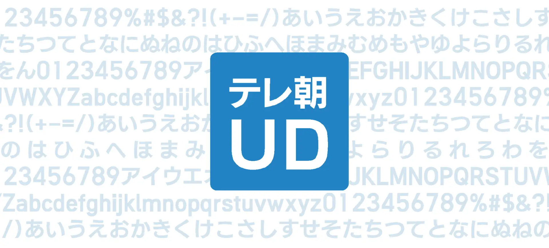
Based on the knowledge and strong commitment that TV Asahi has gained from years of experience in news programs, the original font "TV Asahi UD" was developed in collaboration with Fontworks' typeface design team. Reflecting the current atmosphere in which viewing environments are diversifying, not only on television but also on smartphones and tablets, this font has been created for viewers who enjoy television programs on a variety of media.
Based on Fontworks' "UDKakugo_Large ", the Fontworks team created font data from a prototype designed by the TV Asahi Corporate Design Center. It is an original font that aims to improve visibility unique to television programs, unlike the typefaces we usually develop for paper media and games.
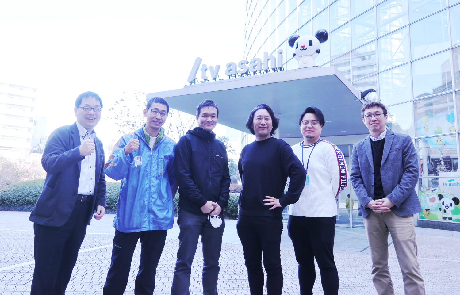
This time, we spoke to art directors Takayuki Fukuda, Hajime Harada, and Koichi Omatsu of the Corporate Design Center of TV Asahi's Technology Bureau about the production process of the font.
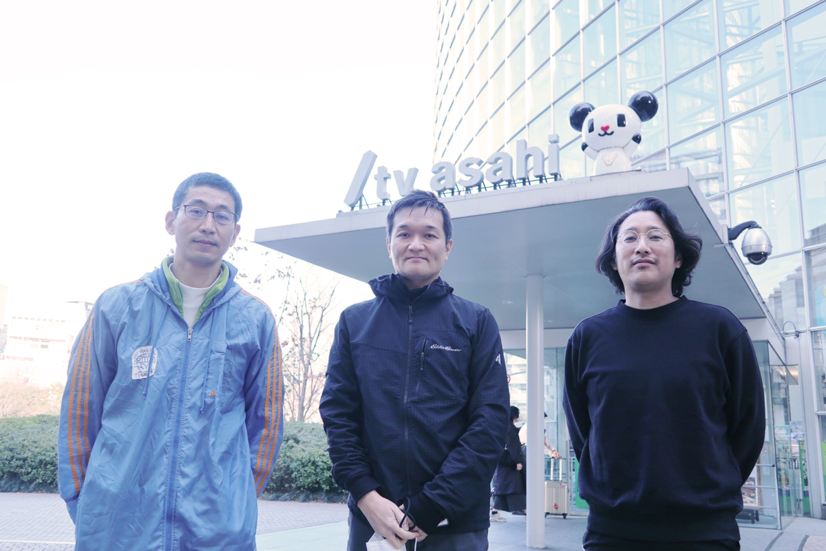
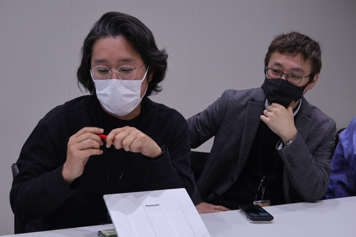
Art Director Mr. Fukuda, Mr. Harada
Unification of program design worked on by the entire news bureau
-First of all, please tell us about your background and current work.
Mr. Fukuda: I joined the company as a CG designer in 1996, and for about four years I was running around the studio with packing tape as an "artist". After that, in addition to title design and posters for various programs, I was in charge of graphic design for advertisements such as Advertisement nameplates and Event related products. is in
Mr. Harada: I joined the company in 2009 and was involved in the development and operation of the telop system used in live broadcasting for five years. From 2014, I shifted to the design work of news information programs, and I am now.
Mr. Omatsu: I joined the company in 1998 and worked in the information system department for about 10 years. After working in the news department and moving to the Corporate Design Center, I have been in charge of producing News CGs displayed on telops and flips for over 10 years, and am currently working as a manager.
-Can you tell us about the beginning of the "TV Asahi UD" project, which we have been developing in collaboration with our company since 2022?
Harada-san: We didn't originally plan to create an original font. It started when a trend arose within the company to use a common font for TV Asahi's news and information programs and to firmly brand the company. While we were considering what kind of font to use, we had the opportunity to talk with Fontworks, and we decided to create an original font based on "UDKakugo_Large ".
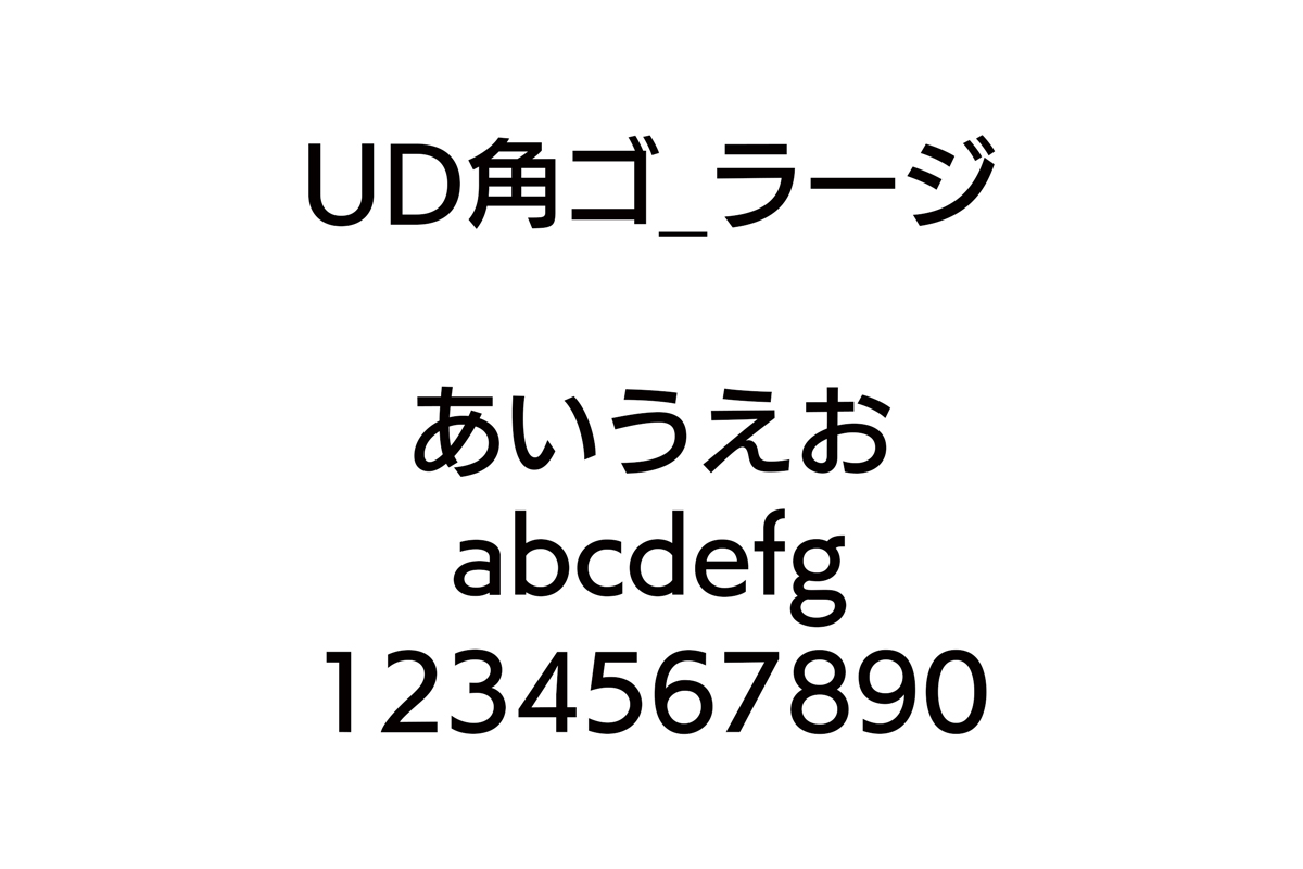
Mr. Omatsu: I started choosing fonts in April 2022, and everyone rated 27 types of fonts, and the top among them was Universal Design Kakugo. After that, in July, after consulting with Fontworks, we started producing "TV Asahi UD", started using it in the program in October, and started using it in affiliated stations in January of this year. , I was able to proceed with the work at a fairly rapid pace.
Mr. Fukuda: I didn't think I would be able to create an original font with this schedule. When we were considering, various fonts from each company were considered, but Universal Design Kakugo had a solid base and was highly visible as a whole, so it was stress-free to look at. I wanted to show the characteristics with hiragana, katakana, and numbers, so I think I was able to make it "unique" by making adjustments.
-How did you choose fonts for each program so far?
Mr. Harada: The characters displayed in news programs were really different at the time, and the basic font was「Rodin」 「NewRodin」 「Universal Design Kakugo 」In many cases, angular Gothic fonts were determined, but in the production captions that the director selected based on the sense of the scene, Rounded Gothic such as" Seurat" and pop typefaces such as" Slump" were sometimes used.
Mr. Fukuda: The directors of each program were free to use the fonts in "LETS," which we have an annual contract with. After the movement to properly design as a TV station began, the Corporate Design Center decided to tackle the issue of making the layout of typefaces, tickers, etc., which had been disparate, common in news programs.
As a result, we designed the colors used for all the programs, the fonts used, the types of decorations, and the layout of the screens, and incorporated them into the manual. The design of the information on the screen has been changed to be able to be understood unconsciously, and the viewer's visibility and understanding of the information should have improved.
-When introducing TV Asahi UD and unifying the design, how did you work to let people in the company know about it?
Mr. Fukuda: Up until now, I hadn't done a lot of partitioning, so it took a lot of courage to switch from being a purveyor to a controlling position. There was some backlash because it restricted the directors who came freely, but at the same time, we have received feedback from young directors that it has become easier than before.
Prior to the introduction of TV Asahi UD, we held briefing sessions on color design and font selection for a total of 500 people from the news bureau in order to deepen their understanding of design, which is not covered in compulsory education.
I started by saying that art and design are completely different things. I explained that art is the embodiment of personal expression, and design is the embodiment for conveying information. I also told them that there is a correct answer if they used colors correctly, and asked them to organize the priorities of the elements displayed on the screen.
After all, you can't Packaging everything unless you properly convey your awareness, so I think that it was possible to unify because of this opportunity to explain. The directors are all people who usually have a willingness to learn, so I feel that it went well because they understood me well.
Typeface design aiming for high visibility in TV programs
-I heard that our typeface design team was very particular about legibility and readability when developing TV Asahi UD. What was the point in creating the original font?
Mr. Harada: I think it's a completely different way of thinking from making normal fonts. For example, in the case of numbers, when used in telops, they have the role of conveying important information that you want to stand out more than other characters, so the top and bottom are larger than usual, and the weight is about one step thicker. The point was that the characteristics were strongly expressed rather than the familiarity when viewed flat.
There are
comments on social media such as "a little thick" and "big", and I feel that what I was aiming for is going well.
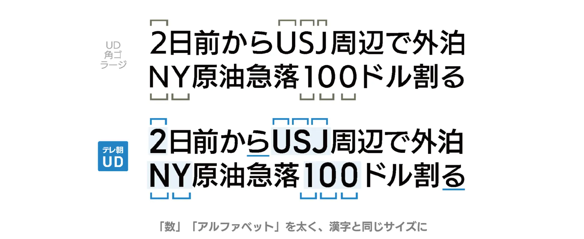
Mr. Fukuda: Our goal is to improve the visibility of the broadcast screen, so I don't think that the correct answer is only characters that are well-balanced as a typeface. Rather than having a sense of uniformity in size and Weight, we have adopted numbers that are easy to see on a TV screen and leave a lasting impression on viewers as TV Asahi uses numbers.
-As our design team, we have experience in designing characters on paper such as DTP and in-game fonts, but it was our first time designing characters for a TV program, so we learned a lot. It was a production process.
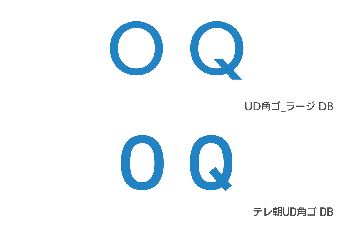
Mr. Fukuda: We have the output of TV programs, so we need to think about the operation of the telop system. In addition to the numbers, I also paid attention to the width of the characters, since the TV screen has a fixed number of pixels in both vertical and horizontal directions. In the case of Universal Design corners, the circles of “O” and “Q” are close to a perfect circle, but by shrinking them slightly horizontally, they fit better on the screen. Since there are words such as place names that cannot be omitted in the telop, we have shortened the design as much as possible.
A font that reflects the “now” and expresses the TV Asahi character
- Looking back on the development process, what do you think?
Mr. Fukuda: Thankfully, this time, I think it went well because there was a command from top to bottom. As a designer, I feel like I've finally done a job I'm satisfied with. While there are so many designed things in the world, I think that the reason why only TVs still have a Showa feel is that the fonts and colors used on the screen have a lot of influence.
We also have to survive as a medium that conveys the "now", so I would like to do more design.
Mr. Harada: In order for people to feel that it is a TV Asahi program at first glance, it is necessary to unify various elements in all programs, so it is quite difficult, but we were able to use the same font for all news programs. I think it's pretty big. I think it will be one of the major factors that creates the image of TV Asahi.
-The key word in the development of original fonts is “likeness”.
Mr. Fukuda: "Now". The rounded corners are often used on the screens of smartphones and browsers, and in our daily lives where characters with various textures exist, we wanted to make it easier for TV programs to be included. There is also a reason why I chose it. Since it is based on the concept of viewer service, I think that our job from now on will be to constantly update things that match the times while keeping a close eye on the mood of the world.
- The update work is still ongoing. The atmosphere of "now" may change in, say, five years from now, and the font may also change at that time.
Mr. Fukuda: Up until now, I don't think that typefaces were updated once they were created, but now most of the services in the world are being improved and updated little by little, so it is necessary to continue. I think it's an element. Even now, when I find a gap, I make small adjustments (TV Asahi UD).
-Finally, as you are working on creating programs that suit various viewing environments, please tell us if there is anything you would like to work on in the future, as a result of the development of TV Asahi UD.
Mr. Shimada, Director of the Center: This is the first time we've ever attempted to have all programs in one go, and the company's reason for making this decision was the changing times. Ten years ago, TV programs were almost exclusively for TV, but now that they can be seen on the Internet, it is no longer possible for each station within the same TV station to focus only on its own program design. I came to think that it might not be possible. In the future, I would like to proceed with what I feel that I still have to do, considering the situation that program Video are used not only on terrestrial broadcasting but also on various distribution platforms.
Interview date: February 6, 2023
tv asahi
Mr. Takayuki Fukuda
Design art director. Overseeing the overall design of news programs. "Good! Morning" "Saturday Sunday STATION" "Wide! Scramble"
Hajime Harada
Design art director. In charge of "Hodo Station", "J Channel" and "Morning Show"
Mr. Koichiro Omatsu
Telop development and operation manager. After working as a news reporter from the core system development and management department, he is in his current position.
Corporate Design Center: Renamed from "Art Production Center" in 2011. As an in-house design department, he is involved not only in programs, but also in a wider range of business design and branding for TV Asahi. In addition to design, he is also involved in cutting-edge technology, and is also involved in the development of VR studios, VFX, and various CG systems. In the "ANTS (Advanced Network Telop System)", which was originally developed and designed, we have developed and built an online telop ordering workflow, and have a track record of switching from paper ordering to online ordering early among TV stations.
Articles in the same Categories
-
[Cookpad Inc.] Original font "Cookpad Sans" that unifies the corporate brand image in order to increase the number of people who sympathize with the mission.
-
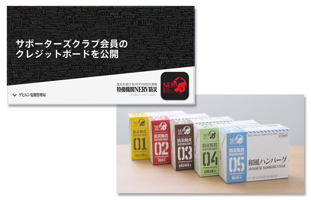
Gehirn x Holika Foods "How to use typefaces that balance safety and design"
-

[CyberAgent] Manages thousands of licenses including those of affiliated companies. Key points for introducing "LETS" in companies
Related article
-
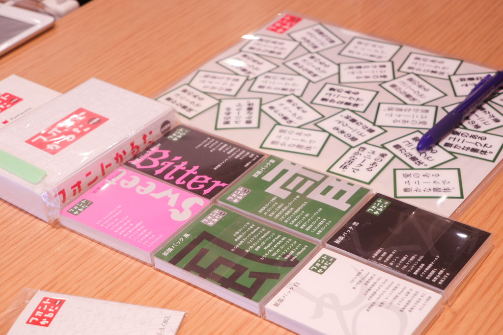
[Adventures around fonts] Part 7: Approaching the activities of the unique and rich "karuta"-"font karuta" production team with love
-
[Adventure over fonts 6th] I want to leave the signboard character "fluctuation"-approaching the activities of the "Noramoji Discovery Project"
-
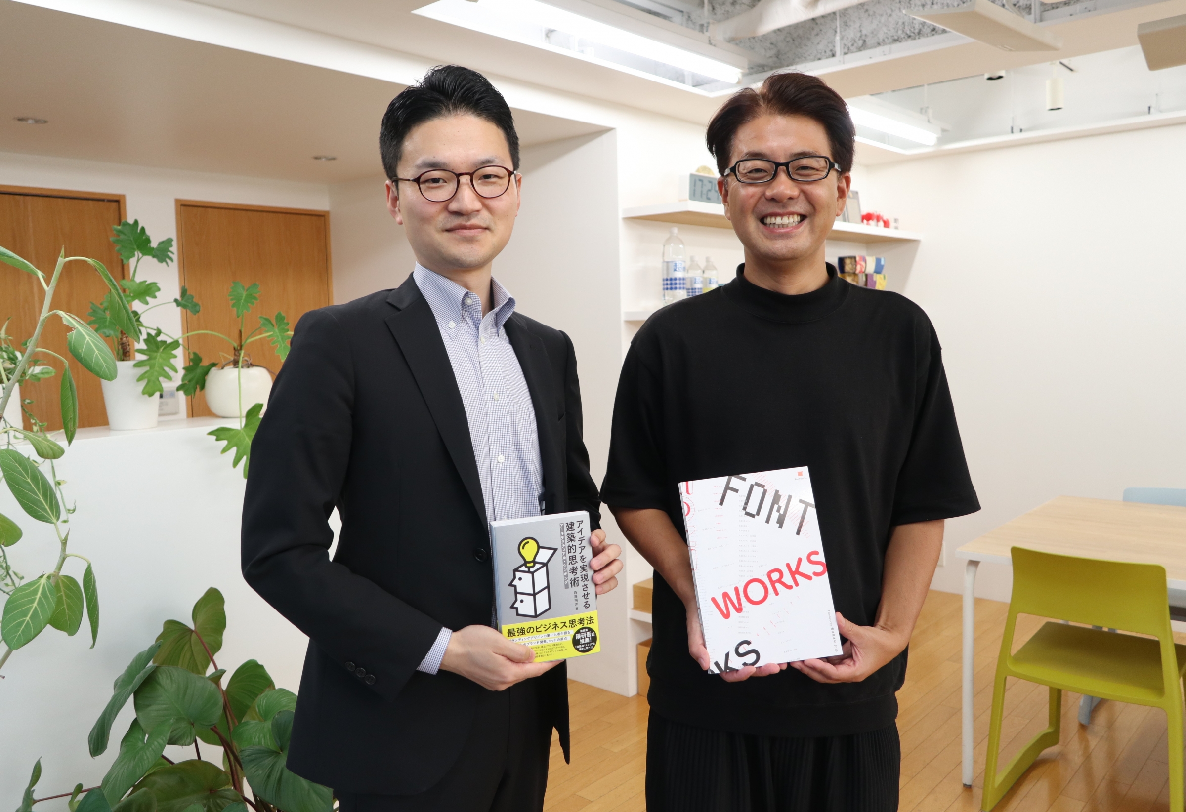
[5th font adventure] Pursuing a happy relationship between management and design-Akihiro Nishizawa, Eight Branding Design