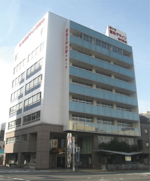
Aichi School of Design and Design is Nagoya's long-standing design vocational school. “To be aware of the mission and responsibility of a final educational institution toward society, and to cultivate the qualities as“ people loved by others ”,“ trusted people ”and“ respected people ”and a healthy mood From the perspective of the founding spirit of "implementing human education that maintains a good social and life view," we have incorporated industry-academia collaboration projects that collaborate with regions, companies, and society, and classes that emphasize competition.
In that class, you will be able to experience the flow of professional work from meeting with the client, planning, proposal, and production, and acquire the ability to practice.
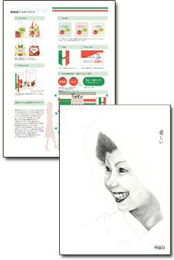
Furthermore, among them, the excellent Advertisement design and display works are actually adopted in Advertisement media and showrooms, which makes students happy and confident and leads to a great leap thereafter.
This time, we talked to students before they went into society as designers about the role of fonts in design, with teachers Ebi and Yada who are Support the development of talent.
Reason for introducing LETS

I introduced LETS because I had the feeling that I had to do something about the fonts when I had to replace the new PC model a few years ago. Until then, I purchased and used fonts in commercially available inexpensive Packaging, but I was not satisfied with the quality of the typeface. Therefore, I decided to search for fonts on the condition that the basic typefaces [Gothic] and [Mincho] are beautiful.
I thought that it would be better for students to have more typeface choices, and after considering several font license products, I chose Fontworks LETS because of its typeface quality and cost performance. Since then, we have increased the number of vehicles required each year.
Type selection and design for students

One of the classes has a curriculum that teaches the process of first creating a design on paper and then finally creating it digitally. When you first start studying design, you draw various fonts by hand, but when you actually start to digitize it, you start using MS Mincho and MS Gothic. It's a bit strange, considering that I have installed LETS' fonts, which have nearly 200 fonts. (laughs)
After a few more months, they start to want to use a slightly different, catchy font. For example, they start using a font with an impact, such as [Reggae]. Some students even use catchy fonts for long texts.
It is probably after about six months that students start to become more conscious of typefaces. They gradually start to think about various concepts, such as typefaces that are easy to read and typefaces that give the design an image of being tighter when set together, and eventually they arrive at basic typefaces like "Gothic" and "Ming". Interestingly, this rule applies to most students. It seems that students begin to understand what a good typeface is as they go through a process of trial and error to find which typeface suits the image of the work. Looking at the trends in the finished works, they tend to choose and use beautiful and smart typefaces. I think "Rodin" is particularly notable for its popularity. (Ebi)
Role of fonts taught in class
While studying design, you will inevitably come to understand how much font selection and how typesetting relate to visuals and how important they are. When it comes to visuals, it is clear to see that students will absorb more and more on their own and improve even if left alone. On the other hand, it seems that they will not improve their handling of letters unless they are taught. I think it is important to teach students how to handle and typeset letters, such as grasping the characteristics of a typeface and arranging them in the appropriate place.
For example, my favorite is RodinNTLG. The top and bottom of this font are perfectly aligned, so I like the fact that it feels crisp and fits well. And more than anything, it's similar to the way I write. The reason I like it is that the strokes and brush strokes are very similar. When I use this font, I make a slight modification to the way it's set up. In RodinNTLG, the small "tsu" character is made relatively large, so I lower the point just for that character. This improves readability.
By giving advice on even small things like this, the image of the graphics and the typeface come together in their minds, resulting in a more appealing piece of work. That's why I strongly teach them that "the letters are what make or break the visuals!!!"
Perhaps that is why, one day in class, I created an imitation of the title image of a certain famous anime in Matisse and showed it to the students, who responded, "Oh, it's Eva (Neon Genesis Evangelion/(c) GAINAX)!" I think the students are also able to sense the atmosphere and image that the combination of font and layout creates. LETS has a wide variety of fonts, so you can choose a font that matches the atmosphere and image of your work, think about how to arrange the letters, and express the image you sense with various combinations. I think this is quite meaningful for the students as well. (Yada)
Feedback to Fontworks
I am satisfied with the number of typefaces released and their quality. I think that Rodin in particular has a purely beautiful design. I think that new typefaces will be released in the future, but because we are a design school, we would like to focus on basic typefaces rather than typefaces that emphasize individuality.
If I had to make a request, it would be about the way fonts are installed. Since we have a large number of LETS contracts, it would be a lot of work to install all the new fonts on all the PCs every year. It would be helpful if it could be made easier to install.
<Editor's Note>
Aichi College of Art and Design is implementing industry-academia collaboration classes as part of its human resource development curriculum. In the entrance gallery, we saw works created at the request of companies and organizations by students who had actually been selected. There were many works that were full of freshness, such as the use of color and the choice of font, and I was surprised at how well-crafted they were. On the other hand, I felt that there were probably many fonts that have not yet been used. Every font has a clear design concept, so as a font manufacturer, we will continue to provide better services and information, including font information, that will be useful for studying design work.
Thank you for taking time out of your busy schedule to participate in this interview. We look forward to working with you in the future. (Muta)
Company Info

| Company name | Aichi Art and Design College |
|---|---|
| location | 4-10-7 Imaike, Chikusa Ward, Nagoya City, Aichi Prefecture |
| TEL | 052-732-1631 |
| Fax | 052-732-7325 |
| URL | http://www.design.ac.jp/ |
For enrollment in the "LETS" program or purchase of products, please Contact Us your retailer or place an order.
