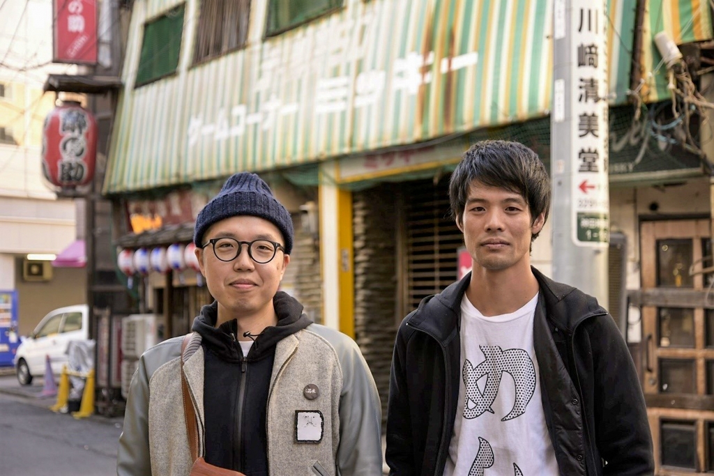
こんにちは、営業部・安藤です。
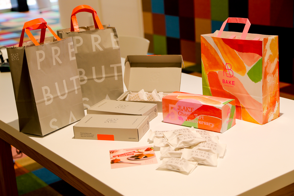
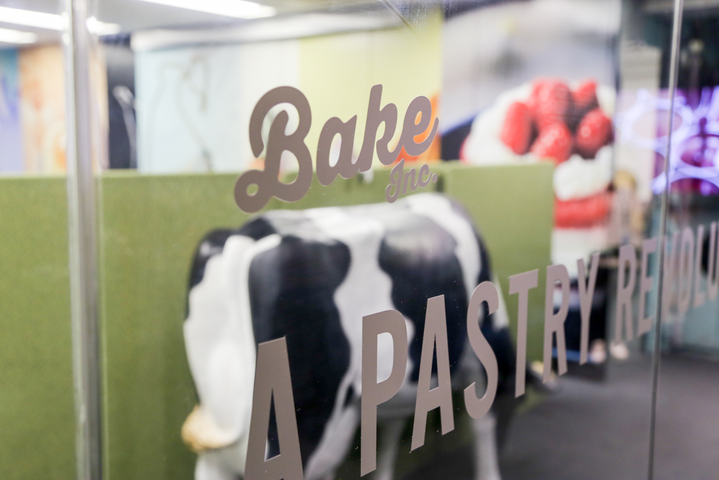
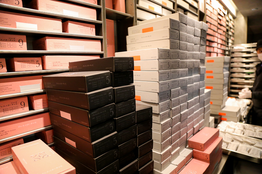
東京駅の丸の内南口改札近く、行列の絶えないお店が有ります。株式会社BAKEが運営するバターサンド専門店「PRESS BUTTER SAND」です。香ばしい匂いが辺りに立ち込め、観光客や通りすがりの人達を引き付けて止みません(筆者もそのひとり)。
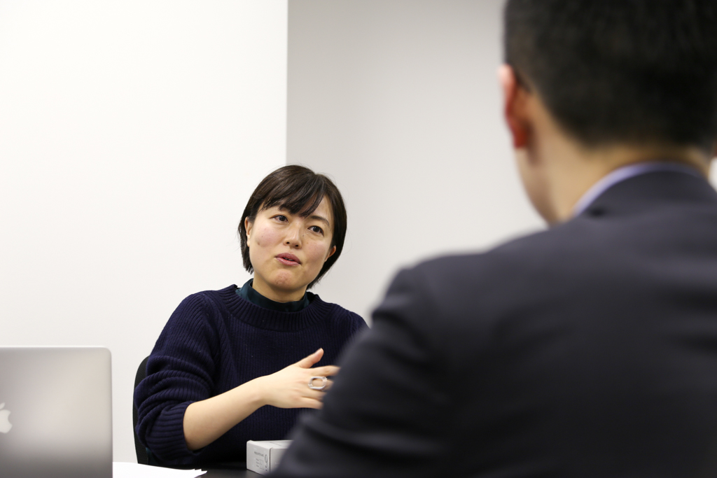
「フォントを巡る冒険」第8回は、株式会社BAKEでクリエイティブ全般を司る柿﨑弓子さんにお話を伺うべく、東京・白金台にある本社を訪ねました。「PRESS BUTTER SAND」のブランド展開に携わった柿﨑さんに、洗練されたパッケージデザインを基点としてブランドコンセプトやデザインの意図、今後の展開について詳しく伺ってきました。
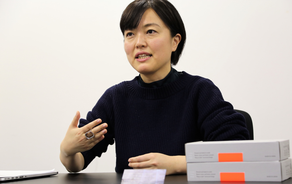
柿﨑 弓子(Yumiko Kakizaki)
武蔵野美術大学視覚伝達デザイン学科卒業後、デザイン事務所を経て、2016年BAKE Inc.入社。各ブランドのプロモーションや店舗グラフィックなどの制作、「PRESS BUTTER SAND」「Chocolaphil」の立ち上げに携わる。現在、BAKE Inc.のクリエイティブ部 部長。
物語の「始点」としての東京駅
―― 柿﨑さん、はじめまして。先週も御社のチーズタルト、バターサンドを美味しく頂きました(笑)。本日は宜しくお願い致します!
柿﨑:ありがとうございます(笑)。こちらこそ、宜しくお願い致します。
―― 2016年、御社に入社されたときのお話から是非お聞かせ下さい。入社後、BAKE CHEESE TARTのシンボルマーク制作に携わったとお聞きしました。
柿﨑:元々は(BAKE CHEESE TARTという)文字列だけだったんですけど、海外展開するときにシンボルマークが必要という話になって、BAKE入社後、シンボルマークの制作に注力しました。
――このシンボルマークのコンセプトは?
柿﨑:「骨格」です。BAKEって、色々なものを削ぎ落して良いものだけを残そうみたいなマインドがあったので、建物の骨組みをイメージしてシンボルマークを新たに制作しました。
BAKE CHEESE TARTは当時3年目のブランドで、既に多くのファンの方が付いてくれていました。ですので、シンボルマーク制作に際しても元々持っている資産を生かしつつ、そこにプラスアルファすることで自然に受け入れてもらえるデザインになるよう工夫しました。
何より、コンセプトを整理することで、BAKE CHEESE TARTのブランドコンセプトである「Authentic & Joy」を再定義する良い契機にもなりましたね。
―― PRESS BUTTER SANDのスタートの経緯についても教えて下さい。
柿﨑:PRESS BUTTER SANDはBAKEとして箱菓子カテゴリーへの初挑戦の機会となりました。加えて、私がこのプロジェクトに携わり始めたときには、東京駅への1号店出店がほぼ決まっていました。
東京駅という最高の物件を頂いて、そこで最高の手土産を作ろう!と。BAKEとしては箱菓子カテゴリーと東京駅の出店と、新しい挑戦が2つ重なった機会となりましたね。
―― PRESS BUTTER SANDの商品自体の魅力は?
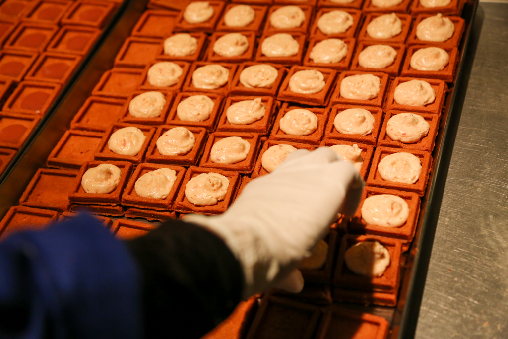
柿﨑:クッキー、クリーム、キャラメルが融合して、バターの美味しさを最大限引き出しているところですね。創業者の想いもあって、バターにフォーカスして、バターの美味しさだけに集中できるお菓子にしよう、と。バター好きの為のバターサンド。それが商品の最大の魅力かなと思います。
完成度が高いが故に、クッキー、クリーム、キャラメルとそれぞれの部材だけで食べたいって仰るファンの方もいらっしゃいます(笑)。バターサンドは分解しても美味しいんだと誇らしくなりますね。
―― ここからはPRESS BUTTER SANDのパッケージデザインについてお伺いします。このデザインは柿﨑さんが担当されたのですか?
柿﨑:はい。BAKE社内のクリエイティブは、1人1ブランド以上、必ず入口から出口まで担当するような形を採っています。PRESS BUTTER SANDに関しても、2017年4月のブランド立ち上げから2年くらいはパッケージ・ポスター・フレーバーのパッケージ、店頭のVMD(Visual Merchandising)など、私ひとりで担当していました。
―― PRESS BUTTER SANDの和文ロゴ(「プレスバターサンド」)、クラシカルな雰囲気をまとっていますね。
柿﨑:このロゴも(PRESS BUTTER SANDの1号店がある)東京駅が実は関係しています。東京駅の駅舎自体、日本の近代化の象徴であり、近代建築の叡智に溢れています。技術が結集している感じが凄く好きで、そこに出店できるというのもあって、「東京駅とのリレーションを持ってデザインしたい」と強く考えました。
文字は時代の空気感を反映しているものだと思っているので、創建当時の外観を再現した東京駅と雰囲気がマッチにするだろうと考えて「築地五号仮名」をベースに和文ロゴを制作しました。
―― なるほど、そういった背景があったのですね!そして、筑紫Aオールド明朝も主要フォントのひとつとして加えて頂きました。
柿﨑:特に可読性の観点から、ロゴタイプと同じ書体で本文を組むには苦しいとも考えました。ポスター・リーフレット・Webなど多岐に渡った表示には向いていないだろう、と。そこで浮上したのが筑紫Aオールド明朝でした。
―― 柿﨑さんの考える、筑紫Aオールド明朝の魅力とは?
柿﨑:ふところがキュっと締まっているけれど、ハライが長くて美形なところですね。クラシカルな要素を揃えつつ、現代にアップデートされて読みやすい状態にモダナイズされているという特長もあって、筑紫Aオールド明朝が好きです。静謐さを湛えているけれど、流れるように読めるというところで迷わず選択しました。
―― 築地五号仮名や筑紫Aオールド明朝で和文のベースを作った一方で、パッケージには欧文も多く見受けられます。
柿﨑:日本のお菓子だけど、完全に「和」に振りたくはなかったんです。モダンさと異国感をテーマに、外国のお土産屋さんの雰囲気をイメージして、欧文を取り入れました。
東京駅自体がインダストリアルな要素が象徴的に表れている場所なので、大量生産なんだけどブレとか味を感じる海外の工業製品のようなデザインをしたくて、ブランドロゴタイプにはFutura、パッケージのサイドの数字は(金属活字系の)Baskervilleを採用しました。
ここだけの話、当初はカッコつけて欧文だけでパッケージを構築しようとも考えていたんですけど(笑)、日本を代表する土産菓子を目指すのだったら和文も入れなきゃダメだな、と思い直して。和文のロゴを基本にデザインを考えていきました。
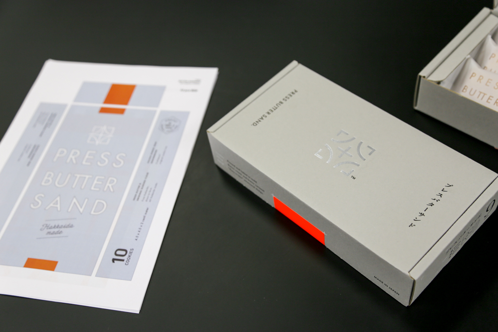
――パッケージ全体を覆うグレーと、シールのオレンジの色の対比も非常に独特ですよね。
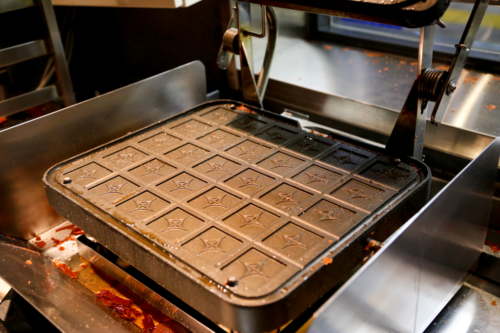
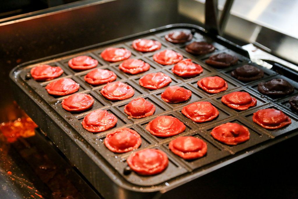
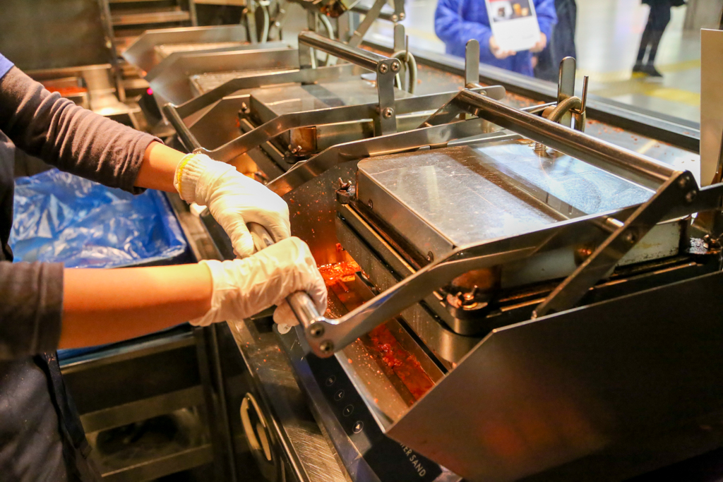
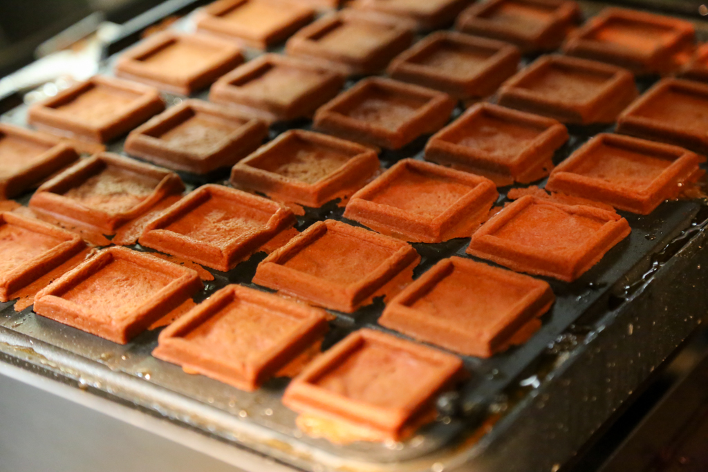
柿﨑:今回のデザイン周りのモチーフの芯になっているのは「鉄」です。前提として、鉄道の「鉄」でも有りますし、PRESS BUTTER SANDの試作で、鉄板で1枚1枚焼いている様子を見て「『鉄』で焼いているクッキーなんだ」と。そこからインスピレーションを得て、デザインはインダストリアルな感じを採用しました。
一方で、鉄が溶けたときを想起させるビビットなオレンジも加えています。鉄板は静的なイメージ(グレー)、溶けた鉄は動的なイメージ(オレンジ)で、色でもコントラストを出したいな、と。
―― PRESS BUTTER SANDのパッケージデザインのエピソードをお聞きして、全ての基点に「東京駅」があると感じました。
柿﨑:ブランドがはじまる場所って凄く大切ですし、象徴的な場所があることでブランドイメージが決まっていくんだと思います。今考えると、東京駅で空き物件ってそんなに頂ける話ではないですし、物語の始点として東京駅を押さえられたのは非常に大きかったですね。
「書体デザイナーを心から尊敬しています」
―― 今度は、柿﨑さんのこれまでの歩みと「文字との接点」をお聞きできればと思います。
柿﨑:文字との接点で言うと、一番記憶にあるのは姉と一緒にオリジナルのカセットテープを編集して、自前のアルバムを作る際に、アーティスト名や曲のタイトル部分を非常に凝って書いてたことですね。曲のテイストに合わせて相応しい手書きで表現したり、外側のプレイリストも凝った文字を書いたりしていました(笑)。
あと、近所の文房具屋さんにインレタ(インスタントレタリング)売ってたんですよ。当時凄いハマってて、100円で購入して文字を自分なりに組んだりして楽しんでいました。
―― 面白い(笑)。学校生活でもデザインが生活の中心にあったのでしょうか?
柿﨑:はい。中学、高校と女子美術大学の付属校に通いました。周りの友人たちが油絵や石膏デッサンが上手すぎて、ファイン系に全く自信が持てませんでしたね(笑)。ただ、ルールのもとでシンプルに整理された状態の絵が好きと気付いたのと、他人と話をしてアウトプットを制作することが得意かもと思って、高校のときに、迷わずデザイン系に進みました。
大学もそのまま上(女子美術大学)に進学することもできたんですけど、外の世界も見てみたくて武蔵野美術大学に進学しました。
―― 柿﨑さんが影響を受けた方や、敬愛するデザイナーはいらっしゃいますか?
柿﨑:御社がフォントメーカーだからということではないんですが、書体デザイナーを心から尊敬しています。大変に価値のある何万字という設計をされていて、我々は普段から使わせて頂いているという感覚がありますね。
個人的なヒーローは、小林章さん(※)。日本で育った日本人が、OptimaやFrutiger等の欧文フォントを改定されたのを見て、日本人でも欧文フォントをあんな風にデザイン出来るんだ、と感動しました。
安藤忠雄さんも好きです。彼曰く「創作活動をしていると99%は辛い。一瞬の喜びの為だけにやってて、あとはまた辛い」。あれほどの大御所でもそう思うんだと思って、自分を戒めています(笑)。プロボクサーを辞めた後、独学で建築を学んだり、海外放浪の旅に数年間出て一層の学びを得たりと、「野」から出てきた感じがまたカッコいいですよね。
あと、父親の影響も大きいですね。父親は配管設備の図面を描く仕事をしていました。図面台が実家にあって、ロットリング(ドイツの製図・筆記具ブランド)の道具が家に沢山あったり、青焼き図面が丸められて家の隅っこに無造作に立てかけてあったり、それがめちゃくちゃカッコよくて。父親とはNゲージ鉄道模型やプラモデルでもよく遊びました。
※ 小林章(Akira Kobayashi, 1960-)
武蔵野美術大学視覚伝達デザイン学科卒業後、株式会社写研へ入社、日本語書体の開発に携わる。株式会社写研を退職後、ロンドン・カレッジ・オブ・プリンティングでカリグラフィーを学び、フリーランスの書体デザイナーとして活動。2001年にLinotype社(現:Monotype社)の書体ディレクターに就任。これまでにOptima、Frutiger等の欧文フォントの改刻、DIN Next、Akko Pro、Neue Frutigerを含む50以上のフォントファミリーの開発を担当。最近では、Monotype初のオリジナル日本語書体である「たづがね」の開発を統括した。
―― お父様もそのラインナップに入っているのが本当に素敵です!そのお三方に多大なる影響を受けてきた柿﨑さんの、デザイナーとしての心構えや矜持を教えて下さい。
柿﨑:物事は「関連性」で出来ていると思っているので、デザインをする対象とその周辺をきちんと調べることを大切にしています。デザインに反映する/しないは考えずに、例えばサイトを深掘りして「こことここが繋がっているんだ」って見つけることが大好きですね。全然使わない知識が9割くらいなんですけど(笑)。
何より、デザインは人の記憶や原体験のなかにあるものを、ちょっと引き出してくれる「きっかけ」だと思ってます。調べ尽くしたなかで、ブランドや商品、サービスに対して、本当に必要なものだけを抽出して一本筋を通すことをデザインの際には心がけています。
―― 柿﨑さんは、デザインにおいて理詰めなタイプなんでしょうか?
柿﨑:理詰めのときと感覚で進めるときと、両方ありますね。基本的には、色のイメージから考えることが多いかな。ただ、どんなときも人に説明できるように、ストーリーを組み立てるようにはしています。
前職では一般消費財のパッケージデザインやブランディング、企業のコーポレートアイデンティティを担当する機会が多くて、クライアントも本当に多岐に渡っていました。元々、工業デザインからスタートした会社で、ロジカルシンキングはここで徹底的に鍛えられましたね。
消費財にも関わらず、デザインや色について説明を求められる日々で、書体も「なんでこの書体?」と常に聞かれてました。何となく、とは当然言えない。書体選択ひとつで商品やブランドの発したいメッセ―ジのトーンも変わります。自分のエモーショナルな部分をデザインに組み込む作業を、前職では特に意識してやっていました。
―― 柿﨑さん的に、前職で一番のヒット作を是非教えて頂けますでしょうか?
柿﨑:「ラ・カンティーヌ」(マルハニチロ)というサバの缶詰のデザインです。当時、マルハニチロさんも新しいターゲット、新しい販路の開拓を掲げてました。大手広告代理店さんと協力してやってたんですけど、一緒にやっていたメンバーが歳が近かったんですね。同じ世代同士で、ライフスタイルの変容に真正面から向き合っていきました。
缶詰のデザインに関して、自分自身の中で掘り下げるのと外的要因とを整理してそれを掘り下げる作業を日々繰り返しました。最後、自身が感じているものをそのまま出したときに時代とフィットして、それがターゲットの生活ともフィットしたときに次の段階に行けると確信しました。「ラ・カンティーヌ」は、日本パッケージデザイン大賞(2015)を受賞して自分のキャリアの転機にもなりました。
―― これまでの歩みとBAKEでの様々なご経験をお聞きしながら、柿﨑さんがPRESS BUTTER SANDに関わるのは必然だったんだろうなと個人的には感じてます。
柿﨑:PRESS BUTTER SANDに、自分の好きなものを詰め込んでると言えますね(笑)。以前、他部署のひとに「柿﨑さんの好きなデザインってどういうデザインですか?」って不意に言われて、なんだろうって考えてたときに、チームのデザイナーに「ここ(PRESS BUTTER SAND)に、柿さんの好きなのが詰まってますよね」って言われて、ハッとしました(笑)。
―― 柿﨑さんの思いが詰まったPRESS BUTTER SAND、今後の展望をお聞かせ下さい。
柿﨑:一昨年の京都駅出店の際には「バターサンド〈宇治抹茶〉」、昨年の博多駅出店の際には「バターサンド〈あまおう苺〉」をローンチしました。PRESS BUTTER SANDに関しては、前提としてその土地特有のフレーバーを作ろうという思いがあります。その土地の人にも喜んでもらいたいし、他の土地の人がその情報に触れた時、「京都には宇治抹茶あるんだ、いいな!」、最終的には「宇治抹茶を食べに、京都へ行こう!」と思って欲しいと考えてます。
私がまさにそうですけど、旅行に行ったらその土地の料理を堪能したいし、大抵は土産を購入するじゃないですか。それって日本特有の文化だなといつも思っていて、その土地で選ばれるNo.1の土産を作りたい。そうやって、地方の盛り上げに一役買えたらより嬉しいです。
―― 柿﨑さん、旅がお好きなんですか?
柿﨑:旅好きですね。旅行に行くと、何かしら必ず持って帰れるものがあるのが好きです。
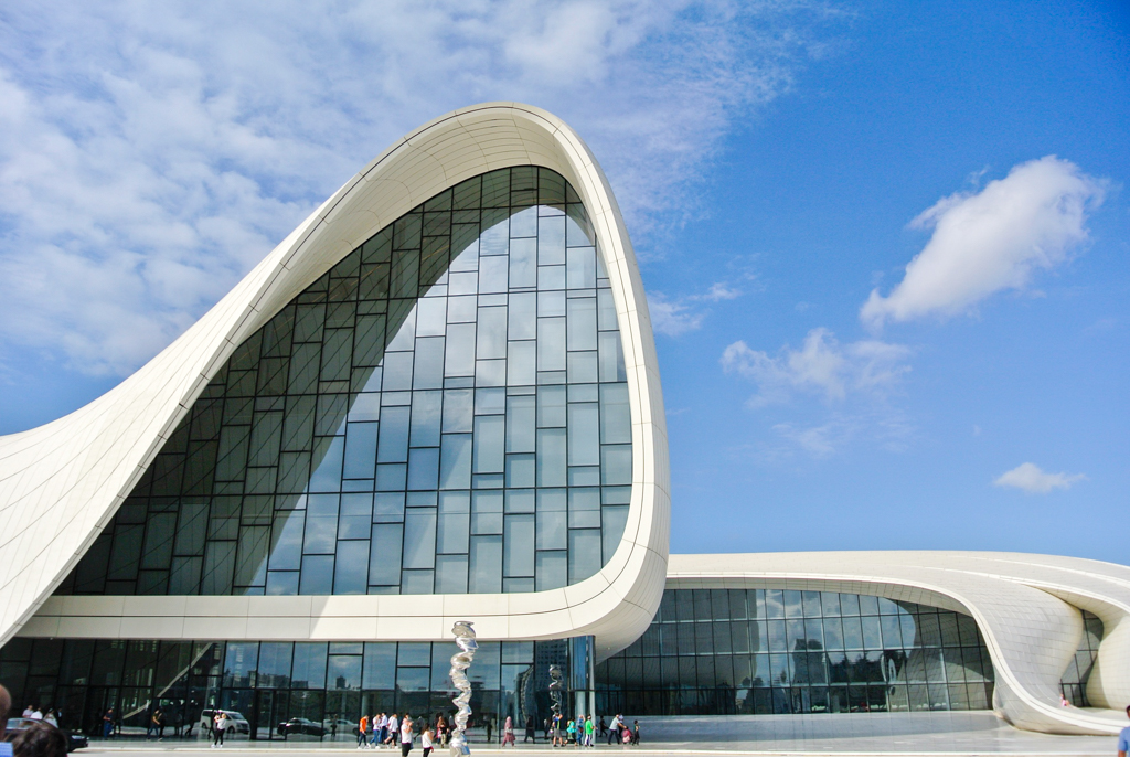
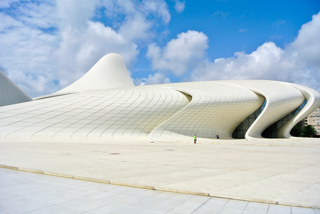
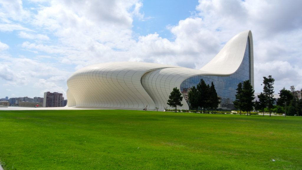
一昨年、アゼルバイジャンに行ってきました。ザハ・ハディド(Zaha Hadid, 1950-2016)設計の「ヘイダル・アリエフ・センター」、第3代アゼルバイジャン大統領のヘイダル・アリエフ(Heydar Aliyev, 1923-2003)のために造られたミュージアムで、この建築物見たさにアゼルバイジャンまで飛んたんですけど、本当に衝撃でした。
権力者が巨額の投資をして建物を造る、その手法自体は良し悪しありますけど、建築の技術、デザイン共に結果引き上げられてるんじゃないかな、と。こんな凄い建物が造れるんだ、と個人的には憧憬の念すら抱きました(笑)。次は、隣国のジョージアに行きたいです!
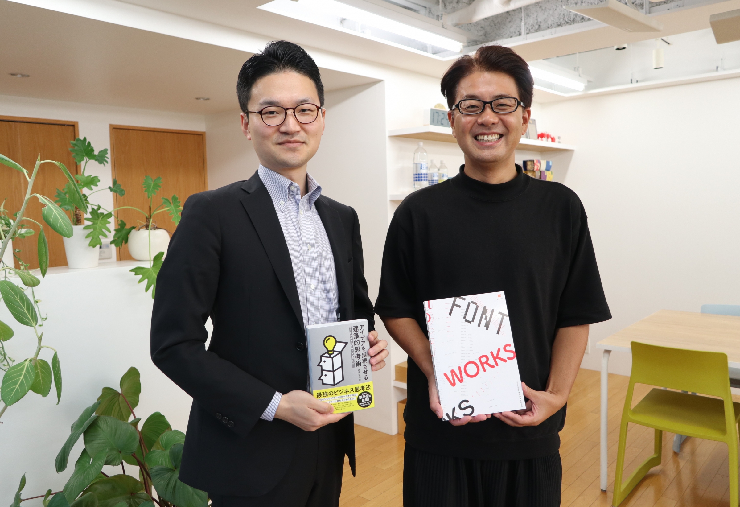
―― その話、もっと深掘りしたい(笑)。是非、別の機会に詳細お聞かせ下さい。今日は長時間に渡って、貴重なお話をありがとうございました!
After Recording 取材を終えて…
「『THE BAKE MAGAZINE』のようなオウンドメディアを僕らも作りたいんだよね」
昨年4月、まめぞうさんと会社近くのカフェでコーヒーを飲んでいたら、不意にこんな一言を投げかけられました。「製菓業界を変える」と銘打って、クリエイティブに真摯に向き合う彼らにまめぞうさんはすっかり魅了されたそう。
彼の熱意に絆されて、筆者も協力して動いた結果、昨年4月に『Fontworks Magazine』が立ち上がりました。今年1月『もじがたり』へとアップデートを遂げたなか、今年度最後の取材で「原点」とも言える会社に伺うことができ、まめぞうさんも筆者も感無量でした。
今回取材した柿﨑さんのフォント偏愛振りにも、筆者は心躍って仕方ありませんでした。「海外の工業製品が好き」という自身の嗜好をベースにフォントを選定したり、旅行先では街中の文字が気になって写真に沢山収めたりといった柿﨑さんの話を聞きながら、同じ匂いを感じたのは言うまでもありません(笑)。
前述のアゼルバイジャン然り、直近のオランダ然り、趣味である旅を通じて得たインスピレーションが創作の原動力となっているとのこと。柿﨑さんが手掛ける「作品」の一層の進化が、個人的にも非常に愉しみです!
取材日:2020年2月21日
写真=まめぞう