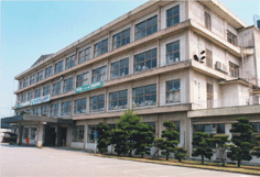
福岡県の南部に位置する八女市(やめし)は、日本を代表するお茶の産地として、また蛍が見られるスポットとしても有名です。人口約72,000人のこの市にとって、お茶は古くから栽培してきた八女地方を代表する農産物であり、市民の歴史や伝統、そして暮らしや文化の中に深く根づいています。そのお茶をこの地域の象徴としてかかげ、「茶のくに 八女・奥八女」をテーマにお茶の持つ健やかさ、日本的な情緒、もてなしの心などを基調として、住み続けたいふるさと作りと観光交流を推進しています。
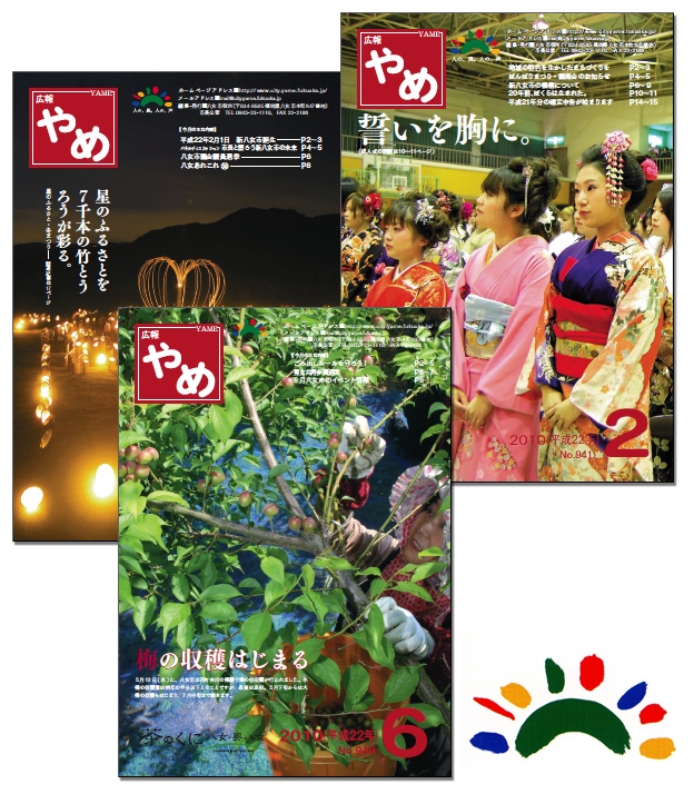
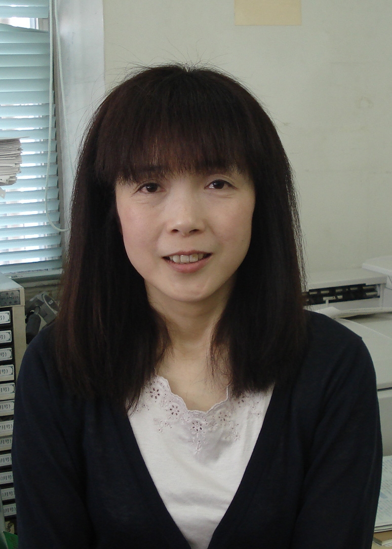
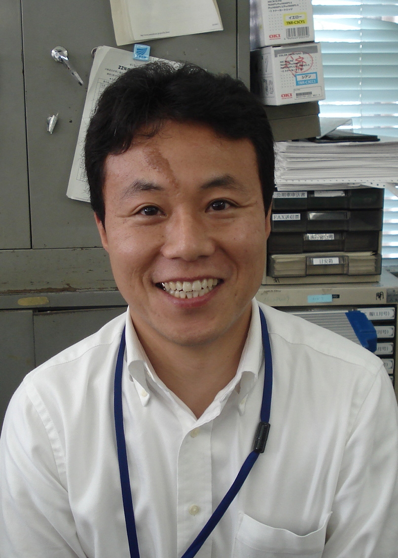
“キレイで読みやすい広報誌”として日本広報協会のセミナーで紹介された『広報やめ』。その編集を手がける同市の広報担当の篠原さん、松尾さんに、大切な情報を読みやすくするために心がけていることと、LETSによって実現されているノウハウを語っていただきました。
キレイな紙面作りへのこだわり
合併によって取材をする範囲が広がり、編集にかける時間が以前より少なくなりました。しかし、より多くの市民の方に読んでいただけるように、広報紙の限られたスペースで、必要な情報をわかりやすくお伝えできるように心がけています。
ひとつめに、『広報やめ』の紙面は二色刷りですが、毎号“色”にこだわって作成しています。藤の花で有名な黒木町と合併したときには、紙面に藤色を使用しました。出来上がりを見たときは、想像していたよりもきれいな色だったので二人で喜んだのを覚えています。また、今の時季ですと、八女市では新茶祈願祭が終わり、お茶のシーズンに突入します。そのため今年の5月号はお茶色にしました。市民の方に『広報やめ』で季節感を感じてもらいたいと思いながら作っています。
ふたつめは、“レイアウトとフォント”についてです。『広報やめ』では、本文は13級21歯幅、詰めは30〜40%で文字を組むようにしています。ただし、文字数が多いときには少し調整をしています。例えば、次の段落に文字が送られるとき、1文字だけが行頭に送られるのは見た目にも美しくないので、文字間を調整してキレイで読みやすいレイアウトになるように注意しています。全体的に見てこのくらいのバランスだったらキレイかなと、いつも考えながら作成しています。
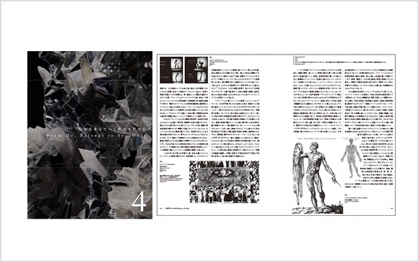
その他にも、紙面に統一感を出すために、たくさんの種類の書体を同じページ内で使わないように心がけています。具体的に、《市民の声 Voice》のコーナーでは、“市民の方からの声”を[筑紫明朝-D]、“市からのお返事”に対しては[筑紫明朝-R]を使用して、視覚的に区別がつくようにしています。微妙な違いですが、紙面のイメージを変えることなくメリハリをつけています。でも、市民の方が見てもほとんど気づかないだろうなとは思うんですが。(笑)
それでも『広報やめ』の中では、本文の[筑紫明朝-RB]以外にも15〜20書体くらいは使っています。例えば、見出しなどのワンポイントや、本や映画を紹介する際などイメージにあったフォントを使用しています。LETSは書体のバリエーションが豊富なので、その場その場の雰囲気にあったものを、楽しみながら、でもこだわりを持って選んでいます。例えば《子育ち支援掲示板》のコーナーでは、子どもに関係する記事なのでゴシック体でも軽やかな感じがすると思い[ロダンわんぱく]を使っています。個人的にも好きな書体なので、中見出しなど他の箇所でもよく使います。
今後フォントワークスに望むこと
毎年新しい書体を出していますよね。一昨年に届いた[筑紫オールド明朝]は非常に気に入りました。本当にキレイですね。日本の文字の美しさは漢字だけでなく、ひらがなやカタカナのキレイさが本当に重要だと思います。一度この書体で本文を組んでみたいと思っています。その他には、[ハミング]も好きな書体で『広報やめ』ではいろんなところで使っています。そのため、太さのバリエーションが増えたのは嬉しいですね。(篠原さん)
私は丸ゴシックが好きなので、[筑紫丸ゴシック]に興味があります。[スーラ]は字面が大きくて少しカジュアルな感じがするので、違ったイメージを表現する際にはぜひ使いたいと思っています。あと、本文で使う[筑紫明朝]は対応しているんですが、他の書体もPr5(Adobe-Japan1-5)対応にしていただけると助かります。地名や人名などの表記に必要な旧字体の文字数が増えることで、適切な漢字を使える書体の選択肢が増え、それぞれの場面にあった雰囲気の書体が選べてもっと便利になると思います。(松尾さん)
LETSはキレイで使いやすい書体がたくさんあって、非常に満足しています。書体以外の希望になるのですが、便利なツールが収録されている LETS Power Up Tool Kit に、いろいろな罫線を収録してほしいです。例えば、アートブラシではなくて、クレヨンで描いたような柔らかい感じの罫線があるとちょっと嬉しいです。今後、期待しています。
秘書広報係 松尾 道広 氏
秘書広報係
松尾 道広 氏
<編集後記>
お二人は、近隣の市町村との合併での取材範囲の拡大、制作物の増加、さらに編集時間の短縮などで非常にご多忙なようでした。それでも、キレイで読みやすい紙面を通じて、市民の方に地域の情報をわかりやすくお伝えするために、様々な工夫をされていました。今後使ってみたい書体のお話では、「あれに使ってみたい、これに使ったらどうか」などとお話されているのを聞いて、取材をさせていただいた私も本当に嬉しい気持ちになりました。今後も、市民の方に喜ばれる『広報やめ』の紙面づくりに、当社のフォントやツールを活用していただけるよう、より一層のサービス拡充と開発に努めて参ります。 お忙しい中、取材にご協力いただきましてありがとうございました。今後ともよろしくお願いいたします。(牟田)
企業情報
| 社名 | 八女市役所 |
|---|---|
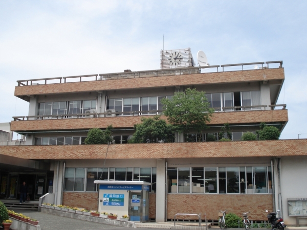
| 所在地 | 福岡県八女市本町647番地 |
| TEL | 0943-23-1111 |
| FAX | 0943-22-2186 |
| URL | http://www.city.yame.fukuoka.jp/ |
「LETS」プログラムへのご入会や製品のご購入については、お取引のある販売店様へお問い合わせ・ご注文くださいますようお願いいたします。