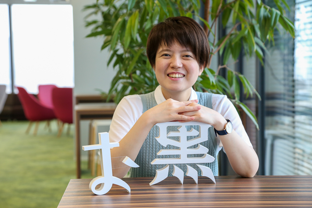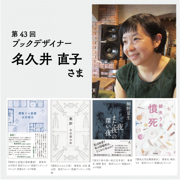
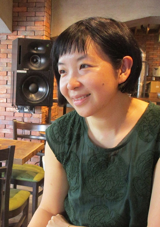
Naoko Hisakui, a book designer who is told that the Chikushi typeface is wonderful in kanji, kana, and Western languages.
You just use the Tsukushi typeface in a variety of books, but that is just particularly like "Text It seems What Tsukushi typeface as a typeface." Therefore, the Text points and attention to your use of the Tsukushi typeface as typeface, had you introduce an example of the use of further Tsukushi typefaces from recent of your work.
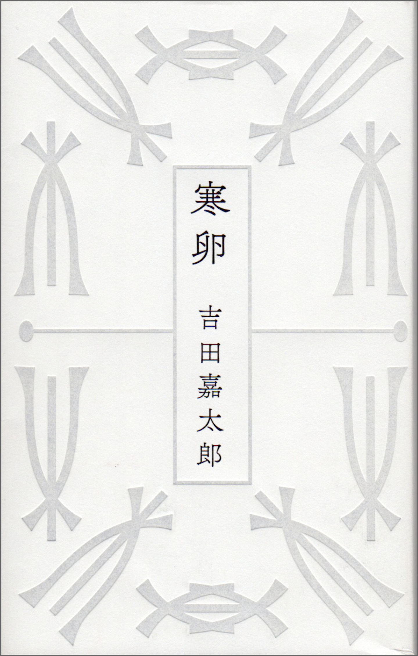
The letters are the "voice sounds" of the book, so choose the Chikushi typeface.
A "book" has no shape in its textual form.
Therefore, I think that book design is the task of materializing intangible text. In the materialization, there are various elements that compose the book as well as the text.
Among these elements, the “letter” (typeface) is like a “voice sound” that embodies text, so I think that it is definitely a major element that determines the mood of the book.
Since those readers mingle longest, "Text typeface" is important
The Mincho font I use is mainly "TsukuAOldMin". I feel that "TsukuBOldMin" is a bit too quirky for me...
I also like "TsukuGo," which was the first Gothic typeface of the Tsukushi typeface. I use these two quite often, and when composing Text text, I often specify "Tsukushi A Old Mincho-R and TsukuGo B" as a frequently used pair.
Nowadays, it is said that the font size of Text of light reading material should be "as large as possible," and the number of fonts is increasing to about "13.5". In the past, a thinner Mincho font (about L in weight) was used for Text, but now that weight gives a slightly weak impression.
TsukuGo B may seem a little too thick for a body of Text, but that Weight suits the modern era. The characters don't get crushed when printed like they used to, and even if you use a slightly smaller font, it still looks cute and doesn't become difficult to read.
Tsukushi A Old Mincho has a slightly quirky style compared to the Ming style that everyone imagines, but when that style flows through text, it gives an elegant and beautiful impression. Among the various old-type Ming fonts, Tsukushi A Old Mincho has a refined impression that is not too Japanese-style. This makes it suitable not only for pure literary texts, but also for translations of foreign literature.
Of course, the cover of a book can be said to be the "face of the book," so it is an important part of book design to attract readers. However, it is Text that readers spend the most time with. Therefore, the Tsukushi typeface I use for the inside of the book, as well as the outside, has an important meaning to me.
Make each letter of the whole sentence look the same
Come to think of it, I don't often use Japanese-European mixed text other than dependent European text in the Tsukushi typeface. When I use the Tsukushi typeface, whether for vertical or horizontal formatting, I often use the dependent European text as it is.
Many of the books I am asked to write are literary works that describe the subtleties of daily life and detailed emotions, so I try to specify the Text combination and typefaces in a way that allows the content to enter the reader's mind when he or she is immersed in the world of the book.
So, when we do mixed Japanese/European typefaces, we inevitably have to adjust the size and Weight, and I worry that this may lead to a feeling of discomfort ...... with the text itself. If we can specify Text a single typeface, the discomfort caused by these differences in typefaces will be eliminated.
However, we often use the "weight mixing" method.
For example, when using "Tsukushi A Old Mincho weight B" for kanji, hiragana, and katakana, the weights for numbers, alphabets, parentheses, and punctuation are slightly reduced to "Tsukushi A Old Mincho weight M".
Of course, there are those who think it is fine to keep the weight thick, but as I mentioned earlier, my preference is to make each individual character in the entire text look the same, or in other words, flat, which is how I arrived at this method. This is also thanks to the fact that Tsukushi A Old Mincho and TsukuGo have a range of weight variations as a font family.
TsukuGo is close to the "cuteness" that women desire
Today I would like to introduce some of my recent work.
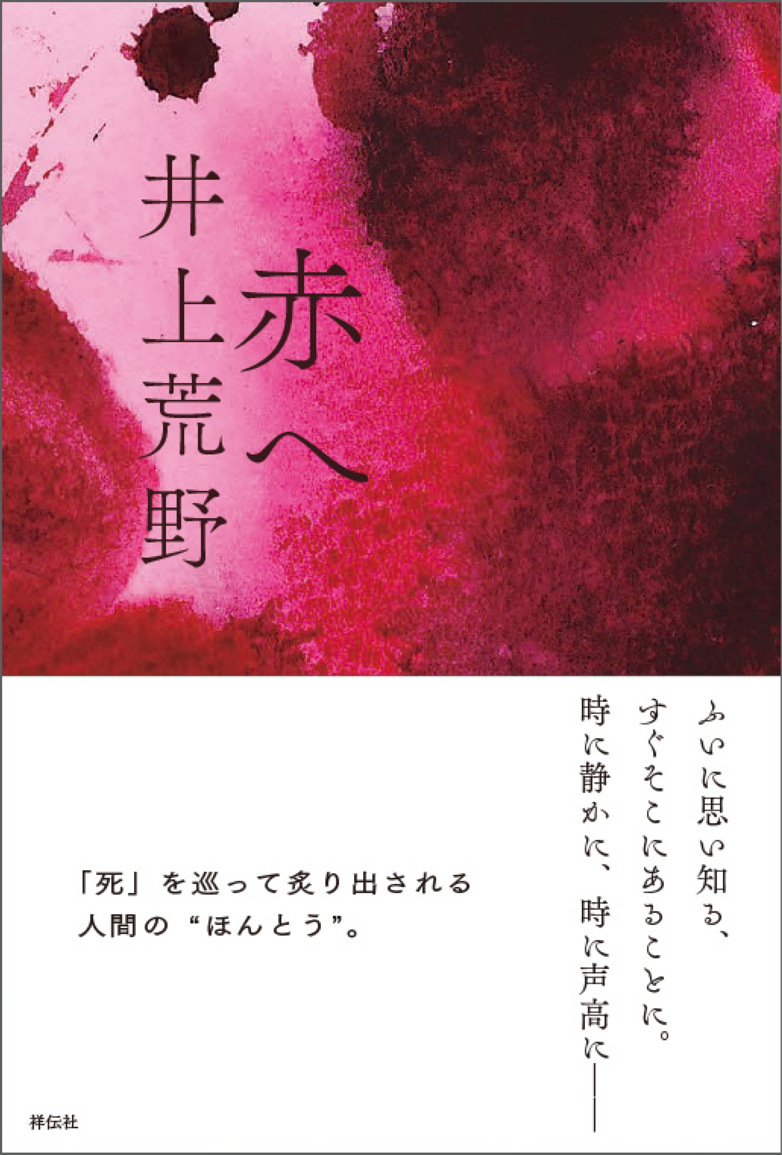
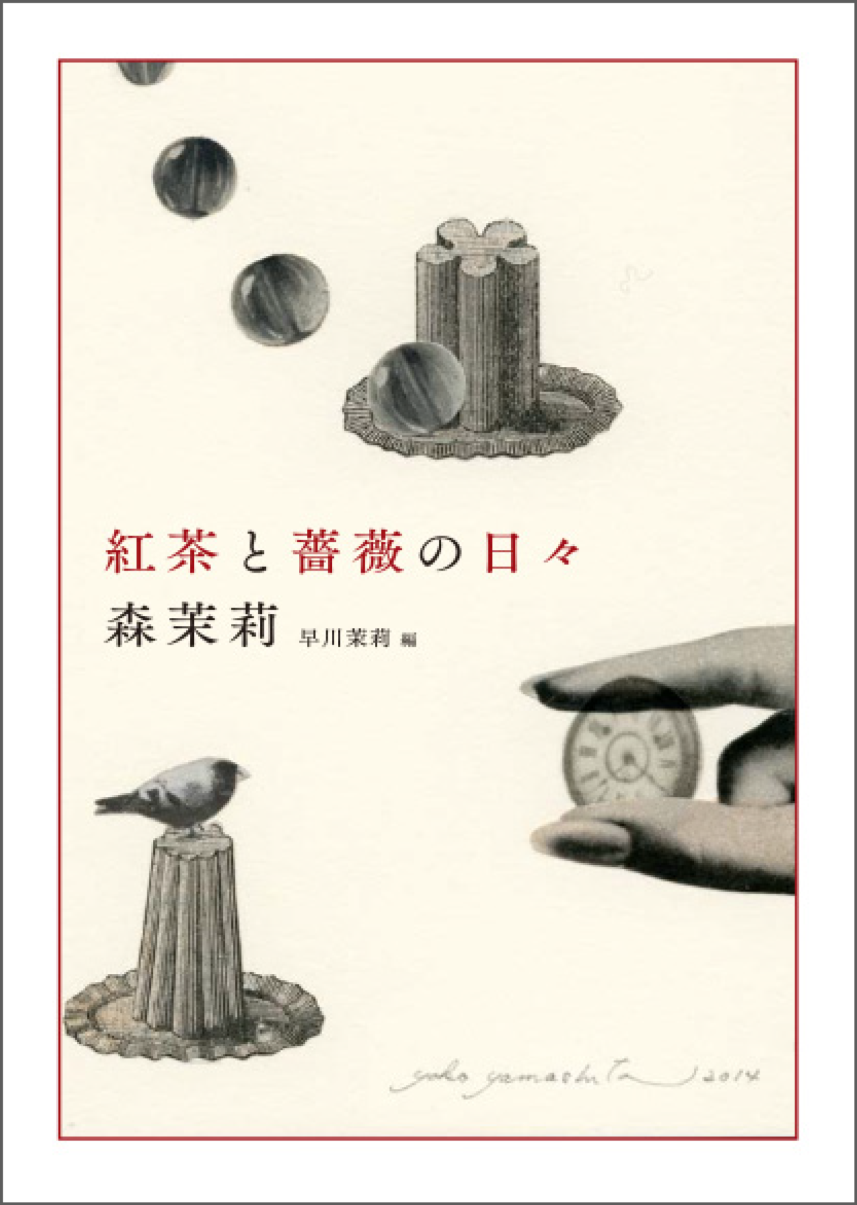
For example, when I was approached about the cover design for Mori Mari's paperback (Mori Mari Collection), it had already been decided that the book would be a series, so I wanted to use a typeface that would leave an elegant and beautiful impression so that it would not ruin the atmosphere no matter what title (characters) came up. Also, the name "Mori Mari" itself is beautiful, isn't it?
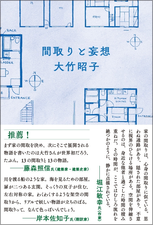
Taking the name into consideration, we used a slightly flat typeface called "Chikushi A Old Mincho" to make both the title and the name look beautiful.
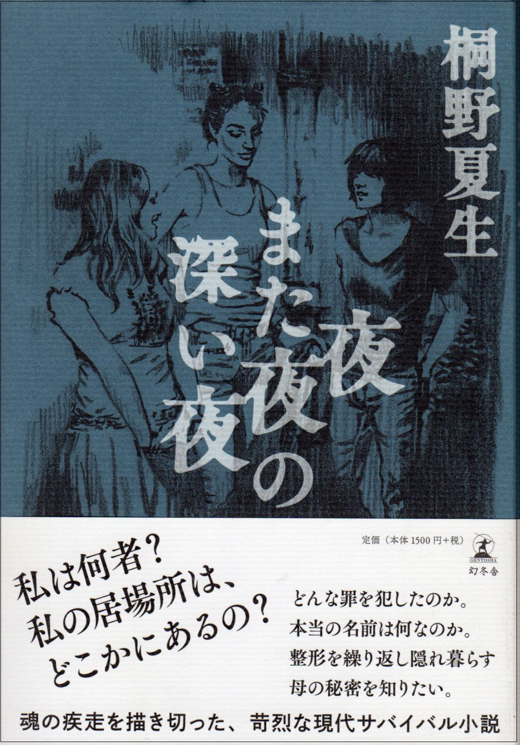
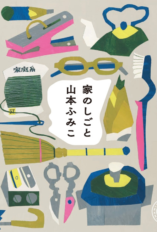
On the other hand, the cover and the contents of Fumiko Yamamoto's "Ie no Shigoto" are in "TsukuOldGothic". This book is an essay written by a woman who is a housewife, and although she lives her life meticulously and carefully, she also has the image of being a bit "strong" and "motherly", so I thought this Gothic font would suit her.
In fact, TsukuGo and TsukuOldGothic are typefaces that changed my image of Gothic fonts.
The impression of each typeface is soft, so it seems like the boundary between the Mincho typeface and the Gothic typeface is disappearing. I've always liked the old-style Gothic typefaces with small kana parts, but the Gothic typefaces of Tsukushi typeface gave me a more mature impression than the previous Gothic typefaces that were used for typography.
Strong Gothic fonts are popular in Advertisement copy, but they are a Gothic font that is suitable for expressing catchphrases aimed at modern adults. When I came across emotional words like sadness and joy in novels, I somehow felt that it was not quite right.
TsukuGo has a nuance that no other Gothic font has had before, and I think it's a typeface that can carry a story or express words that touch on emotions. With the appearance of this typeface, I was able to imagine that Gothic fonts could produce the same soft impression as Mincho fonts. Maybe I think this because I'm a woman, but I think the Gothic fonts of Tsukushi typefaces are in line with the cuteness that women desire.
New typeface ideas from old books in the early Showa period! ?
Also, since I am busy today, I decided to request the typeface I wanted, so I brought in a copy from an old book.
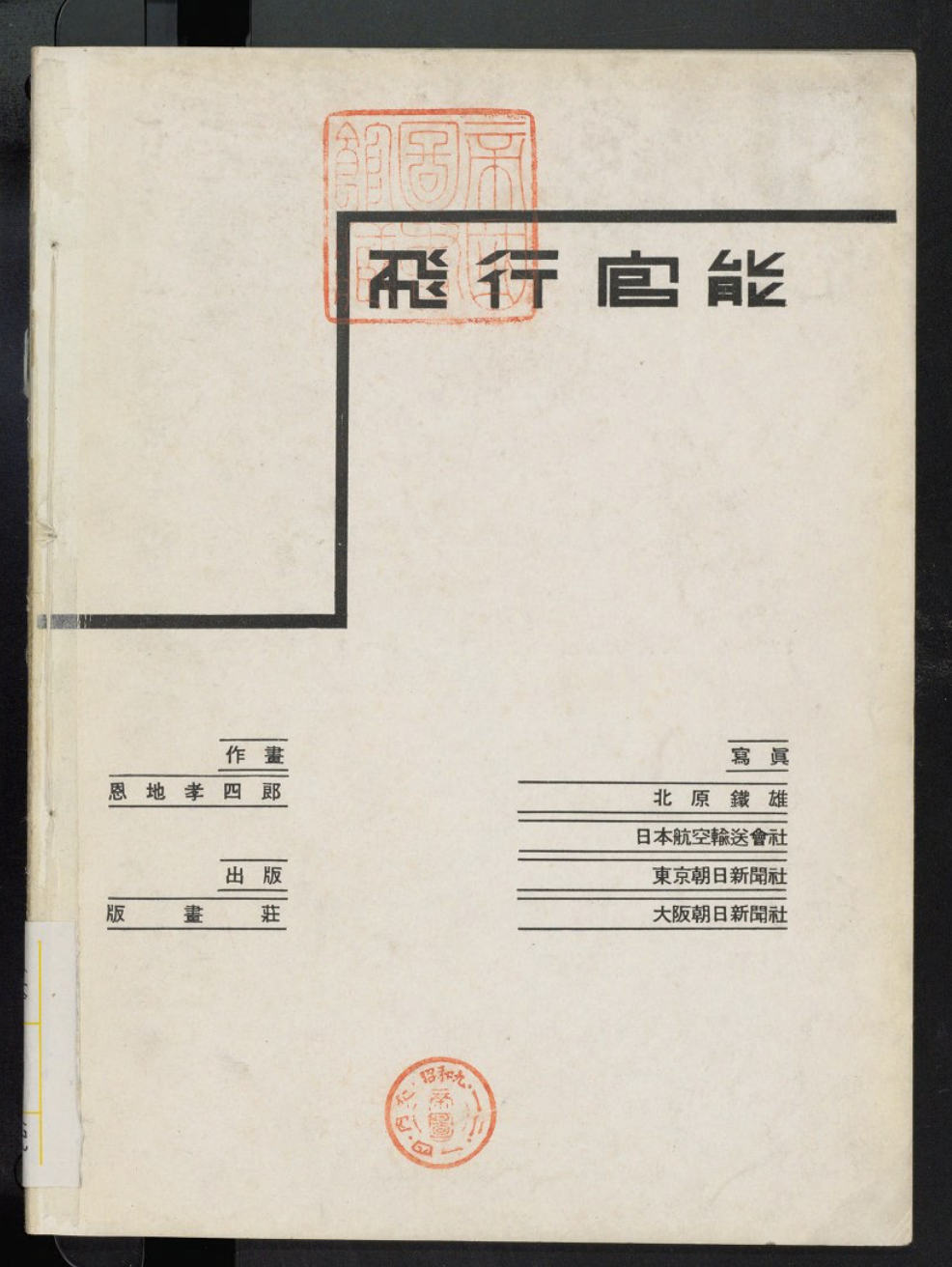
It is a type used in the book "Flight Sensation" bound by Koshiro Onchi, a printmaker and bookmaker in the early Showa era. This type is so nice ... At first glance, the characters used in this book are very quirky, and they are on the side that was shaken off. The katakana is made small, and it is interesting that the alphabet has a very narrow width.
As a book designer, I'm glad that there are both extremes, a standard typeface and a typeface that is extremely shaky. This is, of course, the typeface that was shaken off. It would be great if such a typeface would be a digital typeface.
Then there is the Mincho type that matches the picture books. Nowadays, I think that the Mincho typeface for adults has been filled with the Chikushi typeface, but there is little variation in the Mincho typeface that fits picture books-that is, there are few variations in the Mincho typeface that can be used for children's books, I feel undeveloped.
It's not a textbook, nor is it a general-purpose Mincho font. Right now, there is not enough Mincho typeface for children's books, which is included in the genre of Mincho typeface used in the lines of comics. If there is a new typeface in this field, I think the variations of Mincho type will also spread.
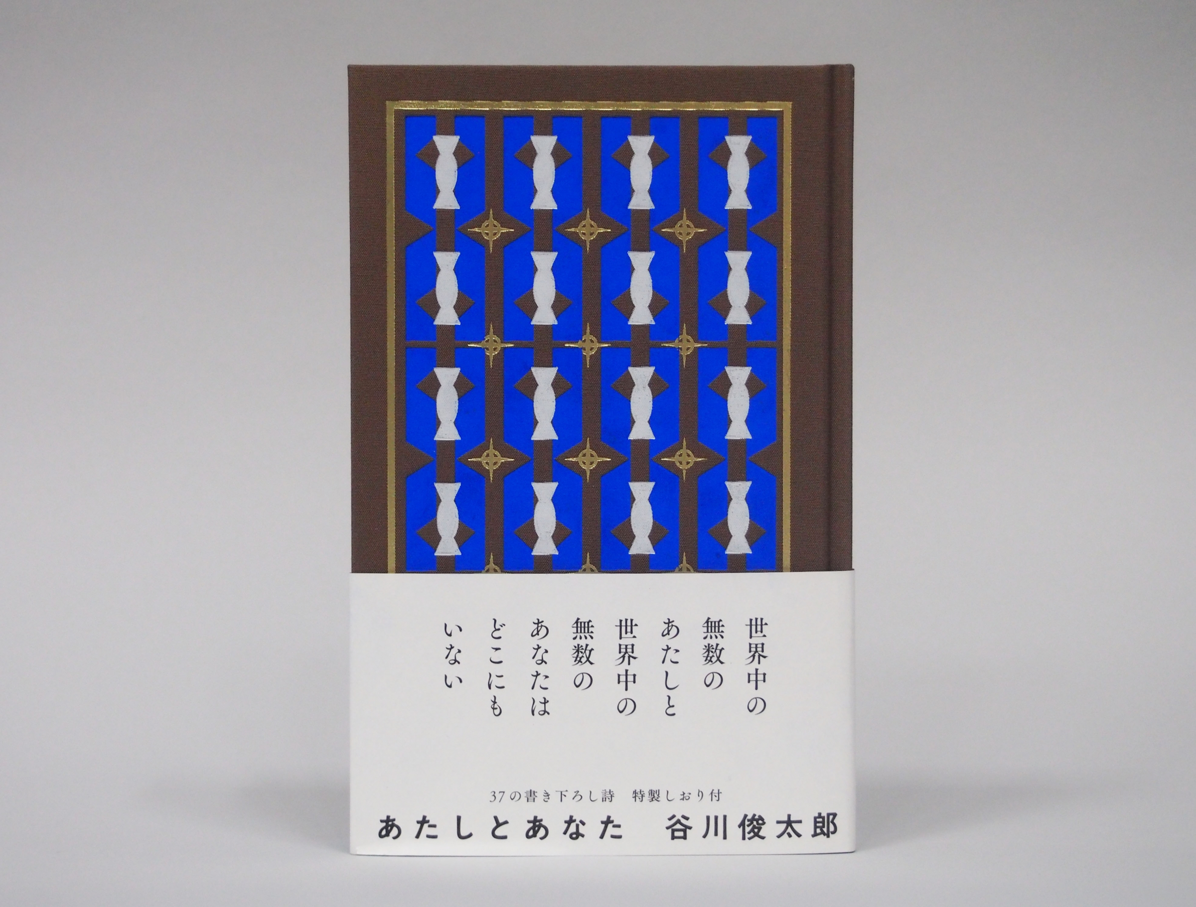
"Atashi to Anata" (Nanarokusha) Author: Shuntaro Tanikawa At Tanikawa's request for a vertical format, we received cooperation from Ishikawa Paper Co., Ltd. and Text-ordered a bright blue paper called "Takesume Torinoko for Printing" for the main text. The cloth-covered cover is embossed with three colors of foil, making it a luxurious work of art. The obi and the poems on the inside pages are decorated with TsukuAOldMin and TsukuOldGothic.