株式会社寺岡精工さまは、流通小売や食品製造、物流や飲食・専門店のお客様に、POSレジや計量包装、ラベリングといった店舗管理などに関わるさまざまな製品・ソリューションを展開しているメーカーです。「新しい常識の創造」に常に挑戦し続け、世界初・業界初の製品やサービスを世に送り出しています。
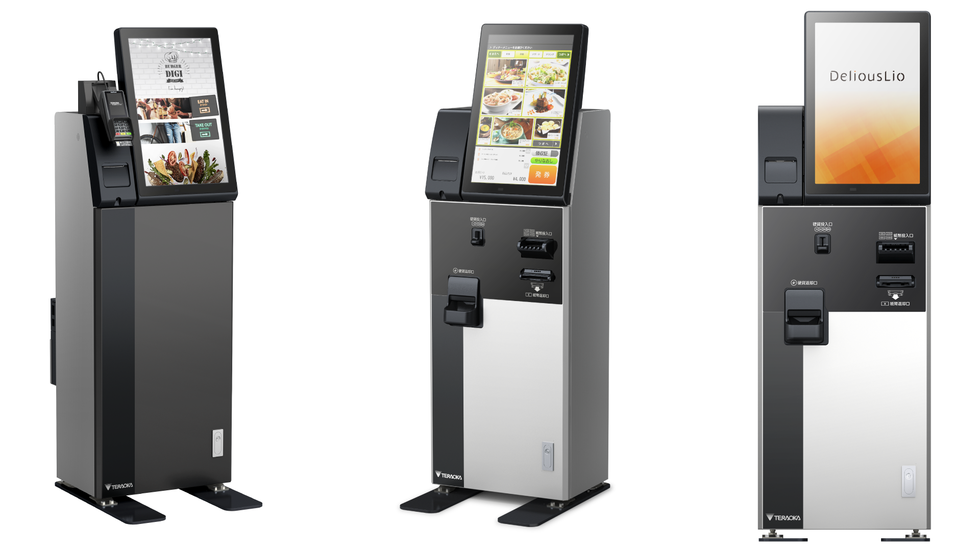
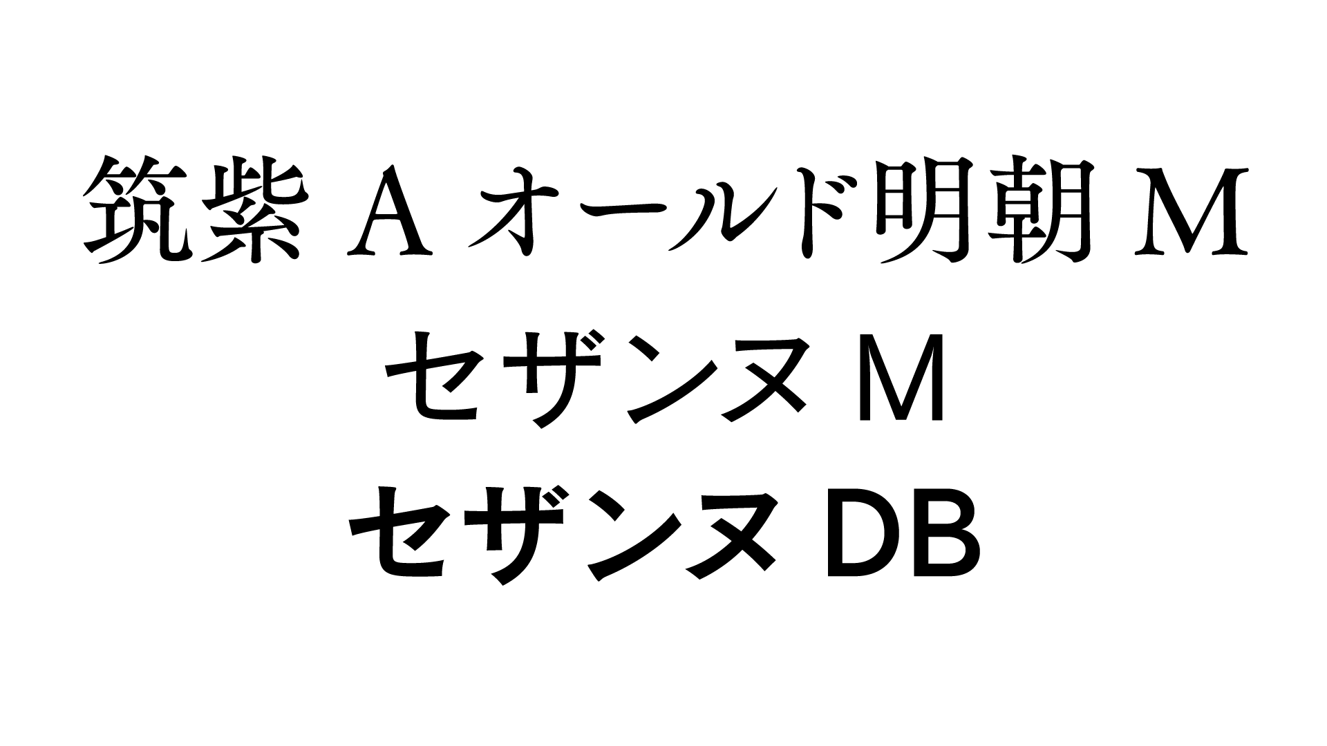
このたび、寺岡精工さまのタッチパネル券売機「DeliousLio(デリオスリオ)」にフォントワークスの書体「筑紫Aオールド明朝M」と「セザンヌM/DB」をご採用・導入いただけました。
実際に書体の選定や採用、導入に関わられた寺岡精工の横野さんに、その経緯についてお話を伺いました。
ディスプレイ上での情報の伝わりやすさを意識した製品
ーー寺岡精工さまは、食品関係や物流など多方面の領域で事業展開をされています。その中で「DeliousLio」という製品はどういった製品なのでしょうか?
横野さん:DeliousLioは、いわゆる「券売機」と言われているものです。最初にお金を入れて食べたいメニューの食券を購入する、そんな券売機と言えば、立ち食いそば屋さんやラーメン屋さんのようなお店にあるイメージを持たれる方が多いのではないでしょうか。
今はタッチパネルを始めさまざまな技術が盛り込まれていて、ディスプレイも大型で縦型のものを搭載した、非常に高機能な製品になっています。店舗にいらっしゃるお客さまには、従来の券売機にあるようなボタンの代わりに、タッチパネルを操作してメニューを選んでもらうというように体験が変わってきました。
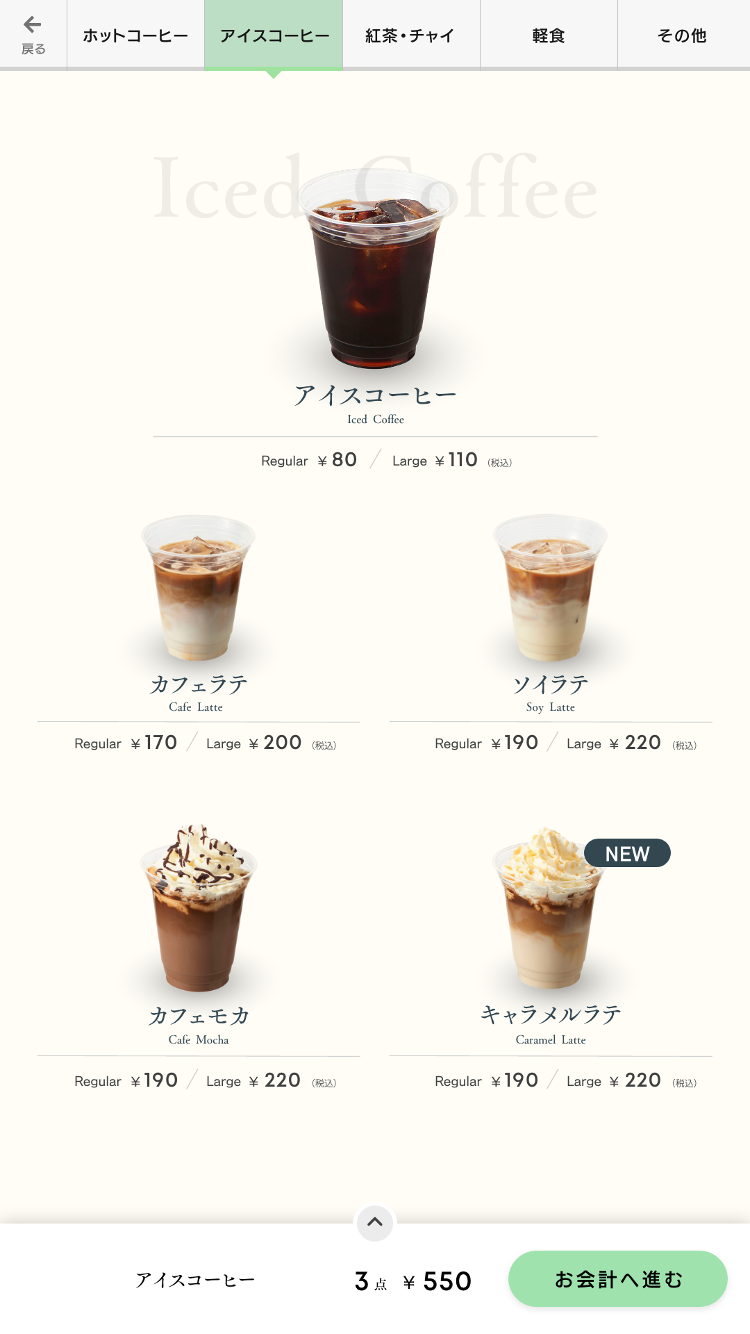
そういった中で、今までのようにメニューの文字が書かれたボタンが整然と並んでいるだけでなく、ディスプレイで表示する画像を自由にレイアウトして組んだり、文字の色や大きさ、書体の種類などを改善したりすることで、メニューを視覚的にもっと分かりやすく伝えることができるようになってきました。
それら「情報の伝わりやすさ」がDeliousLioという製品の特長でもあり、製品を導入いただいている店舗の方からも大変好評をいただいているところです。
シズル感を伝えるために「文字の力」を取り入れた
ーーDeliousLioの開発にあたって、書体に注目されたのはなぜでしょうか?
横野さん:例えばお客様がラーメンを食べようと思った時に、ただ単に「味噌ラーメン」「塩ラーメン」といった文字が並んでいるだけでは伝わる情報が少なく、迷ったり選べなかったりすることもあると思うのです。
美味しそうに見える、艶っぽさなどをイメージする言葉に「シズル感」というものがあります。このシズル感はもちろん、写真や色彩で伝わることもあると思うのですが、文字が持っている力で伝わることもあると思うのです。
パソコンなどで皆さんがよく目にしたり、使ったりするようなシステム標準の書体では、ディスプレイに表示された情報を見て、お客様が「あ、これ食べたい!」と思えるような感覚を引き出せるのだろうか?という疑問が出てきました。
私は製品デザインに携わる部門にいますが、UI/UXというところをとても重要視しています。文字についても重要な要素と捉え、この製品においてはとにかく「シズル感が伝わるような書体をしっかりと選んでいこう」というのが開発コンセプトにありました。
そこでフォント選定を開始し、20書体以上見比べた結果、フォントワークスの「筑紫Aオールド明朝M」に注目しました。比較した中で一番コンセプトにマッチした書体だと感じたため、選定に至りました。最終的な決め手となったのは、やはり「筑紫Aオールド明朝M」が持つデザイン性にあったと思います。
文字自体のデザイン性が、商品を説明する一部だと思うのです。言葉として伝わるだけではなく、商品自体の特徴を表しているべきじゃないかと思っていますし、そのあたりはとても意識しているところです。
ーー「筑紫Aオールド明朝M」のデザイン性に注目いただけたのは本当にうれしいです。DeliousLioには「筑紫Aオールド明朝M」の他、「セザンヌ」もご採用いただきました。この2書体の使い分けはどのようにされているのでしょうか?
横野さん:今回のプロジェクトでは、様々なフォントメーカーさんの複数の書体を候補に検討していました。設定していたペルソナがあったため、それにマッチする書体を最終的に絞り込んでいきました。
結果的にそれが「筑紫Aオールド明朝M」の採用となったのですが、同時にそのペルソナ以外のお客様にもDeliousLioを使用していただきたいという狙いがありましたので、一方で特徴的な「筑紫Aオールド明朝M」を使用し、もう一方ではもう少し汎用的な書体をと考え「セザンヌ」を選んだ、ということになります。
ーーこれまでの製品でも書体選定をされていたかと思いますが、今回のDeliousLioでの書体選びと今までとでは目線が違うことなどありますか?
横野さん:私たちのこれまでの製品で書体が使われるのは、ラベルプリンターでのケースが多かったです。ラベルプリンターで印字されるものは、皆さんがよく目にするもので言うと、スーパーマーケットなどの生鮮食品売場に置かれている商品パッケージに貼ってあるようなラベルですね。他には、ネット通販で届く段ボール箱に貼ってある、住所や製品名などが印字されたラベルなど。そういったラベルを作る機械を製造しています。
印字されたラベルは、主に店舗管理の方が利用したり、店員さんが触ったりします。このような場面ではデザインの美しさとかシズル感とかはあまり必要ではなくて、可読性や視認性といったこと、また文字数が正しく分かる、数字が判別しやすいといった、UD(ユニバーサルデザイン)フォントが持つような特徴が整っていれば良かった、と言えます。
しかし今回のDeliousLioはセルフ式の製品で大きなディスプレイを持っています。利用するのはコンシューマーの方ですので、これまでのラベルプリンターのようなアプローチ手法とは全然違ったものとなります。そのため、DeliousLioはコンシューマー向けにアプローチするという側面から慎重に書体選びを行い優位性を作りたかった、という想いはありました。
はかりメーカーだったからこだわった、数字の綺麗さと佇まい
ーー今回、フォントワークスのUDフォントもあわせてご検討いただき、導入いただきました。
横野さん:UDフォントについても各メーカーさんの書体を比較しました。私たちは元々、はかりのメーカーだったこともあり、数字の佇まいをとても重視していました。
数字って価格であったり、重量であったり、どんな場面でも必要となる重要な要素ですが、フォントワークスのUDフォントはデザインとしてとても綺麗な数字のフォルムを持っていて、優位性が高かったですね。
社内での評判もいいですよ。私自身もびっくりしたことなんですが、採用したフォントをある製品に搭載したときに、これまで入れていたフォントに比べてとても綺麗に数字が表示されたんです。
文字自体の美しさというのもあると思うのですが。私たちのようなデザインやフォントを気にする立場ではない社員からも、「綺麗な文字になりましたね!」というコメントをもらえたりして……。それはとても印象深かったですね。
今回のDeliousLioをはじめ、今後、寺岡精工さまのさまざまな製品にフォントワークスのフォントが搭載される見込み、とのこと。街中や店頭で目にする機会が今後ますます増えることを想像すると、とても楽しみです。「おっ、このタッチパネル券売機は……」と思わず「TERAOKA」のロゴを探したりしてしまうかも(笑)。
ところで、なんと横野さんは自身でフォントを作ることもあるそうです。収めたい枠にどうしても入りきらない……でも数字だけあればいい……、なんて時には、自ら数字を作成されるそうです。
そういったお仕事をされていることもあり、街中を歩くと「このフォントいいな」と感じたり、逆に「もっとこういうフォントを使えばいいのに」と思うこともしばしばだと笑う横野さん。フォントワークスとしても、フォントの導入検討~採用に至るまでの興味深いお話を伺うことができ、実り多い時間となりました。
フォントワークスでは、機器や環境の特性に合わせた組込みフォントの導入のご相談をお待ちしております。お気軽にお問い合わせください。