フォントメーカーとして文字をいかに伝えていくか…
今回新たにLETSのラインナップに加わる字幕書体「ニューシネマフォント」について、書体デザイナーの佐藤英夫氏と、長年にわたり佐藤氏の字幕書体を使い続けてきた映画配給会社ワーナーエンターテイメントジャパンの小川政弘氏、元映倫審査員でシネマ夢倶楽部の秋山茂氏に、その歴史や書体の魅力について対談形式で語っていただきました。 [2007.11取材]
戦前からの洋画に字幕が付いた時代から多くの先輩達が いろんな試行錯誤して生み出してきた書体だから、 これはまさに“字幕文化”だと思うんです。
現在でも映画の字幕は手書きなのですか?
小川
今は手書きで書いているところは、まずないと思いますよ。
秋山
昔は黒いカードに白のポスターカラーで手書きしたものを撮影してタイトルネガを作っていたけど、最近の主流は?
小川
それはプリントを量産する場合ですね。普通は白いカードに黒で手書きして、“パチ打ち”と言って、直接一本一本のフィルムに打ち込んでました。最近はいずれの場合でも、手書き書体をフォント化しています。そこから量産用タイトルネガを作るのは変わりませんが、本数が少ないときの字幕は、パチ打ちからレーザー焼き込みに変わりました。
秋山
昔は1作品あたり、だいたい1,200枚から1,500枚のカードを使ってたと思うけど、佐藤さんで1日に頑張って何枚くらい書いてたの?
佐藤
250枚くらい書ければいいほうだったと思います。
小川
そうですね。仮に1,250枚の枚数があったとすると最低でも5日かかるわけですよ。それがフォント化されたことでかなり短縮されたと思います。
秋山
フォント化して最初の映画ってなんだっけ?
佐藤
『A. I.(エーアイ)』でしたよ。戸田奈津子さんも「こんなことができるようになっちゃったんだ」ってビックリしてたけど、あれがワーナーさんの会社では最初です。
映画は私達も子供の頃から観ていますが、 映画の字幕書体って昔からああいう独特の文字の形だったんですか?
佐藤
それは時代とともに変わってますね。それと書き手はそれぞれ個人差があるんだよね。一種のパーソナリティじゃない?我々は我々なりにアレンジして読みやすい字を時間をかけて作ってきました。字幕書体にとって一番重要なことは、映画を邪魔しない読みやすさなんです。
映画の画面は縦に比べ横幅がかなり広いですが、 それでも一行の文字数は決まっているのですか? どのようなことに注意して文字をデザインするのですか?
佐藤
文字数については、例えばシネマスコープ(※)の場合、横字幕で13文字が一応規約なんですけどね。縦は10文字です。
小川
従来の縦字幕から横字幕に代わったときに、ワーナーが率先してやったんですけど、漢字とひらがなの組み具合が縦と横で違うでしょう。だから縦字幕のひらがなをそのまま横字幕で使うと、漢字とのバランスがデコボコデコボコしちゃって非常に読みにくい。当然、横組みで見た目で綺麗に見えるように直してもらいましたね。
佐藤
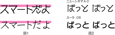
読むときにギクシャクしちゃうんだよね。そこで横組みの場合には、なるべくひらがな・カタカナの肩が揃うようデザインするんです。そうすると、見た目でサッと見えると思うんですよね<図1>。
もう1つは、写植文字だと「ぱ」や「ば」の濁音、半濁音の丸点がすごく小さいんですよ。だから瞬間的に違いがよくわからない。これは丸点もっと大きくした方がいいんじゃないかって……本当に大きくしたんですよね<図2>。普通の人の倍くらいあるんじゃないかっていうくらい。それが逆に目にパッと入るんですよね。つまり可読性ですね。意識することなくスムーズに読めるっていうのは、字幕書体にとって重要な要素じゃないかなと思うんですよね。
写植ができてくると、その文字を使おうかというお話はなかったんでしょうか?
小川
元々それはやっぱりね、各映画会社の制作する人間のフィロソフィーだし、その人の主観なんですよね。もっと言えば好みかな。私なんか昔からの書き文字の字幕書体に慣れ親しんできたでしょ。あれは戦前からの洋画に字幕が付いた時代から多くの先輩達がいろんな試行錯誤して生み出してきた書体だから、これはまさにカルチャーだ、“字幕文化”だと思うんです。だから、これは絶対に後代に伝えていかなきゃいけないという、私はそういう考え方だったんで。本当にどうしても丸ゴシックにせざるをえない例外を除いては、ワーナーの場合は首尾一貫して書き文字で通してましたね。
佐藤さんの書体は、丸ゴシック体のように 均整がとれていながら、書き文字の良さを ミックスしている洗練されたスマートな書体なんです。
濁音、半濁音以外で、佐藤さんがデザインする中で気を付けているところはありますか?
佐藤
特にカタカナなどがクセの強い字にならないことですね。クセ字もやっぱり目を留まらせちゃうんですよね。だから結局私の場合は、ほとんど縦か横かあんまり遊んでないんですよ。流れるように読める、そのまま目に読めるような。
小川
佐藤さんのシネマフォントの他にもいくつか字幕系書体がフォント化されています。私も一通り試してみたんだけど、やっぱり個人的にも、また会社としてもずっと使い続けているのは、佐藤さんの書体なんです。最大の特長は洗練されているというか、非常にスマートなんですね。スマートで丸ゴシックみたいに統一性、均整がとれていながら、その中に書き文字の良さが巧みにミックスされている、残してあるというね・・・それが私から見ると最大の決め手じゃないかな。だから見てて非常に綺麗ですね。
そして、画面を邪魔しない。さっき佐藤さんが言ったようにね、良く言えば個性なんだけど、悪く言えばクセのある書体っていうのは、どうしても字幕が浮いてきちゃう、浮いて見えちゃうんですね。そうするとそれは本末転倒なんですよね。洋画というのは画面と音(音楽・効果音)が主流であって、日本人にはたまたまそれだけではわからないから、いわば付加物でつけたものなんです。だから字幕が邪魔しちゃいけないんですよね。すーっと字幕が何の抵抗もなく入ってきて読みやすいっていうね、クセがないところが佐藤さんの書体の魅力だと思います。
佐藤氏の字幕書体には、空気穴あり・なしの2種類ありますよね。 どう違うのでしょうか?
佐藤
空気穴なしの書体は正字で作成しており、空気穴ありは、さらに独特で略字の書体です。
小川
空気穴ありは、英文タイプライターと同じ原理で打ち抜くために、スポンと抜け落ちないための知恵から生まれた文字ですね。
どちらの書体をメインで使用されているのですか?
小川
ワーナーの場合、ほぼ100%空気穴なしの書体です。
佐藤
小川さんは略字の大嫌いな人で、教育的にも良くないと(笑)。
ワーナー社のルールのようなものがあるのですか?
小川
やっぱり私の場合は突き詰めていくと、“字幕は文化である”と、そういう風に考えています。そうするとやっぱり多くの方々に観てもらうのに、例えば、空気穴ありの略字字形で覚えられては日本語として由々しきことであると…。ですからワーナー社では、できるだけ字幕特有の略字や崩し字は使用せずに、正字を基本書体として使ってきました。
その他には、原則として「ら」抜き言葉は使わないようにしています。いくら若者が話している場面でも「出れる」とはしない、「出られる」と。それからあともう1つは漢字とかなの使い方ですよね。それこそ小説でしたら作家の感性のおもむくままに、同じ言葉であってもある時は漢字、ある時はひらがな、もう自由自在でしょ。でもそれは字幕文化だから、やっぱり表記はきちんと、誰が訳そうが、いわばWordの文字変換原則の本則でいくというルールを守っています。
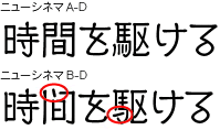
それから技術的な話なんですけど、いわゆる空気穴書体の場合は“トメ”という独特なものがあるんですね。“トメ”というのはですね、文字の一番最後のところでクッと力を入れて、一種の膨らみというのかな、これを“トメ”というんですよ。これをしないと、スクリーン上で非常に見にくくなってしまいます。書道の墨でスーっと細くなるスタイルだと“トメ”がないため、見た感じポツポツと欠けて非常に見にくかったね。こういう書体は基本的には使いません。 佐藤さんの書体ではきちっと全部とまってるでしょう。というか太さがそんなに細くなってないでしょ。だからこれは見た目に非常に綺麗なんですね。
小説ファンのために、できる限り小説のイメージを字幕でも表現してもらおうと工夫した『ハリーポッター』には思い入れがあります。
佐藤氏の字幕書体を使用している作品の中で、 よかったなぁという思い出深い作品はなんですか?
小川
それは、何と言ったって『ハリーポッター』ですよ(笑)。『ハリーポッター』は、松岡さんが訳した日本語版をお読みになるとわかるように、小説そのものが活字が多彩でしょう。少なくても5、6書体は使ってるし、それからまた悲鳴を上げると「わあああ〜」 と大きくなってるじゃないですか。小説ファンのために、できる限り小説のイメージを字幕でも表現してもらおうと思って、普通のセリフのところはいつもの佐藤さんの書体で書いてもらいましたが、私の特注でやってもらったのがですね、ご覧になってわかるように丸ゴシック風手書きなんだけども小説のイメージをちゃんと残してもらってるでしょ。
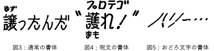
これが普通の書体、普通のルビの大きさなんですよ<図3>。それと1つは呪文ですよ。で、これは何かって言ったらルビなんですよ<図4>。ルビだけど、これは準本文の意味を目指しているんです。
実際の映画の中ではハリーにしても誰にしても全部呪文をカタカナで言うわけですよ。そのカタカナを覚えてもらいたい。でもカタカナだけじゃ意味がわからない。でも、字幕の原則で、意味の方をルビにできないんですよ、漢字だから。漢字をルビにしちゃうとものすごく読みにくくてね。ですから、意味を本文にして、実際に喋ってるセリフを大きめのルビ(準本文)にする。普通のルビですと本体に対して50%くらいなんですが、この場合本体よりちょっと小さめぐらいの文字、約70〜80%くらいにしています。
それで、両方見ると、書体が踊ってるでしょ。小説もこうやって踊っているんですよ。そういう路線を狙ってるわけですね。こういう感じで書いてくださいって、佐藤さんにお願いしました。
例の悪者達が出てきて、おどろおどろしい予言をする場面では、いわゆる「おどろ文字」ね、ドロッと血が滴るような、途中ちょん切れている書体を書いてもらいました<図5>。こういう工夫をしましたね。
佐藤
小川さんから「好きなように書いてくれ」「少し遊んでくれよ」って言われてね。赤壁のところに、血でダァーっと書いてあるでしょ?そういうときにこの文字を使ったんだけど、意外とウケてくれました。それで、映画を観た人にいろいろと感想を聞くと、ちゃんと字読めたよ、読めたけど忘れちゃったって(笑)。でも我々にしてみるとそれが成功なんですよね。
小川
『ハリーポッター』の呪文なんかは字幕版の1つのメリットですね。吹き替え版になると専らセリフだけを言うだけで意味までなさないですから。一生懸命小説を読んでる人は大体意味がわかるかもしれないですけどね。例えば呪文を言ったあと、必ず相手が何か変化しますから、その変化を見て「あっ、こういう意味だな」ということがわかるんでしょうけど。本を熟読していない人や読んでいない人にとっては、字幕がいいですよね、セリフと同時に意味も出せますから。字幕がセリフの和訳だけではなく、イメージを表現することができたこの作品が一番思い入れがありますね。
デジタル化された時代の中で、 ある意味でアナログの要素を残して文字を読める・・・ 人間の心のゆとりにつながるんじゃないでしょうか。
「佐藤氏の字幕書体」が多くの人に使われることをどう思いますか?
小川
まあ、希望というか、めでたいことですよね。非常にめでたいことだし、しかもそれは、今までのように専ら映画のスクリーンの中だけだったのが、いろんな媒体で見られるようになるわけでしょ。それだけその字体を読む人が、映画のことを思い出してくれて、そしてやっぱり映画のその字体を見ることによって映画っていうものに対してのいろんな関心を呼び起こしてくれれば、我々映画人の端くれとしては、それに勝ることはないですね。何と言ってもやっぱりね、何百種類というフォント、書体がある中でこういう手書きの要素が入ったもので文字を読んで、デジタル化された時代の中で、ある意味でアナログの要素を残して文字を読めるってことは、私はいいことだと思います。非常に大げさなこと言いますけど、人間の心のゆとりにつながるんじゃないでしょうか。
秋山
優しさが伝わるよね。
小川
そういうことですよね。
秋山
NHKの『トップランナー』でも使われてるよね。これからは、もっといろんな媒体で佐藤さんの書体が見られるんだろうねぇ。
ぜひご期待ください。 たくさんのLETS会員の方々に使っていただけるように、 私達も精一杯活動させていただきます。


小川氏、秋山氏、佐藤氏と親交が深く、数多くの映画翻訳を手掛けられている映画字幕翻訳家の戸田奈津子氏より、佐藤字幕書体についてコメントをいただきました。
映画の字幕というと、
あの独自の字体に愛着を持つ人が多い。
数十年の試行錯誤を経てきた字幕文化。
佐藤さんもその貢献者の1人だ。
戸田奈津子
※書体のデザイン、仕様などは改善のため予告なく変更することがあります。
※ニューシネマはLETS会員様向けの書体です。
※パッケージでの販売は予定しておりません。