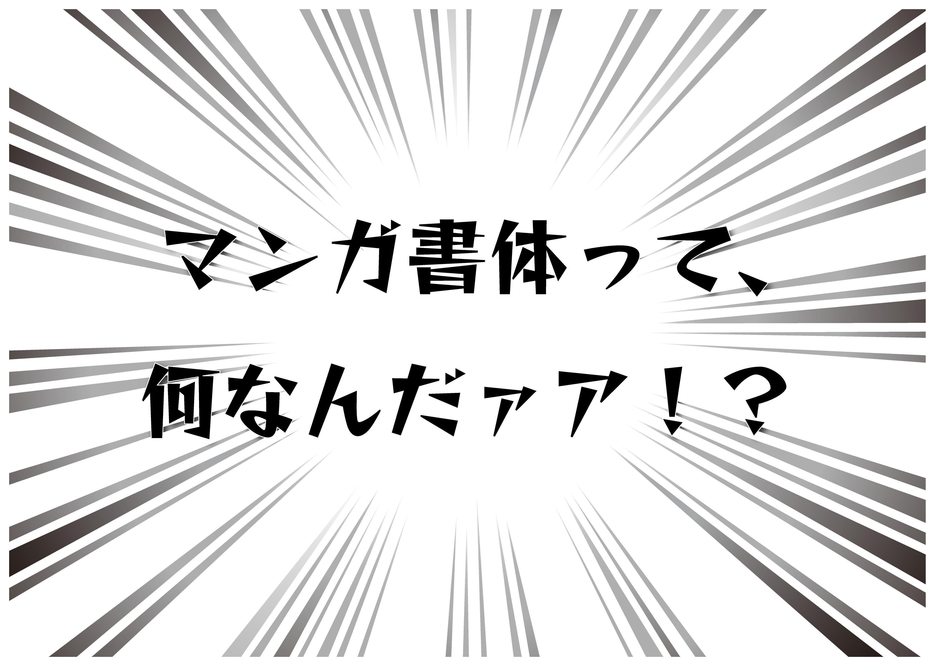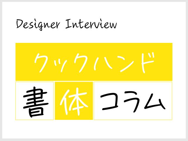
Following on from "Gospel," which is popular in anime and manga, Type Designers Kuwabara's latest typeface is "CookHand."
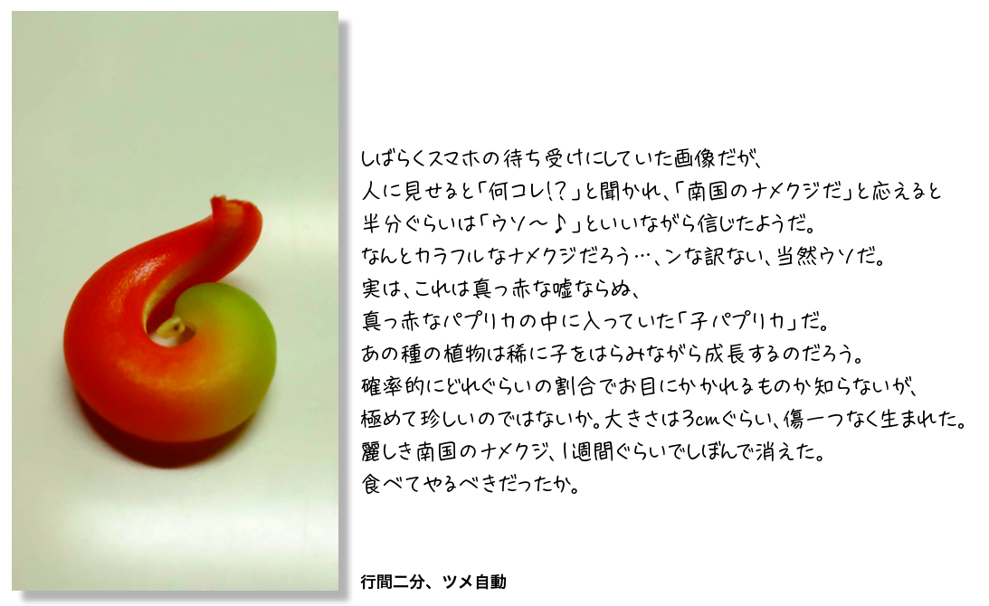
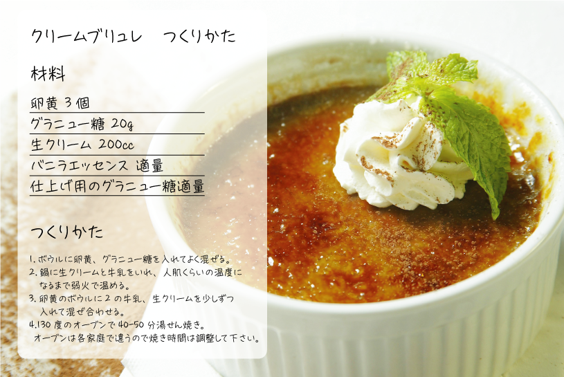
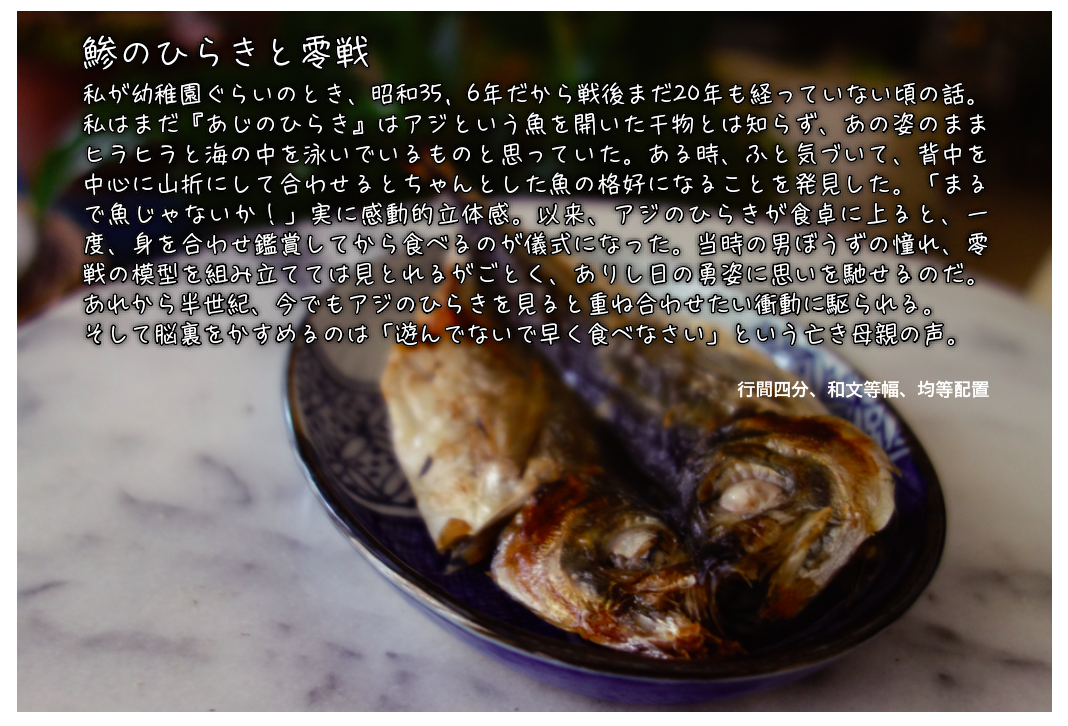
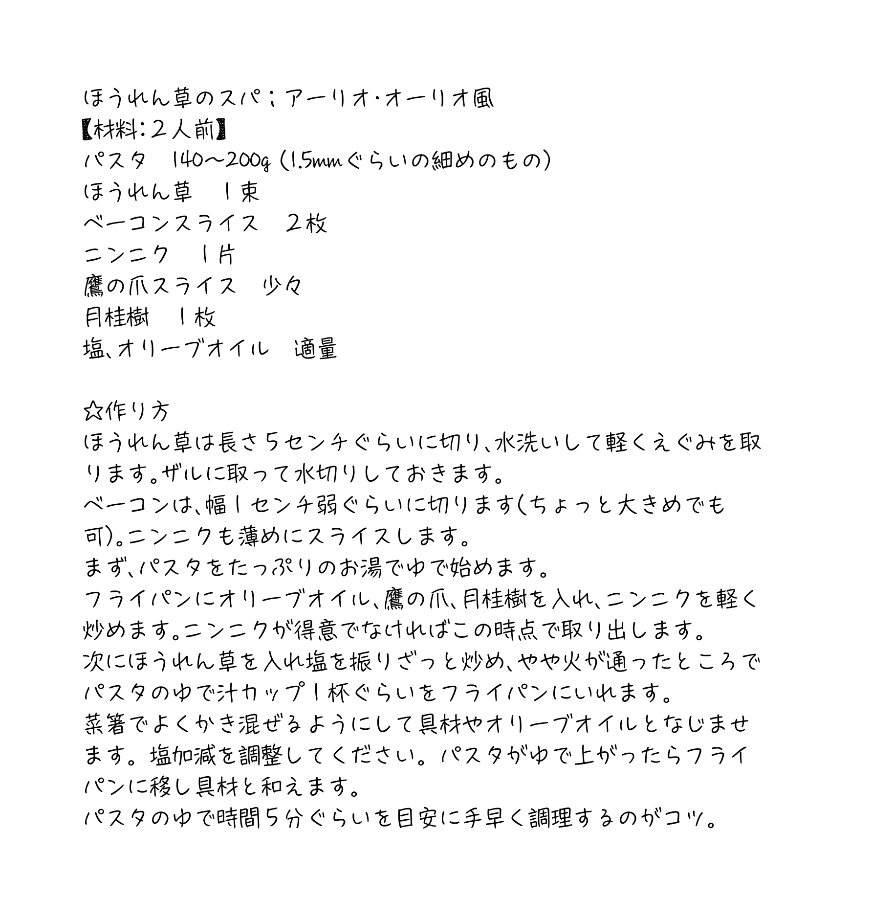
The smooth, familiar touch without too much character is perfect for places where you want to express a handwritten feel, such as recipes and customer testimonials, and the distinctive leaning forward design makes it easy for users to relate to.
This time, we spoke to Type Designers Kuwahara about the design concept of the typeface "CookHand," what inspired it to be created, and the story behind its creation.
What prompted the creation of "CookHand"
I'm always overwhelmed by the exaggeration of the typeface design concept, etc., but in the first place it was a small handwritten recipe like "Today's Menu" distributed at a supermarket in the neighborhood. The letters displayed there were comfortable and the touch was casual and familiar. While looking at these notes, I feel that it is a modest but essence of life to cook and enjoy a meal that is a little different from usual, so I wish I had a handwritten typeface that would be close to my everyday life and decided to make it. It was.
"CookHand" design concept
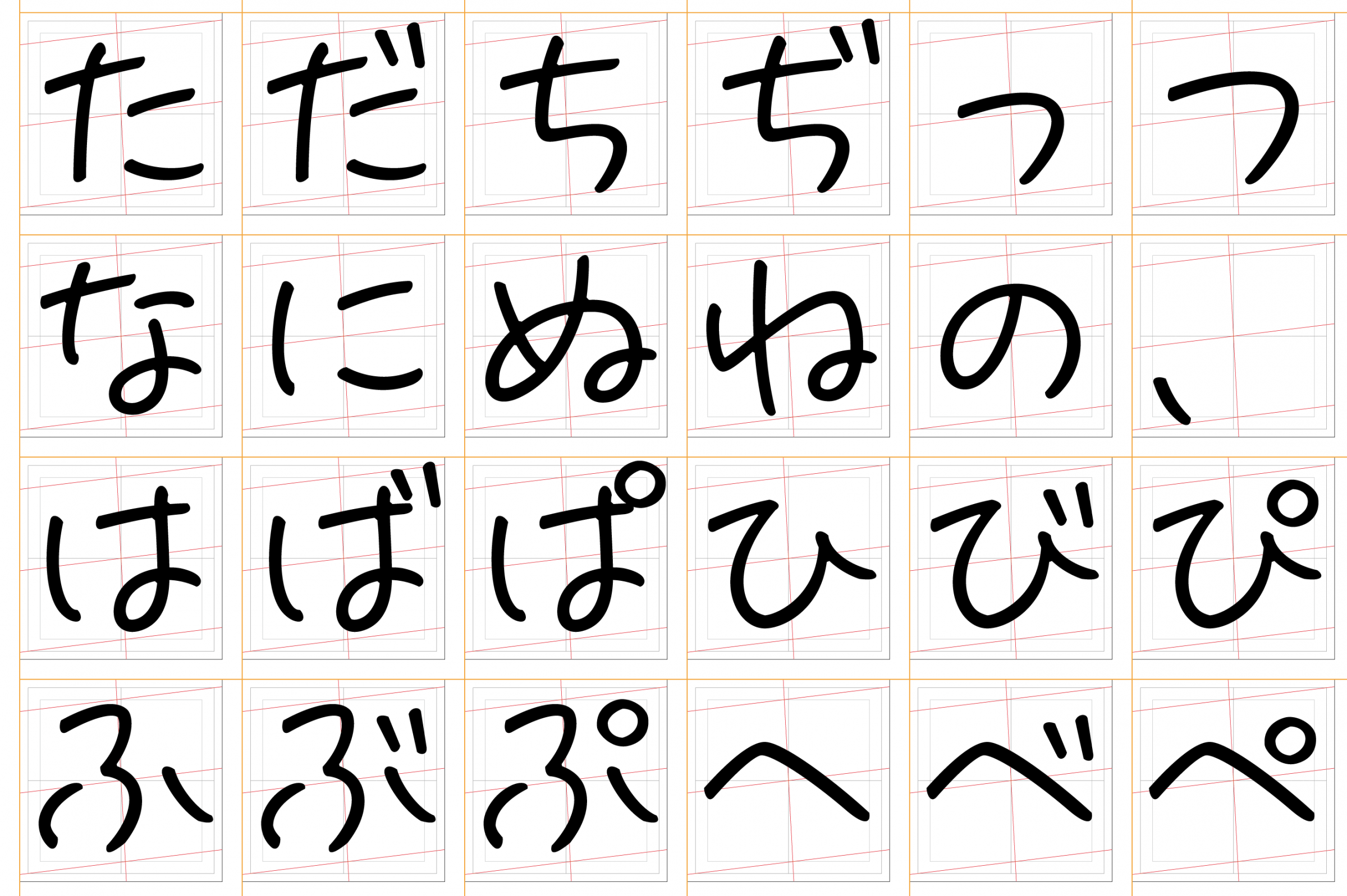
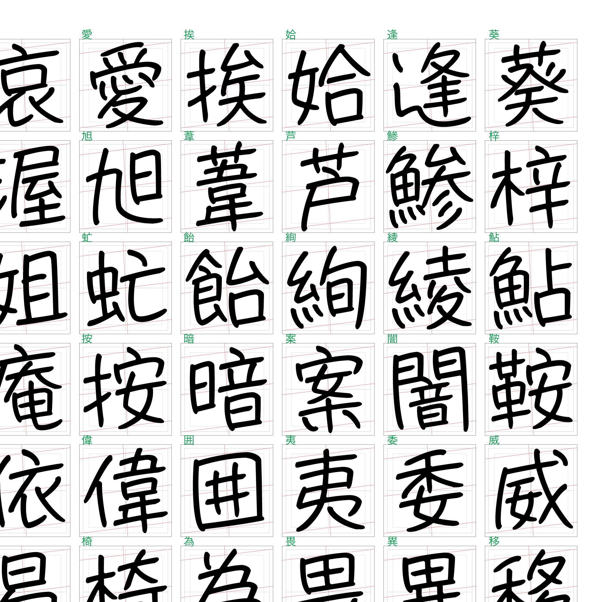
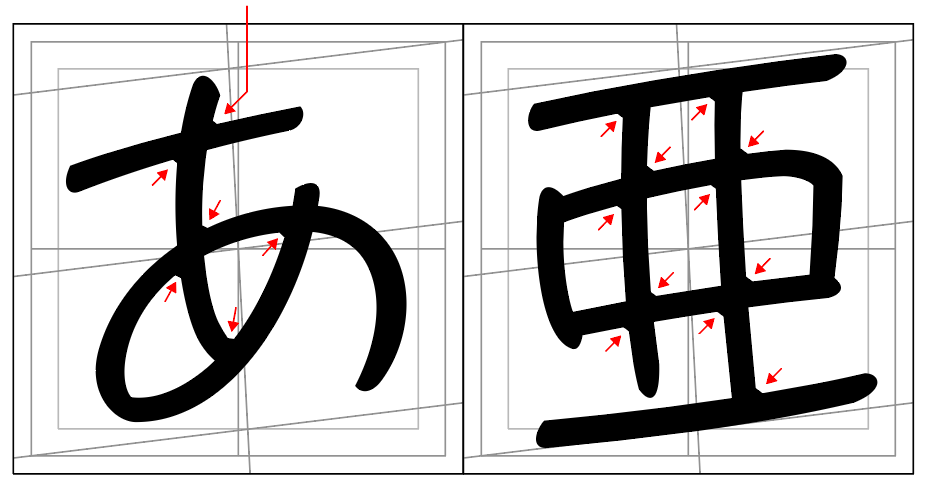
The sharp edges formed by the intersection of the stipples have a crevice to give a slightly softer impression. However, it is also a mood, and it is not a ruled process that must be decided at a certain place. Loose is a loose typeface.
I wrote the recipe memo as an opportunity to create a typeface earlier, but nowadays I think that I will cook while checking recipes on smartphones and tablet PCs instead of paper media such as prints. In that sense, I created each character carefully so that it would not be difficult to read even if it was loose, and carefully arranged the stipples. As a result, the miscellaneous taste has fallen and the taste has faded.
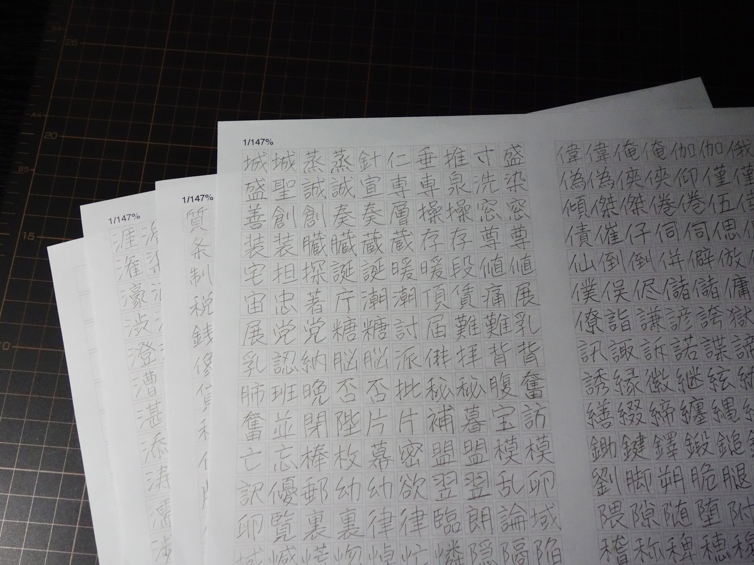
Did you come up with it about four years ago? After that, I started to practice my handwriting. It is strange to practice my own writing, but I practiced my own writing with a pencil or ballpoint pen for about an hour every day.
I feel like I can't get rid of it when I write it by hand, and if I keep writing it, it becomes a lot of nuisances and hard to read. In order to make it a typeface, it is necessary to pack some processing. So, what I practiced is my own character, not really.
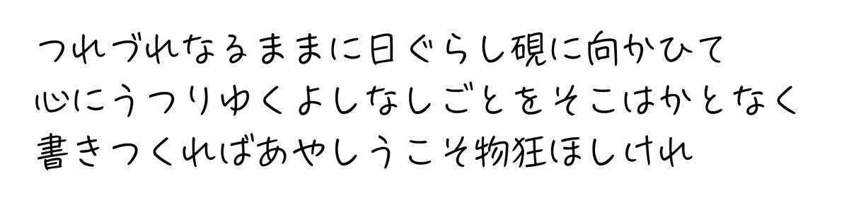
The letters are slanted to the left with a slightly slanted design overall. It was produced assuming that it will be used in horizontal writing mode.
"Cooking + Hand" = "CookHand"
"Taste" or whatever, is food and letters surprisingly close? I also like the typeface name "CookHand:CookHand" because it reminds me of cooking, writing, and handiwork. However, this does not mean that it is a typeface that is dedicated to cooking. I want it to be used casually to describe everyday things.
You can test the font from the following
Profile of Takayuki Kuwahara
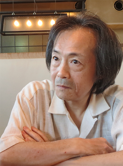
Digital font designer / engineer
Born in Shizuoka City in 1955. In 1977, Tatsuji Kato presided over Tokyo Ginza Namiki Studio, Iwanami Mincho, and began training in precision lettering. After leaving the company in 1986, he mainly produced dot fonts for Sony AV equipment.