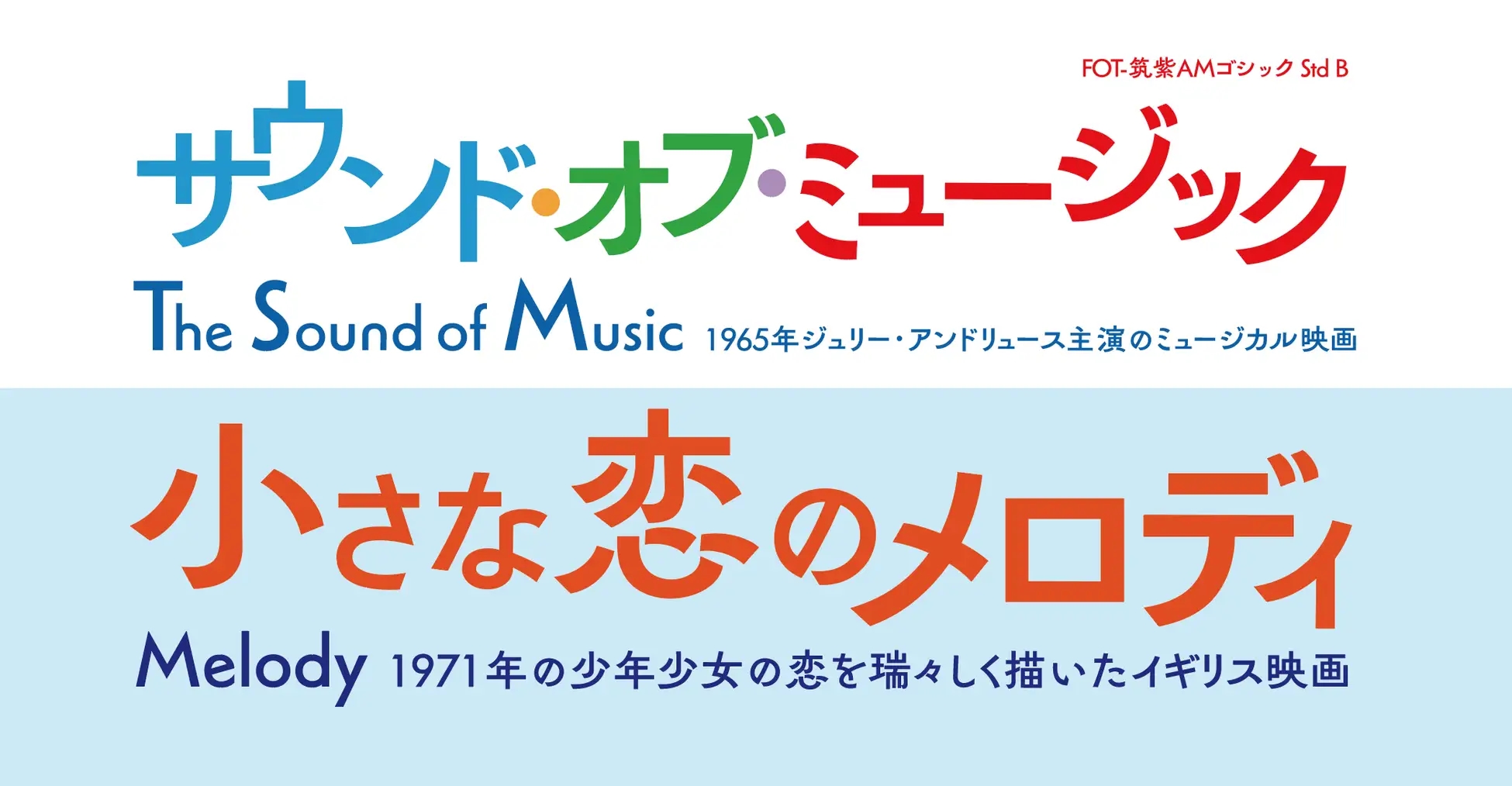
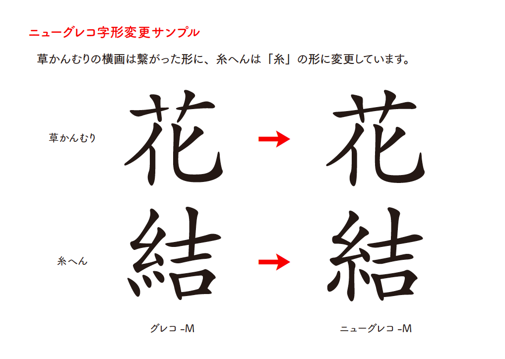
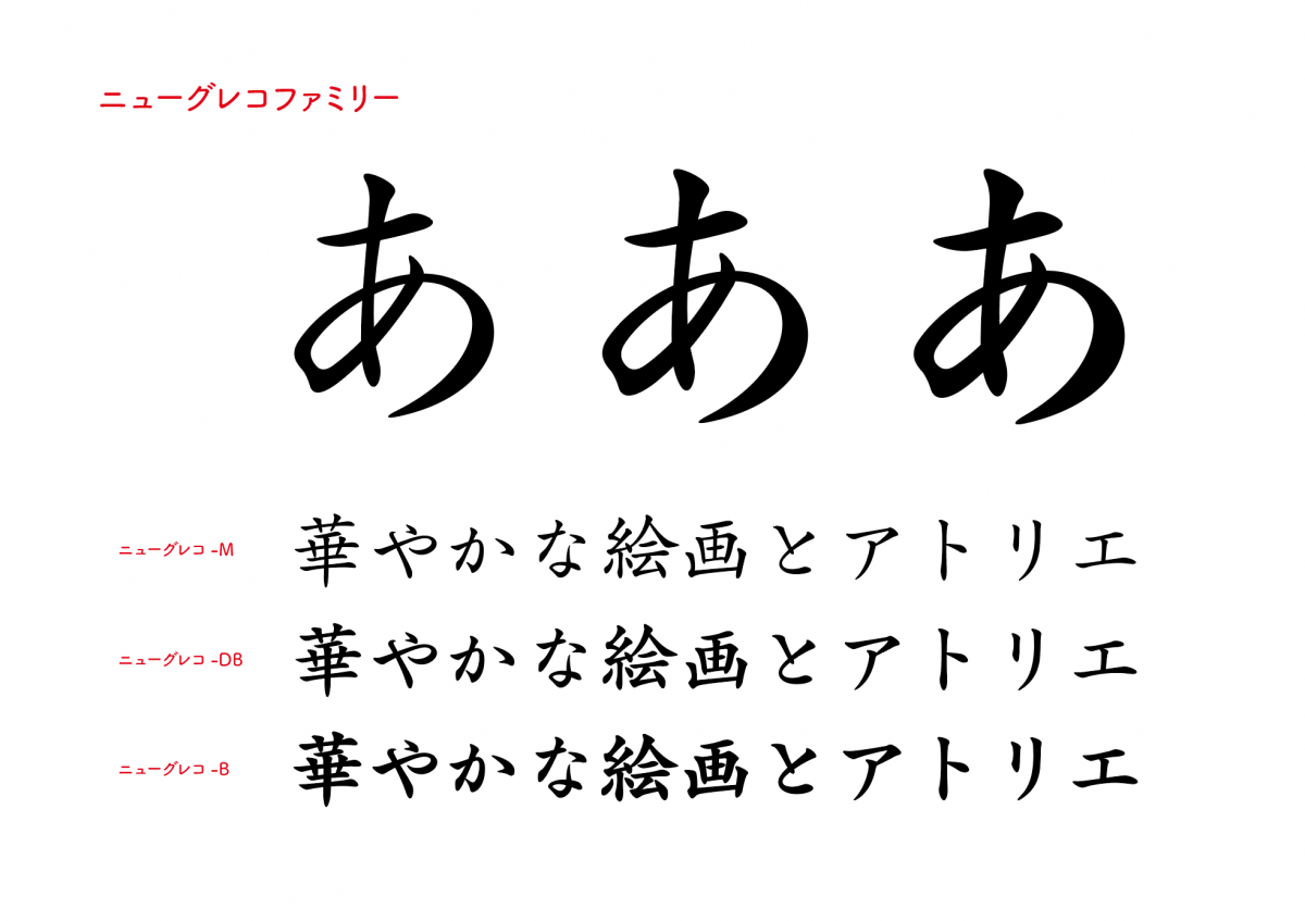
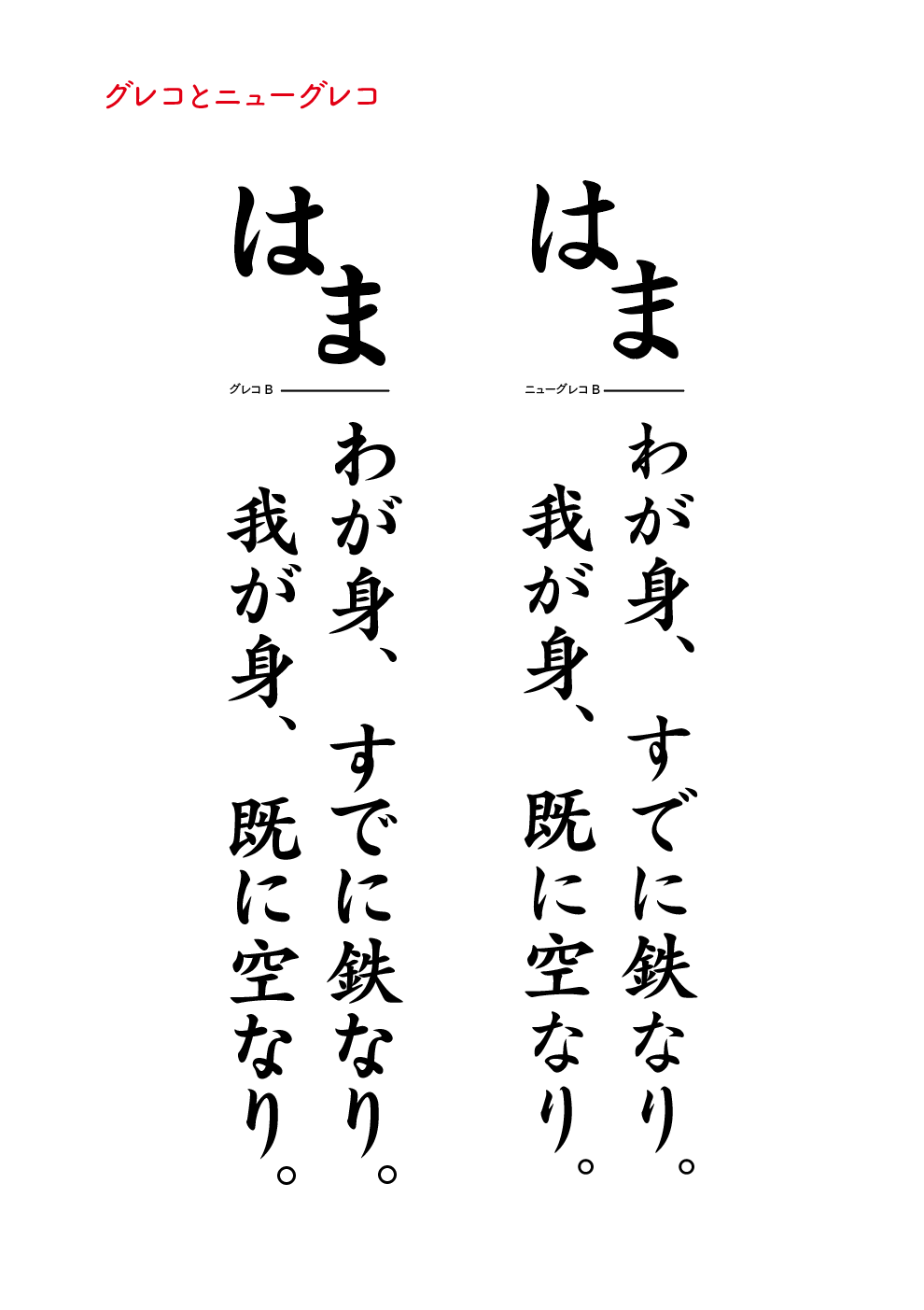
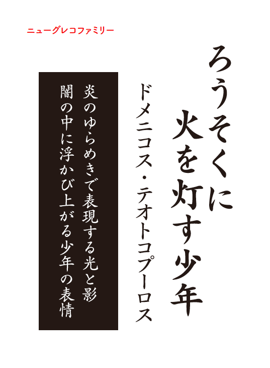
"New Greco" is based on the standard typeface "Greco" and newly supports JIS2004. For the kanji, we have changed "Kusakanmuri" and "Itohen" into modern character shapes that are familiar in Japan. In addition, we created a new "kana" to match the kanji. It is a "kana" design that takes into account the natural flow of brush strokes so that it fits neatly brush strokes. It has a resolute yet gentle atmosphere, and can express both strength and delicacy when composing sentences.
"New Greco charge of typeface design", joined the fifth year of the Type Designers in the mountain village Kanae, "New Greco from the joining of the" untold story and Yamamura of this typeface birth such as the typeface of the concepts and features of the up to until now Type Designers I interviewed the road as.
The road as a Type Designers
This spring, I have reached my fifth year of joining the company. For the first year before joining the company, I had been trained as a part-time job, so it is actually my sixth year.
I have been doing calligraphy since I was 6 years old. After becoming a college student, I became interested in fonts while learning in undergraduate classes and making flyers in circle activities, and I started thinking that I would like to work on fonts from that time. I consulted with the instructor in charge.
Then the instructor in charge took the lead Joint research with Fontworks I was able to attend the meeting, and I had the opportunity to visit Fontworks and listen to Fujita's story. There, he said, "Please let me have an interview." At that time, there was no recruitment, so I said, "I'll give you an assignment, so if you like it, I'll interview you."
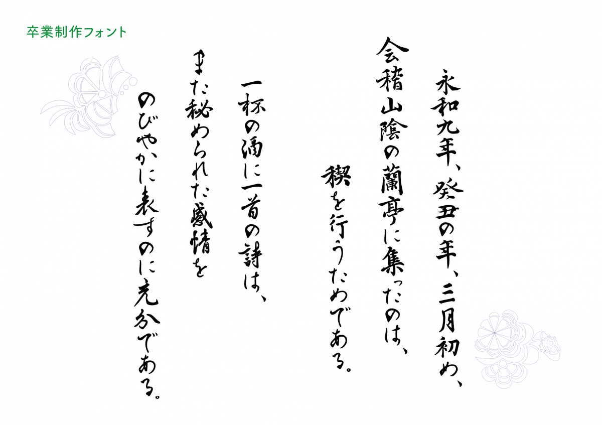
At university, I made brush fonts as a graduation project. After that, when I entered graduate school, I continued to make fonts. I was trying to make Kanji into a font from the work of Ougishi, and then make Kana as a Japanese typeface. At that time, I was producing with Illustrator.
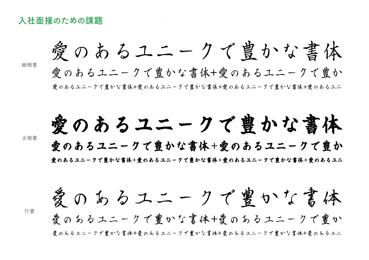
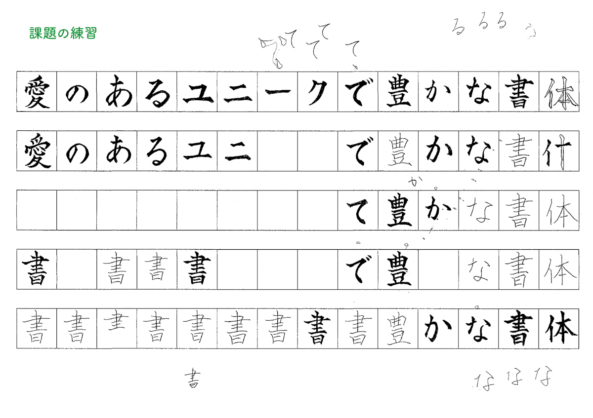
The challenge at this time was to design a single sentence, "Lovely, unique and rich typeface", using fine prints, large prints, and line books.
I was enthusiastic about the task, but until now, I was only writing with a brush, and I had no experience of making each character on a square or writing a skeleton with a pencil. Approximately one month later, finish 3 and submit. I was only worried, but I managed to clear it and have an interview.
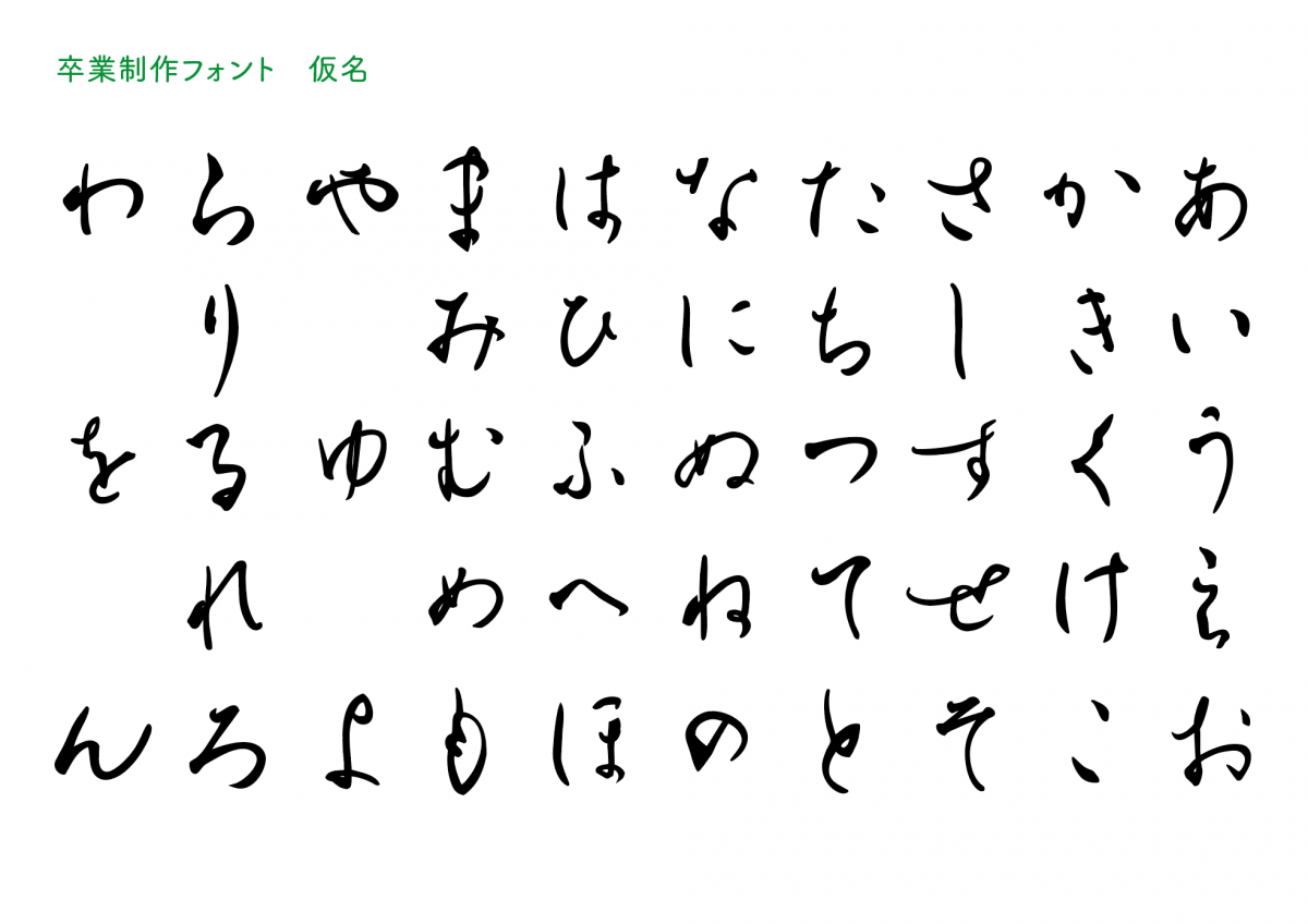
At this time, I asked later why this issue was issued, but it was because I was doing calligraphy all the time and there was a plan to redesign the Kana of "Greco" at the right time. is. Therefore, after joining the company, I will be in charge of pseudonym production for "New Greco".
To actual production. Making kana that touches existing kanji
After receiving a job offer, I decided to work part-time for one year before joining the company. After training such as lettering, I immediately set about working on a pseudonym for "New Greco."
First of all, I made Hiragana of Weight M with short sentences. It's not very difficult, but I can't really feel the feeling when I create each character, and the short sentences are easier to understand because they give me an atmosphere.
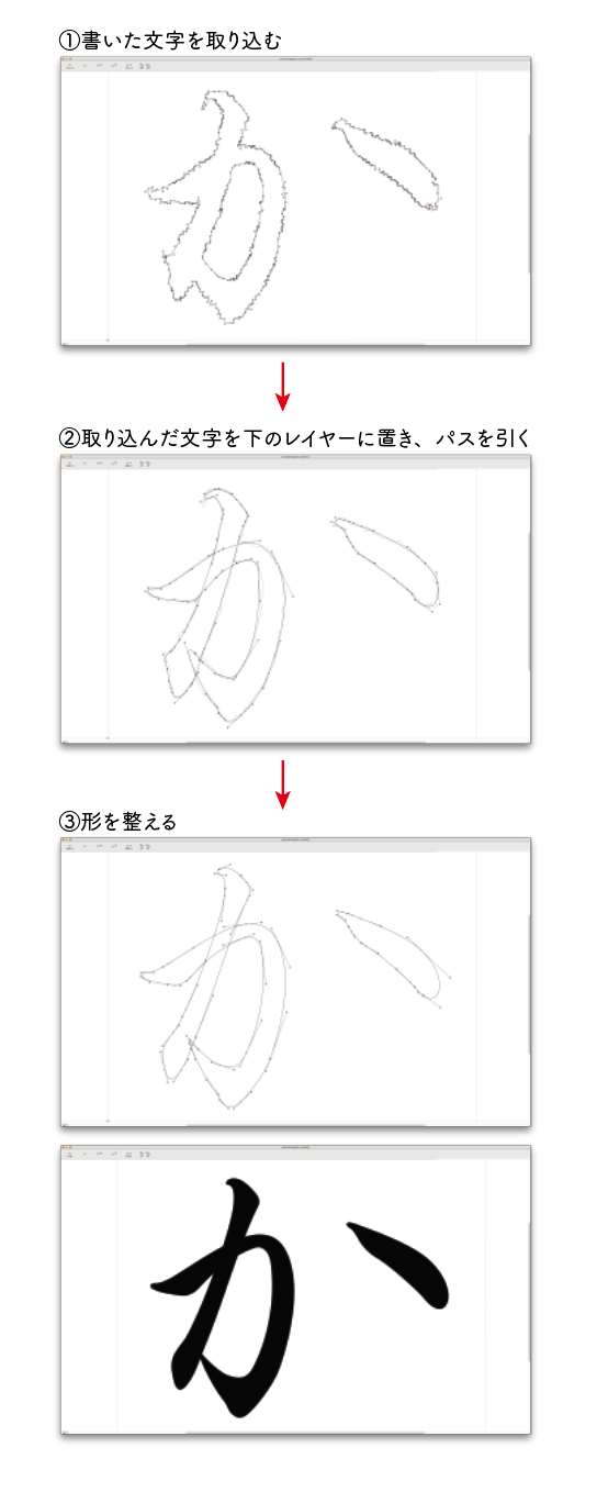
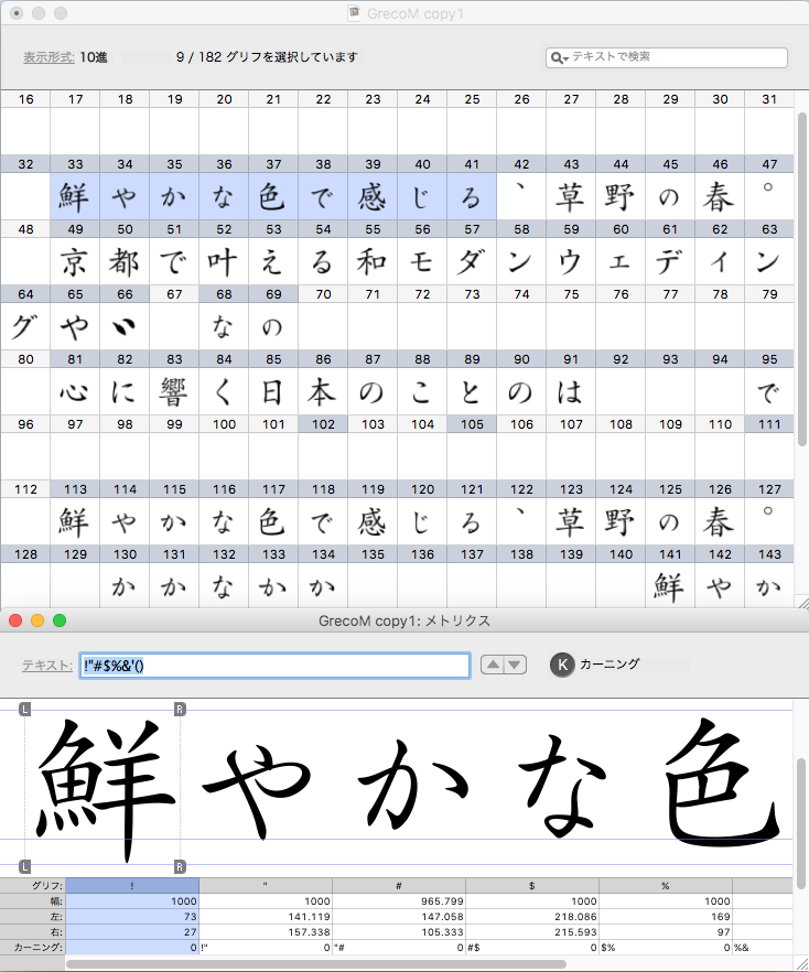
Actually write with a pencil or brush pen, take a picture, lay it on the layer under the font production software, and draw the path of the character. If you can make a few letters based on it, create the remaining hiragana according to it. I made corrections even after the hiragana was completed.
There's also a way to scan and reduce the passes to make it smoother, but I didn't study it, so I dared to continue doing this.
However, the situation where Fujita's OK didn't come out and he couldn't proceed at all continued.
I could write with a brush, but when I actually tried to draw a path, the reproduction did not work well, and in such a situation I could not see the future.
I joined the company on April 1, 2015, and continued to work on "New Greco" after joining the company.
By about July, all the kana of 3 weights had been created and modified, and the process of converting them into fonts was started.
To create another version of "Kana"
There was a period of about two years when other work came in, and I resumed production. I decided to leave the created Kana once and try to make a completely different version of the Kana.
Greco is a well-balanced typeface with better kanji and better balance than other typefaces. Although I also referred to the typefaces of other companies, the one I found most helpful was the textbooks for elementary school students from the Meiji to early Showa eras. At that time, many were written with a brush, and I was able to find various shapes with the same letter.
In addition, although the typefaces for other releases were being produced, the release schedule was decided the following year, so we started the final production for the release. As a result, it was decided to adopt the Kana of the one who made it last.
Kana production of all 3 weights is completed, and in June 2019, all data production including kanji, symbols and setting of character filling is completed.
Difficulty combining new Kana with existing Kanji
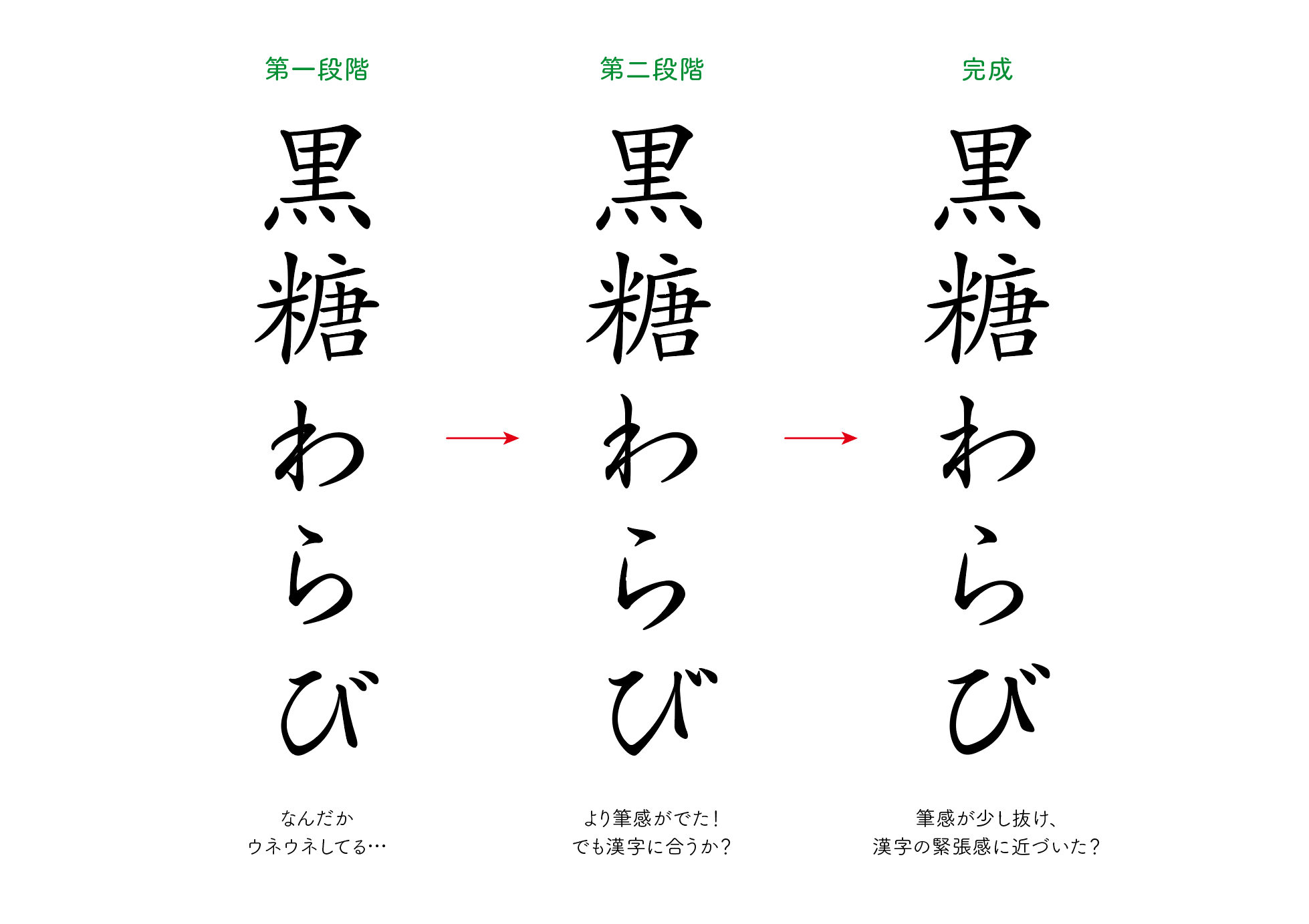
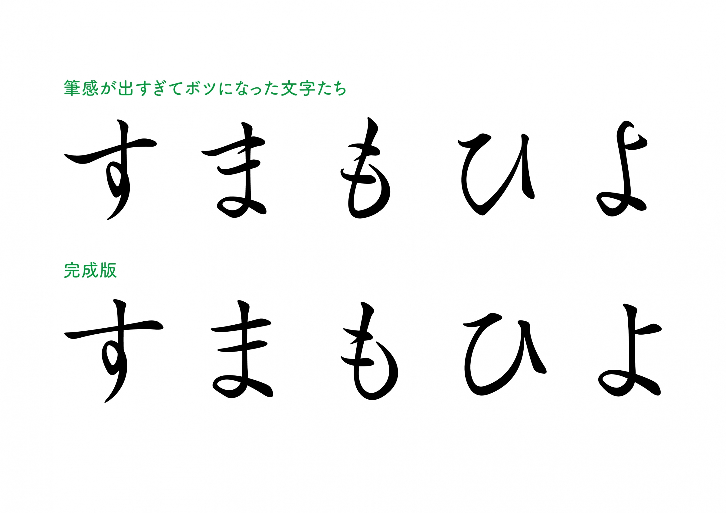
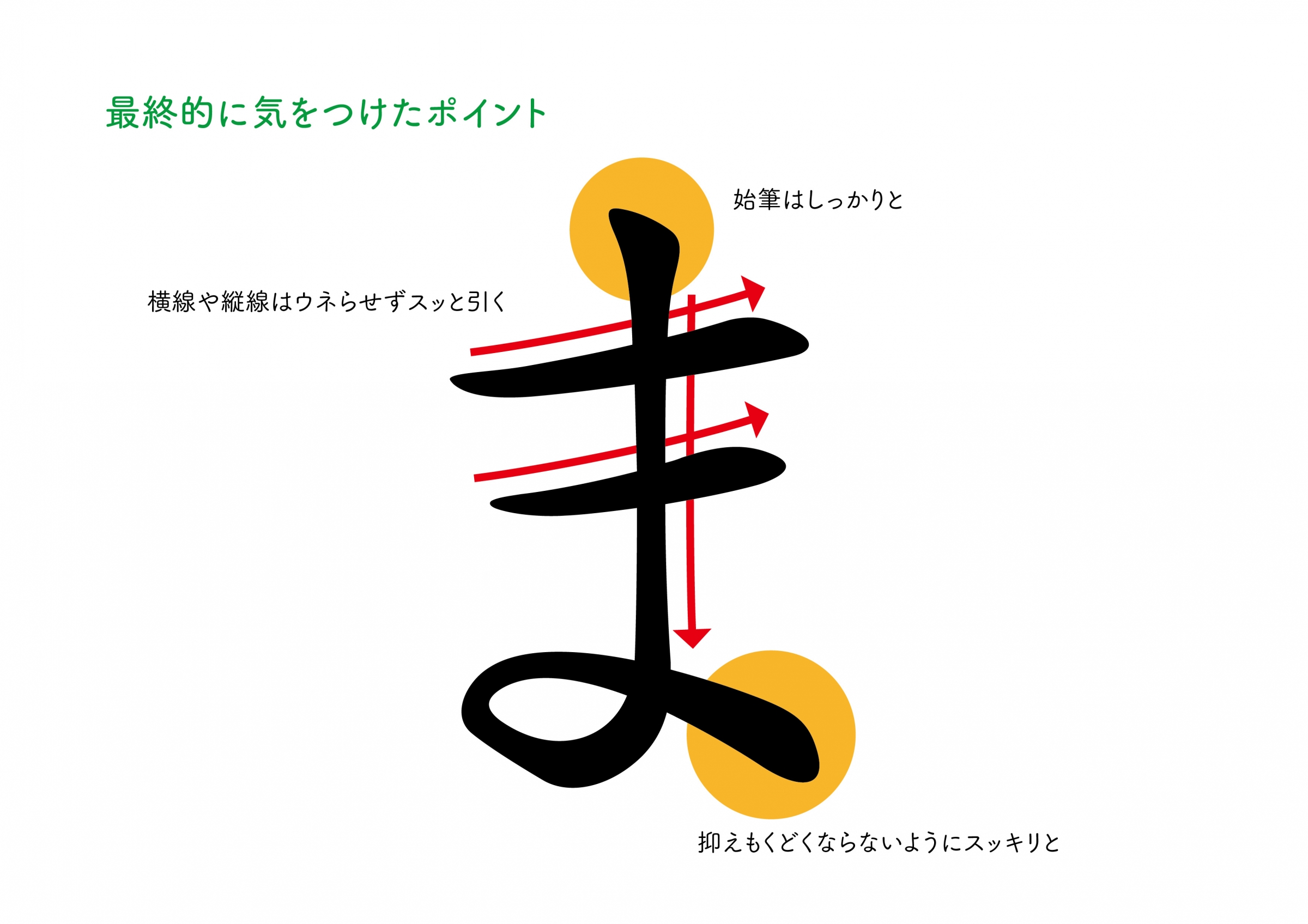
Greco 's kanji is a regular script, it has less brush-like writing than a regular regular script and has a mechanical design. I had to use a kana that fits that kind of kanji, but Fujita told me that I had to make a design that looked like a brush stroke, which I had to do when making my own typeface.
I felt that it was very difficult to make good products despite the restrictions.
It took us five years to release it, but I'm really happy that the typeface I worked on will be released, and I hope that many people will use it!
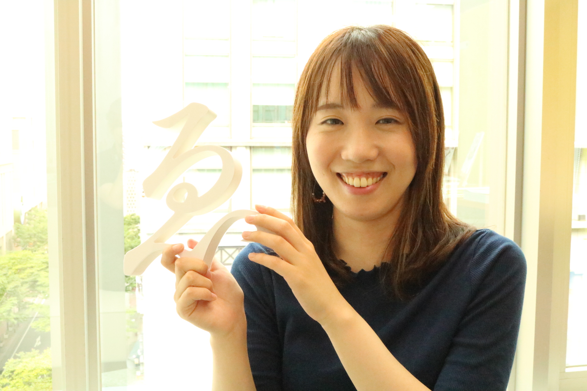
Introduction of Type Designers Kanae Yamamura

Born in Fukuoka Prefecture in 1991.
Completed the master's program at the Department of Arts and Engineering, Graduate School of Arts and Engineering, Kyushu University.
Joined Fontworks Inc. 2015.
Responsible for the production of pseudonyms for "New Greco
He continued to calligraphy when he was 6 years old, and became interested in fonts when he was in college, and aspired to become Type Designers