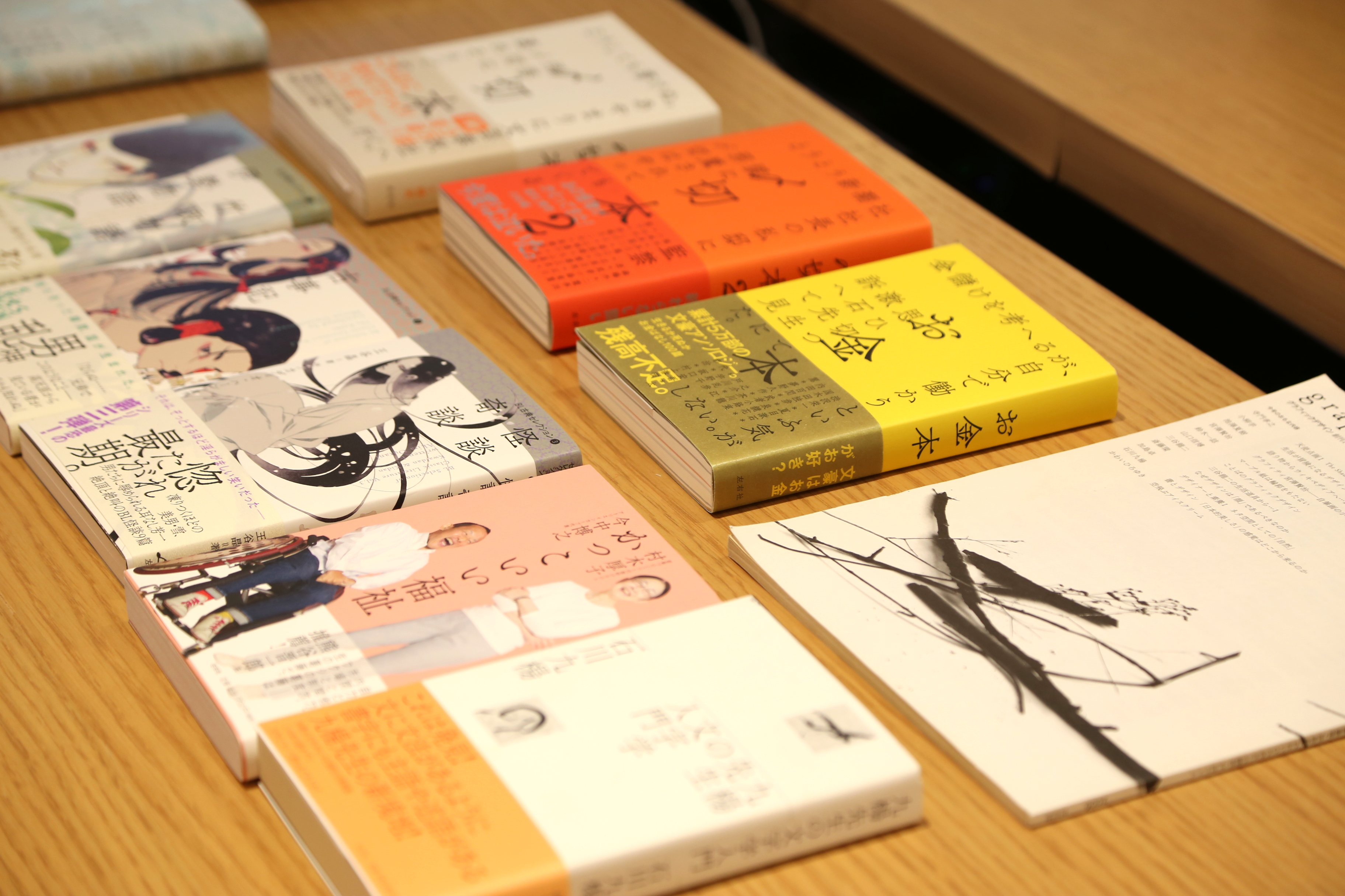
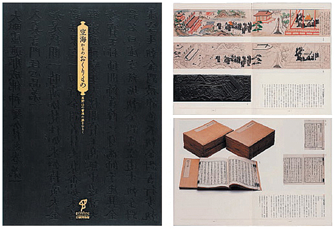
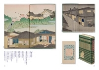
 展覧会「空海からのおくりもの 高野山の書庫の扉をひらく」の図録。 凸版印刷印刷博物館 2011
商品流通の強力な媒体であるカタログやポスターの表現技術を評したコンクール「全国カタログ・ポスター展」で経済産業大臣賞を受賞。本文には「筑紫オールド明朝」を使用。
 佐藤 篤司さま
杉浦康平事務所で働いていたとき、藤田さん(筑紫書体のデザイナー)が制作されている新しいフォントについて、杉浦先生に意見を求めにいらっしゃったことがあるんですね。そのとき、私にもどういったフォントが使いたいかと尋ねられたので、当時のデジタルフォントには存在しなかった丸ゴシックをリクエストさせていただいたことが、フォントワークスフォントを意識し始めた頃だと思います。
ちょうどその後にリリースされた「筑紫丸ゴシック」は、願いが聞き入れられたのか、写植時代に好んで使っていた書体の系統を汲んだような、まさに私が求めていたデザインのフォントだということもあり次にご紹介する「筑紫オールド明朝」と同じくらい、本当に良く使っていますよ。
「筑紫オールド明朝」を用いた作例をご紹介小村雪岱は大正から昭和初期に活躍した日本画家であり、装幀や舞台美術なども手掛けた現代的なデザイナーの先駆けと言える人物で、この本は雪岱の装幀を中心に紹介した作品集です。
大手化粧品メーカーの宣伝部に在籍していたことがあり、その会社の名前がついた書体は、彼が基礎を築いたといえば、装幀を含めたデザイン全般に才能を発揮していたことが想像できると思います。
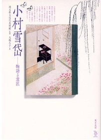
オフセット印刷が無かった時代に、木版印刷による20度刷り…といった驚嘆の技巧や、透明ニスのようなインクを使って光の加減で図柄が浮かんでくるような演出、前後の見返しにも多色印刷をするなど、今と比べてもはるかに豊かな佇まいの装幀の数々が紹介されています。
この「小村雪岱 物語る意匠」の本文にも、冒頭でご紹介している図録と同じフォント「筑紫オールド明朝」を使いました。 線が滲んで見えるとか、版ズレが心配という理由で出版社からはあまり好まれない方法なのですが、雪岱の作品との対比を考え、スミほど強くなく、敢えて濃すぎない色をカケ合わせで使うことで文字が浮き立つような工夫を取り入れました。
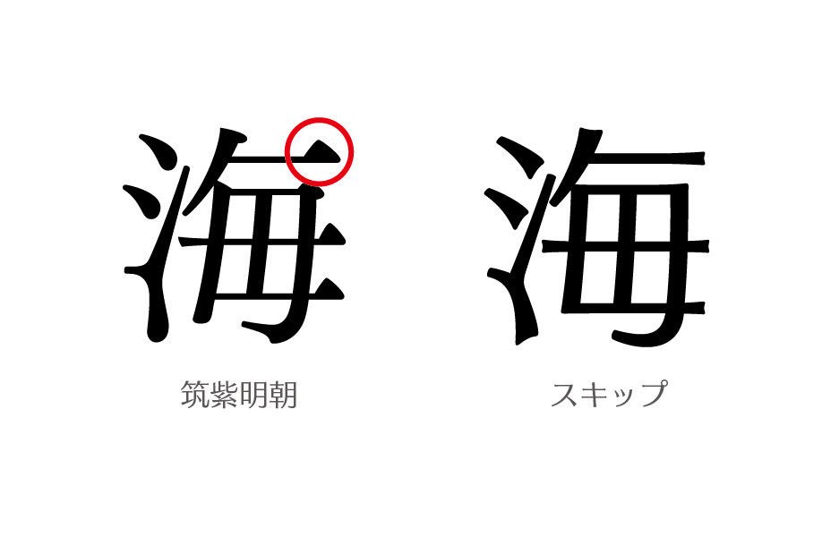
この書体は「クセ」がありますよね。もちろん、文字それぞれに動きが感じられるという良い意味です。明朝体はもともと、筆による字形を抽象化したものなので、デザインの中に手の痕跡がある書体なのですが、「筑紫オールド明朝」は字を書くときの手の動きの勢いが「ハネ」や「ハライ」に残っていて、デザインにスピード感みたいなものが感じられるところが特に気に入ってます。
他の書体と比べて少しこぶりなので、大きさを0.5~1級ほど上げて調整することが多いですが、和文だけでなく従属欧文にも強いこだわりが感じられるデザインになっているので、和文と欧文でフォントを使い分ける手間がないことも、使用頻度の高い書体の1つになっている理由ですね。
大好きなんですが、文字組み次第でパラパラに見えてしまうこともあり、実は扱いの難しい書体だなって思っているんです。好きなフォントだからこそ、気を使いたい、綺麗に見せたいという思いで使っています。
 小村雪岱 物語る意匠 東京美術 2013

大学ではグラフィックデザインの授業でタイポグラフィの講義もします。その中で、文字組の指導も行なうのですが短い授業時間のなかで、書体に対する美意識や繊細に文字組を調整することを徹底することの難しさを感じています。
 俳句を読む、俳句を作る 太郎次郎社エディタス 2011 使用フォント: ニューシネマA/筑紫A見出ミン
4世紀の中国ではすでに「書聖・王羲之」の名声がとどろき、書き文字の美醜が価値観として確立していたそうです。その後の官吏登用試験では王羲之風の文字が書けなければ合格できなかったともいわれています。そこから「文字は人なり」という話をするのですが、最近は文字を書く機会がなかなか無いからか、システムフォントが表示されるだけのスマートフォンなどの端末が身近すぎるからなのか、文字は単に“意味を伝える記号”といった認識が強くなっているのではないかと感じています。
紙の媒体が少なくなり、電子書籍などのメディアに移行してくると、文字組に対する意識が薄らいできてしまいますね。デザインが非物質化するといろんな弊害が出てくるように思います。版面はどの位置に設定するのか、余白はどのくらいとるのかというのもデザインを決定付ける要素です。それが、リフロー型のテキストだったりすると画面に併せて勝手に拡大縮小されてしまう。こうなると固定化された版面という意識が失われてしまいますよね。しっかりした基礎(よりどころ)と言うものがなくなってしまうのではないかと危惧しています。
当然、書籍もデータでいいもの、また形として残したいものといった感じで淘汰されるのではないでしょうか。大きなマーケットにはならないかもしれませんが、書籍はプレミアム感やステータスなどといった趣味のものになってくるかもしれませんね。私はあくまでも紙にこだわって、今後も“手元に置いておきたい”と思ってもらえるようなデザインを念頭に、仕事をしていきたいと思っています。
昔は、使いたくても印刷所がフォントを持っていないという理由で断念したデザインが多々ありました。もちろん、当時だってアウトラインをとって入稿すれば良いことではありましたが、本文で使用したいときなどは、後々の手間を考え、最大公約数的な手段を取らざるを得なかったんです。デザインにあった魅力的なフォントを使えることは、大切に保管しておきたい書籍となる大事な要素の1つだと、改めて感じています。
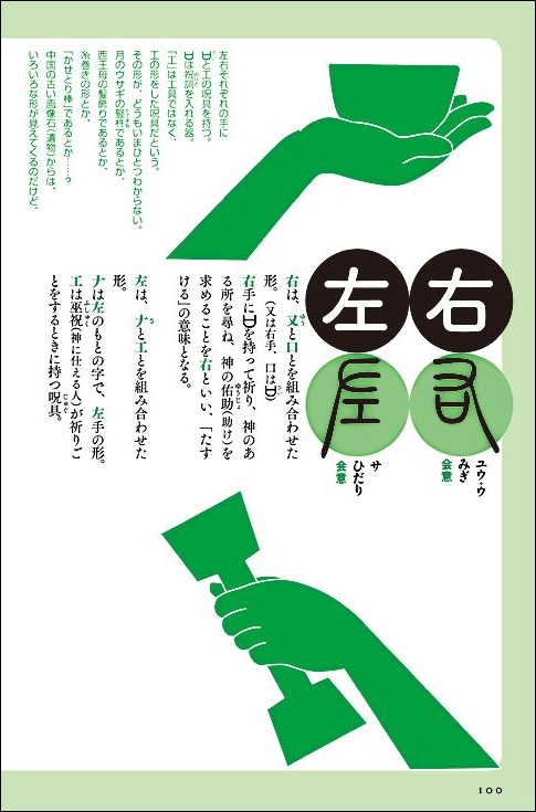 絵で読む漢字のなりたち 太郎次郎社エディタス 2010 使用フォント: 筑紫A丸ゴシック/ 筑紫A見出ミン/筑紫明朝
偉大な書家が書いていた字形、実は今の中国は簡体字なので使わないのですが、ほぼ繁体字を使う日本では当時の字形をそのまま、美しい文字で表現することができるんです。漢字文化圏の全てに誇れるような良い楷書体を作ってくださることを期待しています。
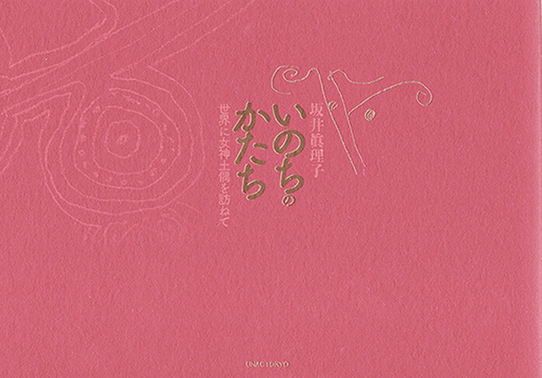
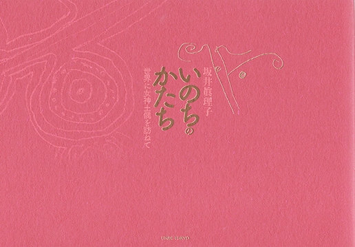
 いのちのかたち 坂井真理子著 UNAC TOKYO 2015 使用フォント:筑紫B丸ゴシック/筑紫ゴシック 世界の女神土偶のスケッチの本ということもあり、土偶のもつ丸みを表現できる書体を選定。
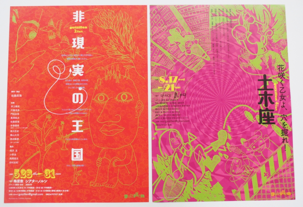 演劇公演 非現実の王国 2015/花咲く乙女よ、穴を掘れ!2016 guizillen 使用フォント:あおかね/筑紫B丸ゴシック 強く、ボリュームのあるあおかね。正方形に収まるようなデザインではなく、 どこかバランスが悪いように感じるところが面白いフォントで、短い単語で強い印象を与えることができたとのこと。
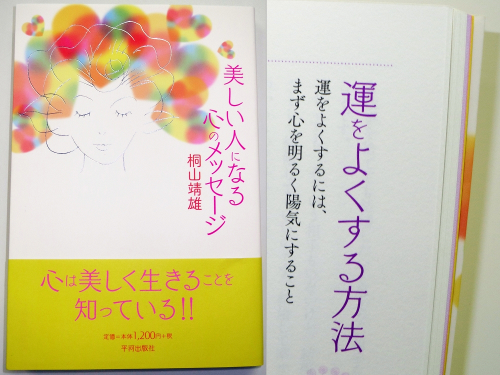 美しい人になる心のメッセージ 桐山靖雄著 平河出版社 使用フォント:パール/筑紫A丸ゴシック/筑紫オールド明朝 読者に女性を想定されていることから、柔らかいイメージを持つ書体を選定。丸ゴシック体ではなく、新鮮味のあるパールは、雰囲気作りに効果的だったとのこと。
さとう・あつし
1959年、北海道生まれ。武蔵野美術大学卒。卒業後、杉浦康平デザイン事務所勤務。2009年独立。以来、フリーのグラフィックデザイナー、武蔵野美術大学非常勤講師。辞書や学術書、一般書籍から雑誌、絵本、コミックまで、ほとんどの出版カテゴリーをデザインの対象とする。「空海からのおくりもの」展覧会カタログで全国カタログ・ポスターコンクール経済産業大臣賞。東京都在住。