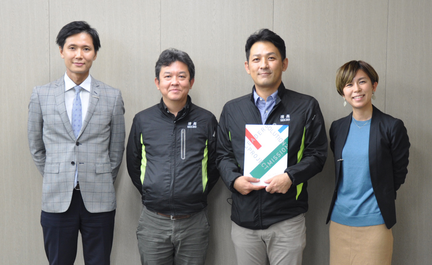
A typeface creator, a Type Designers, a typeface user, a binding house, and a seller, an editor.
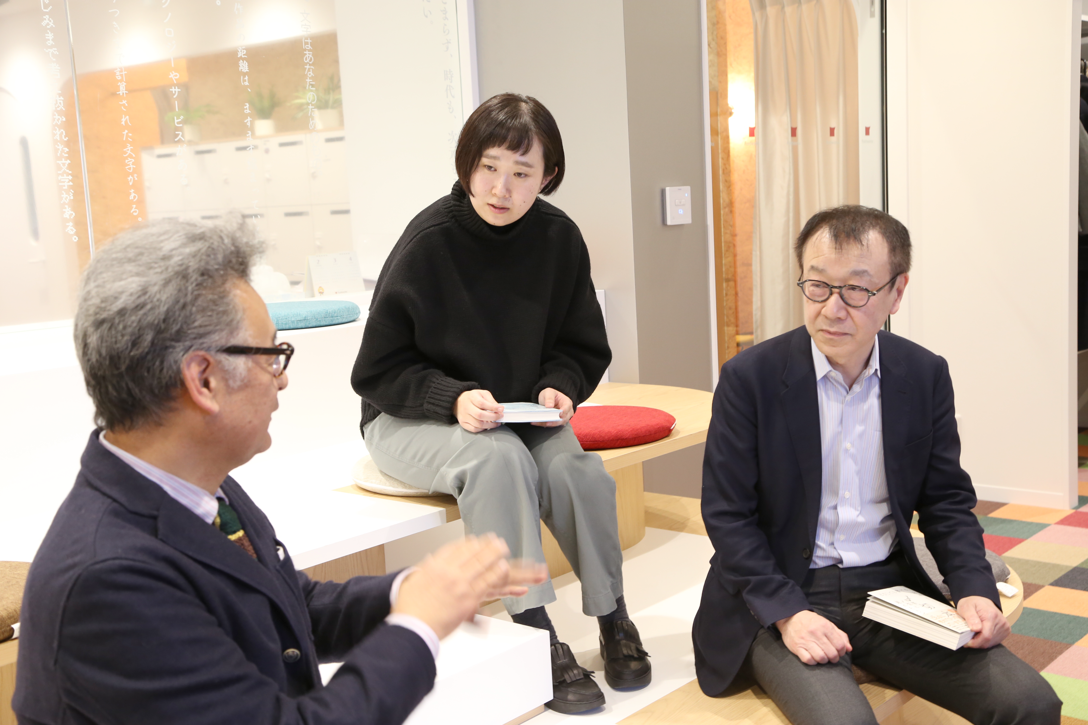
Chikako Suzuki, who is a bookmaker such as "Ikirimoto" and "Moneybook", whose bookbinding has been very talked about, Manabu Koyanagi of the publishing company of the right and left, and the Type Designers who is the creator of Chikushi typeface. Shigenobu Fujita.
We have realized a three-way conversation in different positions, which we met mainly in the Chikushi typeface.
Left: Manabu Koyanagi
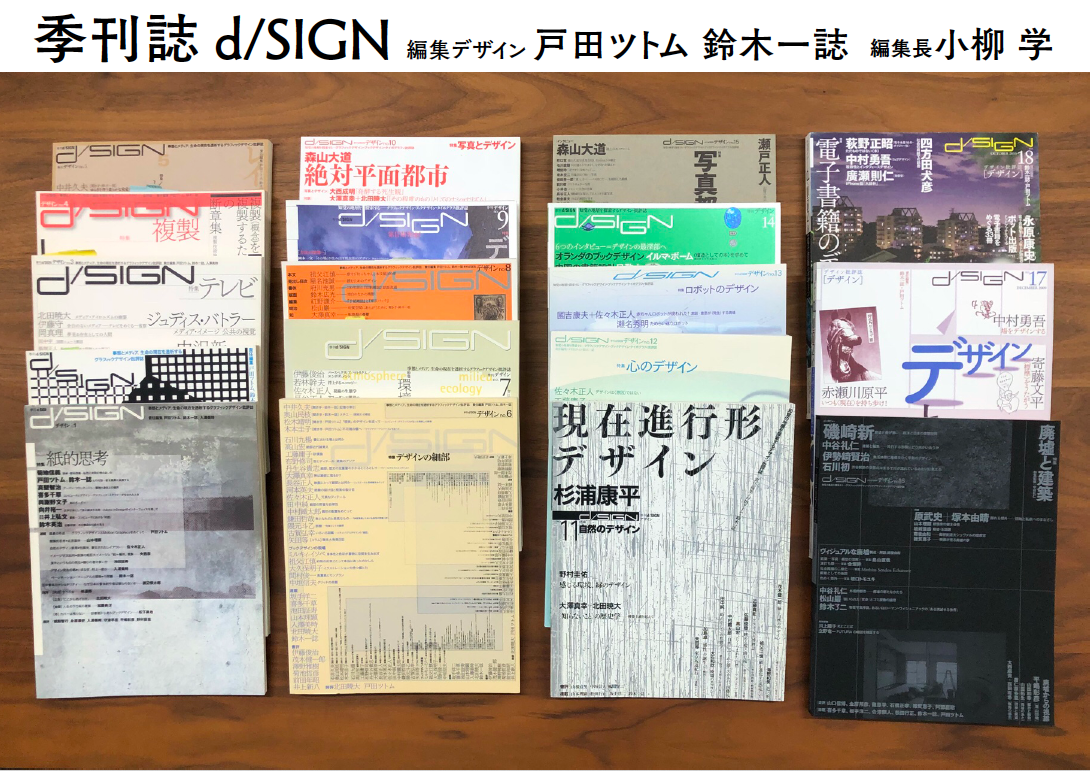
Born in Hokkaido in 1958. After graduating from university, he joined Shinshokan and was the editor-in-chief of "Dance Magazine" and the deputy editor of the thought magazine "Great Voyage".
After leaving the company, he was the editor-in-chief of the quarterly "d / SIGN". In 2005, he established the left and right companies and continues to the present.
From 2006 to 2010, he was in charge of the "selling books" section in the Asahi Shimbun book review section.
His book is "A book that makes Kenji Miyazawa so interesting" (Chukei Publishing).
Right: Chikako Suzuki
graphic designer.
Born in 1983. Graduated from Musashino Art University, Department of Design Information.
Enrolled in Bunpei Ginza since 2007 and has been freelance since 2015.
Engaged in design work such as binding.
Middle: Shigenobu Fujita
Born in Fukuoka Prefecture in 1957. Graduated from Chikuyo Gakuen High School Design Department.
Joined Shaken Character Design Department of Phototypesetting Machine Co., Ltd. in 1975.
Fontworks Inc. in 1998 and developed many typefaces including Tsukushi typeface.
In 2016, appeared on NHK "Professional Work Style".
Received the 2010 Tokyo TDC Award. Received the Tokyo TDC Award 2018 Type Design Award.
My first encounter with TsukuMin was "Maybe it's not suitable for novels."
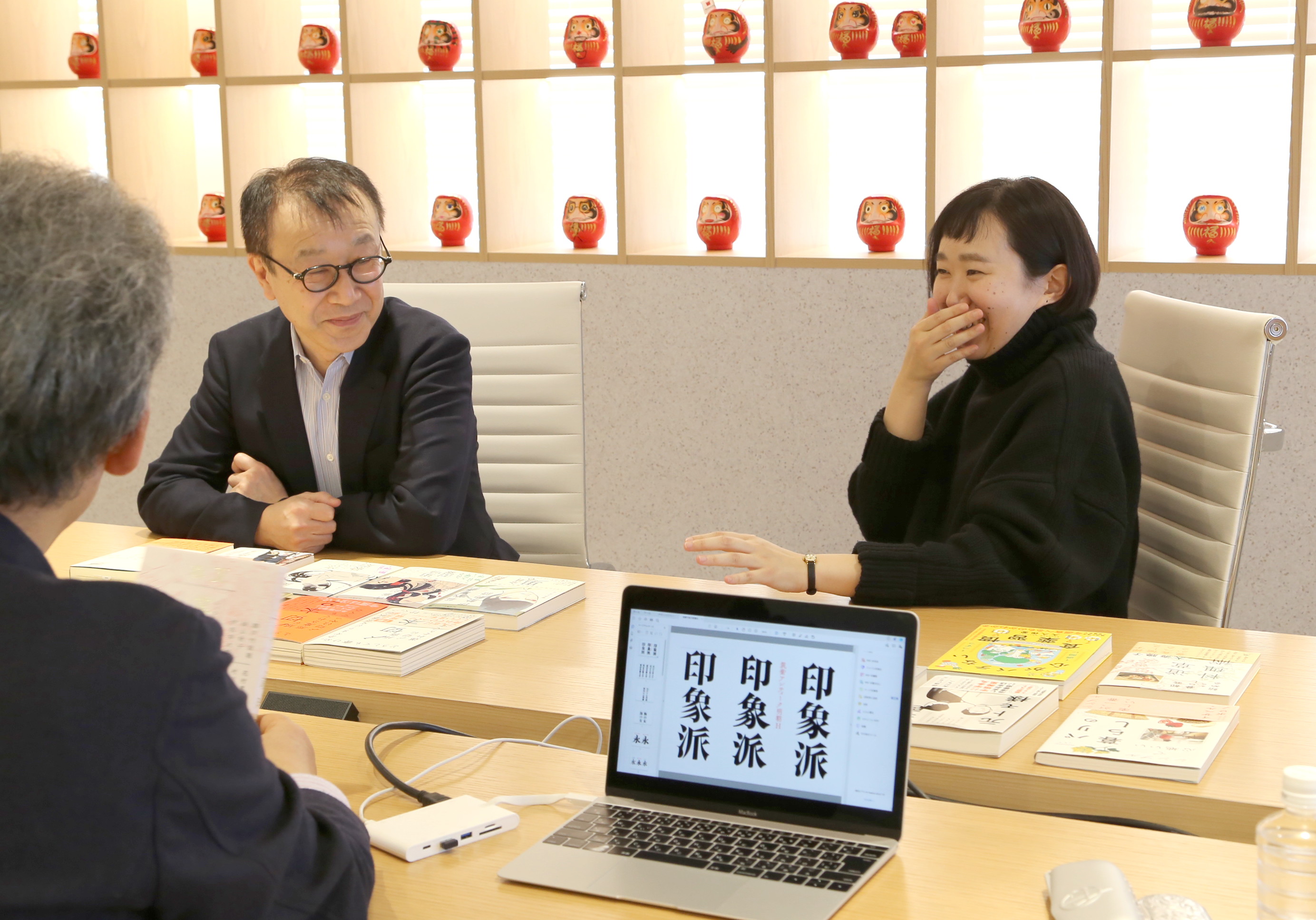
--Please tell us how the three of you met.
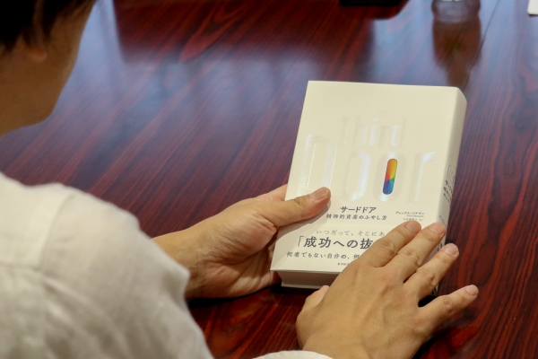
Fujita: I was with Mr. Koyanagi, who was the editor-in-chief of the quarterly magazine "d/SIGN", when I interviewed Mr. Toda Tsutomu for No. 9. On the way back to the station after the interview, Mr. Koyanagi said, "TsukuMin-L is a perfect fit for this book!" But then he said, "But it's not suitable for novels!" That's been stuck in the back of my mind.
Last November, the Fontworks Event "Moji Fes." was held in Shibuya for two days, and since Sososha is in Shibuya, I had the opportunity to meet him for the first time in over a decade. At that time, we talked about Suzuki-san, who uses a lot of Tsukushi typefaces, and I thought I would like to meet him someday and hear more about his work, which led to this discussion.
Koyanagi-san: I think I said that. I did say that (laughs). Thank you for that time.
Fujita: Nice to meet you, Mr. Suzuki. That's right. Through Chikushi you can meet many people. I'm really happy.
Suzuki: Yes. Nice to meet you. However, I have been taking good care of the Tsukushi typeface for a long time. I Bunpei Ginza It's about the time I first started to go to.
The uniqueness of TsukuMin-LB
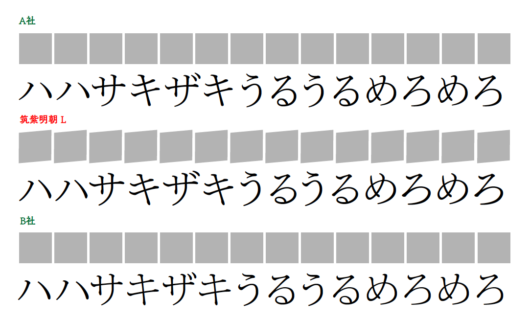
--When I think of TsukuMin I think of L, but is it LB instead of L?
Suzuki-san: I think where designers learn to typeface Text text varies greatly depending on the designer, but Yorifuji (Bumpei) was actually a big fan of TsukuMin LB, so he learned to typeset Text in TsukuMin LB.
At that time, Yorifuji was creating his own analysis table of the cross distribution of typefaces, and he always talked about how TsukuMin was created with an exquisite balance. I remember that very well.
Of course, I still use TsukuMin LB, but it's a typeface that I'm very attached to and that has a big presence in my life.
Fujita: The LB is black, and because the horizontal image is thicker, the horizontal line does not fly even if it is outlined. But originally, I think it's just LB, which is fine. However, if you suddenly put out this as a normal weight L, a different feeling would appear in a general sense, so I decided to release L as a normal L and release it with a weight of LB. I personally like LB.
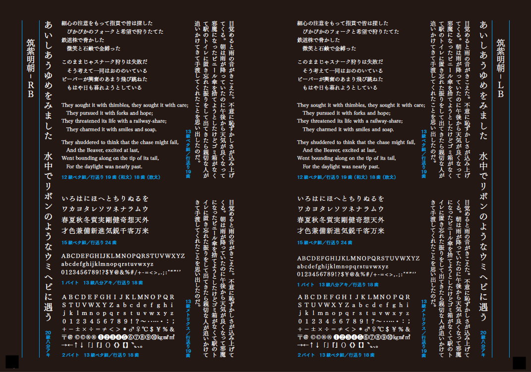
Suzuki-san: If I had to choose between L and LB, I would overwhelmingly only use LB. I use LB as Text text for humanities documents. Compared to other fonts, the Weight doesn't seem to be well balanced.
Fujita: Mr. Sobue (Shin) is like that too. He's LB, not L.
When I was at Sha-Ken around 1975, I was impressed by the Honran Mincho L, which was very modern. It was the complete opposite of rural customs and traditions, and was very urban. It was dry and the relationships were straightforward. Honran Mincho didn't have that rural feel, it was very urban. It was L, but the automatic machines at Sha-Ken at the time made the horizontal lines easy to skip, so they were made thicker. Depending on the print, it looked like a thin gothic with scales even though it was a Mincho typeface. In particular, the horizontal lines of the old Sha-Ken version of ILM, Iwata Mincho, were intentionally made thicker. I really liked that feeling. I thought that if I ever had the chance to make something like that, I would like to make something like that. So TsukuMin was my own reproduction of that kind of thing.
I was talking about this to Yorifuji-san too. "And there's one that's even tighter, I'm thinking about developing that." He said, "That sounds interesting. Please make it." Later, the result was TsukuAntique Mincho.
Recently, fonts designed in a style similar to Tsukushi typefaces, "Mincho typefaces with a thin Gothic look and scales," have become more common. Sobue-san told me, "You made the thin Mincho typeface, which has no difference in Weight between the vertical and horizontal strokes, popular."
Thin Mincho fonts with little difference between vertical and horizontal strokes exude intelligence. I think TsukuMin L and LB look like that. In contrast, TsukuOldMin R has a clear difference in Weight between vertical and horizontal strokes. It exudes intelligence as well as vulgar sexiness.
The sense of distance from the reader is just right regardless of style.
Fujita: As Mr. Koyanagi once told me, TsukuMin is more suitable for academic papers than novels. That's why I developed TsukuBMin, thinking it would be necessary for novels as well.
When we released TsukuAntique Mincho, I was worried that it would be used in Text, but there are still some hurdles to overcome.
Suzuki-san: Yes, that's right. I use it a lot for Heading and stuff.
Fujita: Yes, they can be used on the cover, preface, or afterword, but they are rarely used in the main Text.
Koyanagi: For books with a certain level of sophistication, I think Tsukushi is the typeface for books written by book lovers. The readership of Sososha is made up of a large number of book lovers, so I think Tsukushi is a perfect fit for them.
Suzuki-san: The sense of distance between the reader and the author is just right. I think there is an appropriate sense of distance that can be read, regardless of the style of writing.
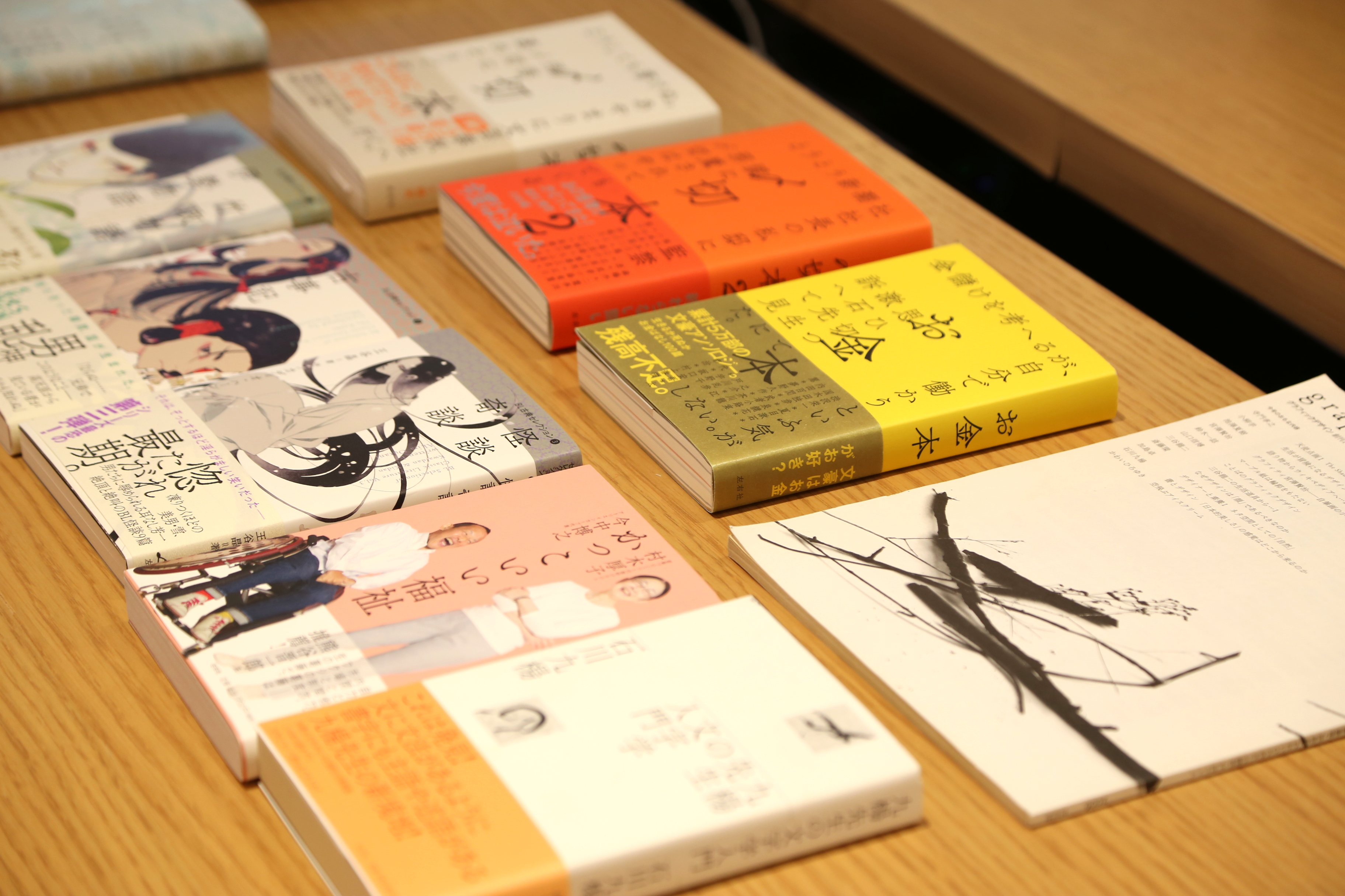
TsukuAntique Mincho has great visual power.
--Both TsukuAntique Mincho and Tsukushi Q Mincho are used quite a lot.
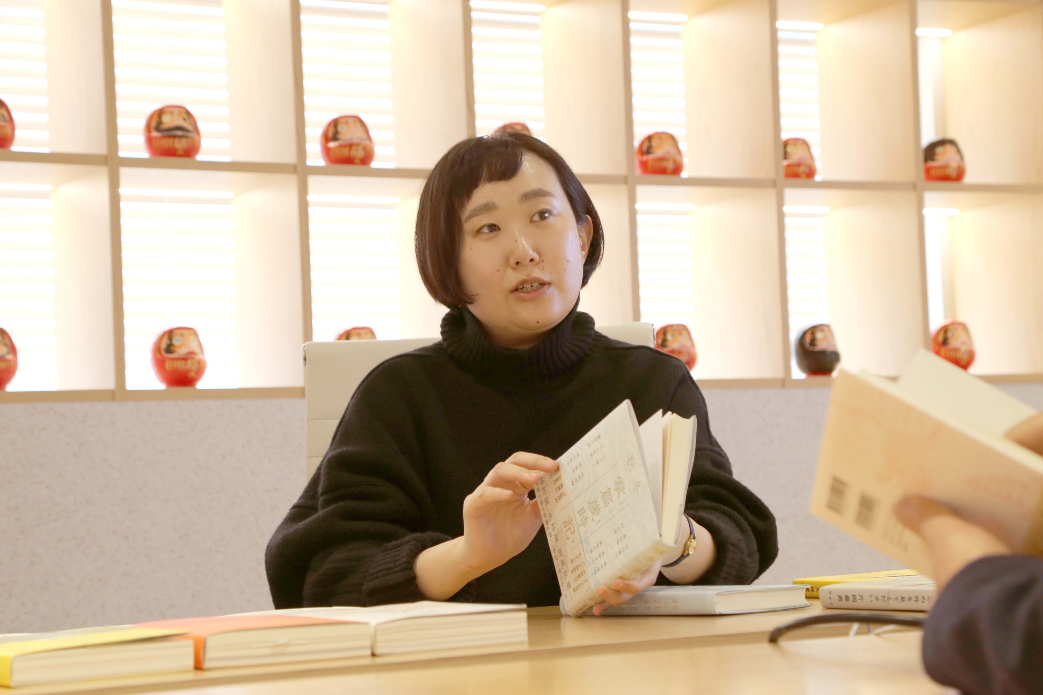
Suzuki-san: When I'm designing a book, I almost always use TsukuMin or TsukuAntique Mincho. TsukuAntique Mincho is visually strong, so when I switch to TsukuAntique Mincho, it seems to work perfectly. That's the kind of power it has. I rely on it a little too much sometimes (laughs).
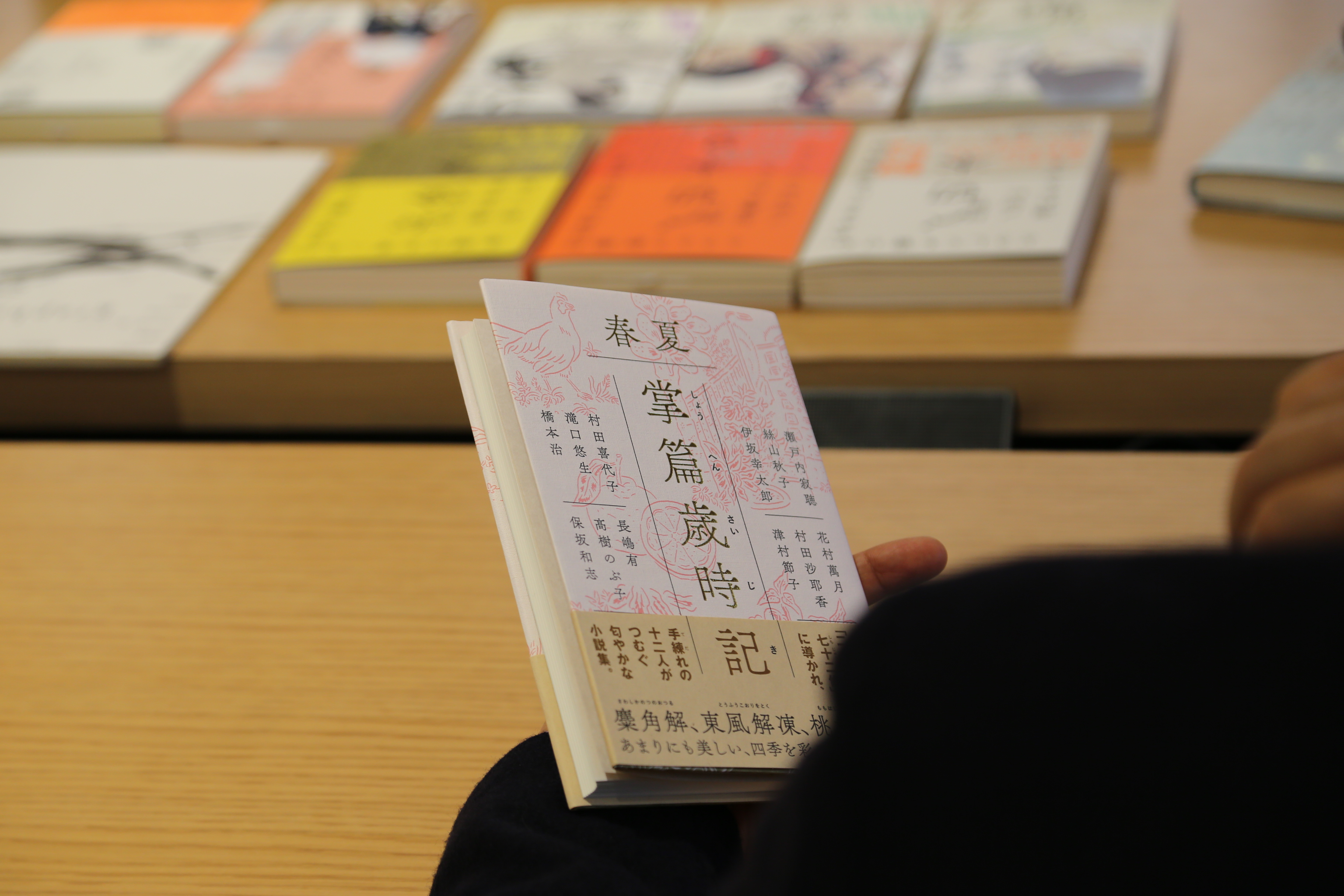
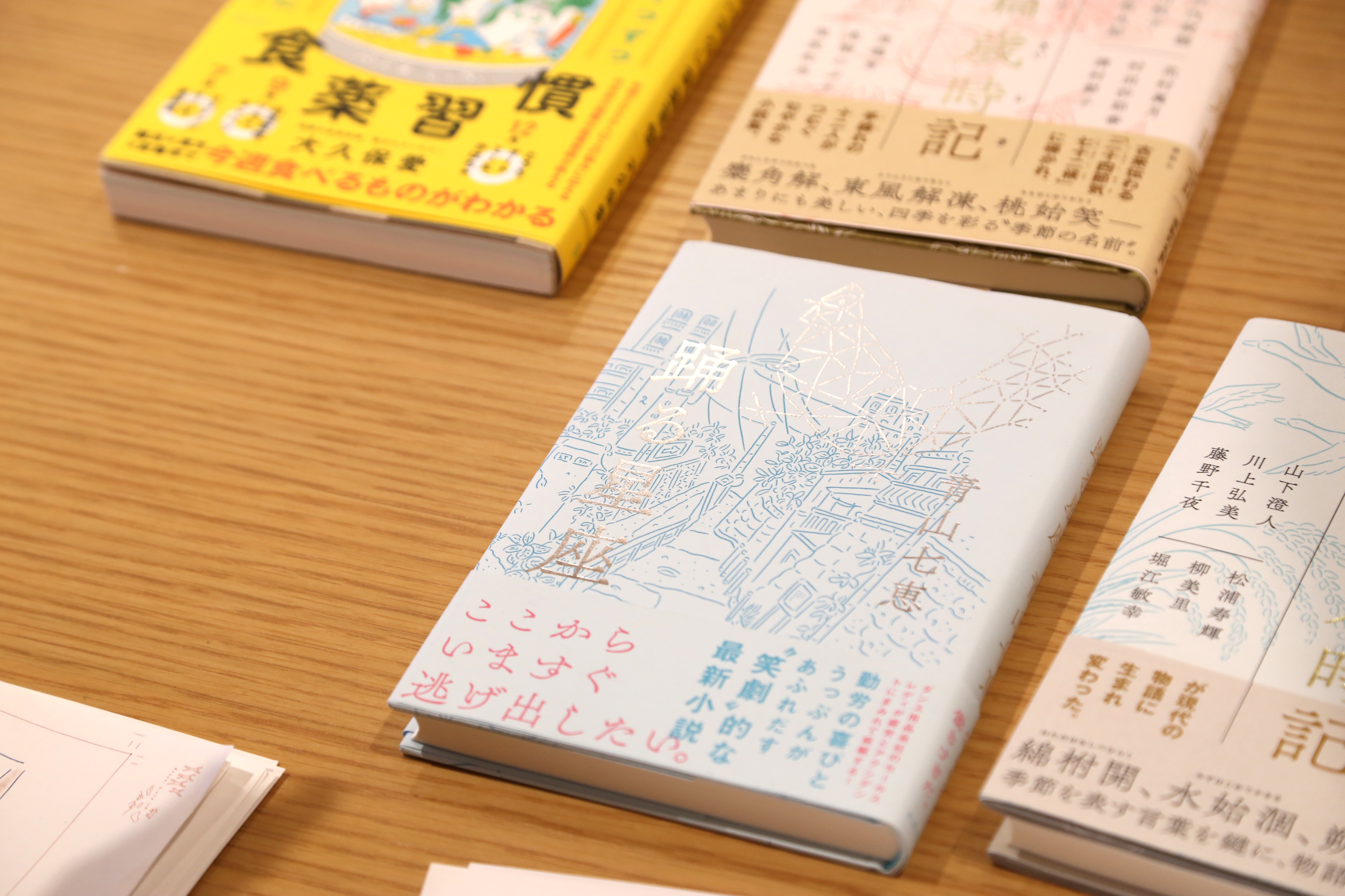
Suzuki-san: As for "Short Stories of the Seasonal Almanac," it's an anthology, so each story is written by a different author. Also, because it's a seasonal almanac, everyone writes according to a seasonal theme. That's how the front cover is made, but when I work on book design, I start with Text before the cover, so when I made this front cover later, the editor was pleased that it matched the theme very well.
Fujita: That's great. So, from the perspective of someone who makes fonts, I'm really curious about what typefaces were used here in the days when there were no TsukuAntique Mincho or Tsukushi Q Mincho. In that case, did they use the same typeface as the content?
Suzuki: In that sense, different designers may have different ways of thinking, but Text is often constructed in Text way, so one approach is to unify the typeface of Text and the typeface on the title page.
In the case of the front page, it is the face of the whole book, so when I bind it, I often match the font to the cover. Speaking of the front page. In that case, what kind of characters would have been on the cover in the days before TsukuAntique Mincho... it's difficult. Perhaps, in the case of this book, if there is no font, there is the option of creating the characters and lettering myself, so I just thought that if it was just the front page and the cover, I might do that.
Considering that, I was attracted to the fact that it has such powerful visual appeal.
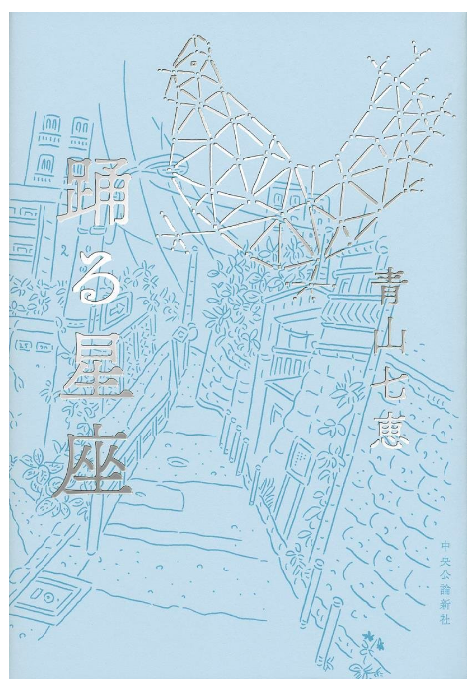
Suzuki: For "Dancing constellation", I want to use this "Ru" from Chikuushi Q Mincho. This was completely decided in the form of "ru".
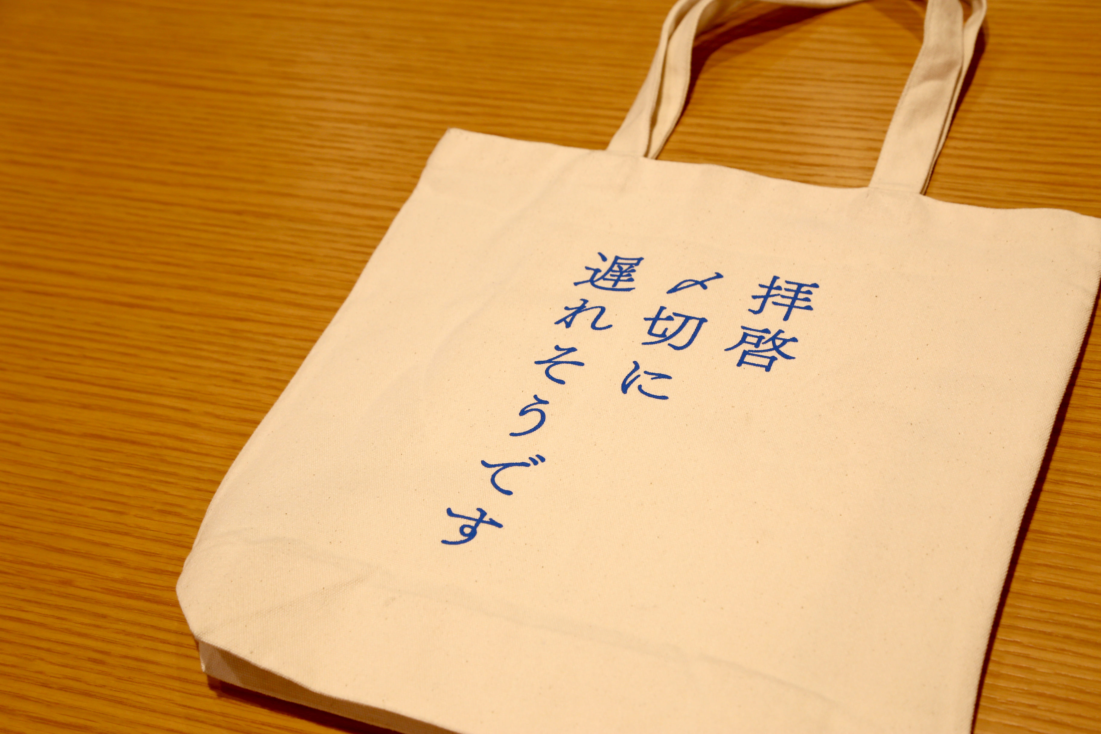
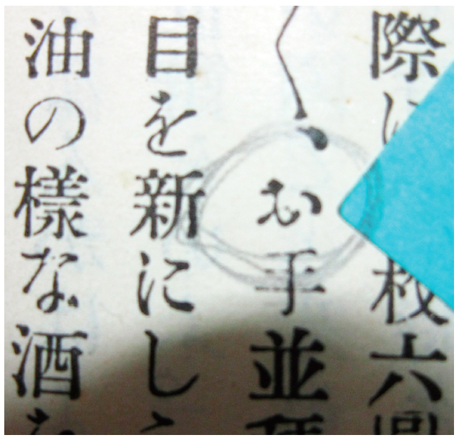
I saw the character "〆" and chose TsukuAntique Mincho.
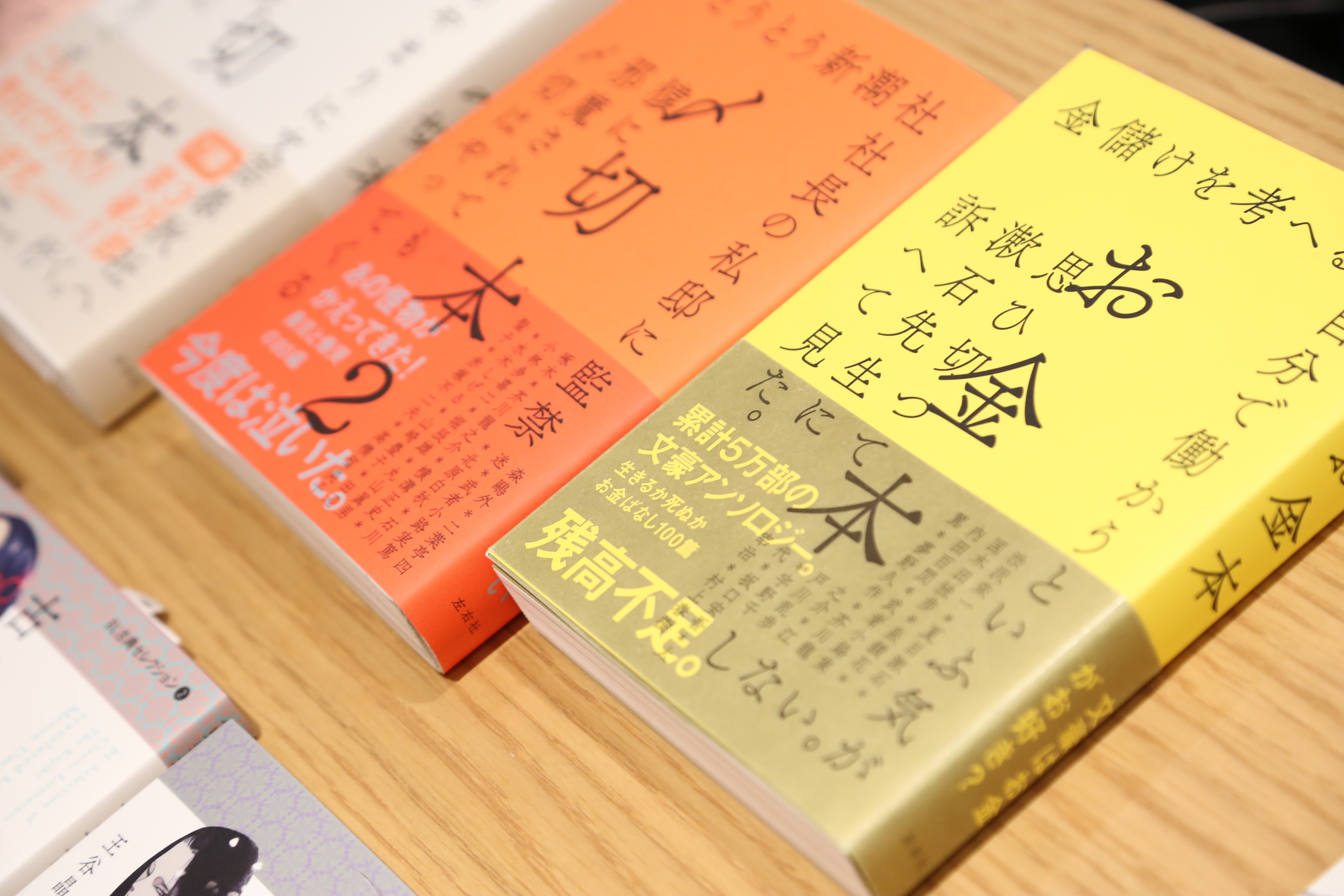
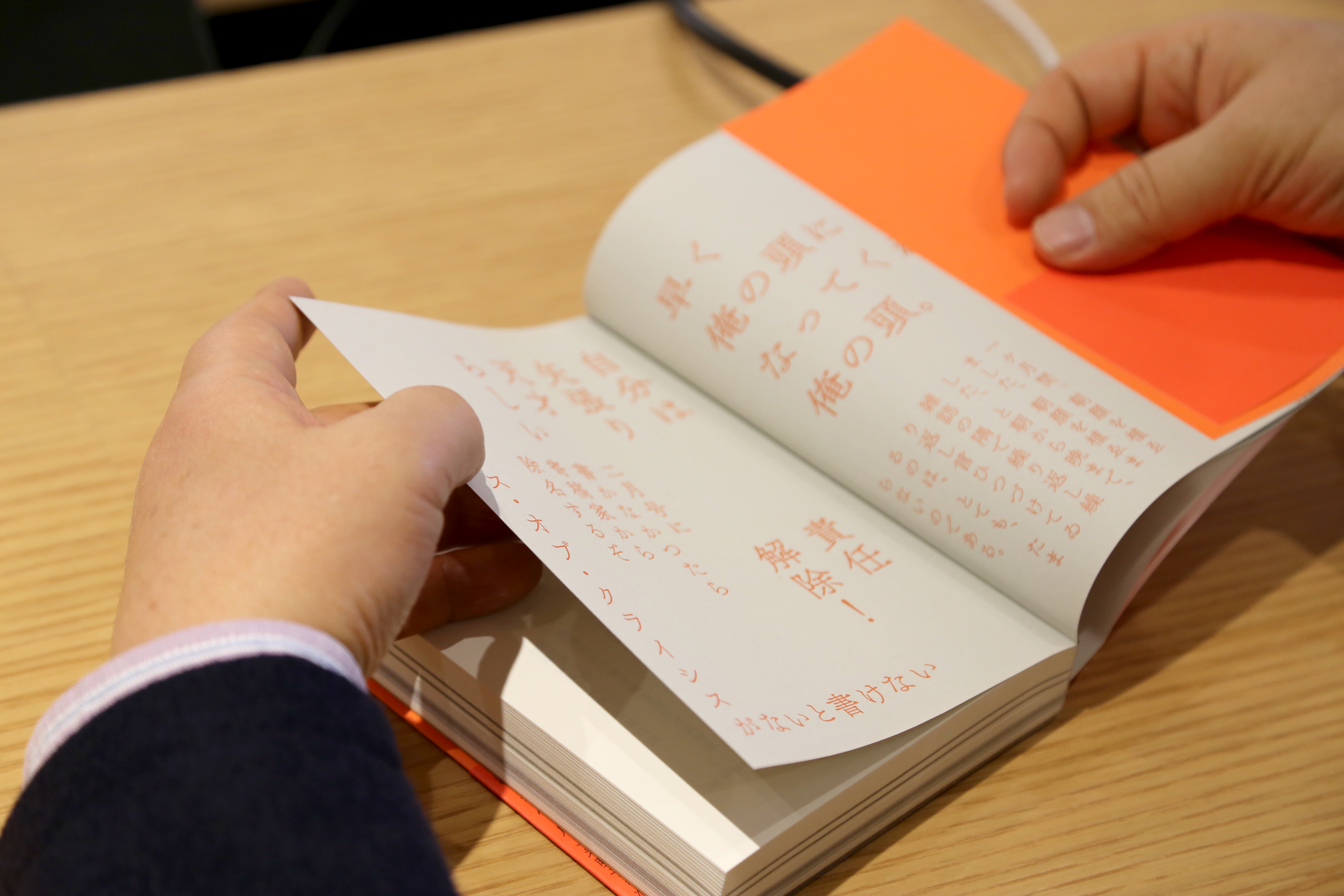
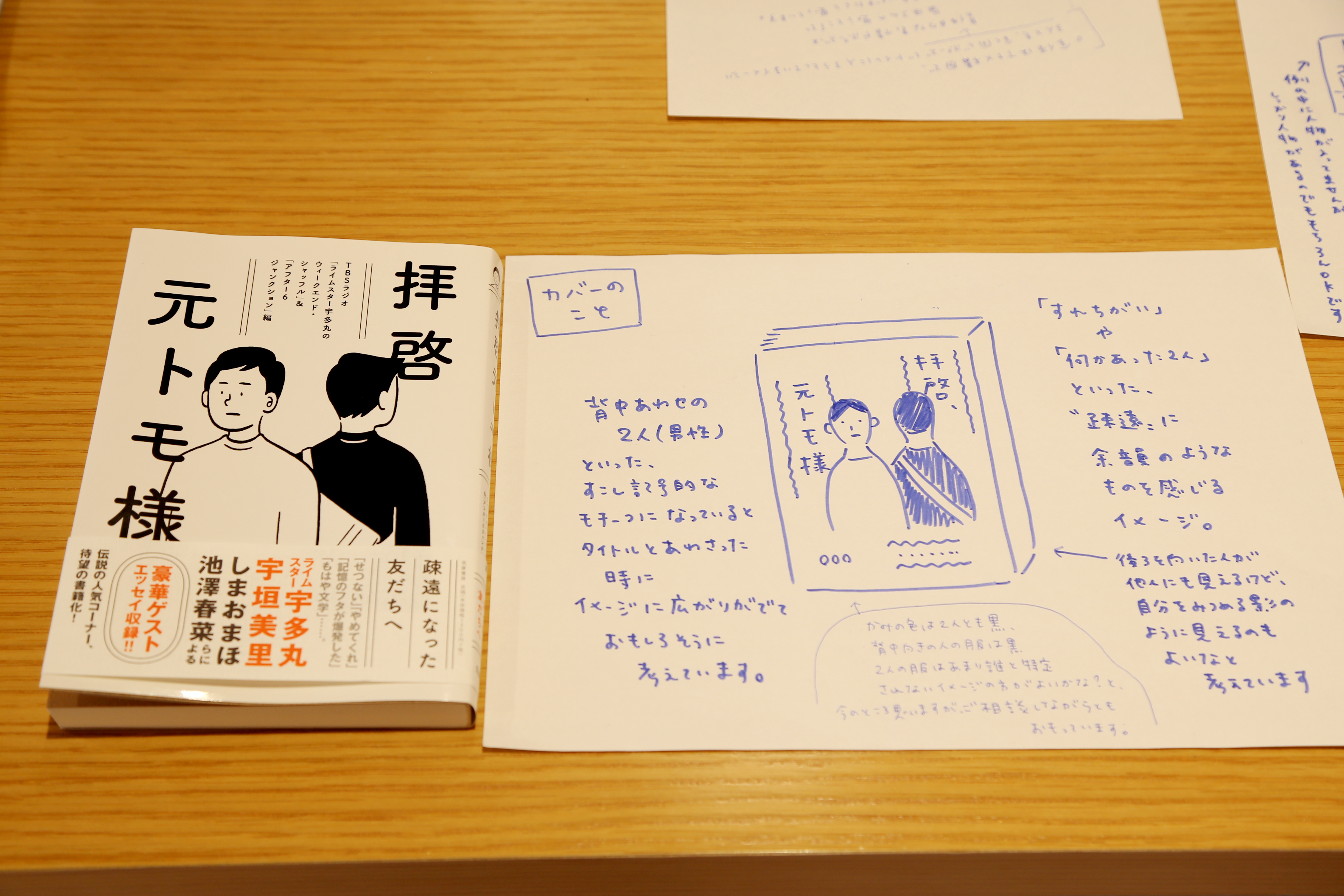
Fujita: The "Deadline Book" was quite shocking. The contents are exposed on the surface, aren't they? This technique is the Sugiura (Kohei) technique, isn't it? He used photographs and illustrations. This one has the text inside exposed on the surface, which I thought was quite interesting.
Suzuki-san: During our meeting, the editor said that he wanted to include the line, "I just can't write it...", but he also said that there were other interesting words in the story, so the first thing that came to mind was that it would be more interesting if those words were at the forefront.
Sometimes, by turning the words themselves into visual pictures, you can give the words more meaning, and this was one such challenge.
As for this deadline book, there were already a lot of words coming out of the writers, so that in itself was powerful.
As for the font, I saw the character "〆" and chose TsukuAntique Mincho. I thought "This is it!"
Fujita: Surprisingly, the character 〆 isn't very interesting in any of the typefaces.
Koyanagi: There's quite a big difference depending on the font.
Fujita: When I was designing, if I designed normally, it would end up like this. But I thought it wouldn't be interesting. When I see "〆" written in brush strokes, it looks cool. I wondered if I could make it look this cool in Mincho font.
The "〆" in other fonts has little movement. Tsukushi font is more about showing the movement of the hand through the strokes, which I think makes it look cool.
Koyanagi: Mr. Suzuki's suggestion for the "end book" is designed with a lot of words from the artist in return. I think the artist's urgency is incredibly similar to the tense feeling of Chikushi typeface. If this is a newspaper typeface, I don't think there is a deadline.
Fujita: Personally, I'm glad that "〆 Kiribito 2" used full-width 2. The design of this 2 is unlikely.
Suzuki: I looked great. "2" What should I do?
"Sound" from Chikushi typeface
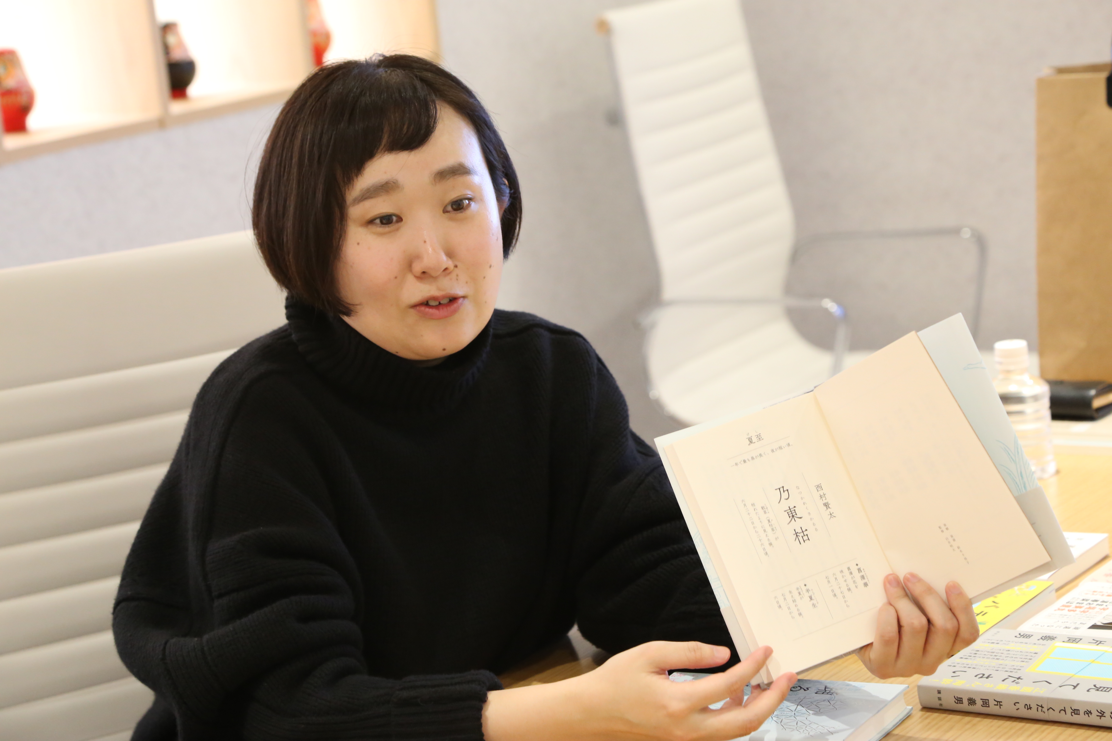
--When you design a book, do you read the contents first and then start designing?
Suzuki-san: Yes, I read it through first.
As for the "Deadline Book," I read it piecemeal because each chapter needed a format. Rather than creating the outside, it felt like I was helping to create the book.
Koyanagi: There are quite a few readers who bought the book because of the cover design. I'm grateful for that. And it's a design made up of letters. Fujita's typeface is easy to recognize at a glance, but when it comes to "Deadline Books," the design speaks to you even more. It's like you can hear a voice. Before I came here today, I asked a staff member about the Tsukushi typeface, and he said that he could hear a voice.
Fujita: When you typeset text in good Mincho font, the text makes a "sound." For example, an announcement in a department store saying, "Thank you for visiting us today." If that were MMOKL, I imagine it would sound like a soft, beautiful announcement in a high-end department store. If it were just Mincho font, it would sound like a normal person speaking in a monotone.
The world is overflowing with the digitalization of metal typefaces from Tsukiji and Shuei. Unlike the plain typefaces from the phototypesetting era onwards, the brush-drawn feel is highly valued. I had thought that I would take my time to create something with that brush-drawn feel someday in retirement, but when I meet with Sobue, he shows me some interesting things.
It's the character "o" from a book from the Meiji period, but there's no space at the end of the knot in the lower left corner. The moment I saw it, I wondered if I could use this interesting style to create the Japanese syllabary. That's how I created TsukuOldMin Type B. If I was going to make one anyway, I thought I might as well make my own version of Tsukiji 36po. Generally, with Type B or Type C, I find a single interesting character and then use it to create the Japanese syllabary. So even if it looks like Tsukiji or Shuei, it's completely different when you look closely. That's the way I create mine.
Creating the Japanese syllabary from the "o" found in books from the Meiji period (TsukuBOldMin)
Old Styles but modern
--This is TsukuOldGothic.
Suzuki-san: I feel that TsukuOldGothic has a sharp feel. Moreover, even though it is an old Styles, it looks like a modern book when typeset. I also like B1 Gothic, but it is originally a phototypesetter typeface, and it feels like it was made by trial and error, so it has a texture or a handmade feel to it... I choose the occasion to use it, but when I want that kind of feel, I use B1.
TsukuOldGothic gives off a sense of nostalgia and warmth, and it exudes an atmosphere that is both modern and old-fashioned.
Fujita: Some designers have described TsukuOldGothic as mellow and mature.

The important thing is "readability" rather than readability.
Koyanagi: What I have always thought about in Chikushi is that it is fashionable and delicate. The readerships of the left and right companies are especially good because there are a lot of people who like books, but what I thought about again is that I feel the movement of the brush. It's cool to look at each character, but if you put them side by side and make them vertical, it's more power. In short, it's easy to read. I was wondering why, but the momentum of the brush remains in the letters. I had such an impression.
Fujita: Mr. Kazuyuki Suzuki is told that "Tsukushi's horizontal composition is unique and the best". That's because we are connected. The impression that the other typefaces are neatly aligned in the eyes of the board. It seems that the letters have stopped and there is no cooperation with each other. However, in Tsukushi, you can see the movements linked to each other, so horizontal writing goes smoothly. Of course, there are also preferences, and some people like it and some hate it.
Koyanagi: If the text is a vehicle, it feels as if you are reading it naturally while following it with your eyes. Rather than consciously reading in the brain.
Fujita: I have a typeface for Text, and it's easy to read. But it's an old theory, but the important thing is "reading comfort." If you compare it to clothes, it is more comfortable to wear than easy to wear. To read is an act in which the line of sight traces the "line". There is an uneven "resistance" in the shape of the letters. Whether or not the "resistance" is irresistible, pleasant or unpleasant, decides whether or not to use the Text Mincho body.
When I write a long novel with a wide-spread newspaper typeface, I get tired of the sight. More specifically, the reason why Ming Dynasty is chosen as the long sentence rather than Gothic is because the design of "Kanji" and "Kana" is completely different only in Mincho. All other typefaces have the same touch design. That's why I'm tired of vision when it comes to feature films. That's why only Mincho can read a 300-page long novel without getting tired. Because the kanji and "kana" are different, there is a change and I never get tired. Chikushi has designed a kana design that gives a comfortable reading rhythm because of the kana design in which the speed of movement of the brush is visible.
Koyanagi: Kana and Kana are completely different. Kana is more brush-like. Hiragana has no meaning in Japanese, so you should just read it. Kanji has a meaning, so slow it down for just a few seconds. That's what you see in the typeface. I think it is calculated and made.
Fujita: By verifying the readability, I will repeat reading after forming many times.
I focused on the readability rather than the readability when reading. As for readability, it is easy to read what you have seen most. Familiar ones are the easiest to read.
--When you design a book, do you take into consideration the "strokes" of the typeface?
Suzuki-san: As for Text composition, I do exactly what you said, and I try to make it comfortable to read. Being easy to read is a functional thing. To put it more simply, I think that the moment it is made into a typeface, it has the function of being easy to read.
I don't know if it's appropriate to say that it sits well, but we do test whether the font sits well by changing the font on the same page.
When I'm finishing the final design, I always adjust the spacing between characters, and when I'm thinking about how to narrow the characters down in the middle of the night, I can definitely feel that with Tsukushi, each character gradually connects together and fits perfectly into place. Each character in TsukuAntique Mincho is cool and complete, and I get a great sense of pleasure when narrowing the characters down. I think there's a sense of comfort in that, too. It's like the margins and the spacing between characters are all calculated.
Koyanagi: The white space is cool too.
Fujita: Ming Kana characters are generally designed to slope slightly to the right. However, most people don't notice this. TsukuMin is designed to slope even further to the right by about +2 degrees. When typeset horizontally, the effect of those two degrees creates a ripple-like effect that helps the eye move smoothly and lightly, which is very comfortable. As with kanji, Tsukushi values the momentum of the characters while maintaining uniformity of space. If you only focus on uniformity of space and there is no momentum in the characters, it's not interesting at all. It's just too serious, isn't it?
In pursuit of such fun that is everyday but never boring
Fujita: From now on, we will be increasing the weight family of TsukuAntique Mincho and TsukuAntique Gothic, and will also be making Heavy.
Suzuki-san: I'm glad that both Gothic and Mincho fonts have Heavy weights. When I'm looking for a really bold font, it's hard to find one, so I end up making my own.
For example, I have almost no knowledge of Mincho fonts with extremely thin horizontal bars and extremely thick vertical bars. So I thought I would try my best to create the characters.
Fujita: In the past, until the middle of the phototypesetting era, there were only thin to extra thick, what would now be called E weight. Then, with the appearance of "Gonna-U", people wondered, "Was there such a thick typeface in the world?" And then the era of weight U came. However, from around 2000, people started to think that using thicker types was a design from the era of our parents. And then, the trend started to shift to using only medium-thick and thin typefaces.
That's why I want to create an era of super ultra thick hair once again.
That era was defined by a simple Gothic font called "Gona," but I want to develop it in the old modern Ming style.
When something becomes popular, thick hair is passed on and people start to see thick hair without feeling out of place. I'd like to see that happen in a few years.
Koyanagi: Is there a reason for that? Thick hair was popular in the 90s, thin hair was popular in the 2000s, and now thick hair is back again.
Fujita: Clothing trends are becoming thicker, thinner, longer, shorter, and so on, spiraling upwards and rotating in circles. I feel like the arrival of the era of Heavy typefaces is right before our eyes. I hope that this typeface will become the central one.
There are three elements to a bookbinding: photos, illustrations, and text. Sometimes there's just text, sometimes just photos. Text accounts for one third of the total. I think people will be happy to see the variety of options available in that area.
It's not fun to make mechanical things.
In the Meiji era, the style of the Ming font was established according to certain rules. The reason why TsukuAntique Mincho and Q Mincho are interesting and fresh is because there are many parts that break those rules.
Suzuki-san: They searched for the perfect balance, and when the typeface was finally completed, I could sense that conflict in the letters and the background to it, which is something that I find very appealing.
You mentioned that you can't just let the atmosphere take over, and when I design books myself, I think that in a way a book is like an extension of our daily lives, but I also want people to keep it and not get bored of it, and at the same time, I don't want it to become too familiar, so I think there's something interesting to be found in finding that balance, and as this is something I'm working on as one of my own challenges, I could really relate to that.
Suzuki: This book is, Chikushimaru Gothic However, it is based on the corner of a radio program that introduced a sad episode with a friend whose content was estranged. The radio program itself is a very broken piece, so I'll try to cherish the broken pieces as well. Even if it's too crushed, it's very difficult to balance. That's why I chose Chikushi Maru Gothic, which is Maru Gothic but also looks like Mincho. I thought that the typeface expressed such difficulties and nuances.
Fujita: Bundaira Ginza uses Gothic as its own typeface, so I thought Chikushimaru Gothic was unpopular. I wondered if it would be better if it was a little more broken. Is it a little too serious?
Suzuki: That's not true. I often use Chikushi Maru Gothic in the Text, and especially with thin weights, editors are happy that it is unlikely.
Fujita: Do you use a thin guy in the Text?
Suzuki: Text and the Heading of intermediate long, slightly longer sentence and Heading I will use in or was.

Nobody refuses to read. That's why it becomes a book open to women
Koyanagi: In Fujita's talk, you used the example of women, but the fonts that women like and the fonts that men like are different, or at least I feel that very strongly. I feel that Tsukushi typeface is a typeface that women really like, but is that actually the case? Do you create it with that in mind?
Fujita: No, I have never really thought about whether my font would appeal to men or women. However, all of Tsukushi's fonts have a human feel to them, and whether they are Mincho or Gothic, they all look like flesh and blood.
When I created Tsukushi Maru Gothic, the first place I saw it being used was in a leaflet for high-end kitchenware.
Since it's a kitchen item, it's something that women will look at. Unlike the previous round gothic fonts, it's not just for children, but adults can look at it too. That concept wasn't even in the cards when I was making it.
Koyanagi: TsukuMin is also often used by Toda Tsutomu for humanities books. With other typefaces, the research books would be written for older men in the industry, but with TsukuMin, the papers would be more accessible to women.
Suzuki: I really feel that it has become more open to women.
Fujita: Until now, Honran Mincho L was used, but now it's TsukuMin. What's changing is that the uncle doctor will be replaced by a female doctor. It was said that Tsukushi was chosen because it's an era in which women are making inroads. Sobue-san said so.
Suzuki: I think there is definitely a feeling that it doesn't reject anyone who reads it.
Koyanagi: When making a book, I would think about the target audience and would consider things like, "I should ask Suzuki to design it," or what kind of table of contents I should use, but I realized that I should really think about things like what typeface to use at the target audience stage.
From what I've heard so far, you are a writer, or more like an artist.
Fujita: I wonder if the people in the world are just creating Ming fonts within the established boundaries.
I want to create Mincho and Gothic fonts with designs that are so intensely appealing, so endearing, that people will almost love them.
Koyanagi: Typefaces have the power to strongly attract people's attention, and book design has that power too.
Suzuki: When I ask an illustrator to create an illustration, rather than asking for a certain touch as a superficial expression, I use the fact that the author's perspective overlaps with the contents of the book as a guideline. Because I want to give it shape in a way that is not superficial. When I use Fujita's font, I feel that it is quite close to that feeling.
When I feel that the feeling I get from the shape is close to what is being said in the book, I think, Ah, this is what I will choose.
Design rough when binding. Roughly share images with editors and illustrators.