Hello, this is sales department Ando.
The other day Australian Travelogue 3 weeks after posting to "Fontworks Magazine". I am returning from Australia in the winter to scorching Japan, and I am exhausted by the heat and humidity every day, but cold drinks are indispensable at that time!
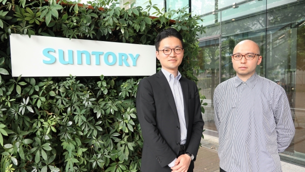
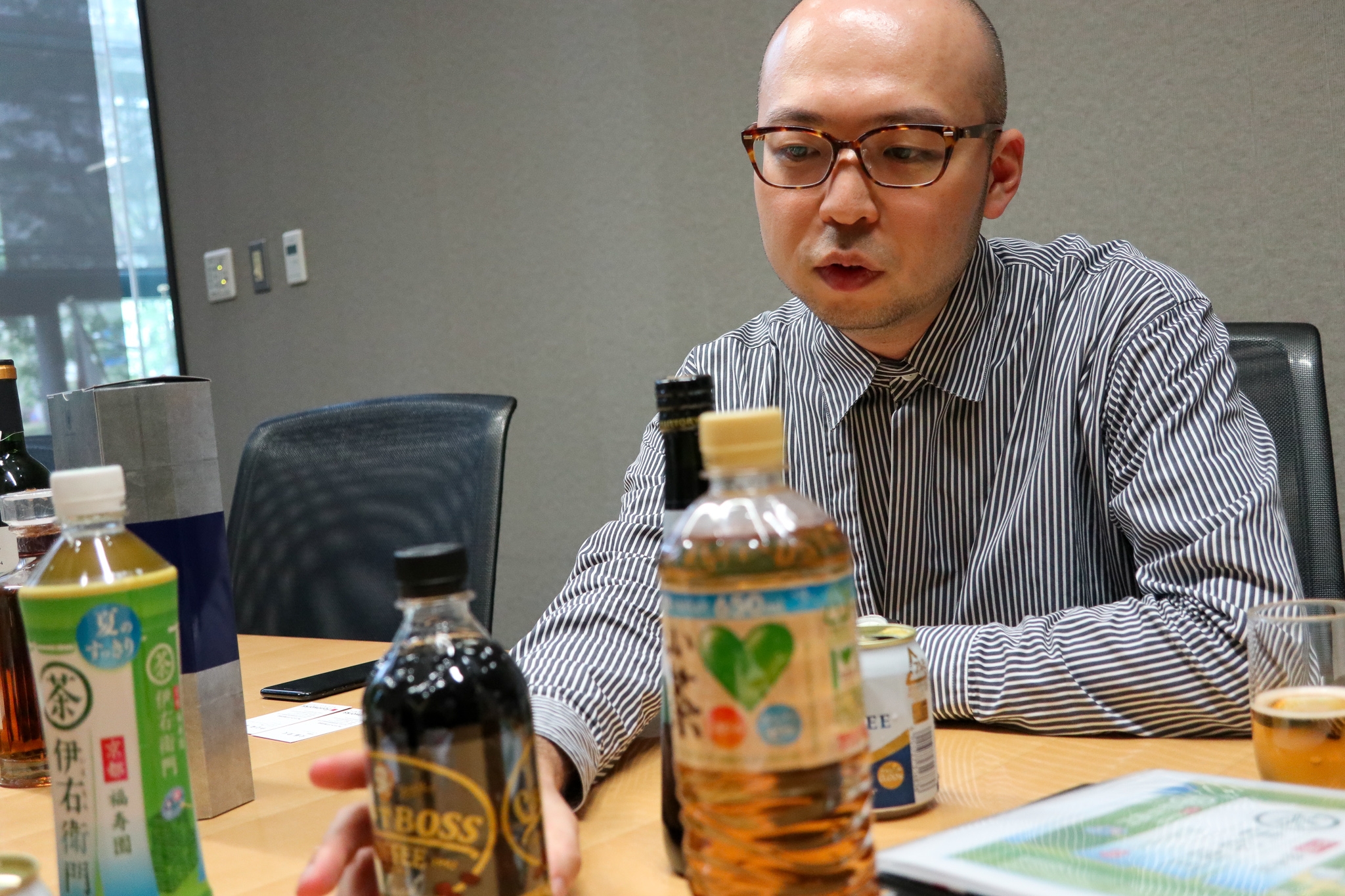
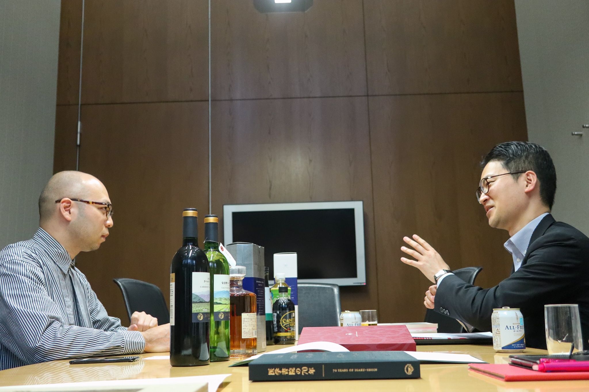
For the 3rd "Adventures around Fonts", we visited Suntory World Headquarters in Daiba to talk with Kei Nishikawa, Design Director at Suntory Communications, Inc. Please listen to the words of the craftsmen who are engaged in various Categories of Packaging released by Suntory and seriously face the design of each label / bottle this time.
Kei Nishikawa
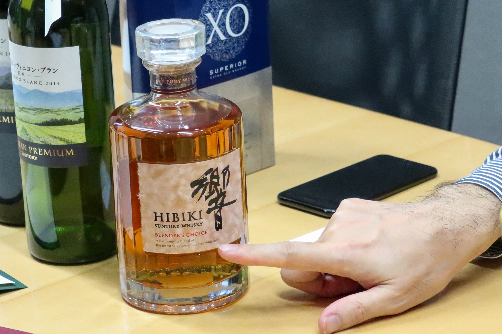
After graduating from the Department of Design, Faculty of Art and Design, Tama Art University, worked at Nobuo Nakagaki's design office. After experiencing editorial design, joined Suntory Holdings Ltd. in 2009. He is involved in numerous product designs such as the Iemon brand, GREEN DA / KA / RA brand, and whiskey "Hibiki."
Dedicated to Eric Gill from middle school!
--Nishikawa, nice to meet you. I look forward to working with you today.
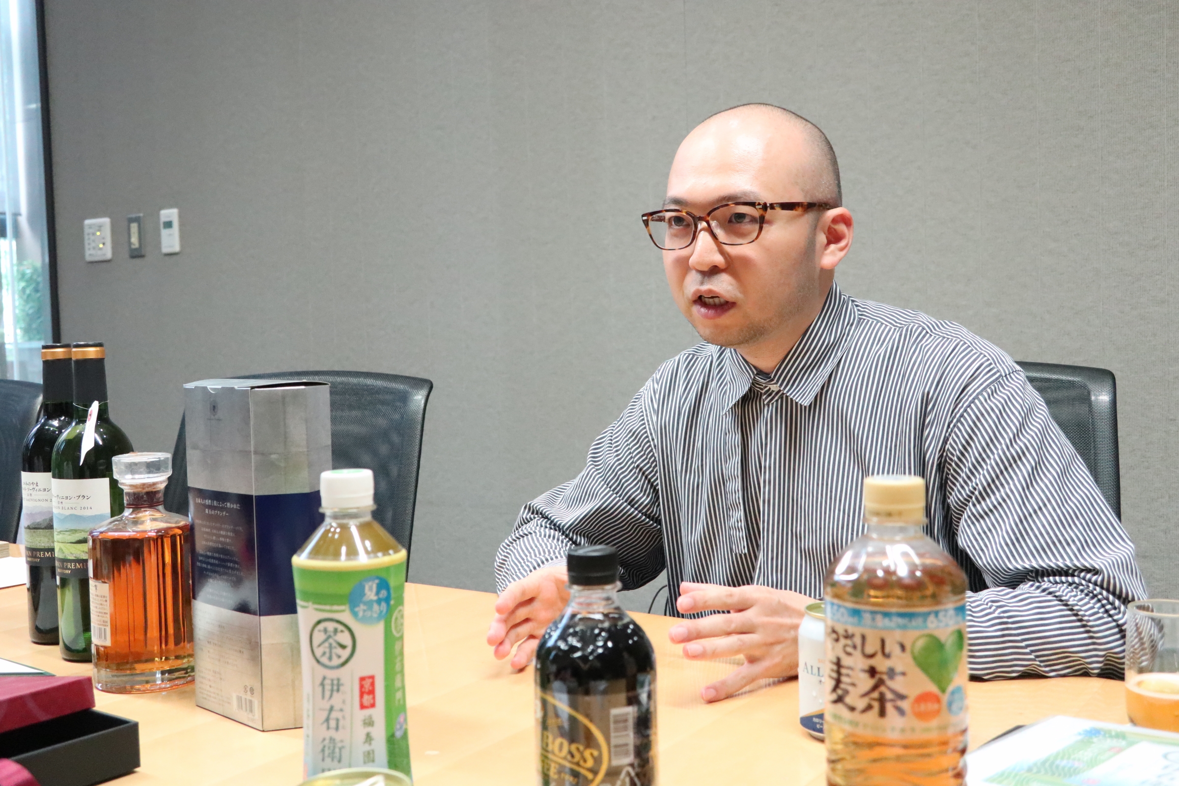
Nishikawa: Thank you for your cooperation. First of all, All free "here you go.
--Too novel (laughs). Let's start the interview while drinking "All Free". First of all, please tell us about the relationship between Mr. Nishikawa and the letters.
Nishikawa: Since my father taught sign planning and typography at the University of Tsukuba, I was familiar with typography from an early age. I remember when I was in junior high school, I was already familiar with typographer Eric Gill (1882-1940).
--What a ripeness!
Nishikawa: There were a lot of typography related materials in my parents' house. There were more parents' homes than university libraries (laughs), so I used to go home and often search for materials.
--Did you be a student when you longed for Eric Gill?
Nishikawa: Yes, I really liked Eric Gill. The typography developed by him, such as Gill Sans and Joanna, is of course great, but he is famous as a sculptor and printmaker in his home country (UK), and his prints are very cool. .. I liked that it had a good balance of black and white with woodcut woodcut, like a Christian religious painting. Together with him, European typography masters such as Hermann Zapf (1918-2015) and Adrian Frutiger (1928-2015) always thought that they were cool.
-Did you imagine a future where you would be involved in typography?
Nishikawa: From the time I was a student, I used to go into and out of typography-related groups from time to time, but the creators said, "How many letters a day do you make, and how many years later will you complete it?" I was delighted to hear a story such as "How many letters are you making?" And said, "Oh, I can't possibly do that." After interacting with them, you realized that you weren't for you. In my college graduation work, I also made a display typeface based on Frutiger. I was glad that they were used for signing plans, but I thought that typography was the main type of body type (typeface for Text), what I was doing was an extension of my hobby. I became interested in designing beautiful things and decided to pursue that path.
4 years of experience leading to the "now"
--After graduating from university, you worked for Mr. Nobuo Nakagaki's design office.
Nishikawa: I never thought of eating rice with books, but I think books are the best way to master typography (laughs). I studied under Mr. Nakagaki, who lives in the world of editorial design, and thankfully, Dr. Nakagaki taught me thoroughly how to select the correct typeface and assemble beautifully.
――Are Professor Nakagaki's teachings alive in your current work?
Nishikawa: It was four years when I especially learned how to convey information and how to face information. Don't neglect the important parts for the reader, such as the size of characters, line spacing, and line length. What I want to convey the most is what kind of information, what size, and where to place it, but now I'm doing it reflexively, but I think it's logical. It's definitely four years since I got the bass.
――Trained under Mr. Nakagaki, finally to the next stage.
Nishikawa: Dr. Nakagaki has made me really good and I have been able to work on many wonderful books. Next, I wanted to see what a designer is doing in a big organization, a place that has an impact on more people. However, in that context, only two major cosmetics manufacturers and Suntory came to mind at the time (laughs). A few weeks after I told Professor Nakagaki that I would quit, I happened to be recruited for a designer from Suntory. I thought this was a chance and applied.
I want to create what customers want, what they are surprised with, and what they find interesting.
――In the beginning, you didn't mean that you decided to get involved in product design, but it's been 10 years since you joined the company, and you can see how you enjoy working every day.
Nishikawa: It is more accurate that the types of fun are completely different. From the viewpoint of designing in the narrow sense, "editing beautiful characters neatly on beautiful paper with a proper printing method", editorial is absolutely more interesting. However, my current job has a completely different interest in being able to create something that reaches the daily lives of customers. I think editorial work is like a monk, and when the materials and themes are decided, it's not uncommon to face the target by myself (laughs). The people who make R & D, the marketers, and the designers will work together. The three parties come together at a fairly early timing and are involved in everything from concept to naming, design and contents. While discussing in a flat manner, the hypothesis → verification process will be swiftly turned on. It takes a lot of time, the power of various departments, and a lot of staff to reach the end of the customer.
--Is there Mr. Nishikawa's commitment in design?
Nishikawa: To be honest, I don't think there is anything particular about it. I want to make something that customers want, amaze, or find interesting, rather than "I want to make something like this." Even if it doesn't look good to me, it's okay. Also, although it's a bit different from what I'm particular about, I'm not even aware of what I am. One day, when I lined up the products of the GREEN DA / KA / RA brand, I had no intention of saying "I am me!" When designing, but it seems like I am (laughs). . It will come out after all. I think that's just right.
--What is the "color" unique to Mr. Nishikawa?
Nishikawa: I like the asymmetrical design, probably because the editorial influence is pretty strong. Editorial doesn't do much symmetrical design. Because there is movement, you can make a gap. It is often said that "I don't know the front of the product." In addition, we call it a “twisting problem,” but I feel that the experience of editorials is very useful in dealing with this problem. When a customer faces a drink on the shelves in a store, the bottle does not always face the front. Designers are conscious of "I want to make the front beautiful", but customers do not care where the front is. It means that the product must be noticed even in the "occipital region". It is not the idea of the front or the back, but how to improve the visibility as a whole. For that reason, we are designing with a great deal of attention to the display group such as raw materials.
――Are there any other things you were aware of when designing?
Nishikawa: For customers looking for FMCG (Fast Moving Consumer Goods), the stress of not being able to immediately find what they want at the store is great. Although it is related to the “twisting problem” mentioned above, I hope that the Packaging design will reduce the cost of selection and eventually play a role of increasing value for customers. This is based on the idea of “value = benefit / cost” and is a really important way of thinking in product development. For example, anyone can come up with a way to improve the benefits of a Packaging renewal. Hold it down and think about whether you can lower costs and increase value. I'm not really into it (laughs). In addition, the label pitch is becoming shorter and shorter in consideration of the environmental load. Since the display area is inevitably narrower, I think there is no doubt that the technology of the display group directly affects the visibility of the product.
--You are making efforts to increase the sales volume of bottles by narrowing down your wisdom to the smallest details. In the first place, what is the current position of the Japanese beverage industry worldwide?
Nishikawa: It is said that it is completely mature. In particular, I don't think there are countries where the categories have been subdivided so far. In the industry term, "thousands", 1,000 new products are released from each company in one year, and at the best, three can be left in the next year. To that extent, each company has been fiercely competitive. As a result, products that have won as many stars as there are stars are now called "standard".
―― そのような業界動向のなかで、御社デザインチームの強みとは?
Nishikawa: We are an in-house design organization, so I will keep in charge of what I was in charge of until it works. Then, the number of failures is considerably accumulated in the department. In some cases, the commercialization itself includes a verification element. Each failure or success is a "point," which is then connected to form a "line," and when the knowledge accumulated in beverages is laterally expanded into Categories such as alcohol and health food, this time the "line" connection It becomes a "face". I think that is the overwhelming strength of in-house.
Continue to pursue how we can contribute to the happiness of people
――By the way, what is the best brand in your company right now?
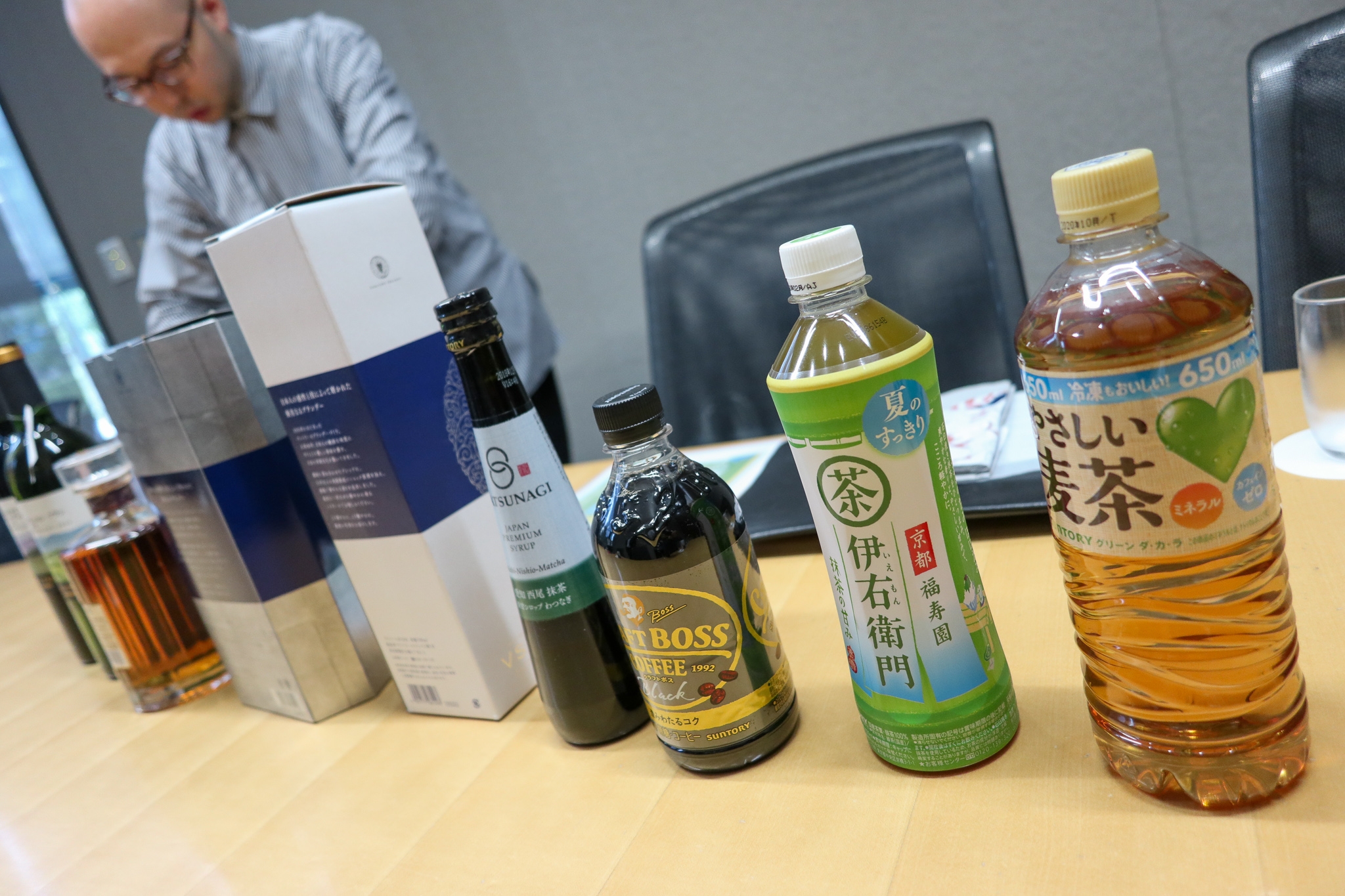
Nishikawa: Among the beverages, Craft boss "is not it. Outstanding. Craft Boss, in charge of Kojima of the design department, created a Categories called plastic bottle coffee. A tasteful design with a high degree of taste, a taste that is satisfying but easy to drink, a capacity of 500 ml, and an Advertisement. Everything snapped in and led to a big hit. I think it is a product that captures the insights of modern workers. after," GREEN DA / KA / RA Easy barley tea] Is also very momentum. This is a product that I have a strong affection for myself.
――What kind of feelings do you have in your mind?
Nishikawa: It was a very tricky development of serving tea from the sports drink brand "GREEN DA / KA / RA". The theme of "GREEN DA / KA / RA" is to make parents and children smile. However, sports drinks are not the only products that can make parents and children smile. For example, there are many parents who do not want to give sugar to their children. At that time, I started with the idea that barley tea is good. Also, research on the R & D department has revealed that barley tea, which is being drunk at home these days, is more often drained than boiled. This "gentle barley tea" was made based on the hypothesis that it should be made by blending several ingredients and creating a water-draining type that has a gentle taste and is less burdensome to the body.
――Actually, I like "friendly barley tea" and I drink it many times a week. The reason is that I just like barley tea, but more specifically, "My mother made it a long time ago. It's close to the taste of barley tea. " While listening to Mr. Nishikawa's story, I felt like I was connected.
Nishikawa: That's a really good story (laughs). Brag to the team!
-- Thank you smile).
Nishikawa: Also, I personally like the logo of "Gentle Barley Tea", but it has a perfect personality even though it is neutral. The scales have a soft feeling, or the horizontal drawing is thicker so that it is not a nervous one though it is a Mincho. The hiragana and kanji weight adjustments are firm and give a sense of overall unity. In a word, this logo is "Aegyo". It's just tea, but if you're with humans for a long time, you'll want to be more affectionate than solid things. It's abstract, but I think it's important that the softness that makes the characters look crispy.
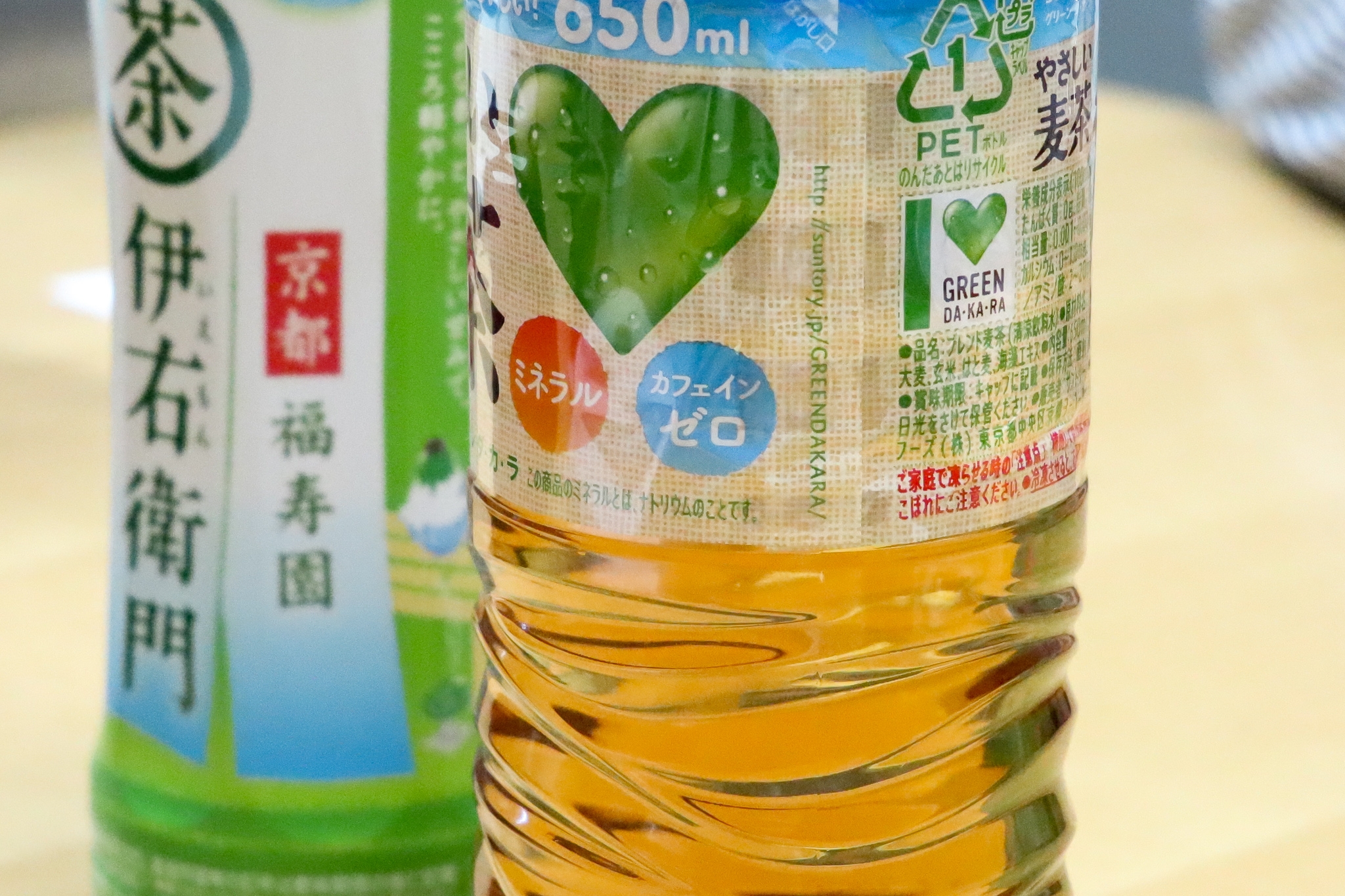
――Thank you for using "Tsukushi A MaruGothic" in front of the "Gentle Barley Tea" label! What is the attraction of Chikushi typeface that Mr. Nishikawa thinks?
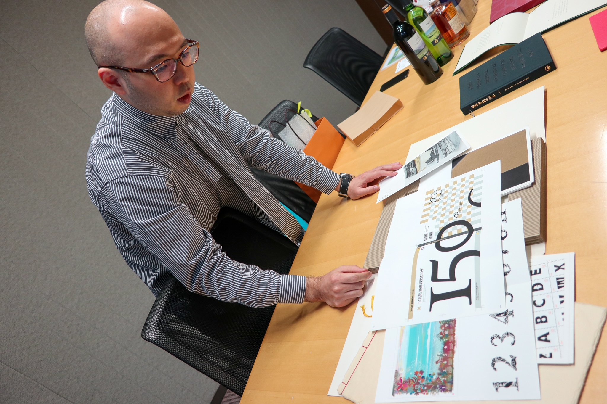
Nishikawa: Is it overwhelmingly elegant? His back and legs are long and he feels the strength of his bones. Above all, it is very important for a designer to have such a beautiful typeface. If you don't have a typeface that fits that image when you want to build a design like this, you can't reach the ideal you envision. On the other hand, when an interesting typeface comes out, I sometimes get inspiration from it. "I want to use this typeface in this scene!"
Nishikawa: (Looking at the Fonts book) A typeface like "Tsukushi C Old Mincho", I can not imagine the use immediately (laugh), but the essence of this typeface is scattered with elements that will lead to the next era I also think that. I want to continue using the Chikushi typeface series in the future!
--Thank you for your nice words! Finally, please tell us what you want to do as a designer in the future.
Nishikawa: How can we contribute to human happiness rather than finding joy in the expression itself? How much can you enjoy yourself in the relationships and relationships with people? I am saying "I would like to have something like this!", And I'm most happy that customers will be happy.
-- Thank you very much today.
After Recording After the interview ...
In 2018, Fontworks set a new tag line called "Freedom with letters, more and more". This expresses the company's intention to create an everyday life with a Styles and to continuously think about how letters can contribute to it. As an individual, personally, I would like to take a step out of the world of fonts based on the tag line, go out and meet various people and listen to them, and see the outside world. It started from last month.
It was the first time I met Mr. Nishikawa who appeared this time in such an "adventure over fonts", but Mr. Nishikawa's knowledge of typography was overwhelmingly deep and I could understand immediately. Most of all, Mr. Nishikawa continues to swim in a world that has completely different contexts even from the words of the same design, from editorial design to product design, but I was very impressed by the attitude that "there is a customer". Inspired by his unwavering stance on design and Suntory's tagline "Living with Water," I decided to set the title of this article to "Living with Water and People."
However, the product Packaging is really deep. The fonts from three font makers are used even just on the front of the "GREEN DA / KA / RA Easy Barley Tea" label, and it seems that people will continue to look at the Packaging after purchasing a plastic bottle for a while (laughs).
Interview Date: August 23, 2019
Photo = Mamezou