視覚障害者・高齢者のための、UDフォントの研究
フォントワークス株式会社はフォントの更なる可能性を求め、視覚障害者・高齢者にとって最適なフォントを求めるべく、「UD(ユニバーサルデザイン)フォント」の研究を実施しました。その内容を報告します。
当社では、ユニバーサルデザインという観点からUDフォントの研究を行ない、「全ての人に有効なデザインであるUDフォント」を目指し開発してきました。その過程を経て、「全ての人に有効なデザインを一つだけ開発するより、特定のグループ毎で最適なUDフォントになるよう文字デザインを変更する方が、全グループの人に最適なフォントを届けられるのではないのか」という考えに至りました。
初回の研究では高齢者グループを対象とした実験を行い、「高齢者・若年者間であまり違いがない」と結論づけ、当社UDフォントをリリースしています。前段で述べた考えにならうと「あまり違いがない」とするのではなく、小さな違いに対応する必要があり、まずはここから取り組むこととなりました。
また議論の中で、「高齢者だけではなく、視覚障害者も取り込んだ方が良い」という意見が出たため、視覚障害者・高齢者のためのUDフォントの研究と開発を行っています。
研究の概要
1. フォント比較実験
二つの実験を行いました。
・可読性評価実験
「読みやすさ」という観点からフォントを評価します。
・判別性評価実験
誤読しやすい文字の「判別しやすさ」という観点からフォントを評価します。
今回の研究は、視覚障害者・高齢者にとって、「様々なフォントの中から最適なフォントを求めること」を目的とし、また、「判別性を考慮しながら、可読性を中心に評価すること」としました。
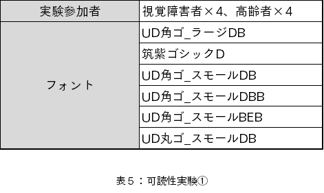
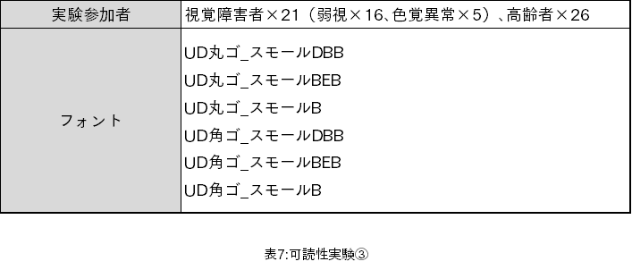
被験者の選定は株式会社ミライロ様、株式会社ドゥ・ハウス様にご依頼しました。
当社はデザイン性豊かな多くのフォントをとり揃えています。すなわち、全てのフォントから只一つのフォントを選ぶための実験の試行回数はとても大きなものになります。
その一方で、視覚的な弱者に対し長時間の実験を行うことの問題もありました。そこで、試行回数を減らすために全フォントからデザイン書体を外し、一般的な明朝、ゴシック、丸ゴシックを実験対象フォントとしました。
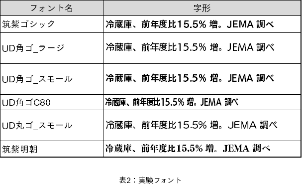
実際には以下のフォントを対象としています。
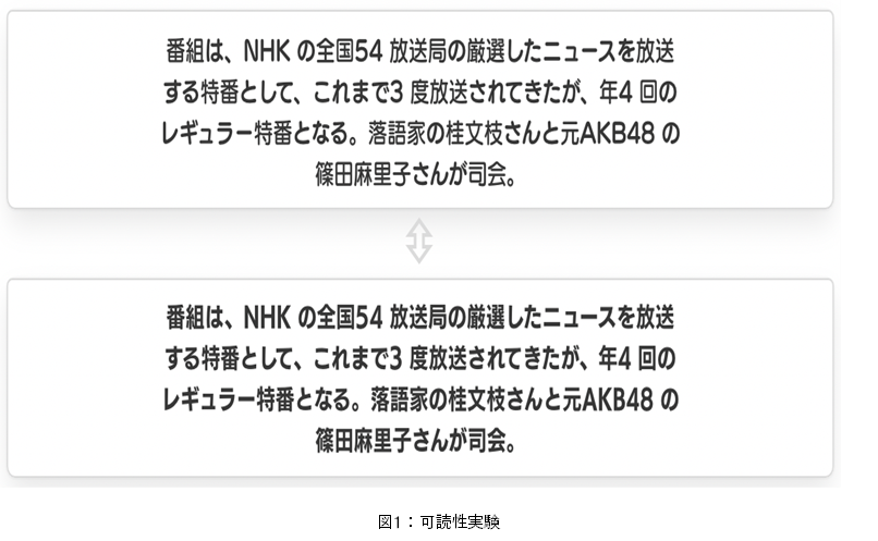
コロナ禍であることから対面での実験ではなく、実験用のWebアプリを作成し、それを被験者が所有するPC、あるいはタブレットで動作させて行うオンライン実験を実施しました。実験アプリの文字表示では、Webフォントを使用しています。
また、実験にあたり以下の制約を被験者に対して設定しました。
・タブレットもしくはPCから回答可能であること(スマートフォンは不可)
・明るい部屋で参加すること(明るさの設定なし)
・普段、白黒反転した状態では閲覧していない
・指定アプリに表示される文字情報を拡大・縮小することなく、閲覧可能であること
・画面との距離は30〜40㎝であること
フォント比較実験まとめ
(1)若年者との違い
以前の研究(九州大学との共同研究報告 vol.1 ~ユニバーサルデザイン(UD)フォントの評価に関して~)では、タイプフェースの違いを重視していたため、若年者と高齢者ともに同じウェイトで比較を行いました。その際、本文はR、M等の中くらいのウェイトのフォントを使用しています。
「視覚障害者、高齢者はそれより太いウェイトを最適としていると思われること」が、今回の実験でわかりました。
(2)推奨フォント
実験で設定した環境下を前提とします。
・本文
UD丸ゴ_スモールBEB、あるいはBが良いとします。準じて、UD角ゴ_スモールも良いとします。
・見出し
UD角ゴ_スモールBEB、あるいはBが良いとします。準じて、UD丸ゴ_スモールも良いとします。
(3)判別性について
想定通り、濁点と半濁点のように、違いの部分が小さい文字同士は判別しにくいという結果が現れました。将来的に判別性を良くする試みが必要だと考えます。
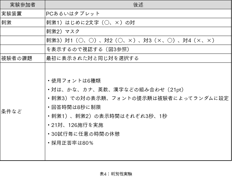
実験詳細
■実験の分割
予備実験を含め、3度の実験を行いました。1度の実験で使用するフォント数は「6」とし、実験を重ねることで適切なフォントを探索することにしました。

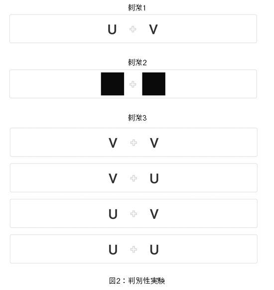
■可読性実験

■判別性実験
実験結果
■調査①
□実験
事前のアンケートで、ウェイトの太いものが良いという意見があったため、「漢字のウェイトがDB、漢字以外のウェイトがB」である『UD角ゴ_スモールDBB』と、
「漢字のウェイトがB、漢字以外のウェイトがEB」である『UD角ゴ_スモールBEB』を最初に準備しました。
『UD角ゴ_スモールE』を使用する選択肢もありましたが、視覚障害者の方が見ると漢字のカウンターが潰れてしまう可能性を考え、特別にフォントを準備しました。
これに合わせて、より細いウェイトのフォントをタイプフェース毎に混ぜることで、適切なウェイト、タイプフェースを探すことを目的とし、調査①を実施しました。
※タイプフェース:書体
※カウンター:文字の余白スペースのうち、完全に閉じた部分、または、部分的に閉じた部分を指す
□可読性結果
視覚障害者・高齢者で評価結果に違いがありませんでした。
・本文
全体的に、評価を3つに分けることができました。

・見出し
全体的に、評価を3つに分けることができました。
□可読性評価
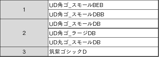
R11)本文、見出しともに、『UD角ゴ_スモールBEB』、『UD角ゴ_スモールDBB』の評価が高く、そして、より『UD角ゴ_スモールBEB』の方の評価が高かったため、調査②以降は、Bのウェイトを中心に検証することにしました。
R12)第2グループにおいて、『UD角ゴ_スモール』が、『UD角ゴ_ラージ』と同等か良いため、字面面積の大きさはスモールで良いと判断しました。
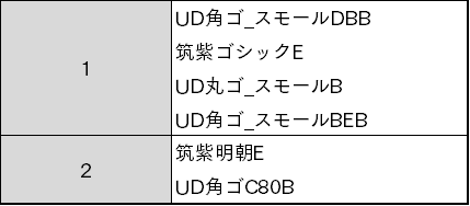
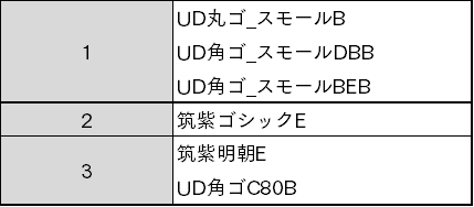
□判別性結果
回答までにかかった時間が短いほど判別しやすいと評価しました。
・視覚障害者
UD角ゴ_スモールBEB
UD角ゴ_ラージDB
UD角ゴ_スモールDB
UD角ゴ_スモールDBB
UD丸ゴ_スモールDB
筑紫ゴシックD
・高齢者
UD丸ゴ_スモールDB
UD角ゴ_ラージDB
筑紫ゴシックD
UD角ゴ_スモールDB
UD角ゴ_スモールBEB
UD角ゴ_スモールDBB
□判別性評価
L11)視覚障害者と高齢者では、評価が別れてしまいました。
しかしながら、今回は可読性を中心に評価しているため、調査②以降は可読性に合わせてBのウェイトを中心にすることにしました。以降の判別性調査については、各対についての判別のしにくさを理解することを目的としました。
■調査②
□実験
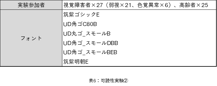
R11、L11を受けて、『UD角ゴ_スモールDBB』、『UD角ゴ_スモールBEB』を選択しました。ウェイトBの丸ゴシック、それに相当するウェイトの筑紫ゴシック、筑紫明朝、角ゴシックコンデンスを選択しました。
これらにより、適切なタイプフェースを探すことを目的とし、調査②を実施しました。
□視覚障害者可読性結果
視覚障害者、高齢者で評価結果の違いが少しありました。弱視と色覚異常では順位に違いはありましたが、評価グループには違いが無いため、全てをまとめました。
・本文
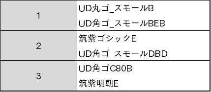
・見出し

□高齢者可読性結果
・本文
・見出し
□可読性評価
R21)視覚障害者・高齢者ともに、筑紫明朝、コンデンス書体の評価が低くなりました。明朝体は横画の細さ、コンデンス体は相対的な縦画の太さが他の書体に比べて細いことが原因ではないかと考えています。
また、筑紫ゴシック体は、標準的な評価であったことから、調査③以降は、角ゴシック体、丸ゴシック体を中心にウェイトを探索することにしました。
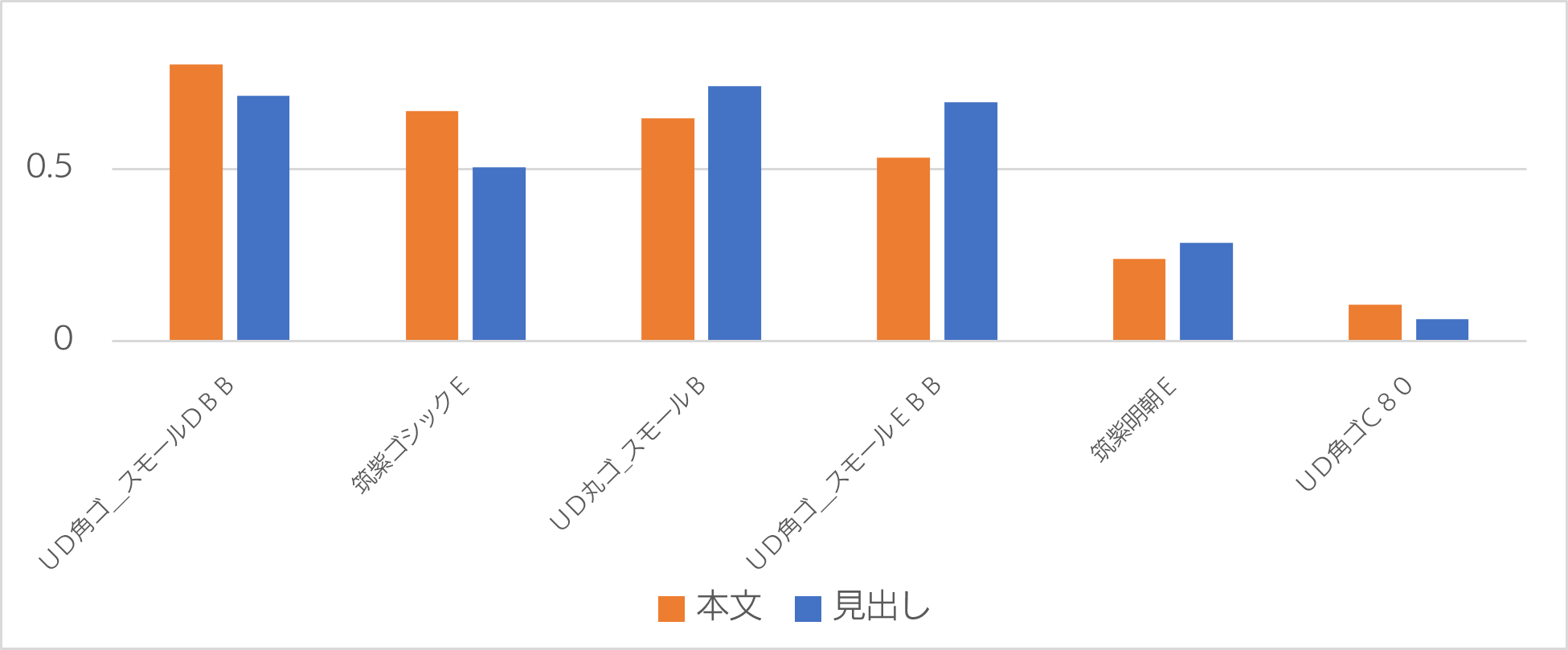
■調査③
□実験
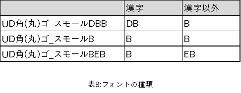
『UD角(丸)ゴ_スモールDBB』、『UD角(丸)ゴ_スモールBEB』、『UD角(丸)ゴ_スモールB』は、以下のようなウェイトを持つフォントです。
R21を受けて、丸ゴ、角ゴのこれらのフォントの差異を調査することにしました。
(1)漢字と漢字以外のウェイトを変更することに効果があるのかどうか
(2)丸ゴシックと角ゴシックはどちらが優位か
上記(1)(2)を大きな目的として、調査を行いました。
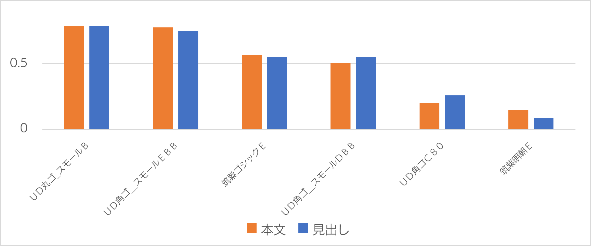
□可読性結果
調査②とは異なり、全体的に似たタイプフェースが揃っているため、標準偏差も小さくなり、大きな差が出にくい状況になりました。
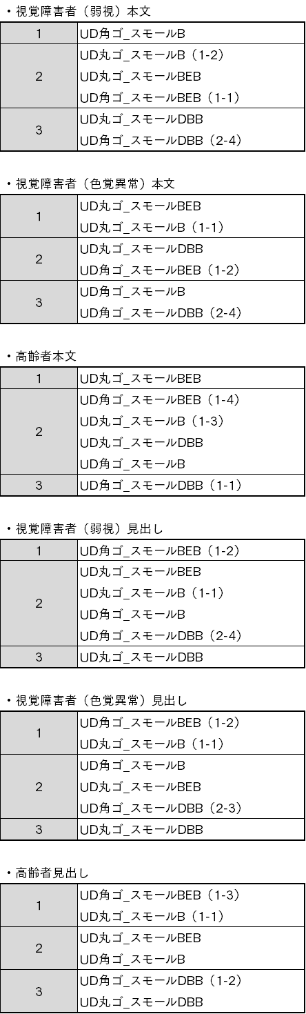
その上で以下のような評価グループに分けました。『UD丸ゴ_スモールB』、『UD角ゴ_スモールDBB』、『UD角ゴ_スモールBEB』は調査②でも使用しましたので、括弧内に調査②での結果(評価グループ-順位)を記述します。
□可読性評価
R31)全体的に差は大きくありませんでしたが、そのうえで「丸ゴシックと角ゴシックの比較」「丸ゴシック同士と角ゴシック同士の比較」を行ない、以下のように評価しました。
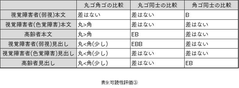
この結果を受けて、視覚障害者(色覚障害)/高齢者ともに本文に対しては、丸ゴシックが優位。また、見出しでは角ゴシックの方が若干優位という結果になりました。
R32)全体的にDBBが、視覚障害者(色覚異常)が3位、高齢者本文が4位以外は、5位または6位と下位に沈んでいます。しかし、BEBとBに明確な優位性は無いようです。
つまり、目的(1)である「漢字と漢字以外のウェイトを変更することに、どのような効果があるのか」については、効果は見られないと考えられます。
R33)「見出し」に関しては、視覚障害者・高齢者共に順位に似たような傾向が見られます。