AR環境下での文字情報提示手法の研究
フォントワークス株式会社は、東京大学大学院情報工学系研究科 廣瀬・谷川・鳴海研究室、電気通信大学大学院情報理工学研究科 広田研究室(特任助教 櫻井翔)と共同で、AR環境(拡張現実感(Augmented Reality;AR)環境)において効果的に文字情報を提示する手法と、各種情報提示の状況において適切と考えられるフォント特性を検証するため、「AR環境下での文字情報提示手法の研究」を実施しました。
研究の概要
1.AR環境下での情報提示の目的の状況などの分類
AR環境において適切なフォントを選択するために、まず、文字情報が提示される目的や状況を明確にしておくことが必要と考えました。
先行研究の調査などから、
(A)提示目的
(B)提示方法
(C)提示状況
の観点で以下のように分類しました。
(A)情報の提示目的による分類
文字情報を提示する目的として、内容よりも文字情報に目を向けてもらうことが目的であるもの(=発見型)と、内容を理解してもらうことが目的であるもの(=理解型)に分類しました。
・発見型
情報が提示されていることに注意を向けてもらうのを主目的とする情報提示です。例えば、メニューや通知等のユーザインタフェース、広告、看板、注意喚起などがあげられます。
・理解型
情報の内容を精査してもらうことを主目的とする情報提示です。例えば、ネット記事、マニュアル、メールの本文があげられます。
(B)情報提示方法による分類
AR空間において文字情報の位置を自由に移動させることができます。場所やモノに紐づいて空間に固定されて提示されるもの(=空間固定提示)と、ユーザに追従し、常にユーザの視界に提示されるもの(=ユーザ追従提示)に分類しました。
・空間固定提示
特定の場所に固定された情報提示で、モノや場所と紐づいた情報提示に適しています。例えば、商品情報のアノテーション、経路ナビゲーション、観光情報の表示があげられます。
・ユーザ追従提示
ユーザの移動に追従する情報提示で、ユーザインタフェース等の提示に適しています。例えば、メニュー画面、通知などがあげられます。
(C)情報提示状況による分類
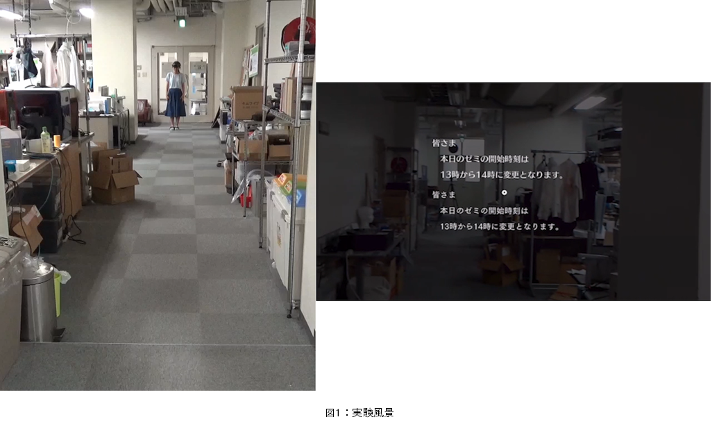
HoloLensのような装着型ARデバイスを用いれば、常にAR環境に提示された情報を見ながら生活することも可能になります。情報を提示する背景が大きく変化するかどうかによって、ユーザ静止時とユーザ歩行時に分類しました。
・ユーザ静止時
ユーザが特定の位置にとどまり、周りを見回す程度の動きのみを行う状況です。提示された文字情報の背景が大きく変化しないであろうことが想定されます。例えば、座ってメールやネット記事を読む状況があげられます。
・ユーザ移動時
ユーザが歩いたり、モビリティに乗るなど動き回る状況です。提示された文字情報の背景が大きく変化します。例えば、歩きながら届いたメールをチェックするといったことや車載ヘッドアップディスプレイでの提示などがあげられます。
補足:文字提示方式について
さらに、もう一つの要素として、文字提示方式による分類があげられます。文字の表示方式については、文字のみを表示する形式(Plain)、文字の背景にビルボードと呼ばれる単色の矩形を描画する方式(Billboard)、文字の周囲にぼかした縁を表示する方式(Anti-interference)、文字の背後に影を落として表示する方式(Shadow)があります。
このうちビルボード方式では、ビルボードの描画によって実背景が隠されてしまうため、多くの文字情報が提示される場合や、情報を実世界の物体と結びつけて提示する必要がある場合などには適しません。また、ビルボードを利用した場合には、通常の紙に書かれた文字を提示するのと類似の状況になると考えられるため、本研究ではビルボードを用いない場合を前提として検討をすすめることとし、プレーンな文字表示方式を扱います。
2.フォント比較実験
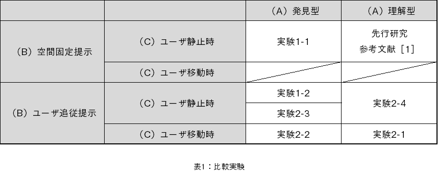
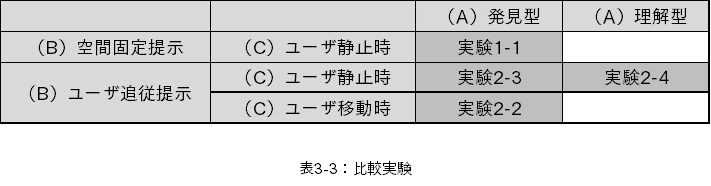
A、B、Cの3種類の分類にしたがって、8つの文字情報を提示する環境を作ることができます。しかしながら、以下の二つの環境については除外しました。
・(A)発見型、(B)空間固定提示、(C)ユーザ移動時
適切な実験を行うために、広い空間を必要とすること、また、妥当とできる空間の大きさ、配置する場所を想定できませんでした。
・(A)理解型、(B)空間固定提示、(C)ユーザ移動時
理解型のテキストが空間固定提示されている状態で、ユーザが移動しながら確認するという状況を想定できませんでした。
そのため、2つを除いた以下の6つの環境について、調査しました。第一次研究で空間固定提示を中心に、第二次研究でユーザ追従提示を中心に実験を行いました。
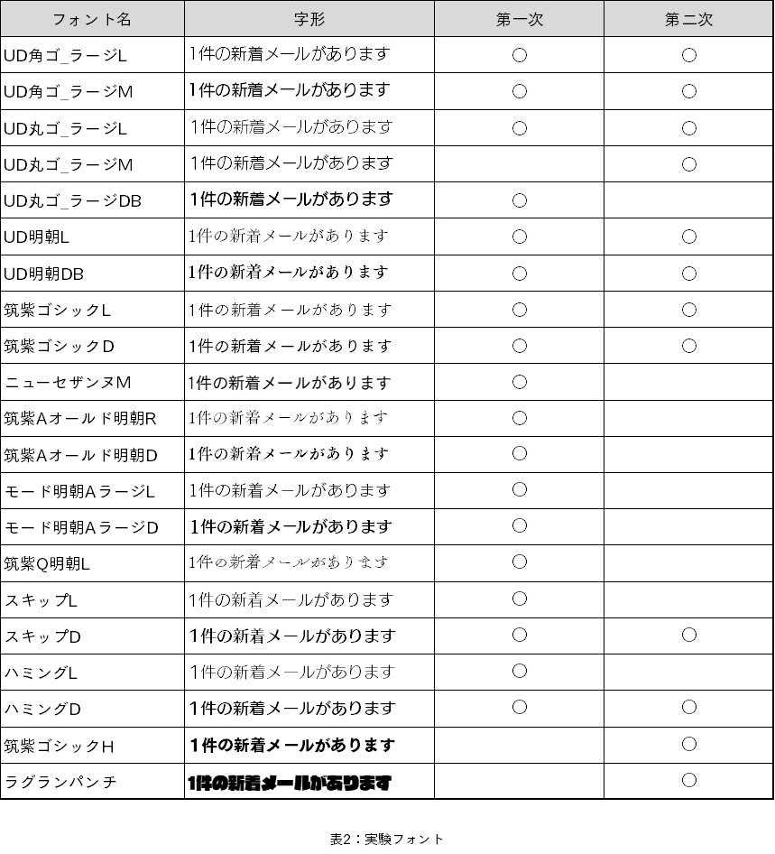
当社はデザイン性豊かな多くのフォントを揃えています。その全てのフォントを研究の対象とすることもできますが、研究の背景、実験の規模を考え、第一次研究では18フォントを基本としました。
第一次研究の結果、濃度の高いフォントが選ばれる傾向が見えたため、第二次研究では整理し、10フォントを基本としました。更に、濃度の高い2フォントを研究の対象として追加しました。
フォント比較実験まとめ
(1)分類の違い
A、B、Cの分類が違えば、最適なフォントの傾向は異なると考えられます。
(2)明朝体
第一次研究では、ユーザ追従時における発見型の情報提示において、ゴシック体よりも明朝体の方が優れていると結論づけました。しかし第二次研究の結果からは、明朝体はAR環境にはあまり適していないと考えられます。
(3)理解型×空間固定×静止時
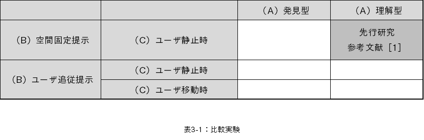
清原らはフォントと表示メディアが文章の内容理解に与える影響を調べました(参考文献[2])。この研究では、文章内容の理解度を問う課題において、明朝体よりもゴシック体の方が、成績が良くなることが示されています。
この結果から、紙面やディスプレイ上において、明朝体よりもゴシック体の方が理解型の情報提示に有利であると考えられます。この特性は、空間に固定された理解型の情報提示においては紙面上の場合と大きな違いを生まないと考えられます。そのため、空間固定型のARによる文字提示においても、明朝体よりもゴシック体の方が理解型の情報提示に有利であると考えられます。
(4)理解型×ユーザ追従×移動時
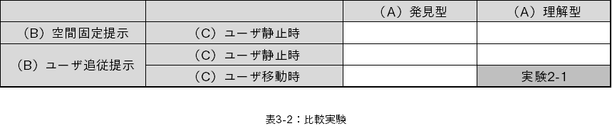
デザイン要素を排した一般的な角ゴシック体、丸ゴシック体が適しているのはないかと推測されます。実験の移動時にはかなり文字が揺れていました。
その状況で内容を理解するためには、よりシンプルなデザインのフォントが適していると考えられます。
(5)発見型と、理解型×ユーザ追従×静止時
明朝体のデータを排除すると、特に強く濃度との相関関係があるように考えられますが、適切な濃度はそれぞれ異なります。ラグランパンチのように極端に濃度が高いフォントはあまり適したフォントにならないと考えられます(第一次実験ではラグランパンチを使用していませんが、同様の結果が得られると考えられます)。
実験詳細
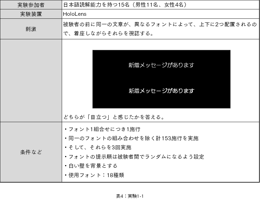
■実験1-1)(A)発見型(B)空間固定提示(C)ユーザ静止時
■実験2-1)(A)理解型(B)ユーザ追従提示(C)ユーザ移動時

■実験2-2)(A)発見型(B)ユーザ追従提示(C)ユーザ移動時

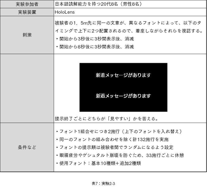
■実験2-3)(A)発見型(B)ユーザ追従提示(C)ユーザ静止時
■実験2-4)(A)理解型(B)ユーザ追従提示(C)ユーザ静止時

実験結果
サーストンの一対比較法により相対尺度を導出しました。
1人の被験者に付き「1組合せを2度」施行しているため、延人数の回答率をもとに計算しました(少数点以下第4位を四捨五入)。数値が高いほど読みやすいことを示します。(この表は第二次研究のものになります。)
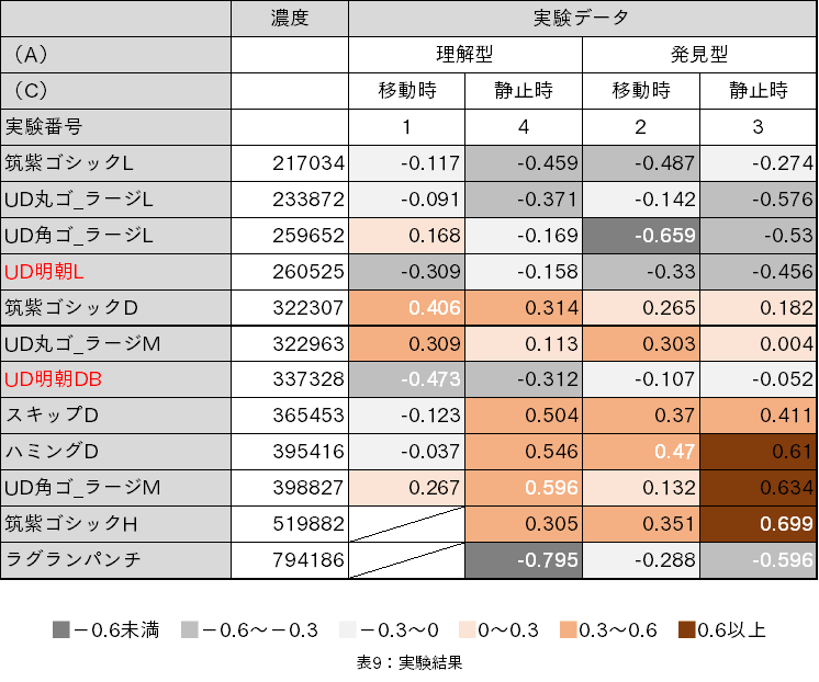
濃度は文字の黒い部分の面積です。当社で行っているフォントの物理的特性を示す値の一つで、全ての文字の平均値になります。最大値は1,000,000ですので、ラグランパンチは80%近い濃度のフォントということを示しています。この濃度順にデータを並べました。
他にも、文字を囲む最大内接矩形の面積である、字面面積を計算したりしました。
参考文献
[1] Michele Fiorentino,Saverio Debernardis,Antonio E Uva,and Giuseppe Monno. Augmented reality text style readability with see-through head-mounted displays in industrial context, Presence: Teleoperators and Virtual Environments, Vol. 22, No. 2, pp. 171–190,2013
[2] 清原一暁、 中山実、 木村博茂、 清水英夫、 清水康敬 (2003) 文章の表示メディアと表示形式が文章理解に与える影響、日本教育工学雑誌、 27(2)、 117-126