Fontworks has conducted joint research with Kyushu University in order to seek further possibilities for fonts and to seek basic performance for fonts.
<Researcher>
Kyushu University Faculty of Design content creative design department
Professor Hisahiro Ihara
Assistant Professor Kiriko Fuji
Takahiro Miyagaki Technical Staff
Department of Design and Human Sciences, Faculty of Design Design, Kyushu University
Professor Masaharu Sunaga
Kyushu University Education Reform Promotion Headquarters
Yang Ning Specially Appointed Assistant Professor
<Research name>
Basic research on the impression of fonts and their relevance to font morphological attributes
Research background
Many of our studies, starting with [Research on UD font evaluation], measure font morphological attributes and investigate the correlation between them and experimental results. In the process, it was found that the subject was aware of the character density and character area. On the contrary, it was not possible to clearly identify that it recognizes other morphological attributes. As a result, we have the potential that "many people can only recognize the morphology of letters, except for density and face area."
When people see letters, they not only recognize them as symbols, but also see them as images. As a result, it is thought that the characters as information are recognized and at the same time the impression as an image is captured. Density and face area are closely related to the black part of the letters. In other words, there is a possibility that "many people strongly capture the impression of the black part when recognizing a character as an image."
We develop and sell many fonts. In its development, we are conscious of the impression that the font gives, and design the form (including the black part). In other words, we are aware that fonts give different impressions depending on their form, that is, they induce a specific impression. We thought that many people could capture that impression as well. However, I came to think that it is possible that we can do it because we are experts who have the eyes to see the small differences in letters. Therefore, I decided to conduct research to clarify the following questions for non-experts.
- (Q1) In general, how far can a person distinguish a difference in characters?
- (Q2) If the difference can be discerned, can the difference induce an impression on a person?
research summary
The entire study consists of two experiments, their considerations, and a survey based on those experiments.
- Similarity evaluation experiment
This experiment will show how far a person can distinguish the difference in letters. At the same time, we also collect materials for impression evaluation experiments. - Impression evaluation experiment
In this experiment, we will evaluate whether fonts can induce impressions on humans. - Correlation between impression evaluation and morphological attributes
Investigate the morphological attributes that induce impressions.
This document, because it aims to clarify the background of research, omit a description of the "correlation of the impression evaluation and form attributes".
The Company offers a large selection of a variety of design rich many fonts. You can also be a subject of study all of its fonts, background research, consider the scale of the experiment, it was selected the following 40 fonts as a subject of study.
Selected fonts, without being attracted to the concentration and textually area many people to get to and evaluated by focusing on possible typeface skeleton and Shofu, so that the difference in shape easily recognized, Mincho, Gothic, Rounded Gothic, Display each of the Categories evenly than, and was assumed to be felt in almost the same weight.
| Typeface to be studied | TsukuNewsMin L, Tsukushi Q Mincho-L, TsukuAntique Mincho-L, TsukuMin-R, Tsukushi A Old Mincho-R, Tsukushi B Old Mincho-R, Tsukushi C Old Mincho-R R, Tsukushi B Vintage Mincho-L-R, ShueiMin-L, Matisse-M, Mode Mincho A-L, Mode Mincho B-L, TsukuGo-R, DNPShueiGoKin-L, DNPShueiGoGin-L, Cezanne-M, NewRodin-M, Rodin-M, Tsukushi A Marugo -R, Tsukushi B Marugo -R, Seurat-L, Anito-L, Greco-M, NewGreco-M, Utrillo-M, Klee-DB, RodinCattleya-M, Rodin NTLG-M, RodinWanpaku-M, RodinBokutoh-M, RodinHappy-M, Budo-L, RodinHimawari-M, Humming-L, Skip-L, Pearl-L, PalRamune, Nana-L, Kikyo-A -L, Matisse V-M |
|---|
Similarity evaluation experiment
This experiment will show how far a person can distinguish the difference in letters. At the same time, we also collect materials for impression evaluation experiments.
experimental method
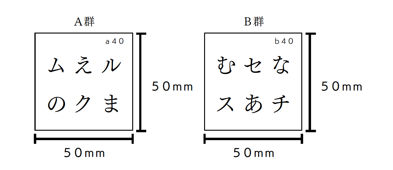
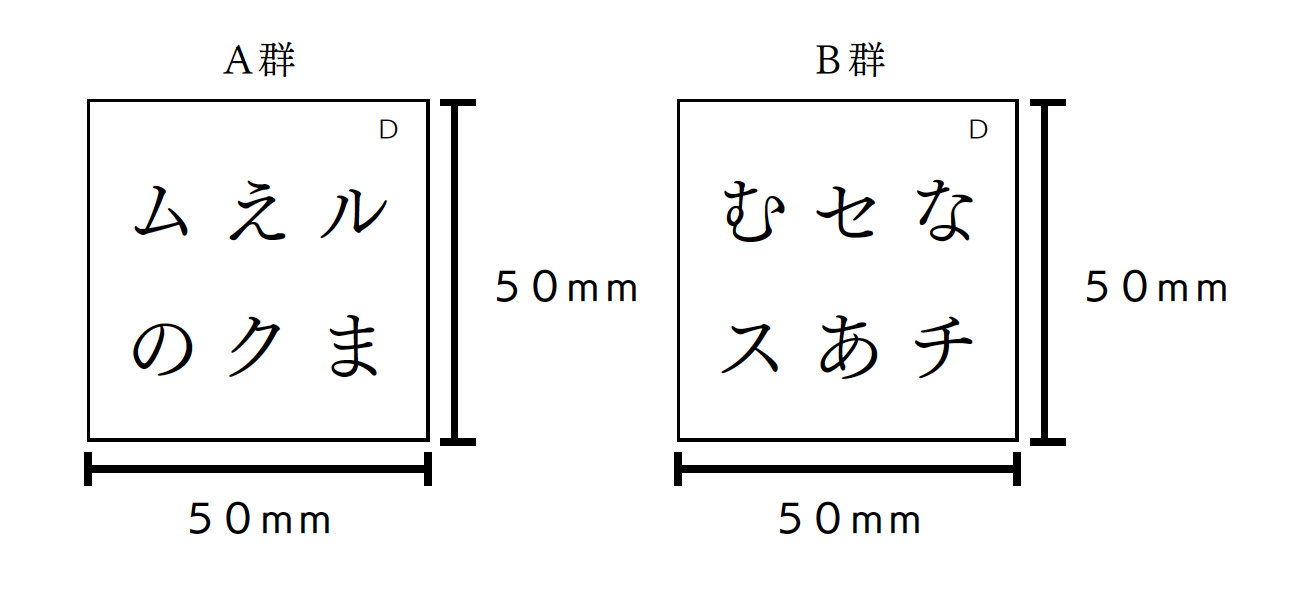
As a stimulus, we created two sets (A group and B group) of 40 character cards (one for each font) as shown in Fig. 1.
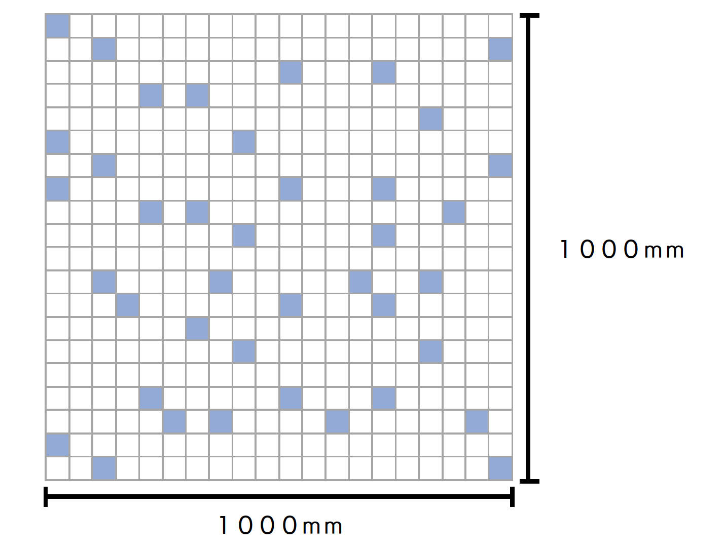
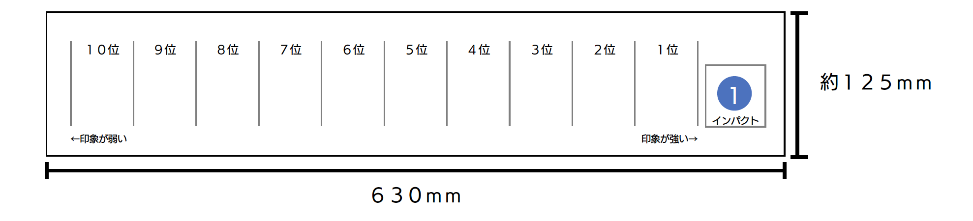
The participants of the experiment were asked to arrange 40 fonts of either of these stimuli (group A or group B) on the two-dimensional arrangement sheet as shown in Fig. 2 according to the degree of similarity.
I instructed the participants as follows.
- Place fonts that you think are similar in the grid and fonts that are not similar in the distance.
- The evaluation items on the vertical and horizontal axes when arranging may be freely determined.
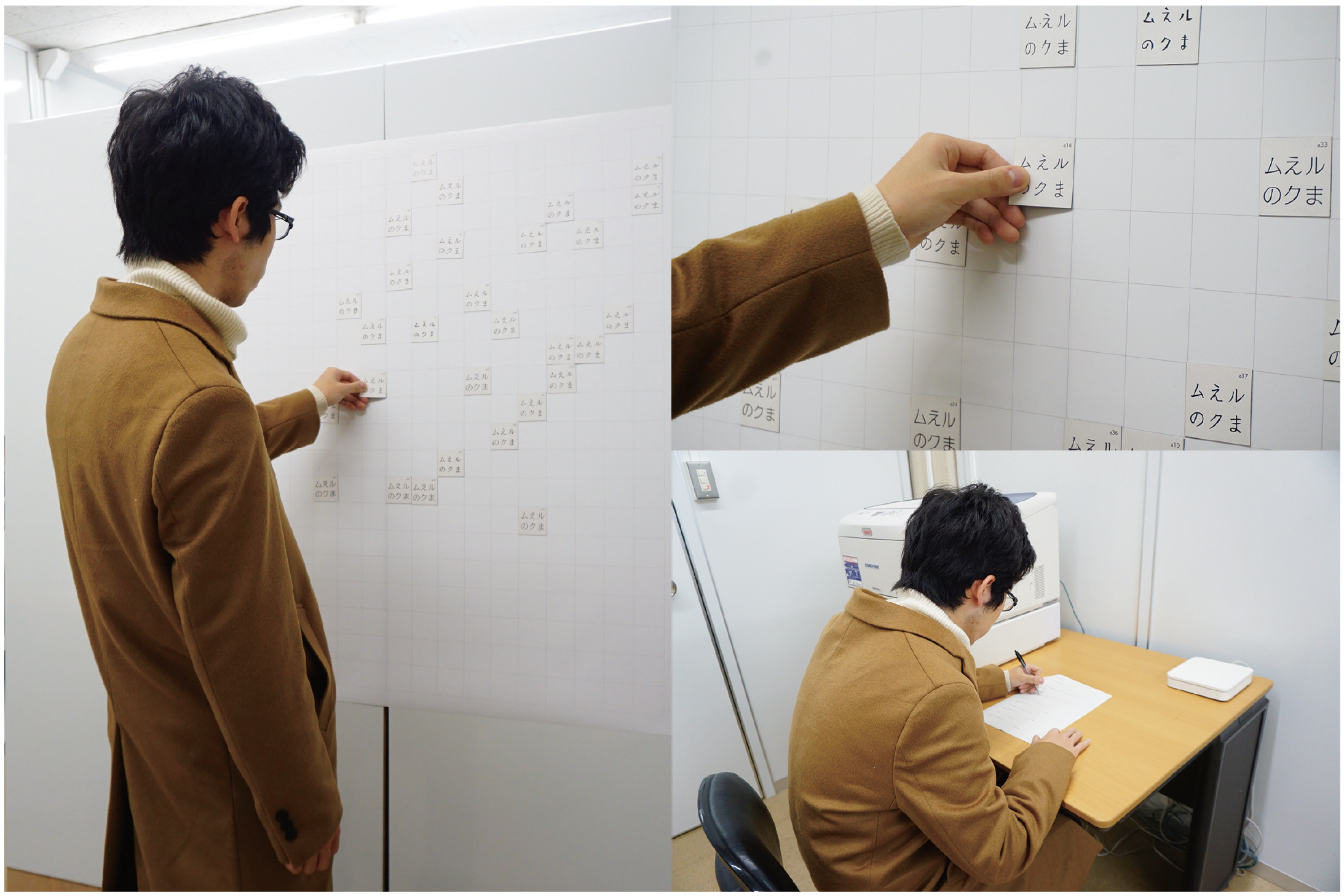
After being placed, we conducted a questionnaire and interview, and collected the evaluation items, the characters of interest, and the evaluation factors as shown in Table 1.
| Axis and evaluation items | Characters of interest | Evaluation factor | |
|---|---|---|---|
| Vertical axis | Handwriting feeling | Munama | I felt that it was mechanical when the baseline and letters were aligned |
| Horizontal axis | readability | e | I felt that the readability was high if the shape was close to a square and the balance of each character was good. |
This information will be the material for the impression evaluation experiment.
| ① Experiment participants | 60 university and graduate students |
|---|---|
| ② Selected glyph | Selected with reference to the outline classification of characters in "Character Design <Volume 3> Hiragana" (Maruzen, 1965) and "Character Design <Volume 4> Katakana" (Maruzen, 1966) by Keinosuke Sato. Hiragana (A, E, Na, No, Ma, Mu) 6 characters Katakana (ku, su, se, chi, mu, ru) 6 characters |
| ③ Stimulation | Create 2 sets (A group, B group) of 40 paper cards [50 mm x 50 mm] (1 card per font) in which 6 characters as shown in FIG. 1 are mixed and arranged in 3 characters x 2 lines per line. Participants were assigned to have the same number of trials in both groups to confirm and average the differences. |
Data conversion and analysis
Each section of the 2D layout sheet can have coordinates from 0 to 19 in the horizontal and vertical directions. Now you can calculate the distance between the fonts. Cluster analysis was performed based on that distance.
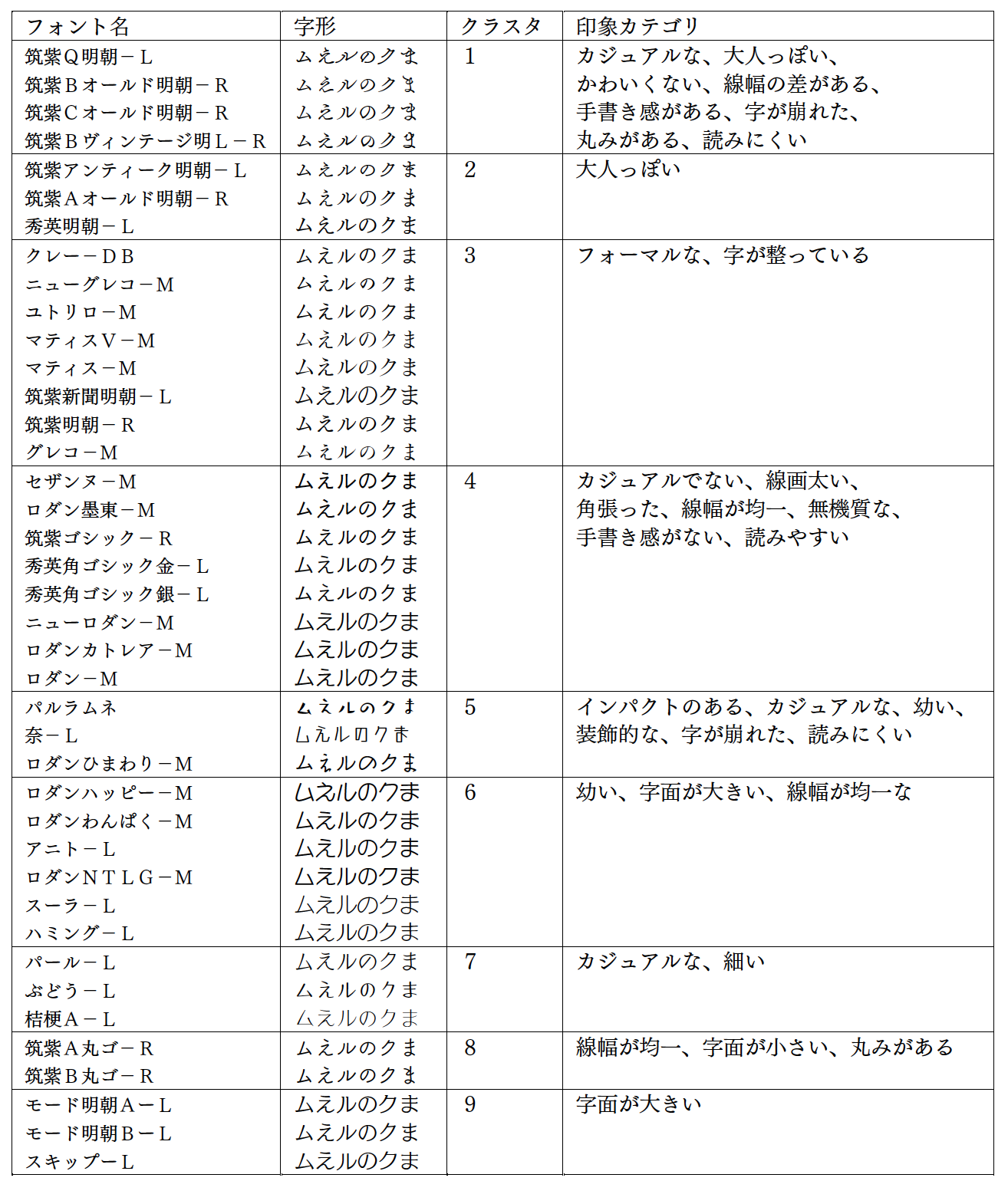
As a result of performing a cluster analysis once in groups A and B, it was found that they were roughly divided into similar clusters. Therefore, we have determined that character differences do not affect the results. Therefore, we combined all the data and performed a cluster analysis. The results are shown in Table 4.
We also analyzed the results of the questionnaire for the impression evaluation experiment. Since the evaluation items of the questionnaire are written in the language of each experiment participant, we collected equivalent items and set the impression category.
| Impression category | Example of evaluation items |
|---|---|
| Impact | The magnitude of the impact and whether the impact is strong |
| cute | Cuteness |
| Decorative | Decorative, character decoration |
| formal | Polite, formal / casual |
Return to the 2D layout sheet used in the experiment and assign the impression category from the evaluation items of the participants. Then, you can give the font a score in the impression category from the position of the font. Then, from the relationship between the font and the cluster mentioned above, calculate the average deviation value of the impression category for the cluster. Table 4 shows the impression categories with high average deviation values for the clusters.
Conclusion
At the level of the resulting clusters, one would be able to tell the difference in fonts.
Impression evaluation experiment
In this experiment, we will evaluate whether fonts can induce impressions on humans.
Impression word
フォントが誘起する印象を評価するために、類似度評価実験で得られた印象カテゴリを基に、表5のように印象語を選定しました。
| Impact cute Decorative formal Young hard Handwriting feeling casual Mature round soft |
Evaluation font
Each impression word is selected based on the impression category, and the degree of impression is a value called deviation value, which has already been analyzed in the similarity evaluation experiment for each cluster and font. Therefore, for each impression word, 10 fonts for evaluation were selected from 40 fonts by the following method.
- From the top two clusters with deviation values, the first font and the lowest font, respectively.
→ 4 fonts - From the bottom two clusters with deviation values, the first font and the lowest font, respectively.
→ 4 fonts - Standard Gothic and Mincho
→ 2 fonts
experimental method
As a stimulus, 10 character cards (1 for each font) as shown in Fig. 1 were created for each impression word in 2 sets (A group and B group).
We asked the participants to place the stimuli of either (A group or B group) and 10 fonts on the placement sheet as shown in Fig. 5 according to their impressions.
| ① Experiment participants | 40 university and graduate students |
|---|---|
| ② Stimulation | In order to confirm and average the differences due to glyphs, 20 experimental participants were assigned to group A and another 20 were assigned to group B so that both groups had the same number of trials. |
| ③ Environment | Since face-to-face experiments were difficult due to the spread of the new coronavirus infection, the experiment kit was mailed to the participants' homes after explaining the experiment online. |
analysis
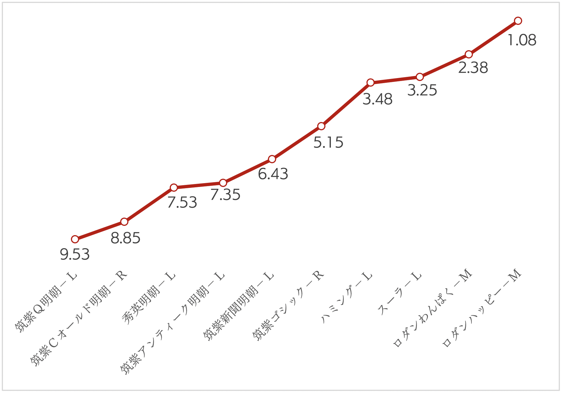
We analyzed the data in terms of average ranking. There were some impression words with large variance, such as "round", but the overall ranking appeared. Especially for "young", the ranking appeared beautifully as shown in Fig. 6.
Conclusion
(Q1) In general, how far can a person distinguish a difference in characters?
(Q2) If the difference can be discerned, can the difference induce an impression on a person?
In response to these questions
(A1) Regarding characters such as hiragana and katakana, it became clear that they recognize the difference in large typeface categories such as Gothic and Mincho, regardless of their knowledge of characters.
(A2) It was found that a specific impression can be induced.