Kurokane EB
「越」の「戉」の左下は正しいです。「宇、芋」の字体は間違いです。
About fonts
Correspondence service
designer
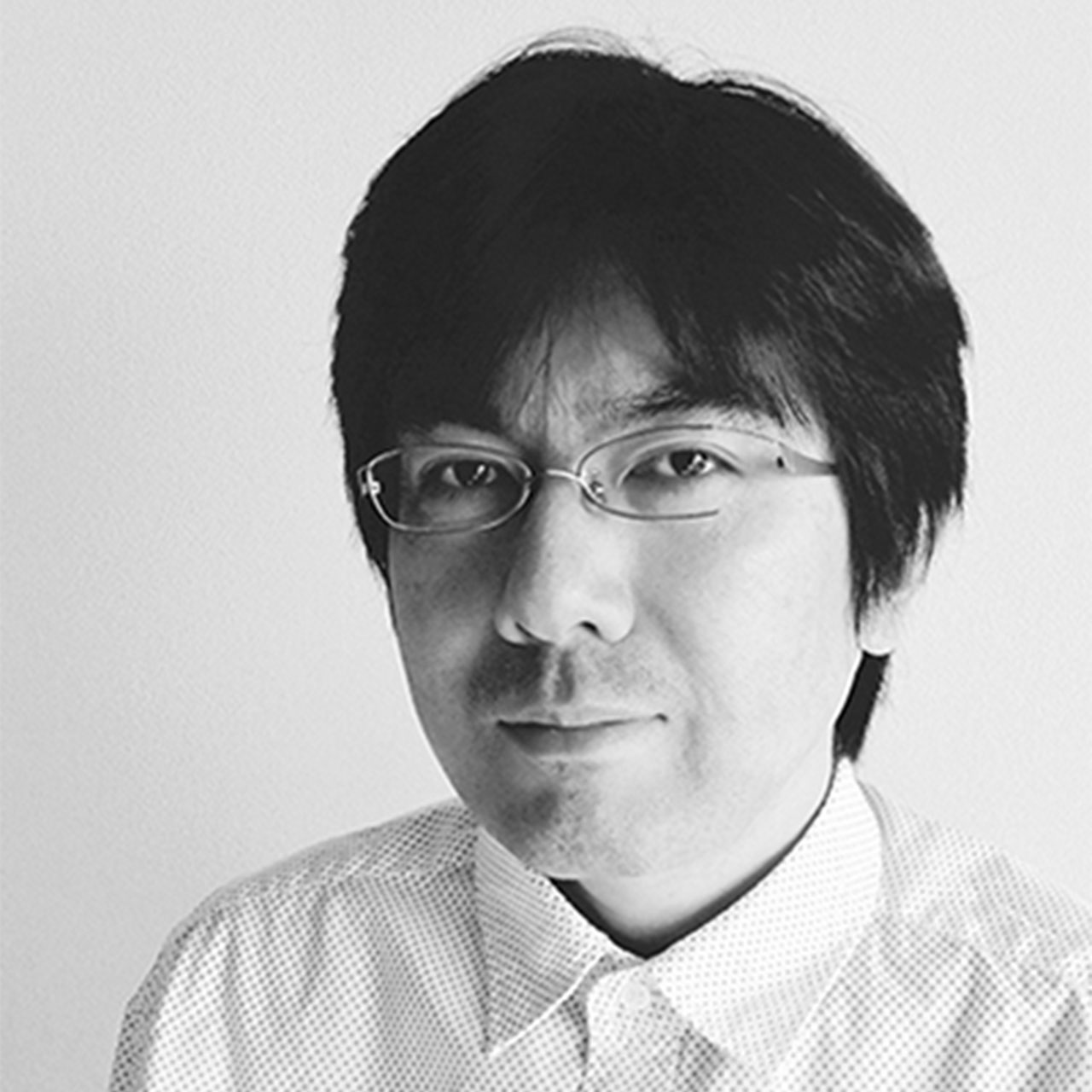
Zenji Osaki
Details
- How to read
- Kurokane
- Font maker
- Fontworks
- Foundry
- Fontworks
- Language:
- Japanese
- category
- Display
- standard
- JIS X 0208:1990
- Character Sets
- Click here for details
- file size
- 2 MB
- OpenType function
- Character width Half-width metric (halt)
- Kerning
- Proportional metrics (palt)
- Vertical type width half-width metrics (vhal)
- Vertical pair kerning (vkrn)
- Vertical Proportional Metrics (vpal)
- Any ligature (dlig)
- Single-width double-byte character (fwid)
- Mono-width half-width character (hwid)
- JIS78 character shape (jp78)
- General ligatures / standard ligatures (liga)
- Proportional glyphs (pwid)
- Old font (trad)
- Vertical type (vert)
Glyph
{{ currentShapeTextTitle }}
- {{ text }}
フォントファミリー1スタイル
{{ currentSampleTextTitle }}
- Kurokane EB
- {{ currentSampleText }}
detail of function
{{ functionType === 'spec' ? '文字セット' : 'OpenType機能' }}
| OTF | TTF | ||||||||
|---|---|---|---|---|---|---|---|---|---|
| AJ 1-6 | AJ 1-5 | AJ 1-4 | AJ 1-3 | ||||||
| Pr6 | Pr6N | Pr5 | Pr5N | Pro | ProN | Std | StdN | ||
| EB | ● | ● | |||||||
Ligature
- General ligatures / standard ligatures (liga)
- Glyph depending on context (calt)
- Any ligature (dlig)
letter
- Small Caps (smcp)
- Uppercase small caps (c2sc)
- Swash-shaped (swsh)
- Design variations (salt)
Number
- Lining number (lnum)
- Old Styles numbers (onum)
- Proportional number (pnum)
- Monospaced numbers (tnum)
- Fraction (frac)
- Superscript ordinal notation (ordn)
Set of designs
- Design set 01-20 (ss ##)
Glyphs with different widths
- Proportional glyphs (pwid)
- Proportional metrics (palt)
- Proportional kana (pkna)
- Single-width double-byte character (fwid)
- Mono-width half-width character (hwid)
- Character width Half-width metric (halt)
- Monospaced triplet (twid)
- Monospaced quartet (qwid)
Culturally different glyphs
- JIS78 character shape (jp78)
- JIS83 character shape (jp83)
- JIS90 character shape (jp90)
- JIS2004 character shape (jp04)
- Old font (trad)
- Glyph for ruby
- Kana for horizontal writing (hkna)
- Standard print font (nlck)
- Modified glyph (nalt)
- Italic
Vertical writing function
- Vertical pair kerning (vkrn)
- Vertical type (vert)
- Vertical Proportional Metrics (vpal)
- Vertical type width half-width metrics (vhal)
- Kana for vertical assembly (vkna)
Other
- Kerning
- Typesetting / decomposition (ccmp)
- Localized glyphs (locl)
- Superscript (sups)
- Subscript
Correspondence service
-
Fontworks LETS
An annual flat-rate font service that allows you to use all of the high-quality, variety of fonts from multiple manufacturers. With a wide variety of lineups, we offer various fonts such as Japanese, Hangul, Simplified Chinese, Traditional Chinese, Thai, and Hebrew.
-
mojimo-live
A "telop" that is essential for video production. Although it seems to be obvious on TV programs, even on YouTube etc., not only lines and emotional expressions, but also situation explanations, product introductions, blurs and punches, etc. , Now it is indispensable.
-
mojimo-jewel
This sparkling feeling is like a jewel. Shiny & gorgeous anime-style fonts are finally here! Doujinshi, YouTube videos, and other work-making ... Sparken your spirit, courage, and cute soul ☆
Usage
-
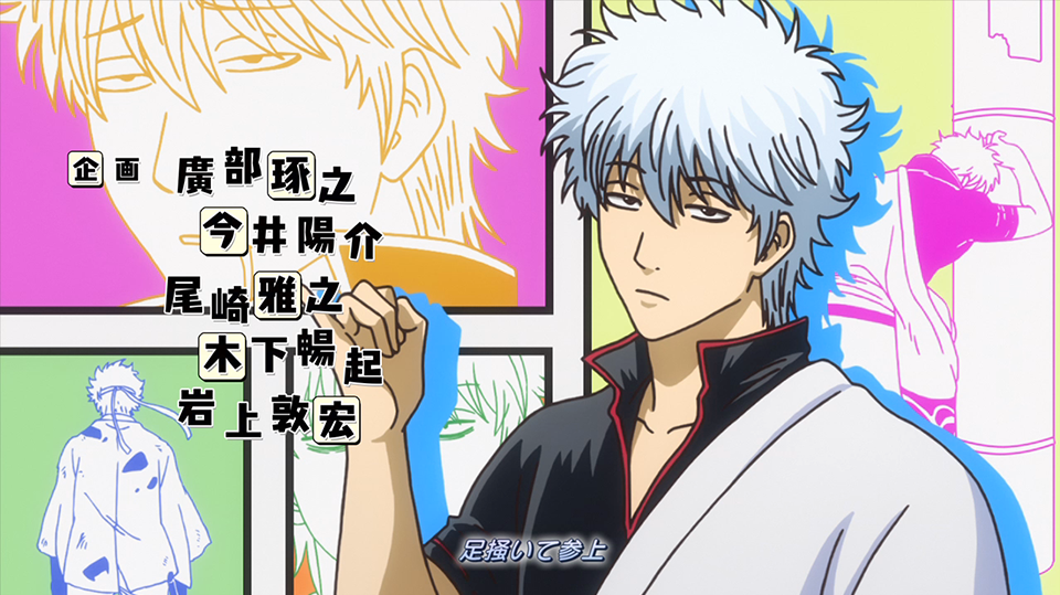
Gintama
PalRamune / Kurokane etc.
Ⓒ Sorachi Hideaki / Shueisha, TV Tokyo, Dentsu, BNP, Aniplex
-
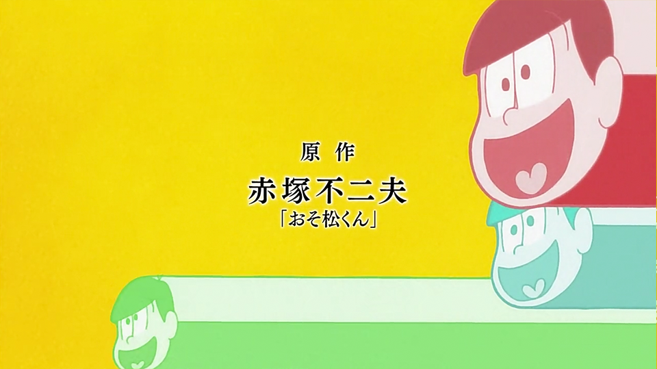
Osomatsu
BabyPop / Aokane / Kurokane / UDMarugo_Large / Stick / TelopMin / Matisse etc.
© Fujio Akatsuka / Mr. Osomatsu Production Committee
-
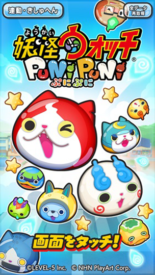
Yo-Kai Watch Punipuni
Kurokane / Rowdy / Seurat
© LEVEL-5 Inc.© NHN PlayArt Corp.
-
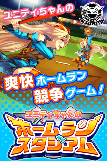
Unity's Home Run Stadium
Kurokane / Rodin
©2014 Unity Technologies Japan / ©KLab Games
-
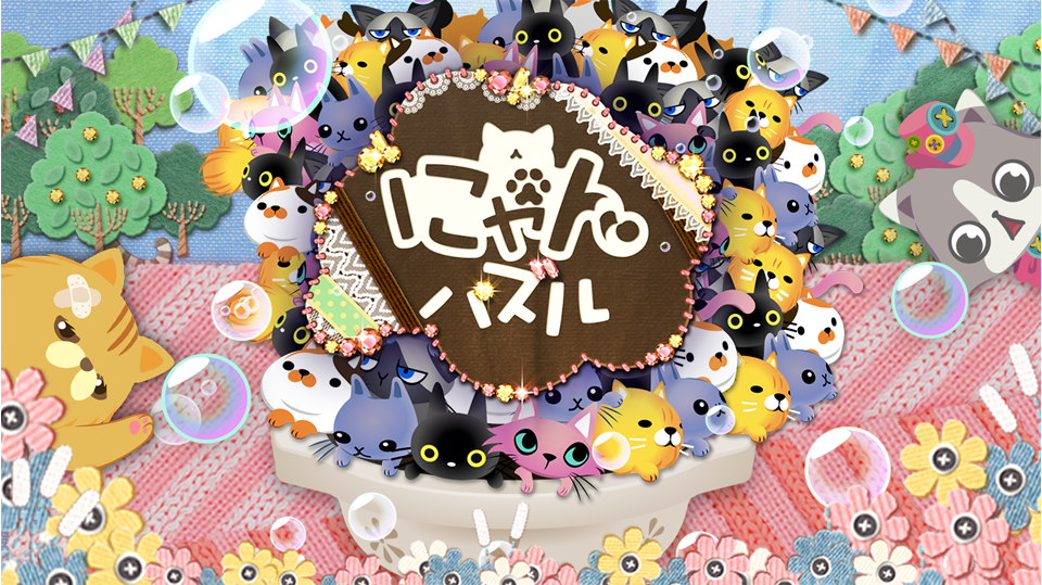
Nyan puzzle
Kurokane
©DeNA Co.,Ltd. All rights reserved.
-
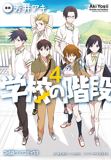
School stairs
Kurokane
-
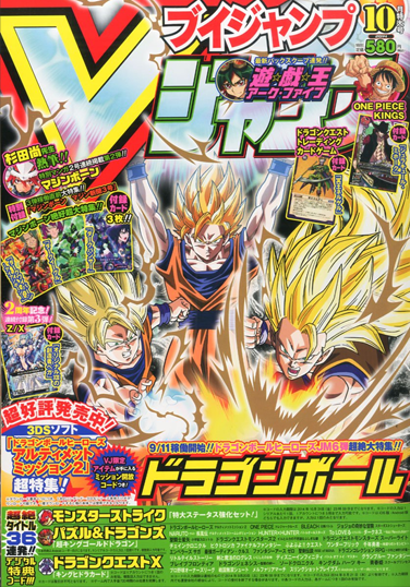
V Jump October 2014 Extra Large Issue
RocknRoll / Kurokane / Manyo Koin Large / NewCinemaA / Chiaro
© Ishizuka 2 Yuko / Shueisha
-

Travel
TsukuAOldMin / TsukuARdGothic / TsukuBRdGothic / RodinBokutoh / Rodin / Kurokane
-
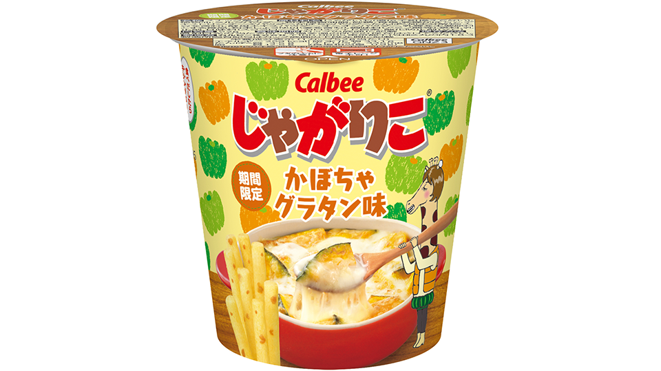
Jagariko
Kurokane / RocknRoll / Yuruka
© 2026 Monotype KK